


Most lead generation programs produce data. Few produce the right decisions from it. Knowing which lead generation KPIs to track is what separates teams that grow their pipeline with intention…
Table of contents
Most websites leak visitors like a broken bucket. Traffic comes in, looks around, leaves without a trace.
Lead generation forms fix that problem.
They turn anonymous browsers into named contacts you can actually follow up with. Email addresses, phone numbers, company details captured and ready for your sales funnel.
Learning how to use website forms for lead generation changes everything about your conversion strategy.
This guide covers form types, placement strategies, field optimization, and the design elements that separate high-converting forms from ignored ones. You’ll walk away knowing exactly how to capture more qualified leads from your existing traffic.
What is a Lead Generation Form
A lead generation form is a web-based tool that collects contact information from website visitors in exchange for something valuable.
Name, email address, phone number, company details. These form fields capture the data you need to start a conversation with potential customers.
The exchange works both ways.
Visitors get access to ebooks, free trials, consultation requests, or exclusive content. Your business gains qualified leads ready for nurturing through the sales funnel.
Every website form serves this core purpose: turning anonymous traffic into identifiable prospects you can follow up with. To capture leads effectively, you need to embed lead capture forms in high-traffic areas.
How Lead Generation Forms Work
The Value Exchange Process

Someone lands on your page. They see an offer. You ask for their information. They decide if the trade is worth it.
That decision happens in seconds.
The perceived value of your lead magnet must outweigh the perceived cost of sharing personal data. Data from Ruler Analytics shows the average form conversion rate across industries sits at 2.7%, which means 97.3% of visitors walk away.
Strong value propositions convert. Weak ones get ignored.
Why visitors abandon forms (The Manifest):
- 29% cite security concerns
- 27% find the form too long
- 11% abandon due to ads or upselling
- 10% don’t understand why you need their data
Two-thirds who start a form complete it, but that still leaves 34% abandoning mid-fill.
Form Submission Flow
The technical process follows a predictable pattern:
- Visitor enters data into form fields
- Browser validates input format
- Server receives and stores the submission
- CRM integration creates a new contact record
- Form submission confirmation message appears
- Marketing automation triggers follow-up sequence
Each step matters. Break any link in this chain and you lose the lead.
Which Form Fields Kill Conversions
Zuko Analytics data reveals specific fields drive people away. The password field shows the highest abandonment rate at 10.5%. Email fields cause 6.4% to quit, phone numbers 6.3%.
Asking for a phone number reduces conversion by 5%, street address drops it 4%, age 3%, and city/state 2%.
Single-column forms get completed 15.4 seconds faster than multi-column layouts. That time difference matters when the average form abandonment happens at just 1 minute and 43 seconds.
Forms with dropdown fields see the highest abandonment rates overall.
But here’s the catch: InsideSales research shows multi-step forms can boost conversions by up to 300% when properly optimized. The key is breaking complexity into digestible chunks.
Response Speed Determines Everything
Responding within 5 minutes makes you 100 times more likely to connect and convert compared to waiting 30 minutes. Yet the industry average response time sits at 42 hours.
Research from Velocify found responding within 1 minute can boost conversions by 391%. Wait just one more minute (for a 2-minute response) and that improvement drops to 160%.
Harvard Business Review data confirms firms contacting leads within an hour are 7 times more likely to qualify them than those waiting just one more hour.
Studies show 78% of customers buy from the first company that responds. Speed doesn’t just improve your odds, it decides the winner.
Design Elements That Impact Completion
Adding trust badges increases conversions by 16% overall. For checkout forms specifically, their absence causes 12% of abandonment according to Feathery data.
Desktop users show a 47% view-to-starter rate versus 42% on mobile. But mobile cart abandonment hits 85.65% in 2025, compared to roughly 73% on desktop.
The average web form contains 5 fields, which typically drives the highest conversion rates according to HubSpot. Go beyond that and watch completion rates plummet.
Contact forms average 11 fields. Comparison forms demand 36 inputs. Local government forms require 71 inputs and take 8.5 minutes to complete.
Industry Benchmarks
Professional services convert at 9.3%, the highest rate. B2B technology and real estate both struggle at 1.7%, the lowest.
Travel and automotive industries see form abandonment rates above 80%. Finance (75.7%), retail (75.8%), and nonprofits (77.9%) face similar challenges.
Follow-Up and Automation
Marketing automation software generates 451% more leads according to DemandSage research. But only 21% of acquired leads are actually ready for a sale.
Research from Annuitas Group shows nurtured leads make 47% larger purchases. The problem? 65% of B2B businesses lack a proper lead nurturing process.
CXL research found inline form-field validation causes a 22% decrease in errors and reduces completion time by 42%. Forms with radio buttons get completed 2.5 seconds faster than dropdown fields.
The average checkout displays twice as many fields as needed according to Baymard Institute data. That excess friction costs conversions.
What Works Now
- Keep forms to 3 fields when possible
- Use single-column layouts
- Add inline validation
- Display trust badges
- Implement multi-step progression for complex forms
- Set up instant response automation (under 5 minutes minimum)
- Track abandonment at the field level
- Test continuously
Forms that ignore these benchmarks lose to competitors who implement them. Every second of delay, every extra field, every missing trust signal costs you leads.
Types of Lead Generation Forms
Contact Forms
Basic contact form setups requesting name, email, and message. Common placement includes contact us page sections, footers, and sidebars.
Use case: general inquiries and initial touchpoints with potential customers.
HubSpot data shows contact forms convert at an average of 1.7% across industries. Professional services hit 2.5%, while B2B eCommerce struggles at 0.7%.
Keep these to 3-5 fields maximum. Adding social proof increases conversion by up to 26% according to GetLeadForms research.
Newsletter Signup Forms
Single-field or two-field sign up forms for email capture. Often paired with popups or embedded in blog content.
Email collection forms convert at an average of 15% according to HubSpot. But this varies widely based on implementation.
Newsletter popup performance (OptiMonk data):
- Incentive-free popups: 5.10% conversion
- Ebook offer popups: 7.49% conversion
- Discount offer popups: 7.65% conversion
- Conversational popups: 15.2% conversion
Landing pages outperform popups with a 23% signup rate. Popups make up 66% of all signup forms but convert lower overall.
Subscription forms work well for building email lists and nurturing long-term relationships. Research from Beehiiv shows newsletter open rates average 38.7% across industries.
Registration Forms
Multi-field registration forms handle webinar signups, event registrations, or account creation.
Webinar registration pages convert at 30% from cold traffic according to ConvertKit. That’s significantly higher than most other form types.
These qualify leads through additional information gathering. Company size, job title, industry. Data points that help segment your audience.
Application forms show the highest completion rate of any form type at 75% according to Zuko Analytics. But asking for too much information kills that rate fast.
Demo Request Forms
Longer forms asking about budget, timeline, and specific business needs.
Perfect for B2B lead capture and high-intent prospect qualification. Sales teams love these because they pre-qualify opportunities.
B2B companies see conversion rates of 10-15% on gated content offers according to research from Amra and Elma. Top performers push this to 15%+.
Between 5-10% of leads from gated content turn into sales opportunities. That creates a solid foundation for nurture programs.
Dynamic forms can increase conversion by up to 160% according to Chili Piper data. These adapt questions based on previous answers.
Gated Content Forms
Forms that unlock downloadable resources. Ebooks, whitepapers, templates, research reports.
Gated content establishes expertise while capturing mid-funnel leads actively researching solutions.
The median landing page conversion rate reached 6.6% in Q4 2024 according to Unbounce. Top 25% hit 5.31%, top 10% reach 11.45%.
But here’s the catch: only 62% of users who fill out the form actually consume the gated content. The rest abandon after submission.
Progressive profiling works better for longer sales cycles. Show different fields based on what you already know about the visitor. Forrester research shows this increases lead quality by 58%.
Delayed gating (showing 30-50% of content before requiring a form) increases conversion by 35-45% compared to hard gates according to Content Marketing Institute.
Multi-Step Forms
Multi-step forms break long questionnaires into sequential pages, revealing questions progressively.
Reduces form abandonment by making the process feel manageable. Studies show conversion rate increases of 86% compared to single-step alternatives.
Only 40% of marketers use multi-step forms according to HubSpot, but those who do see dramatically better results. InsideSales research found properly optimized multi-step forms can boost conversions by up to 300%.
The key is strategic breakdown. Each step should feel like progress, not a barrier.
Multi-step formats work because of psychological commitment. Once someone starts, they’re more likely to finish. Zuko Analytics shows completed form sessions have 5.6 field returns on average compared to 4.6 for abandoned sessions.
Quiz and Assessment Forms
Interactive forms providing personalized results based on user responses.
Quiz performance dominates other lead gen methods. Interact data shows quizzes convert at 40.1% from start to lead. That means 4 out of 10 people who start a quiz become leads.
Compare that to static forms converting at 2.8%. Outgrow analysis of 50,000+ forms found interactive forms achieve 47.3% conversion, a 16.9x improvement over traditional approaches.
Using quizzes drives engagement, enables lead segmentation, and delivers product recommendations visitors actually want.
Quiz completion rates hit 85% when designed properly versus 20% for traditional forms according to ActiveCampaign research. Email signup rates through quizzes reach 40.1% compared to 2-3% for static opt-in forms.
Interactive content generates 52.6% more engagement than static content. Users spend 13 minutes on interactive elements versus 8.5 minutes on traditional content.
Assessment quiz types that work best:
- Diagnostic quizzes (identify problems)
- Personality quizzes (categorize into personas)
- Product recommendation quizzes (match solutions to needs)
- Skills assessments (evaluate current level)
B2B SaaS companies see 53% average conversion rates with quizzes. Marketing agencies hit 49%, professional services 44%, and e-commerce with product finders 41%.
The magic is in the value exchange. Users invest 3-5 minutes answering questions, becoming primed to share contact info for personalized results. Research shows interactive content drives 2x more conversions than passive content.
Where to Place Lead Generation Forms on a Website
Above the Fold Placement
Position forms where visitors see them without scrolling.
Content above the fold captures 57% of page viewing time according to Nielsen Norman Group research. But placing forms too high often backfires. It introduces friction before visitors understand your value.
CTAs above the fold outperform below-the-fold placement by 304% according to WiserNotify. Yet MECLABS testing found a below-the-fold treatment increased conversion by 220% when it clearly conveyed value first.
The lesson? Context matters more than position. Short newsletter signups work above the fold. Complex demo requests need trust-building content first.
Static forms convert at 45.53% versus 25.96% for modal popups according to Factors.ai data.
Landing Page Integration
Dedicated pages with single conversion goals remove navigation and distractions.
Unbounce analysis of 41,000 landing pages shows median conversion hit 6.6% in Q4 2024. Top performers reach 11.45%. Landing page forms outperform popups with 23% signup rates.
Match form placement to offer complexity. Free trials can sit higher on the page. Expensive products need detailed explanation before asking for contact info.
Blog Post Embeds
Inline forms within article content work because readers already invested time.
Place them after establishing value. Mid-point or end of posts performs best. Match form offers to content topics.
Organic traffic converts at 2.4% versus 1.3% for paid traffic according to First Page Sage. Content marketing generates leads at 62% less cost than traditional marketing.
Popup and Modal Windows
Popup forms average 11.09% conversion according to OptiMonk. Top performers hit 42.35%.
Timing drives results. Popups appearing on the second page a visitor views generate 28.98% conversion. Behavior-based triggers (scroll depth, exit intent) outperform static delays by 35-40%.
Performance by popup type:
- Cart abandonment: 17.12%
- Fullscreen: 14.40%
- Gamified: 13%
- Seasonal offers: 11.88%
- Newsletter with discount: 7.65%
- Newsletter without incentive: 5.10%
Exit intent popups save 10-15% of abandoning visitors. Exit popups offering discounts convert 7% of leaving visitors. Cart abandonment popups recover 13.5% of abandoned sales.
Mobile popups convert at 5.3% versus desktop at 3.11% according to Drip research. Multi-step popups hit 5.64% compared to 3.07% for single-step versions.
URL-targeted popups convert at 5.80% versus 2.30% without targeting. That’s 152% higher when you match context to page content.
Understanding different types of popups helps you choose the right trigger.
Sidebar Positioning
Persistent forms visible across multiple pages maintain presence without interrupting.
Less aggressive than popups. Lower conversion but better user experience. Inline CTAs outperform sidebar placement with 121% higher click-through rate according to WiserNotify.
Sidebars suit longer browsing sessions where visitors explore multiple pages.
Footer Placement
Forms in the bottom section catch visitors who consumed your content.
Low commitment placement for simple email captures. Footer forms add zero friction but convert lower than above-fold or popup placement.
Best for ongoing list building rather than high-priority conversions. Visitors who reach the bottom demonstrated interest by scrolling through everything.
What Actually Works
Match placement to complexity:
- Simple newsletter signup: Above fold, popup, or footer
- Demo requests: Landing page with value proposition first
- Gated content: Mid-content or end of blog posts
- Cart recovery: Exit intent popups
- Event registration: Dedicated landing page
Test everything. Run A/B tests comparing placements. The fold matters less than providing value before asking for information.
How Many Form Fields to Include
The Field Count and Conversion Relationship
Fewer fields typically mean higher completion rates. Adding fields increases friction but can improve lead quality.
Forms with 3 fields convert around 25% according to OptinMonster. Forms with 6+ fields drop to 15% completion.
But it’s not perfectly linear. HubSpot data shows reducing from 4 fields to 3 increases conversion by almost 50%. Yet 30% of marketers report highest conversion with 4 fields.
The average web form contains 5 fields. Comparison forms demand 36 inputs. Local government forms require 71 inputs and take 8.5 minutes to complete.
Field type matters more than count. Standard text fields don’t cause major dropoff according to Zuko Analytics. Large text areas and dropdown boxes kill conversions because they signal bigger time commitments.
Understanding form fields helps you balance quantity against quality.
Required vs Optional Fields
Mark only truly necessary fields as required.
HubSpot Research 2024 shows conversion drops 7% with each additional required field. Beyond seven fields, bounce rates jump 50% compared to three-field forms.
Specific field impact on conversion:
- Phone number: -5%
- Street address: -4%
- Age: -3%
- City/state: -2%
Password fields show 10.5% abandonment rate. Email fields cause 6.4% to quit, phone numbers 6.3%.
Choose form fields for capturing high-quality leads based on your sales process, not wishful thinking.
Field Types That Work Well
Email address carries least friction while providing most value. Name personalizes follow-up with minimal resistance.
Company name signals B2B qualification. Job title enables segmentation.
Phone number creates high friction but indicates strong intent. Only request it when the offer justifies the ask.
Name fields show shortest completion time at 3.5 seconds according to Zuko. Address questions take 7.4 seconds.
Dynamic forms increase conversion by up to 160% according to Chili Piper. These adapt questions based on previous answers.
Progressive Profiling Approach
Collect basic information first. Gather additional details over subsequent interactions.
Progressive profiling increases form completion by 35% according to Marketo Benchmark Report 2024. It reduces abandonment by 45% based on Eloqua Study 2024.
Stanford research 2024 shows people who agree to small requests are significantly more likely to agree to larger requests later. Users who initially provide only email are 320% more likely to share additional information in later interactions.
Typical progression:
- First visit: Name and email
- Second visit: Company name and job title
- Third visit: Budget range and timeline
- Later visits: Pain points and current solutions
This approach improves data quality by 28% through contextually relevant inquiries according to HubSpot Research. B2B buyers go through 8-10 touchpoints before purchasing, creating multiple opportunities to gather information.
When used correctly, progressive profiling increases conversion rates by 20% according to Aritic research. Form analysis shows 68.32% of page viewers initiate forms, with 65.99% completing them.
Form Design Elements That Affect Conversion
Single Column vs Multi-Column Layouts
Single column forms guide the eye downward in a natural reading pattern.
Users complete single-column forms 15.4 seconds faster than multi-column versions according to CXL research. Multi-column layouts confuse completion sequence.
But context matters. One HubSpot test showed a two-column form improved conversion by 57%. Single-column is the safer default for better form design results.
Multi-page forms convert at 13.85% versus 4.53% for single-page forms. Break complexity into digestible steps, not columns.
Label Placement Options
Labels above fields perform consistently well across devices.
Inline placeholder text disappears on click, causing confusion. External labels prevent this problem.
Placing labels above input fields increases conversion by reducing friction. Matching input field size to expected answer length also improves completion.
Studies show viewers process lowercase text faster than all capitals. A distinct, well-labeled field receives 232% more clicks than a congested layout.
Button Copy and Color
Action-oriented button text outperforms generic labels.
Best performing CTA words:
- “Get” instead of “submit”
- “Reserve” instead of “enter”
- “Try” instead of “click here”
Using “submit” reduces conversion by 3% according to research. “Get Your Free Guide” converts better than “Submit.”
Button color should contrast with surrounding elements. Contrasting colors increase conversion by 38%. CTA buttons surrounded by white space increase conversion by over 200%.
Mobile Responsiveness
Desktop converts 8% better than mobile on average according to Unbounce analysis. Yet 83% of landing page visits happen on mobile devices.
Mobile ecommerce conversion averages 2.85% versus 3.85% for desktop. Desktop view-to-starter rate hits 47% compared to 42% for mobile.
Mobile forms need touch-friendly input areas and appropriately sized buttons. Mobile-optimized landing pages improve conversion rates by 27%.
53% of mobile visitors leave pages that take longer than 3 seconds to load. A one-second delay reduces conversions by 7%.
Error Messaging
Inline form-field validation reduces errors by 22% and cuts completion time by 42% according to CXL research.
Users with inline validation show 31% higher satisfaction. They complete forms 42% faster than forms without real-time feedback.
Clear form error messages explain exactly what needs fixing without frustrating visitors.
Adding trust badges increases conversion by up to 26%. Security concerns drive 29% of form abandonment, so visible trust signals matter.
CAPTCHAs reduce conversion by as much as 40%. Use them sparingly, only when absolutely necessary.
Form Field Optimization Techniques
Smart Defaults and Autofill
Pre-populate fields using browser autofill or IP-based detection for country and region.
Using autofill increases conversion by more than 10% according to Zuko Analytics. Users who trigger autofill show 71% completion rate versus 59% for those who don’t.
Autofill is clearly correlated with successful form completion. It reduces typing effort and increases completion rates.
Enable autofill options for names and addresses to speed up form completion. This simple feature can dramatically reduce abandonment.
Conditional Logic
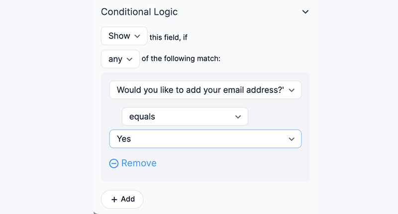
Show or hide fields based on previous answers.
Dynamic forms increase conversion by up to 160% according to Chili Piper research. Conditional logic keeps forms short while collecting relevant qualifying information.
Consider a form builder with conditional logic for complex requirements.
The approach works because users only see fields relevant to their situation. No wasted fields, no confusion, no unnecessary friction.
Field Masking
Format phone numbers and dates automatically as users type.
Field masking reduces input errors and submission failures. It guides users toward correct formatting without explicit instructions.
Users spend 7.4 seconds completing address fields on average according to Zuko data. Proper masking reduces this time and prevents formatting mistakes.
The name field shows the shortest completion time at 3.5 seconds with just 0.3 field returns. Simple, clear formatting expectations make this possible.
Input Validation
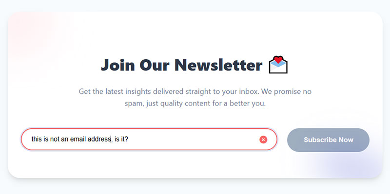
Form validation checks email formats, required fields, and data patterns before allowing submission.
Inline validation catches mistakes before submission. It reduces errors by 22% and cuts completion time by 42% according to CXL research.
Users with inline validation show 31% higher satisfaction levels. They complete forms 42% faster than forms without real-time feedback.
Key validation features that work:
- Real-time email format checking
- Password strength indicators
- Required field highlighting
- Character limit counters
- Phone number format verification
Catches problems early. Prevents frustration at the final step.
Completed form sessions average 5.6 field returns compared to 4.6 for abandoned sessions. Validation reduces these returns by catching errors immediately.
How to Write Form Copy That Converts
Headlines Above Forms
State the value proposition clearly. What does the visitor get?
Using the right headline increases conversions by 307% according to Keywords Everywhere research. ConversionLab got 31.4% more signups by using exact search terms people typed instead of vague alternatives.
Make it specific and desirable. Vague promises don’t motivate action.
Speak to audience pain points before presenting your product as the solution. The headline either stops people or loses them in seconds.
Field Labels and Microcopy
Keep labels short and clear.
A distinct, well-labeled field receives 232% more clicks than a congested layout according to Feathery data. Viewers process lowercase text faster than all capitals.
Add helper text only when the expected input might be unclear. Good form UX design minimizes cognitive load.
Placing form labels above input fields and matching field size to expected answer length increases conversion by reducing friction.
Privacy Statements
Include brief reassurance about data handling.
Security concerns drive 29% of form abandonment according to The Manifest. Adding trust badges increases conversion by up to 26%.
Link to full privacy policy without cluttering the form area. Trust signals matter for conversion optimization.
67% of visitors abandon forms forever if they encounter complications. Only 20% follow up with the company. Trust messaging prevents that initial hesitation.
Call to Action Text
Write button copy describing the outcome.
Best performing CTA buttons include action words like “get”, “reserve”, and “try” rather than “submit” or “enter” according to WordStream. Using “submit” reduces conversion by 3%.
Focus on what the user receives, not what they must do:
- “Start My Free Trial” beats “Register Now”
- “Get Your Free Guide” beats “Submit”
- “Reserve My Spot” beats “Click Here”
Personalized call-to-action buttons convert 42% more customers than generic ones. CTA buttons with contrasting colors increase conversion by 38%.
Forms that include the term “email” in their copy show higher conversion rates. Lead capture forms have seen conversion rates double when copy clearly states what users get.
Nearly two out of three marketers report average landing page conversion rates under 10% according to HubSpot. The difference often comes down to copy that focuses on visitor benefits versus company needs.
Lead Magnet Types for Different Form Purposes
Educational Content Offers
GetResponse research shows 47% of marketers report video and text lead magnets deliver the best opt-in results. Short-form content outperforms longer formats. Video clips hit 55.7% conversion rates while webinars achieve 70.2% among long-form options.
High-converting educational formats:
- Ebooks and guides: Guidebooks drive 67.2% conversion in long-form written content
- Whitepapers and research reports: Still powerful for B2B. MarketingSherpa data shows 78% of B2B customers used white papers when making purchase decisions. Companies using 5-step nurture sequences saw 38% higher conversion rates for white paper downloads
- Video tutorials and courses: 73% of marketers say short-form video drives higher conversion than long content
- Checklists and templates: 58.6% of marketers report these short-form assets convert better than lengthy documents. Interactive tools like quizzes now convert at 5.2% vs gated ebooks at 0.9% according to HubSpot
Templates deliver instant value. Users can implement immediately without reading 30 pages.
Access-Based Offers
B2B SaaS free trials convert between 15-30% according to First Page Sage data from 86 companies. The median B2B trial conversion rate sits at 18.5% in 2025. Top performers hit 35-45% while elite companies reach 60%+.
Trial conversion benchmarks:
- Opt-out trials (credit card required): 48.8% average conversion
- Opt-in trials (no credit card): 18.2% average conversion
- B2C SaaS: 15-20% conversion rates
- Enterprise SaaS: 10-15% conversion (longer sales cycles, more stakeholders)
7-14 day trials with urgency messaging outperform 30-day trials by 71%. Recurly found the median B2B trial conversion hits 66% overall.
Access offers that convert:
- Free trials and demos
- Exclusive community membership
- Early access to new features
- Members-only content
Consultation Offers
B2B consultation offers work because they require commitment from both sides. Perfect for service businesses where relationship quality matters more than volume.
What works:
- Free assessments
- Strategy sessions
- Custom quotes
- Expert consultations
Focus Digital Research shows industries with higher contract values demonstrate stronger lead-to-sale performance. Biotech achieves 1.6% lead-to-sale conversion while Industrial IoT shows 0.6% due to complex decision-making.
Email marketing delivers the highest channel-to-lead conversion across industries. Biotech leads at 12%. Paid channels (Meta, Google, LinkedIn) show 30-40% lower conversion than email.
Discount and Deal Offers

Digital coupons hit an average redemption rate of 7% or higher in ecommerce. Retail conversion rates fall between 5-10% depending on product category. About 38% of all online transactions involve a discount code.
Discount performance data:
- 62% of U.S. shoppers actively search for promo codes when shopping online
- 67% of consumers made a purchase solely because they found a coupon
- Moderate discounts of 10-25% can boost conversion rates by 25-35%
- Contest forms achieved 35% conversion vs 11% for general lead gen forms
Proven discount strategies:
- First-purchase discounts
- Limited-time promotions
- Loyalty program enrollment
- Free shipping thresholds
Strategic limited-time offers with 15-20% discounts show the best balance between conversion improvement and margin preservation. These work particularly well for lead generation for ecommerce strategies.
Implementation tip: Nearly half of consumers (46%) search coupon sites like RetailMeNot. Make your offers discoverable where shoppers already look. Email remains the top delivery method, with 45% of shoppers preferring coupon delivery this way.
Form Placement Strategies by Page Type
Homepage Forms
Homepages don’t convert as well as dedicated landing pages. Research shows 44% of B2B traffic gets directed to homepages instead of landing pages, but this rarely works well since visitors face too many navigation options.
Keep forms visible without overwhelming your main message.
Homepage form best practices:
- Newsletter signup forms perform best here, with email collection forms hitting 15% average conversion rates
- Balance lead capture with navigation and other page objectives
- Place forms above the fold where they capture 57% of page-viewing time according to Nielsen Norman Group
- Landing pages convert at 23% while popups (which make up 66% of signup forms) perform worse
Static forms outperform modal popups. Data from Factors.ai shows static forms achieve 45.53% success rates vs 25.96% for popup modals.
Product and Service Pages
High-intent visitors land here ready to evaluate options. These pages capture people actively considering purchase decisions.
Position forms strategically:
- After benefit descriptions and key features
- Near pricing information where comparisons happen
- Desktop users convert at 4.03% while mobile lags at 2.19% (ContentSquare 2024 data)
Forms with 4 fields get the highest conversion rates according to over 30% of marketers. Reducing fields from 11 to 4 can boost conversions by 120%.
Organic traffic converts at 2.4% while paid traffic averages just 1.3%, showing the value of matching visitor intent to page content.
Blog and Content Pages
Blog content achieves an average conversion rate over 5%, making content pages effective for lead capture when executed properly.
Match your form offer to the topic:
- Email marketing post → email marketing resource download
- SEO guide → SEO checklist or template
- Product comparison → free trial or demo
Relevance drives action. First Page Sage data shows B2B content marketing conversion rates vary significantly by alignment between content and offer.
Implementation tactics:
- Place CTAs in prominent spots (beginning, middle, end of posts)
- Text-based CTAs embedded in blog content convert 121% better than banner ads
- End-of-post banner CTAs only generate 6% of leads that blog posts produce
- Blog posts offering templates convert 240% more than standard articles
Personalized CTAs convert 202% better than generic ones. Use specific, action-oriented language like “Download Now” instead of “Submit.”
Pricing Pages
Visitors here compare options, evaluate costs, and make purchasing decisions. They’re deeper in the buying journey.
HockeyStack Labs analyzed 31M website visitors from 80 B2B SaaS companies. Key findings:
Transparent pricing pages:
- Form submission rate: 2.8%
- Submit-to-pipeline conversion: 17.50%
Non-transparent pricing pages:
- Form submission rate: 4.6% (higher curiosity factor)
- Submit-to-pipeline conversion: 10.31% (lower quality leads)
While non-transparent pages get 1.64x more form submissions, transparent pages deliver 1.7x better pipeline conversion. Transparent pricing generates better quality leads.
What works on pricing pages:
- Consultation or custom quote forms for high-touch sales
- Demo booking options (pricing pages with transparent info increase demo form submissions)
- Interactive ROI calculators (one case study showed 971% conversion increase)
- Clear CTAs like “Get Started” or “Book a Call”
The average pricing page bounce rate sits at 39% vs 70% for demo pages. Pricing pages keep visitors engaged longer, making them ideal for consultation offers that continue conversations with sales teams.
A/B Testing Form Elements
What to Test First
Start with elements that directly impact conversion rates.
High-impact test priorities:
Number of form fields: Reducing fields from 11 to 4 can boost conversions by 120%. HubSpot data from 4,000 customers shows conversion rates drop most significantly when going from 3 to 4 fields. Over 30% of marketers report the highest conversion rates come from forms with exactly 4 fields.
Button copy and color: Button text changes drive serious results. One company saw a 192% boost after switching CTA text. Color matters for visibility, not psychology. Analysis of 2,588 A/B tests shows blue buttons win 31% of the time, green 22%, and red 16%. HubSpot increased conversions by 21% changing button color from green to red, but the real factor was contrast against background color, not the color itself.
Headline text: Specific, clear CTAs increase conversion rates by 161%. Text-based CTAs in content convert 121% better than banner ads.
Form placement on page: CTAs placed above the fold outperform below-the-fold placement by 304%. Centered CTAs get 682% more clicks than left-aligned ones. Forms above the fold capture 57% of page-viewing time.
Multi-step vs single-page forms: Multi-step forms show 14% higher conversion than single-step versions. One study found two-step forms were 30% more effective than traditional single-page forms. The average completion rate for multi-page forms hits 13.85% vs 4.53% for single-page.
How to Run Valid Tests
Test one element at a time. Changing multiple variables simultaneously makes results impossible to interpret. If you change both button color and headline text, you won’t know which drove the improvement.
Sample size requirements:
Industry standard suggests minimum 30,000 visitors per variant with at least 3,000 conversions. However, many experts recommend at least 100 conversions per variation to ensure statistical significance.
Use a sample size calculator before starting. Input your baseline conversion rate, minimum detectable effect (the smallest change you want to detect), and desired confidence level (typically 95%). The calculator tells you exactly how many visitors you need.
Run tests for 2-6 weeks minimum. Shorter periods don’t capture weekly behavior patterns or account for traffic fluctuations. Longer tests ensure results hold true over time.
Confidence levels matter. Standard practice uses 95% confidence, meaning there’s only a 5% chance your results occurred by random chance. Statistical power should be set at 0.8 (80%) to ensure you detect real differences.
Common testing mistakes to avoid:
- Stopping tests early because results look good (wait for statistical significance)
- Testing during unusual periods (holidays, major events)
- Not accounting for different traffic sources
- Ignoring mobile vs desktop performance differences
Interpreting Test Results
Higher conversion rates only matter if lead quality remains consistent.
Track the complete funnel:
Submission volume tells part of the story. A form generating 50% more submissions sounds great until you discover 70% qualify as low-quality leads. One pricing page test achieved a 971% conversion increase but saw a 15% dip in demo-to-opportunity conversion because more unqualified leads entered the funnel.
Form-to-customer conversion matters most. Chili Piper’s 2024 research on B2B demo forms found companies letting customers book meetings immediately after form fill doubled inbound conversion rates from 30% to 66.7%.
Monitor these metrics together:
- Form submission rate
- Lead qualification rate
- Lead-to-opportunity conversion
- Opportunity-to-customer conversion
- Average deal size
- Time to close
A winning test shows improvement across multiple stages, not just initial submission numbers.
Real-world testing insights:
Only 52% of companies that use landing pages actually test them. Among those testing, 56% of marketers prefer A/B testing as their CRO method. Marketers who run A/B tests report conversion rates 10% higher on average than those who don’t test.
Form analytics tools like session recordings reveal where users get stuck. Removing one unnecessary field based on this data can double completion rates.
Calculate your conversion rate: Total conversions divided by total visitors, multiplied by 100. If 1,000 visitors submit 50 forms, that’s a 5% conversion rate. Compare this against your variant to measure lift.
The ideal testing period is 2-6 weeks. Anything shorter may not hold true over time due to day-of-week patterns and seasonal fluctuations.
CRM and Email Integration
Connecting Forms to Your Database
Automatic form submission flow into your CRM prevents data loss and eliminates delays. Manual entry creates serious problems: 23% of CRM users struggle with it as their biggest frustration, while 17% face integration issues with other tools.
Companies using CRM effectively see conversion rates boost by up to 300%. However, only 40% fully implement their systems due to lack of training or poor integration.
Choose platforms with native integrations like HubSpot, Salesforce, or ActiveCampaign. These automatically populate contact records, add tags, and trigger workflows without manual work.
Organizations automating lead management enjoy a 10% revenue boost through systematic nurturing and timely follow-up.
Lead Routing Rules
Speed determines conversion. Prospects contacted within the first hour are 7x more likely to qualify compared to those reached after an hour.
Route by form type:
- Demo requests → Sales team with instant booking capability
- Newsletter signups → Marketing automation sequences
- Contact forms → Qualification workflow before sales handoff
- Free trial requests → Product onboarding automation
Letting customers book meetings immediately after form fill doubles conversion from 30% to 66.7%. Only 8% of top B2B SaaS companies have implemented this.
Email nurturing campaigns generate an 8% CTR compared to general sends at 3%. In 2024, automated emails drove 37% of all email-generated sales despite accounting for just 2% of volume.
Qualification prevents waste:
Only 27% of leads sent to sales are actually qualified. Yet 61% of marketers send every lead directly to sales without scoring, overwhelming teams with unqualified prospects.
Companies implementing lead scoring see 20% increases in sales productivity. Machine learning scoring reports 75% higher conversion rates, with top performers reaching 6% versus the 3.2% industry average.
Tagging and Segmentation
Tags enable precise follow-up matching buyer journey stage. 90% of email professionals report that segmentation increases performance.
Essential tags to implement:
- Traffic source (organic, paid, referral, social)
- Lead magnet downloaded (ebook, webinar, demo, trial)
- Engagement level (email opens, clicks, page visits)
- Industry or company size (for B2B)
- Purchase intent signals (pricing page visits, demo requests)
Personalized campaigns created through CRM insights boost conversion rates by 80%. Content aligned with prospect’s buyer journey stage increases conversions by 72%.
Timing matters for follow-up:
Following up within 3 days increases replies by 31%. Waiting just 1 day decreases response rates by 11%. The first follow-up gets 220% more responses, but a second follow-up only adds 9%.
Lead scoring ROI:
High-performing companies using AI-driven scoring achieve 6% conversion rates while the average sits at 3.2%. Only 44% of organizations use lead scoring, showing massive untapped potential.
Email marketing generates $36-$40 for every dollar spent (3,600-4,000% ROI). Cart recovery emails alone convert at 8.24%, much higher than the 1.22% average email conversion rate.
Measuring Form Performance
Primary Form Metrics
Form views vs submissions:
Track how many people see your form versus how many complete it. The average form conversion rate across all industries sits at 1.7%. Landing pages achieve 4.14% average submission rates.
Only 49% of visitors who view a form actually start filling it out. Of those who start, just 16.5% complete it. This means the overall view-to-completion rate for contact forms drops to a lowly 9%.
Submission rate benchmarks by industry:
- Industrial: 2.8%
- Professional services: 2.5%
- B2B services: 2.2%
- Real estate: 0.6%
- B2B eCommerce: 0.7%
Drop-off analysis identifies friction:
81% of users abandon forms after starting to fill them out. The average abandonment time is 1 minute and 43 seconds.
Password fields show the highest abandonment rate at 10.5%. Email (6.4%) and phone number fields (6.3%) also cause significant dropouts. Asking for a phone number reduces conversion rates by 5% unless the field is optional.
Critical abandonment patterns:
- 81% of people abandon after beginning
- 67% abandon forever if they encounter complications
- Only 20% follow up with the company after abandoning
- 30% will return if offered something valuable (free tool, report)
- 19% return if the company reaches out via email
Lead quality score matters most:
Higher conversion rates mean nothing if leads don’t buy. Track which forms produce actual customers, not just submissions.
Industries with highest form abandonment: Automotive (82%), travel (81%), nonprofits (77.9%), finance (75.7%), retail (75.8%). Lowest: Local government (3%), insurance (6%).
Track these metrics in your analytics dashboard weekly. Most successful companies review form performance at least monthly.
Analytics Setup
Set up form submissions as conversion events in Google Analytics. This lets you track exactly where leads originate and which pages drive the most conversions.
Essential tracking points:
- Traffic source performance (organic converts at 2.4%, paid at 1.3%)
- Page-level conversion rates
- Device-based performance (desktop: 3%, mobile: 2%)
- Time to completion
- Field-level abandonment
Desktop users convert at 47% starter rate compared to 42% for mobile. Static forms perform better than modal popups, achieving 45.53% success versus 25.96% for popups.
Monitor completion times:
Checkout forms take 3 minutes 21 seconds on average. Registration forms: 1 minute 35 seconds. Users who abandon recruitment forms spend 1 minute 40 seconds before giving up, while successful converters finish in 1 minute 25 seconds.
Forms placed above the fold capture 57% of page-viewing time. Multi-step forms show 13.85% completion rates versus 4.53% for single-page forms.
Continuous Improvement Process
Review data monthly and test changes based on observed friction. Improving form abandonment rate requires ongoing optimization, not one-time fixes.
Quick wins backed by data:
Reduce fields from 4 to 3 for a 50% conversion increase. Limiting fields to 3 can slash abandonment rates entirely. The average checkout displays twice as many fields as needed.
Remove dropdown fields where possible. Forms with dropdowns experience the highest abandonment rates. Radio buttons complete 2.5 seconds faster than dropdown selections.
Add inline field validation. This causes a 22% decrease in form errors and reduces completion time by 42%.
Testing priorities:
Only 52% of companies with landing pages actually test them. Marketers who run A/B tests on forms report conversion rates 10% higher on average.
Better checkout design can reduce abandonment by 35%, translating to nearly $260 billion in recovered orders globally. The ideal checkout flow contains 12-14 form elements (7-8 form fields), yet the average US checkout has 23.48 elements.
Field-specific improvements:
Remove required account creation (23% of users abandon because of this). Add trust badges (12% abandon without them). Make phone numbers optional (37% abandon mandatory phone fields).
Avoid two-column layouts (confusing and increases abandonment). Use single-column forms, which complete faster and convert better.
Session recordings reveal exactly where users get stuck. Companies using form analytics to identify problem areas see 35% drops in abandonment.
Common Form Mistakes to Avoid
Asking for Too Much Information
Every field adds friction. Forms with 5 fields or fewer achieve 50% conversion rates, while forms with 10+ fields drop to just 20%.
Reducing fields from 4 to 3 can boost conversions by almost 50%. Over 30% of marketers report their highest conversion rates come from forms with exactly 4 fields.
Field-specific impact:
Asking for phone numbers reduces conversion by 5% unless optional. 37% of users abandon forms that require phone numbers. Email fields cause 6.4% abandonment, phone fields 6.3%.
Password fields show the highest abandonment at 10.5%. Multi-line text areas and dropdown boxes decrease conversions more than single-line text fields.
Request only what you genuinely need for immediate follow-up. The average checkout displays twice as many fields as necessary. Phone numbers, detailed demographics, and optional information can wait until later in the customer relationship.
Using Generic Button Text
“Submit” reduces conversions by 3% compared to action-oriented button text. Generic labels tell visitors nothing about what happens next.
The best performing CTA buttons use action words like “get”, “reserve”, and “try” rather than “submit” or “enter”. Specific, clear CTAs increase conversion rates by 161%.
Examples that convert:
- “Get My Free Guide” instead of “Submit”
- “Book My Demo” instead of “Send”
- “Start Free Trial” instead of “Continue”
- “Download Report” instead of “Enter”
Describe the outcome visitors receive. Make the value proposition clear in your button copy. Test different variations to find what resonates with your audience.
Hiding Forms Below Content
Forms placed above the fold capture 57% of page-viewing time. If visitors must scroll extensively, many leave before finding your form.
Only 49% of people who view a form actually start filling it out. Don’t make them hunt for it. Desktop users show a 47% view-to-starter rate compared to 42% for mobile, indicating the challenge of form discovery on smaller screens.
Position forms where visitors naturally look. For landing pages, place forms in the top third of the page. For longer content pages, use sticky or floating forms that remain visible while scrolling.
Static forms perform better than modal popups, achieving 45.53% success versus 25.96% for popups. Popups make up 66% of all signup forms, yet landing pages with visible forms achieve 23% signup rates.
Neglecting Mobile Users
Mobile generates 62.54% of global website traffic but converts at just 2.8% versus desktop’s 3.2%. That 14% performance gap represents massive lost revenue.
Mobile-specific challenges:
Users are 31% more likely to complete forms on larger screens. Mobile cart abandonment hits 85.65% in 2025 compared to 73% on desktop. Small screens, slower load times, and touch-based inputs create friction.
88% of mobile users won’t return after a bad experience. The average adult finger width is 11mm, requiring larger touch targets for smooth navigation.
Mobile optimization essentials:
- Single-column layouts (two-column forms confuse mobile users)
- Large, thumb-friendly buttons (minimum 44×44 pixels)
- Auto-fill enabled for addresses and payment details
- Mobile-friendly payment options (Apple Pay, Google Pay, PayPal)
- Numeric keyboard defaults for payment fields
- Guest checkout options (23% abandon when forced to create accounts)
Test forms on actual phones and tablets. Desktop testing alone misses critical mobile usability issues. Mobile users average just 3 open tabs versus 4-7 for desktop, indicating more focused but hurried browsing.
Inline validation cuts completion time by 42% and reduces errors by 22%. This matters even more on mobile where typing is slower and more error-prone.
Missing Confirmation Messages
After submission, visitors need immediate, clear feedback confirming their action completed successfully.
A strong registration successful message sets expectations for what happens next and reassures users the form worked.
Effective confirmation elements:
- Clear success message immediately visible
- Next steps explained (check email, wait for contact, etc.)
- Timeline for follow-up (within 24 hours, same day, etc.)
- Confirmation number if applicable
- Option to download or save confirmation
Without confirmation, users wonder if the form submitted properly. 20% of users who abandon will follow up with the company, but most simply leave uncertain. Clear feedback prevents confusion and repeat submissions.
The average form completion time is 1 minute 25 seconds. After investing that time, users deserve instant confirmation their effort wasn’t wasted.
Form Builder Tools Comparison
WordPress Form Plugins
WordPress forms offer flexibility for site owners already on the platform. Almost 50% of marketers agree that web forms are their highest converting lead generation tool.
Popular options:
- WPForms: User-friendly drag-and-drop builder, integrates with major email platforms
- Gravity Forms: Advanced conditional logic, payment processing capabilities
- Contact Form 7: Free, lightweight, requires more technical knowledge
- Ninja Forms: Modular approach with add-ons for extended functionality
For teams on tight budgets, free WordPress form plugins provide essential features without investment.
Looking specifically at lead capture? Explore WordPress lead generation plugins designed for conversion optimization. Multi-step forms show 86% higher conversion rates than single-page forms.
Standalone Form Platforms
Each platform serves different complexity levels and budgets. The average form conversion rate across all industries is 1.7%, but the right tool can significantly improve performance.
Typeform: Conversational interface creates engaging user experiences. One-question-at-a-time format reduces overwhelm. Best for surveys and feedback collection where user experience matters most.
Jotform: Extensive template library (10,000+ templates). Drag-and-drop builder requires no coding. Strong for teams needing quick deployment across multiple use cases.
Google Forms: Free and simple. Limited design customization but integrates seamlessly with Google Workspace. Ideal for basic data collection and internal forms.
123 Form Builder: Workflow automation built in. Routes submissions to appropriate teams automatically. Good for organizations with complex approval processes.
Marketing Platform Forms
HubSpot, Mailchimp, ActiveCampaign, and ConvertKit include built-in form builders with tight CRM integration.
Benefits of platform-native forms: submissions automatically flow into your database, eliminating manual data entry that frustrates 23% of CRM users. Lead scoring and segmentation happen instantly based on form responses.
Email marketing generates $36-$40 for every dollar spent. Forms that connect directly to your email platform enable immediate automated follow-up sequences that drive 37% of email-generated sales.
Good choice for teams already using these platforms. No separate login, unified reporting, and seamless handoff from marketing to sales.
Conversion advantage: Companies letting customers book meetings immediately after form fill see conversion rates double from 30% to 66.7%.
Landing Page Builder Forms
Unbounce, Leadpages, Instapage, and Landingi specialize in conversion-focused pages with A/B testing tools built in.
The median landing page conversion rate sits at 6.6% across industries. Top 25% of landing pages convert at 5.31% or higher, while top 10% achieve 11.45%.
Platform strengths:
Forms optimized for increasing form conversions from paid traffic. Dynamic text replacement matches ad copy to form headlines, improving relevance.
Built-in testing capabilities mean you can run experiments without additional tools. Marketers who A/B test forms report conversion rates 10% higher on average.
Best for teams running paid campaigns where every percentage point in conversion rate directly impacts ROI. Landing pages written at 5th-7th grade reading level convert 56% higher than those at 8th-9th grade level.
These platforms justify their cost when you’re spending significant amounts on traffic acquisition and need to maximize conversion efficiency.
Form Security and Compliance
Spam Prevention Methods
Honeypot fields catch bots without bothering humans. They work by adding invisible fields that legitimate users never fill out, but automated bots complete. Zero friction for real visitors.
CAPTCHA provides stronger protection but reduces conversions. Forms with CAPTCHA enabled show higher abandonment rates. 12% of users abandon forms when trust badges are missing, suggesting security concerns impact completion.
Balance security against user experience. If spam isn’t overwhelming, honeypot fields offer the best trade-off. For high-traffic forms attracting serious bot activity, CAPTCHA becomes necessary despite the conversion cost.
Modern alternatives like reCAPTCHA v3 run invisibly in the background, scoring user behavior without interrupting form completion. This approach maintains security while preserving the user experience.
Form security protects both your business and visitor data from unauthorized access and malicious attacks.
GDPR and Privacy Requirements
Certain regions require explicit consent checkboxes and clear data usage explanations. 29% of users cite security reasons as a main concern when completing online forms, making transparency critical for conversion.
GDPR applies to any business collecting data from EU residents, regardless of where your company is located. Non-compliance carries fines up to 4% of annual global turnover or €20 million (whichever is higher).
Core requirements:
- Explicit consent (pre-checked boxes don’t count)
- Clear explanation of data usage
- Easy way to withdraw consent
- Right to access stored data
- Right to delete personal information
Review GDPR compliant forms requirements based on your audience locations. Different regions have varying regulations, from GDPR in Europe to CCPA in California.
GDPR consent form examples show proper implementation that balances legal requirements with conversion optimization.
Privacy concerns cause 67% of users to abandon forms forever if they encounter complications. Clear, upfront communication about data handling builds trust that improves completion rates.
Data Storage Considerations
Secure transmission via HTTPS is non-negotiable. Forms submitted over unsecured HTTP connections expose user data to interception. 30% of users will return to complete a form if there’s something valuable in it for them, but only if they trust your security measures.
Essential security practices:
Encrypted storage for sensitive information. Credit card details, passwords, and personally identifiable information require encryption at rest, not just in transit.
Access controls limit who can view form submissions. The average business takes 1 minute 35 seconds to process a registration, but poorly secured data can be accessed in seconds by unauthorized users.
Regular security audits identify vulnerabilities before they’re exploited. Companies automating their lead management processes see 10% revenue boosts, but only when data security maintains customer trust.
Clear retention and deletion policies meet compliance requirements while building trust. Explain how long you keep data and why. Offer easy ways for users to request deletion.
Adding trust badges increases form conversions by up to 26%. Norton Secured is the most recognized, with 35.6% of users trusting it. Display security indicators prominently near sensitive form fields.
Forms handling payment information must comply with PCI DSS standards. Most businesses use third-party payment processors to avoid the complexity of maintaining PCI compliance themselves.
FAQ on How to Use Website Forms for Lead Generation
What is a lead generation form?
A lead generation form collects visitor contact information in exchange for something valuable. Names, email addresses, phone numbers. Visitors submit this data to access ebooks, free trials, consultations, or exclusive content. The form feeds your sales funnel with qualified prospects.
How many form fields should I include?
Keep it between 3-5 fields for optimal conversion rates. Fewer fields reduce friction. More fields improve lead quality but hurt completion rates. Test what works for your audience. Start minimal and add fields only when the data genuinely helps your sales process.
Where should I place lead capture forms on my website?
Above the fold placement captures peak attention. Landing pages work best for focused campaigns. Blog posts benefit from inline forms mid-content. Sidebar positions maintain visibility without interruption. Test inline forms or popup forms to find your highest-converting placement.
What makes a good lead magnet offer?
Value and relevance. Ebooks, templates, free trials, exclusive access. The offer must solve a specific problem your audience faces. Generic content fails. Match the lead magnet to the page topic and visitor intent for maximum conversion optimization results.
How do I reduce form abandonment?
Minimize required fields. Use multi-step forms or single-step forms based on complexity. Add progress indicators. Ensure mobile responsiveness. Remove CAPTCHA when possible. Clear error messages help visitors fix mistakes quickly without frustration.
Should I use popups for lead generation?
Popups convert well when timed correctly. Exit-intent forms catch leaving visitors. Scroll-triggered popups engage readers. Immediate popups annoy everyone. Balance visibility against user experience. Test timing and frequency to avoid damaging your bounce rate.
How do I integrate forms with my CRM?
Most form builders connect directly to HubSpot, Salesforce, Mailchimp, and ActiveCampaign. Native integrations work best. Zapier handles custom connections. Automatic data flow prevents manual entry errors and ensures immediate follow-up through your marketing automation sequences.
What button text converts best?
Action-oriented copy describing the outcome. “Get My Free Guide” beats “Submit.” “Start My Trial” outperforms “Register.” Focus on what visitors receive, not what they must do. Test variations. Small copy changes often produce significant conversion rate improvements.
How do I measure form performance?
Track submission rates, abandonment points, and lead quality scores. Google Analytics records conversion events. Form analytics tools show field-level drop-off data. Compare which forms and placements generate buyers, not just submissions. Quality matters more than volume.
Are GDPR consent checkboxes required?
Depends on your audience location. European visitors require explicit consent and clear data usage explanations. Add unchecked consent boxes and link to your privacy policy. Form accessibility and compliance build trust while meeting legal requirements across regions.
Conclusion
Knowing how to use website forms for lead generation transforms your site from a digital brochure into a lead capture machine.
The fundamentals stay consistent. Minimize form fields. Write compelling button copy. Place forms where visitors actually see them. Test everything.
Your form builder choice matters less than execution. HubSpot, Typeform, WPForms, Gravity Forms. Pick one and optimize forms based on real submission data.
Start with a single high-converting form on your best traffic page. Track the conversion rate. Improve field labels, adjust placement, refine your lead magnet offer.
Small changes compound. A 2% lift here, 3% there. Suddenly your inbound marketing generates twice the qualified leads from the same visitor count.
Build the form. Capture the lead. Close the deal.
