

Your login form is the first real interaction users have with your product. Get it wrong and they bounce. Get it right and they barely notice it exists. These examples…
Table of contents
The first message a user sees after creating an account sets the tone for everything that follows. Get it wrong, and you lose them at the exact moment they’re most engaged.
A strong registration successful message confirms the action, points users toward their next step, and builds trust with clear, on-brand microcopy. A weak one creates confusion, kills momentum, and sends people hunting for answers in their spam folder.
This guide breaks down real registration successful message examples from companies like Slack, Duolingo, Airbnb, and Stripe. You’ll find copy you can use across confirmation pages, welcome emails, toast notifications, and mobile app screens, along with practical advice on tone, structure, and common mistakes that cost conversions.
What Is a Registration Successful Message?
A registration successful message is the confirmation text a user sees immediately after completing an account creation or signup process. It tells them the action worked.
These messages appear across web apps, mobile apps, email inboxes, in-app modals, and toast notifications. Anywhere a user creates an account, a confirmation message should follow.
There’s a difference between a registration confirmation and a verification message, though people mix them up constantly. The confirmation says “your account was created.” The verification says “check your email to activate it.” Sometimes both happen in the same screen. Sometimes they’re split across channels.
GetResponse benchmarking data shows welcome emails achieve an average open rate of 83.63% and a click-through rate of 16.60%. That first touchpoint after registration gets more attention than almost anything else you’ll ever send.
Which means the words on that confirmation screen or in that first email carry real weight. A vague message loses the user at the exact moment they’re most engaged.
This guide covers 50+ real registration success message examples across 8 categories:
- General messages (5 examples)
- Friendly & playful messages (5 examples)
- Professional/corporate messages (5 examples)
- Inspirational messages (5 examples)
- Fun & quirky messages (5 examples)
- E-commerce & retail messages (5 examples)
- Event registration messages (5 examples)
- Educational platform messages (5 examples)
Registration Successful Message Examples
We’re breaking down registration successful message examples by most typical use cases, starting with general ones most of the businesses can use on their registration forms.
General Registration Successful Message Examples
Best for: Any business that’s looking for all-encompasing registration messages that can be applied in many cases.
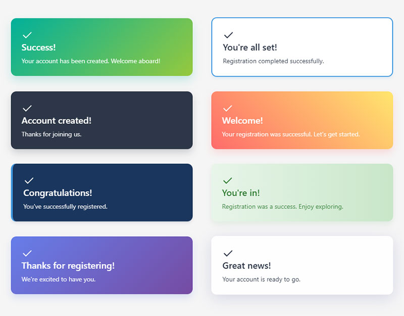
- Success! Your account has been created. Welcome aboard!
- You’re all set! Registration completed successfully.
- Account created! Thanks for joining us.
- Welcome! Your registration was successful. Let’s get started.
- Congratulations! You’ve successfully registered.
- You’re in! Registration was a success. Enjoy exploring.
- Thanks for registering! We’re excited to have you.
- Great news! Your account is ready to go.
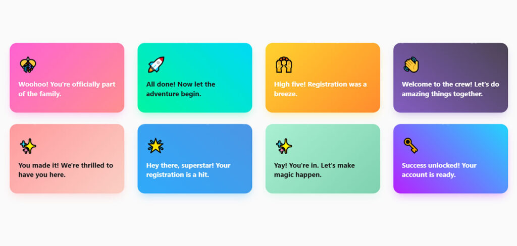
Friendly/Playful Messages
Best for: Brands that want to appear friendly and playful through their registration successful messages.
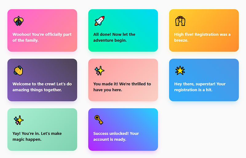
- Woohoo! You’re officially part of the family.
- All done! Now let the adventure begin.
- High five! Registration was a breeze.
- Welcome to the crew! Let’s do amazing things together.
- You made it! We’re thrilled to have you here.
- Hey there, superstar! Your registration is a hit.
- Yay! You’re in. Let’s make magic happen.
- Success unlocked! Your account is ready.
Professional/Corporate Messages
Best for: Businesses that want to use professional tone of voice with their customers.
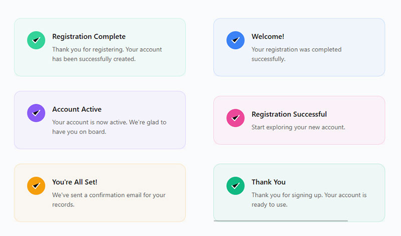
- Thank you for registering. Your account has been successfully created.
- Welcome! Your registration was completed successfully.
- Your account is now active. We’re glad to have you on board.
- Registration successful. Start exploring your new account.
- You’re all set! We’ve sent a confirmation email for your records.
- Thank you for signing up. Your account is ready to use.
Inspirational Messages
Best for: Brands that want to inspire their customers to take action such as life coaches, etc.
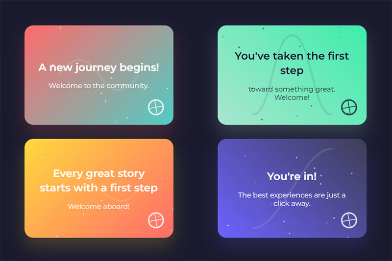
- A new journey begins! Welcome to the community.
- You’ve taken the first step toward something great. Welcome!
- Every great story starts with a first step. Welcome aboard!
- You’re in! The best experiences are just a click away.
Fun/Quirky Messages
Best for: Brands that want to entertain their website visitors and stay on top of mind.
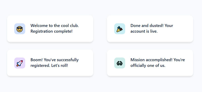
- Welcome to the cool club. Registration complete!
- Done and dusted! Your account is live.
- Boom! You’ve successfully registered. Let’s roll!
- Mission accomplished! You’re officially one of us.
E-commerce & retail registration successful message examples
- Welcome! Your account is ready – start filling your cart.
- Success! Registration complete. Your first deal is just a click away.
- You’re in! Explore today’s top picks just for you.
- Thanks for signing up – exclusive offers are waiting.
Event messages
- You’re all set – your event registration is confirmed.
- Success! You’ve saved your spot.
- Registration complete! Check your email for event details.
- You’re officially on the guest list – see you there!
Educational & learning platform messages
- Success! You’re registered and ready to start learning.
- Welcome aboard – your first lesson is just a click away.
- Registration complete! Knowledge awaits you.
- You’re officially enrolled – let’s begin your journey.
What Makes a Registration Successful Message Effective?
Not all confirmation messages do the same job. Some just confirm. Others push users forward. The difference comes down to a few specific qualities you can check against any message you write.
Clarity Above Everything
The user needs to know the action worked. No ambiguity. “Your account has been created” beats “Thanks for joining!” every time because it confirms the specific thing they just did.
According to Zuko Analytics, 55% of people who visit a form abandon it before completing it. The ones who actually finish deserve a clear confirmation, not a mystery.
If someone just spent two minutes filling out registration forms, the least you can do is tell them it worked.
A Direct Next Step
Confirmation without direction is a dead end. Every effective registration message includes a call to action: log in, check your email, complete your profile, or start using the product.
UserGuiding research found that users who complete an onboarding checklist are 3x more likely to become paying customers. The confirmation message is where that checklist begins.
Skip the next step and you lose momentum. Include it, and you’re already moving users toward activation.
Tone and Brand Alignment in Confirmation Messages
A fintech app and a gaming platform shouldn’t sound the same after registration. Tone has to match what users expect from the brand.
Slack’s onboarding, for example, uses conversational microcopy and celebratory moments right after signup. Their success message after a user sends their first message reinforces product value while keeping things light. Stripe, on the other hand, keeps it clinical and precise because their users are handling money.
| Industry | Tone | Example phrase |
|---|---|---|
| SaaS / Productivity | Friendly Helpful |
“You’re in! Let’s set up your workspace.” |
| Banking / Finance | Formal Reassuring |
“Your account has been securely created.” |
| Gaming / Social | Playful Energetic |
“Welcome to the crew. Let’s play.” |
| Healthcare | Calm Professional |
“Registration complete. Your data is protected.” |
According to Marketing LTB, rewriting microcopy (labels, error messages, confirmation text) leads to an average 8% lift in conversions. Tone isn’t decoration. It’s a conversion lever.
Mailchimp is famously playful (“High fives!”), while LinkedIn keeps things buttoned up. Both work because they match what users expect from the brand voice. If your sign up forms have a casual tone, your confirmation message should match.
How to Display a Registration Successful Message
Writing the copy is half the job. The other half is deciding where it shows up and how it gets rendered after the form submits.
Three questions settle most of it. Does the user stay on the page? Do they need to read something before they move on? Are they on mobile?
WordPress and Form Plugins
Most WordPress sites never touch code for this. The form plugin handles it.
WPForms: open the form, go to Settings > Confirmations, then pick Message, Show Page, or Go to URL. The Message option keeps users on the same page and swaps the form for your text. Fine for newsletter signups. Weak for account creation, since you usually need a verification instruction plus a resend link.
Gravity Forms: Settings > Confirmations, same three types. Gravity lets you run multiple confirmations with conditional logic, so a user who picks “student” can get different copy than one who picks “agency”. Underused feature, honestly.
IvyForms: confirmation type sits in the form settings panel, and you can drop merge tags like {name} or {email} straight into the success text. Personalized confirmation with zero code.
One thing people forget: the redirect page needs its own copy. A blank thank-you page with the word “Thanks” on it is worse than an inline message.
HTML Form With JavaScript
For a static or hand-built form, you intercept the submit, post the data, then render the success state.
<form id="signup-form">
  <input type="email" name="email" required>
  <button type="submit">Create account</button>
</form>

<div id="signup-success" class="success-box" role="status" aria-live="polite" hidden>
  <strong>Your account has been created.</strong>
  <p>Check your inbox to verify your email address.</p>
  <a href="#" id="resend-link">Didn't get it? Resend</a>
</div>
const form = document.getElementById('signup-form');
const success = document.getElementById('signup-success');

form.addEventListener('submit', async (e) => {
  e.preventDefault();
  const res = await fetch('/api/register', {
    method: 'POST',
    body: new FormData(form)
  });

  if (res.ok) {
    form.hidden = true;
    success.hidden = false;
    success.focus();
  }
});
The role="status" and aria-live="polite" bits matter more than they look. Without them, a screen reader user submits the form and hears nothing at all.
PHP Form Handling
Classic server-side flow. Post to the same file, set a flag, print the message.
<?php
$registered = false;

if ($_SERVER['REQUEST_METHOD'] === 'POST') {
    $email = filter_input(INPUT_POST, 'email', FILTER_VALIDATE_EMAIL);

    if ($email) {
        // save user, send verification email
        $registered = true;
    }
}
?>

<?php if ($registered): ?>
  <div class="success-box" role="status">
    <strong>Registration complete.</strong>
    <p>We sent a verification link to <?= htmlspecialchars($email) ?>.</p>
  </div>
<?php else: ?>
  <form method="post">
    <input type="email" name="email" required>
    <button type="submit">Sign up</button>
  </form>
<?php endif; ?>
Use POST-redirect-GET in production so a refresh doesn’t resubmit the form. And echo the email back to the user. It kills the “did I typo my address?” doubt instantly.
Modal, Redirect, or Inline
| Method | Best for | Watch out for |
|---|---|---|
| Inline (replace form) | Newsletter, waitlists, short forms | Easy to miss if the form sits below the fold |
| Toast notification | Secondary actions, saved settings | Auto-dismiss kills the message before slow readers finish |
| Modal | Signups needing one clear next action | Blocks the page, annoying on small screens |
| Redirect to page | Account creation, paid signups, events | Loses the form context, so the copy has to stand alone |
My default for account registration: full redirect to a dedicated success page. It gives you room for the confirmation, the CTA, the resend link, and it gives you a clean URL to fire a conversion event on.
Toasts for anything a user can afford to miss. Never for verification instructions.
Copy-Paste Success Message Components
Grab these, restyle them, ship them.
Success Banner
.success-box {
  display: flex;
  gap: 12px;
  padding: 16px 18px;
  border: 1px solid #b7e0c4;
  border-left: 4px solid #2e9e5b;
  border-radius: 8px;
  background: #f2fbf5;
  color: #14532d;
  font-size: 15px;
  line-height: 1.5;
}

.success-box strong { display: block; margin-bottom: 4px; }
.success-box a { color: #14532d; text-decoration: underline; }
Contrast on that green passes 4.5:1 against the background. Most “success green” palettes you find on Dribbble do not.
Toast Notification
<div id="toast" class="toast" role="status" aria-live="polite" hidden>
  Account created. Check your email to verify.
</div>
.toast {
  position: fixed;
  bottom: 24px;
  right: 24px;
  padding: 14px 18px;
  border-radius: 8px;
  background: #14532d;
  color: #fff;
  font-size: 14px;
  box-shadow: 0 6px 20px rgba(0,0,0,.18);
  transform: translateY(12px);
  opacity: 0;
  transition: opacity .2s ease, transform .2s ease;
}

.toast.is-visible { opacity: 1; transform: translateY(0); }
function showToast(message, duration = 5000) {
  const toast = document.getElementById('toast');
  toast.textContent = message;
  toast.hidden = false;
  requestAnimationFrame(() => toast.classList.add('is-visible'));

  setTimeout(() => {
    toast.classList.remove('is-visible');
    setTimeout(() => (toast.hidden = true), 200);
  }, duration);
}
Five seconds, not three. Three is the default everyone copies and it’s too fast for anyone reading in a second language.
Success Modal
<div class="modal-overlay" id="success-modal" role="dialog" aria-modal="true"
     aria-labelledby="success-title" hidden>
  <div class="modal">
    <h2 id="success-title">You're in</h2>
    <p>We sent a verification link to your inbox. Click it to activate your account.</p>
    <button id="modal-cta">Go to dashboard</button>
    <button id="modal-resend" class="link">Resend email</button>
  </div>
</div>
const modal = document.getElementById('success-modal');

function openSuccessModal() {
  modal.hidden = false;
  document.getElementById('modal-cta').focus();
}

document.addEventListener('keydown', (e) => {
  if (e.key === 'Escape' && !modal.hidden) modal.hidden = true;
});
Focus goes to the primary button, not the container. Escape closes it. That’s the minimum for a modal that doesn’t trap keyboard users.
How to Write a Registration Successful Message
You’ve seen the examples. Now here’s how to write your own from scratch, whether it’s for a toast notification, a full-page success state, or a form submission confirmation message in an email.
The Three-Part Structure
Every registration message follows the same skeleton, no matter the platform or industry:
Part 1, Confirm: Tell the user the action succeeded. “Your account has been created.” Keep this under 10 words.
Part 2, Direct: Tell them what to do next. “Check your email to verify” or “Go to your dashboard.” One action, not three.
Part 3, Support: Give a fallback. “Didn’t receive the email? Click here to resend.” This catches everyone who runs into trouble.
UXPin research found Yoast achieved an 11.30% increase in conversions simply by adding reassuring microcopy to their checkout. The same logic applies to registration: address concerns before users have them.
Character Count Guidelines by Placement
| Placement | Max characters | Includes CTA? |
|---|---|---|
| Toast notification | 50–80 | No (auto-dismisses) |
| Modal popup | 100–200 | Yes, one button |
| Full-page success | 200–400 | Yes, primary Secondary |
| Confirmation email | 300–600 (body) | Yes, one prominent button |
These aren’t hard rules. But if your toast notification has 300 characters of text, something’s wrong. And if your full-page success state has 50 characters, you’re probably missing a CTA or support link.
Common Mistakes to Avoid
Vague language: “Thanks!” tells the user nothing. They don’t know if their account was created, if they need to verify, or what comes next.
Missing next step: A dead-end confirmation page is a wasted opportunity. Insiteful data shows 67% of site visitors abandon a form permanently if they encounter complications. Don’t let a confusing post-registration experience be the complication.
Broken links: The verification email link that doesn’t work. The “Go to Dashboard” button that 404s. Test every link in your confirmation flow on every device.
Weak Versus Strong Messages
Same action, different outcome. The pattern is always the same: the weak version confirms nothing and asks for nothing.
| Weak | Strong |
|---|---|
| “Success” | “Welcome, [Name]. Check your inbox to verify your email.” |
| “Thank you” | “You’re in. We sent a confirmation to [email].” |
| “Form submitted” | “Your account has been created. Complete your profile to get started.” |
| “Please check your email” | “Verification link sent to [email]. Didn’t get it? Resend.” |
| “Registration complete!” | “Registration complete. Your first lesson is unlocked. Start now.” |
| “Done” | “You’re on the guest list. Event details are in your inbox.” |
Notice what the strong column does. It names the action, names the channel, and names the next click. Three jobs in under fifteen words.
If you’re using WordPress, test your whole registration pipeline. Form validation catches errors before submission. But the confirmation message catches everything after.
Registration Message Microcopy Checklist
Before you ship any registration confirmation, run through this:
- Confirmation clarity: Does the message explicitly say the account was created?
- CTA presence: Is there one clear next action? Not two. Not zero.
- Tone match: Does the voice match the rest of your product?
- Accessibility: Can a screen reader announce the success state? Is the color contrast on any success banner at least 4.5:1?
- Localization: If you serve multiple regions, is the message translated and culturally adapted (not just word-for-word)?
Well, that’s the checklist I use. Your mileage may vary depending on your product complexity and audience. But if you hit these five, you’re ahead of most sites already.
Getting the confirmation message right is one of the cheapest UX improvements you can make to your web forms and form UX design. The copy takes 30 minutes to write and test. The impact on user activation can last for months.
FAQ on Registration Successful Message Examples
What is a registration successful message?
It’s the confirmation text displayed to a user immediately after completing a signup or account creation process. It tells them the action worked and typically includes a next step like email verification or profile completion.
Where do registration confirmation messages appear?
They show up across multiple touchpoints: in-app modals, toast notifications, full-page success screens, confirmation emails, push notifications, and SMS. The format depends on the platform and the form design you’re using.
What should a registration successful message include?
Three things. A clear confirmation that the account was created, one specific call to action (verify email, log in, start using the product), and a support fallback like a resend link or help contact.
How long should a registration confirmation message be?
Toast notifications work best at 50-80 characters. Modals can handle 100-200. Full-page success states can go up to 400 characters. Confirmation emails should keep the body under 600 characters for best results.
What is the difference between a registration confirmation email and a welcome email?
The confirmation email is transactional. It verifies the action happened. The welcome email is relationship-building. It introduces the brand, highlights features, and arrives after verification is complete.
How do I write a funny registration successful message?
Match your brand voice first. Humor works for casual products like Slack or Duolingo but backfires in healthcare or banking. Always confirm the action clearly before adding personality. Clarity comes before creativity.
Why do users not receive registration confirmation emails?
Spam filters catch them. Misconfigured email settings block them. Typos in the email field during signup cause failed delivery. Always include a resend verification link on the confirmation screen and mention checking the spam folder.
Can registration messages improve user onboarding?
Yes. A confirmation message that directs users toward a first action (creating a project, completing a profile, starting a lesson) accelerates activation. Products with a “quick win” during onboarding retain significantly more users.
What are common mistakes in registration successful messages?
Vague language that doesn’t confirm the action. Missing next steps that leave users stuck. Broken verification links. Copy that doesn’t match brand tone. And skipping form accessibility considerations like screen reader support.
Should I A/B test my registration confirmation page?
Absolutely. Test your CTA button text, message tone, and whether a creative or straightforward version gets more clicks. Even small copy changes on confirmation pages can produce measurable lifts in user activation rates.
Conclusion
The right registration successful message examples prove that post-signup copy is not an afterthought. It’s one of the highest-impact, lowest-cost UX improvements you can make to any signup flow.
Every confirmation screen, verification email, and account activation message is a chance to move users forward. Whether you’re building a SaaS onboarding flow, a mobile app success screen, or a simple WordPress user registration page, the structure stays the same: confirm, direct, support.
Match the tone to your brand. Keep the CTA specific. Test the copy like you’d test any other conversion element.
Steal from the examples here. Adapt them for your form design examples and audience. Then measure what happens to your activation rate.
Small words. Big difference.