




Most WordPress attacks don’t start at the login page. They start at a form, because a form is the one part of a site built to accept whatever a stranger…
Table of contents
Browser validation and server validation aren’t doing the same job, even though setting both up feels like double work. One catches typos while someone’s still filling out the form. The other one is the version that actually decides whether bad data gets through, and it does not care what the browser already checked.
That split, checking input against rules before a submission gets accepted, is what people mean by form validation. It touches every field a visitor can type into: a login box, a shipping address, a two-line contact form. Native HTML attributes handle some of it. JavaScript libraries handle more. Then the server checks everything again, because neither of the first two layers can be trusted on their own.
Baymard Institute’s e-commerce benchmark put a number on how often this gets skipped: 32% of checkout pages provide no field-level validation at all. In practice that means the shopper fills everything in, hits submit, and only then finds out something was wrong.
What Is Form Validation?
Every rule a form applies before accepting a submission, from a required-field check to a full email format test, falls under this term. It’s separate from sanitizing user input in your forms, which happens after the data is already accepted and strips or encodes whatever could cause trouble downstream.
The timing is the whole point. Catching a malformed email or an empty required field before it turns into a support ticket costs a lot less than catching it after, once someone’s already annoyed and reaching out for help.
Two layers handle this, and neither one covers for the other. Client-side validation runs in the browser before the form ever leaves the page. Server-side validation runs again once the data lands on the backend, whether or not the browser already gave it a pass. Skip either one and there’s a gap somewhere, even on a form that looks airtight from the outside.
Client-Side Validation vs Server-Side Validation
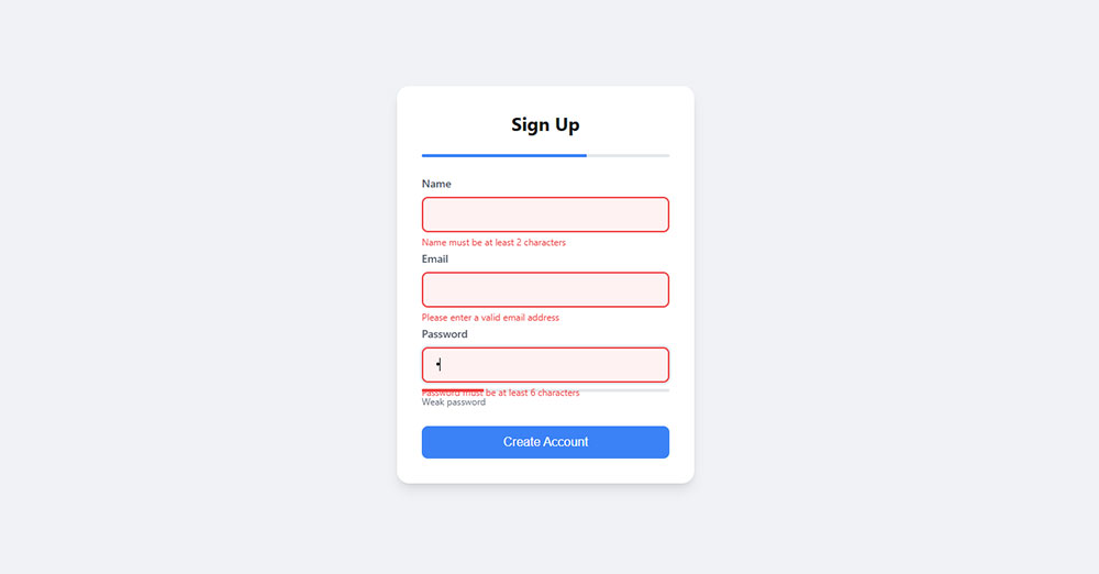
See the Pen
Modern Sign Up Form With Inline Validation by Bogdan Sandu (@bogdansandu)
on CodePen.
Client-side checks run the instant someone leaves a field, no round trip to a server involved, which is why they feel fast. Server-side checks take longer because they involve an actual request, but they’re the ones that can’t be faked by turning off JavaScript or editing a request before it’s sent. A form with only one of these is missing half its job, and it’s usually the server-side half that gets skipped when a deadline is tight.
| Validation Type | Speed | Security Level | Works Without JavaScript |
|---|---|---|---|
| Client-side | Instant | Low, bypassable | No |
| Server-side | Round-trip delay | High, authoritative | Yes |
| Hybrid (both) | Instant, then confirmed | High | Degrades to server-only |
There’s a closer breakdown of client-side versus server-side input checks that gets into the framework-specific syntax, since setup looks pretty different depending on whether you’re in plain JavaScript, React, or a backend language like PHP or Node.
Syntactic Validation vs Semantic Validation
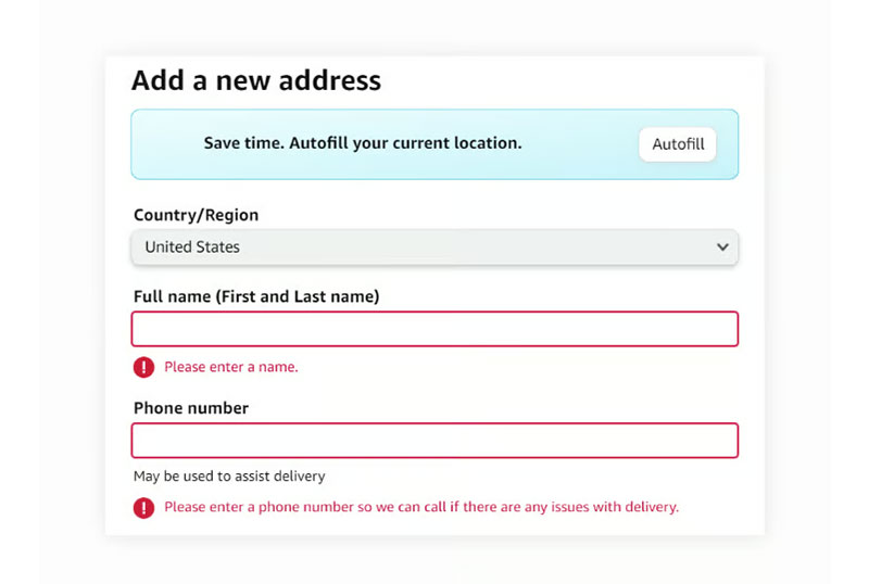
Syntactic validation only looks at shape. Does the email address have an @ symbol in it, is the phone number the right number of digits, that sort of thing. It has no idea whether the answer is true, only whether it’s formatted like a real answer would be.
Semantic validation goes further and checks whether the input means something correct: whether that email belongs to an account that already exists, whether a discount code is still active. That kind of check almost always needs a database lookup, which is exactly why it ends up on the server instead of the browser. Most libraries handle the syntactic side natively, right in the browser. Semantic rules are the ones you write yourself.
Real-Time Validation vs On-Submit Validation
Plenty of checkout forms still wait until the very end to say anything. Baymard Institute’s checkout research found 31% of sites don’t offer live inline validation at all, so a shopper can fill out several fields wrong and not find out until after they hit submit.
Real-time validation fires the moment someone leaves a field, usually tied to the blur event, or after a short pause in typing if it’s checking as they go. On-submit waits. It holds every check until the whole form is filled out, then tests everything at once, right before the request goes out.
- onBlur event: fires the moment focus leaves the field, which suits format checks well
- onChange event: fires on every keystroke and gets noisy fast without debouncing
- Debounce: delays the check by a few hundred milliseconds so a field doesn’t get judged mid-word
UK Parliament’s design system goes the other way on purpose, and avoids validating a field while someone’s still typing in it. Their reasoning: interrupting mid-entry raises stress rather than lowering it. That’s a judgment call, and it sits inside the wider question of form UX design.
Password fields are the one exception almost everyone agrees on. Real-time strength feedback beats an on-submit check nearly every time.
How Do You Design Accessible Form Error Messages?
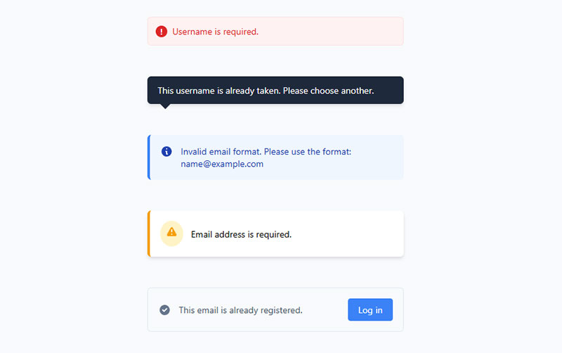
Two things have to happen together: the problem needs to exist as actual text, not just a color change, and that text has to be tied to the specific field that caused it. Miss either piece and a screen reader user ends up with less information than someone who can just see the red border.
- WCAG 3.3.1 (Error Identification): the Level A requirement in the W3C’s guidelines. Once an error is detected, the field and the problem have to be described in text, never through color or an icon alone.
- aria-live region: announces error text that gets added to the page dynamically, without pulling keyboard focus away from the field someone’s still working in.
- aria-describedby: links an input to its error message directly, so a screen reader reads both together instead of just the bare field.
Only 2% of checkout sites write error text specific enough to actually say what went wrong, per Baymard Institute’s e-commerce benchmark. The other 98% mostly land on something like “invalid input,” which tells the shopper there’s a problem and nothing else.
GOV.UK’s design system does both at once: a summary of every error sits at the top of the page, and an inline message shows up under each broken field too. Each one gets a hidden “Error:” prefix that only assistive technology reads. That kind of placement and wording decision gets covered in more depth under form accessibility best practices.
Associating Errors With Fields Using ARIA
The field, the label, and the error message all need to point at each other in the markup. Miss that step and a screen reader user hears the input without ever hearing why it failed.
- Give the error message element a unique id
- Add that id to the input’s aria-describedby attribute
- Set aria-invalid=”true” on the input while the error is active
Wording matters just as much as the markup here. A message that says exactly what to fix, instead of just flagging that something’s wrong, cuts recovery time by a real margin. Borrowing from a set of already-tested form error message examples beats writing that copy from a blank page.
What Is the Best Form Validation Library for Your Project?
The right library depends on the framework already in use and how complex the rules need to get. Native HTML5 attributes cover basic cases for free. Dedicated libraries add schema validation, type inference, and cross-field logic on top of that.
HTML5 Constraint Validation API costs nothing to add and works before a single line of JavaScript loads, since it’s built into every modern browser. The catch is that it only covers simple pattern and required checks, and styling that native error bubble consistently across browsers is more annoying than it should be.
React Hook Form keeps re-renders to a minimum by working with uncontrolled components, stays light in bundle size, and plugs directly into schema libraries like Zod. The hook-based API takes some getting used to for teams coming from a controlled-component background, though most people adjust within a week or two.
npm registry data shows React Hook Form pulling more than 55 million weekly downloads against Formik’s roughly 4.3 million, per current npm trends figures. Formik still gets picked for projects with an existing controlled-component setup, since the API feels familiar to teams who started there. It re-renders on every keystroke though, and the bundle is heavier than React Hook Form’s, which is part of why newer projects tend to lean the other way.
Zod is TypeScript-first: define the schema once and the static types come from it directly, with no separate interface to maintain. It’s newer than Yup, so a handful of older tutorials and third-party integrations still assume Yup is what you’re using.
Zod’s weekly npm downloads sit above 164 million against Yup’s roughly 11 million, according to current npm trends data. Yup has the longer track record and wider integration support across older Formik-based projects, but its schema definitions need more manual type annotation, since they were never built with TypeScript inference in mind.
None of these replace the requirement to validate again on the server. A client-side library, however capable, only ever handles the browser half of the job.
How Do You Implement Form Validation Step by Step?
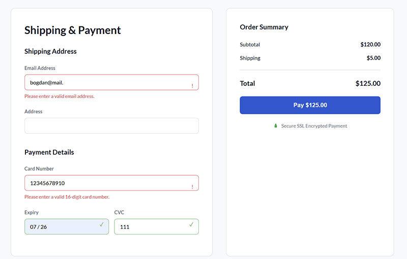
There’s a fixed order here: native attributes first, a JavaScript layer on top of that, server-side duplication last. Skipping the order doesn’t actually save time. It just pushes the debugging to a worse moment, usually right before launch.
- Add required, pattern, minlength, and type attributes directly to each input. This covers the basic cases the HTML5 Constraint Validation API can already handle with no script involved.
- Layer a JavaScript or library solution on top for real-time feedback, custom error text, and anything the native attributes can’t express, like matching a password confirmation field against the original.
- Connect each error message container to its input with aria-describedby before testing starts, not after. Retrofitting this later means tracking down every field again.
- Duplicate every one of those rules on the server. Anything checked only in the browser can be skipped just by disabling JavaScript or editing the request directly before it’s sent.
- Return field-specific error responses from the server so the frontend can show the same message it would have shown client-side, instead of a generic failure.
The first two steps overlap a lot with general HTML form best practices, since attribute choice and field order end up shaping validation before any custom script even runs.
A login form is usually the fastest place to watch this order pay off. Required and type=”email” catch typos instantly, a library adds a readable message, and the server rejects anything that slipped through, like a script tag pasted into a name field.
How Does Form Validation Improve Security?
Form validation reduces the attack surface by rejecting malformed input before it reaches a database query or a server function. It is not, on its own, a security control on the client side.
OWASP’s Input Validation Cheat Sheet is blunt about that limit. Client-side JavaScript checks can be circumvented by anyone who disables JavaScript or routes the request through a proxy, so the server-side layer is what actually holds the line.
- Malformed data types, like text submitted where a number is expected
- Out-of-range values, like a negative quantity or a discount code above 100%
- Injection attempts hidden inside otherwise valid-looking fields, like a script tag inside a name field
Validation alone doesn’t stop bots either, it just filters what they submit. A honeypot field, a hidden input real users never see or fill in, catches a large share of automated submissions before validation even runs.
Positive validation, checking input against a list of what’s allowed rather than what’s forbidden, remains the approach OWASP recommends over blacklisting known-bad patterns. Blacklists age badly. Allow lists mostly don’t.
Does Form Validation Reduce Form Abandonment and Increase Conversion Rate?
Yes.
Clear validation catches a mistake while the user’s still in the frame of mind to fix it, instead of after a failed submission has already broken their attention and sent them off somewhere else entirely.
- 18% of US shoppers who abandoned a cart for a fixable reason blamed a checkout that was too long or complicated (Baymard Institute)
- 34% of checkout sites clear a correctly entered credit card number the moment a validation error fires anywhere else on the page, forcing the shopper to retype the whole number from scratch (Baymard Institute)
- 11.3 visible form fields is the checkout average, while roughly 8 cover what’s actually required to complete the purchase (Baymard Institute)
- 35.26% potential lift in conversion just from fixing checkout usability issues, forms included, at large e-commerce sites (Baymard Institute)
Three of those four numbers get addressed by the same fixes: fewer fields, clearer formatting, and a validation layer that catches typos before submission instead of after.
A set of tested tactics for improving form abandonment rate walks through the fixes in more detail.
Once the basic friction points are gone, a separate breakdown covers how to increase form conversions from there.
None of this needs a redesign. Most of it is fixing what’s already sitting on the page.
What Are the Most Common Form Validation Mistakes?
Most of these mistakes aren’t really about missing rules. They’re about timing and how the message gets delivered. Validating on every keystroke is a common one, since it flashes an error while someone’s still mid-word, before they’ve had a chance to finish typing. Vague error text is another: “invalid input” says something is wrong without saying what, which just pushes the guesswork onto the user.
Skipping the server-side layer entirely is worse, because it leaves the form wide open to anyone who disables JavaScript. Color-only indicators, a red border with nothing else, fail WCAG outright and quietly exclude colorblind users. And placeholder text used as the only label disappears the second someone starts typing, taking whatever format hint it was carrying along with it.
That last one shows up constantly on payment and phone fields, where format matters most.
A wider set of placeholder text examples shows the gap between a hint that helps and one that vanishes at the exact moment it’s needed.
Expedia’s checkout learned a version of this the hard way. An ambiguous optional field labeled Company confused customers into typing their bank’s name and address instead of their own.
The mismatch wasn’t caught until payment verification failed, and removing the field is estimated to have added $12 million a year in recovered revenue (Silicon.com, 2010).
Most of these mistakes trace back to the same root cause: form design decisions made without watching how real people fill things out under time pressure.
When Should Form Validation Be Skipped or Relaxed?
Validation isn’t free. Every rule that’s too strict rejects a real answer somewhere, while every optional field validated anyway adds friction for nothing.
| Situation | Why Strict Rules Fail | Better Approach |
|---|---|---|
| International postal codes | UK, Canadian, and other formats don’t match a US 5-digit pattern | Validate format per selected country, not one shared pattern |
| Name fields | Hyphens, apostrophes, and non-Latin characters get rejected by strict patterns | Accept broad Unicode input, skip character whitelisting |
| Optional fields | Forced validation on a field nobody has to fill out adds friction with no data benefit | Validate format only if something was entered |
| Low-traffic internal tools | A single admin filling out a form rarely benefits from client-side polish | Server-side validation alone is usually enough |
Countries without a postal code at all, and there are more than a few, break any pattern that assumes one is required.
A field marked optional that still throws a formatting error the moment something is typed teaches users to leave it blank next time, which defeats the point of collecting it.
The goal isn’t fewer rules. It’s rules that match what a real answer actually looks like.
How Do You Test Form Validation Across Browsers and Assistive Technology?
Testing this properly means checking more than one thing: what the browser actually renders, what a screen reader announces out loud, and what happens on the rare form where JavaScript never loads at all.
- Cross-browser check: the native error bubble looks and behaves differently between Chrome, Firefox, and Safari
- JavaScript-disabled check: confirms the server-side layer actually catches everything the client-side layer would have
- Keyboard-only check: tab through every field and error message without touching a mouse at all
National Federation of the Blind v. Target Corporation, settled in 2008 for $6 million, rested partly on inadequate labeling and prompting inside Target.com’s own forms.
That’s a category of failure automated scanners routinely miss, since a field can be technically present in the code and still be unusable with a screen reader.
Screen Reader Testing vs Automated Accessibility Audits
WebAIM’s 2025 audit of one million home pages found that 34.2% of form inputs still lacked a proper label, a gap automated scanning catches instantly.
Tools like axe and Lighthouse catch a specific set of problems fast: missing labels, missing alt text, insufficient color contrast, plus structural issues like heading order and missing landmarks. All of that happens in seconds.
What they don’t catch is trickier to test for. Does the error announcement actually interrupt at the right moment? Does focus move to the first error field after a failed submission? Is a custom dropdown or date picker even operable without a mouse? Those questions only get answered by turning on NVDA, JAWS, or VoiceOver and actually listening to the page. There’s no shortcut for that part.
FAQ on Form Validation Best Practices
What Is the Difference Between Form Validation and Form Sanitization?
Validation checks input against expected rules, like format or required fields, and rejects whatever fails. Sanitization is a separate step that comes after: it strips or encodes risky characters once the data’s already been accepted, so nothing stored can later execute as code.
Secure forms run both, in that order.
Do Screen Readers Automatically Announce Validation Errors Without ARIA Live Regions?
No. A screen reader only announces content it’s told to watch.
Without an aria-live region or moved keyboard focus, an inline error can appear on screen while assistive technology stays completely silent, leaving the mistake undetected.
Should You Use Zod or Yup for Schema Validation?
Zod is the better fit for TypeScript-first projects, since it infers static types straight from the schema without extra annotation work. Yup still makes sense if there’s an established Formik codebase already built around it.
For a brand new project with nothing legacy to work around, Zod’s usually the default. Ripping out a working Yup schema just to switch rarely pays for itself.
Is Form Validation Required for GDPR or Legal Accessibility Compliance?
GDPR doesn’t mandate specific validation rules, but it requires clear, unambiguous consent, which means consent checkboxes can’t default to checked and must validate as an explicit action.
Accessibility law, including the ADA, is satisfied through WCAG-aligned error identification, not GDPR.
Can You Validate a Form Without JavaScript Enabled?
Yes, partially. Native HTML5 attributes like required, pattern, and type still validate through the browser’s own engine, no script needed.
Custom rules, real-time feedback, and tailored error text depend on JavaScript, so a no-JS form falls back to browser defaults.
Do Password Strength Meters Count as a Form Validation Feature?
Partly. A strength meter gives feedback on quality, weak, fair, strong, without blocking submission.
It becomes validation only when paired with an enforced rule, like a minimum length or character mix that must pass before the form accepts the password.
What Comes First in Form Validation Best Practices?
Server-side validation locks down first, before anything else gets built. Client-side checks, accessible error messages, and which library to use all sit on top of that layer, and it’s the one layer that attackers and disabled-JavaScript browsers alike can’t skip past.
What follows is the order that actually holds up under an attack, or a script that just didn’t load:
- Server-side validation and rejection rules
- Accessible, field-specific error text tied to each input
- Client-side real-time feedback and library choice
Building server-first costs a slower initial rollout, since every rule ends up written twice before a single field ships. It survives a disabled script or a request sent straight to the API though, which the client-only version never would.
The same server-first, accessibility-first order applies once validation stops being the only input rule on the page. A broader guide to web form best practices carries that logic across layout, field count, and submission flow.