






Most WordPress attacks don’t start at the login page. They start at a form, because a form is the one part of a site built to accept whatever a stranger…
Table of contents
A screen reader user tabs into a checkout form and one of the fields just announces “edit text.” No name, no hint about what it wants, nothing. That’s the actual problem form accessibility deals with: whether a field’s label, its current state, and any error attached to it reach assistive technology at all, not just whether the form looks fine to someone clicking around with a mouse.
Developers and QA teams don’t invent their own standard for this. They test against the Web Content Accessibility Guidelines, and that same standard gets cited directly by Section 508, EN 301 549, and the ADA’s Title II rule for public sector forms.
The scale of the problem is bigger than most teams assume. In February 2026, 95.9% of home pages carried at least one detectable WCAG 2 failure, and missing form labels sit among the handful of error types behind nearly all of it (WebAIM Million, 2026).
What Is Form Accessibility
Pass every general accessibility check on a page and you can still ship a checkout form a screen reader user can’t finish. That’s the gap this term actually covers: whether someone navigating by keyboard, screen reader, or other assistive tech can find a field’s name, catch its current state, and reach a working error message.
General web accessibility covers a whole page, navigation, images, reading order, the works. This piece is narrower. It only cares about one loop: entering data and getting it submitted.
The people this affects aren’t some rounding error either.
- Screen reader users depend on a field’s accessible name, not where it happens to sit on the screen
- Keyboard-only users tab through the entire form and never touch a mouse
- People with motor disabilities need bigger click targets and forms that don’t punish a slow or imprecise click
- Users with cognitive disabilities need an error message that says what to fix, not just that something failed
None of these are edge cases. They’re the reason a form gets finished or gets abandoned halfway through.
What WCAG Success Criteria Apply to Form Accessibility
Most of what makes a form usable comes down to five WCAG success criteria: 1.3.1, 3.3.1, 3.3.2, 4.1.2, and 2.4.7. Knowing which one covers which failure saves real time during a QA pass.
- 1.3.1 Info and Relationships (Level A) requires a label tied to its field in code, not just placed near it visually
- 3.3.1 Error Identification (Level A) requires a failed field to be flagged in text, never by color or icon alone
- 3.3.2 Labels or Instructions (Level A) requires every input that expects data to have a label or instruction attached to it
- 4.1.2 Name, Role, Value (Level A) requires custom controls to expose what they are and what state they’re in to assistive technology
- 2.4.7 Focus Visible (Level AA) requires the control that currently has keyboard focus to be visibly marked
These five criteria live inside WCAG 2.2, which the W3C published on October 5, 2023. That version added 9 new success criteria and retired one obsolete one, landing on 86 total, 55 of which sit at Level A or AA (W3C, 2023).
The legal side leans on this standard directly. Section 508 covers US federal agencies, EN 301 549 covers the European Accessibility Act, and the ADA’s Title II final rule points specifically to WCAG 2.1 AA for state and local government sites, one version behind the current 2.2 release.
That legal pressure actually shows up in the numbers. Home pages on the .gov domain average 18.5 detectable accessibility errors, 67.1% below the 56.1 average across the wider web, largely because federal sites carry a legal obligation most commercial sites simply don’t have (WebAIM Million, 2026).
How Should Form Fields Be Labeled for Accessibility
See the Pen
Accessible Form by Rachele (@racheleditullio)
on CodePen.
Every form field needs an accessible name. Which method creates that name, a native label element, aria-labelledby, or aria-label, decides whether a screen reader announces something useful or just mutters “edit text.”
| Method | How It Works | Best Use | Screen Reader Behavior |
|---|---|---|---|
| Native label element | for/id pairing or wrapping the input | Standard visible text labels | Reads label text plus field type on focus |
| aria-labelledby | Points to an id already on the page | Labels built from more than one text element | Reads the referenced text as the accessible name |
| aria-label | Text supplied directly in the attribute | Icon-only fields with no visible text | Reads the attribute value, overriding any visible text |
| aria-describedby | Points to hint or error text nearby | Format hints and validation messages | Reads the description after the label, not instead of it |
Native Label Element and the for Attribute
The label element is the default choice, and it stays the default for good reason.
The for attribute matches the input’s id, which creates a programmatic tie that satisfies Success Criterion 1.3.1. Clicking or tapping the label text moves focus straight into the field too, which helps anyone with limited fine motor control. Screen readers announce the label automatically the moment a field receives focus, no extra markup required.
One in three form inputs on the web’s most visited home pages, 33.1% to be exact, still isn’t labeled through any of these methods at all (WebAIM Million, 2026). That number hasn’t moved much in years, which says less about the difficulty of the fix and more about how often it just gets skipped.
ARIA Labeling Techniques for Non-Standard Layouts
Not every field has room for a visible label sitting next to it. That’s where aria-labelledby and aria-label take over.
A search box next to a magnifying glass icon usually has no visible text at all, so aria-label supplies the name directly in the markup. A field summarizing a price built from three separate spans, currency, amount, and billing period, can point to all three with aria-labelledby, letting the screen reader stitch together one coherent name from pieces that were never meant to stand alone.
Placeholder text does not count as a label under any of these methods. It vanishes the second someone starts typing, and screen readers treat it as a hint at best. Real, tested wording for this kind of supporting text matters more than most teams assume, mainly because nobody notices it’s missing until a user is already stuck.
How Should Required and Optional Fields Be Indicated
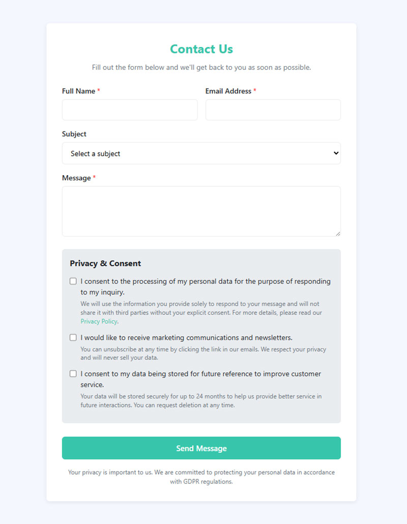
Required fields need a marker that a screen reader actually announces, plus something a sighted user can see without color being the only signal. In practice that usually means pairing the aria-required attribute with a visible asterisk and a written key explaining what the asterisk means.
There are a few ways teams handle this, and they don’t carry equal weight.
- aria-required=”true” makes screen readers announce “required” right after the field name, with no visual change needed on its own
- An asterisk with a text key works because a symbol by itself fails 1.3.1, it carries no programmatic meaning, so a line reading “* indicates a required field” needs to sit near the top of the form
- The HTML5 required attribute triggers native browser validation and gets picked up by most screen readers automatically
- Marking optional fields instead makes sense on forms where nearly everything is mandatory, since labeling the few optional fields cuts down on visual noise
Marking matters most on longer forms, where several field types sit together and someone has to scan quickly for what’s mandatory before hitting submit.
Placement matters too, more than it probably should. Keeping the marker inside the label text itself, rather than floating it off to the side of the input, keeps the indicator readable at high zoom levels. It’s a small detail, but it connects to bigger decisions about how the whole form gets laid out.
How Should Form Errors Be Identified and Announced
Form errors have to be identified in text, tied to the specific field that failed, and announced to assistive technology the moment they appear. Not left for someone to stumble on by scrolling around.
Inline Error Messages Versus Error Summaries
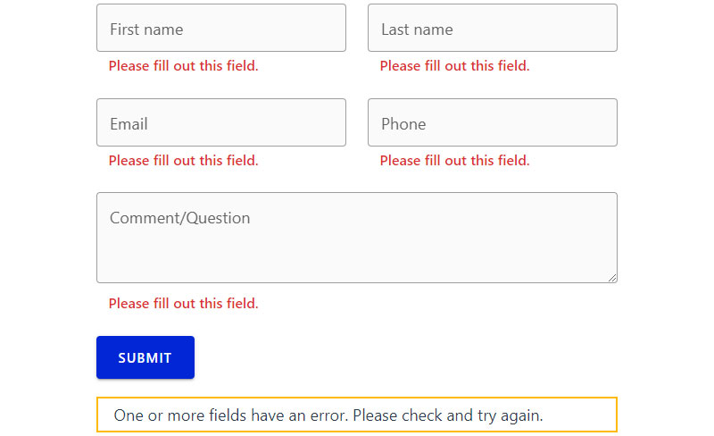
Inline messages sit directly under the field that failed, connected through aria-describedby so a screen reader reads them right after the label.
Error summaries do it differently. They collect every failure into one list at the top of the form, and each item links down to the field it describes.
GOV.UK’s design system uses exactly this pattern. Its error summary component moves keyboard focus onto the summary itself the instant validation fails, and prefixes the page title with “Error:” so screen reader users know something went wrong before they’ve even reached the form.
Real, tested wording for these messages is easier to borrow from working examples than to invent from a blank page, especially once a form has more than two or three fields that can fail at once.
Announcing Errors With aria-live and aria-invalid
Two attributes handle the announcing once the message itself exists on the page.
aria-invalid=”true” flags the field itself as failed, and most screen readers announce it as “invalid” the moment focus lands there.
An aria-live region announces new content the instant it shows up, which matters for errors that only appear after an async check, a username already taken, say.
When that error can even appear ties directly to whether validation runs in the browser or waits on a round trip to the server, and that decision changes how soon a live region has anything to announce at all.
Color alone never satisfies 3.3.1. A red border with no text next to it tells a screen reader user precisely nothing failed.
How Does Keyboard Navigation Work in Accessible Forms
See the Pen
Accessible Web Form Example by Bogdan Sandu (@bogdansandu)
on CodePen.
Keyboard navigation in an accessible form means every field, button, and control can be reached and operated with Tab, Shift+Tab, Enter, and arrow keys, in an order that actually matches what’s on screen.
Native HTML elements carry this behavior automatically, because browsers build it in for free. That’s really the whole argument for sticking with plain HTML form elements before reaching for a custom widget built out of divs and spans.
A few things reliably break keyboard access:
- A div or span repurposed as a button, with no role or tabindex added to make it focusable
- Positive tabindex values that override the natural, source-order tab sequence
- Focus traps inside a form section that was never supposed to be a modal dialog
- Custom dropdowns that respond fine to a mouse click but ignore arrow keys entirely
That first one shows up constantly. Home pages average 4.8 elements marked role=”button”, up from 3.6 just a year earlier, and every single one of them needs manual keyboard handling that a native button element just gets for free (WebAIM Million, 2026).
Radio buttons and checkboxes behave differently once focus reaches them, and getting that difference backwards is a common reason forms feel broken to a keyboard-only user. A grouped set of radio buttons moves between options with arrow keys. Each checkbox, on the other hand, takes its own separate tab stop. So the choice between radio buttons and checkbox grouping carries real keyboard consequences, well beyond how the two controls happen to look.
Georgia’s state digital services team ran an accessibility initiative that added a visible focus border to every interactive element on the page and attached labels to form inputs that were missing them, measured against WCAG 2.0 AA.
Where Should Focus Move After Validation or Submission
Focus has to land somewhere useful after a form gets submitted. On the first invalid field or the error summary if validation fails, on a confirmation message or the next logical control if it succeeds.
- If validation fails, focus moves to the error summary, or straight to the first field that needs fixing, so a screen reader announces the problem right away
- If submission succeeds, focus moves to a confirmation message, not back up to the top of the page where nothing has visibly changed
Leaving focus exactly where it was after a failed submission is one of the most common breaks in this whole chain. Nothing announces. Nothing visibly changes for a keyboard user. A screen reader user has no way of knowing the click did anything at all.
Success Criterion 2.4.7 requires a visible focus indicator wherever focus lands next, and that matters just as much on the confirmation state as it does on an error field.
Home pages average 30.4 instances of tabindex=”0″ or tabindex=”-1″, up 17% from the year before and nearly 300% since 2020, a sign that more sites are manually managing focus order instead of just relying on source order (WebAIM Million, 2026).
Getting this sequencing right shapes the entire feel of finishing the form, not just its technical compliance. Usually it’s the difference between a form that feels solid and one that feels like it might have quietly failed.
What Autocomplete and Input Types Improve Form Accessibility
Autocomplete tokens and input types tell browsers and assistive technology what kind of data a field expects. That speeds up entry for people with motor and cognitive disabilities, and it satisfies WCAG Success Criterion 1.3.5, Identify Input Purpose.
That criterion arrived in WCAG 2.1 back in 2018, at Level AA, and it only applies to fields collecting information about the person actually filling out the form, not about anyone else.
Autocomplete Token Values and What They Trigger
autocomplete=”email” pulls a saved email address straight from the browser’s stored profile. autocomplete=”tel” and autocomplete=”name” do the same for phone number and full name. autocomplete=”postal-code” and autocomplete=”bday” cover address and birth date fields.
None of this changes what the field looks like. It changes how much typing a person has to do to get through the form.
For someone with a motor disability, or honestly anyone filling out the same address for the tenth time this month, that difference is the entire point of the criterion.
Choosing Input Types for Mobile Keyboards
The type attribute changes more than validation. It changes which keyboard a phone actually pulls up.
type=”email” brings up the @ symbol on the on-screen keyboard, type=”tel” switches to a numeric pad, and type=”number” typically restricts the keyboard to numbers, though it still permits a decimal point, minus sign, or “e” in most browsers.
- tel
- number
- url
- date
Picking the right one cuts down on mistyped entries and back-and-forth keyboard switching, which matters most for anyone with a motor or cognitive disability typing on a small screen.
How Do Screen Readers Announce Form Fields and Errors
A screen reader announces a field’s accessible name, its role (text box, checkbox, whatever it is), its current state, and its value the moment focus lands on it, then reads any linked hint or error text through aria-describedby.
Desktop Screen Reader Behavior: NVDA and JAWS
JAWS remains the most used primary desktop screen reader at 40.5%, with NVDA close behind at 37.7% (WebAIM Screen Reader Survey #10, 2024).
Both announce the label, role, and state almost identically for standard HTML controls. The differences only really show up on custom widgets, where one screen reader might catch a state change the other misses entirely.
JAWS announces “required” immediately after the label whenever aria-required is set on the field. NVDA reads the aria-describedby content right after the field type, with no extra configuration needed on the user’s end.
Mobile Screen Reader Behavior: VoiceOver and TalkBack
Touch changes the whole interaction model. Swiping right moves to the next field instead of pressing Tab.
- Double-tap anywhere on screen to activate the focused field
- Rotor or reading controls jump directly between form fields, skipping everything else on the page
- The on-screen keyboard still changes to match the input type, same as on desktop
91.3% of screen reader users report using a screen reader on a mobile device at all, and VoiceOver is the mobile screen reader of choice for 70.6% of that group (WebAIM Screen Reader Survey #10, 2024).
TalkBack covers most of the remaining share on Android. Both handle standard HTML form controls the same way they always have, automatically, with no extra markup required.
Which Tools Test Form Accessibility
Automated scanners, browser extensions, and manual screen reader testing each catch a different slice of form accessibility problems. No single method catches all of them, not even close.
| Tool | What It Tests | Automation Level | Cost/Access |
|---|---|---|---|
| axe DevTools | ARIA misuse, missing labels, contrast | Automated plus guided manual checks | Free extension, paid Pro tier |
| WAVE | Missing labels, empty links, heading structure | Automated | Free browser extension |
| Lighthouse | WCAG checks built into Chrome | Automated | Free, built into Chrome DevTools |
| Manual screen reader pass | Announcement quality, focus order, keyboard traps | Manual | Time cost only |
Deque Systems, the company behind axe-core, built its own coverage study from over 13,000 audited pages and nearly 300,000 flagged issues.
Automated rules fully covered 57% of the accessibility issues found on those pages, leaving the rest for manual review (Deque, Automated Accessibility Coverage Report).
Automated tools miss a fair amount, mostly the stuff that needs a human ear:
- Whether the tab order actually matches a logical reading order
- Whether an error message makes sense once it’s read out loud, not just whether it technically exists
- Whether a keyboard trap exists inside a component that never intended to be a modal
axe-core has been downloaded billions of times since Deque open-sourced it in 2015, and Google adopted it in 2017 to power the accessibility panel inside Chrome’s Lighthouse.
How Do You Build an Accessible Form Step by Step
Building an accessible form isn’t really up for debate on ordering. There’s a sequence that works: get the markup structured, attach labels, wire up validation and error handling, and only then test with an automated scanner alongside a real screen reader before anything ships.
- Structure the markup. Group related fields with fieldset and legend, and pick the correct native input type for each field before writing any custom code.
- Attach labels. Connect every field to a label element through for and id, or use aria-labelledby where the layout has no room for a standard label.
- Mark required and optional fields. Add aria-required plus a visible text key, never a bare asterisk with no explanation anywhere on the page.
- Build validation and error handling. Decide whether checks run client-side or server-side, connect the resulting error text with aria-describedby, and plan the error summary pattern before writing a single line of validation logic.
- Set focus destinations. Route focus to the error summary on failure and to a confirmation message on success, every single time, no exceptions.
- Test with two methods. Run an automated scanner first to catch the obvious gaps, then tab through the entire form with a screen reader running before it ships.
Getting the validation step wrong undoes everything teams got right in the first four steps. It happens more than you’d think. Looking at documented form validation best practices before writing custom logic tends to save a full round of rework later, which is a cost most teams only discover after they’ve already paid it.
The U.S. Web Design System, built by the federal government’s digital services team, follows almost exactly this sequence and gets tested against Section 508 as a baseline requirement, not an afterthought.
Native Form Controls vs Custom Form Widgets: Which Is More Accessible
Native form controls carry keyboard support, screen reader announcement, and focus handling built into the browser for free. Custom form widgets have to recreate every one of those behaviors by hand, through ARIA and JavaScript, and it’s easy to miss one.
Native Controls
Keyboard support ships with the browser at zero development cost, and screen readers announce native controls consistently across NVDA, JAWS, and VoiceOver. Behavior stays correct automatically as browsers update too, no maintenance required on your end.
The tradeoff is visual. Styling is limited, especially on select dropdowns, and there’s no built-in way to add icons or secondary text inside an option.
Salesforce, IBM, and Shopify default to the native select element in their own design systems rather than rebuilding it from scratch, a choice documented by engineering teams that have compared both approaches directly (LEGO Engineering, 2022).
Custom Widgets Built to the ARIA Authoring Practices Guide
5.7% of home pages carry a custom ARIA menu, and 22% of those menus introduce accessibility barriers from incomplete markup or missing keyboard interactions (WebAIM Million, 2026). That’s a rough hit rate for something meant to improve the experience.
The ARIA Authoring Practices Guide, maintained by the W3C’s ARIA working group since 2014, documents the exact keyboard model and required roles for widgets like comboboxes, tabs, and listboxes. Following it closely gets you full control over visual design and interaction, room for icons and secondary data and layouts a native control simply can’t support.
The cost is that every keyboard interaction and every screen reader announcement has to be built and tested by hand. One missed ARIA state, one forgotten keydown handler, and the entire component breaks for assistive technology users while looking completely fine to everyone else.
When Does Form Accessibility Fail or Not Apply
Form accessibility fails when markup passes an automated scan but still confuses a real user. That happens through mislabeled ARIA, error text that never gets announced, or a focus trap that no scanner was ever built to catch.
Common Implementation Mistakes
- Labels hidden with display:none instead of a screen-reader-only technique that keeps them in the accessibility tree
- aria-live regions that fire before the announced content actually exists in the DOM, so nothing gets read at all
- Placeholder text used as the only label, gone the instant someone starts typing
- A visible asterisk with no text key explaining what it means, anywhere on the page
Every one of these can pass a quick visual review and still fail every screen reader test that follows it.
Conditions Where Compliance Still Fails Real Users
“Complex or difficult forms” ranks among the most problematic items screen reader users report running into, a pattern that has held steady across more than a decade of the same running survey (WebAIM Screen Reader Survey #10, 2024).
Passing every WCAG success criterion doesn’t actually guarantee a form is usable. Cognitive load, instruction clarity, and field order all sit outside what any single checklist item tests directly.
There’s a narrow exception worth naming: internal tools built for a small, known user base that has already opted into a different, tested workflow of its own. That’s genuinely the exception, though, not the rule, and it never extends to anything public facing.
FAQ on Form Accessibility Best Practices
What Is the Difference Between Form Accessibility and General Web Accessibility?
General web accessibility covers an entire page: navigation, images, headings, reading order. Form accessibility narrows down to one interactive loop, the cycle of entering and submitting data, and it adds requirements like error identification that static content never has to deal with.
Is aria-label or a Visible Label Element the Better Choice?
A visible label element wins whenever there’s room for it, since it helps sighted keyboard users too, not just screen reader users. Save aria-label for when no visible text exists at all, an icon-only search field, that kind of thing.
Do Accessible Forms Need Separate Handling for Touch Input?
Touch adds one requirement keyboard access doesn’t have: target size. WCAG 2.2’s Target Size criterion sets a 24 by 24 CSS pixel minimum for tap targets, since fingers are a lot less precise than a mouse pointer.
How Do You Make Multi-Step Forms Accessible?
Announce the current step and total step count through a heading at the top of each page, then move focus to that heading on every transition. That way a screen reader user tracks actual progress, not just whatever set of fields happens to load next.
How Do You Make an Accessible Date Picker or Dropdown?
Follow the combobox or grid pattern from the ARIA Authoring Practices Guide closely, arrow key navigation between dates included, plus an accessible name that announces the selected value. And always keep a plain text input as a fallback for typing a date directly, because someone will want to.
Does Accessible Form Design Require Extra Work on Mobile?
Yes, mostly around touch target size and zoom. Text has to stay readable and functional when resized up to 200% (WCAG 1.4.4), and the layout has to reflow without a horizontal scrollbar at 400% zoom, equivalent to a 320 CSS pixel-wide viewport (WCAG 1.4.10). Labels also can’t lean on hover states, since a touchscreen has no way to trigger one.
What Should You Fix First in Form Accessibility Best Practices?
If you’re only fixing one thing, fix labeling and error identification first. A missing label or a silent error blocks every other fix from mattering, no matter how well built the rest of the form is.
After that, the order roughly goes like this:
- Label every field and identify errors in text
- Fix keyboard operability and focus destinations
- Add autocomplete tokens, then run a screen reader pass
Put the two figures already on record next to each other and you get a ceiling, not a floor. Automated scanners catch roughly 57% of issues on average, and 95.9% of home pages still trip a detectable failure even at that reduced rate. Real failure rates almost certainly run higher than either number suggests on its own.
Once a form clears these fixes, the next layer worth addressing is broader form design, layout, visual hierarchy, and field order decisions that shape completion rates for every visitor, not only the ones using assistive technology.