


Roughly half of the people who start filling in a web form never finish it. The fix is rarely design. It is picking the wrong form type for the job,…
Table of contents
Every form on your site is only as good as the fields inside it.
Bad field choices drive users away. The right ones, in the right order, with the right input types, can double your completion rates without changing a single word of copy.
This guide covers the most practical website form fields examples across contact forms, registration flows, checkout pages, surveys, and more.
You will also find coverage of HTML5 input attributes, form field validation patterns, accessibility requirements, and layout decisions that affect how users move through your forms.
Whether you are building from scratch or fixing a form that is leaking conversions, the field-level details here apply directly.
What Are Website Form Fields
A form field is a single, interactive input element that collects one piece of data from a user. It is not the form itself. The form is the container. The field is what sits inside it.
That distinction matters more than it sounds. A checkout form might have 12 fields. Each one collects something different: a name, a ZIP code, a card number. Each field has its own behavior, validation rules, and input type. They are separate units that happen to share a wrapper.
Fields appear across nearly every touchpoint on the web. WordPress forms, e-commerce checkouts, survey tools, login screens, booking pages – all of them are built from the same core building block: individual input fields stacked together with purpose.
The Difference Between a Form and a Form Field
Form: the parent container. Handles submission, routing, and validation logic as a whole unit.
Form field: a single child element. Handles one input, one label, one validation rule.
This is worth knowing because it changes how you think about design problems. A form with a 67% abandonment rate (Formisimo) usually has a field-level problem, not a form-level one. One tricky field – a phone number, a password, a date picker – can tank the whole thing.
Where Form Fields Appear
Form fields are not limited to obvious contact or checkout flows. They show up across the entire user journey.
- Login and signup screens
- Checkout and payment flows
- Survey and feedback pages
- Search bars and filter panels
- Profile and settings pages
- Newsletter and subscription popups
Browsers render each field based on its HTML input type attribute. Set it to email and mobile users get a keyboard with an @ symbol. Set it to number and they get a numeric pad. The field type directly shapes how users interact with it.
Hidden fields also count. They pass data like UTM parameters or session IDs silently in the background – no user interaction required.
Free Email Regex Validator for Forms
Types of Website Form Fields
Most forms use a mix of six to eight field types. Each one suits a different kind of data collection.
Picking the wrong type creates friction. Asking someone to type their country into a text field when a dropdown would do the job is just bad UX. Zuko Analytics data shows forms with dropdown fields have notably higher abandonment rates than forms using radio buttons – and CXL found radio button fields get completed about 2.5 seconds faster on average.
| Field type | Best for | Common use case |
|---|---|---|
| Text input | Short free-form answers | Name City Company |
| Textarea | Long free-form answers | Message Feedback Notes |
| Dropdown (select) | Long lists of options | Country State Category |
| Radio buttons | One choice from a short list | Plan type Gender Yes / No |
| Checkboxes | Multiple selections allowed | Interests Permissions Terms |
Text Input Fields
Single-line text handles names, emails, phone numbers, and short answers. The type attribute does heavy lifting here: type="email" triggers format validation automatically, type="tel" pulls up the phone keypad on mobile.
Field width should match expected input length. A first name field should not span the full page width. Research from an eye-tracking study supported by Google found that matching input field size to expected answer length reduces user confusion and speeds up completion.
The password field deserves special attention. Zuko Analytics shows it has a mean abandonment rate of 10.5%, the highest of any common field type. Letting users toggle password visibility cuts that friction significantly.
Selection and Choice Fields
Radio buttons and checkboxes serve different purposes. Easy to mix them up, but they are not interchangeable.
Radio buttons: one answer only. Use for mutually exclusive choices with five or fewer options. Checkboxes: one or more answers. Use for multi-select options and single toggle confirmations (like terms of service). Dropdowns: one answer from a long list. Best when you have more than six options and screen space is limited.
Worth knowing: the distinction between radio buttons and checkboxes affects how users interpret what they are being asked. Getting this wrong leads to data collection errors, not just UX friction.
Specialized Input Fields
HTML5 introduced a range of input types that go well beyond text. Most developers underuse them.
- Date/time pickers – avoid text fields for dates. Browser-native pickers prevent format errors.
- File upload – the
acceptattribute limits file types on the client side before upload. - Range sliders – good for satisfaction ratings and budget selectors where a numeric range makes sense.
- Hidden fields – pass campaign data, session IDs, or referral sources silently.
Typeform and Google Forms both lean heavily on specialized field types for survey flows. The difference in completion rates compared to plain text forms is noticeable.
Contact Form Fields Examples
Contact forms have the lowest conversion rate of any form type. Fluent Forms data puts the view-to-completion rate at just 9%, with only 38% of users who actually interact with a contact form going on to submit it.
That number improves significantly with fewer, better-chosen fields. HubSpot’s testing found forms with three fields performed best, with each additional field pulling conversions down.
Standard Contact Form Field Set
Most contact forms that actually convert well keep the field count between three and five. Here is what the basics usually look like.
| Field | Input Type | Required? |
|---|---|---|
| Full name | type="text" |
Yes |
| Email address | type="email" |
Yes |
| Subject / inquiry type | Dropdown or radio | Optional |
| Message | textarea |
Yes |
The Phone Number Problem
37% of users will abandon a form that requires a phone number (WPForms). Making the field optional nearly eliminates that abandonment.
If you need a phone number – for sales demos, service callbacks, anything where voice contact matters – make the field optional and add a short note explaining why you want it. Context removes the friction. Without it, users assume cold calling.
Zuko data shows phone number fields carry a 6.3% field abandonment rate, placing them among the top three most-abandoned input types alongside password and email fields.
Real-World Contact Form Examples
HubSpot’s own contact form keeps fields to four: name, email, company, and message. PandaDoc fits the entire form above the fold with no scrolling required. Both made deliberate decisions about what to exclude.
Tools like Gravity Forms and Typeform handle contact forms differently. Gravity Forms uses a traditional stacked layout. Typeform breaks fields into one-per-screen flows. See real contact form examples to compare how different field structures affect user experience across industries.
For ready-to-use layouts, contact form templates offer a faster starting point than building field sets from scratch.
Registration and Signup Form Fields Examples

Registration forms are the quickest to complete of any form type, averaging one minute and 35 seconds (Zuko Analytics). They also carry a 63% start-to-complete rate – decent, but clearly sensitive to friction.
The goal is to collect only what you need for account creation. Everything else can wait.
Core Registration Field Set
These are the fields that nearly every signup flow needs. Strip anything beyond this unless there is a direct product reason to include it.
- Email address (
type="email", required) - Password (
type="password", with strength indicator) - Confirm password (reduces submission errors – though some products skip this and use email verification instead)
- Terms and conditions checkbox (GDPR and legal compliance)
Username fields are debatable. Notion does not ask for one at signup. Shopify does not either. Most modern SaaS products have moved away from usernames entirely in favor of email-as-login.
Age and Date of Birth Fields
Date of birth fields are tricky to implement well. Browser-native date pickers work fine on desktop but frustrate mobile users who have to scroll through month/year wheels to reach 1988.
Common alternatives:
- Three separate dropdowns (day, month, year) – more control, slightly more friction
- A single text input with format guidance (e.g., “DD/MM/YYYY”) – fast but error-prone
- Age verification checkbox (“I confirm I am 18 or older”) – lowest friction, weakest verification
Mailchimp uses a simple date of birth field on their audience form builder. They make it optional and position it well below the primary fields so it does not interrupt the main signup flow.
Social Login as an Alternative

Replacing a full registration field set with a “Sign up with Google” button removes most of the friction entirely.
23% of users will abandon a checkout if forced to create an account (WPForms). Social login sidesteps this. It also solves password fatigue and reduces the risk of users entering throwaway email addresses just to get past the gate.
For WordPress-based registration flows, see how to build registration forms without a plugin for a lightweight, code-based approach. Browse registration form examples from real products to see how different teams structure their field sets.
Checkout and Payment Form Fields Examples
Baymard Institute’s benchmark of US checkout flows found the average checkout displays 23.48 form elements to users by default – about 14.88 if counting only form fields. Their research suggests most checkouts need no more than 8 fields. That is a meaningful gap.
The global cart abandonment rate sits at 70.19% (Baymard, 2024). Over a quarter of those abandoners cited a “too long or complicated checkout process” as their reason for leaving.
Billing and Shipping Address Fields
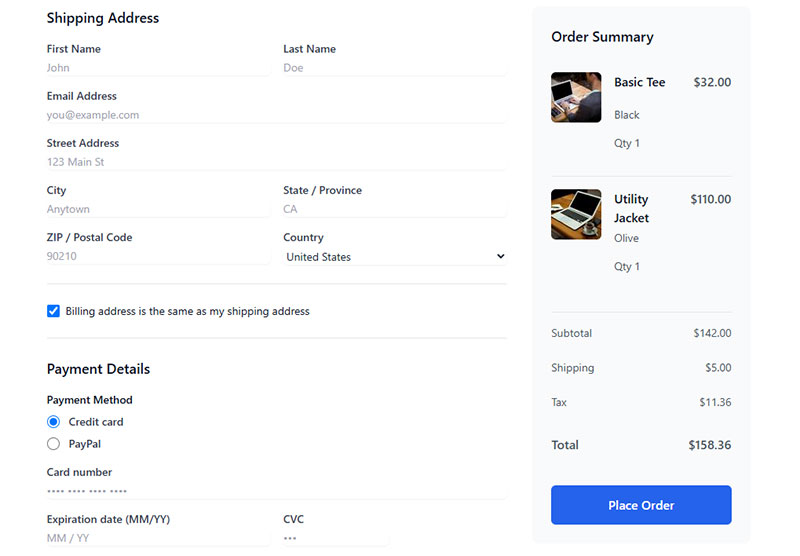
Address fields are where checkout forms get bloated fast. The standard set includes:
- First and last name (separate fields, or a single “full name” field)
- Street address line 1
- Street address line 2 (optional, apartment / suite)
- City
- State / province (dropdown)
- ZIP / postal code
- Country (dropdown, default to user’s location)
One thing Baymard flagged: 15% of e-commerce sites ask for the same information twice in a single checkout flow. Separate billing and shipping address sections are the usual culprit. A “same as shipping” checkbox collapses this into one action.
Payment Fields and PCI Compliance
Credit card input fields require special handling. Raw card data should never pass through your server unless you have PCI DSS compliance in place.
Stripe Elements and WooCommerce Payments both handle this by rendering card fields in iframes – the data goes directly to the payment processor, never touching your backend. The fields look native to your form but technically live on Stripe’s domain.
Standard payment field set: card number, expiry date (MM/YY), CVV. Some checkouts add a cardholder name field – useful for fraud prevention but adds friction. Shopify’s accelerated checkout skips it entirely.
Guest Checkout vs. Account Creation
Forcing account creation before purchase is one of the most documented sources of checkout abandonment.
23% of users will not complete a checkout if they are required to register an account (WPForms). A guest checkout option – with an optional “save my details” prompt after purchase – keeps the conversion path clean while still offering account benefits to users who want them.
Amazon does this well. After placing an order as a guest, users are shown a low-friction “create an account” prompt that pre-fills their email from the order form. The field burden is near zero at that point. For checkout-specific checkout optimization tactics, field reduction is consistently one of the highest-impact levers.
Survey and Feedback Form Fields Examples
74% of businesses use web forms to generate leads, and 49.7% identify them as their most effective conversion tool (Fluent Forms, 2026). Surveys sit at the other end of that spectrum – they collect data rather than leads. But the field design principles overlap more than you might expect.
Survey fields fail for the same reason contact fields do: wrong field type, too many questions, poor sequencing.
Likert Scale and Rating Fields
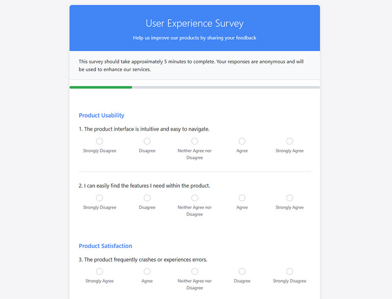
The most common feedback field type. A Likert scale presents a statement and asks users to rate their agreement on a fixed range – usually five or seven points.
Five-point scale: faster to complete, less granular data. Seven-point scale: more nuance, slightly higher cognitive load.
SurveyMonkey and Typeform both default to five-point scales in their templates. Google Forms uses star ratings as a visual shorthand for the same concept.
For practical implementations, see Likert scale question examples across different survey types.
Open-Ended vs. Closed-Ended Survey Fields
Open-ended fields (textarea inputs) produce richer qualitative data. Closed-ended fields (radio buttons, checkboxes, dropdowns) are faster to complete and easier to analyze at scale.
The tradeoff is real. A 10-question survey that mixes both types will get more completions than an all-textarea survey, but less depth than an all-open format. Most effective survey forms use closed-ended fields for quantitative data and limit open-ended fields to one or two at the end.
SurveyMonkey’s internal data shows response rates drop significantly when surveys exceed 7-10 questions. Keep it lean. See how leading tools approach this through survey form templates and feedback form examples built around different research goals.
Matrix and Ranking Fields
Matrix fields pack multiple questions into a grid. Efficient on desktop, painful on mobile. A 4-row matrix on a phone requires horizontal scrolling or extremely compressed text – neither is good.
Ranking fields ask users to drag or order options by preference. They produce clean, usable data but require more cognitive effort than most other field types. Use them sparingly, and always test them on mobile before publishing.
For broader context on collecting structured user feedback, feedback form best practices cover field selection alongside question framing and form structure decisions.
Form Field Attributes and Properties
HTML5 added a range of built-in input attributes that handle validation, formatting, and browser behavior without any JavaScript. Most sites still underuse them.
The right attribute on the right field removes entire categories of user errors before they happen. That is cheaper than fixing them with custom validation scripts after the fact.
Required, Disabled, and Read-Only
Required: adds browser-native validation. Screen readers announce the field as required when it receives focus, no ARIA attributes needed.
Disabled: prevents input and excludes the field value from form submission entirely. Use it for fields that should not be edited in the current state.
Read-only: prevents input but still submits the field value. Useful for pre-filled reference data like an order number or account ID.
Mixing up disabled and readonly is a common source of data bugs. They look the same to the user but behave completely differently on submission.
Placeholder Text vs. Labels
Labels win. Every time.
Placeholder text disappears the moment a user starts typing. If they pause mid-form, they have no reference for what the field was asking. Accessibility guidelines from W3C’s WAI explicitly warn against using placeholder text as a substitute for visible labels.
The better approach: use top-aligned labels above every field, with placeholder text only as a formatting hint (e.g., “e.g. DD/MM/YYYY”), never as the label itself.
UXmatters research found that top-aligned labels result in forms completed 50% faster than left-aligned labels because they require fewer eye fixations.
Validation Attributes
HTML5 validation attributes handle the most common input rules natively.
| Attribute | Controls | Example Use |
|---|---|---|
maxlength |
Max character count | Name, username fields |
min / max |
Numeric range | Age, quantity, price |
pattern |
Regex format | Phone, ZIP, postal code |
autocomplete |
Browser autofill | Email, address, card |
The autocomplete attribute is the easiest win most forms ignore. Setting autocomplete="email" or autocomplete="given-name" lets browsers pre-fill fields correctly, cutting completion time significantly on returning visits.
For a broader look at HTML form best practices covering attribute usage, structure, and input type selection, the patterns here apply across nearly every form type.
Form Field Validation Examples
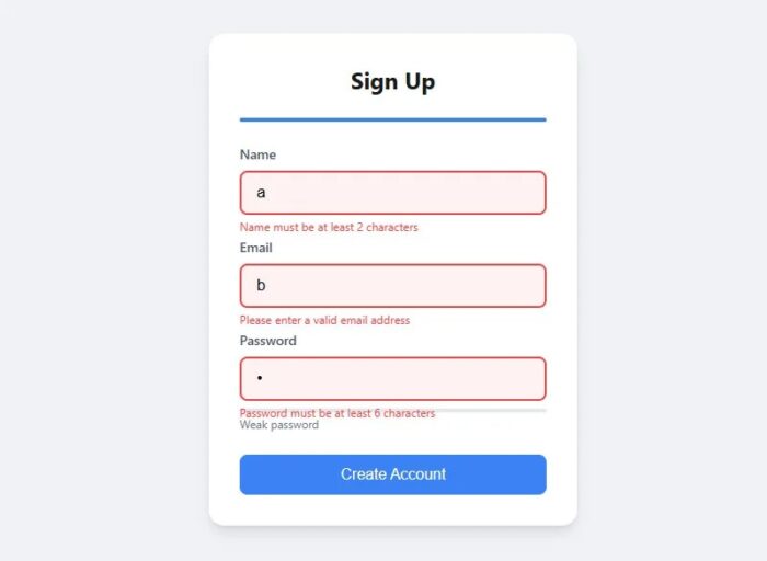
Baymard Institute’s 2024 testing found that 31% of e-commerce sites provide no inline field validation at all. That means users reach the submit button, hit an error, and have to backtrack through a form they thought they had completed.
Inline validation prevents exactly that. It catches problems at the field level, the moment a user moves to the next input.
Inline vs. On-Submit Validation
CXL research shows inline validation produces a 22% decrease in form errors and cuts completion time by 42%. Hard to argue with those numbers.
Inline (on-blur): validates when the user leaves the field. Best for formatted inputs like email, phone, and postal code.
On-submit: validates when the user clicks the submit button. Use as a catch-all backstop, not the primary method.
Avoid validating while the user is still typing. Flagging an email field as invalid mid-keystroke (e.g., before they have typed the domain) is needlessly aggressive and creates frustration without adding accuracy.
Email and Phone Validation Patterns
Zuko Analytics shows email fields carry a 6.4% abandonment rate – partly because overly strict validation rejects valid addresses.
A reliable HTML5 email pattern:
<input type="email" required autocomplete="email">
This handles the basic format check. For phone fields, use type="tel" with a pattern attribute that accepts common formats. Stripping spaces and dashes server-side is better than forcing users to type in an exact format they may not know.
See real form error message examples for how leading products phrase validation feedback across different field types.
Password Field Validation
The password field has the highest abandonment rate of any field at 10.5% (Zuko Analytics). Two design decisions reduce that significantly.
- Show a strength indicator that updates as the user types (weak, fair, strong)
- Add a show/hide password toggle to eliminate confirmation mismatch errors
Slack’s password field uses a color-coded strength meter that updates in real time. Nielsen Norman Group’s 2024 guidelines specifically cite this pattern as a strong model for complex input fields.
For deeper coverage of form validation best practices including timing, error recovery, and client-side vs. server-side approaches, the field-level patterns here are just the starting point. The distinction between client-side and server-side validation matters for both UX and security.
Accessibility Requirements for Form Fields
The 2023 WebAIM Million report analyzed one million home pages and found 96.3% had detectable WCAG failures, with missing form input labels among the most common issues. That is not a niche problem. It is the default state of most web forms.
About 1.3 billion people globally live with a disability (WHO, 2023). Inaccessible form fields directly block a significant share of potential users from completing basic tasks.
Label Association and ARIA Attributes
The for/id pair is the baseline. Every visible label needs a for attribute matching the corresponding field’s id. When correctly paired, screen readers announce the label when the field receives focus.
Where a visible label is not possible (icon-only inputs, composite controls), use aria-label or aria-labelledby instead. For error messages, link them to their field with aria-describedby.
Do not use both required and aria-required on the same field. Screen readers will read “required” twice. One attribute handles both purposes.
Focus States and Keyboard Navigation
Keyboard-only users navigate forms entirely using Tab and Shift+Tab. If a field has no visible focus indicator, those users cannot tell where they are in the form.
WCAG 2.2 (published October 2023) added two new focus-related success criteria that raise the bar beyond what 2.1 required. Focus indicators must now meet minimum size and contrast thresholds, not just be “visible” in some ambiguous way.
Practical minimum: a 2px outline with 3:1 contrast ratio against the adjacent background. The browser default is often not enough.
Placeholder Text and Color Contrast
Placeholder text typically renders at roughly 40% opacity. That fails WCAG 1.4.3 contrast requirements for most color schemes.
WebAIM’s 2024 report found low-contrast text on 81% of homepages. A lot of that lives inside form fields. Placeholder text is a consistent offender.
The fix is not complex. Remove placeholder text where it duplicates the label. Keep it only for format hints, and ensure those hints meet 4.5:1 contrast against the field background.
For a full breakdown of what WCAG 2.1 AA requires from form fields specifically, form accessibility best practices covers label structure, error identification, and keyboard navigation in practical terms.
Form Field Design Patterns and UI Best Practices
Layout decisions affect completion rates before a user has typed a single character. Users make a judgment about form complexity in the first few seconds of seeing it.
CXL’s research shows single-column forms are completed an average of 15.4 seconds faster than multi-column forms. That gap closes when you move to mobile, where multi-column layouts create horizontal scanning problems on narrow screens.
Single-Column vs. Multi-Column Layout
Single-column almost always wins. The path through the form is a straight vertical line. No visual ambiguity about field order, no Z-pattern eye movement.
The one legitimate exception: short pairs that clearly belong together. Day, month, year. Hours, minutes. Card number, expiry, CVV. Grouping these side-by-side is expected, and fighting that expectation creates its own friction.
Multi-column layouts often appear on forms designed by people optimizing for screen real estate rather than completion rate. The form UX design tradeoffs here are well-documented.
Field Width as a Signal
Field width communicates expected input length. A full-width ZIP code field looks wrong. A narrow first name field looks wrong too.
Google’s UX research found that matching input field size to the expected length of the answer reduces confusion and speeds completion. Users pick up on width as a cue for how much to type.
Practical guidelines:
- Short fields (ZIP, CVV, date parts): 25-30% width
- Medium fields (first name, city): 40-50% width
- Long fields (email, company, full address): 60-100% width
- Message/comment areas (textarea): always full width
Mobile-Specific Field Design
Only 3% of users prefer to fill out forms on mobile (Fluent Forms, 2026). Yet mobile accounts for a majority of web traffic, which means most users who prefer desktop are still forced onto mobile forms regularly.
The inputmode and type attributes control which keyboard appears on iOS and Android.
| Field | Correct Type / Mode | Keyboard Triggered |
|---|---|---|
type="email" |
@ and .com keys visible | |
| Phone | type="tel" |
Numeric dialpad |
| ZIP / postal | inputmode="numeric" |
Number pad |
| URL | type="url" |
Slash and .com keys |
Touch targets for form fields should have a minimum tap height of 44px (Apple HCI guidelines) or 48dp (Material Design). Smaller targets cause mis-taps, which trigger validation errors that are not the user’s fault.
For a complete look at how layout, field grouping, and visual hierarchy interact, form layout best practices covers the structural decisions that affect completion before a user types anything. For overall patterns across form types, web form best practices and mobile form best practices cover the ground specific to each context.
FAQ on Website Form Fields
What is a website form field?
A form field is a single input element that collects one piece of data from a user. It lives inside a form container but functions independently, with its own label, input type, and validation rules.
What are the most common types of form fields?
The most used types are text inputs, email fields, password fields, dropdowns, radio buttons, checkboxes, textareas, date pickers, file upload fields, and hidden fields. Each serves a specific data collection purpose.
How many form fields should a contact form have?
Three to five fields is the standard range. HubSpot data shows forms with three fields convert best. Each additional field reduces completion rates, so include only what you genuinely need from the user.
What is the difference between a radio button and a checkbox?
Radio buttons allow only one selection from a group. Checkboxes allow multiple selections. Use radio buttons for mutually exclusive choices and checkboxes when users can pick more than one option simultaneously.
Why do form fields cause abandonment?
The most common triggers are too many fields, required phone numbers, mandatory account creation, and security concerns. Zuko Analytics data shows the password field alone carries a 10.5% abandonment rate.
What HTML input types should I use for form fields?
Use type="email" for email, type="tel" for phone, type="number" for numeric input, and type="date" for dates. Correct HTML5 input types trigger the right mobile keyboard and handle basic client-side validation automatically.
What is inline form field validation?
Inline validation checks a field’s input as soon as the user moves to the next field. CXL research shows it reduces form errors by 22% and cuts completion time by 42% compared to on-submit validation only.
How do form field labels affect accessibility?
Labels linked to fields via matching for and id attributes let screen readers announce the field purpose on focus. The 2023 WebAIM report found missing form labels among the most common WCAG failures across one million pages.
Should form fields use placeholder text?
Sparingly. Placeholder text disappears when users start typing, removing the only label reference mid-entry. Use top-aligned visible labels instead. Reserve placeholder text for format hints only, like “e.g. DD/MM/YYYY”.
What form fields work best for lead generation?
Name, email, and one qualifying field (company, role, or inquiry type) perform best. Reducing fields from 11 to 4 can increase conversions by 120%, according to HubSpot. For more, see which fields capture the highest-quality leads.
Conclusion
This conclusion is for an article presenting website form fields examples across every major form type, from contact and registration flows to checkout, survey, and feedback forms.
The patterns covered here apply whether you are working with raw HTML5 input elements, a form builder like Gravity Forms or Typeform, or a full checkout stack built on WooCommerce or Stripe.
Field type selection, label placement, inline validation, and WCAG-compliant accessibility requirements are not separate concerns. They work together to reduce friction and lift completion rates.
Start with the field set that matches your form’s purpose. Cut anything that does not directly support that goal.
Better field decisions produce better data, fewer abandoned submissions, and users who actually finish what they started.

