






A form is usually the last thing standing between a visitor and whatever you actually want them to do: buy something, sign up, ask a question. Optimizing that form means…
Table of contents
A submission comes back with two answers to a question that only had room for one. That’s a checkbox sitting where a radio button belonged, and you usually find out weeks later when someone tries to process the data.
The reverse is quieter. A radio group on a question with several valid answers just throws the extras away, and nobody complains because nobody knows what they lost.
Circles and squares carry the whole contract with the user. Shape says how many you can pick, and people read it before they read anything else on the page.
What Is a Radio Button
Radios travel in groups, and the group is the point. Pick one and every sibling clears itself. That circular shape is already doing work before a single click, signalling single selection on sight.
The name comes from old car radios. Push one preset and the others physically popped back out. Same behaviour, same metaphor, decades later.
Markup stays about as plain as HTML gets: <input type="radio">, with a shared name attribute binding every option into one group. That shared name enforces the one-selection rule, not the browser being clever about it. Standard stuff, the kind covered in most HTML form best practices guides.
There are four default states to account for:
- Unselected, an empty circle sending no value on submit
- Selected, a filled dot whose value goes with the form
- Disabled, greyed out and skipped by keyboard focus
- Focused, showing a visible outline ring for keyboard users
Nielsen Norman Group’s rule is to select one option by default, since a radio group is meant to have exactly one option active at all times. The main exception is a default that would be presumptuous, like preselecting a gender or a title. In that situation their advice isn’t to ship an empty group but to reconsider whether you need the field at all, or to use a different control.
Before any CSS touches it, that native circle renders slightly differently in Chrome, Safari, and Firefox. Each browser paints its own version using the OS accent color.
What Is a Checkbox
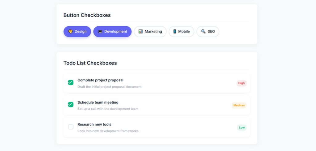
Squares work alone. Each one flips a single option on or off without caring what its neighbours are doing, so users can pick zero, one, or every last box. The square shape and the checked attribute together mark it as a multi-select control.
Ticking one never clears another. That independence is exactly why checkboxes handle multi-select lists that radio buttons structurally cannot.
The markup mirrors radio syntax with one input type swapped: <input type="checkbox">, the checked attribute for a default-on state, and a value that rides along on submit only when the box is ticked.
Most people forget the third state. Indeterminate shows a dash instead of a checkmark, and JavaScript is the only way to set it. There’s no HTML attribute.
| State | Appearance | How it’s set |
|---|---|---|
| Unchecked | ☐ Empty square | Default state (checked attribute is absent) |
| Checked | ☑ Square with checkmark | User clicks the checkbox, or add the checked attribute (<input type="checkbox" checked>) |
| Indeterminate | ▣ Square with a dash (–) | Can only be set with JavaScript (checkbox.indeterminate = true) |
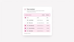
Gmail shows both in action. Every message row carries a checkbox, and the “select all” box up in the header flips to that indeterminate dash the second you tick only some of the rows.
What Is the Difference Between a Radio Button and a Checkbox
Selection count settles it. A radio button allows one choice from a set. A checkbox allows zero, one, or many, each toggled independently. Radio circles mean pick one, checkbox squares mean pick any, and the two also submit data in different shapes.
| Dimension | Radio Button | Checkbox |
|---|---|---|
| Selections | Only one option can be selected in a group | Zero, one, or multiple options can be selected |
| Shape | Circle | Square |
| Empty state | Can start with no selection unless one is preselected | Can always remain unchecked |
| Submitted data | Sends a single value | Sends one or more values (multiple values with the same field name, often processed as an array) |
Sparkbox ran a first-click test with 214 responses from participants aged 18 to 74, comparing switches, radio buttons, and checkboxes on a binary notification setting. Participants operated the checkbox fastest, at a median 6.6 seconds against 7.5 for switches and 8.9 for radio buttons. Yet the checkbox landed the lowest success rate of the three at 91.5%, behind switches at 94.4% and radio buttons at 93.0%. Speed and accuracy aren’t the same thing, and the three controls finished close enough that overall design quality mattered more than the widget choice.
Shape and Visual Convention
Circle for radio, square for checkbox. Users read that shape as a signal before they get near a label.
Break the convention and comprehension drops. Style a checkbox as a circle and people expect single-select behavior, then get confused when two boxes stay ticked at once. Nielsen Norman Group’s checkbox guidelines are explicit: never use circles as checkboxes, because they’re too easily mistaken for radio buttons. Keeping shape true to function is a basic part of solid form design.
Data Sent on Form Submit
The two controls hand different payloads to the server. A radio group sends one key-value pair, the selected option’s value. A checkbox group sends multiple pairs under the same name, read on the other end as an array.
An unticked checkbox sends nothing at all. Not false. Nothing. That trips up a lot of first-time backend code waiting for a boolean that never arrives.
When Should You Use a Radio Button
Mutually exclusive choices, where the user has to land on exactly one. Payment method, shipping speed, plan tier, a single survey rating. Show two or more options, never a lone radio, and pre-select something sensible.
Common fits:
- Payment type (Credit Card, PayPal, Bank Transfer)
- Shipping speed (Standard, Express, Overnight)
- Plan tiers on a pricing page
- Yes/no confirmations where both options need to stay visible
Two working rules hold up across almost every form. A radio group needs at least 2 options, and it needs a safe default unless the whole group is clearly optional or a default would be presumptuous. Nielsen Norman Group has been flagging the no-default problem since 2004, so none of this is new advice.
Stripe Checkout is a clean example. Shipping rates are presented as radio buttons so only one rate can ever apply to an order.
When Should You Use a Checkbox
Independent options where any combination is valid, plus the single yes/no agreement case. Filters, notification opt-ins, feature toggles, consent boxes. Don’t force a lone checkbox to act as an either/or, since that job belongs to a radio pair.
Multi-select filters are the obvious use. Color, brand, size, price range, stackable all at once.
Opt-ins too, so email newsletters, SMS alerts, product update toggles. And then the single standalone box for a terms-of-service agreement or a “remember me” toggle, which behaves like a plain on/off switch and nothing more.
One pet peeve, and a legal requirement in Europe. A pre-checked promotional-email box feels manipulative, and NN/g’s recommendation from ecommerce user testing is to leave consent boxes blank so users actively opt in. Under the GDPR, pre-ticked consent boxes don’t constitute valid consent at all, so for marketing opt-ins this stops being a preference and becomes a compliance question.
Many of Amazon’s left-rail product filters use checkboxes, which is what lets a shopper stack brand, color, and rating together without any one choice clearing another.
Can a Radio Button Be Unchecked
No, a native radio button cannot be unchecked by clicking it again. Only picking another option in the same group clears it, or a form reset. Checkboxes toggle off on a second click by design, which is part of why people keep expecting radios to do the same.
Need an empty state? Add a “None” or “Clear” option to the group. That’s the honest fix. JavaScript reset patterns exist, but users don’t expect a radio to deselect on click, so they read as broken.
Sparkbox caught this happening. 3% of participants frustratedly clicked the “wrong” side of a radio button trying to deselect it. Radio buttons were the only control in that study to produce a “you’re using it wrong” moment.
How Do You Style Radio Buttons and Checkboxes With CSS
Two real routes exist here. Set accent-color for a one-line recolor that keeps native accessibility intact, or use appearance: none to strip the control and rebuild it with a label, a sibling selector, and pseudo-elements. Native inputs ignore most other CSS you throw at them.
| Method | Effort | Control |
|---|---|---|
accent-color |
Very Low (one line of CSS) | Change the checkbox/radio color only |
| Hidden input + styled label | Medium | Create a custom appearance while preserving native behavior and accessibility |
appearance: none + pseudo-elements |
High | Full control over shape, size, colors, borders, animations, and interactions |
Native checkboxes and radios render small by default, roughly 13 to 16px depending on the browser, which is part of why scaling and clickable area come up so fast the moment you start customizing. Plenty of CSS form examples walk both routes end to end.
The accent-color Property
One line recolors the checkmark or dot while keeping the browser’s built-in keyboard and screen-reader behavior. It’s the option I reach for first, every single time.
What you get is color, not shape or size, and that’s the trade. accent-color shipped in Chrome 93 and Edge 93 in late August and early September 2021, Firefox 92 in September 2021, and Safari 15.4 in March 2022. Older browsers fall back to default colors, which degrades gracefully rather than breaking anything.
Custom Controls With Pseudo-elements
When you need a custom shape, animation, or gradient, build the visual on the <label> and drive it from the input’s :checked state through a sibling selector.
- Hide the real input visually, don’t delete it
- Keep it in the DOM so focus, keyboard, and form data still work
- Paint the dot or checkmark with
::beforeor::after
Rip the input out entirely and you’ve traded accessibility for looks. Never worth it.
How Do You Make Radio Buttons and Checkboxes Accessible
Give every control a label, group radio buttons in a fieldset, and keep the keyboard working. Each input needs a programmatically linked label, radio groups need a legend for context, and the tap target has to stay large enough to hit.
The core requirements break down like this. Labels first, either by wrapping the input in a <label> or linking them with matching for and id. Then grouping, where a <fieldset> plus <legend> tells screen readers what the whole radio set is asking. ARIA is mostly a non-issue, since native inputs carry state for free and only custom controls need role="radiogroup" and aria-checked.
Keyboard behavior differs between the two controls, and users notice immediately when it’s wrong.
| Action | Radio Group | Checkbox |
|---|---|---|
| Reach it | Tab enters the radio group (or the selected radio) | Tab moves to each checkbox individually |
| Move within | Arrow keys move between radio buttons in the same group | Tab moves between checkboxes; Arrow keys are generally not used |
| Select / Toggle | Space selects the focused radio button (cannot unselect it with the keyboard if it’s the only selected one) | Space toggles the focused checkbox on or off |
WCAG 2.2, published as a W3C Recommendation in October 2023, sets a minimum tap target of 24 by 24 CSS pixels in Success Criterion 2.5.8 (Level AA). The stricter Level AAA rule, 2.5.5 Target Size (Enhanced), pushes that to 44 by 44px.
There’s an exception that changes how you audit this. SC 2.5.8 includes a User Agent Control clause: if the browser sets the size and you haven’t modified it, the target is exempt. So a completely unstyled native checkbox rendering at 13px doesn’t fail. The moment you apply your own width, height, or padding, the exception no longer applies and the 24px floor is yours to meet.
SC 2.5.8 also carries a spacing exception. An undersized target passes if a 24px-diameter circle centered on it doesn’t intersect another target’s circle. Either way, enlarging the control or making the label clickable is the practical fix, and it helps everyone regardless of what the criterion technically demands.
The GOV.UK Design System wraps every radio set in a fieldset with a legend, which is why its forms read cleanly on a screen reader. Matching that pattern is the shortcut to solid form accessibility best practices.
What Are Common Mistakes When Choosing Between Radio Buttons and Checkboxes
The recurring errors all come from mixing up single-select and multi-select behavior. Checkboxes get used for exclusive choices, radio groups ship with one lonely option, consent boxes arrive pre-checked. Each one either confuses users or corrupts the data coming back.
Accessibility vendor TestParty reports that 95% of sites have at least one improperly grouped radio set, usually from missing fieldset and legend markup, making it the most common radio failure on the web.
The mistakes worth auditing your own forms for:
- Checkboxes used for exclusive choices, letting users tick two conflicting options when radio buttons belong there
- A lone radio button, which can’t be unchecked and has nothing to contrast against, so use a single checkbox
- A single checkbox standing in for a yes/no pair, when both answers need to stay visible and two radio buttons read clearer
- No default on a required radio group, where a safe pre-selection beats shipping an empty state
- Circle-styled checkboxes, since the round shape signals single-select and breaks expectations
Nielsen Norman Group is harsh on this: no professional interaction designer would use checkboxes where radio buttons belong, since the distinction is taught in the first interaction design class, and getting it wrong marks you as an amateur. Getting it right is quietly central to good form UX design.
Radio Button vs Checkbox vs Toggle Switch vs Dropdown
Match the control to the decision, not the other way around. Radio buttons pick one from a short visible set. Checkboxes select any combination. Toggle switches flip a single setting with instant effect. Dropdowns hide a long single-select list to save space.
| Control | Selection | Effect | Best For |
|---|---|---|---|
| Radio Button | Select one option from a set | Applied on form submission | A short set of mutually exclusive options that all fit on screen |
| Checkbox | Select zero, one, or multiple options | Applied on form submission | Independent options or multi-select choices |
| Toggle Switch | Turn a single setting on/off | Takes effect immediately | Instant settings (e.g., Dark Mode, Notifications) |
| Dropdown (Select Menu) | Select one option from a list | Applied on form submission | Longer lists where showing every option would crowd the page |
Design systems draw the dropdown threshold in different places, which is where most people slip:
- USWDS recommends radio buttons for fewer than 7 items
- Google Material Design (M3) sets the threshold at 6
- IBM Carbon draws the line at 3
Nielsen Norman Group’s own guidance is a floor rather than a ceiling: avoid dropdowns when there are only two or three options that could be radio buttons instead. Their reasoning is that radio buttons carry lower cognitive load, because every option stays permanently visible and comparable, and selection takes a single click.
As a practical rule, keep choices visible when a handful will fit, move to a dropdown once the list crowds the page, and switch to a searchable combobox when scanning the list becomes the bottleneck. The cutoff depends on your layout, not on a magic number.
The toggle-versus-checkbox line is about timing, and NN/g is firm here: a toggle switch must take effect immediately and should never require a Save or Submit click. If the change waits for submit, use a checkbox instead. Toggles also always carry a default value, and they can’t express the indeterminate state a checkbox can.
On phones, a switch gives a bigger touchpoint and suits thumb reach, which is why Material Design leans on toggles for on/off settings and why they show up so often in solid mobile form best practices.
Google Forms makes the trade-off explicit rather than automatic. Multiple choice (radio buttons), Checkboxes, and Dropdown are three separate question types the creator picks between, with Multiple choice as the default. Radio buttons keep every option visible, and the dropdown exists precisely for when a long list would dominate the page.
FAQ on Radio Button Vs Checkbox
What is the main difference between a radio button and a checkbox?
Selection count. Radio buttons let users pick one option from a group of mutually exclusive choices, while a checkbox is an independent toggle, so users can select zero, one, or many at once.
When should I use a radio button instead of a checkbox?
When choices are mutually exclusive and only one can apply, like payment method or shipping speed. Reach for checkboxes when any combination of independent options is valid.
Can a radio button be unchecked?
No. A native radio button cannot be unchecked by clicking it again. Only selecting another option in the same group clears it, or a form reset. Add a “None” option if you need an empty state.
Why is a radio button a circle and a checkbox a square?
Learned convention, nothing deeper than that. A circle signals single selection, a square signals multi-select. Users read that shape before the label, so swapping them breaks expectations and causes mistakes.
Should a single checkbox or two radio buttons be used for yes/no?
A single checkbox works for a simple opt-in like terms agreement. Use two radio buttons when both answers need equal visibility, since a lone checkbox hides what the unchecked state means.
How many options does a radio group need?
At least 2 options, never one. If you only have a single yes/no choice, a checkbox or toggle fits better than a lone radio button.
What is the indeterminate state on a checkbox?
A third checkbox state showing a dash instead of a checkmark. It marks a “select all” parent box when only some children are ticked, and only JavaScript can set it.
How do I style radio buttons and checkboxes with CSS?
Set accent-color for a one-line recolor that keeps native accessibility, supported since Chrome 93 and Firefox 92 in 2021 and Safari 15.4 in 2022. For full custom shapes, use appearance: none and rebuild the control with a label and pseudo-elements.
When should I use a dropdown instead of radio buttons?
Keep radio buttons while the full set of options fits comfortably on screen. Design systems place that cutoff anywhere from 3 items (IBM Carbon) to 7 (USWDS). Move to a dropdown when the list crowds the layout, and a searchable combobox once it gets tedious to scan.
What is the difference between a checkbox and a toggle switch?
Timing. A checkbox waits for a submit button before its selection applies, while a toggle switch takes effect immediately, which makes it right for instant settings like dark mode rather than form choices.
Conclusion
The radio button vs checkbox decision comes down to one question: can the user pick more than one? Single-select stays with the radio group and its shared name attribute. Multi-select belongs to the checkbox.
Get the shape convention right and users read the control before the label.
Keep the fieldset and legend in place so screen readers and keyboard users follow the group.
Recolor with accent-color when you can, and only strip the native input when a custom design truly needs it.
Watch the option count too. Under five, radio buttons beat a dropdown; past fifteen, a combobox saves space.
Match the control to the choice, and your forms return cleaner data with fewer errors.