

The first message a user sees after creating an account sets the tone for everything that follows. Get it wrong, and you lose them at the exact moment they’re most…
Table of contents
Most forms fail before a user even reaches the submit button.
Poor label placement, the wrong input types, zero inline validation – these are not edge cases. They are the default. And they cost real conversions every day.
Following form design best practices directly affects completion rates, error frequency, and user trust across every form type, from checkout flows to lead capture pages.
This guide covers the decisions that matter most: layout, field organization, validation, mobile usability, accessibility, multi-step design, and the technical details that hold everything together.
Form Design Best Practices (Quick Overview)
| Aspect | Good Form Design | Poor Form Design |
|---|---|---|
| Field labels | Persistent labels placed above each field, always visible while typing | Placeholder text used as the only label, disappearing the moment input begins |
| Layout structure | Single-column layout that follows natural vertical scanning, reducing cognitive load | Multi-column grid forcing users to track fields horizontally, increasing scan errors |
| Error feedback | Inline validation shown next to the affected field immediately after the user finishes typing | Generic error list shown only after form submission, with no indication of which field caused the issue |
| Required fields | Required fields marked with an asterisk (*) and optional fields explicitly labeled “optional” | No distinction between required and optional fields, leaving users uncertain before submitting |
| Field count | Only essential fields included. Additional data collected incrementally through progressive profiling | All possible data points collected upfront, creating friction that raises abandonment rates |
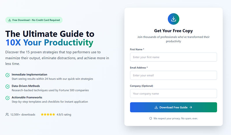
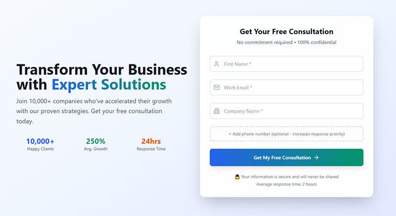
| CTA button | Action-oriented label that describes the outcome, such as “Get my free trial” or “Create account” | Generic label such as “Submit” that gives no context about what will happen next |
| Input field sizing | Field width matches the expected input length, giving users a visual cue of how much to type | Uniform field widths regardless of input type, making short answers feel disproportionate |
| Input controls | Radio buttons used for 2 to 3 options, reducing the number of interactions required | Drop-down menus used for only 2 or 3 options, requiring an extra click and hiding choices |
| Submission confirmation | Clear success message appears immediately after submission, stating what happens next | Page refreshes with no confirmation, leaving users uncertain whether the form was received |
| Mobile experience | Responsive layout with large touch targets, appropriate keyboard types, and autofill support | Desktop-only layout with small tap areas and no input type attributes, forcing manual keyboard switching |
Form Layout and Field Organization
Layout decisions affect how long it takes a user to complete a form and how many errors they make along the way. Most of these decisions are made once and then never revisited – which is a problem, because the defaults are often wrong.
Great design also means knowing how to embed forms without disrupting UX or page flow.
Single-Column Layout vs. Multi-Column Layout
CXL Institute research found that users complete single-column forms an average of 15.4 seconds faster than multi-column versions. That is not a small difference.
Multi-column layouts break the natural top-to-bottom reading path. Users have to decide which direction to scan, and they frequently make the wrong call – filling in fields out of sequence and triggering validation errors that were entirely avoidable.
Baymard Institute UX benchmarking found that 16% of e-commerce sites still use extensive multi-column checkout forms, directly contributing to cart abandonment when users misinterpret field order.
The only reasonable use cases for side-by-side fields are tightly paired inputs where the relationship is obvious:
- First name and last name
- City and state/ZIP
- Start date and end date
Outside those cases, single-column is the safer default. It scales cleanly to mobile, handles long labels without breaking, and keeps the user moving in one direction.
Grouping Related Fields
Field grouping reduces cognitive load by giving users a mental model of what the form is asking for.
| Group Type | Example Fields | Why It Helps |
|---|---|---|
| Personal info | Name, email, phone | Mirrors how people think about themselves |
| Address block | Street, city, state, ZIP | Follows real-world mental model of an address |
| Payment details | Card number, expiry, CVV | Matches the physical card layout |
| Account setup | Username, password, confirm | Groups security-related decisions together |
The order of fields matters too. Ask for name before email, not the reverse. The sequence should follow real-world logic, not whatever order the database schema was built in. Reviewing form layout best practices in detail is worth the time if you are redesigning an existing flow.
Dropbox famously reduced their signup to just email and password at the top of the funnel. That two-field approach reportedly increased their conversion rate by over 40% – the rest of the information was collected progressively after users experienced value from the product.
Choosing colors, fonts, and field styles that match your brand is faster when you use dedicated form customization options rather than overriding styles with raw CSS.
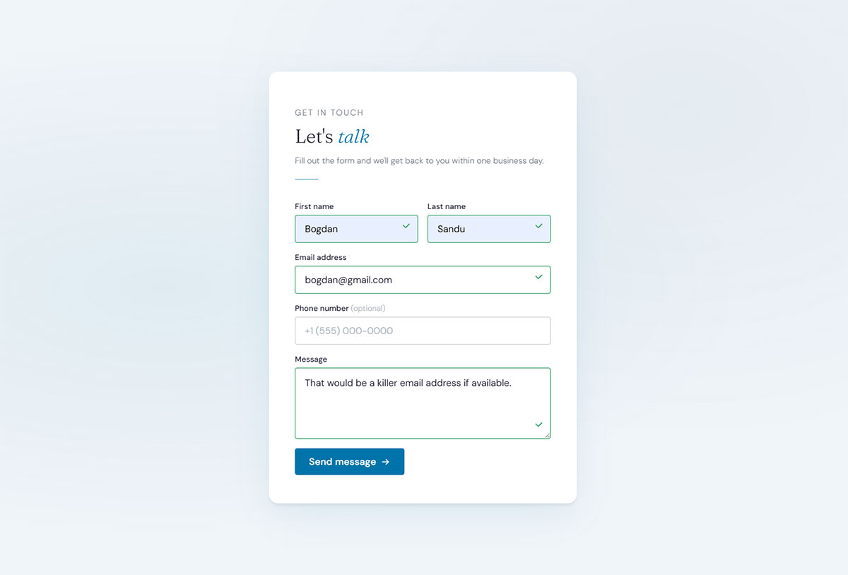
Labels, Placeholders, and Input Hints
Label and hint design looks like a small detail. It is not. These elements are the primary way users understand what you are asking for, and getting them wrong causes errors, confusion, and abandonment.
Label Placement
Eye-tracking research published by Matteo Penzo at UXmatters showed that top-aligned labels produce the fastest form completion times, because users can process the label and the field in a single eye fixation.
Left-aligned labels force a zigzag reading pattern. The user’s eye has to travel back and forth between the label column and the input column – a pattern that slows things down and increases the chance of associating the wrong label with the wrong field.
UXmatters research puts the saccade time difference at roughly 500ms for left-aligned vs. 50ms for top-aligned labels. Across a 10-field form, that adds up.
There is one exception worth knowing: dense data-entry forms with many familiar fields (admin dashboards, medical intake, government forms) sometimes work better with right-aligned labels. The trade-off is that this pattern only holds when users already know what to expect in each field.
For most web forms, top-aligned labels are the right default.
The Placeholder Text Problem
Using placeholder text as a replacement for labels is one of the most common and most damaging form design mistakes.
Placeholder text disappears the moment a user starts typing. If they get distracted mid-form and come back, there is no way to know what a half-filled field was asking for. Nielsen Norman Group testing found that placeholder-only forms increased errors and completion time across every demographic tested, with older users hit hardest.
There is a secondary issue. Placeholder text is typically styled in light gray, which fails WCAG color contrast requirements. If you darken it to pass accessibility checks, users mistake it for pre-filled data and skip the field entirely.
Use placeholders for format hints only:
- “e.g., [email protected]”
- “MM/DD/YYYY”
- “+1 (555) 000-0000”
Never as a label replacement. If a form looks cleaner without visible labels, the design needs rethinking – not the labels. See more on this in our guide on placeholder text examples.
Helper Text Placement
Below the field, not inside it. This is the consistent recommendation from both Nielsen Norman Group and Baymard Institute research.
Helper text placed below the input stays visible while the user is typing. It does not compete with the label above the field. And it occupies the same position where error messages will appear – which means the user’s eye already knows where to look when something goes wrong.
Input Field Types and Selection Controls
Choosing the wrong input type is a surprisingly common mistake. It adds friction for users and increases error rates – two things that directly hurt form completion.
Matching Input Type to Data Type
CXL research found that forms with radio buttons are completed an average of 2.5 seconds faster than forms with dropdown selection fields for the same data.
That finding alone should shift how most designers approach option selection. Dropdowns are overused. They hide choices behind an interaction step and create extra cognitive work for the user.
| Input Type | Use When | Avoid When |
|---|---|---|
| Radio buttons | 5 or fewer mutually exclusive options | More than 6 options (too much vertical space) |
| Dropdown | 6+ options, especially long lists (countries, states) | Binary yes/no choices or 2–3 option selections |
| Checkboxes | Multiple selections allowed from a defined set | Single-select scenarios (use radio buttons instead) |
| Text input | Free-form data: names, addresses, custom values | Constrained data with a defined set of valid options |
The full guide on radio buttons vs checkboxes is worth reading if you regularly design forms with multiple selection patterns.
Date Pickers and Input Masks
Date pickers are one of the most inconsistently implemented controls on the web. The right approach depends on what kind of date you are asking for.
Native date inputs (HTML5 type="date") work well on mobile – they trigger the platform’s native date picker, which users already know how to operate. On desktop, they are inconsistent across browsers and often look broken.
Three separate text fields (month, day, year) outperform both calendar pickers and single date inputs for dates of birth and other historical dates, according to GOV.UK’s own research on their government forms.
Input masks for phone numbers and credit card fields help users understand the expected format as they type. The key is to format in real time without deleting characters the user has already entered.
For more context on these patterns, see our guide on form fields and their specific behaviors.
Form Validation and Error Handling
Validation is where most forms lose users who were fully willing to complete them. Poor error handling does not just frustrate – it causes abandonment that never recovers. According to WPForms, more than 67% of site visitors will abandon a form forever if they encounter complications, and only 20% will follow up with the company afterward.
Inline Validation vs. On-Submit Validation
A List Apart research showed users could complete forms with inline validation 42% faster, made 22% fewer errors, and reported 31% higher satisfaction compared to on-submit validation.
That is not a marginal improvement. It is the difference between a form that feels broken and one that feels helpful.
The tricky part is timing. Validate too early (on the first keystroke) and you flag errors before the user has finished typing. Validate too late (only on submit) and users have to backtrack through multiple fields to fix mistakes.
On-blur validation (triggering when the user leaves a field) is the standard recommendation. It checks input after the user has finished with a field, but before they submit the whole form.
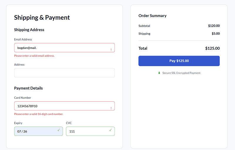
Writing Error Messages That Actually Help
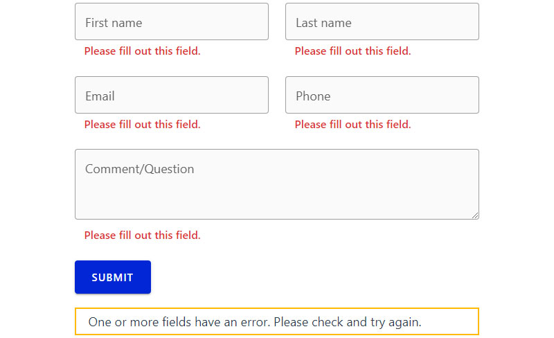
Vague error messages are a form usability problem that is entirely within the designer’s control to fix. Yet most forms still default to generic copy.
The pattern is simple. Specific beats vague every time:
- Wrong: “Invalid input”
- Wrong: “Please fill out this field”
- Right: “Enter a valid email address (e.g., [email protected])”
- Right: “Password must be at least 8 characters and include one number”
Error messages should sit directly below the problematic field – not at the top of the page, not in a modal. Research published in a ResearchGate study on error message placement found that errors near the erroneous field significantly outperformed top-of-form error summaries on all measured metrics: efficiency, effectiveness, and satisfaction.
There is also one rule that gets broken constantly: never clear the form on a failed submission. Expedia famously traced a $12 million annual revenue loss to a single error in one of their contact forms. Preserve every field that was correctly filled in – make the user fix only what is actually wrong.
For a full breakdown of how to handle these situations, see form validation best practices and real-world form error message examples.
Success States and Confirmation
Confirmation is the part of the form flow that gets the least design attention. Which is strange, because it is the last impression you make on a user who just did what you asked them to do.
A good confirmation message does three things: tells the user the submission worked, tells them what happens next, and gives them a clear path forward (back to the home page, to their account, to a next step).
Ambiguous success states – a page that just reloads, or shows a vague “thank you” with no context – leave users unsure whether anything happened. Some will submit the form a second time. See form submission confirmation message examples for patterns that work.
Button Design and Form Submission

The submit button is where everything either closes or falls apart. Users who make it this far are close to converting. Button design determines whether they do.
Button Label Specificity
Insiteful data shows that 3% more people abandon a form if the submit button says “Submit.” That is a meaningful conversion hit for one word change.
The fix is straightforward: label the button with what the user is actually getting or doing.
- “Create My Account” beats “Submit”
- “Get My Free Quote” beats “Send”
- “Book a Demo” beats “Submit Form”
- “Download the Guide” beats “Enter”
WordStream research confirms the best-performing CTA copy uses action words like “get,” “try,” “book,” and “download.” Words like “submit,” “enter,” “access,” and “complete” consistently underperform.
Placement, Hierarchy, and Disabled States
The primary submit button should align to the left edge of the form’s input fields. Left-aligned placement matches the natural reading endpoint of a form – the user’s eye arrives there after completing the last field.
Secondary actions (Cancel, Reset, Save Draft) should be visually subordinate to the primary button. Do not put “Cancel” next to “Submit” at the same size and weight. Users will click the wrong one under the pressure of completing a long form.
Disabled submit buttons are a debated pattern. The argument for: they prevent premature submission. The argument against: they give users no feedback on why they cannot proceed. If you use a disabled button state, pair it with inline validation that makes the issue visible before the user reaches the button.
Loading States After Submission
Once a user clicks submit, something should change on screen within 100 milliseconds – even if the server response takes longer. A loading spinner, a button label change to “Submitting…”, a progress indicator. Something.
Without visual feedback, users click again. Double submissions create duplicate data, order errors, and support tickets. This is a technical implementation detail that has real user experience consequences.
For context on how these patterns apply in practice, see our full collection of form design examples.
Mobile Form Design
Mobile devices account for 64% of global internet traffic as of late 2024 (Digital Web Solutions). But desktop users still complete forms at a meaningfully higher rate.
Zuko Analytics data shows the desktop starter-to-completion rate sits at 55.5%, compared to 47.5% on mobile. That 8-point gap is not a device problem. It is a design problem.
Touch Targets and Keyboard Types
Minimum touch target size: 44x44px per Apple HIG, and 48x48dp per Google Material Design guidelines.
Smaller targets create tap errors, frustration, and field abandonment. Reform.app research found mobile users are 31% more likely to complete forms on larger screens – part of that is viewport, and part is tap target size.
Keyboard type matters just as much. Use the correct HTML input types so the right keyboard appears automatically:
type="email"for email fieldstype="tel"for phone numberstype="number"for numeric-only inputsinputmode="numeric"for things like ZIP codes that need a number pad but aren’t technically a number
Missing these causes users to get the wrong keyboard and manually switch. On a phone, that is a real friction point.
Autofill and Autocomplete Attributes
Chrome’s own data from 2024 is striking: users who use autofill complete forms 35% faster and abandon them 75% less often than those typing manually.
Zuko Analytics corroborates this. Among users who triggered autofill, form completion was 71% vs. 59% for those who did not. The difference is substantial on mobile, where typing is the main source of friction.
Autofill only works when the autocomplete attribute is correctly set. Common ones to implement:
autocomplete="given-name"andautocomplete="family-name"autocomplete="email"autocomplete="tel"autocomplete="street-address",postal-code"autocomplete="cc-number",cc-exp",cc-csc"
Using autocomplete="off" blocks autofill entirely. Most modern browsers ignore this for sensitive fields (and rightly so), but it still breaks the experience in edge cases. Do not disable it.
Thumb Zone and Layout on Small Screens
The bottom third of a phone screen is where thumbs reach most naturally. The top third is the hardest to reach one-handed.
Primary actions (the submit button) belong in the easy-reach zone. If a user has to stretch to hit “Create Account” after filling out a form, you are making them work for their own conversion.
Simplified mobile forms see up to 63% higher completion rates than cluttered equivalents, according to Tinyform research. Single-column layouts, large tap targets, and minimal field counts are what drive that gap. For a deeper breakdown of mobile-specific patterns, see our guide on mobile form best practices.
Accessibility in Form Design
AudioEye’s 2023 Digital Accessibility Index found that 1 in 4 forms are missing descriptive labels for people with disabilities. That is not a niche problem. It affects 1.3 billion people globally who experience significant disability (WHO, 2023).
Beyond the ethical case, there is a legal one. ADA website accessibility lawsuits increased 37% in the first half of 2025 compared to the same period in 2024 (AudioEye), and McKinsey estimates consumer companies lose $6.9 billion annually because of inaccessible websites.
Labels, ARIA, and Screen Reader Support
Every input needs a programmatically associated label. Visual proximity is not enough. Screen readers need the connection in the HTML.
Two correct approaches:
- Use
<label for="field-id">pointing to the input’sidattribute - Use
aria-labelledbywhen the visible label is a heading or existing element
Never rely on placeholder as the only label. It disappears when a user starts typing and has no persistent accessible name for assistive technology.
For required fields, add the HTML required attribute alongside any visual asterisk. The visual marker alone means nothing to a screen reader.
Focus Indicators and Color Contrast
WCAG 2.2 (released October 2023) added a new criterion: Focus Not Obscured (2.4.11). Sticky headers and cookie banners cannot completely hide a focused element.
The broader rule has been in place for years, but a surprising number of teams still remove the default browser focus outline without replacing it. Never do this. Keyboard users lose all orientation when focus is invisible.
On color: WCAG 1.4.1 prohibits using color as the only way to convey information. An error field shown only in red fails this criterion. Pair color with an icon, a text label, or a border change.
| Accessibility Requirement | WCAG Criterion | Common Failure |
|---|---|---|
| Label association | 1.3.1 (A) | Placeholder-only labels, no for/id link |
| Error identification | 1.4.1 (A) | Red color alone, no text or icon |
| Focus visible | 2.4.7 (AA) | Removed outline with no replacement |
| Touch target size | 2.5.8 (AA, WCAG 2.2) | Targets under 24×24 CSS pixels |
The WebAIM Million 2023 report found that missing form input labels were among the top six most common WCAG failures across 1 million analyzed web pages. For practical implementation guidance, see our full breakdown of form accessibility best practices.
Testing With Real Assistive Technology
Automated scanners catch roughly 30% of WCAG issues (WebAIM), which means 70% require manual or user testing to find.
Custom dropdowns and date pickers are where things break most often. Native HTML controls work with screen readers by default. Custom-built versions frequently do not, because they lack the right ARIA roles, states, and keyboard event handling.
Test with NVDA on Windows and VoiceOver on macOS and iOS. Keyboard-only testing (no mouse, no touch) catches a different set of problems that automated tools miss entirely.
Multi-Step Forms and Progress Indicators
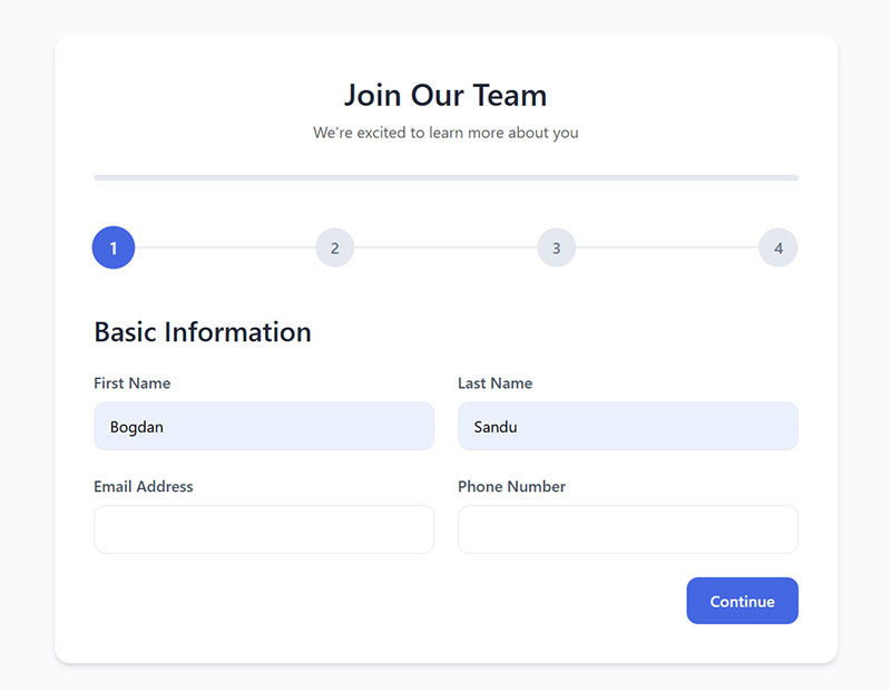
Multi-step forms convert at an average of 13.85% compared to 4.53% for single-page forms, a 206% difference, according to 2024-2025 data from Formstack and Venture Harbour.
HubSpot found that only 40% of marketers use multi-step forms, despite their conversion rate being 86% higher. That gap represents an enormous and largely unused optimization opportunity.
When to Use Multi-Step (and When Not To)
Multi-step is not always the right call. The format works best in specific situations:
- Forms with more than 6-7 fields where cognitive load is a concern
- Flows where question order affects which fields are shown (conditional logic)
- Lead generation forms where starting with low-commitment questions builds momentum
- Mobile forms where vertical scrolling through a long single page creates friction
Avoid multi-step for: simple contact forms (2-3 fields), newsletter signups, or any form where the user can see the entire scope at a glance. Breaking a 3-field form into steps adds navigation overhead without any cognitive benefit.
Progress Indicator Design
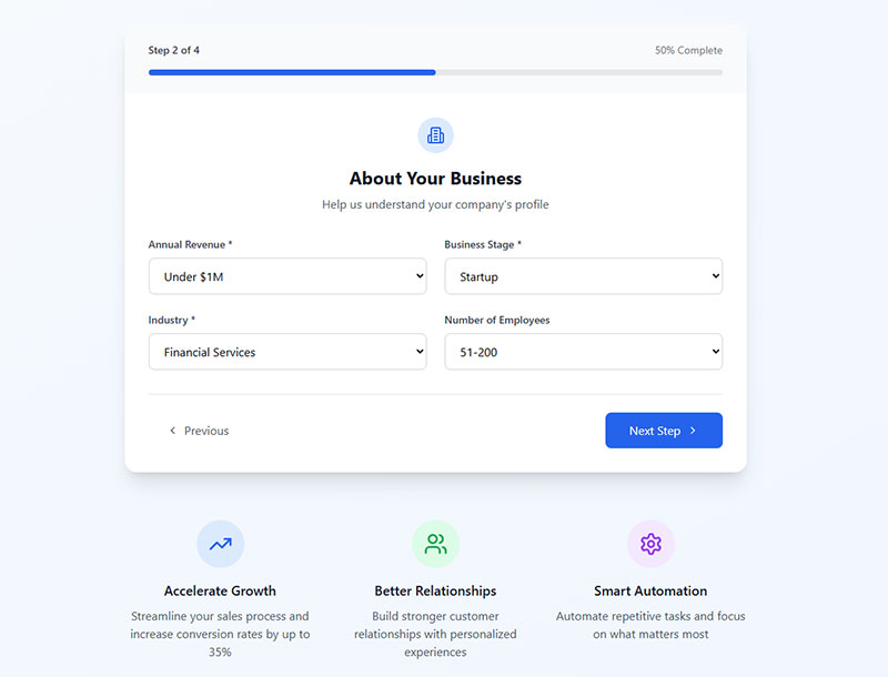
University of Nebraska-Lincoln research found users shown animated progress bars were 3x more willing to continue than those with no progress indicator. Forms with clearly visible progress indicators convert 15-20% higher than multi-step forms without them (LeadGen Economy).
The endowed progress effect is what makes this work. When users feel they have already made progress, they are more motivated to finish. This is why starting a form with the progress bar slightly filled in (even before the first question) tends to increase completion.
Numbered steps (“Step 2 of 4”) consistently outperform percentage bars in testing. The specificity helps users feel oriented. Empire Flippers saw a 51.6% increase in conversions in 47 days after adding a visible progress bar to their multi-step business valuation form.
Back Button Behavior and Saving Progress
Back navigation needs to preserve every answer the user has already given. This seems obvious. Plenty of forms still do not get it right.
A multi-step form that clears data when the user goes back forces re-entry of information they already provided. Most users will abandon rather than repeat themselves.
For longer forms, autosave is worth implementing. Even a 2-3% recovery rate on abandoned sessions represents meaningful ROI on paid traffic. See our collection of multi-step form examples and the research on multi-step vs. single-step forms for more context on when each format performs best.
Form Performance and Technical Considerations
Good form UX starts collapsing when the technical implementation is sloppy. Autofill that misfires, validation that only runs server-side, no form analytics – these are invisible problems until you look at your abandonment data.
Client-Side vs. Server-Side Validation
Both are required. They solve different problems.
Client-side validation gives users instant feedback without a server round-trip. It catches format errors, empty required fields, and password mismatch before a submission is attempted. Fast, low-friction.
Server-side validation is the security layer. Client-side validation can be bypassed by anyone who knows how to open developer tools. Never trust form input without server-side validation, regardless of what the front end does.
The pattern is: validate on the client for UX, validate on the server for security. Skipping either creates a problem – just in different ways. For more on this, see our comparison of client-side vs. server-side form input validation.
Form Analytics and Field-Level Tracking
Most teams track overall form conversion. Very few track field-level abandonment, and that is where the real data lives.
| Tool | What It Tracks | Best For |
|---|---|---|
| Hotjar | Field drop-off, rage clicks, heatmaps | Visualizing where users struggle |
| Mouseflow | Session recordings, funnel analysis | Watching real user behavior |
| Zuko Analytics | Field return rates, abandonment timing | Dedicated form analytics |
| Google Analytics 4 | Form events, funnel visualization | Integration with broader site data |
Zuko data shows that the password field has a mean abandonment rate of 10.5%, the highest of any field type, followed by email (6.4%) and phone number (6.3%). Without field-level tracking, you would never know which specific field is killing your conversions. You can also track form submissions in Google Analytics to connect field behavior to broader traffic and campaign data.
Security, CSRF, and Input Sanitization
Forms are the primary entry point for malicious input on most web applications. This is not hypothetical.
Three non-negotiable requirements:
- CSRF tokens on every state-changing form (prevents cross-site request forgery)
- Server-side input sanitization before any data touches a database
- HTTPS everywhere – unencrypted form submissions expose user data in transit
Spam is a separate but related problem. Honeypot fields (hidden inputs that only bots fill in) catch most automated submissions without degrading the user experience. CAPTCHA works too, but adds friction – Moz data shows CAPTCHA measurably increases abandonment rates.
For WordPress sites, using a form builder with integrated form spam protection — covering reCAPTCHA, hCaptcha, and honeypot fields — removes the need to piece together separate anti-spam tools.
For a broader look at sanitizing submitted data before it reaches your application layer, the full walkthrough on how to sanitize user input covers the patterns that matter most.
FAQ on Form Design Best Practices
How many fields should a form have?
Keep it to the minimum needed. Forms with 3-5 fields consistently outperform longer ones. Each additional field reduces conversion rate by roughly 4.1%, according to a 2024 HubSpot study. Only ask for what you will actually use.
Should labels go above or beside input fields?
Top-aligned labels perform best in most cases. Eye-tracking research shows they reduce completion time by up to 50% compared to left-aligned labels, because users process the label and field in a single eye fixation rather than scanning horizontally.
What is the difference between inline validation and on-submit validation?
Inline validation checks input as users complete each field. On-submit validation waits until the form is submitted. Inline validation reduces errors by 22% and speeds completion by 42%, per A List Apart research. On-blur timing works best for most forms.
When should you use a multi-step form?
Use multi-step layouts when a form has more than 6-7 fields, or when conditional logic determines which questions appear. Multi-step forms convert at 13.85% on average versus 4.53% for single-page forms, according to Formstack and Venture Harbour data.
Are placeholder texts a good replacement for labels?
No. Placeholder text disappears when users start typing. Nielsen Norman Group testing found placeholder-only forms increase errors across all demographics. Use placeholders for format hints only, like “e.g., [email protected]”. Never as a label substitute.
What makes a form accessible?
Every input needs a programmatically linked label via for/id or aria-labelledby. Error messages must use more than color alone. Focus indicators must remain visible. The WCAG 2.2 guidelines cover the full set of requirements for compliant form accessibility.
How does form layout affect conversion rate?
Significantly. Single-column layouts are completed 15.4 seconds faster than multi-column forms, per CXL Institute research. Multi-column layouts break the natural reading path, cause field-order confusion, and increase validation errors – particularly during checkout.
Should the submit button say “Submit”?
Avoid it. Data from Insiteful shows 3% more users abandon forms when the button reads “Submit.” Use specific action copy instead: “Create My Account,” “Get My Quote,” or “Book a Demo” consistently outperform generic labels in form conversion testing.
What are the most common reasons users abandon forms?
Security concerns (29%), form length (27%), and unnecessary questions (10%) top the list, according to The Manifest. Poor mobile form usability, slow load times, and vague error messages also contribute. Fixing field count and error handling addresses the majority of abandonment causes.
How do autocomplete attributes improve form performance?
They allow browsers to autofill fields from saved user data. Google Chrome’s 2024 analysis found autofill users complete forms 35% faster and abandon them 75% less often. Correct autocomplete attribute values are required – browsers cannot reliably guess without them.
Conclusion
This conclusion is for an article presenting the core principles behind form design best practices – from single-column layouts and top-aligned labels to inline validation, mobile usability, and WCAG compliance.
None of these are difficult changes. Most are one decision, made once.
Field grouping, button copy, autocomplete attributes, progress indicators – each one removes a small amount of friction. Together, they shift form completion rate from average to genuinely good.
The data is consistent across sources: fewer fields, clearer error messages, and accessible input design reduce abandonment and build user trust.
Start with the section that matches your biggest drop-off point. Fix that first.
