


Your login form is the first real interaction users have with your product. Get it wrong and they bounce. Get it right and they barely notice it exists. These examples…
Table of contents
Your form structure is quietly deciding how many leads you lose. The debate around multi-step forms vs single-step forms comes down to one question: which layout gets more people to hit submit?
The answer depends on your form length, audience, and what you’re collecting. A 3-field newsletter signup and a 15-field insurance quote have completely different needs. Getting this wrong means higher form abandonment, lower conversion rates, and wasted ad spend driving traffic to forms that don’t convert.
This guide breaks down the research, real conversion data, and UX principles behind both approaches. You’ll learn when to split a form into steps, when to keep it on one page, and how to optimize forms based on what actually works, not assumptions.
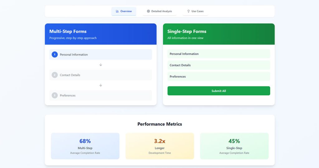
What Is a Multi-Step Form?
A multi-step form is a web form that splits input fields across two or more sequential screens. Each step collects a portion of the total required data before the user moves forward.
You’ve filled one out before, probably without thinking about it. Every time you go through a checkout flow on Shopify or submit an insurance quote through a comparison site, you’re using a multi-step form.
The structure usually follows one of three patterns:
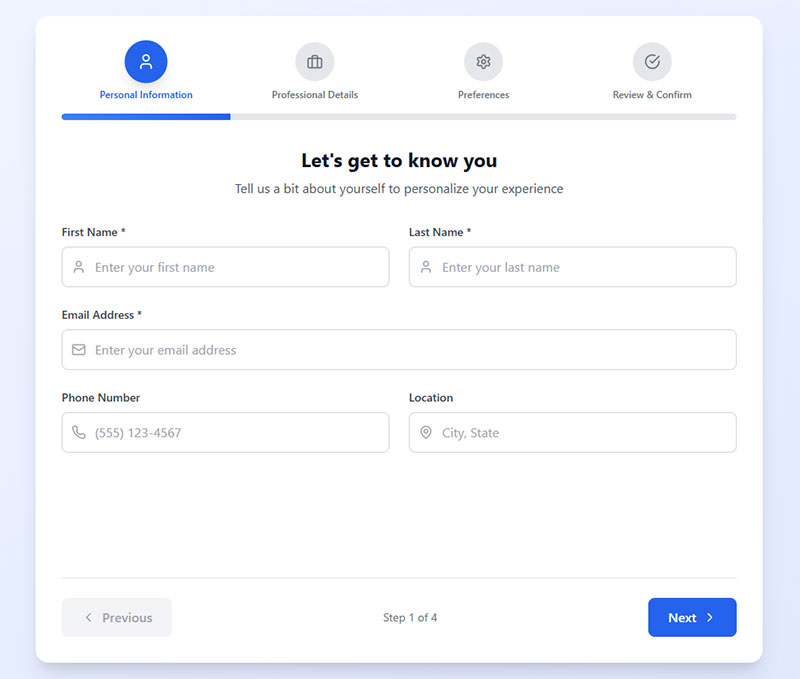
- Wizard-style: separate pages or views with a “Next” button, common in onboarding sequences and SaaS sign-ups
- Accordion: collapsible sections on a single page that expand as the user progresses
- Progress-bar-based: a visual indicator showing how many steps remain, used heavily in e-commerce checkout and registration forms
There’s a difference between a true multi-step form and progressive disclosure. With multi-step, users move between distinct views or page loads. Progressive disclosure just reveals fields on the same page based on earlier input. Both reduce what’s visible at any given moment, but the user experience is different.
Multi-step forms show up most often in high-commitment scenarios. Think mortgage pre-approvals, lead generation forms for B2B SaaS, enterprise software trials, and intake forms for professional services.
HubSpot data shows that only 40% of marketers currently use multi-step forms. But the ones who do see conversion rates that are 86% higher than single-step alternatives. That gap is hard to ignore.
What Is a Single-Step Form?

A single-step form displays every input field on one page or screen. The user fills everything out and hits submit once. Done.
These are the forms you interact with dozens of times a week. Login forms, newsletter sign up forms, quick contact forms, search filters. Anywhere the ask is small and the intent is high.
But “single-step” doesn’t always mean “short.” Some single-step forms have 15 or 20 fields crammed onto one page. A job application, a detailed survey form, a government document. These still technically qualify as single-step, even though the user experience can feel like running a marathon.
The distinction matters: a 3-field subscription form and a 20-field application form are both single-step, but they create completely different levels of friction. Length alone doesn’t determine whether single-step is the right call.
According to Zuko Analytics, the average form conversion rate across all industries sits at just 1.7%. Most of the forms dragging that number down? Long, poorly structured single-page forms that overwhelm users before they even start typing.
How Form Structure Affects Completion Rates
This is where the data gets interesting. And a little counterintuitive for anyone who’s spent years following the “fewer fields = more conversions” rule.
Formstack’s research found that multi-page forms achieve a 13.9% conversion rate compared to 4.5% for single-page forms. That’s more than triple the performance, and it holds up across different industries and form types.
ConversionXL’s research backs this up, showing multi-step forms can boost conversions by up to 300% compared to long, single-page alternatives.
But here’s the thing. Raw numbers without context will get you into trouble.
Completion Rates in Lead Generation Forms
BrokerNotes, a B2C financial lead generation site, switched from a single-step to a multi-step form. Their conversion rate jumped from 11% to 46%. That’s not a marginal gain. That’s a complete transformation of their lead generation funnel.
Venture Harbour saw similar results across multiple properties. Their consulting inquiry form went from a 0.96% conversion rate to 8.1% after switching to multi-step. A 743% increase.
Empire Flippers optimized their multi-step business valuation form with clickable buttons and a progress bar. The result? A 51.6% increase in conversions in just 47 days.
The pattern is consistent for forms that collect 7+ fields. Splitting them into steps works better for designing lead capture forms that actually convert.
Completion Rates in E-Commerce Checkout
Baymard Institute’s 2024 benchmark data tells a more nuanced story for checkout optimization.
The average e-commerce checkout flow is 5.1 steps long and contains 11.3 form fields. That step count has barely changed since 2012.
But Baymard’s research shows that what actually drives abandonment isn’t the number of steps. It’s the total number of form fields users have to deal with. Most sites only need 8 fields for a complete checkout, yet the average displays 11.3.
18% of US online shoppers have abandoned an order specifically because the checkout process was too long or complicated, according to Baymard. And with the average cart abandonment rate sitting at 70.22%, there’s a lot of room to improve through better form structure.
Cognitive Load and User Perception
The numbers above make more sense once you understand what’s happening in the user’s head.
George Miller’s chunking principle (the classic “7 plus or minus 2” rule) explains why we struggle with long forms. Our working memory can only hold a limited number of information chunks at once. A form with 15 visible fields overloads that capacity before the user even picks up their cursor.
Nielsen Norman Group’s research on form UX design outlines four principles for reducing cognitive load: structure, transparency, clarity, and support. Multi-step forms naturally hit on at least two of those. They impose structure through step division and provide transparency through progress indicators.
The sunk cost effect plays a big role here. When someone completes step 1 of a multi-step form, they’ve invested time. Walking away means that time was wasted. Psychologically, users who start a multi-step process feel pulled to finish it.
BJ Fogg’s behavior model helps explain this from another angle. Conversion depends on three things: motivation, ability, and a trigger happening at the same time. Multi-step forms increase perceived ability (each step looks easy) while using the “Next” button as a repeated trigger.
But this doesn’t scale infinitely. Too many steps and the momentum reverses. Users start feeling like they’re stuck in a loop with no clear end point. That’s where progress bar indicators become critical. Baymard Institute’s checkout research shows that visible progress tracking can reduce anxiety and keep users moving forward.
The Manifest’s survey data adds another angle: 27% of users abandon forms because they look too long. That’s a perception problem, not a content problem. Same number of fields, different visual presentation, completely different outcome.
Data Quality and Input Accuracy
Completion rate gets all the attention. But data quality? That’s where multi-step and single-step forms create very different outcomes for your business.
Step-by-Step Validation
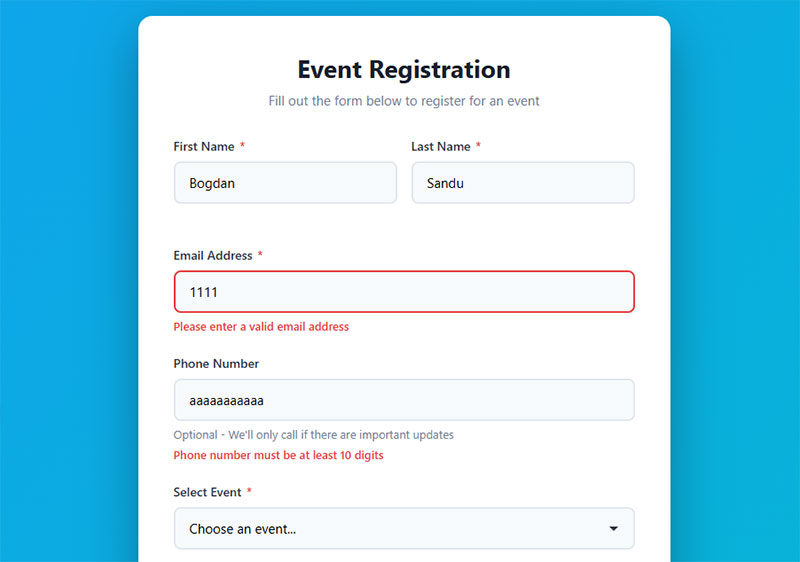
Multi-step forms validate data per step. If someone enters an invalid email on step 2, they see the error immediately. They fix it before moving to step 3. The mistake doesn’t compound.
CXL research found that inline form validation reduces errors by 22% and cuts completion time by 42%. In a multi-step form, that validation happens in smaller, more focused chunks, which makes error correction feel less overwhelming.
Single-step forms often dump all errors at once after the user clicks submit. Took me a while to figure out why users found that so frustrating (it resets the entire context of what they were doing). A wall of red error messages on a 15-field form is one of the fastest ways to kill a conversion.
Full-Picture Review
Single-step forms have one clear advantage here. The user can see all their inputs at once and cross-reference information before submitting. An address that doesn’t match a zip code, a phone number with one digit missing, a date that seems off.
This matters a lot for forms where accuracy of the overall picture is more valuable than per-field correctness. Tax forms, for example. Or any website form that feeds directly into a CRM where bad data creates downstream problems.
There’s a design fix for multi-step forms, though. Adding a review step at the end (step 4 of 4 shows everything) gives users that same ability to check their work. Best of both worlds, if you build it right.
Mobile Performance Differences
Desktop and mobile are two completely different animals when it comes to form completion. And the gap is wider than most people realize.
Zuko Analytics data shows desktop has a 55.5% starter-to-completion rate, while mobile sits at 47.5%. That 8-point gap represents real lost revenue for any business getting significant mobile traffic.
Desktop conversion from view to completion? 37.2%. Mobile? 31.3%. And only 3% of people actually prefer filling out forms on a mobile device, according to The Manifest. But they still have to do it, because mobile now accounts for over 60% of all web traffic.
Why Multi-Step Works Better on Small Screens
A long single-step form on a phone means endless scrolling. Landscape mode with the keyboard open? The keyboard takes up to 70% of the screen. The user can barely see what field they’re filling out, let alone the five fields below it.
Multi-step forms fix this by showing only a few form fields at a time. Each step fits within the viewport. No scrolling past 12 fields while trying to thumb-type on a 6-inch screen.
Mobile forms that are simplified and broken into steps see up to 63% higher completion rates, according to Tinyform’s 2025 UX research. That’s a massive lift just from restructuring the same content.
Load Time and Technical Considerations
Client-side multi-step forms (built with JavaScript, running on a single page load) tend to perform well on mobile because the initial load happens once. Each subsequent step just swaps the visible fields without a new server request.
Server-side multi-step forms (separate page loads per step) can be slower on mobile connections. But they have an advantage: partial data gets saved to the server after each step. If the user’s connection drops mid-form, everything entered up to that point is preserved.
The average checkout time on mobile is 40% longer than on desktop. Every second of added friction matters more on a phone than on a laptop. Whether you’re building WordPress forms or custom solutions, the mobile experience should drive your form structure decisions more than the desktop experience.
When Multi-Step Forms Perform Better
Not every form benefits from being split into steps. But when the conditions are right, the performance gap is significant.
Formstack data shows multi-step forms achieve a 13.9% conversion rate versus 4.5% for single-page equivalents. That gap widens as form complexity increases.
Complex Data Collection

Seven or more fields is the tipping point. Once a form crosses that threshold, single-step layouts start bleeding conversions. Users see the wall of inputs and bounce before typing a single character.
Insurance quote forms, mortgage applications, and enterprise software trials all sit well above that field count. Breaking them into logical groups (personal info, then preferences, then contact details) makes each step feel small.
Tinkoff Bank saw a direct lift in credit card applications after switching to a multi-step format for their online application process.
Conditional Logic Scenarios
Forms with conditional logic are a natural fit for multi-step. When later fields depend on earlier answers, showing everything at once creates confusion.
- A survey form that branches based on user type
- A WordPress form with file upload that only appears for certain selections
- An event registration form where ticket type determines which follow-up questions appear
HubSpot reports that 36% of marketers never run user tests on their forms. The ones who do test conditional multi-step flows consistently see better form fields for capturing high-quality leads.
High-Commitment Transactions
The endowed progress effect works best when stakes are high. Users filling out a detailed lead capture form for a $50,000 software purchase are already motivated. Multi-step structure channels that motivation forward.
Vendio saw a 214% increase in leads after switching from an on-page form to a multi-step format, according to Venture Harbour’s case study data.
When Single-Step Forms Perform Better
Single-step forms win when the ask is small and the user’s intent is high. Splitting a 3-field form into 3 steps would be absurd. It adds clicks without reducing any real friction.
A single-step leave request form works best — it has few fields and users want to complete it quickly without navigating multiple screens.
Short Forms and Quick Actions
Newsletter signups, login screens, and basic contact us pages all work best as single-step. The user knows what they want. Get out of their way.
HubSpot data shows forms with 3 fields hit the sweet spot for most marketers. Over 30% report their highest conversion rates with exactly that count. At this length, multi-step adds friction instead of removing it.
Urgency and Momentum
Donation forms during a fundraiser. Flash sale checkouts. Limited-time opt-in forms tied to an expiring offer.
In these cases, every additional click between “I want this” and “Done” is a potential exit point. Single-step keeps the path short. Pair it with a strong call-to-action and minimal distractions on a focused landing page form, and you’ve got the fastest path to conversion.
B2B Contact Forms
B2B audiences expect directness. A contact form asking for name, email, company, and message doesn’t need a wizard. Your mileage may vary, but I’ve seen B2B contact forms outperform lead generation forms that tried to do too much.
Ruler Analytics data puts B2B services form conversion rates at 2.2%. Keeping those forms simple and single-step respects the professional’s time.
How to A/B Test Form Structure
Gut feelings about form structure are wrong about as often as they’re right. Testing is the only way to know what actually works for your specific audience.
HubSpot reports that marketers who A/B test their forms see conversion rates 10% higher on average. And yet, 36% of marketers never run tests on their forms at all. That’s a lot of missed opportunity.
What to Measure
Completion rate is the obvious metric. But it’s not the only one that matters.
Field-level drop-off: Which specific field causes people to leave? Zuko Analytics data shows that password fields have the highest abandonment rate at 10.5%, followed by email (6.4%) and phone number (6.3%).
Time-to-complete: A form that converts at the same rate but takes half the time is better for user experience. Checkout forms average 3 minutes and 21 seconds to complete, according to Zuko Analytics.
Data quality score: Are you getting valid emails, real phone numbers, complete addresses? High completion with garbage data is worse than lower completion with clean data.
Tools and Setup
Google Analytics 4 event tracking can measure step-by-step progression through multi-step forms. Hotjar and Crazy Egg provide heatmaps and session recordings that show exactly where users struggle.
- Zuko Analytics specializes in form-level analytics with per-field drop-off tracking
- Optimizely and VWO handle A/B test deployment and statistical significance calculations
- Typeform and Formstack have built-in analytics dashboards for their respective types of forms
Only 1 in 7 A/B tests reach statistical significance, according to TrueList. Run your test long enough to collect at least 100 conversions per variation before making decisions.
Common Testing Mistakes
Changing too many variables at once. If you switch from single-step to multi-step AND redesign the fields AND change the copy, you won’t know what caused the result.
Test one thing: the structure. Keep fields, copy, and design identical between variants. Run the test during a normal traffic period, not during a seasonal spike or promotional campaign.
Implementation Patterns and Technical Considerations
The decision between multi-step and single-step doesn’t end at the design phase. How you build it affects performance, data integrity, and form accessibility.
Client-Side vs. Server-Side Multi-Step
Client-side multi-step (built with React Hook Form, Formik, or vanilla JavaScript) keeps everything on one page. Fast transitions, no server round-trips. But if the browser tab closes, all progress is lost unless you build in local state management.
React Hook Form is the lighter option at 27.9kB bundled, with no dependencies and fewer re-renders per field change. Formik offers more built-in features but weighs in at 44.34kB and re-renders the entire form on each input change, according to LogRocket’s comparison data.
Saving Partial Data
This is where a lot of multi-step implementations fall short. If a user completes 3 of 4 steps and leaves, do you keep that data?
Server-side saves after each step give you the most reliable partial data capture. Formsort research shows that 20% of partial form responders will come back and finish if you send them a link to their incomplete form.
For WordPress forms, plugins like Gravity Forms and WPForms offer form abandonment add-ons that save partial entries automatically. These work well for improving form abandonment rates without custom development.
Accessibility Requirements
WebAIM’s 2025 Million analysis found 34.2% of form inputs across the top million websites were not properly labeled. Multi-step forms make this problem worse if developers don’t handle focus management between steps.
WCAG 2.2 compliance for multi-step forms requires:
- ARIA landmarks and role attributes that announce step changes to screen readers
- Focus management that moves keyboard focus to the first field of each new step
- Progress indicators with proper
aria-valuenowandaria-valuemaxattributes
Single-step forms are simpler to make accessible. One page, one set of labels, one submit button. If accessibility is a primary concern and your form is short, single-step removes a layer of complexity. For long forms where multi-step is the better UX choice, follow the HTML form best practices for semantic markup, and test with NVDA or VoiceOver before shipping.
There were 4,605 ADA website lawsuits filed in 2024, with 92% citing WCAG standards, according to AllAccessible. Form security and accessibility aren’t optional features. They’re legal and ethical requirements.
FAQ on Multi-Step Forms Vs Single-Step Forms
What is the difference between a multi-step form and a single-step form?
A multi-step form splits input fields across multiple screens or pages. A single-step form shows every field on one page. The right choice depends on how many fields you need and what data you’re collecting.
Do multi-step forms convert better than single-step forms?
For forms with 7+ fields, yes. HubSpot data shows multi-step forms convert 86% higher than single-step alternatives. But for short forms under 5 fields, single-step usually wins because extra clicks add unnecessary friction.
When should I use a single-step form instead?
Use single-step for login screens, newsletter signups, basic contact us page templates, and any form with fewer than 5 fields. High-intent users on these forms want speed, not guided steps.
How many fields are too many for a single-step form?
Research from Baymard Institute suggests most checkout flows only need 8 form fields. Beyond that threshold on a single page, users feel overwhelmed. Consider splitting into steps once you pass 6 or 7 visible fields.
Do progress bars improve multi-step form completion rates?
Yes. Progress indicators reduce user anxiety by showing how much remains. They tap into the endowed progress effect, where people who see visible progress feel motivated to finish. Always include one in your multi-step form design.
Are multi-step forms better on mobile devices?
Generally, yes. Small screens make long single-step forms painful to scroll through. Multi-step shows fewer fields per view, which fits mobile viewports better. Zuko Analytics data shows mobile form completion lags desktop by about 8 percentage points.
How do I reduce form abandonment on multi-step forms?
Start with low-friction questions first. Save sensitive fields like email and phone for later steps. Use inline validation per step and add a visible progress bar. Saving partial data also helps recover users who leave mid-form.
Can I A/B test multi-step against single-step forms?
Absolutely. Tools like Optimizely, VWO, and Google Analytics 4 event tracking let you compare both structures. Keep fields and copy identical between variants. Only change the structure so you know exactly what caused any difference in conversion rate.
What are the accessibility concerns with multi-step forms?
Multi-step forms need proper ARIA attributes, keyboard focus management between steps, and screen reader announcements for step transitions. WebAIM’s 2025 analysis found 34.2% of form inputs across top websites lacked proper labels. Single-step forms are simpler to make accessible.
Which form builders support multi-step forms?
Typeform, Gravity Forms, and WPForms all support multi-step natively. For custom builds, React Hook Form handles multi-step well with minimal re-renders. Form builders with conditional logic make it easier to create dynamic step sequences.
Conclusion
The choice between multi-step forms vs single-step forms isn’t about picking a side. It’s about matching your form structure to the complexity of what you’re asking users to do.
Long forms with conditional logic, file uploads, and mixed input types belong in a multi-step layout. Short, high-intent forms like signups and web forms for quick contact belong on a single page.
The data consistently shows that form completion rates improve when cognitive load drops. Whether that means fewer visible fields per step or fewer total fields on one screen depends entirely on your use case.
Don’t guess. Run an A/B test with tools like VWO or Hotjar. Track field-level drop-off, not just overall conversion. Measure micro conversions at each step.
The best form is the one your users actually finish. Start with the research, test against real behavior, and let your form conversion data guide the decision.
