




Most form tutorials show you what’s possible. This one shows you what actually works. The State of CSS 2024 survey puts Tailwind CSS at 62% developer usage. More teams are…
Table of contents
Most roundups labeled “contact form examples” are just screenshots of empty templates. Pulling from a live site instead gets you something different: the actual field order, and what happens the moment validation catches a typo. You also see what a visitor sees the second after they hit submit, which a static image never shows.
Design teams and WordPress site owners check these before building a contact page, comparing field count and layout against forms already live on comparable sites. That comparison ends up mattering most for small business and SaaS sites, where the form is often the only path from a visitor to an actual lead.
Contact forms don’t ask for much, either. Four fields on average, fewer than any of the other six form types Formstack tracked, and they convert at just 1%, according to the company’s 650,000-account Form Conversion Report (2015).
What Fields Appear in a Contact Form?
Name, email, subject, and message make up the typical four-field default, stacked top to bottom in that order. Anything past that only earns its spot when there’s an actual reason for it.
Core Fields Every Contact Form Needs
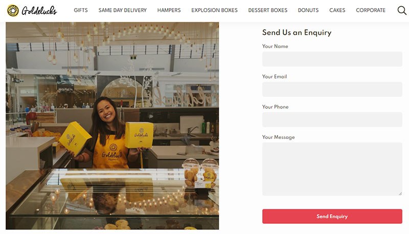
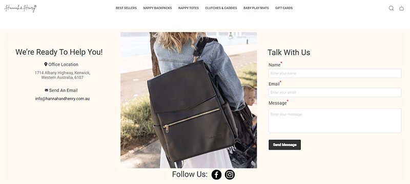
The baseline barely changes from form to form: a name field, usually one text input rather than split first-and-last boxes, an email field the form genuinely can’t function without, and a message field sized for a few sentences rather than a full page. Everything else in the field library, subject lines, dropdowns, phone numbers, gets layered on top of this baseline, not swapped in instead of it.
Field order follows a logic most people never actually question. Email sits near the top because it’s the one piece of data that makes the whole submission usable in the first place, and losing it to a typo further down the form costs the entire inquiry, not just that field.
Optional Fields That Depend on Use Case
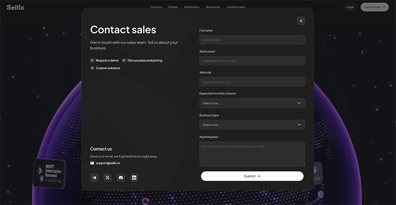
Each optional field needs a reason to be there before it gets added.
- Dropdown for inquiry type
- Phone number field
- File upload
- Checkbox for newsletter opt-in
There’s genuine disagreement on how to label required versus optional fields, and it doesn’t fully resolve. Baymard Institute’s checkout usability research leans toward marking whichever fields are the exception on a given form (often just the optional ones, since most fields are usually required), arguing that an asterisk on every single field adds visual noise without much payoff.
Nielsen Norman Group pushes back on that. Their position is that marking only the optional fields still leaves people guessing at what’s actually required, so they recommend an explicit “required” label or asterisk instead, spelled out rather than implied.
Neither organization has published a study tying a specific conversion lift to either approach, so honestly, picking one convention and sticking with it consistently across the whole form probably matters more than which one gets picked.
Checkbox and radio button fields get confused often. A checkbox lets someone pick more than one option, a radio button forces just one, and mixing them up is a common enough contact form mistake that it’s worth double-checking before launch.
A phone number field is the one worth a second thought. Making it optional rather than required tends to lift completion without losing leads who actually want a callback.
What Layout Styles Do Contact Forms Use?
Single-column, multi-step, inline, and popup or modal cover almost every contact form layout on the web. Contact forms convert at an average of 38%, well behind application forms at 75%, according to Crazyegg’s 2026 form statistics report, and layout choice is one of the biggest levers behind that gap.
Single-Column Layout
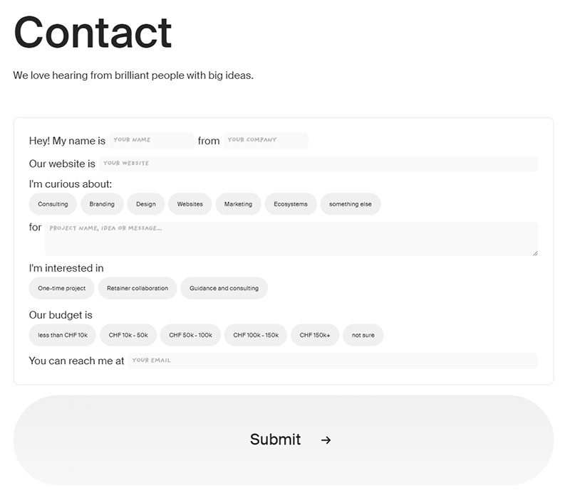
One field per row, top to bottom, no side-by-side pairing. It reads left to right without any visual guesswork, which is why most support and contact pages default to it.
Scanning order stays predictable start to finish, and mobile and desktop end up looking basically the same. It’s also the easiest layout to hand-code without reaching for a framework. The downside shows up once a form passes five or six fields: the page just gets long, and all that unused horizontal space on a wide monitor starts to feel like a waste.
Multi-Step Layout
Fields split across two or more screens, usually with a progress indicator at the top. Multi-step form examples typically open with the easy fields, name and email, then save the harder questions for whichever screen comes later.
Because only a handful of fields show at once, the whole thing feels shorter than it actually is, and there’s room to show conditional fields that only make sense for some visitors. That flexibility costs something too: every extra screen is a place someone can bail, and building it takes more development work than a form that just scrolls.
Inline Layout
Fields sit directly inside a page’s content, not boxed off in a card or sidebar. A common example is a blog post that ends with a two-field email capture, styled to read like part of the article instead of an ad bolted onto the bottom.
It blends in well, which is the whole appeal, though that same low profile means it’s easy to miss if the design doesn’t make it stand out, and harder to reuse consistently across different pages.
Popup and Modal Layout
Popups interrupt. That’s the whole design philosophy in two words.
A popup form drops over the page content, set off by a click, a timer, or the moment someone’s cursor heads for the browser’s close button. Whether it beats an inline form usually comes down to how aggressive the actual goal is.
It’s hard to miss, which works in its favor for something with one clear conversion goal, a newsletter signup being the obvious case.
On a support or contact page it tends to feel out of place instead, mostly because the visitor already came looking for the form and didn’t need to be stopped first. Mobile makes the whole thing riskier, too. A modal that’s even slightly clumsy to close turns from a conversion tool into the reason someone leaves the page.
How Does Contact Form Validation Work?
Validation checks what someone typed before the form lets it through, catching a missing email or an empty required field before it reaches an inbox. Most forms run this in layers, and the layer someone actually notices first is the error message itself.
A good error message shows up next to the field the moment something’s wrong, not after the whole form gets rejected. WPForms’ 2024 roundup of form statistics found inline field-level validation cuts form errors by an average of 22% compared to validating only after a full submit attempt, citing research from CXL.
Client-Side Validation vs Server-Side Validation
Client-side validation happens right in the browser, usually the instant a field loses focus or someone clicks submit. HTML5’s required attribute covers the simple cases well enough on its own. JavaScript picks up the slack for anything more specific, like checking that an email actually matches a real pattern.
None of that holds up if someone turns JavaScript off, though, which is exactly why server-side validation exists: a second, mandatory layer that runs after submission, since client-side checks alone can be skipped entirely just by disabling JavaScript in the browser.
| Layer | Runs where | Catches | Can be bypassed |
|---|---|---|---|
| Client-side | Browser | Empty fields, format errors | Yes, with JavaScript off |
| Server-side | Server | Malicious input, spoofed data | No |
How Do Contact Forms Block Spam?
Honeypot fields, CAPTCHA challenges, CSRF tokens, and rate limiting handle most contact form spam between them, and none of them work as well alone as they do stacked together.
A honeypot field is a hidden input a real visitor never sees, but a bot fills it in anyway because bots tend to scan and complete every field they find on a page. CAPTCHA and reCAPTCHA work differently, throwing up a visible or invisible challenge built to separate human behavior from scripted behavior.
CSRF tokens do their work behind the scenes: a unique value gets generated every time the form loads, and any submission that shows up without a matching token gets treated as forged.
Rate limiting rounds things out by capping how many submissions one IP address can push through in a given window, catching the volume-based bots the other three sometimes miss.
Setting up a honeypot costs nothing in user friction, since a real visitor never sees the field to begin with. Google’s reCAPTCHA remains the most common challenge-based option, and adding it to a WordPress contact form usually takes a plugin setting rather than custom code.
Automattic’s Akismet plugin, built originally for filtering WordPress comments, gets pointed at contact forms too, checking submissions against a constantly updated spam database.
What Makes a Contact Form Accessible?
An accessible contact form works the same way for a screen reader user as it does for someone clicking through with a mouse. That means every field carries a real label, not placeholder text pretending to be one. Focus states need to stay visible too. And when something goes wrong, the error has to actually get announced to assistive tech, not just show up in red somewhere on the page.
WebAIM’s 2026 Million report found missing form input labels on 51% of home pages tested, one of the more fixable failures on the list.
| Requirement | What it covers |
|---|---|
| WCAG conformance | Level AA is the common target for form controls |
| ARIA labeling | Announces field purpose to screen readers |
| Keyboard navigation | Every field and button reachable without a mouse |
| Error announcement | Assistive tech hears the error, not just sees it |
None of this requires exotic tooling. Matching a visible label to its input with a proper for and id pairing solves most of what WebAIM’s data flags, and it connects to form accessibility best practices more broadly, which cover contrast ratios and focus order in more depth than a single section here can.
Government websites tend to score better on this than most industries, largely because legal requirements force the issue instead of leaving it to preference.
Which Contact Form Platform Should You Use?
The realistic options come down to a WordPress plugin, a hosted no-code builder, custom code, or a CRM-connected form wired straight into a sales pipeline. Which one actually fits depends less on preference than on how much control the build needs, and who’s stuck maintaining it after launch.
| Platform | Type | Best fit | Built-in spam protection |
|---|---|---|---|
| WPForms | WordPress plugin | Small business, quick setup | Yes, honeypot and reCAPTCHA |
| Gravity Forms | WordPress plugin | Complex, multi-step workflows | Yes, honeypot and reCAPTCHA |
| Typeform | Hosted no-code builder | Conversational, one-question forms | Limited, account-level filtering |
| Webflow Forms | Built-in site builder element | Sites already built in Webflow | Basic, honeypot only |
WordPress contact form plugins cover most of this market. WPForms alone runs on more than 6 million active sites and appears on 1.12% of the top 1 million websites, per BuiltWith data cited in WPBeginner’s 2026 WordPress report. Contact Form 7, the free alternative most WordPress users meet first, is installed on more than 10 million sites according to the WordPress.org plugin directory.
No-code builders like JotForm, Google Forms, and Wix Forms skip hosting and server setup entirely, trading design control for speed. Custom code stays relevant for teams that want a form matching their exact design system rather than a plugin’s defaults.
Building a WordPress form without a plugin means writing the HTML by hand and wiring up validation yourself. Mail delivery still has to get handled on top of that, and it’s usually the piece that breaks first.
CRM-connected forms, the kind HubSpot and Salesforce offer, write straight into a lead record the moment someone submits, skipping the inbox step entirely.
What Contact Form Examples Work Best by Industry?
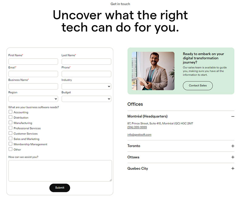
Field requirements shift by industry, mostly because a bad lead costs a different amount depending on what’s being sold. Two fields might be plenty for a SaaS company to qualify someone. Real estate is a different story: an agent usually needs three or four just to route the inquiry to the right listing, since “interested” doesn’t mean much without knowing which property.
SaaS Contact Forms
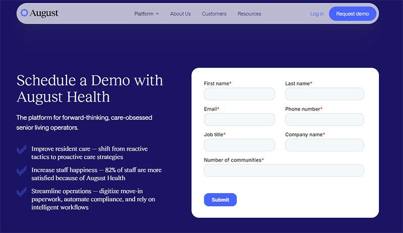
SaaS demo-request forms tend to work best kept short, and the data backs that up. Demo-booking forms peak in completion at 4 to 6 fields, according to Crazyegg’s 2026 form statistics report. That usually means a work email field to filter out personal Gmail addresses, plus company name and something like a team size or use case dropdown, enough for sales to gauge fit before anyone picks up the phone.
Field choices for SaaS lead generation lean toward qualification over volume, since a sales team would rather call five real prospects than fifty tire-kickers.
Ecommerce Contact Forms
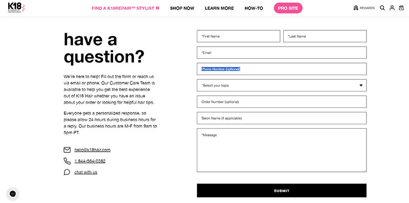
Ecommerce support forms usually open with an order number field instead of a name field, flipping the order most other industries default to. An issue-type dropdown (shipping, returns, billing, product question) routes the ticket before a human ever has to read it.
Shopify’s own contact template follows exactly this pattern, asking for the order number before it asks for the message itself.
Real Estate Contact Forms
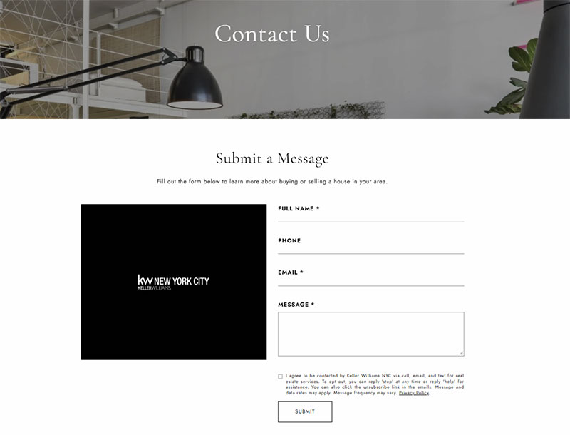
Real estate inquiry forms carry a property reference field most other industries skip entirely.
A preferred contact time field shows up often too, since real estate lead generation works around showings and open houses rather than a nine-to-five schedule.
A property ID paired with a budget range dropdown is a common combination, and it tends to pre-qualify someone before the first phone call even happens.
Restaurant and Local Business Contact Forms
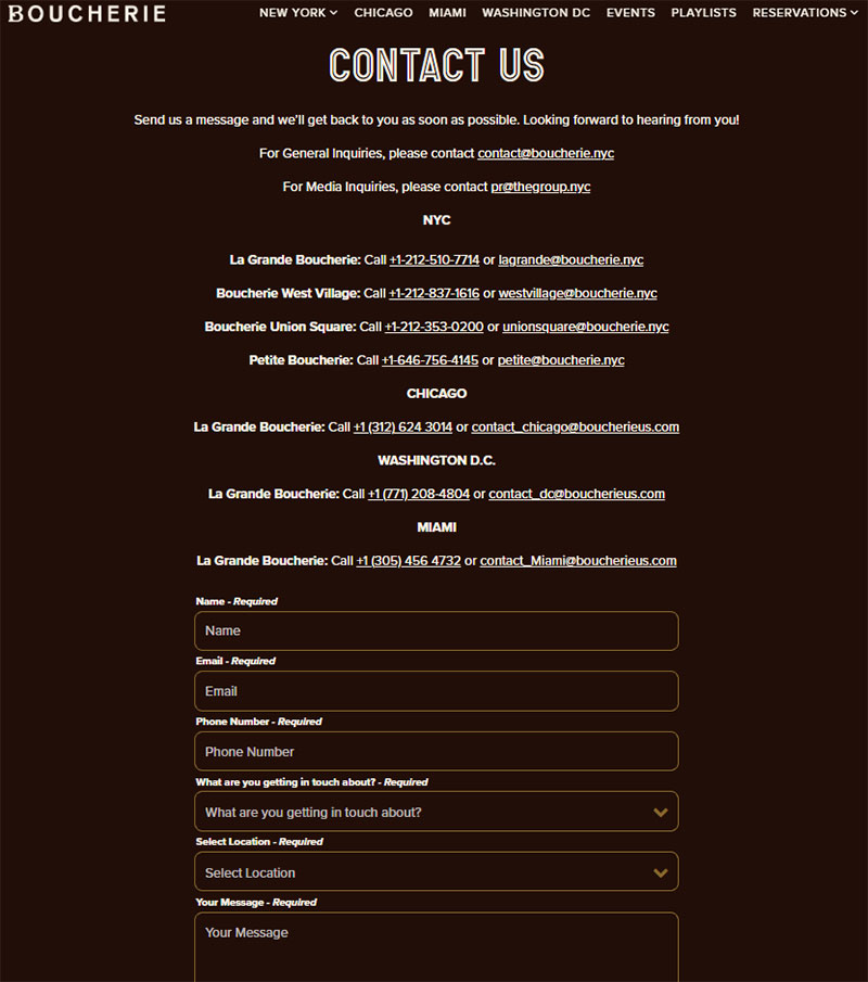
Subject and message mostly disappear here, replaced by date, time, and party size. A general contact form still exists on most restaurant sites, but the reservation form is the one that actually gets used. OpenTable and similar reservation platforms built an entire business around this narrower field set.
What Design Elements Increase Contact Form Conversions?
Design choices move completion rates more than most teams assume. A handful of decisions, field count, CTA wording, microcopy and trust signals, visual hierarchy, end up doing most of that work.
Button copy matters more than most teams give it credit for. Wording that implies exclusivity, phrases like “be the first” or “members only,” lifts completion by 10.6%, according to Typeform’s 2025 Lead Capture Form Report. A generic “Submit” button just doesn’t do much to motivate anyone by comparison, and testing call to action wording against whatever the default label is remains one of the cheapest experiments a team can run.
Microcopy near the submit button, a line like “we reply within one business day,” reduces the uncertainty that stops someone from finishing. Visual hierarchy matters just as much as the wording does. A form buried below three paragraphs of marketing copy gets skipped even when the fields themselves are short.
Most of these fixes fall under general form conversion practice rather than anything specific to contact pages.
Field Count and Completion Rate
HubSpot’s own analysis of more than 40,000 customer landing pages found the drop-off isn’t a straight line.
Conversion peaked at three fields, just over 25%, then fell sharply, nearly by half, the moment a fourth field was added. Past that point the decline flattens out considerably, and a ten-field form converts only somewhat worse than a one-field form.
Either way, the practical move stays the same. Keep a first-touch form to three or four fields, and make anything past that earn its place.
Multi-step layouts are often pitched as the fix for longer forms, but the most-quoted number behind them deserves a caveat.
The claim that multi-step forms convert 86% higher than single-step forms, cited widely (including in WPForms’ own 2024 statistics roundup), traces back to a small 2019 HubSpot survey of just 173 marketers, only 40% of whom used multi-step forms at all.
A 2026 review of form statistics flagged other findings from that same survey, like conversion supposedly rising with every additional field, as implausible. Treat the 86% figure as an outdated, weakly-sourced number rather than a reliable benchmark.
Multi-step forms can still lower perceived effort by showing fewer fields per screen at once, but the actual lift depends heavily on the specific form and audience.
How Do You Build a Contact Form Step by Step?
Building a working contact form comes down to the same six steps no matter which platform you’re on. Skipping one of them is usually why a “finished” form breaks in production.
- Pick the route. WordPress plugin, no-code builder, or custom code, based on how much control the build needs.
- Add and order the fields. Name and email first, message last, optional fields only where justified.
- Set validation rules. Mark required fields, add format checks for email and phone.
- Add spam protection. A honeypot field at minimum, reCAPTCHA if the site gets targeted traffic.
- Connect submission delivery. Route the data to an inbox, a CRM, or an automation tool.
- Test across devices and with a screen reader. Submit the form from a phone and from a keyboard only, before calling it done.
Step five trips up more builds than any other. A form can validate perfectly and still fail silently if the email settings behind it are misconfigured.
Once the form is live, tracking submissions in Google Analytics confirms it’s actually converting, not just sitting there.
None of these steps need the same tool twice, either. A team might build the form in WPForms, filter spam with something else entirely, then route final delivery through a dedicated mail service on top of that.
When Does a Contact Form Not Work?
A contact form is not the right tool everywhere, and pretending otherwise creates worse outcomes than just picking a different channel.
When a Different Contact Method Works Better
A form isn’t the right default in a few recurring situations. High-urgency support is one, since a live answer beats a queued message when someone’s account is locked and they’re losing money by the minute. Complex, multi-variable requests, a custom software quote being the classic example, rarely fit cleanly into form fields either. And on a very low-traffic page, the form’s own upkeep can end up costing more than it ever brings back.
Live chat or a phone number outperforms a form whenever response speed decides whether the visitor stays a customer. The broader chatbots vs forms comparison covers this trade-off in more depth, including where a hybrid setup, form for records, chat for speed, still makes sense.
Intercom, a company built around in-app messaging, replaced its own contact forms with live chat years ago, betting that speed mattered more than structure.
When a Contact Form Technically Breaks
A form that looks fine can still fail completely, and the visitor rarely finds out. A misconfigured SMTP connection lets someone submit successfully while the message never reaches an inbox.
WPForms not sending email is one of the most common support threads on the plugin’s own forums, almost always traced back to hosting-level mail delivery, not the form itself.
A handful of other failure points tend to repeat across different sites. Ad blockers strip the form’s JavaScript before it even loads, for one.
Caching plugins are another common culprit, serving up a stale version of the page that’s still carrying an expired CSRF token. Then there’s the routine plugin update that quietly renames a field’s name attribute, breaking the mail template that still references the old one without throwing any visible error.
None of these show up in a quick visual check. They only surface once someone tests the form end to end.
What Contact Form Mistakes Lower Submission Rates?
Most contact form problems come from a short, repeatable list of mistakes, and none of them require a redesign to fix, just attention.
| Mistake | Effect | Fix |
|---|---|---|
| Too many fields upfront | Higher abandonment before the first field gets filled | Cut to name, email, message; add fields only when justified |
| No inline validation | Errors surface only after a full submit attempt | Validate field by field, as the visitor types |
| Aggressive CAPTCHA | Real visitors get blocked along with bots | Start with a honeypot, add CAPTCHA only if spam persists |
| No confirmation message | Visitor resubmits or assumes the form failed | Show a clear success message or redirect to a thank you page |
Aggressive CAPTCHA might be the costliest mistake of the four, mostly because it blocks real visitors silently, not just the bots it’s supposed to be stopping. A challenge tuned too strict rejects visitors on shared IP addresses (offices, universities, coffee shops) right alongside the bots it’s meant to catch.
Improving form abandonment rate usually comes down to removing friction one field or one confusing step at a time, not a full rebuild.
Input sanitation gets skipped more often than it should, especially on custom-coded forms built without a framework’s built-in protections. Sanitizing user input stops a stray script tag or SQL fragment from doing damage after it clears validation.
FAQ on Contact Forms
What Is the Difference Between a Contact Form and a Lead Generation Form?
The difference between contact forms and lead generation forms really comes down to intent. A contact form collects a general inquiry: name, email, message, nothing more specific than that. A lead generation form asks for more, qualifying details like company size or budget, and what it collects feeds a sales pipeline rather than landing in a support inbox.
How Are Contact Form Submissions Delivered to an Inbox or CRM?
Most forms send submissions by email through SMTP, straight to a designated inbox. Others push data directly into a CRM like HubSpot or Salesforce through a native integration or a webhook, skipping the inbox step and writing the lead record immediately.
Is a Multi-Step Form Better Than a Single-Page Form for Lead Generation?
For lead generation specifically, yes, multi-step usually wins. Splitting fields across screens lowers the perceived effort and lets qualifying questions wait until someone is already invested. For a plain three-field contact form, though, the extra clicks of a multi-step layout rarely pay off.
Should a Contact Form or a Live Chat Widget Be Used on a Support Page?
It depends on urgency and volume. A support page with time-sensitive issues, account lockouts, billing errors, benefits from live chat’s instant back-and-forth, while lower-traffic or document-heavy requests still work fine with a plain contact form.
Do Contact Forms Need a GDPR Consent Checkbox on Every Site?
Only if the site collects personal data from EU visitors and uses it beyond replying to the inquiry, like adding the address to a marketing list. A simple support form that replies once usually skips the separate checkbox.
What Happens to a Contact Form if JavaScript Is Disabled?
Inline, real-time validation stops working since it runs through JavaScript, and any form submitting through AJAX without a fallback fails silently. A form built with progressive enhancement still submits normally, because the HTML5 required attributes and the server-side check still run without a script.
Where Should You Start When Building From Contact Form Examples?
Contact form examples work best as a starting checklist, not a finished blueprint. Field structure gets settled first: name, email, and message locked in before any layout, validation, or spam-protection decision gets made, since every later choice ends up building around whatever the fields already are.
Building spam protection last means junk submissions reach the inbox during the first few days live, a cost most teams accept in exchange for shipping a working form faster rather than a perfect one.
This build order holds as of August 2026. A shift toward chat-first capture, already reshaping SaaS lead forms, moves qualification ahead of any static field, so that order won’t necessarily stay fixed forever.
The surrounding page matters just as much once fields and validation are locked. That’s covered in contact us page examples, which places the same form inside a full page: headline, map, trust signals, the works.