


Most form tutorials show you what’s possible. This one shows you what actually works. The State of CSS 2024 survey puts Tailwind CSS at 62% developer usage. More teams are…
Table of contents
“This field is required.”
That single line of text has killed more form conversions than slow load times and bad button colors combined.
Vague, unhelpful error messages frustrate users and push them to abandon your forms entirely. Zuko Analytics data shows that 55% of people who start a form never finish it, and poor error handling is a major reason why.
This guide breaks down real form error message examples across email fields, passwords, payment inputs, required fields, and multi-step flows. You’ll see what the best implementations from Stripe, Google, and the GOV.UK Design System actually look like, along with before-and-after rewrites you can apply to your own forms today.
What Is a Form Error Message?
A form error message is a short piece of text that tells users their input doesn’t meet a field’s validation requirements. That’s it. Nothing fancy.
You’ve seen them a thousand times.
- “Please enter a valid email address.”
- “Password must contain at least 8 characters.”
These micro-texts sit between a user completing your form and bouncing off your page entirely.
Zuko Analytics data shows that 55% of people abandon forms before finishing them. And the password field alone triggers a 10.5% drop-off rate, higher than any other common input. A lot of that friction comes down to how (and when) errors get communicated.
There are three main patterns for displaying these messages:
- Inline validation errors appear directly below or beside the input field the moment something goes wrong
- Error summary blocks group all problems at the top of the page after submission, typically with anchor links to each problematic field
- Toast notifications pop up briefly as floating alerts, though these are less common for form-specific errors
The GOV.UK Design System uses a combination approach. They show an error summary at the top of the page AND inline messages next to each field. The summary includes anchor links so users can jump straight to the problem. That dual-display pattern has been tested extensively across UK government services.
From an accessibility standpoint, WCAG Success Criterion 3.3.1 (Error Identification) requires that errors be described to users in text. Color alone won’t cut it. Red borders without an accompanying message fail this criterion, and the 2024 DOJ rule formally adopted WCAG 2.1 Level AA as the standard for ADA Title II compliance.
The bottom line: error messages aren’t just UI decoration. They’re the difference between a completed submission and an abandoned form.
Form Error Message Examples
General form errors
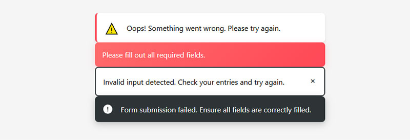
- Oops! Something went wrong. Please try again.
- Please fill out all required fields.
- Invalid input detected. Check your entries and try again.
- Form submission failed. Ensure all fields are correctly filled.
- Some fields are missing or contain errors. Please review the form.
Username or email error messages
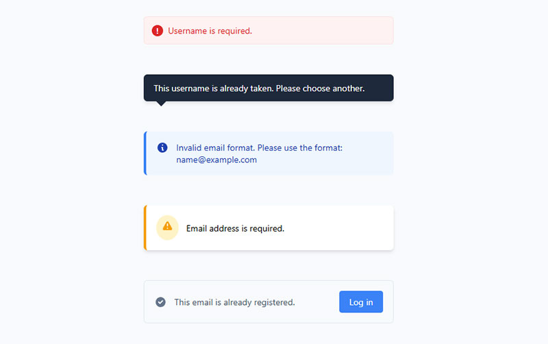
- Username is required.
- This username is already taken. Please choose another.
- Invalid email format. Please use the format: [email protected].
- Email address is required.
- This email is already registered. Try logging in instead.
Password errors
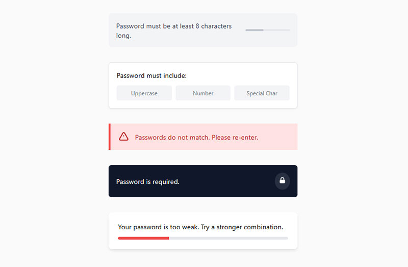
- Password must be at least 8 characters long.
- Password must include at least one uppercase letter, one number, and one special character.
- Passwords do not match. Please re-enter.
- Password is required.
- Your password is too weak. Try a stronger combination.
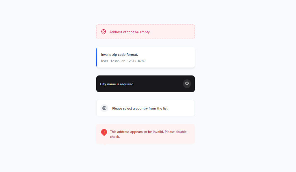
Address or location errors
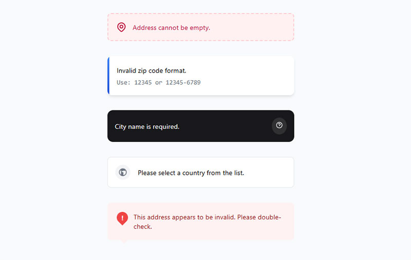
- Address cannot be empty.
- Invalid zip code format. Use 12345 or 12345-6789.
- City name is required.
- Please select a country from the list.
- This address appears to be invalid. Please double-check.
Phone number errors
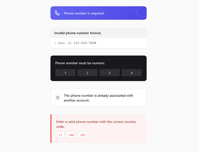
- Phone number is required.
- Invalid phone number format. Use +1 123-456-7890.
- Phone number must be numeric.
- This phone number is already associated with another account.
- Enter a valid phone number with the correct country code.
Date or time error messages in forms
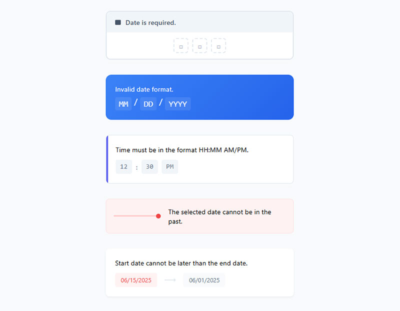
- Date is required.
- Invalid date format. Use MM/DD/YYYY.
- Time must be in the format HH:MM AM/PM.
- The selected date cannot be in the past.
- Start date cannot be later than the end date.

What Makes a Form Error Message Effective?
Bad error messages share the same DNA. They’re vague, they blame the user, and they don’t tell anyone what to do next.
“Invalid input” means nothing. “Error” means even less. Took me a while to realize that writing error text is a real content design skill, not an afterthought you toss to a developer at the end of a sprint.
Specificity Over Vagueness
The GOV.UK Design System puts it plainly: error messages should explain what went wrong and how to fix it. “Enter your full name” works. “This field is required” is a lazy fallback.
CXL research found that inline form validation produced a 22% increase in success rates and a 42% decrease in completion times when users got specific, actionable feedback. Luke Wroblewski’s study at A List Apart backed this up with eye-tracking data showing fewer fixations on forms with clear inline messages.
The UK Parliament Design System even recommends including language from the field’s label inside the error message. If the label says “Date of birth,” the error should say “Enter your date of birth” instead of just “Enter a date.”
Tone and Blame Framing
“You failed to enter a valid phone number.” Nobody wants to read that.
Neutral, instructional language works better. “Enter a phone number, like 555 0123” removes blame entirely. The user doesn’t feel scolded, and they know exactly what format you expect.
Some teams go further and inject personality into error copy. Mailchimp has done this well for years. But personality should never come at the cost of clarity. A joke that obscures the fix is worse than a boring message that gets the job done.
Placement and Timing
When to show the error matters almost as much as what it says.
Luke Wroblewski’s testing showed that validating fields after the user finishes typing (on blur) worked better than validating while they’re still typing. Premature error messages frustrated users and actually increased error rates.
The GOV.UK Design System explicitly recommends against validating when a user moves away from a field. Their pattern waits until the user clicks “Continue” or “Submit.” At least in their context, with government forms, that approach tested well. Your mileage may vary depending on form complexity.
Nielsen Norman Group’s 2024 guidelines recommend inline validation where possible, with error messages placed below or next to the field. They also suggest a subtle pulse animation on error icons to draw attention, though they caution against overdoing animation when multiple errors appear simultaneously.
Email Validation Error Message Examples
Email is probably the most validated field on the internet. And most sites still get it wrong.
Zuko Analytics data shows the email field carries a 6.4% abandonment rate, making it one of the top three drop-off points after password and phone number. A chunk of that comes from unclear or overly strict validation.
Common Email Error Patterns
Missing @ symbol: “Please include an ‘@’ in the email address.” Chrome’s built-in HTML5 validation actually says this verbatim, which is… okay. Not great. A better version would be: “Enter an email address in the format [email protected].”
Missing domain: “Enter a complete email address, including the part after @.” This is what Shopify uses on their signup forms. Direct, no guesswork.
Typo suggestions: Google and Mailchimp both implement “Did you mean gmail.com?” prompts when someone types “gmial.com” or “gamil.com.” These feel almost magical. I’ve seen developers struggle with the regex for this, but libraries like mailcheck.js handle it cleanly.
Disposable email rejection: Some lead generation forms block temporary email addresses from services like Guerrilla Mail. If you do this, tell the user why. “Please use a permanent email address” is better than a generic “Invalid email.”
Inline vs. On-Submit Email Errors
For email fields specifically, inline validation makes a lot of sense. The format rules are simple and client-side checkable. You don’t need a server round-trip to know that “john@” is incomplete.
But here’s where it gets tricky. Validating while the user types creates false errors. Someone typing “john@gm” hasn’t finished yet. The “after” method (validating when the user tabs away from the field) avoids this problem.
Stripe handles this well on their payment forms. The email field validates after blur, shows a red outline with a message below, and clears the error state as soon as the user starts editing again. Clean, predictable, no surprises.
Password Field Error Message Examples
Password fields are the single biggest source of form friction. That 10.5% abandonment rate from Zuko’s data isn’t an accident.
Most password validation involves multiple rules stacked together: minimum length, uppercase, lowercase, numbers, special characters. Communicating all of those requirements clearly, before and during input, is where most form design falls apart.
The Checklist Pattern
Apple, Microsoft, and WordPress all use a variation of the same approach: show all password requirements upfront as a checklist, then check them off in real time as the user types.
Apple’s iCloud signup shows requirements like:
- At least 8 characters
- Upper and lowercase letters
- At least one number
Each item gets a green checkmark when satisfied. This is instant inline validation done right, because the user is working toward a goal, not recovering from an error.
Password Strength Indicators vs. Error Messages
These are two different things, and they serve different purposes.
Strength indicators (weak, fair, strong) give qualitative feedback. Slack’s password field shows a color-coded strength meter that updates as you type. Nielsen Norman Group’s 2024 guidelines specifically praise this pattern for complex inputs.
Error messages enforce hard rules. “Password must be at least 8 characters” is a pass/fail gate. There’s no “kind of” passing.
The best implementations combine both. Show the strength indicator during typing for encouragement, then display specific error messages only on submission if hard requirements aren’t met.
Confirm Password Mismatches
“Passwords do not match.” Almost every site uses this exact text, and honestly, it works fine. This is one case where convention beats creativity.
WordPress adds a visual cue: the confirm password field turns red and shows a clear “Mismatch” indicator. Quick, scannable, immediately understood.
Required Field Error Message Examples
“This field is required.”
Look, we’ve all written that message at some point. It’s the default in jQuery Validate, React Hook Form, and basically every validation library ever built. But it’s also the laziest possible error text because it tells the user nothing they didn’t already know.
Better Alternatives to “Required”
The fix is simple. Name the field in the message.
| Generic message | Better version |
|---|---|
| This field is required | Enter your first name |
| Please fill out this field | Enter your email address |
| Required | Select your country |
| Field cannot be empty | Enter a date of birth |
Baymard Institute’s research found that the average checkout has 11.3 visible form fields while only about 8 are typically needed. When you have that many fields on screen and five of them say “This field is required,” the user has to cross-reference each error with its label. That’s unnecessary cognitive work.
Typeform takes a different approach entirely. Their conversational forms show one question at a time, so required field errors are always contextual. “Please type your answer” appears right there, under the only visible question. No ambiguity possible.
Grouping Multiple Required Field Errors
When a user hits “Submit” and three required fields are empty, you have a choice. Show individual inline errors, show a summary at the top, or both.
The GOV.UK pattern does both. Their error summary component starts with the heading “There is a problem” and lists each error as a clickable link. Below, each field gets its own inline message.
Jotform and most WordPress contact form plugins default to inline-only errors. That works for short forms with three or four fields. But on longer forms like registration forms or intake forms, a summary block at the top saves users from scrolling up and down trying to find what’s red.
Zuko Analytics found that 78% of users submit forms without errors on the first try when those forms follow usability best practices. That number drops to 42% for forms that don’t. The quality of required field messaging is a big part of that gap.
Phone Number and Address Error Message Examples
Phone numbers and addresses are where validation gets genuinely hard. Not “password-has-a-number” hard. Actually hard.
A valid US phone number looks nothing like a valid UK number. A Japanese address has a completely different structure than a German one. And users enter these fields in wildly inconsistent formats: with dashes, without dashes, with country codes, without country codes, with parentheses around the area code.
Phone Number Format Challenges
The strict approach: “Enter a 10-digit phone number.” Amazon uses this on their US checkout forms. It works for a domestic audience but fails the moment an international customer shows up.
The flexible approach: Accept almost anything and clean it up server-side. Stripe does this. Their payment forms strip spaces, dashes, and parentheses automatically before validation. The user never sees an error for formatting issues.
The GOV.UK Design System explicitly recommends accepting phone numbers in any format. Their guidance says to strip unwanted characters silently rather than throwing a validation error. If hyphens or spaces don’t change the meaning of the data, don’t punish users for including them.
When a phone number field triggers a 6.3% abandonment rate (Zuko Analytics), and making it optional nearly doubles completion rates (Feathery), the format of your error message matters less than whether you should be requiring the field at all.
Address and Postal Code Errors
Postal code validation is a minefield of edge cases.
US ZIP codes are 5 digits (or 5+4). UK postcodes follow an alphanumeric pattern like “SW1A 1AA.” Canadian postal codes alternate letters and numbers. And then there are countries without postal codes at all.
Baymard Institute found that 28% of mobile checkout sites don’t auto-detect city and state from the postal code. That’s a missed opportunity because auto-detection reduces the number of fields users have to fill and eliminates a whole category of errors.
Here’s what a good address error flow looks like on a well-built web form:
- “Enter a valid ZIP code” (not just “Invalid input”)
- “This ZIP code doesn’t match the selected state” (cross-field validation)
- Auto-populate city and state after ZIP entry to prevent mismatches entirely
Amazon’s checkout handles address errors through a confirmation dialog. If their address validation service can’t verify what you typed, they show the original entry alongside a suggested correction. Users pick one. No red text, no error state. Just a polite “Did you mean this?” That’s about as frictionless as checkout optimization gets for address fields.
For sites handling international traffic, mobile forms add another layer of complexity. Small screens and autocomplete conflicts mean your phone number and address errors need to be concise. Two lines of error text below a field on a 375px-wide screen eats into the viewport fast.
Payment and Credit Card Form Error Message Examples
Payment forms are where bad error messages cost real money. A user who can’t figure out what went wrong with their card number doesn’t try again. They leave.
Baymard Institute’s benchmark reveals that 70% of e-commerce sites do surprisingly little to help users type their card data correctly. And 34% of sites don’t even retain credit card numbers after a validation error, forcing users to re-enter everything from scratch.
Common Credit Card Input Errors
| Error type | Bad message | Better message |
|---|---|---|
| Wrong card number | “Invalid card” | “Check your card number. It should be 16 digits.” |
| Expired card | “Card error” | “This card expired in 03/2024. Try a different card.” |
| Wrong CVV | “Security code failed” | “Enter the 3-digit code on the back of your card.” |
| Unsupported card type | “Error processing” | “We accept Visa, Mastercard, and Amex.” |
Stripe Elements handles most of these automatically. Their embedded payment fields validate card numbers using the Luhn algorithm in real time, auto-detect the card brand from the first digits, and format spaces into the number as users type. 53% of sites skip Luhn validation entirely, according to Baymard.
Error Messages for Failed Transactions vs. Input Mistakes
These are two completely different categories, and mixing them up confuses everyone.
Input validation errors catch problems before the form is submitted. Wrong format, missing field, expired date. The user can fix these immediately.
Transaction failures happen after submission, when the payment processor or issuing bank rejects the charge. Insufficient funds, fraud flags, network timeouts. The user usually can’t fix the underlying problem from your form.
PCI compliance adds a wrinkle here. You can’t tell users exactly why a transaction was declined by the bank. “Your card was declined” is about as specific as you’re allowed to get. Saying “insufficient funds” exposes financial information the cardholder may not want displayed.
PayPal handles declined transactions by showing a general message with a suggestion to try another payment method. Square’s checkout does the same, adding a “contact your bank” line. That’s about the best you can do within PCI constraints.
L.L. Bean stands out in Baymard’s benchmarks for matching their credit card field sequence to the physical card’s layout, which reduces typing errors before they happen. That kind of error prevention is worth more than any error message.
Form Error Message Examples for Accessibility
The 2026 WebAIM Million report found that 33.1% of form inputs across the top million home pages were not properly labeled. One third. On the most popular sites on the internet.
And here’s the part that gets overlooked: pages using ARIA actually had more accessibility errors on average (59.1) than pages without ARIA (42). Not because ARIA is bad, but because developers misuse it constantly.
ARIA Attributes for Error Messages
aria-describedby: Links an error message to its form field. Screen readers announce the error text when the user focuses the field.
aria-invalid=”true”: Tells assistive technology that a field contains an error. Add it when validation fails, remove it when the user corrects the input.
role=”alert”: Forces screen readers to announce content immediately when it appears in the DOM. Use this for error summaries that show after form submission.
The Deque accessibility team recommends moving focus to the first field with an error (or to the error summary) after a failed submission. Without this, keyboard users won’t know something went wrong.
Beyond Red Text
WCAG 1.4.1 (Use of Color) says you can’t rely on color alone to communicate errors. A red border means nothing to someone who can’t see red.
Accessible error states combine multiple signals:
- Color change (red border or background)
- Icon (warning triangle or exclamation mark)
- Text message describing the error
Nielsen Norman Group’s 2024 form error guidelines suggest adding a semitransparent background of the same color to error fields. This makes the error state visible even on long forms with many inputs.
The GOV.UK Design System and U.S. Web Design System (USWDS) both prefix inline error messages with a visually hidden “Error:” label. Screen readers read it aloud, but sighted users don’t see the redundant word. Small detail, big impact for form UX design.
Real-World Accessible Error Implementations
The GOV.UK pattern adds “Error:” to the page title element when validation fails. Screen readers announce the title immediately on page load, so a user with a screen reader knows there’s a problem before they even reach the form content.
Adobe’s form error pattern uses a red icon with a subtle pulse animation to draw visual attention. Nielsen Norman Group specifically praises this approach, though they warn against using multiple animated icons when several fields have errors simultaneously.
The 2024 DOJ rule formally requires WCAG 2.1 Level AA for state and local government websites. That includes Success Criteria 3.3.1 (Error Identification) and 3.3.3 (Error Suggestion). If you’re building WordPress forms for a government client, or really any public-facing site, accessible error handling isn’t optional.
Multi-Step Form Error Message Examples
Multi-step forms break long processes into smaller chunks. That’s great for user experience. But it makes error handling trickier because errors can surface at different points: within a step, between steps, or at final submission.
HubSpot data shows multi-step forms convert 86% higher than single-step forms. But that conversion advantage disappears fast if error handling across steps is poorly executed.
Errors Caught on Step Transition
When a user clicks “Next” or “Continue,” you validate the current step before advancing. If something’s wrong, block the transition and show inline errors on the current page.
TurboTax does this exceptionally well. Their tax filing flow validates each section independently. If you skip a required field, you can’t move forward. The error message appears right there, in context, while all the surrounding fields are still visible. Their password field even shows a real-time checklist during account creation.
The alternative, letting users skip ahead and catching all errors at the end, creates a terrible experience. Imagine completing 8 steps of an insurance application only to find out step 3 had a problem. Nobody wants to backtrack through a form with a progress bar to find a single missing field.
Progress Indicator Behavior During Errors
Good pattern: Mark the step with an error indicator (red dot, warning icon) in the progress bar so users can see which steps need attention even when they’re on a different step.
Bad pattern: Graying out future steps without explaining why. Users don’t know if the form is broken or if they did something wrong.
Baymard Institute found that 23% of users abandon carts due to excessive form complexity. In multi-step checkout flows, unclear error states between steps contribute directly to that number.
SaaS onboarding flows often use conditional logic to show or hide steps based on previous answers. This means an error on step 2 might change what appears on step 3. If your validation doesn’t account for this, you can end up with phantom errors on steps the user never even sees.
Save and Resume with Error States
Long forms (insurance quotes, loan applications, event registration) need save-and-resume functionality. The tricky question: should you save a form that has errors?
Yes. Always. Losing 15 minutes of progress because one field is invalid is unforgivable. Save the partial data and mark which fields still need attention when the user comes back.
FormAssembly’s multi-step forms support this pattern natively, preserving user input across sessions and flagging incomplete fields on return. Improving form abandonment rate depends heavily on this kind of error recovery, especially for complex forms that take multiple sessions to complete.
Worst Form Error Messages and What to Use Instead
Some error messages are so bad they’ve become running jokes in the design community. But real users encounter them every day, and real conversions die because of them.
Zuko Analytics data shows that forms following usability guidelines see 78% error-free first submissions, compared to 42% for forms that don’t. The gap between those numbers is largely about how errors are communicated (and prevented in the first place).
The Worst Offenders
“Error.” That’s it. No explanation, no context, no path forward. I’ve seen this on live production sites. More often than you’d think.
“Error 422: Unprocessable Entity.” HTTP status codes leaked to end users. This happens when server-side validation returns a raw API response instead of a human-readable message. Developers see it during testing and forget to map it to actual copy.
“Invalid input.” Which input? Invalid how? What should it be instead? This tells the user absolutely nothing actionable.
“Please correct the errors below.” A summary without specifics. The user still has to scan every field on the page to figure out what’s wrong.
Before and After Rewrites
| Before | After | Why it’s better |
|---|---|---|
| “Invalid date” | “Enter a date in DD/MM/YYYY format” | Shows expected format |
| “Error in field” | “Enter a number between 1 and 100” | Gives acceptable range |
| “Required” | “Enter your company name” | Names the specific field |
| “Not valid” | “Phone number must be at least 10 digits” | States the rule clearly |
| “Check your info” | “The ZIP code doesn’t match the state you selected” | Explains the conflict |
Each rewrite follows the same principle: tell the user what’s wrong and what to do about it. The GOV.UK Design System calls this using “instructions” for empty fields and “descriptions” for format problems. “Enter your name” when the field is blank. “Name must be 35 characters or fewer” when the entry is too long.
Error Messages That Actually Help
The best error messages share three qualities:
- They name the field
- They describe what’s wrong
- They tell the user how to fix it
“Password must include at least one uppercase letter” hits all three. “Invalid password” hits zero.
Stripe’s sign up forms consistently follow this pattern across their dashboard. Every error is specific, every message is actionable. Their error text never exceeds one sentence, which matters on forms where placeholder text already occupies visual space.
If you’re looking to optimize your forms, start with error messages. Rewrite every generic message into something specific. Test with real users. Track which fields generate the most errors using tools like Zuko Analytics or Google Tag Manager event tracking. Then fix those fields first, either by rewriting the error copy or by relaxing your validation rules.
Well, the thing is… most teams skip this step entirely. They build the form, connect it to the backend, ship it, and never look at error data again. At least in my experience, that’s where most of the easy wins are hiding.
FAQ on Form Error Messages
What is a form error message?
A form error message is a short text that appears when user input doesn’t meet a field’s validation rules. It identifies the problem and tells the user how to fix it before submitting the form.
What makes a good error message in a form?
Good error messages are specific, actionable, and blame-free. They name the field, describe what went wrong, and explain how to fix it. “Enter a valid email like [email protected]” beats “Invalid input” every time.
Where should error messages appear on a form?
Place error messages directly below or beside the field that triggered the error. For longer forms, add an error summary at the top of the page with anchor links to each problematic field, similar to the GOV.UK Design System pattern.
Should I use inline validation or validate on submit?
Inline validation (after the user leaves a field) reduces errors by about 22%, according to CXL research. Validate after blur, not while the user is still typing. Premature feedback increases frustration and error rates.
How do I make form error messages accessible?
Use aria-describedby to link error text to its field, add aria-invalid=”true” on invalid inputs, and never rely on color alone. WCAG 3.3.1 requires errors to be described in text, not just shown visually.
What are common mistakes in form error message design?
Generic text like “Error” or “Invalid field” with no context. Leaking server codes like “Error 422” to end users. Clearing all form data after a validation failure. Using only red color without an icon or text message.
How do error messages work in multi-step forms?
Validate each step before letting users advance. Show inline errors on the current step and mark completed steps with a warning icon if they contain unresolved problems. Never wait until final submission to surface all errors.
What error messages should a password field display?
Show all password requirements upfront as a checklist. Check off each rule in real time as the user types. For mismatches, “Passwords do not match” is the accepted standard. Combine a strength indicator with specific rule-based messages.
How do payment form error messages differ from regular form errors?
Payment errors split into input validation (wrong card number, expired date) and transaction failures (declined by the bank). PCI compliance limits how specific you can be about declined transactions. Input errors should still be fully descriptive.
How can I reduce form errors instead of just messaging them?
Use input masks, auto-formatting, and forgiving validation that strips extra characters silently. Pre-fill fields with known data. Match field lengths to expected input. Prevention always beats recovery, but clear error messages remain the safety net.
Conclusion
Every form error message example in this guide points to the same thing. Specificity wins. Tell users what went wrong, name the field, and show them how to fix it.
Generic validation text like “Invalid input” or “Required” costs you completions. Rewriting those messages into clear, actionable copy is one of the fastest UX fixes available.
Pair good error copy with proper ARIA attributes, inline validation timing, and accessible color contrast. These aren’t separate concerns. They work together.
Start by auditing your highest-traffic forms. Track which fields trigger the most errors using tools like Zuko Analytics or Google Tag Manager. Fix those first.
Then test with real users. Watch where they hesitate. Read the error messages out loud. If a message doesn’t sound like something a helpful person would say, rewrite it.
Good error message design doesn’t just reduce friction. It builds trust, protects conversions, and makes your forms work for everyone, including keyboard and screen reader users.

