





Most form tutorials show you what’s possible. This one shows you what actually works. The State of CSS 2024 survey puts Tailwind CSS at 62% developer usage. More teams are…
Table of contents
Registration forms don’t all look the same, and they don’t need to. A checkout account, a webinar RSVP, and a SaaS trial signup are solving different problems on different pages. What ties them together is what happens at the end: a saved account gets created, not just a message that lands in someone’s inbox and waits for a reply.
Ecommerce checkouts rely on one. So do membership sites and SaaS trials, though for different reasons, and design teams tend to judge the whole thing by a single number: how many fields a visitor actually finishes before giving up and closing the tab.
Baymard Institute’s design library holds more than 18,000 annotated ecommerce UX design examples across 70 page types, including account-creation and registration screens, drawn from an ongoing benchmark of 344 top ecommerce sites (Baymard Institute, 2026).
What Is a Registration Form?
See the Pen
Modern Accessible Registration Form by Bogdan Sandu (@bogdansandu)
on CodePen.
Fill one out and the result is always the same. You end up with a stored account tied to credentials, something waiting for you the next time you come back to the site. That’s the detail that separates it from almost every other form out there.
A contact form works differently. It collects a question or complaint and routes it to an inbox, which is why most contact form layouts stay shorter than a full registration flow. A survey is a different animal too. It gathers opinions and doesn’t create an account for anyone. And a one-time checkout form, the kind built for a single purchase with no login attached, isn’t really registration either, even though it can look similar on the page.
Registration sits inside a wider family of web forms, each built for a different job, and knowing the full range of form types makes it easier to pick the right one for a given page.
Airbnb’s registration form asks for a name, birthdate, email, and password before a guest can book a stay, leaving trip details for a later step.
What Are the Different Types of Registration Form Examples?
Registration forms change shape based on what happens after signup, not just what industry they sit in.
An event form collects a headcount. A SaaS form collects a work email. The fields follow the outcome, not the other way around.
| Type | Core Fields | Typical Trigger |
|---|---|---|
| Event registration | Name, email, ticket quantity | Conference, webinar, RSVP |
| Student registration | Grade level, guardian contact | School enrollment |
| Employee onboarding | Department, start date, tax ID | New hire paperwork |
| Ecommerce account | Shipping address, email | First purchase |
| Membership signup | Username, interest tags | Community join |
| SaaS trial | Work email, company size | Product trial start |
Event Registration Forms
Event forms exist to get a name on a list and a body through a door, virtual or physical.
Ticket quantity and session preference show up here more than almost anywhere else. Date selection matters too, which is why webinar sign-up pages often add a calendar field a simple contact page never needs.
Eventbrite’s registration flow asks for name and email up front, then defers ticket add-ons to a second screen. The fields that usually follow:
- Ticket type or session dropdown
- Attendee count or plus-one field
A date and time zone selector rounds it out for anything happening live.
Student and School Forms
Most school forms need a parent or guardian on record before a minor account goes live. That single requirement shapes almost everything else on the page.
- Grade level or class assignment
- Emergency contact and document upload
A parent’s signature or digital consent typically closes the form, especially for enrollment under age 18.
Employee Onboarding Forms
New hire paperwork covers the basics fast: department and manager name, start date and work location. Emergency contact information gets added in here too, tucked in wherever it fits.
Add banking details and tax identification, and this becomes the most sensitive registration type on the list.
All of it routes the new hire into payroll and building access systems before their first day.
Ecommerce Account Forms
Shoppers hit this form at the worst possible moment, right after they decided to buy, when any friction risks losing the sale.
Shipping and billing address top the list, plus a guest checkout toggle for anyone who doesn’t want to commit to an account yet. Getting this step wrong ties directly into checkout optimization work more broadly.
A saved payment method usually gets added after signup instead of during it, once trust is already established.
Membership Sign-Up Forms
Username and bio field replace the shipping address here. The goal is a visible profile, not a package that needs delivering somewhere.
- Interest tags or topic preferences
- Short intro or “why you’re joining” field
Community platforms lean on this kind of detail more than a checkout form ever would.
SaaS Trial Forms
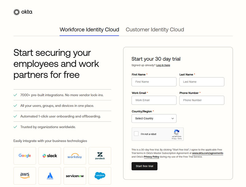
Image source: okta.com
Two fields decide whether this form converts. Everything else can wait.
Work email and company size are enough to start a trial. Job title can get asked for later, and honestly, phone number should probably wait until someone’s ready to upgrade anyway.
Use case is the one most teams get wrong here. It’s tempting to ask upfront, but it’s usually collected better once someone’s actually inside the product, using it.
What Fields Appear in a Registration Form Example?
Every registration form pulls from the same short list of building blocks, then adds one or two extras depending on what the account actually unlocks.
Name, email, and password cover most of what shows up on screen. A closer look at common form field types shows why those three rarely change.
Core Fields
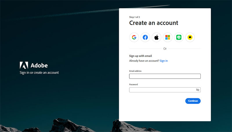
Image source: adobe.com
Text input, email, and password make up the backbone of nearly every registration form built today, though the exact order and styling shifts from site to site.
A dropdown menu narrows a choice like country or role, while a radio button or checkbox handles a yes-or-no or pick-one decision.
- Text input for name or username
- Email field with format validation
- Password field with strength requirements
- Dropdown menu for structured choices
- Autofill-ready fields for faster mobile entry
Slack’s registration flow asks only for a work email on the first screen, leaving password creation for the very next step.
Specialty Fields
Some registration flows need more than identity. They need proof or permission.
A file upload field handles a resume, ID scan, or transcript, while a phone field paired with a one-time code can replace a password entirely.
| Field | Common Use |
|---|---|
| File upload | ID, resume, transcript |
| Phone + OTP | Two-factor or passwordless entry |
| Consent checkbox | Terms of service, marketing opt-in |
Which Fields Should Be Required vs Optional?
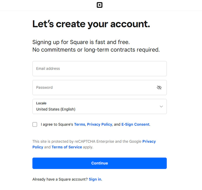
Image source: square.com
A short list stays required on almost every registration form, no matter the industry:
- Name or username
- Email address
- Password
- Terms of service checkbox
Everything past that gets murkier. Phone number, company name, and birthday all work better left optional, added only once the product actually needs them, not just because a form template comes with a spot for them.
- Phone number
- Company name
- Birthday or age range
Baymard Institute’s checkout research links forced account creation to 18% of cart abandonment, which is the clearest argument for keeping the required list short.
Duolingo lets users complete a first lesson before creating any account at all. It only prompts for a full profile, name, age, email, and password together, once someone actually wants to save their progress and streak.
A field either blocks the next step or it doesn’t. If a user can reach value without it, it belongs in the optional column, and reducing form abandonment usually starts exactly there.
How Does Registration Form Validation Work?
Validation checks whether the data a user typed actually meets the rules the form expects, before any of it reaches a database.
Client-side checks catch obvious problems first. Server-side checks catch the rest, and real-time inline feedback ties the two together while someone’s still typing, which is the core of most form validation practices in production today.
Client-Side Validation
The browser checks format and completeness before anything gets sent to a server. A missing @ symbol or domain gets flagged on the email field immediately, and a blank required field, name or password, throws an error before the form even tries to submit.
Password strength meters work the same way, updating in real time while someone’s still typing instead of waiting for a failed submission to say anything.
GitHub enforces a minimum password length (at least 15 characters, or 8+ characters with a number and a lowercase letter) and checks new passwords against known breached-password lists, a common example of client-side and server-side rules working together on a signup form.
Inline error messages appear directly under the field they belong to, not bundled into one alert at the top of the form.
Server-Side Validation
Client-side checks can be bypassed. Server-side validation cannot, which is why it carries the real security weight.
It confirms an email isn’t already registered, strips out anything that looks like malicious input, and enforces password rules the browser can’t fully check by itself.
The difference between client-side and server-side checks matters most here, since one layer protects the experience and the other protects the database.
Baymard Institute’s usability research found that 31% of ecommerce sites still don’t provide live inline validation, leaving users to discover errors only after they submit the form.
What Authentication Methods Appear in Registration Forms?

Image source: hubspot.com
Authentication decides how a returning user proves they’re the same person who signed up, and whatever gets chosen at registration usually sticks for the life of the account.
Most forms lean on one of a handful of options: plain email and password, a social login button, a magic link sent by email, a one-time code texted to a phone, or full single sign-on for anyone inside a company network.
| Method | Pros | Cons |
|---|---|---|
| Email and password | Universal, no third-party dependency | Password fatigue, higher abandonment |
| Social login | One click, nothing new to remember | Ties the account to a provider you do not control |
| Magic link | No password to forget or leak | Depends on fast, reliable email delivery |
| Phone OTP | Fast on mobile, no password | SMS delivery cost and carrier delays |
| Single sign-on | One login across internal tools | Heavier setup, best suited to enterprise |
Social login replaces the password field with a single button, using OAuth or OpenID Connect behind the scenes to confirm identity through a provider the user already trusts, like Google or Apple.
Across the Auth0 and Okta platforms, 25% of monthly active users chose a social login option at least once, according to Auth0’s own analysis of platform login data.
Spotify offers account creation through Google, Facebook, or Apple alongside email and password, cutting the credential-entry step for most new signups.
Choosing the right mix usually comes down to audience and risk tolerance, one of the harder calls in any set of sign-up form best practices.
Which Registration Form Layout Converts Best?
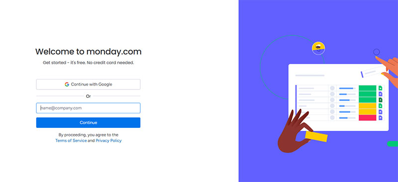
Image source: monday.com
Layout affects completion more than most teams expect, since it changes how much effort a form appears to demand before a user even starts typing.
Single-column layouts generally outperform multi-column ones, since the eye follows one straight line down the page instead of jumping between fields.
| Layout | Best For | Typical Pattern |
|---|---|---|
| Single-column | Short forms, mobile traffic | Highest completion under 5 fields |
| Multi-step | Forms with 6 or more fields | Breaks length into digestible steps |
| Modal or popup | Low-commitment sign-ups | Fast entry, higher exit risk |
| Inline embedded | Blog and content pages | Low friction, blends into the page |
Multi-step forms work best once the field count climbs past five or six, since breaking the process into stages keeps the form from looking intimidating on first glance.
Plenty of well-known multi-step form examples split a long signup into two or three short screens instead of one long page.
Modal and inline layouts solve a different problem: getting a small amount of information without pulling the user away from what they were already doing.
The choice between the two usually comes down to context, and a side-by-side look at inline forms versus popup forms makes the trade-off clear.
Baymard Institute’s checkout research puts the average multi-step flow at 5.1 steps, a figure that has stayed remarkably stable across years of tracking (Baymard Institute, 2024).
Typeform builds its own registration flow around one question per screen, the same conversational pattern the company sells to its customers.
How Many Fields Should a Registration Form Have?
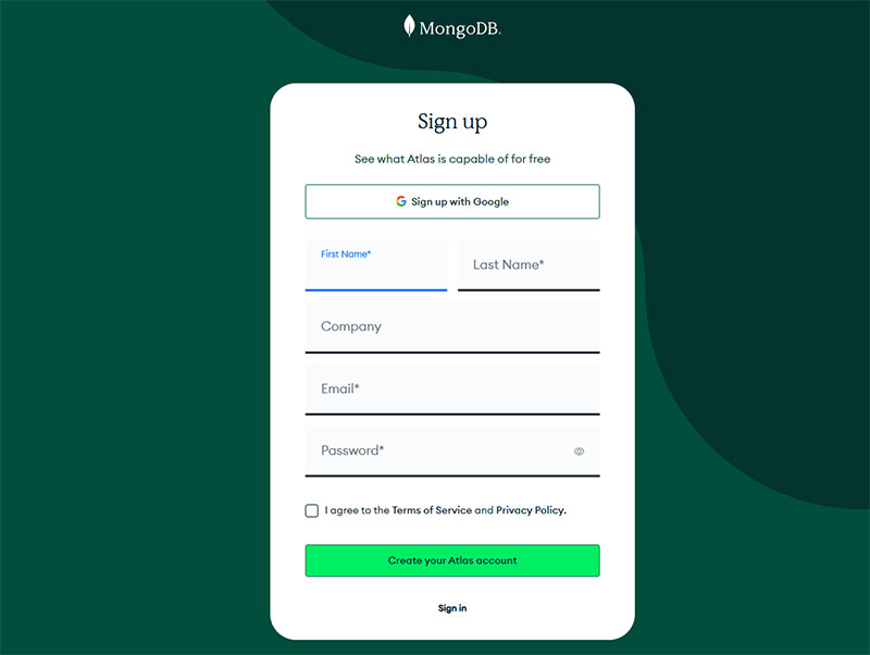
Image source: mongodb.com
Three to five fields cover most registration forms that convert well. Every field past that point tends to cost more completions than it gains in data.
The exact number depends on what happens after signup, but the direction is always the same. Fewer visible fields, more finished forms.
The numbers back this up pretty clearly.
- Average ecommerce checkout: 11.3 form fields in 2024, down from 12.7 in 2019 (Baymard Institute)
- 89% of checkout forms still split name into two fields instead of one, adding friction most users don’t need (Baymard Institute, 2024)
- 84% of ecommerce sites still show account-creation fields before checkout instead of delaying them to the confirmation step (Baymard Institute, 2024)
A closer look at how to optimize forms for completion usually starts with counting visible fields before touching anything else.
Etsy uses a single “Full Name” field instead of splitting first and last name, a small change Baymard’s own testing found nearly eliminates the hesitation multi-field names cause.
Once a form crosses five or six fields, splitting it across steps tends to help more than trimming further. A look at multi-step versus single-step forms shows why the two approaches solve different problems.
What Makes a Registration Form Accessible?
An accessible registration form works the same way whether someone’s using a screen reader, navigating by keyboard only, or clicking around with a mouse. None of the three should hit a dead end.
WCAG 2.1 Level AA is the baseline most teams build against, since it’s the standard referenced in the ADA’s 2024 Title II rule for public-sector web content.
In practice, that means a handful of things stay true at once.
- Every input tied to a visible label, not just a placeholder
- Full keyboard navigation, no mouse required to reach or submit the form
- Error messages announced to screen readers, not just shown in red text
- Color contrast that meets WCAG thresholds on both text and error states
WebAIM’s 2026 Million report found that 33.1% of form inputs on the web’s most visited homepages still lack a proper label, one of the most common form-related accessibility failures it tracks.
Getting this right is part of broader form accessibility best practices, not a separate checklist bolted on at the end.
Gov.uk’s registration and account forms are built to this standard by default. Visible labels, described errors, keyboard support, all baked into the design system every government service reuses.
Good accessibility and good form UX design overlap more than most teams expect. A form that’s easy for a screen reader is usually easier for everyone else too.
Which Tool Should You Use to Build a Registration Form?
The right tool depends on how much control the form needs, not how big the company building it is.
Most registration forms in production get built one of a few ways. The table below breaks it down, including one plugin worth a specific look.
| Approach | Cost Tier | Customization | Best For |
|---|---|---|---|
| IvyForms | Free plan, paid tiers on top | Drag and drop, conditional logic, multi-step forms | WordPress registration and lead capture |
| No-code builder | Free to mid-tier | Limited to template options | Small teams, fast launch |
| WordPress plugin | Free to mid-tier | Moderate, addon-dependent | Existing WordPress sites |
| Custom code | Development time | Full control | Specific validation or design needs |
IvyForms sits inside that WordPress plugin row, but it’s specific enough to call out on its own. It’s a drag-and-drop form builder with conditional logic and multi-step flows, and it’s designed so submissions land as organized records you can filter and export, not just raw entries sitting in an inbox.
It plugs into tools like Mailchimp, Google Sheets, and Slack for the marketing side, plus payment processors, and it comes from the same team behind Amelia, Trafft, and wpDataTables. A free plan covers most small-site setups. Paid tiers open up once the forms get bigger or the workflow gets more involved.
No-code builders like Typeform, Google Forms, and JotForm need no development work, trading some design flexibility for speed.
WordPress-based sites usually reach for a plugin instead. A look at free WordPress form plugins covers what’s available before anyone pays for an upgrade.
Teams that need full control over fields and styling often skip plugins entirely. A form generator can help create the initial markup for a registration form, although account creation, password handling, and server-side validation still need to be implemented separately. Building a registration form without a plugin stays a realistic option even on a WordPress site.
WPForms alone reports it is trusted by over 6 million websites, a sign of how far no-code and low-code building has replaced hand-coded forms for most teams. (IvyForms is newer to that race, but it’s going after the same ground.)
How Do You Design a Registration Form Step by Step?
Building a registration form in the right order avoids most of the rework that happens when validation or accessibility gets bolted on at the end.
- List every field the account actually needs, then cut anything that can wait until after signup
- Choose a layout: single-column for under five fields, multi-step for more
- Wire up client-side validation first, then server-side checks behind it
- Add labels, placeholder text, and inline error messages tied to each field
- Test keyboard navigation and screen reader behavior before anything else ships
- Run the finished form past a few real users on mobile before launch
Good form design treats these steps as sequential, not simultaneous, since fixing accessibility after launch costs far more than building it in from step five.
Field order and grouping matter here too. A closer look at form layout best practices covers how to group related fields so the form reads in a logical order, not just a technical one.
Skipping the mobile test is the most common shortcut teams take, and it’s usually the first thing that breaks once real traffic hits the form.
When Does a Registration Form Not Work?
A registration form fails when it demands commitment before the user has seen any value, which is the exact moment most abandonment happens.
Someone comparing options or just window shopping isn’t going to fill out a five-field form to keep looking around. Guest checkout, or a simple email capture, works better for that kind of visitor.
Products with a free trial or demo run into a related problem. Asking for a password before anyone’s actually touched the product raises the barrier for no real reason, and delaying registration until after that first real interaction tends to keep more people in the funnel.
Then there’s the simple stuff. A single download or a one-time RSVP rarely justifies a full account, a lighter form (or no form at all) usually fits better.
Baymard Institute’s checkout research found that 17% of US online shoppers have abandoned an order specifically because the process felt too long or complicated.
At Williams Sonoma and Stance, shoppers who choose guest checkout are told upfront that they can create an account after the purchase, letting them finish the transaction first (Baymard Institute).
Sometimes the better fix isn’t a shorter form at all. A quick look at chatbots versus forms shows that conversational interfaces can replace registration entirely for narrow, low-stakes tasks.
FAQ on Registration Forms
What Is the Difference Between a Registration Form and a Sign-Up Form or Contact Form?
Sign-up form and registration form name the same thing, a form that creates a user account.
A contact form differs. It routes a question to an inbox and creates no account, login, or stored credentials at all.
What Is a Honeypot Field and How Does It Stop Bots?
Bots fill out every field they can find on a page, including ones a real visitor would never see. That’s the trick behind it: a hidden form input, invisible to real visitors but sitting right there in a page’s HTML for anything scanning it automatically.
A honeypot field rejects any submission where that field isn’t blank, catching spam without a CAPTCHA.
Why Do Registration Forms Need a Consent or Terms Checkbox?
Without one, a business has no proof anyone agreed to anything before their account existed. That’s the real reason the checkbox is there, recording explicit agreement to a site’s terms of service and privacy policy, a requirement under GDPR and similar regulations.
GDPR compliant forms start with this checkbox.
Should a Registration Form Always Require Full Account Creation, or Is Guest Checkout Better?
Full account creation makes sense for anything people come back to: memberships, SaaS products, communities.
Guest checkout is usually the better call for a one-time purchase or anything low-commitment. Forcing a password field onto a first-time buyer raises abandonment without much of a lasting payoff.
What Common Mistakes Cause Registration Form Abandonment?
Common mistakes include hiding password rules until after a failed attempt, skipping a show-password toggle, and giving no progress indicator on a multi-step form.
Requiring email verification before a user can do anything else inside the product often causes the sharpest drop-off of all.
What Should You Fix First in Registration Forms?
A registration form improves fastest when field count, validation feedback, and account-creation timing get fixed in that order. Each later fix depends on the field list a form has already locked in for its layout.
- Trim visible fields to the minimum an account needs
- Add inline validation before launch, not after complaints
- Move account-creation timing to the point of proven interest
Moving account-creation timing later trades a short-term drop in verified-account volume for a longer-term gain in completed signups, since a delayed credential step lets more visitors reach the product before anything blocks them.
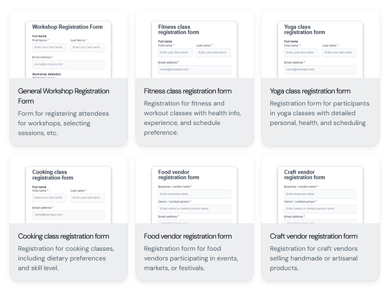
A set of ready registration form templates turns this fix order into a working starting point instead of a blank layout.