
Roughly half of the people who start filling in a web form never finish it. The fix is rarely design. It is picking the wrong form type for the job,…
Table of contents
Most sign-up forms lose users before they ever hit submit.
Too many fields, vague error messages, a CTA button that says “Submit” – these are not small details. They directly kill your form conversion rate.
This guide covers the sign-up form best practices that actually move the needle: field count, label design, CTA copy, password UX, inline validation, mobile optimization, privacy compliance, trust signals, and accessibility.
Each section is grounded in real data, not guesswork.
What Is a Sign-Up Form
A sign-up form is a structured input interface that collects user data to initiate account creation, newsletter subscription, or access to gated content. It is the first point of friction between a visitor and a product.
Not every form that collects data is a sign-up form. Contact forms, checkout forms, and intake forms serve different goals. Understanding the different types of forms helps clarify which rules apply where.
Core Components
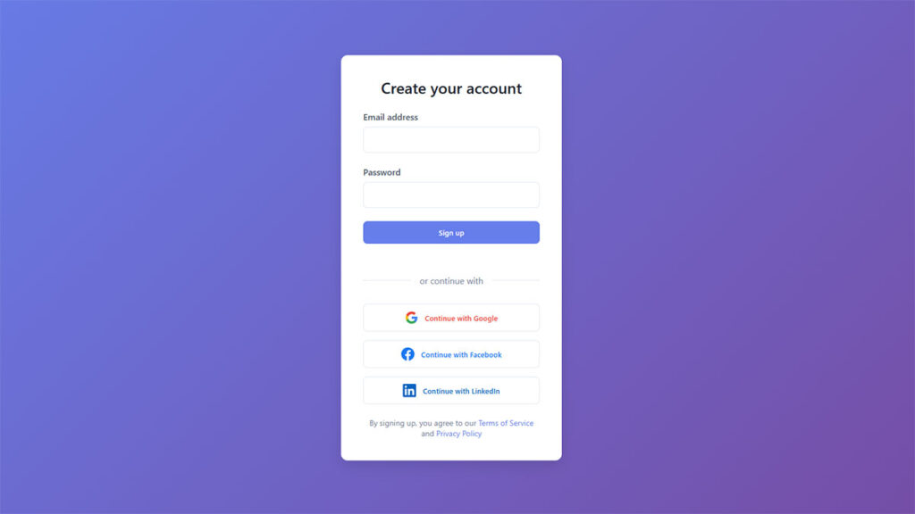
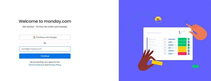
A standard sign-up form includes input fields, a submit CTA button, a privacy notice, and optional social login options.
These elements work together to reduce user hesitation. Remove any one of them carelessly and the form completion rate drops.
| Placement Type | Common Use Case | Typical Conversion Context |
|---|---|---|
| Modal / Popup | Email capture, lead generation | Triggered by scroll depth or exit intent |
| Inline | Newsletter subscription, blog opt-in | Embedded within content |
| Dedicated landing page | SaaS trial, account creation | Standalone page with focused copy |
| Sidebar | Content upgrades, quick capture | Persistent, low-interruption |
According to HubSpot, landing pages have the best sign-up rates at 23%, while popups make up 66% of all sign-up forms by volume. Both have a place depending on the goal.
Sign-Up Forms vs. Other Form Types
Sign-up forms initiate a new relationship: account creation, newsletter opt-in, or first-time access.
Login forms resume an existing one. Mixing them up, or presenting them on the same screen without clear differentiation, creates real confusion for users. A label like “Create Account” vs. “Log In” is not optional.
Registration forms are the fastest to complete of any form type, averaging one minute and 35 seconds, according to Fluent Forms data. They also carry a 63% start-to-complete rate. That is a decent baseline. Whether your form hits that benchmark depends almost entirely on the decisions covered below.
Sign-Up Form Best Practices vs. Common Mistakes
| Aspect | Best Practice | Common Mistake | Impact |
|---|---|---|---|
| Field Count | Ask only for what is essential at sign-up (typically email and password). Collect additional profile details later through onboarding or account settings. | Including 5 or more fields upfront (phone number, company name, birthdate) when they are not required for account creation. | Conversion drop |
| CTA Copy | Use action-oriented, value-driven button text such as “Start my free trial” or “Claim 15% off” to communicate the direct benefit of completing the form. | Using generic labels like “Submit” or “Register,” which carry no motivational or value signal for the user. | Lower clicks |
| Error Handling | Display inline error messages directly below the problematic field after form submission. Specify both the problem and the fix (e.g., “Password must be at least 8 characters”). | Showing a generic error summary at the top of the form, or using live field validation that interrupts input flow before the user finishes typing. | Friction spike |
| Social Login | Offer one-click sign-up via Google, Apple, or other identity providers as a primary option, reducing the number of inputs a user must complete to zero. | Burying social login options below the email form or omitting them entirely, forcing all users through a manual entry process regardless of preference. | Missed opt-ins |
| Mobile Layout | Use a single-column layout with large tap targets and thumb-friendly spacing. Design for mobile viewports first, then scale up for desktop breakpoints. | Designing multi-column forms for desktop and not testing on real devices, resulting in overlapping fields, oversized labels, and broken layouts on small screens. | Abandonment |
| Trust Signals | Add microcopy near sensitive fields (“No credit card required,” “We never share your data”) along with security badges or a subscriber count to reduce hesitation. | Asking for personal data (phone number, payment info) without any reassurance, privacy note, or social proof visible near the point of input. | Trust erosion |
| Value Proposition | State a specific, benefit-driven incentive in the form headline or subheading (e.g., “Get 10% off your first order”) so the user understands what they receive in exchange for signing up. | Using vague or brand-centric headlines like “Join our community” that describe the action without communicating a clear, tangible benefit to the user. | Low motivation |
| Password Fields | Include a show/hide password toggle on a single password field. Use a confirmation code sent to the user’s email to verify identity rather than a “Confirm Password” repeat field. | Adding a “Confirm Password” field that produces mismatch errors without indicating which entry is wrong, slowing down completion and discouraging autofill. | Avoidable errors |
Free Form Conversion Rate Calculator
Form Length and Field Count
Field count is the single biggest variable in sign-up form conversion rate. More fields = more drop-off. This is not a theory. It is consistent across every dataset that covers form completion behavior.
HubSpot data shows that over 30% of marketers report the highest conversion rates from forms with exactly four fields. Reducing fields from 11 to 4 has been shown to increase conversions by 120%.
Single-Step vs. Multi-Step Forms
Single-step forms show every field at once. Multi-step forms spread them across two or more screens, usually with a progress indicator.
Only 40% of marketers use multi-step forms, but Hubspot data puts their conversion rate at 86% higher than single-step. The reason is psychological: a short first step lowers the commitment barrier, and once started, users are more likely to finish.
That said, multi-step forms done poorly kill conversions. There is a whole separate issue around how multi-step forms can backfire when steps are poorly organized or progress is unclear. Check out some multi-step form examples that handle this well.
Progressive Profiling
Ask for less upfront. Collect more over time. That is the idea behind progressive profiling.
Instead of a seven-field sign-up form, you ask for an email address first. Then, once the user is inside the product and experiencing value, you collect additional data through secondary prompts.
- Works well for SaaS onboarding flows
- Works well when you need data that isn’t critical at sign-up (job title, company size, phone)
- Does not work well when downstream workflows depend on that data from day one
Omnisend research found that sign-up forms with three fields convert at an average of 10%, the highest of any field count tested. Forms asking for email and name converted at 7.41%, compared to 5.73% for email and birthdate. What you ask for matters as much as how many fields you include.
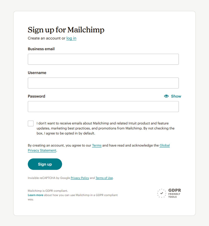
Mailchimp’s default email sign-up form asks for a single field: email address. That is not an accident.
Field Labels, Placeholder Text, and Input Types
These three decisions look minor. They are not. Poor label placement and relying on placeholder text alone are among the most common usability failures in sign-up form design.
Nielsen Norman Group research consistently recommends labels placed above their fields, not beside them or inside the field as placeholder-only text.
Why Placeholder-Only Labels Fail
Placeholder text disappears the moment a user clicks into the field. Once it is gone, users who pause mid-form often forget what the field was asking for.
On top of that, placeholder text typically renders in light gray against a white background, which rarely meets WCAG 2.1 contrast requirements. It is a usability and accessibility problem at the same time.
Floating labels (labels that sit inside the field but float upward on focus) solve the disappearing problem but introduce their own issues: they can look small once floated, and they add visual complexity. They are not a universal fix.
Input Types and Autofill
Matching your HTML input type to the data you are collecting is a low-effort, high-impact decision.
type="email"triggers the correct mobile keyboard and enables browser email autofilltype="tel"pulls up a numeric pad on mobile, removing a common friction pointtype="password"masks input and integrates with password managersautocomplete="given-name",autocomplete="email"and similar attributes tell the browser exactly what to autofill
Autofill is one of the highest-leverage optimizations available. pdfFiller data from 2024 shows autofill enabled forms complete 35% faster and see roughly 75% lower abandonment. That is a significant gain for a change that takes about ten minutes to implement.
Took me a while to appreciate how much the autocomplete attribute actually matters. Most forms skip it entirely, which means Chrome and Safari have to guess, and they often guess wrong.
CTA Button Design and Copy
The submit button is the last thing a user reads before deciding to convert. It deserves more thought than it typically gets.
Generic copy like “Submit” or “Register” performs consistently worse than specific, value-oriented alternatives. This is not debatable at this point.
Copy That Converts
Wordstream data confirms that the best-performing CTA buttons use action words like “get,” “reserve,” and “try” rather than passive verbs like “submit” or “enter.”
First-person framing works. ContentVerve found that changing “Start your free 30-day trial” to “Start my free 30-day trial” increased click-through rate by 90%. One word.
PartnerStack changed “Book a Demo” to “Get Started” and saw conversion rate jump from 6.66% to 14.09%, a 111.55% increase (HubSpot, 2022). The reason is straightforward: “Get Started” sounds like you are helping the user, while “Book a Demo” sounds like you are trying to pull them into a sales process.
See more real-world call to action examples that show this principle at work across different industries.
Size, Placement, and Visual Hierarchy
Minimum tap target: 44×44 pixels, per WCAG 2.1 guidelines. On mobile, anything smaller causes mis-taps and frustration.
Color contrast: The button needs to stand out from everything around it. Not just from the background, but from other interactive elements on the page. If you have to squint to find it, you have a hierarchy problem.
Placement: Below the last field, visible without scrolling where possible. On mobile, a sticky button at the bottom of the screen is sometimes the right call for longer forms.
| Copy Pattern | Example | Typical Effect |
|---|---|---|
| Generic / Passive | “Submit,” “Register” | Baseline, lower conversion |
| Action verb + benefit | “Get Free Access,” “Try It Free” | Consistent lift |
| First-person framing | “Start My Trial,” “Create My Account” | 10–90% improvement over second-person |
| Personalized / Contextual | “Join 40,000 Developers” | 202% better than basic CTAs (HubSpot) |
Adding social proof directly below the CTA button has also shown results. One case study reported a 68% increase in conversion rate after adding a review widget directly under the form’s submit button (HubSpot, 2022).
Password Requirements and Account Security UX
The password field has the highest drop-off rate of any single form element. Zuko Analytics data puts the mean abandonment rate for password fields at 10.5%, higher than every other common input type.
That number is not surprising once you think about what users face: vague requirement messages, no feedback until they submit, and no way to see what they typed.
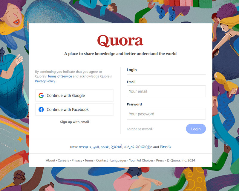
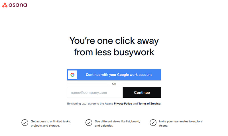
Social Login vs. Password Creation
Social login sidesteps the password problem entirely. According to the State of Consumer Identity Trends 2023 report, passwordless authentication methods had the highest user retention of any login approach tested.
Google and Facebook remain the most commonly used social login providers. Google has been gaining ground, now accounting for around 10% of all social logins globally (LoginRadius, Q1 2024), while Facebook holds the majority share across most industries.
Apple Sign-In is worth adding if your audience skews iOS-heavy. It is still small at roughly 5% of social logins, but that share is growing. Keep social login options to two or three maximum. Offering too many creates choice paralysis and actually hurts conversion.
The trade-off is real: social login reduces sign-up friction significantly, but ties your user accounts to a third-party provider. For most consumer products, that trade-off is worth it. For privacy-sensitive audiences in regulated industries, it is a harder call.
Password Field UX
If you are not offering social login and users need to create a password, these are non-negotiable:
- Show/hide toggle: An eye icon that lets users reveal their input. Standard since 2023 and no longer considered a security concern in any modern UX context (CorsoUX, 2026).
- Real-time strength indicator: Show weak / medium / strong feedback as the user types. Guide them, but do not block completion for a “weak” password that technically meets requirements.
- Specific error messages: “Must contain at least 8 characters, one number, and one uppercase letter” beats “Password too weak” by a wide margin. Vague errors cause abandonment.
Dropbox simplified their sign-up to require only an email and password initially, collecting everything else post-registration. Their form completion rate reflects that decision.
Inline Validation and Error Handling
When and how a form shows errors is one of the most overlooked aspects of sign-up form design. Get this wrong and you lose users who were completely ready to convert.
There are two moments where validation can fire: on blur (when a user leaves a field) and on submit (after the user clicks the CTA button). On-blur validation wins almost every time.
On-Blur vs. Submit-Time Validation
On-blur (real-time, per field):
- User fills in the email field and moves to the next
- Error appears immediately if the format is wrong
- User can fix it before continuing
Submit-time (all at once):
- User fills in the entire form and clicks submit
- Multiple errors appear at the same time
- User has to scroll back up to find and fix each one
Research by Luke Wroblewski found that real-time field validation can reduce form abandonment by up to 22%. That is a meaningful number for a change that is mostly a front-end implementation decision.
Read more about form validation best practices, including when submit-time validation still makes sense.
Error Message Copy and Placement
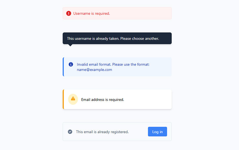
Error messages belong next to the field that caused the problem, not at the top of the form. Displaying a list of errors at the top requires users to scan back down and match each error to its field. Most do not bother.
Specific, actionable copy is the difference between a user fixing the error and a user leaving.
| Vague (Avoid) | Specific (Use) |
|---|---|
| “Invalid email” | “Enter a valid email like [email protected]“ |
| “Password too weak” | “Add at least one number and one uppercase letter” |
| “Required field” | “Enter your first name to continue” |
One more thing: do not rely on red color alone to signal an error. Roughly 8% of men and 0.5% of women have some form of color vision deficiency. A red border with no icon or text label is invisible to a meaningful portion of your users. Pair color with an icon and with descriptive text. Every time.
For the full picture on error messaging, see these form error message examples that show both patterns in practice.
Mobile Optimization
Mobile accounts for the majority of web traffic globally, yet mobile form completion rates consistently lag behind desktop. Zuko Analytics data puts desktop view-to-completion at 47% vs. 42% for mobile. That 5-point gap is almost entirely a design problem, not a device problem.
Simplified mobile forms see up to 63% higher completion rates than their unoptimized counterparts, according to Tinyform’s 2025 UX research.
Keyboard Types and Touch Targets
Set input types correctly. Every field should trigger the keyboard the user actually needs.
type="email"on email fields, which surfaces the “@” key on iOS and Android automaticallytype="tel"for phone number inputs, pulling up a numeric keypad- Minimum touch target: 44×44 pixels per WCAG 2.1, and honestly bigger is better on mobile
- Field spacing of at least 8px between inputs to prevent accidental taps
Buttons placed in the natural thumb zone (lower-middle of the screen) saw up to 25% higher interaction rates on mobile, per Smashing Magazine’s 2024 research. Worth keeping in mind when placing your CTA on long forms.
Single-Column Layout and Font Sizing
Single-column layout is non-negotiable on mobile. CXL research shows users complete single-column forms an average of 15.4 seconds faster than multi-column ones, and that gap gets worse on small screens.
Font size matters more than most designers realize. iOS Safari auto-zooms any input with a font size below 16px. That zoom breaks the layout and disorients users mid-form.
Set all input field fonts to a minimum of 16px. Then check your form on an actual phone, not a browser’s device emulator. They are not the same thing.
For a deeper look at mobile-specific decisions, the full guide on mobile form best practices covers tap targets, autofill behavior, and keyboard optimization in more detail.
Autofill and Biometric Sign-In
Google reported in 2023 that adding autofill sped up form completions by 30%. Combined with the pdfFiller 2024 data showing 75% lower abandonment with autofill active, this is the highest-leverage low-effort optimization available on mobile.
Add autocomplete attributes to every field. Then test Chrome Autofill, Safari’s autofill, and a password manager like 1Password to make sure they all populate correctly.
Biometric sign-in (Face ID, Touch ID) is growing fast. For products with returning users, supporting passkeys is now a realistic option on all major platforms.
Privacy, Consent, and Legal Requirements
GDPR enforcement is not theoretical. The GDPR Enforcement Tracker recorded over 2.4 billion euros in total fines as of September 2024, with a significant share tied directly to unclear consent mechanisms and failure to state processing purposes.
Beyond fines, 90% of consumers say they won’t purchase from companies that fail to clearly explain how their data is used (Ivyforms, 2025).
What GDPR Requires on Sign-Up Forms
The core GDPR rules for consent are straightforward:
- Consent must be freely given, specific, informed, and unambiguous
- Pre-ticked checkboxes are illegal under GDPR. Full stop.
- Consent cannot be bundled: if you want email consent and retargeting consent, those need separate checkboxes
- Users must be able to withdraw consent as easily as they gave it
- You must keep a record of when, where, and how consent was given
Data privacy requests increased 246% from 2021 to 2023, with deletion requests making up more than 40% of all requests (DataGrail, 2024). Your consent records are not optional documentation.
See real examples of how to structure these forms in practice with these GDPR consent form examples, and a step-by-step breakdown of how to create GDPR compliant forms that hold up under scrutiny.
Privacy Copy That Does Not Kill Conversions
Legal compliance and a good user experience can coexist. Most sign-up forms fail at both because the privacy copy is either buried, written in legal jargon, or non-existent.
| Weak Copy | Better Copy | Why It Works |
|---|---|---|
| “I agree to the Terms” | “I agree to receive weekly tips. Unsubscribe any time.” | Specific, scannable, no jargon |
| “See our Privacy Policy” | “We never sell your data. Privacy Policy” | Reassures before they click |
| No disclosure at all | “Join 40,000 developers. No spam, ever.” | Trust signal + commitment |
A good rule: if someone reads your consent copy in three seconds and still understands what they’re agreeing to, you’re on the right track.
For double opt-in specifically, while not required by GDPR, it is considered best practice in most EU countries and significantly improves list quality. ConvertKit uses it as a default for good reason.
Social Proof and Trust Signals
Users hesitate at sign-up forms. They do not know you. They do not trust you yet. Social proof near the form is one of the fastest ways to fix that.
Adding social proof to forms can increase conversion rate by up to 26% (GetLeadForms). Displaying subscriber or user counts lifts conversions by up to 15%, according to Trustmary research.
Types of Trust Signals That Work Near Sign-Up Forms
User/subscriber counts: “Join 40,000 developers” or “Trusted by 12,000+ teams.” Works when the number is real and respectable. A small number can actually hurt.
Logos of known customers or press mentions: Instant credibility transfer. Slack, Notion, and Linear all use logo strips near their primary sign-up CTAs.
Short testimonials: One or two sentences from a real person with a name and photo. 72% of consumers say positive testimonials increase their trust in a business (Wiser Notify, 2023).
Real-time activity notifications: “42 people signed up in the last hour.” Real-time social proof notifications boost conversions by 10-15% (WiserReview, 2026).
When Trust Signals Backfire
More is not better here. Stacking five types of social proof around a single form creates visual noise and competes with the CTA for attention.
Pick one or two trust signals. Place them either directly below the form heading or immediately below the submit button. Test which placement converts better for your specific audience before committing to either.
Also: outdated subscriber counts, testimonials without names, and stock photos presented as real customers all erode trust rather than build it. Authenticity beats polish every time. 63% of consumers say testimonials featuring real, named customers are more credible than anonymous quotes (WiserReview, 2026).
Accessibility and WCAG Compliance
Nearly half of all websites have form inputs that lack proper labels, according to WebAIM’s Million analysis. That is not a minor oversight. It means screen reader users hit a field with no announced label and have no idea what to type.
As of 2024, 95.9% of top websites failed automated WCAG 2 checks (WebAIM). Automated testing only catches 20-30% of issues, which means the real failure rate is significantly higher.
Label Association and Keyboard Navigation
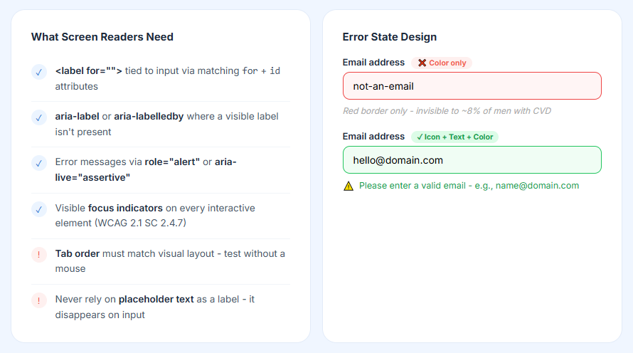
Every input needs a programmatically associated label. Not a placeholder. Not a visual label that happens to be nearby. A real <label for=""> association or aria-labelledby.
What screen readers need to announce a field correctly:
- A
<label>element tied to the input via matchingforandidattributes - Or
aria-label/aria-labelledbywhere a visible label is not present - Error messages announced live via
role="alert"oraria-live="assertive" - Focus indicators visible on every interactive element (WCAG 2.1 SC 2.4.7)
Keyboard navigation order must match the visual layout. Tab through your form with a mouse disconnected. If the focus jumps around the page unexpectedly, you have a structural problem in your HTML.
Color Contrast and Error State Design
Low-contrast text appeared on 83.6% of all homepages in WebAIM’s 2024 analysis. It is the single most common WCAG failure, and it is entirely preventable with a contrast checker.
WCAG 2.1 AA requires a minimum contrast ratio of 4.5:1 for normal text. Placeholder text typically fails this. Field borders on white backgrounds often fail it. Check everything, not just your body copy.
For error states: pair red color with an icon and with text. Never rely on color alone to communicate an error. Roughly 8% of men have some form of color vision deficiency, meaning a red-border-only error state is invisible to a meaningful portion of your users.
| Testing Tool | What It Checks | Best For |
|---|---|---|
| axe DevTools | Automated WCAG violations in browser | Dev-time checks, CI pipeline |
| WAVE | Visual overlay of errors and alerts | Design review, quick audits |
| VoiceOver (macOS/iOS) | Real screen reader experience | Manual testing, user flow review |
| Color Contrast Analyzer | Text and UI contrast ratios | Design QA on any element |
The full requirements are outlined in the form accessibility best practices guide, which covers ARIA implementation, focus management, and screen reader testing in detail.
Companies leading in accessibility generate 1.6 times more revenue and 2.6 times more net income than peers who do not (Accenture, 2023). Accessibility and business performance are not in conflict.
FAQ on Sign-Up Form Best Practices
How many fields should a sign-up form have?
Three to four fields is the sweet spot. Omnisend research shows three-field forms convert at an average of 10%. Every field you add beyond what is necessary drops your form completion rate. Ask only what you need at sign-up.
What is the best CTA button copy for a sign-up form?
Avoid “Submit.” Use action-oriented copy like “Get Started,” “Create My Account,” or “Join Free.” First-person phrasing consistently outperforms second-person. Wordstream data confirms verbs like “get,” “try,” and “reserve” drive higher conversion rates than passive alternatives.
Should I use single-step or multi-step forms?
Multi-step forms convert 86% better than single-step ones, according to HubSpot. But only when steps are logically grouped and progress is visible. A poorly structured multi-step flow kills conversions faster than a long single-step form.
What is inline validation and why does it matter?
Inline validation checks each field as the user completes it, not after they hit submit. Real-time feedback reduces form abandonment by up to 22% (Luke Wroblewski). Place error messages directly next to the field that caused the problem, never only at the top.
How do I make my sign-up form GDPR compliant?
Never use pre-ticked checkboxes. Consent must be freely given, specific, and unambiguous. Include a plain-language privacy notice and link to your privacy policy. Separate checkboxes are required for separate consent purposes. Double opt-in is considered best practice across most EU markets.
Does social proof near a sign-up form actually help?
Yes. Adding social proof to forms can lift conversion rate by up to 26% (GetLeadForms). User counts, short testimonials, and logo strips all work. Limit yourself to one or two trust signals placed near the heading or directly below the CTA button.
What are the most important mobile form design rules?
Use single-column layouts, set input types correctly to trigger the right keyboard, and keep touch targets at minimum 44×44 pixels. Set all input fonts to at least 16px. iOS Safari auto-zooms anything smaller, which breaks the layout and frustrates users mid-form.
Should I offer social login on my sign-up form?
For most consumer products, yes. The password field has a mean abandonment rate of 10.5% (Zuko Analytics). Social login removes that friction entirely. Offer Google and Facebook as defaults. Limit options to three maximum to avoid choice paralysis.
What accessibility standards apply to sign-up forms?
WCAG 2.1 Level AA is the accepted standard. Every input needs a properly associated <label>. Error messages must be announced via role="alert". Color contrast must meet a 4.5:1 minimum ratio. Never rely on color alone to communicate an error state.
What is progressive profiling and when should I use it?
Progressive profiling means collecting minimal data at sign-up, then gathering more over time once users are inside the product. Use it when you need non-critical data like job title or company size. It reduces upfront friction without permanently sacrificing the information you eventually need.
Conclusion
This conclusion is for an article presenting a complete picture of what separates a high-converting registration form from one that quietly bleeds users at every step.
Field count, label placement, password field UX, mobile layout, GDPR consent, and WCAG compliance are not isolated decisions. They compound. Getting three of them right while ignoring the rest still leaves conversion on the table.
The data is consistent across every source: less friction means more completions.
Start with an audit of your current form. Check field count, input types, error handling, and tap targets. Then test one change at a time.
A well-built user registration flow does not need to be complex. It needs to be clear, fast, and trustworthy.
