


Roughly half of the people who start filling in a web form never finish it. The fix is rarely design. It is picking the wrong form type for the job,…
Table of contents
Most forms lose users before the second field.
Following web forms best practices is the difference between a form that converts and one that quietly bleeds leads. Bad label placement, missing inline validation, broken autofill support, no trust signals. Any one of these kills completion rates.
This guide covers what actually moves the needle: field reduction, input design, error handling, mobile optimization, accessibility, and technical implementation.
Each section is built around real data from Zuko Analytics, Baymard Institute, and HubSpot. No filler, no generic advice.
What Are Web Form Best Practices
Web form best practices are design, UX, and technical decisions that reduce friction, increase form completion rates, and produce accurate data.
They cover everything from how you label a field to how you handle an error message after a failed submission. Get them right, and your forms become one of the highest-converting tools on your site. Nearly 50% of marketers say web forms are their top-performing lead generation tool, according to HubSpot.
There are real consequences to getting this wrong. Zuko Analytics data shows the overall view-to-completion rate across industries sits at roughly 51.7%, and usability problems cause 67% of visitors to abandon a form permanently.
Good form design is not just about aesthetics. It is about understanding what users need at each stage, whether they are filling out a contact form, a checkout, or a registration flow.
The sections below break down each practice area with specifics. No fluff, no vague advice about “reducing friction” without explaining how.
The difference between form design and form UX
Form design covers visual decisions: layout, field sizing, typography, color, and spacing.
Form UX covers behavioral decisions: when to validate, how to sequence fields, where to place labels, and how users move through the form mentally.
Both matter. A visually clean form with broken validation logic will still frustrate users. A well-coded form with poor label placement will still cause hesitation.
Most form problems are UX problems, not design problems. Keep that in mind as you work through the rest of this.
Where forms fit in the conversion funnel
| Form Type | Typical Use | Avg. Starter-to-Completion Rate |
|---|---|---|
| Contact | Inquiries, support | ~38% (Zuko) |
| Purchase / Checkout | Transactions | ~58% (Zuko) |
| Onboarding / Registration | Account creation | ~68% (Feathery) |
| Insurance application | High-intent leads | ~95% (Feathery) |
The gap between contact forms and insurance forms is enormous. Intent drives completion more than design does. But design still determines how much of that intent you actually capture.
Free Form Conversion Rate Calculator
Form Length and Field Reduction
Field count is one of the most debated topics in form optimization. And the data is genuinely conflicting, which is worth being upfront about.
A Zuko study found no direct correlation between the number of fields and completion rate. Yet 27% of users say form length is why they abandoned a form (The Manifest, 2023). HubSpot data shows reducing fields from 11 to 4 increased conversions by 120% in one test.
The honest answer: field count alone is not the issue. Perceived effort is.
Progressive disclosure and multi-step forms
Multi-step forms with one question per step convert 86% higher than single-step forms with many fields, according to HubSpot. Only 40% of marketers use them, which is a missed opportunity.
Progressive disclosure works because it reduces the visible cognitive load. Users see one thing at a time. They commit in small steps instead of looking at a wall of fields and deciding it is not worth it.
- Break long forms into logical groups (identity, contact, preferences)
- Add a progress indicator so users know how far they are
- Keep each step to 2-3 fields maximum
- Save partial entries where possible to allow users to resume
Typeform’s 2024 analysis of 2.6 million forms found that keeping forms to six questions or fewer produced the highest response volumes. Forms with visuals saw a 120.6% higher completion rate than those without.
For real-world multi-step form examples, you can see how different industries sequence their fields across steps.
When short forms hurt
Short forms filter out low-intent users. That sounds like a problem, but it can be an advantage.
In B2B, about 50% of employers say longer application forms intentionally filter out applicants who are not serious (The Manifest). For lead generation forms, adding a qualifying question like company size or budget can reduce volume while improving lead quality significantly.
Unbounce found that shortening a form actually decreased conversions in one test by 14%. Context matters more than rules.
The fields that kill completion rates
Zuko field-level data from 2024-2025 shows a clear hierarchy of problem fields:
- Password: 10.5% mean abandonment rate
- Email: 6.4% abandonment rate
- Phone number: 6.3% abandonment rate (higher when no reason is given)
The average checkout already has 11.3 visible fields even though only 8 are typically required (Baymard Institute, 2024). Removing those 3 extra fields is a straightforward win most teams ignore.
Input Field Design and Labeling
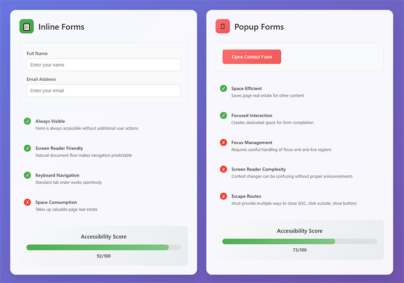
Label placement has a bigger effect on form usability than most people expect. The NNGroup’s eye-tracking research showed top-aligned labels reduce eye movement between labels and fields, speeding up completion.
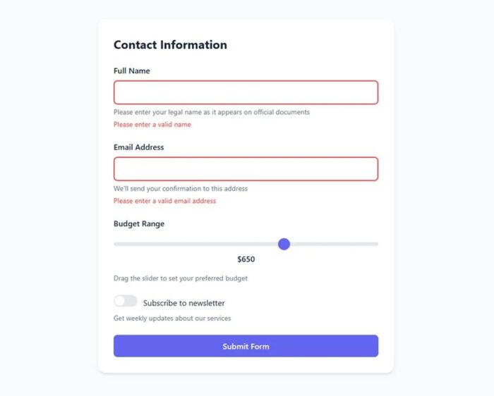
Placeholder-only labels are the worst option. Once a user starts typing, the label disappears. They forget what they were asked. They have to delete their input to check. It is a small friction point, but it adds up across a multi-field form.
Top-aligned labels vs. placeholder-only
Top-aligned labels: Fastest to scan, most accessible, works at any field width.
Floating labels: Start inline, float above on focus. A reasonable middle ground. Still has accessibility tradeoffs since the label is small when floating.
Placeholder as label: Fails accessibility, fails users with cognitive issues, and disappears on focus. Avoid using it as the only label.
As of 2023-2024, the industry default has shifted clearly toward top-aligned labels and floating labels (Concept7 UX research). Left- or right-aligned labels in front of fields are now mostly reserved for desktop tax and government forms where horizontal space is managed deliberately.
Input field width as a visual cue
Field width communicates expected input length. A full-width field for a ZIP code feels wrong and creates brief hesitation. A short field for a phone number causes users to wonder if they have enough space.
- Short fields: ZIP code, CVV, date (month/year)
- Medium fields: First name, last name, city
- Full-width fields: Email, full address, message/text areas
This is a small detail that makes a form feel considered vs. thrown together. Users notice it subconsciously even if they never articulate it.
Required vs. optional field marking
The standard convention is an asterisk (*) for required fields with a legend at the top of the form. But if every field is required, marking them all with asterisks adds visual noise for no benefit.
A cleaner approach when most fields are required: mark only the optional ones with “(optional)” in the label. This flips the convention and reduces clutter. The right choice depends on the ratio of required to optional fields in your specific form.
For more on form fields and how different input types behave, there is a dedicated breakdown worth reviewing if you are building custom implementations.
Matching HTML input type to content
| Input Type | Triggers On Mobile | Use For |
|---|---|---|
type="email" |
Email keyboard (@ key visible) | Email address fields |
type="tel" |
Numeric keypad | Phone numbers |
type="number" |
Numeric keyboard | Quantities, ages |
type="date" |
Native date picker | Dates of birth, appointments |
type="url" |
URL-optimized keyboard | Website URLs |
Not setting the correct input type means mobile users get a generic text keyboard for every field. That adds unnecessary typing effort on small screens and is one of the easiest fixes available.
Inline Validation and Error Handling
Baymard Institute found that 31% of e-commerce sites do not offer inline validation at all, even though it is one of the clearest ways to reduce submission errors and abandonment.
Inline validation implemented on-blur (when a user leaves a field) increases form completion rates by around 22%, according to research by Luke Wroblewski. Real-time keystroke validation, on the other hand, decreases completion by 8-12% because it flags errors before users have finished typing. That feels like being corrected mid-sentence.
Error message copy that actually helps
Most error messages are written by developers, not writers. It shows.
“Invalid input” tells a user nothing. “Enter a valid email address, like [email protected]” tells them exactly what to fix and how.
- Be specific about what went wrong
- Tell users what format is expected, not just that they failed
- Use plain language, not system terminology
- Keep messages short, one sentence maximum
For a detailed look at how to write and display these, the form error message examples resource covers real patterns across different form types.
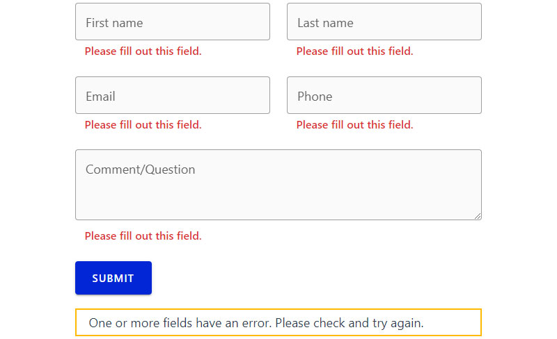
Error placement and visual design
Next to the field: Best option. Users see the error exactly where the problem is.
Summary at the top: Useful as a secondary indicator, especially for long forms or screen readers. Not sufficient on its own.
Color alone: Never enough. WCAG 2.1 requires that errors are communicated through more than color. Red text next to a field needs to be accompanied by an icon or explicit label.
For accessible error handling specifically, the form validation best practices guide goes into the ARIA attributes and DOM structure required to make errors work for screen reader users.
Preventing errors vs. recovering from them
Prevention is better than recovery. Every error a user has to fix is a moment where they might quit.
- Use format hints below the field label (“MM/DD/YYYY”)
- Use input masks for structured data like phone numbers or credit cards
- Use autocomplete and dropdown options where free text is not needed
- Add password strength indicators instead of waiting for a “too weak” error
Dropbox keeps their signup form to just an email and password initially, deferring everything else. That design decision comes from understanding that every field is a potential exit point.
Mobile Form Optimization
Mobile users now account for the majority of web traffic. But desktop users still complete forms at a meaningfully higher rate: 47% view-to-completion on desktop vs. 42% on mobile (Zuko Analytics, 2024).
That gap is not inevitable. It is a design problem. Mobile users abandon forms 27% more often than desktop users on average (Tinyform, 2025), but simplified mobile forms can see up to 63% higher completion rates than their unoptimized counterparts.
Touch targets and thumb zone design
Apple’s Human Interface Guidelines specify a minimum touch target of 44×44 points. Google’s Material Design sets 48x48dp. Both exist because smaller targets cause tap errors, which cause frustration, which causes abandonment.
- Minimum touch target: 44px height for all inputs and buttons
- Sufficient spacing between fields to prevent accidental taps
- Primary CTA button placed within the natural thumb reach zone
- Avoid side-by-side fields on mobile (they make both fields too narrow)
For a complete breakdown of mobile-specific patterns, the mobile form best practices guide covers layout, keyboard types, and input sizing in depth.
Avoiding dropdowns on mobile
Native dropdowns on mobile are painful. The select element triggers a system picker that breaks the visual flow, feels dated, and is slow to interact with on small screens.
Alternatives that work better on touch devices:
- Segmented controls: For 2-4 options (e.g., gender, yes/no)
- Radio buttons: For 3-6 options that all need to be visible
- Autocomplete with type-ahead: For long lists like country selection
The radio button vs. checkbox distinction matters here too. Radio buttons enforce single selection; checkboxes allow multiple. Using the wrong one for a question confuses users and corrupts your data.
Single-column layouts and field order
Multi-column layouts on mobile force fields into widths that are too narrow to tap accurately. Single-column is the standard for a reason.
Field order on mobile matters more than on desktop because scrolling to correct a previous field is much more disruptive. Follow the natural information hierarchy:
Identity fields first. Contact details second. Account or payment details last. Breaking this order causes hesitation because it violates the mental model users already have about how forms work.
Autofill, Autocomplete, and Browser Support

Autofill is one of the highest-leverage optimizations available for any form. When Chrome Autofill is enabled and used, forms are completed approximately 35% faster and see roughly 75% lower abandonment (Chrome Developers, December 2024).
Despite this, 39% of e-commerce sites break autocomplete with incorrect or missing field attributes (Build Grow Scale, 2024). That is a straightforward technical error with a measurable cost.
HTML autocomplete attribute values
The autocomplete attribute tells browsers what data to offer for a given field. Without it, browsers guess, often incorrectly.
| Autocomplete Value | Field Purpose |
|---|---|
name |
Full name |
email |
Email address |
tel |
Phone number |
street-address |
Street address line |
postal-code |
ZIP / postal code |
cc-number |
Credit card number |
new-password |
Password creation (triggers strong password suggestions) |
one-time-code |
OTP / verification codes |
The name attribute also plays a role. Password managers and browsers both use it to identify fields. Unconventional name values like inputfield1 break autofill compatibility entirely.
When to turn autocomplete off
There are legitimate cases for autocomplete="off". OTP fields should not prefill from previous sessions. CVV fields on payment forms should never be stored or autofilled. Some banking and healthcare forms carry compliance requirements around data persistence.
Outside those cases, turning autocomplete off to be “safe” is actually hurting your completion rate. It removes a feature users actively rely on, especially on mobile where typing is slower.
Password managers and form compatibility
Password managers like 1Password, Bitwarden, and the built-in browser keychain rely on proper type="password" fields and consistent field name attributes to detect login forms and offer stored credentials.
Custom-styled password inputs that manipulate the DOM in unusual ways can break this detection. Tested compatibility with at least Chrome and Safari autofill behaviors is the minimum. If your login or registration form conflicts with password managers, you will see abandonment from users who cannot log in without manual credential lookup.
For WordPress-specific setups, the way WordPress forms handle field attributes varies significantly between plugins, and it is worth verifying that your chosen plugin outputs correct autocomplete values before launching any high-traffic form.
Form Accessibility Requirements
Nearly half of all websites have form inputs that lack proper labels, according to WebAIM’s 2024 analysis of one million homepages.
That is not a minor UX issue. When a field has no associated label, a screen reader user cannot tell what the field is asking for. The form is effectively broken for them.
96.3% of homepages had detectable WCAG failures in 2024 (WebAIM Million). Accessibility is not a niche concern. It is the default state of the web, and forms are one of the most common failure points.
WCAG 2.1 requirements specific to forms
The relevant success criteria for form accessibility:
- 1.3.1 Info and Relationships: Form labels must be programmatically associated with their fields
- 1.3.5 Identify Input Purpose: Fields collecting personal data must use correct autocomplete values
- 3.3.1 Error Identification: Errors must be identified in text, not color alone
- 3.3.2 Labels or Instructions: Every input must have a visible label or clear instruction
The U.S. DOJ finalized its WCAG 2.1 AA rule for state and local government websites in April 2024. Private sector enforcement continues to rise: ADA Title III federal lawsuits totaled 8,800 in 2024, a 7% increase from 2023 (Seyfarth Shaw).
Screen reader compatibility for form fields
The correct pattern: Use a visible <label> element with a matching for attribute tied to the field’s id. Do not use aria-label as a substitute for a visible label, except where screen real estate genuinely makes a visible label impossible.
For error messages, use aria-invalid="true" on the field and aria-describedby to link the error text. Without this, screen readers announce the field without the associated error.
Focus management in multi-step forms
When a user moves to a new step, focus must shift to the top of that step or to a heading that announces it.
Leaving focus in its last position from the previous step means keyboard and screen reader users have to manually navigate back up to understand where they are. Most multi-step forms skip this entirely.
For a full breakdown of what accessible form patterns look like in practice, the guide on form accessibility best practices covers ARIA implementation and keyboard navigation in detail.
CTA Button Design and Placement

The submit button is the last gate between a completed form and a lost submission. Most forms treat it as an afterthought.
Benefit-driven CTA buttons outperform generic ones by 19% on average (Marketing LTB, 2024). “Create My Account” converts better than “Submit.” “Start Free Trial” converts better than “Sign Up.”
CTA button copy that converts
Generic labels like “Submit” or “Send” describe an action. Specific labels describe an outcome.
The copy that consistently performs well includes words tied to the user’s actual goal:
- “Get My Free Quote”
- “Book My Demo”
- “Download the Guide”
- “Create My Account”
HubSpot’s 2024 data shows marketers who A/B test their CTAs see about a 28% lift in conversion performance. Most teams never test their button copy at all.
For more patterns and copy ideas, the collection of call to action examples is worth bookmarking.
Visual hierarchy and button contrast
Primary button: Filled, high contrast, clearly dominant on the page.
Secondary button (Cancel, Back): Outlined or ghost style. Should never compete visually with the primary CTA.
A/B testing from Crazy Egg shows placing CTAs below social proof raises conversion rates by about 25%. The sequence matters: trust first, action second.
Disabled submit buttons and loading states
Disabling the submit button until all fields are valid sounds logical. In practice, it causes confusion because users cannot tell why they cannot proceed.
A better pattern: allow submission attempts, then show specific inline errors. This gives users actionable feedback instead of a button that silently refuses to work.
After submission, show a clear loading indicator immediately. Users who click a submit button and see nothing happen will click it again. That causes duplicate submissions, which creates data and operational problems downstream.
Trust Signals and Privacy Within Forms

Security concerns are the single biggest reason users abandon forms, at 29% (The Manifest, 2023). That outranks form length, which comes second at 27%.
Pew Research found that 73% of Americans feel they have little to no control over how their data is used. That anxiety is present every time someone fills in their email address on a site they do not already trust.
Microcopy near sensitive fields
Short, specific reassurance next to a sensitive field reduces that anxiety in the moment.
It needs to be specific, not generic. “Your data is safe” means nothing. “We will only use this to send your quote. No marketing emails.” is a commitment users can evaluate.
| Field | Generic (Ineffective) | Specific (Effective) |
|---|---|---|
| “We respect your privacy” | “Used only to send your confirmation” | |
| Phone | “Your info is secure” | “For delivery updates only. No sales calls.” |
| Credit card | “Safe checkout” | “256-bit SSL. Processed by Stripe.” |
Adding trust badges to checkout forms has shown a 16% increase in overall conversions, with a 22% increase among new visitors (Feathery data).
GDPR and CCPA consent checkboxes
Pre-checked consent boxes are not valid under GDPR. Consent must be a clear, active choice.
The checkbox must be unchecked by default, with a plain-language label describing exactly what the user is agreeing to. Bundled consent (“I agree to the terms and to receive marketing emails”) is also non-compliant. As of 2023, GDPR enforcement has resulted in over 2.8 billion euros in fines, with consent violations among the most common causes (privacyengine.io).
For implementation guidance and real examples, the resource on how to create GDPR compliant forms covers field placement, checkbox copy, and documentation requirements.
Removing trust-damaging fields
Asking for information that does not obviously serve the user’s current goal signals that you are collecting data for your own purposes. Phone number without context. Date of birth on a non-age-sensitive form. Company size on a basic contact form.
Every unexplained field is a small trust cost. Some users absorb it. Others leave. Removing fields that cannot be justified to the user is both a UX improvement and a trust improvement at the same time.
Form Performance and Technical Implementation
Page speed directly affects form completion. Users who experience a load time of 3 seconds or less visit 60% more pages than those on slower connections (NitroPack, 2023 Google Core Web Vitals study). Forms sitting on slow pages start at a disadvantage before the first field is even visible.
Native HTML5 validation vs. custom JavaScript
Native HTML5 validation: Built into the browser. Zero JavaScript required. Works on submit. Limited styling control and inconsistent error message formatting across browsers.
Custom JS validation: Full control over timing, copy, and placement. Required if you want on-blur validation. More code to maintain and test.
Most production forms use a combination: HTML5 attributes like required, minlength, and pattern as a baseline, with a lightweight JavaScript layer for inline validation UX. Loading a full validation library for a three-field contact form is overkill.
Preventing duplicate submissions
Duplicate submissions happen when users click submit, see no feedback, and click again.
- Disable the button immediately on first click
- Show a loading spinner or progress indicator
- Use idempotency keys on the server to deduplicate if the same request arrives twice
Without server-side deduplication, disabling the button alone is not enough. Network latency can cause the same request to arrive multiple times. Backend protection is the safety net when the frontend fails.
Cross-browser testing priorities
Form rendering differences between browsers are more common than most developers expect. Date inputs look different on Chrome vs. Safari. Select element styling behaves differently on iOS Safari. Password field handling varies between Chrome autofill and Safari’s Keychain.
| Browser | Known Form Issues | Priority |
|---|---|---|
| Chrome | Autofill yellow background override, date picker | High |
| Safari (iOS) | Select/dropdown rendering, input zoom on focus | High |
| Firefox | Number input spinners, date input unavailable | Medium |
| Edge | Password reveal icon conflicts with custom icons | Medium |
Zuko Analytics data shows Edge users had the highest view-to-completion rate of any browser family at 46.7%, while Samsung Browser users had the lowest at 40.6%. Device mix and rendering differences both contribute to that gap.
Form analytics and ongoing optimization
Marketers who run A/B tests on their forms report conversion rates 10% higher on average than those who do not test at all (HubSpot). Yet 36% of marketers never run any user tests on their forms.
Field-level analytics tools like Hotjar, Zuko, or purpose-built form analytics show exactly which field users abandon on, how long they spend on each input, and how many times they return to correct a field. That data turns guesswork into specific fixes.
For a practical look at how to increase form conversions, the process of auditing field-level drop-off data and prioritizing what to test first is covered in detail. And if you are tracking submissions through your analytics platform, setting up form submission tracking in Google Analytics is the baseline step before any optimization work can be data-driven.
FAQ on Web Forms Best Practices
How many fields should a web form have?
As few as the task requires. HubSpot data shows reducing fields from 11 to 4 increased conversions by 120%. Only ask for what you need at this stage. Every extra field is a potential exit point, especially on mobile.
Where should form labels be placed?
Top-aligned labels are the fastest to scan and the most accessible option. Placeholder-only labels disappear on focus, confuse users, and fail WCAG 2.1 requirements. Always use a visible label above the field.
When should inline validation fire?
On blur, not on keystrokes. Validating while a user is still typing feels like being corrected mid-sentence. Research by Luke Wroblewski shows on-blur validation increases form completion by around 22%.
What is the best way to handle form error messages?
Place them next to the field that caused the error. Be specific. “Enter a valid email like [email protected]” works. “Invalid input” tells the user nothing and increases abandonment.
How do I make a form accessible?
Associate every field with a visible <label> using matching for and id attributes. Use aria-invalid and aria-describedby for error states. Ensure keyboard navigation works in logical order throughout the full form.
Does form length affect completion rate?
Perceived length matters more than actual field count. Multi-step forms convert 86% higher than long single-page forms, according to HubSpot, because they reduce visible cognitive load at each step.
How does autofill affect form conversion?
Significantly. Chrome autofill data from 2024 shows forms are completed 35% faster and see 75% lower abandonment when autofill works correctly. Use proper autocomplete attribute values on every field.
What CTA button copy works best for form submissions?
Outcome-focused copy outperforms generic labels. “Get My Free Quote” converts better than “Submit.” Benefit-driven CTA buttons outperform generic ones by 19% on average. Test your copy before assuming the default works.
How do I reduce form abandonment on mobile?
Use single-column layouts, correct HTML input types to trigger the right keyboard, and minimum 44px touch targets. Mobile form abandonment runs 27% higher than desktop. Removing unnecessary fields is the fastest fix.
Do trust signals on forms actually improve conversions?
Yes. Forms with trust badges show a 16% increase in overall conversions and a 22% lift among new visitors. Short microcopy near sensitive fields, like “used only to send your confirmation,” reduces security-related abandonment directly.
Conclusion
This conclusion is for an article presenting the full picture of web forms best practices, from field reduction and label placement to WCAG compliance and autofill support.
No single fix transforms form conversion rate. It is the combination: tighter field grouping, specific error messages, correct autocomplete attributes, trust signals near sensitive inputs, and consistent cross-browser testing.
Accessibility is not optional. Nearly half of all websites have form inputs without proper labels. That is lost conversions and real legal exposure.
Start with your highest-traffic forms. Run field-level analytics. Cut what cannot be justified. Test your CTA button copy.
Small, data-driven changes compound. The forms that convert best are not the most creative ones. They are the most considered.

