


A form is usually the last thing standing between a visitor and whatever you actually want them to do: buy something, sign up, ask a question. Optimizing that form means…
Table of contents
Most of your visitors want what you’re offering. They just quit before hitting submit.
In a survey by The Manifest, 81% of people said they had abandoned an online form at some point after starting to fill it out, and average form conversion rates sit in the low single digits when measured against everyone who sees the form.
That gap between interest and completion is where money leaks. Learning how to increase form conversions closes it.
Fair warning on the numbers below. A lot of the statistics that circulate on this topic have drifted a long way from the research they came from, so each one here is traced back to its original source with sample sizes and dates where they matter. Some of them do not survive that check.
What Is Form Conversion Rate?
Form conversion rate is the percentage of people who complete and submit a form out of everyone who saw or started it. The formula: (completed submissions / total form views or starts) x 100. A page with 1,000 visitors and 30 submissions converts at 3%.
There are a few ways to measure it, and they tell wildly different stories:
- View-based, dividing submissions by everyone who saw the form
- Start-based, dividing by the people who touched a field
- Completion-based, dividing by the people who reached the last field
This distinction matters more than any benchmark. Ruler Analytics puts the average form conversion rate across industries at 1.7% measured against views, while benchmark sets that measure submissions against people who actually interacted with the form report medians above 17%. Same forms, different denominator, tenfold difference in the headline number.
So before you compare yourself to any published figure, check what it’s dividing by. Sector benchmarks swing hard too, with professional services and healthcare typically outperforming B2B SaaS.
One more distinction worth holding onto. A smaller step like starting a field counts as a micro-conversion, while the actual submit is the macro-conversion you’re optimizing toward.
Free Form Conversion Rate Calculator
What Causes Low Form Conversion Rates?
Low form conversions come from friction: too many fields, intrusive questions, unclear errors, slow load, and missing trust cues. Each one adds a reason to quit before hitting submit.
The most-quoted number in this space needs unpacking. The Manifest surveyed 502 US adults in 2018 and found 81% had abandoned an online form after beginning to fill it out. That is a lifetime, per-person measure, not a per-form abandonment rate, and it gets misquoted constantly as “81% of forms are abandoned.” The survey also skewed older, with 56% of respondents aged 55 or above.
The same survey found the top reasons people quit: security concerns (29%), form length (27%), advertisements or upselling (11%), and unclear reasons for collecting the data (10%).
What holds up regardless of the exact percentage: most of your lost conversions aren’t people who never engaged. They’re people who started, got annoyed, and left.
How Many Fields Cause Drop-Off?
Field count is the single biggest lever, and the effect is non-linear. Recent benchmark aggregations show conversion falling modestly from around 3 fields to 5, then dropping off a cliff between 5 and 7 fields, where each additional field costs roughly twice what it did before.
That makes 5 visible fields a useful audit trigger. Past it, either cut fields or split the form into steps.
Some sectors publish genuinely punishing forms. Zuko Analytics’ data on government forms shows averages far beyond anything a commercial site would attempt. Nobody finishes those willingly.
Which Fields Trigger the Most Abandonment?
Phone number requests do the most damage, because users read them as a sales call waiting to happen.
A physical address on anything that isn’t shipping feels invasive and gets skipped. Password fields are their own category, and Zuko’s analytics consistently rank them among the highest-abandonment fields on any form.
Then there are the ambiguous ones. Any field a user can plausibly misread will get filled in wrong, which is the real lesson of the Expedia case below.
Understanding which form type you’re building shapes which fields actually earn their place. A checkout form justifies more fields than a newsletter box ever could.
How Does Reducing Form Fields Increase Conversions?
Cutting fields lifts conversions because every field removed subtracts effort, hesitation, and opportunities to make a mistake.
The famous Expedia case is worth telling accurately, because the usual retelling gets the mechanism wrong. In 2010, Expedia’s then-VP of global analytics Joe Megibow described how an optional field labeled “Company” sat below the traveler’s name on the booking form. Some customers read it as a request for their bank’s name, entered that, and then entered their bank’s address in the address field below. When the credit card address verification ran, it failed. Bookings collapsed and the call center absorbed the fallout. Deleting the field recovered roughly $12 million a year.
So the lesson isn’t only “fewer fields is better.” It’s that an ambiguous label can quietly destroy a transaction flow. A clearer label like “Your Company” and “Home Address” would likely have captured most of that value too.
Other documented field-reduction results circulate widely and are worth treating as illustrative single-site case studies rather than laws:
| Change | Reported Result | Source & caveat |
|---|---|---|
| Removed one ambiguous optional field | ~$12 million annual profit | Expedia, 2010. Cause was failed address verification, not field count alone |
| Reduced form from 11 fields to 4 | +160% form submissions | ImageScape, via CXL, single-site case study |
| Reduced form from 9 fields to 5 | +34% form submissions | Marketo, single-site case study and its own marketing |
When More Fields Actually Help
Fewer fields isn’t a universal law. Venture Harbour documented tests where cutting fields reduced overall value, because the remaining leads were lower quality and sales wasted time chasing them.
You’re trading raw volume against lead quality. More qualifying fields mean fewer submissions but better-fit prospects. Measure the thing you actually sell, not the form fill.
Progressive profiling splits the difference. You ask for 2-3 fields now, then collect more on return visits, so no single form ever feels long.
How Does Multi-Step Form Design Affect Completion?
Breaking a long form into sequential steps generally raises completion, because each step shows fewer fields and less visible effort.
A caution on the number you’ll see everywhere. The claim that “multi-step forms convert 86% higher, per HubSpot” is repeated across hundreds of pages, but the citations are circular and no primary HubSpot study appears to be locatable. Where underlying figures are given, they trace to Formstack (roughly 13.9% for multi-page versus 4.5% for single-page), a ratio of about 3x, which doesn’t produce 86% anyway. Meanwhile, more recent benchmark aggregations put the multi-step lift closer to 14% on average, and around 21% on B2B lead-gen forms with 6+ fields.
The honest summary: multi-step reliably helps on longer forms, the direction is well supported, and the precise magnitude depends entirely on your form and audience. Treat 86% as folklore and test it yourself.
Why Sequencing Works
The trick is front-loading. Start with the easy, low-commitment questions and save the sensitive ones for later steps.
Once someone answers step one, they’ve made a small commitment. The foot-in-the-door effect makes them more likely to finish what they started.
Progress bars help here. Showing “Step 2 of 4” gives users a finish line to walk toward instead of an open-ended wall of inputs.
When Multi-Step Backfires
Short forms don’t need steps. A 2-3 field signup broken into multiple pages just adds clicks for no reason.
The math flips on tiny forms. If someone can see the whole thing fits in ten seconds, hiding fields behind a “Next” button creates friction instead of removing it.
Worth reading before you commit, since multi-step layouts can quietly tank conversions when applied to the wrong form length.
What Form Layout Increases Completion Rate?
Single-column layouts with top-aligned labels and generous spacing complete fastest. The strongest quantitative evidence comes from a CXL Institute study run by Ben Labay: participants completed a linear single-column form (n = 356) an average of 15.4 seconds faster than the same questions in a multi-column layout (n = 346), significant at 95% confidence.
Note what that study measured, which was completion time rather than conversion rate. Faster is a reasonable proxy for less friction, but it isn’t the same as more submissions. Baymard Institute’s checkout research separately found a meaningful share of e-commerce sites still running multi-column layouts that cause skipped fields.
Single-Column vs Multi-Column
| Layout | Completion Speed | Risk |
|---|---|---|
| Single-column | 15.4 seconds faster (CXL, n=702 total) | Low, since it follows a natural top-to-bottom reading pattern |
| Multi-column | Slower | Higher risk of skipped fields and misread requirements |
Eyes scan straight down a single column. Multi-column forms force a zigzag, and users lose their place.
Worth knowing: HubSpot publicly ran a counter-test on one of its own high-traffic demo pages, switching from one column to two. Best practice is a starting hypothesis, not a verdict.
Label Placement and Field Grouping
Top-aligned labels win for speed and completion, according to Nielsen Norman Group. Floating labels come a close second when vertical space is tight.
Placeholder-only labels are the trap. Once a user starts typing, the label vanishes, and they forget what the field wanted.
On placement, NN/g’s 2018 eyetracking study found users spend about 57% of page-viewing time above the fold and about 74% within the first two screenfuls. That research measured attention on pages generally, not forms specifically, so read it as a reason to place your form early rather than as a measured form-conversion finding.
Tap targets need a floor of 44×44 points (Apple Human Interface Guidelines), a threshold grounded in MIT Touch Lab measurements putting the average finger pad at roughly 10-14mm. Smaller than that and people misclick. There’s a lot more nuance in how field grouping and spacing shape completion once you get past the basics.
How Do Trust Signals Improve Form Submissions?
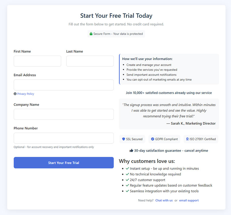
Trust signals raise submissions by removing the “is this safe?” hesitation right before someone commits.
Here the sourcing needs correcting. The widely repeated claim that “Baymard Institute found trust badges boost conversions by 42%” does not appear in Baymard’s published research. The 42% figure traces back to a single Blue Fountain Media case study in which adding a VeriSign badge to a checkout page lifted that form’s conversion rate by 42%. It has been re-attributed to Baymard so many times that the misattribution now outranks the original.
What Baymard has actually documented is more modest and more useful: roughly 18-19% of cart abandonments stem from users not trusting the site with their card details, and seal recognition matters more than seal presence, with well-known marks like Norton and PayPal outperforming obscure certifications. An unfamiliar badge can increase suspicion rather than reduce it.
The underlying anxiety is real. IBM’s 2025 Cost of a Data Breach report puts the global average breach at $4.44 million, and consumers have absorbed enough of that news to hesitate at the form.
Privacy Microcopy
A short line like “We never share your email” placed under the email field cuts hesitation on the exact input people guard most.
It works because it answers the unspoken question at the moment it’s being asked. No extra page, no policy link, just reassurance in context.
Security Badges and Social Proof
Put SSL and security seals beside payment and personal-data fields, where the stakes feel highest, and use marks your audience will actually recognize.
Subscriber counts borrow credibility from the crowd, so “Join 40,000 subscribers” next to the CTA does quiet work. Star ratings and testimonials do something similar when they sit inside the form’s visual field, answering “do others trust this?” before the doubt has time to set in.
SSL is the baseline now. Browsers flag any form without HTTPS as “Not secure,” which kills trust before a single field gets filled. Locking down the security layer behind your forms protects both the data and the conversion.
What Makes a High-Converting Call-to-Action Button?
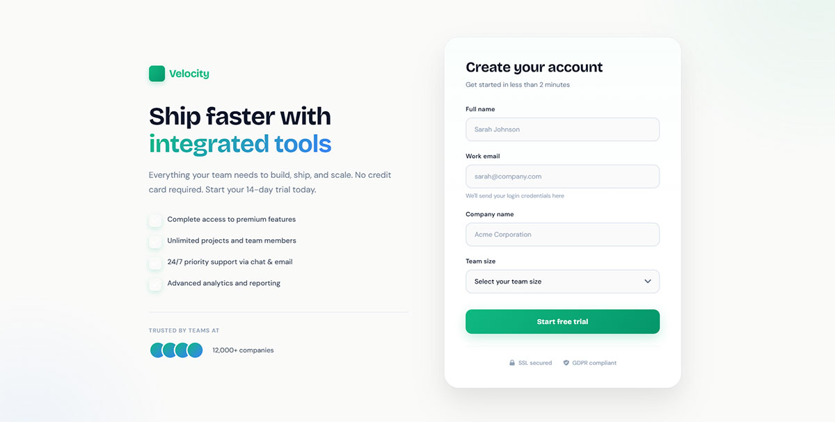
High-converting buttons use specific first-person copy, strong contrast, and a single clear action. HubSpot’s analysis of more than 330,000 CTAs found personalized buttons converted 202% better than default ones.
Specificity is the multiplier, though the precise percentages attached to it vary by source and most come from vendor aggregations rather than controlled research.
Copy That Beats “Submit”
The worst word your button can say is “Submit.” It describes what the user does for you, not what they get.
Swap it for the outcome. “Get My Free Quote” beats “Submit” because it names the reward, and short benefit-led copy of roughly three to four words is the common pattern among high performers.
PartnerStack changed “Book a Demo” to “Get Started” and went from 6.66% to 14.09% conversion, a relative lift of about 111%. Same button, different promise.
Contrast, Size, and Count
Contrast against the page background matters more than the specific color. Speero and CXL found only about one in seven color tests produces a statistically significant win, and contrast is what drives the ones that do.
Keep it to one primary action. Unbounce’s Landing Page Analyzer study of 18,639 pages found pages with a single link or CTA averaged 13.5% conversion, pages with two to four averaged 11.9%, and pages with five or more averaged 10.5%. Two points of caution here. Those bands are 1 / 2-4 / 5+, not 1 / 2 / 3+, and the data is correlational, so simpler pages may correlate with better-built campaigns rather than causing the lift. Unbounce’s newer Q4 2024 dataset, covering 41,000 pages and 464 million visitors, reports a 6.6% median conversion rate as the current baseline.
Every extra button splits attention. The broader set of tweaks that lift form performance almost always starts with cutting the page down to one obvious next move.
How Does Inline Validation Reduce Form Abandonment?
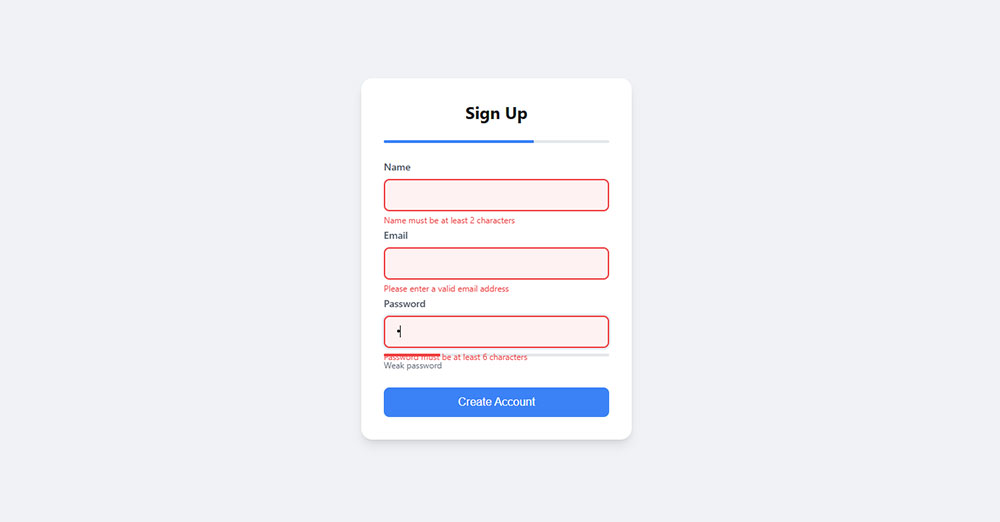
Inline validation catches errors as users fill each field, so nobody submits a form only to bounce back to a page full of red.
The study everyone cites is Luke Wroblewski’s, conducted with UK usability consultancy Etre and published in A List Apart in 2009. It is frequently misattributed to eBay. Against a control that validated only after submit, the best-performing inline version showed a 22% increase in success rates, a 22% decrease in errors, a 31% increase in satisfaction, a 42% decrease in completion time, and a 47% decrease in eye fixations.
Two caveats the original publication itself surfaced: the sample was small, and commenters including usability researchers David Travis and David Hamill flagged that the within-subjects design leaves it open to learning and fatigue effects. The direction is well supported by practice; the exact percentages deserve less weight than they usually get.
Timing is where the real guidance lives. Validate on blur, when someone leaves a field, rather than on every keystroke, which corrects people mid-word and can raise error rates rather than lower them. Notably, the GOV.UK Design System takes the opposite position for its context and validates on submit, which is a useful reminder that this depends on your users and form type.
Where to Place the Error Message
Next to the failing field is the best option, since users see the problem exactly where it happened. NN/g’s guidance points the same way. A summary at the top works as a backup, especially on long forms and for screen readers.
Vague copy is the real killer. “Invalid input” tells nobody anything, while “Enter a valid email like [email protected]” fixes the mistake instantly. Reusing the field’s own label in the message helps too: if the label says “Date of birth,” the error should say “Enter your date of birth.”
Success States, Not Just Errors
Green checkmarks confirm a field is right, which matters on inputs where people second-guess themselves.
Use them sparingly. A checkmark on every field clutters the interface. Reserve them for email, phone, and password strength, where validity isn’t obvious.
How Does Mobile Optimization Affect Form Conversions?
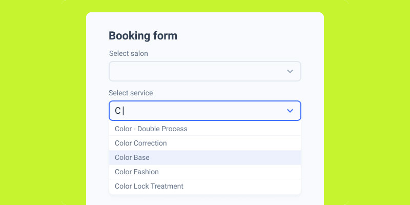
Mobile forms convert lower than desktop, and the fix is technical: correct input types, working autofill, and thumb-friendly placement. Zuko’s form analytics put the mobile view-to-starter rate at 42% versus 47% on desktop and 41% on tablets, and users overwhelmingly report preferring desktop for form filling.
Closing that gap is mostly a matter of removing self-inflicted friction.
Input Types and Keyboards
Setting type="tel" and type="email" triggers the right keyboard automatically, which reduces typing errors and speeds entry. Precise percentage claims here circulate from vendor blogs without published methodology, so take the direction rather than the digits.
The wrong keyboard on a single field costs seconds and invites mistakes. Multiply that across six fields and the mobile conversion gap explains itself.
Autofill Is a Major Lever
Zuko’s analysis found that among users who triggered autofill, form completion reached 71%, compared with 59% for users who did not. Only about 23% of users triggered autofill at all, which is the opportunity.
| Autofill State | Completion Rate | Source |
|---|---|---|
| Autofill triggered | 71% | Zuko Analytics |
| No autofill | 59% | Zuko Analytics |
This is a correlation, not proof that autofill causes completion, since people who autofill may simply be more practised users. Even so, the fix is nearly free: set correct autocomplete attributes and standard field names so browsers can do their job.
Thumb Zone and Tap Targets
Most mobile interaction is thumb-driven, which is why primary buttons like “Place Order” belong within comfortable reach rather than in a top corner.
Keep tap targets at 44×44 points minimum, and set input font size to 16px so iOS Safari doesn’t auto-zoom and break your layout. There’s a fuller checklist in designing forms that work on small screens.
How Do You A/B Test a Form for Higher Conversions?
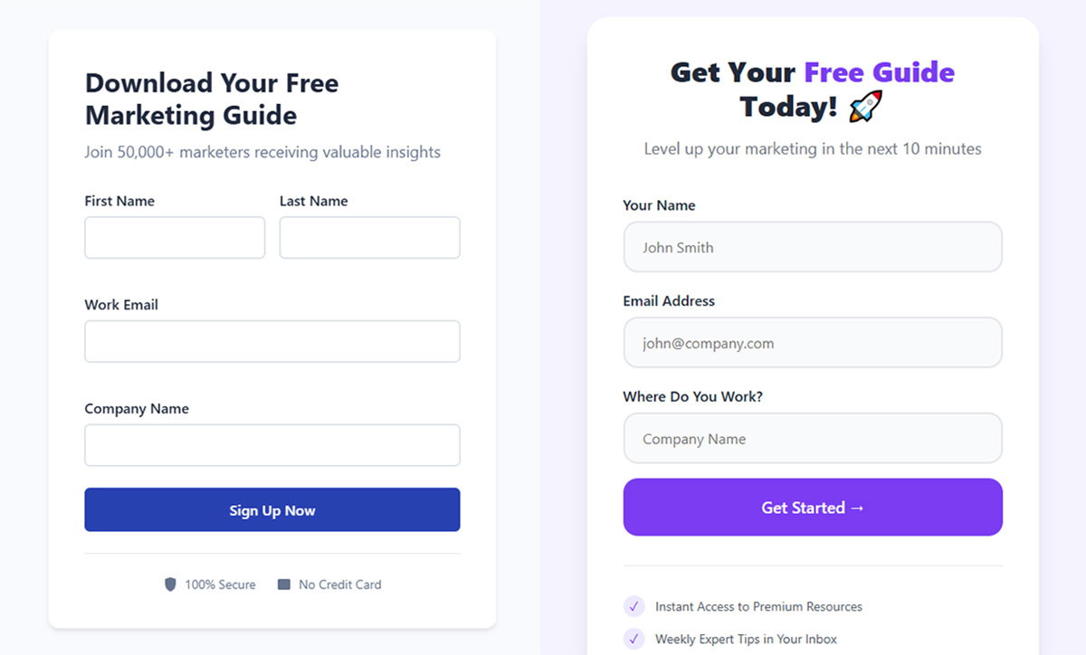
A/B testing a form means running two versions against live traffic and keeping the one that wins at 95% confidence.
Testing replaces opinion with data, and given how many of the benchmarks in this article turned out to be single-site case studies, that matters more than usual. The problem is most teams call a winner too early, before the numbers mean anything.
Reaching Statistical Significance
The standard threshold is 95% confidence (p under 0.05), meaning a 1 in 20 chance the result is noise.
Calculate your minimum sample size before launching, using baseline conversion rate and expected lift with power set at 80%.
Run each test long enough to cover full business cycles, typically two to four weeks, and aim for at least 100 conversions per variant as CXL recommends. A test that hasn’t hit its pre-calculated sample size hasn’t finished, no matter how good the graph looks.
Tools That Reveal Drop-Off
Form analytics come first. Zuko and native HubSpot reporting show per-field abandonment, so you know exactly where people quit.
For session behavior, Hotjar and Microsoft Clarity map rage clicks and funnel exits. VWO and Optimizely handle the split and the math on the experiment side.
Change one variable at a time. If you swap the CTA copy and the field count together, a win tells you nothing about which change earned it.
What Personalization and Autofill Tactics Lift Completion?
Personalization shrinks perceived effort by showing each user only the fields that apply and pre-filling the ones you already know. Baymard’s checkout research is the strongest evidence here: it estimates large e-commerce sites can raise conversion substantially through better checkout design, and separately finds the average checkout displays roughly twice as many form fields as it needs.
Dropbox stripped its signup to email and password first, collecting everything else later. Less upfront, more finished.
Pre-Filling Known Data
For logged-in or returning users, fill in what you already have. Every pre-filled field is one less reason to quit.
Enrichment tools can infer company size or industry from an email domain, so users never type what the system can look up.
Conditional Logic That Adapts
Conditional logic (also called skip logic) shows or hides fields based on prior answers. Typeform’s Logic Jump and Jotform’s rule builder both do this.
A conference form that shows 23 fields to a virtual attendee who’ll never need a T-shirt size or hotel preference bleeds completions. Branching hides the irrelevant ones.
Fewer visible fields, higher completion. Getting comfortable with how branching rules actually work is worth the afternoon it takes to learn.
One Question at a Time
Typeform popularized the conversational, single-question format, and it reduces the intimidation of a long form by never showing the full length at once.
Each screen asks one thing. The user answers, the next appears, and momentum builds instead of dread.
This works best for B2C surveys, quizzes, and the kind of engaging, interactive form flows where the experience matters as much as the data. For a dense B2B form a returning user fills weekly, it just adds clicks.
FAQ on How To Increase Form Conversions
What is a good form conversion rate?
It depends entirely on the denominator. Ruler Analytics puts the cross-industry average near 1.7% measured against form views, while benchmarks measuring submissions against people who actually interacted with the form report medians above 17%. Compare yourself only to figures that use your measurement basis.
How many fields should a form have?
Keep visible fields at 5 or fewer where possible. Benchmark data shows a cliff between 5 and 7 fields, where each additional field costs roughly twice what earlier ones did. Past that point, cut fields or split into steps.
Do multi-step forms really convert better?
On longer forms, generally yes, though the popular “86% higher, per HubSpot” figure is circular and untraceable to a primary study. More recent benchmark data suggests a lift closer to 14% on average and around 21% on B2B lead-gen forms. The exception is forms of only 2-3 fields, where steps just add clicks.
Does reducing form fields always increase conversions?
Not always. Expedia recovered roughly $12 million by removing one confusing field, but Venture Harbour documented tests where fewer fields lowered lead quality. Fewer submissions of better-fit prospects sometimes beats high volume of weak ones.
What CTA button copy converts best?
First-person, outcome-focused copy wins. “Get My Free Quote” beats “Submit” because it names the reward, and short benefit-led copy of three to four words is the common pattern. PartnerStack lifted conversion about 111% by changing “Book a Demo” to “Get Started.”
How does inline validation help?
Inline validation catches errors as users complete each field. Luke Wroblewski’s 2009 study with Etre, published in A List Apart, measured a 22% increase in success rates and 42% faster completion, though on a small sample. Validate on-blur, not on every keystroke.
Why do mobile forms convert lower than desktop?
Small screens, typing friction, and broken autofill. Zuko’s data shows a 42% view-to-starter rate on mobile versus 47% on desktop. Correct input types trigger the right keyboard, and working autofill is associated with completion rates of 71% versus 59%.
What are trust signals and do they work?
Trust signals are credibility cues near the form: privacy microcopy, recognized SSL badges, and subscriber counts. The widely cited “42% from Baymard” figure is a misattribution of a single Blue Fountain Media VeriSign test. Baymard’s actual finding is that around 18-19% of cart abandonments stem from payment-security distrust, and that badge recognition matters more than badge presence.
How long should I run an A/B test on a form?
Run it two to four weeks, cover full business cycles, and reach 95% confidence before deciding. CXL recommends at least 100 conversions per variant. Test one variable at a time, or you won’t know which change earned the lift.
Does single-column layout matter?
Yes. A CXL Institute study found participants completed single-column forms 15.4 seconds faster than multi-column ones (n = 356 vs 346, significant at 95%). Note it measured completion time, not conversion rate. Eyes scan straight down without zigzagging.
Conclusion
Knowing how to increase form conversions comes down to removing friction one field, one label, and one error message at a time.
No single tweak carries the whole result. The lift compounds.
Cut the fields users don’t need. Switch to a single-column layout with top-aligned labels.
Add inline validation that catches mistakes on-blur. Fix the mobile keyboard and let autofill do its job.
Then test. Reach 95% confidence before you trust any change, and watch per-field drop-off in tools like Zuko or Microsoft Clarity.
Small edits like a sharper CTA or a privacy line near the email field move real numbers.
Start with your highest-traffic form. Ship one change, measure it, and keep going.