








A form is usually the last thing standing between a visitor and whatever you actually want them to do: buy something, sign up, ask a question. Optimizing that form means…
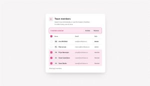
HTML Checkbox: Syntax, Styling and 12 Working Examples
An HTML checkbox is a form input element that lets a user select any number of independent options from a group at the same time, with each box holding its…

Lead Generation for Agencies: A Complete Guide
Here’s the rewritten article as HTML markup, ready to paste into WordPress. Facts, stats, links, and tables are preserved exactly as given. html Most agency owners are still the ones…
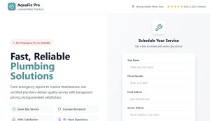
Lead Generation for Contractors: Proven Strategies
A homeowner with a leaking pipe or a dead HVAC unit doesn’t spend weeks researching. They call two or three companies, pick whoever answers, and move on with their day….

Registration Success Message: 50+ Copy-Paste Examples
The first message a user sees after creating an account sets the tone for everything that follows. Get it wrong, and you lose them at the exact moment they’re most…

Radio Button vs Checkbox: The Rule Everyone Gets Wrong
A submission comes back with two answers to a question that only had room for one. That’s a checkbox sitting where a radio button belonged, and you usually find out…
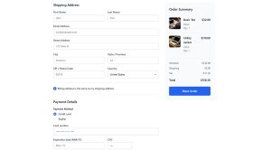
How to Increase Form Conversions: The 81% You’re Losing
Most of your visitors want what you’re offering. They just quit before hitting submit. In a survey by The Manifest, 81% of people said they had abandoned an online form…

Contact Us Page Templates: 4 Fields Beat 11
A contact page is one of the few pages on a site with a single job: get someone to reach out, then get someone to answer them. That second part…