




Most form tutorials show you what’s possible. This one shows you what actually works. The State of CSS 2024 survey puts Tailwind CSS at 62% developer usage. More teams are…
Table of contents
Most people building a feedback form don’t start with a blank page. They grab something that already worked, an old customer survey, a template a coworker used last quarter, and adjust the wording from there.
That’s basically the point of collecting feedback form examples like these: a shortcut past the blank page, borrowed from customer support teams, HR departments, and event organizers who’ve already tested what actually gets answered.
Question order alone can move the needle. SurveyMonkey’s own analysis of respondent completion data found that feedback forms opening with a multiple-choice question average an 89 percent completion rate, against 83 percent for forms that lead with something open-ended. Six points, just from picking which question goes first.
What Is a Feedback Form?
Ask someone to define this on the spot and most people land on roughly the same idea: a way to find out how someone feels about something. True enough, but the details matter more than the definition. A feedback form collects opinions, ratings, or comments from a specific group of people, and it does that after one clear interaction, not as some ongoing relationship check-in.
The line between a feedback form and a general survey comes down to scope. A general survey stretches to cover a lot of ground. A feedback form stays short and ties itself to a single moment, a purchase, a support call, an event, or a product release just after it ships.
It’s one member of a much wider family of forms that sites run day to day. Contact forms, registration forms, order forms, and a full range of form types beyond that all live in the same general category, just built for different jobs.
Intent is really the dividing line. A feedback form exists to measure a reaction. It isn’t there to process a transaction, and it isn’t there to capture a lead, even though plenty of homepages try to sneak both jobs into one form.
It’s also not a few other things people mix it up with. Not a full market research questionnaire, run for statistical rigor across a large sample. Not a support ticket, where someone is logging a problem that needs an actual fix. And not, despite how often the two get confused, a lead capture form built to convert a visitor into a prospect.
What Question Formats Do Feedback Forms Use?
Feedback forms mostly draw from the same small toolkit: rating scales, multiple choice, matrix grids, and open-ended text. Each one trades speed for depth, which is why most forms end up mixing two or three formats instead of leaning on just one.
| Format | Structure | Best For |
|---|---|---|
| Rating scale | Numeric or star range, usually 1 to 5 or 1 to 10 | Quick sentiment checks |
| Multiple choice | Single or multi-select from fixed options | Categorizing feedback fast |
| Matrix question | Grid rating several items on the same scale | Comparing multiple attributes at once |
| Open-ended | Free text field, no fixed options | Capturing detail a scale cannot |
Closed and open formats between them cover most of what shows up across the wider types of survey questions used in feedback collection generally.
Closed-Ended Formats
Closed-ended questions hand respondents a fixed set of options, and that’s really what makes the resulting data fast to scan and easy to chart later.
- Rating scale and star rating questions, usually running 1 to 5 or 1 to 10
- Multiple choice questions, either single-select or multi-select
- Yes/no questions for a quick binary check
- Ranking questions, where someone orders a short list of options
Multiple choice questions run on the same interface logic behind the classic radio button vs checkbox decision: pick one option, or pick several.
Open-Ended Formats
Open-ended questions hand the respondent a blank text field instead of a menu to choose from.
They surface the kind of detail a rating scale just can’t get to: the specific reason behind a low score, or the exact feature someone wanted and didn’t get.
The tradeoff is volume. Open text takes longer to answer and longer to read afterward, which is exactly why most forms limit themselves to one or two open questions among several closed ones.
Customer Feedback Form Examples
Most customer feedback forms fall into one of a handful of patterns that keep showing up regardless of industry: post-purchase check-ins, follow-ups after a support ticket closes, and the standalone general satisfaction survey. Three to five questions is the norm, and they usually go out within days of whatever interaction they’re measuring.
Post-Purchase Feedback Form Example
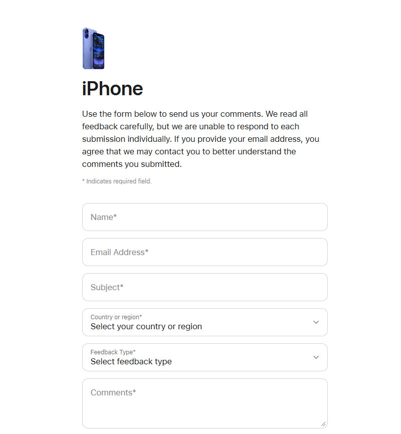
Image source: apple.com
A post-purchase form usually opens with a rating scale question, then narrows down with one or two open text follow-ups once the respondent’s already committed to answering.
The sequence tends to look the same across brands: an overall satisfaction rating out of five stars first, then something about delivery speed and the condition the product arrived in, then usually one open field at the end for anything that didn’t fit the earlier questions.
Most brands aren’t writing this list from scratch. They borrow a short set of post-purchase survey questions and adjust the wording for their own product.
Customer feedback surveys average a 31.81 percent response rate, according to SurveyMonkey’s 2025 platform data. That’s well above what a cold outreach email typically pulls, which says something about timing more than anything else.
Customer Service Feedback Form Example
See the Pen
Modern Feedback Form with Interactive Emoji Ratings by Bogdan Sandu (@bogdansandu)
on CodePen.
A customer service feedback form fires the moment a support ticket closes, while the whole interaction is still fresh enough to remember clearly.
It usually pairs a Customer Effort Score question, essentially asking how easy it was to get the problem resolved, with a short satisfaction rating tacked on after.
Airbnb runs almost exactly this pattern, sending NPS and CSAT surveys by email once a support interaction wraps up, on top of the post-stay reviews it already prompts from both guests and hosts.
Some teams swap the effort question out entirely and go with a set of customer service survey questions that dig into specific agent behavior instead: response time, tone, whether the issue actually got fixed.
Employee Feedback Form Examples
On the employee side, most feedback forms land in one of three buckets: the satisfaction survey, the onboarding check-in, or the anonymous pulse survey HR runs a few times a year. Anonymity ends up being the biggest design call in any of these, since it directly shapes how honest people are willing to be.
Employee Satisfaction Form Example
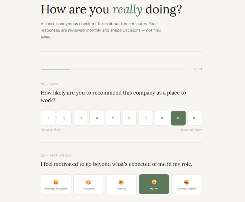
Employee satisfaction forms tend to circle the same handful of themes: how the relationship with a direct manager is going, whether workload and work-life balance feel sustainable, and whether there’s room to grow or get recognized for good work.
Marks & Spencer treats this as a layered program rather than a single annual event. Three pulse surveys go out every year, backed by one larger annual engagement survey, and team engagement gets built directly into each manager’s own performance goals as a KPI.
Most HR teams aren’t writing new questions every cycle either. They pull from a standard bank of employee satisfaction survey questions and adjust as needed.
Onboarding Feedback Form Example
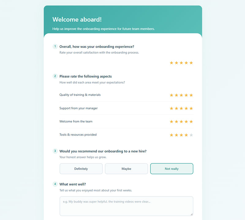
Onboarding feedback checks in at fixed points rather than firing once and calling it done, usually week one, day thirty, and day ninety.
General employee feedback surveys average a 43.05 percent response rate on SurveyMonkey’s platform, well above the 21.51 percent typical for the big formal annual engagement survey. New hires tend to answer more candidly when the form allows anonymous submission too, especially on anything touching manager support or unclear expectations early on.
A short set of onboarding survey questions covering training clarity, manager check-ins, and role expectations usually covers what a thirty-day form actually needs.
Event and Training Feedback Form Examples
Event and training feedback forms share one trait above everything else: timing. Sent right after a session, while the experience is still fresh, they capture sharper answers than anything emailed out a week later ever will.
Post-Event Feedback Form Example
Keep it short.
A post-event form that drags past two minutes runs straight into survey fatigue, and people abandon it before they hit submit. The ones that work well usually stick to an overall event rating, then something about the speakers or specific sessions, a logistics question covering venue and registration and timing, and one open field asking what to change next time.
Most organizers aren’t building this from scratch either. They pull from a standard set of post event survey questions and swap in whatever’s specific to the event.
Training and Course Evaluation Form Example
Training feedback isn’t quite the same animal as event feedback, mostly because it has to measure whether anyone actually learned something, not just whether they had a decent time.
A course evaluation usually asks whether the material lined up with the stated learning goals, whether the pace worked for the group, and then the harder question: whether the person can actually apply any of it back on the job.
Registration friction and facility complaints show up constantly in the open comments on these forms, even when the rating scores themselves come back strong. Worth noticing when that happens, since a good average score can hide a logistics problem nobody’s fixing.
A focused list of training survey questions, split between content quality and delivery quality, tends to produce more useful answers than one long generic form ever does.
Product and Website Feedback Form Examples
Product and website feedback forms usually live inside the product itself, triggered by a specific action instead of sent out over email. That placement alone is what separates them from customer service or event forms.
Product Feedback Form Example
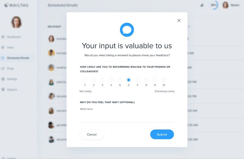
Image source: mailtag.io
Asana collects this kind of feedback through an exit survey shown right in its subscription cancellation flow, catching the actual reason for churn while it’s still top of mind instead of guessing at it later.
A product feedback form usually shows up after a new feature ships, right around a subscription cancellation, or inside a beta test tied to a specific build number. Timing matters more than wording here.
Most product teams lean on direct survey questions about product quality rather than open-ended prompts, mainly because scores are easier to track release over release than paragraphs of free text are.
Website Feedback Form Example
See the Pen
Modern Dark Theme Feedback Form with Micro-interactions by Bogdan Sandu (@bogdansandu)
on CodePen.
Plenty of SaaS sites run a small on-page survey widget that lets a visitor pick what they want to comment on: a specific feature, the product overall, or a direct line to support.
It usually shows up as a small embedded widget tucked in a corner of the screen rather than a full-page interruption nobody asked for.
What it’s actually measuring is page usability, missing content, and whatever broken element a visitor stumbled into mid-task. A short set of website feedback survey questions covering findability and task completion covers most of what a site owner needs to know.
What Measurement Method Should a Feedback Form Use?
Three measurement methods show up again and again across feedback forms: Net Promoter Score, Customer Satisfaction Score, and Customer Effort Score. Each one is really answering a different question, loyalty, satisfaction, or ease, and picking the right one comes down to what specific moment the form is trying to measure.
The numbers behind these methods make the stakes clear. Median Net Promoter Score across industries sits at 42, with B2C brands averaging 49 against 38 for B2B (Survicate, 2025).
The U.S. national Customer Satisfaction Index average held at 77.0 in the first quarter of 2025, across approximately 400 companies (ACSI, 2025). And on the effort side, 96 percent of customers who report a high-effort experience become disloyal, against just 9 percent after a low-effort one (Gartner, originally CEB).
Net Promoter Score
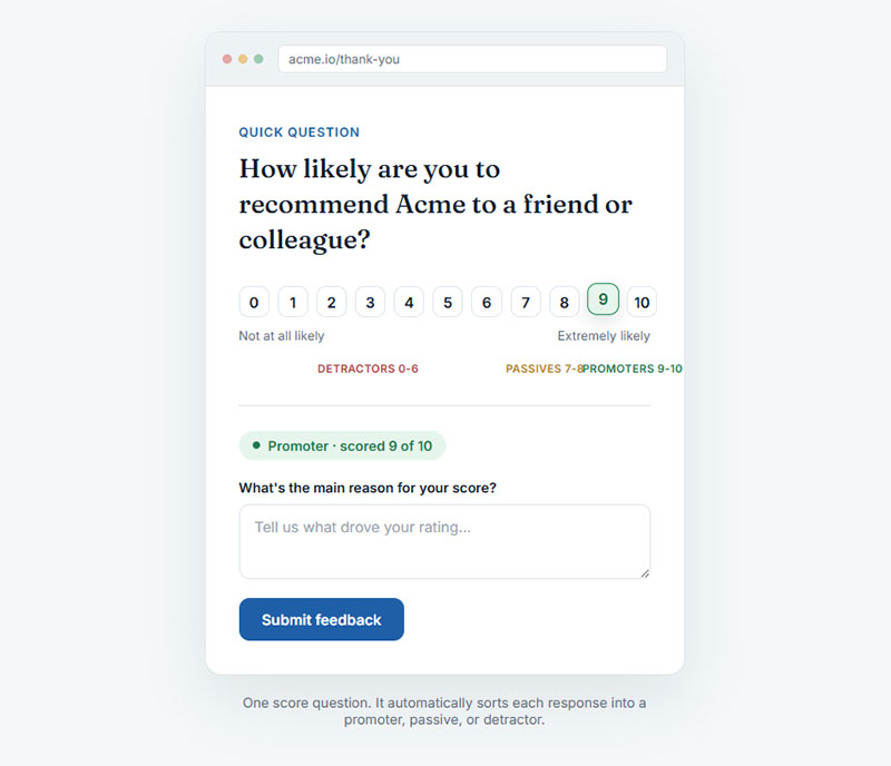
Net Promoter Score asks exactly one question: how likely is this customer to recommend the company to someone else, scored zero to ten.
Fred Reichheld developed the method at Bain & Company back in 2003, and it’s still the most reused single-question format in customer feedback today, probably because it’s so easy to slot into almost anything.
Responses split into promoters, the 9s and 10s, passives sitting at 7 or 8, and detractors anywhere from 0 to 6. The score is just the promoter share minus the detractor share, nothing more complicated than that.
A form built around the standard NPS survey questions format rarely needs more than the core question plus one open follow-up asking why.
Customer Satisfaction Score
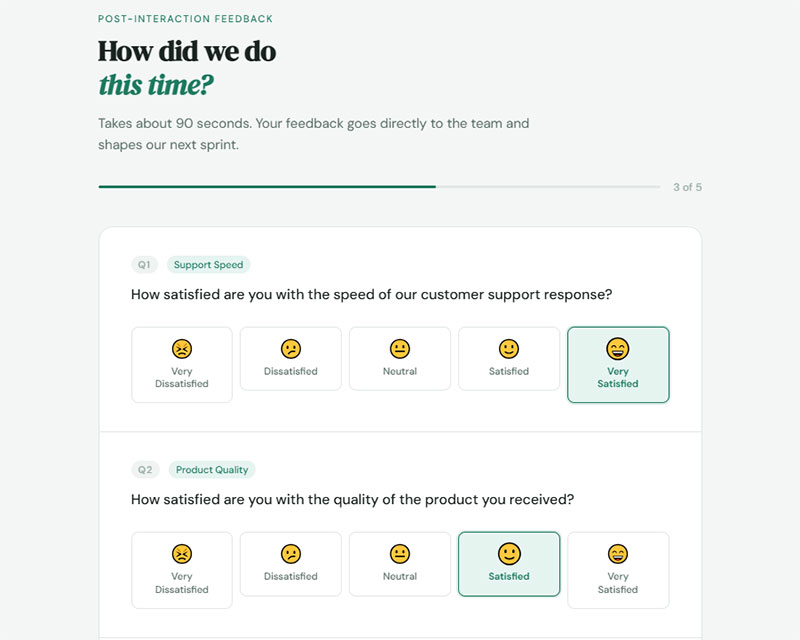
Customer Satisfaction Score measures how someone felt about one specific interaction, not the broader relationship with the company.
Most implementations run it on a 1 to 5 scale, and the score itself is just the share of 4s and 5s out of total responses. It works best within minutes or hours of the interaction, before the memory of it starts to blur into everything else that happened that day.
CSAT is answering a narrower question than NPS, which is exactly why it pairs so well with a post-purchase or customer service feedback form.
Customer Effort Score
Low effort beats delight.
Customer Effort Score asks how easy it was to get something done, scored on a 1 to 7 scale, and it predicts repurchase better than a satisfaction score does on its own.
Most CES questions run on the same Likert scale format that Rensis Likert introduced back in 1932, just relabeled around effort instead of agreement. Same basic idea, different question.
It fits best on a customer service feedback form, right after a ticket closes, while the friction is still fresh enough to rate honestly.
Which Feedback Form Builder Should You Use?
IvyForms, Google Forms, Typeform, SurveyMonkey, Jotform, and Microsoft Forms cover most of what a team actually needs for a feedback form. The right pick usually comes down to budget, how much question logic is needed, and how polished the finished form has to look.
None of the six is objectively best. Each one just wins a different job.
| Builder | Free Plan | Best For |
|---|---|---|
| IvyForms | Free forever (Lite plan, no credit card) | WordPress sites that want forms built right into the dashboard |
| Google Forms | Free, unlimited responses | Simple internal feedback forms |
| Typeform | Capped, billed by monthly responses after | Polished customer-facing forms |
| SurveyMonkey | Limited, no skip logic on free tier | Statistical analysis, cross-tabulation |
| Jotform | Free tier, limited submissions | Payment and file upload fields |
| Microsoft Forms | Free with Microsoft 365 | Teams already inside Office |
IvyForms makes sense if the site’s already running on WordPress, but if it is, the pitch is simple: no separate account, no embed code, no extra login. Forms live right inside the admin dashboard, submissions and all.
The free tier (branded Lite) isn’t a stripped demo either. Drag and drop building, spam protection through reCAPTCHA, hCaptcha or Turnstile, entry management, GDPR-friendly fields. That’s a fair chunk of what a basic feedback form actually needs.
The paid side is where it gets different from everything else on this list. Most builders rent you features monthly, forever. IvyForms sells lifetime plans instead, so one purchase unlocks conditional logic, multi-step forms, digital signatures, Google Sheets sync, and Mailchimp integration for good. No renewal, no creeping subscription cost.
The obvious limit: it’s WordPress-only. Nothing to install anywhere else, and no version for teams on Shopify, Webflow, or a custom stack.
Google Forms is free at any volume with no response cap, which is rare among the six.
It works well for a quick internal feedback form, though the free version stays basic. A fuller look at Google Forms alternatives is worth a read once conditional branching or custom branding becomes a requirement.
Published 2026 pricing comparisons don’t agree on the exact free-tier response cap for SurveyMonkey either. Some list 25 responses per survey, others list 40, but every comparison agrees the free plan drops skip logic and advanced branching.
Typeform flips that tradeoff. It’s a more polished, one-question-at-a-time experience, but billed by monthly response volume once a form starts getting real traffic.
A form that clears roughly 1,000 responses a month on Typeform usually forces an upgrade to a higher paid tier. A wider look at Typeform alternatives covers what else fits that kind of budget.
Jotform and Microsoft Forms round out the list as solid fallback options. Jotform earns its spot through payment and file-upload fields most builders skip, and Microsoft Forms makes sense mainly for teams already living inside a Microsoft 365 account.
Where the data actually ends up depends on the integrations available. Zapier connects to almost anything else in a stack, Google Sheets gives a live, editable response log, Slack fires real-time alerts on new submissions, and Salesforce routes feedback straight into a CRM record for whoever needs to follow up.
Which Distribution Channel Works Best for a Feedback Form?
Email, an embedded website widget, a QR code, or an in-app prompt each work best in a different situation, and matching the channel to where the interaction actually happens matters more than picking whatever’s easiest to set up.
Email links still make the most sense for post-purchase and employee satisfaction forms going out to a known list. They reach people who’ve stepped away from the product or the site entirely, and they can handle a longer form with several questions without feeling cramped the way an on-page widget would. The catch is that email competes with a full inbox, and open rates tend to fall the longer a list sits unused.
An embedded website widget flips most of that. It’s a small on-page form, usually triggered right after a specific action, and it catches feedback the moment friction actually happens rather than days later. Nobody has to leave the page or open a separate app.
The obvious limit: it only reaches people who are already on the site, so it says nothing about anyone who bounced before triggering it. Some site owners build it as a fixed section on the page, others use a popup that fires after a short delay, and the choice between inline forms vs popup forms usually comes down to how much interruption that particular moment can absorb.
QR codes work best tied to a physical location: a restaurant receipt, an event badge, a hotel key sleeve.
They catch feedback while someone’s still on-site, and they don’t need an app or an email address on file to work. They do depend on someone actually pulling out a phone and scanning, which is a real drop-off point in practice, not just a theoretical one.
In-app or kiosk prompts live inside the product itself, so they catch people at the exact moment of use.
In-app surveys on mobile average a 27 to 36 percent response rate, compared with just 6 to 15 percent for email, according to Qualaroo’s 2025 analysis. The tradeoff is the same one embedded widgets run into: it only reaches people already inside the product, so it says nothing about the ones who left before ever opening it.
How Do You Create a Feedback Form?
There’s no real shortcut around doing this in order. Skip the first step and the whole form usually ends up too long and too vague to be useful, which is the single most common failure pattern here.
- Define the goal and the metric. Decide upfront whether the form is measuring satisfaction, effort, or loyalty, since that choice shapes every question that follows it.
- Choose the question format. Mix a rating scale with one or two open text fields instead of relying on either format alone.
- Set the question count to match the use case. A two-minute customer or event form stays short by design. An onboarding or internal research form can run longer without hurting completion much.
- Decide on anonymity. Anonymous forms tend to pull more honest answers on sensitive topics. Named forms allow a direct follow-up when one’s needed.
- Add a progress indicator and lay out one question per page. This matters a lot more on longer forms than short ones, where it barely registers.
- Test the form, then set the thank-you message. Run it past a few people first, and make sure the ending page actually tells respondents what happens with their answer.
Some site owners skip a dedicated form tool altogether and build the feedback form right inside a page, using native blocks instead of a plugin. A full walkthrough of how to create forms in WordPress without plugins covers that route step by step, for anyone who’d rather skip a separate tool entirely.
Whichever route ends up getting used, the last screen matters almost as much as the first question. A clear form submission confirmation message confirms the response actually went through and, ideally, says what happens next.
What Mistakes Lower Feedback Form Response Rates?
Most of the drop in feedback form response rates traces back to a handful of repeat offenders: too many questions, a progress bar stuck in the wrong spot, a layout that breaks the second someone opens it on a phone, vague wording, and no confirmation message once it’s done.
Too many questions is the big one. Once a form runs longer than its use case actually calls for, it pushes straight into survey fatigue, and abandonment climbs with pretty much every added field after that. A short guide on how to avoid survey fatigue covers the specific triggers in more detail. Question order matters almost as much as question count, for what it’s worth.
Progress bar placement is the one most people get backward. Top-of-page progress bars showing a running percentage actually increased drop-off compared with no progress bar at all, while bars placed at the bottom of the page improved completion, according to SurveyMonkey’s own analysis of respondent data. A closer look at form progress bar examples shows the difference in practice rather than as an abstract rule on paper.
A layout that breaks on a phone screen loses a big share of respondents before they’ve answered a single question, and most feedback forms today get opened on mobile first, not desktop. Beyond that, vague or leading wording (questions that quietly hint at the answer the business wants to hear) and skipping the confirmation message, leaving respondents unsure whether the thing even submitted, round out the list.
When Does a Feedback Form Not Work?
A feedback form runs out of usefulness in a few predictable spots: not enough responses to mean anything, a topic too tangled for closed questions, an anonymity requirement that blocks any follow-up, and situations where behavior already tells the real story better than a survey would.
Response volume too low is the most common failure. Most statisticians treat 100 responses as the floor for a meaningful result, according to research aggregated by Survicate, with a recommended ceiling around 10 percent of the total population, up to 1,000 responses, whichever number is smaller. A five-question form that comes back with eight responses is not data. It’s anecdote dressed up as a chart.
Some topics are just too complex for closed questions. A rating scale can’t untangle why a long-term customer is quietly losing trust in a product, or why a new hire feels disconnected from the team despite decent onboarding scores. Those situations call for an actual conversation instead. A look at chatbots vs forms lays out where a structured form runs out of road and something more conversational has to take over.
There’s also the anonymity problem: a fully anonymous form can’t flag which specific customer or employee needs a direct response, even when one clearly does. And sometimes behavior has already answered the question. Cart abandonment data or feature usage logs often show what someone actually did more reliably than what they said they’d do in a form.
Self-reporting bias sits underneath all of this. People answer surveys the way they want to be seen, not always the way they actually behaved, so a feedback form works best next to behavioral data, not instead of it.
FAQ on Feedback Forms
What Is the Difference Between a Feedback Form and a Customer Survey?
A feedback form stays short and ties itself to one moment: a purchase, a support call, an event. A customer survey runs longer, covers more ground, and usually supports market research rather than tracking a single interaction.
How Long Should a Feedback Form Be?
Length depends mostly on where the form shows up. One embedded after a single action should stay under a minute. An emailed form can run longer without much penalty, but completion drops once total time passes two to three minutes, regardless of the channel used to send it.
Should a Feedback Form Be Anonymous or Identified?
Default to anonymous for sensitive topics: employee sentiment, workplace culture, leadership feedback. Default to identified whenever a specific reply or fix is actually expected: customer service, product bugs, order issues. The topic decides the setting here, not some blanket rule applied across the board.
What Integrations Connect to a Feedback Form?
Beyond Zapier and Slack, plenty of feedback tools sync straight into Airtable for a structured response database, or into Google Analytics to tie a given submission back to the exact page and session that triggered it, in real time.
Is a Feedback Form GDPR Compliant and Accessible Under WCAG?
Neither compliance happens automatically. GDPR requires clear consent language and a stated data retention period for EU respondents. Accessibility comes down to keyboard navigation, labeled fields, and sufficient color contrast, measured against WCAG 2.1 AA, the standard benchmark for web accessibility.
Which Feedback Form Examples Should You Build First?
Feedback form examples built around one high-traffic moment, a post-purchase check-in or a customer service follow-up, deliver the fastest signal, and they belong first in any rollout, ahead of employee, event, or product feedback forms that reach a smaller, slower audience.
Run the math and it gets specific fast. A 31.81 percent customer feedback response rate paired with the 100-response floor for meaningful data means roughly 315 sends are needed before results actually hold up, a threshold neither number states on its own.
That sequencing trades breadth for speed: post-purchase and customer service forms only reach customers who finished a transaction, not the ones who left without saying a word.
The next step from here is a broader set of best practices for creating feedback forms, covering wording, timing, and structure across whatever channel a team ends up leaning on most.