



Google Analytics files plenty of visits under direct that were never direct. In a 2023 experiment by SparkToro and Really Good Data, covering 1,113 test visits across 11 networks, 100%…
Table of contents
Only 1 in 26 dissatisfied customers ever files a complaint, according to research from thinkJar. The other twenty-five just leave. No complaint, no exit survey, nothing in the analytics dashboard explaining why the checkout page suddenly stopped converting. That gap is exactly what website feedback survey questions exist to close.
Visitors behave the same way customers do in a store. They don’t announce what annoyed them. They close the tab.
A well-timed question on the right page can catch some of that before it disappears for good: why someone bailed at checkout, whether the search results actually matched what they typed, what almost talked them out of buying in the first place. None of that shows up in a heatmap, and session recordings only show you the click, not the reason behind it.
Wording matters more than most people assume going in. Ask the wrong question at the wrong moment and the answer you get back looks like data. It isn’t.
What Are Website Feedback Survey Questions
A support ticket gets filed when something breaks. A review shows up whenever a customer feels like writing one, sometimes days or months later, if they bother at all.
A feedback survey question runs on a different clock entirely. Someone picked the exact wording and the exact moment it fires, tied to a specific page, task, or exit point. That’s really the whole difference between this format and the other two: intent baked directly into the timing.
Put simply, these are structured prompts placed on a site to catch a visitor’s opinion, satisfaction, or friction point right as it’s happening, not whenever they happen to feel like sharing it.
They don’t compete with analytics or session recordings either. Heatmaps show what a visitor did on a page. The survey question is often the only thing there asking why.
Common Question Formats
Most on-page prompts fall into a handful of formats, and using the wrong one for the situation is an easy way to waste the fifteen seconds of patience a visitor is willing to give you.
- Rating scale, usually 1 to 5 or 0 to 10
- Open-ended text for verbatim comments
- Multiple choice for reason selection
- Binary yes/no for quick task confirmation
Same idea, different formats, and the wording shifts with each one:
| Format | Example question |
|---|---|
| Rating scale | How easy was it to find what you needed? (1-5) |
| Open text | What were you looking for that you didn’t find? |
| Multiple choice | What brought you here today? (compare prices, research, buy, get support) |
| Yes/no | Did this page answer your question? |
A closer breakdown of types of survey questions covers the branching and matrix formats that show up in longer, standalone surveys rather than on-page microsurveys.
What Types of Website Feedback Surveys Exist
Picking the right survey type matters just as much as picking the right wording. Net Promoter Score, Customer Satisfaction, Customer Effort Score, exit-intent, and usability surveys each answer a genuinely different question, and using the wrong one is how a team ends up with a spreadsheet full of numbers nobody can act on.
| Survey Type | Core Focus | Typical Trigger |
|---|---|---|
| Net Promoter Score | Loyalty and referral intent | Post-purchase, repeat visit |
| Customer Satisfaction | Single interaction quality | After checkout, support chat |
| Customer Effort Score | Task friction | After self-service task |
| Exit-intent | Abandonment reason | Cursor moves toward close |
| Usability | User experience and findability | Mid-session, on key pages |
Onboarding surveys are the outlier here. They target brand-new visitors instead of returning ones, usually within that very first session, to capture a first impression before it has time to fade.
The wording for this type looks different from the rest too. A set of onboarding survey questions asks about first impressions and initial expectations rather than satisfaction with a completed task.
Building any of these starts the same way no matter which type you land on. Nail down the goal first, then create a survey form around that one goal, instead of building a single form that tries to measure everything at once and ends up measuring nothing well.
What Makes a Website Feedback Survey Question Effective
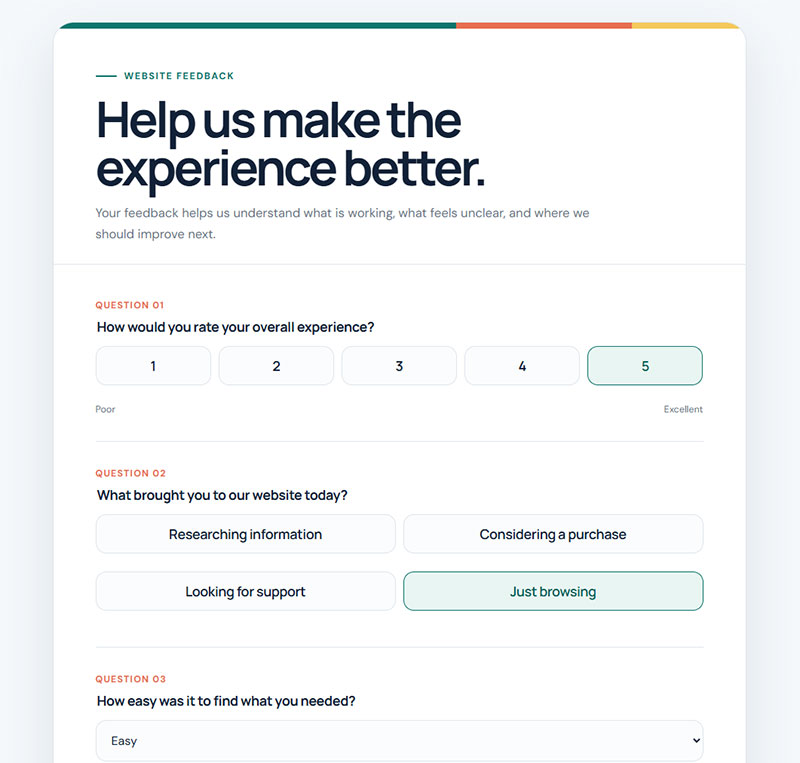
Ask about one thing at a time. That’s the rule most on-page surveys break first, usually without anyone noticing until the data comes back muddy.
A question like “was the checkout fast and easy” asks two things at once. A low score doesn’t tell you which problem caused it, slow, confusing, or both, and now someone has to go guess.
Neutral phrasing matters just as much as question count. A question that hints at the answer a business wants, “How much did you enjoy our new checkout?”, pulls the response toward agreement before the visitor has even thought about it.
Most on-page feedback widgets only have room for one or two questions before a visitor loses patience and clicks away.
Survey completion rate tracks question count closely. Surveys with 1 to 3 questions finish at an average of 83.34%, according to Survicate’s analysis of 267,564 responses.
That rate drops to 65.15% for surveys with 4 to 8 questions, 56.28% for 9 to 14, and 41.94% once a survey reaches 15 questions or more. The pattern is about as linear as data gets.
Guidance on building feedback forms that don’t frustrate a respondent applies directly here. Shorter beats comprehensive almost every time.
Rating Scale Consistency
Scale direction has to stay fixed across an entire survey.
Flipping from “1 equals best” on one question to “1 equals worst” on the next produces answers that look perfectly consistent but actually measure the opposite of what the respondent meant.
A standard 1-to-5 Likert scale question keeps that direction locked for the whole survey, which is part of why it’s stayed the default for on-page satisfaction prompts for so long.
Avoiding Leading and Double-Barreled Wording
Wrong: “Wasn’t our new search feature helpful?”
Right: “How helpful was the search feature?”
The first version assumes a positive answer before the visitor even opens their mouth. The second one actually leaves room for a real one.
Double-barreled wording fails in a similar way. “Was the site fast and easy to use” needs to split into two separate questions, one for speed and one for ease, or you’re back to guessing which one dragged the score down.
More Rewrites Worth Stealing
| Weak version | What breaks | Better version |
|---|---|---|
| Do you like our new design? | Opinion with no action attached | Was anything harder to find after the redesign? |
| How was your experience? | Too broad to code or act on | Did you finish what you came here to do? |
| Rate our fast, secure checkout | Two claims baked into the prompt | How would you rate the checkout process? (1-5) |
| Any feedback? | Skipped by nearly everyone | What’s one thing we could change on this page? |
| Why didn’t you buy? | Accusatory, kills the answer | What stopped you from completing your purchase today? |
| Was the page useful and clear? | Two ideas, one answer slot | Split: usefulness, then clarity |
Which Net Promoter Score Questions Work Best for Websites
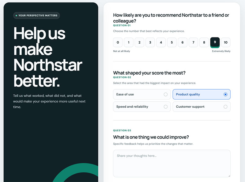
Fred Reichheld introduced Net Promoter Score at Bain and Company in 2003, built as a single-question alternative to long satisfaction surveys. The wording hasn’t really moved since: “How likely are you to recommend [website] to a friend or colleague?” scored 0 to 10.
- Promoters: scores of 9 or 10
- Passives: scores of 7 or 8
- Detractors: scores of 0 through 6
NPS subtracts the detractor percentage from the promoter percentage, which is why the resulting number can run negative. That trips people up the first time they see it.
The global median across industries sits at 42 for 2025, according to Survicate’s benchmark study, with B2C companies outperforming B2B by 11 points, 49 versus 38.
T-Mobile posts an NPS of 82, well above the telecom industry average of 31, based on 2025 benchmark data compiled by Sobot. (Other benchmarking firms place T-Mobile and the telecom average considerably lower, so treat this specific figure as one vendor’s dataset rather than a universal number.)
The follow-up question carries just as much weight as the score itself. Skip it and NPS turns into a vanity number with no real path to improvement. Route the follow-up by score band instead of showing everyone the same box:
| Score | Follow-up to show |
|---|---|
| 9-10 | What would you tell a friend about us? |
| 7-8 | What would have made this a 9 or 10? |
| 0-6 | What went wrong, and what should we fix first? |
Two more that work on a site specifically:
- How likely are you to come back to this site the next time you need something like this? (0-10)
- Which part of the experience are you scoring, mostly? (products, prices, site itself, support, delivery)
Trigger timing decides whether the data means anything at all. Ask the question after a purchase or a repeat visit, never on someone’s first session, since a brand-new visitor has no relationship yet to actually score.
A wider set of NPS survey questions covers loyalty-specific follow-ups for subscription and SaaS products, where the standard wording needs slight adjustment.
Which Customer Satisfaction Questions Work Best for Websites
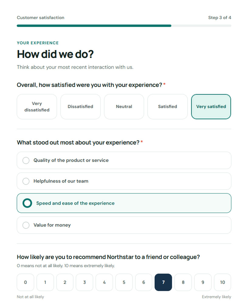
CSAT is narrower than NPS by design. It measures one interaction, not the whole relationship somebody has with a site, and the standard wording keeps that scope tight: “How satisfied were you with [interaction]?” paired with a 1-to-5 scale.
Star ratings, smiley-face icons, and a plain binary yes/no all measure the same underlying thing. They just carry different visual weight, and honestly, which one you pick usually comes down to brand feel more than data quality.
Checkout needs its own version of the question. So does a support article, a search results page, even a return policy FAQ. One generic “how did we do” asked everywhere flattens all of that into noise nobody can use.
Page-Specific CSAT Wording
| Page | Question to ask |
|---|---|
| Checkout confirmation | How satisfied were you with the checkout process? (1-5) |
| Product page | Did this page give you enough information to decide? |
| Search results | How well did these results match what you searched for? (1-5) |
| Help article | Did this article solve your problem? (yes / partly / no) |
| Pricing page | Is it clear which plan is right for you? |
| Blog post | Did this answer the question you came here with? |
| Account dashboard | How satisfied are you with how easy this is to use? (1-5) |
Amazon and Chewy post CSAT scores above 80, well ahead of the retail and ecommerce average, according to Sobot’s 2025 industry benchmarking.
A low score needs a reason attached to it, or it’s just a number. The standard dissatisfaction follow-up, “What could we have done better?”, turns that bare number into something a team can actually fix. A few sharper alternatives:
- What was missing from this page?
- Which part of this took longer than it should have?
- What did you expect to happen that didn’t?
Ready-made customer satisfaction survey templates cover most of these interaction-specific variants without writing each one from scratch.
Which Customer Effort Score Questions Work Best for Websites
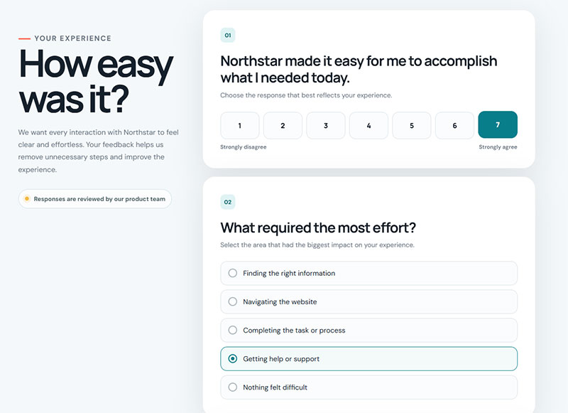
CEB research (the group now part of Gartner) surveyed more than 75,000 customers and found that reducing customer effort predicts loyalty better than satisfaction does. That finding reshaped how a lot of teams think about support.
The standard wording: “[Website] made it easy for me to [complete task],” scored on a 1-to-7 agreement scale from strongly disagree to strongly agree.
CEB, now part of Gartner, introduced the metric in 2010 after that research pointed away from customer delight and toward effort reduction as the stronger driver of loyalty.
The gap between outcomes isn’t subtle. 96% of high-effort customers report becoming disloyal, compared with just 9% of low-effort customers. CES is probably the most underrated of the three metrics, mostly because effort is so much easier to fix than sentiment.
CES outperforms CSAT specifically in self-service contexts: password resets, return requests, account setup, and search, basically anywhere a customer tries to finish a task alone.
- Returns: “It was easy to start my return”
- Account setup: “It was easy to set up my account”
- Search: “It was easy to find what I was looking for”
- Password reset: “It was easy to get back into my account”
- Checkout: “It was easy to complete my order”
- Subscription changes: “It was easy to change my plan”
- Booking: “It was easy to find a time that worked for me”
- Cancellation: “It was easy to cancel”
That last one makes people uncomfortable, which is usually a sign it’s worth asking. A hard cancellation flow shows up in reviews eventually, and you’d rather read about it in a survey first.
Pair the score with one of these:
- What made this harder than it needed to be?
- How many attempts did it take before you got it done?
- Did you have to look for help anywhere outside this site?
| Metric | Question Focus | Scale | Best Trigger |
|---|---|---|---|
| NPS | Overall loyalty | 0 to 10 | Post-purchase, repeat visit |
| CSAT | Single interaction | 1 to 5 | After checkout or support |
| CES | Task friction | 1 to 7 | After self-service task |
These three rarely belong in the same survey. Layer NPS and CSAT together in one form and it reads as redundant to a respondent, which drags down completion for both.
Which Exit-Intent Survey Questions Reduce Bounce and Cart Abandonment
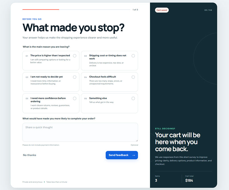
Unlike NPS, CSAT, or CES, this question fires mid-decision, before the interaction has even finished.
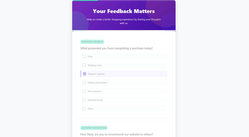
The core question: “What stopped you from completing your purchase today?”, shown the instant a cursor moves toward the browser’s close button or address bar.
On desktop, that cursor tracking is the whole mechanism. Mobile has no cursor to read, so detection falls back on scroll-up velocity or a back-button tap instead.
Average conversion for these popups varies depending on who measured it. Flint’s analysis of more than a billion displays puts the general average at 3.94%, while Hellobar reports a tighter industry range of 2.8% to 4.6%.
Cart-specific exit questions, shown only to visitors who already have items sitting in a basket, land close to 17% across every dataset, roughly three to six times the general rate.
| Source | General Exit Popup | Cart-Specific Popup |
|---|---|---|
| Flint | 3.94% average | 17.12%, 26.83% top performers |
| Hellobar | 2.8% to 4.6% | Around 17% |
| Envive AI | 3% to 5% | 17.12%, 42.35% top performers |
The reason options matter more than the design wrapped around them. A leaving visitor isn’t going to type a paragraph, so multiple-choice answers work better here than an open text box.
- Price too high
- Shipping cost
- Just browsing
- Technical issue
- Comparing with other sites
- Couldn’t find what I wanted
- Delivery was too slow
- Wanted to check something with someone first
Exit Questions by Page Type
The reason someone leaves a pricing page has nothing to do with why they leave a cart. Match the question to the page:
| Page | Exit question |
|---|---|
| Cart | What stopped you from checking out today? |
| Product page | What information were you hoping to find here? |
| Pricing | Is anything about our pricing unclear? |
| Signup form | What made you stop partway through? |
| Search results | Didn’t find it? Tell us what you were after. |
| Homepage | Were you looking for something specific? |
Macy’s skips the question entirely on one version of its cart-exit popup, leading with an incentive instead, a percentage off a first purchase, shown only to visitors who already have items in their cart (Hellobar). Sometimes the fix matters more than the diagnosis.
NiceHair paired exit-intent targeting with cart-page placement and cut its cart abandonment rate by 50% while capturing more than 350,000 leads, according to Sleeknote’s published case data.
Real exit intent popup examples from other brands are worth reviewing before writing the question, since the surrounding design changes how the question actually gets read.
Which Usability and Navigation Survey Questions Reveal UX Problems
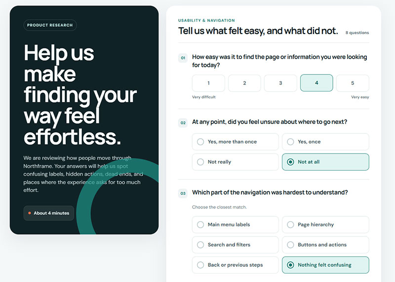
Click paths show where a visitor went. Neither a heatmap nor a session recording shows whether they actually found what they came for, and that gap is exactly what this type of question is built to close.
The core question: “Were you able to find what you were looking for today?”, paired with a task-success follow-up: “What were you trying to do?”
The rest of the set:
- What were you trying to do on this page?
- Did you finish it? (yes / no / partly)
- How easy was it to get around the site? (1-5)
- Was there anything on this page you found confusing?
- Did anything here look broken or load slowly?
- Where did you expect to find [feature] before you found it here?
- Is there anything you looked for and couldn’t find?
- What would you name this section if it were up to you?
That last question sounds odd until you run it. Visitors rename navigation labels in plain language, and their wording is usually better than whatever the internal team argued about for three weeks.
Nielsen Norman Group research shows the average visitor decides whether to stay on a page within 10 to 20 seconds.
People form an aesthetic judgment about a webpage in as little as 50 milliseconds, according to research by Lindgaard and colleagues, one of the studies underpinning the five-second test as a comparison method.
Getting the first click right predicts almost everything that follows. Bob Bailey’s usability research found that visitors who click the correct link first complete their task successfully 87% of the time.
That figure drops to 46% for visitors whose first click misses, a gap wide enough that one misplaced link can quietly sink task completion across an entire site.
| Method | What It Measures | Best Timing |
|---|---|---|
| Five-second test | First impression, message clarity | Pre-launch, design review |
| First-click test | Navigation and label clarity | Pre-launch or live site |
| On-page findability question | Real-task success, live traffic | Ongoing, live site |
A five-second test happens off the live site with recruited participants. A findability question happens on the live site, with real traffic trying to finish a real task, which is a very different kind of evidence.
The two methods work best together rather than as substitutes. One measures a first impression, the other measures whether a task actually got finished, and neither one alone tells the whole story.
Which Questions Work Best on Content and Blog Pages
Content pages get surveyed less than they should. Traffic reports tell you people arrived. They say nothing about whether anyone got what they came for.
- Did this article answer your question? (yes / partly / no)
- What question did you come here hoping to answer?
- What’s still unclear after reading this?
- Was anything here out of date or wrong?
- How would you rate this article? (1-5)
- What would you want us to write about next?
The “what question did you come here with” prompt is the most useful of the bunch. Answers come back in the visitor’s own phrasing, which tends to be nothing like the headings anyone wrote.
Which Questions Work Best on Pricing and Signup Pages
Money pages deserve their own wording. Generic satisfaction questions are useless here because nobody is satisfied or dissatisfied yet, they’re deciding.
- Is it clear which option is right for you? (yes / no)
- What’s the one thing keeping you from signing up right now?
- Is there anything about the pricing you don’t understand?
- What were you expecting to pay before you saw this page?
- Which competitors are you comparing us to?
- What would you need to see to feel confident about this?
The competitor question makes marketing teams nervous and sales teams very happy. Plenty of visitors answer honestly, and the list you get back is more accurate than any competitive analysis deck.
Which Open-Ended Questions Generate the Most Useful Feedback
Two questions do most of the work here: “What almost stopped you from [completing action] today?” and “What’s one thing we could change to make this better?”
The first surfaces near-misses, friction a visitor pushed through instead of abandoning. The second surfaces priorities directly, without making a visitor interpret what a number on a rating scale is even supposed to mean.
Others worth rotating in:
- What did you expect to see here that wasn’t here?
- If you could change one thing about this page, what would it be?
- What almost made you leave?
- How would you describe what we do to a colleague?
- What made you choose us over another option?
- What’s the one thing you wish we’d told you sooner?
Response length depends heavily on the format. Schaefer and Dillman’s 1998 research found email respondents wrote an average of 40 words per open-ended answer, compared with just 10 words from respondents completing a mailed paper questionnaire.
A single text field on a live site rarely captures more than a sentence or two. That’s fine. The goal is a specific complaint or a specific piece of praise, not an essay.
Keep it to one or two per survey. Open-ended questions take real mental effort, and stacking three or four onto a single on-page survey empties out response quality fast.
Raw verbatim responses pile up quickly once a survey has been running for a few weeks.
Grouping them into recurring themes, rather than reading each one individually, is where a structured approach to analyzing survey data actually pays off.
When and Where Should Website Feedback Surveys Trigger
Timing decides whether a survey question gets an honest answer or gets closed on reflex before anyone reads it.
| Trigger | Fires When | Best For |
|---|---|---|
| Time-on-page | Visitor stays past a set duration | Content pages, blog posts |
| Scroll-depth | Visitor scrolls past a set point | Long-form pages, pricing pages |
| Exit-intent | Cursor moves toward closing the tab | Checkout, cart pages |
Hotjar’s own documentation describes several survey display formats built around this logic, including Popover surveys anchored to a page corner, Embedded surveys placed inline with content, and Full-screen surveys that take over the viewport at a chosen moment.
A checkout page needs a friction question, something that gets at what almost stopped the purchase. A blog post is looking for something else entirely, more about whether the content actually answered what someone came to find out.
Running the same generic survey everywhere on a site produces answers nobody can really act on, because the question and the context don’t match up.
Frequency capping keeps a returning visitor from seeing the same prompt too often. Cooldown windows vary by platform, commonly ranging from about two weeks up to 90 days, though transactional triggers, like a post-purchase question, are usually exempt from that cap.
Guidance on how to avoid survey fatigue covers how to set that cooldown without losing coverage of new visitors.
Placement affects completion more than most teams expect going in. Central modal pop-ups reach a 39.9% completion rate, the highest among placement types tested, according to SurveySparrow’s analysis of survey widget performance.
Mobile needs its own placement rules, not just a smaller version of the desktop layout. Mobile traffic accounts for roughly two-thirds of site visits industry-wide, per Sogolytics, which means a survey that only renders cleanly on a laptop screen misses most visitors by default.
A closer look at mobile form best practices covers touch-target sizing and viewport handling in more depth.
Which Tools Are Used to Build and Deploy Website Feedback Surveys
Most teams end up choosing between a small handful of platforms: Hotjar, Qualtrics, Typeform, SurveyMonkey, VWO, and Google Forms, each built around a different use case rather than competing directly on features.
- Hotjar handles on-page microsurveys paired with heatmap and session recording data.
- Qualtrics brings enterprise-scale statistical rigor to large research programs.
- Typeform builds design-forward standalone surveys distributed by link.
- SurveyMonkey offers fast, self-serve standalone and email-distributed surveys.
- VWO bundles on-site surveys into a wider conversion-testing suite.
- Google Forms stays free and no-frills, fine for simple one-off surveys.
Hotjar was acquired by Contentsquare in 2021, and the two businesses completed their full corporate merger in July 2025. Hotjar’s survey tools now sit inside Contentsquare’s Free, Growth, and Pro tiers rather than a standalone Hotjar plan.
That pricing split matters more than it might seem. Qualtrics licenses typically start between $25,000 and $50,000 a year for a small enterprise team, according to CleverX’s 2026 pricing analysis.
SurveyMonkey’s published individual plans start around $39 a month (billed annually), a fraction of even a small Qualtrics contract.
| Tool | Deployment | Best Use Case | Entry Pricing |
|---|---|---|---|
| Hotjar | On-page widget | Microsurveys with behavior data | Free tier available |
| Qualtrics | Standalone, embedded | Enterprise research programs | Custom, enterprise |
| Typeform | Standalone link | Design-forward branded surveys | Free tier available |
| SurveyMonkey | Standalone, email | Fast self-serve surveys | From $39/month |
| VWO | On-page widget | Surveys bundled with A/B testing | From $198/month |
VWO, short for Visual Website Optimizer, was founded in 2009 by Wingify and built its survey tool as one module inside a broader conversion-testing suite, not as a standalone product.
For a WordPress site specifically, a dedicated WordPress survey plugin often covers on-page microsurveys without adding a second analytics platform on top of an existing stack.
Google Forms alternatives are worth a look once a team outgrows its limited branching logic and design controls.
What Mistakes Lower Website Feedback Survey Response Rates
Most of the response-rate damage on a website feedback survey traces back to a small set of repeat offenders.
- Too many questions on an on-page widget
- Leading or double-barreled wording
- Missing mobile optimization
- Trigger timing that interrupts a task instead of following it
- No stated time estimate or incentive
On-page microsurveys carry a much lower ceiling than standalone survey links to begin with. A SurveySparrow study covering in-app and web survey widgets found an average response rate of 25.25% and a completion rate of 23.04%, well below what a standalone linked survey typically reaches.
Leading and double-barreled wording doesn’t just lower completion. It quietly inflates satisfaction scores too, since a respondent nudged toward agreement answers faster and rates higher, which makes a broken experience look fine on a dashboard when it isn’t.
A survey box that doesn’t resize for a small screen forces pinch-zooming just to read the question. Most visitors close it rather than fight with it, understandably.
Firing a survey mid-task interrupts the very thing being measured. A checkout-page survey that pops up before the payment button is even visible captures frustration with the interruption itself, not with the checkout flow it’s supposed to be testing.
Missing a stated time estimate or incentive lowers the start rate before a visitor even reads the first question. Which-50 reports on a medical-journal study finding that offering compensation improved completion at every survey length tested, including the shortest version.
Most of these mistakes trace back to the same root cause: treating the survey like a checkbox to tick off instead of a moment a real visitor has to get through.
Practical fixes for improving form abandonment rate apply just as directly to a survey as they do to a signup or checkout form.
FAQ on Website Feedback Survey Questions
Should website feedback surveys be anonymous?
Most on-page surveys are anonymous by default, since no login is required to answer. Attaching an email or account ID increases response quality for follow-up but can lower participation, since some visitors hesitate to leave identifiable feedback about a bad experience.
What’s a good response rate for a website feedback survey?
There’s no universal benchmark: on-page microsurveys and standalone linked surveys measure completely different pools. What matters more than hitting a percentage is whether respondents represent your actual visitor mix, not just the most opinionated fraction of it.
Can survey questions be A/B tested?
Yes, running two question phrasings to different visitor segments reveals which wording produces more completions and clearer answers. Most on-page survey tools support this natively, though standalone linked surveys usually require a separate testing tool to split traffic.
Do on-page surveys slow down website performance?
A well-built survey widget loads asynchronously, so it shouldn’t block a page’s core content from rendering. Poorly coded third-party embeds can still add measurable delay, which is why checking a tool’s script-loading method matters as much as its question features.
What’s the difference between a survey and a poll?
A poll asks one quick question, usually multiple choice, purely to gauge opinion in the moment. A survey combines several question types, often rating scales and open text, to measure something more specific: satisfaction, effort, or the reason behind a behavior.
Do website feedback surveys need GDPR consent?
Anonymous, aggregate feedback generally doesn’t trigger GDPR consent requirements. Once a survey collects an email, IP address, or other personal data, standard consent rules apply, and building GDPR compliant forms from the start avoids a retrofit later.
Can AI generate website feedback survey questions?
AI tools can draft question variations quickly, but they don’t know your specific friction points. The strongest questions still come from watching real session recordings or support tickets first, then using AI to tighten the wording, not invent the topic.
How many answer options should a multiple-choice feedback question have?
Four to six options cover most cases without overwhelming a visitor mid-decision. Fewer than four often forces a false choice, while past six, most respondents stop reading carefully and just pick the first option that looks close enough.
How often should feedback survey questions be updated or rotated?
Revisit wording whenever a page redesign changes the task being measured, or roughly every 6 months even if nothing else changed, since visitor behavior and priorities shift. Stale questions asked against a redesigned page often measure a workflow that no longer exists.
Should survey results be shared publicly or kept internal?
Aggregate NPS or CSAT trends work fine as public trust signals, similar to a rating badge. Verbatim open-ended responses almost always stay internal, since visitors write them expecting a private read, not a quote on a testimonials page.
Conclusion
Most sites don’t need a dozen website feedback survey questions running at once. One question, placed where the friction actually lives, beats a full program launched before anyone even has a hypothesis to test.
Expect the first few weeks of data to look messier than any benchmark suggests. A handful of vocal respondents can swing a Net Promoter Score pretty hard before volume evens things back out.
Start with the page bleeding the most revenue, a pricing page or the first step of onboarding, not whichever page happens to be easiest to instrument. A dead-end in navigation or a confusing form field usually outranks a general satisfaction check in what it actually reveals.
Fifty honest answers from the right page beat a thousand guesses pulled from a dashboard nobody trusts.