

Most form tutorials show you what’s possible. This one shows you what actually works. The State of CSS 2024 survey puts Tailwind CSS at 62% developer usage. More teams are…
Table of contents
Most visitors leave without buying, subscribing, or even remembering your site exists.
Exit intent popups catch them at the door with one last offer.
The best campaigns recover 10-15% of abandoning traffic. Some hit nearly 20% conversion rates.
This collection of exit intent popup examples breaks down what actually works across ecommerce, SaaS, and content sites.
You’ll see real campaigns from brands like OptinMonster, Zendesk, and Neil Patel, plus the targeting methods, design patterns, and conversion tactics behind each one.
Whether you’re trying to reduce cart abandonment, build your email list, or collect feedback from bouncing visitors, these examples show exactly how to do it.
What is an Exit Intent Popup
An exit intent popup is a targeted overlay that appears when a visitor shows signs of leaving your website.
The popup triggers based on mouse movement patterns, cursor velocity, and position tracking.
When someone moves their cursor toward the browser’s close button or address bar, the system detects this behavior and displays a message.
The goal is simple: stop the visitor, present an offer, and convert them before they bounce.
Most exit popups offer discount codes, free shipping, lead magnets, or newsletter signups in exchange for an email address.
Unlike timed popups that interrupt browsing, exit overlays only appear at the moment of abandonment. This makes them less intrusive and more effective for conversion rate optimization.
Exit Intent Popup Examples
Modern Exit Intent Popup with Landing Page
See the Pen
Modern Exit Intent Popup with Landing Page by Bogdan Sandu (@bogdansandu)
on CodePen.
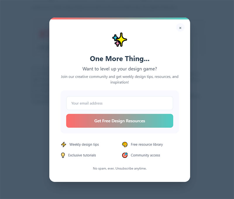
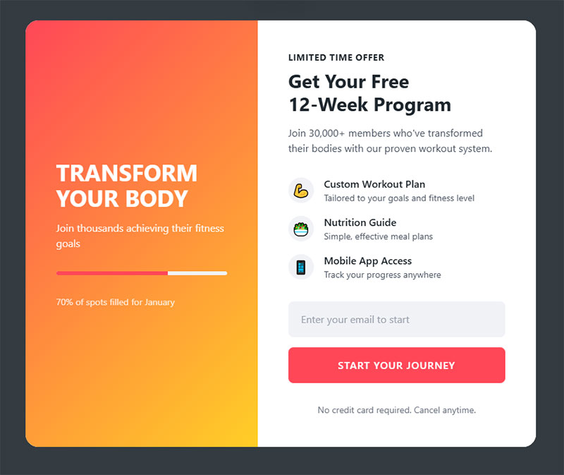
Playful Modern Exit Intent Popup – Design Community Edition
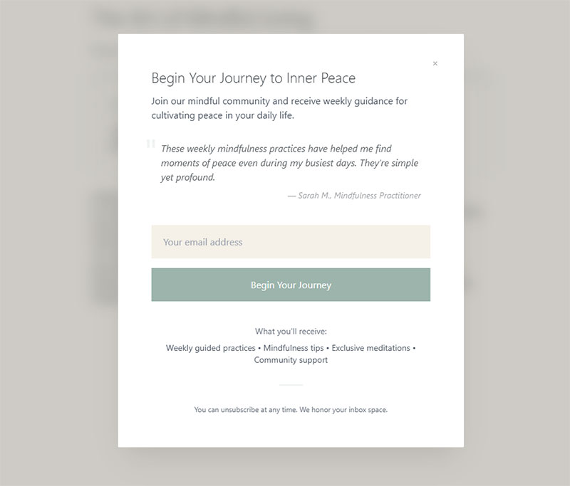
Minimalist Wellness Exit Intent Popup
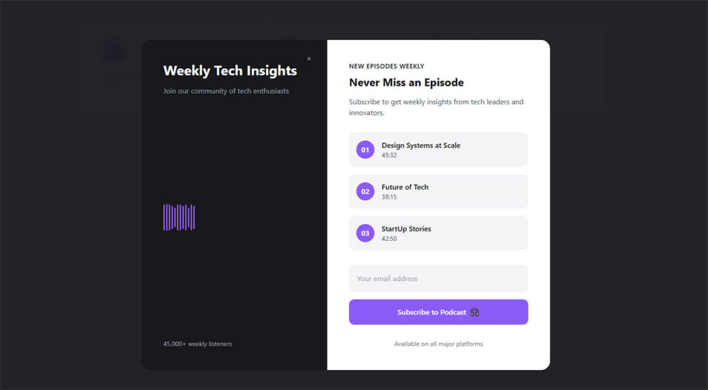
Futuristic Tech Exit Intent Popup
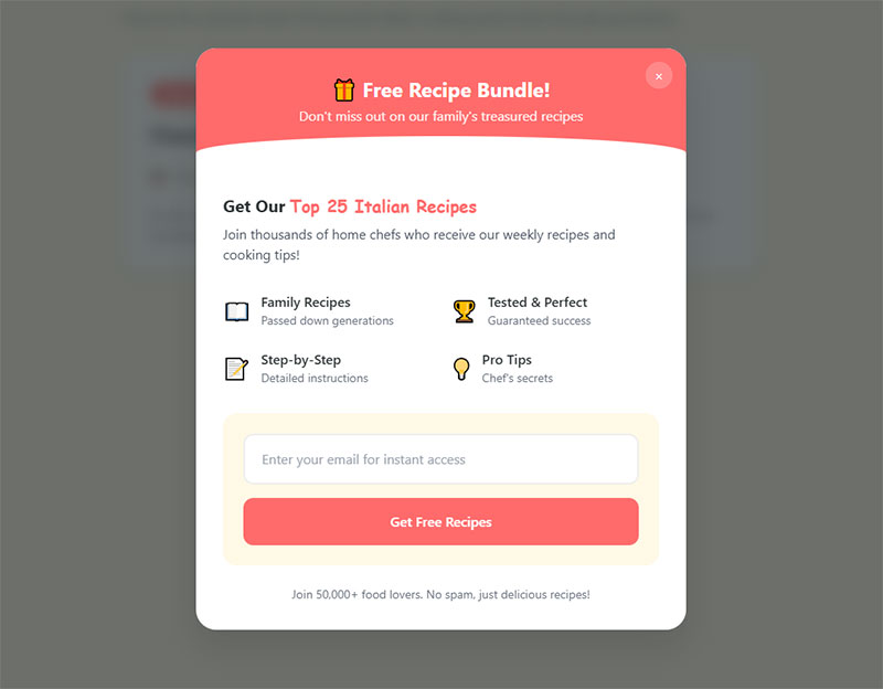
Culinary Recipe Exit Intent Popup
Energetic Fitness Exit Intent Popup
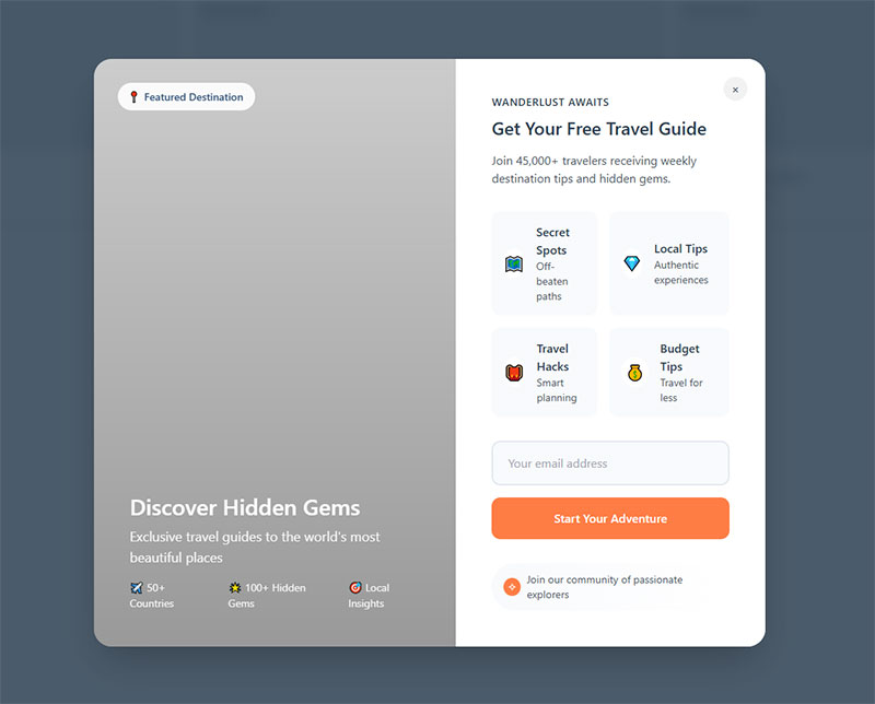
Travel Adventure Exit Intent Popup
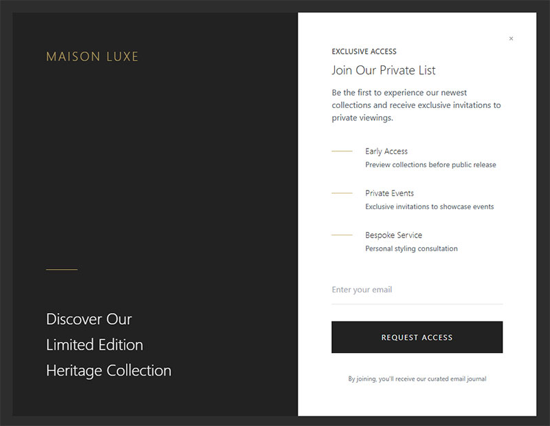
Luxury Brand Exit Intent Popup
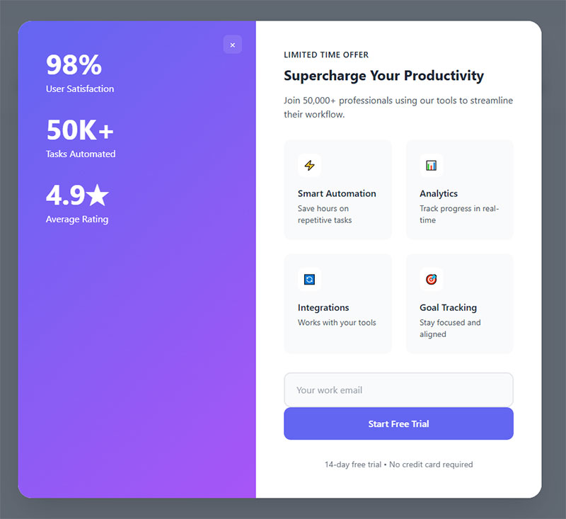
Modern SaaS Exit Intent Popup
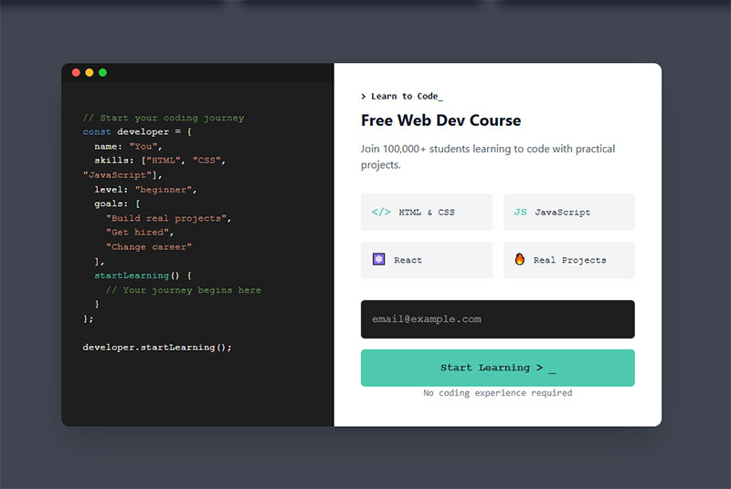
Code Editor Exit Intent Popup
Audio Podcast Exit Intent Popup

Why Exit Intent Popups Still Convert
There’s a common assumption that popups are dead. That people hate them and just close everything immediately. The data tells a different story.
Wisepops analyzed over 1 billion popup displays and found the average popup conversion rate in 2026 sits at 4.82%, up from 4.65% the year before. The top 10% of campaigns averaged a staggering 57.7% conversion rate. Exit intent popups specifically convert at around 3.94% on average, but that number jumps significantly with proper targeting and offer quality.
For practical benchmarking, Popupsmart’s 2025 report across 10,000+ campaigns puts the average at 3.49%, with well-optimized exit intent and cart abandonment popups reaching double digits.
How Exit Popups Compare to Other Triggers
| Trigger type | Avg. conversion rate | Best for |
|---|---|---|
| Click-triggered | 54.42% | Pre-qualified visitors High-intent |
| AI-powered triggers | 15.98% | Ecommerce personalization |
| Hover-based | 13.05% | Interactive content |
| Scroll-based | 5.37% | Blog readers Long pages |
| Exit intent | 3.94% | Recovering departing visitors |
| Landing page load | 4.72% | Aggressive lead capture |
Source: Wisepops 2026 Popup Statistics Report
Click-triggered popups obviously win on raw conversion rate, but that’s because the visitor already clicked something intentionally. Exit intent targets a completely different audience: people who would otherwise be gone forever.
And here’s the thing about Google compliance. Exit intent popups fire when someone is leaving, not when they arrive. Google’s mobile interstitial penalty specifically targets popups that block content on initial page load from search results. Google’s John Mueller has confirmed that exit-triggered overlays are not targeted by this penalty. So you can run them without worrying about your search rankings taking a hit.
The Real Value Proposition
Conversion Sciences research found that well-crafted exit popups can save 10 to 15% of abandoning visitors. That’s traffic you already paid for (through ads, content, SEO) walking out the door.
Getting even a fraction of those people to stay, subscribe, or buy means you’re squeezing more value from existing traffic instead of spending more to acquire new visitors. That math works for basically any business model.
Discount and Coupon Exit Popups
This is the most common exit intent popup format in ecommerce, and for good reason. Someone is about to leave your store. You offer them a deal. Some percentage of them take it. Simple.
But “simple” doesn’t mean every discount popup works equally well. DiviFlash data shows that popups offering discounts achieve an 8.53% conversion rate, compared to 3.82% for popups without any discount. That’s more than double the performance just by including an incentive.
Percentage-Off Popups
The classic “Get 10% off your first order” popup is everywhere for a reason. It works. Fashion and DTC brands lean heavily on this format.
What separates good from bad here: A clean single-field email capture, bold typography showing the discount percentage front and center, and a clear call to action button. The offer needs to be immediately obvious within the first half-second of seeing it.
I’ve seen developers struggle with making these feel on-brand. The popup should look like it belongs on your site, not like a generic template someone dropped in. Match your brand colors, use your actual fonts, and keep the copy tight. “Get 15% Off” beats “Sign Up For Our Newsletter And Receive A Special Discount” every time.
Countdown timers add urgency. DiviFlash reports that popups with countdown elements convert at 5.91% versus 3.99% without them. That’s a 48% lift just from adding a ticking clock. But use them honestly. Fake urgency erodes trust fast.
Free Shipping Popups
Free shipping offers often outperform percentage discounts in ecommerce. Baymard Institute’s research across 50 studies calculates the average cart abandonment rate at 70.22%, and unexpected shipping costs are one of the top reasons people bail.
A free shipping popup that appears right as someone tries to leave a product page directly addresses the most common purchase objection. The key is setting a minimum threshold (“Free shipping on orders over $50”) so you protect your margins while still giving people a reason to complete the order.
This approach works especially well when paired with checkout optimization strategies that reduce friction at the payment stage. The popup gets them back to the cart. The checkout experience closes the sale.
Cart Abandonment Exit Popups
Cart abandonment exit popups are the highest-converting popup type, period.
Envive AI’s conversion research shows cart abandonment popups achieve a 17.12% average conversion rate, with top performers reaching 42.35%. Compare that to the general popup average of 3-5% and you start to see why every serious ecommerce store runs these.
The reason is intent. Someone who added items to their cart already demonstrated buying interest. They’re not casual browsers. They’re one friction point away from a purchase, and an exit popup catches them at exactly the right moment.
What High-Converting Cart Popups Look Like
Show the actual products. The most effective cart abandonment popups display an image of what the visitor is leaving behind. Generic “Don’t forget your items!” messaging works, but showing the actual product creates a stronger emotional pull.
Add a time-limited incentive. Popupsmart’s benchmark data shows that exit intent popups with limited-time offers performed especially well, and the best-performing campaigns combined urgency with personalization. Something like “Complete your order in the next 15 minutes and get 10% off” gives people a specific reason to act now.
Keep the form minimal. This isn’t the place for a multi-step form. You want one click that takes them back to checkout, or at most an email field so you can follow up if they still leave.
Kiss My Keto used targeted exit intent popups and decreased cart abandonment by 20%. Indestructible Shoes improved ecommerce conversion by 13.2% with a similar approach. These aren’t theoretical numbers. Real stores, real results.
Tools like Privy, Justuno, and CartStack specialize in this for Shopify and WooCommerce setups. Most let you pull product data directly into the popup template so visitors see exactly what they left in the cart.
Email List Building Exit Popups
Not every exit popup needs to push a sale. Some of the best-performing ones focus purely on growing an email subscriber list. The trade-off is simple: give something valuable in exchange for an email address.
Getsitecontrol research confirms you can convert up to 7% of abandoning visitors into email subscribers when the offer is right. That’s significant when you consider those visitors were about to disappear completely.
Lead Magnet Popups
A lead magnet popup offers a downloadable resource in exchange for an email. Think PDF guides, templates, checklists, mini-courses.
The trick is matching the lead magnet to the page content. If someone is reading a blog post about kitchen renovations and your exit popup offers a “Free Kitchen Planning Checklist,” that’s relevant. If it offers a generic “Subscribe to our newsletter,” that’s boring and vague.
This concept of content-specific upgrades works incredibly well. Backlinko popularized the approach years ago, and it’s still effective because it feels personalized even when it’s automated. You create one lead magnet per major topic cluster and serve the matching popup based on page URL.
Two-step opt-ins add another layer. Instead of immediately showing a form, you first ask a yes/no question like “Want the free checklist?” When someone clicks “Yes,” they’ve made a micro-commitment. The email field appears second. Popups using this two-step approach have been shown to convert around 11.9% according to Rejoiner data.
If you’re running WordPress, combining WordPress lead generation plugins with your popup tool lets you capture emails and route them directly into your CRM or email platform. OptinMonster, Sumo, and Thrive Leads all support this kind of integration natively.
Gamified Spin-to-Win Popups
Gamified popups flip the typical email capture on its head. Instead of “give us your email for 10% off,” you spin a wheel and land on your discount randomly. It feels like winning something rather than trading information.
The numbers back it up. Wisepops reports spin-to-win popups achieve a 29.99% conversion rate, which is 642% higher than traditional popups at 4.04%. OptiMonk puts the figure around 13.23% for gamified popups overall.
Wheelio and OptinMonster both offer built-in wheel popup formats. The setup is straightforward: you define the prize tiers (usually 60-70% low-tier like 5% off, 15-20% mid-tier like 10% off, and 5-10% high-tier like free shipping), connect your email platform, and set the trigger to exit intent.
One warning though. Spin-to-win popups can feel gimmicky on certain sites. They work great for fashion, beauty, and general ecommerce. They feel weird on a law firm website or a B2B SaaS platform. Know your audience.
Survey and Feedback Exit Popups
Sometimes the smartest popup doesn’t try to convert anyone. It asks a question instead.
Feedback popups triggered on exit collect qualitative data about why visitors are leaving. That data is often more valuable than one extra email address because it tells you what’s broken on your site.
Single-Question Exit Surveys
“What stopped you from buying today?”
That one question, served as an exit popup on product or checkout pages, can surface issues you’d never find in analytics. Maybe your shipping costs are too high. Maybe people can’t find size information. Maybe your return policy is buried and nobody trusts the purchase.
Hotjar and Qualaroo are the go-to tools for this. Both support exit-triggered micro-surveys with single-question formats. You can use multiple choice for easy analysis or open text for richer insights.
OptiMonk data shows feedback popups convert at 12.62% on average. That’s higher than most email capture popups, probably because answering one quick question feels like less of a commitment than handing over an email address.
NPS and Satisfaction Popups
SaaS companies and service businesses use Net Promoter Score popups on exit to gauge satisfaction. The format is clean: “How likely are you to recommend us?” with a 0-10 scale.
These work especially well on support pages and help documentation. Someone just finished reading your help article. Before they leave, you ask if it actually solved their problem. That feedback loop directly improves your content and reduces future support tickets.
If you’re collecting any feedback through popups, keep GDPR compliant forms in mind. Adding a consent checkbox does add friction (tests show a roughly 25% decrease in signups), but the alternative is collecting data you can’t legally use. Build compliance into the design from the start rather than bolting it on later.
The data from exit surveys feeds back into every other popup type. If 40% of survey respondents say your shipping is too expensive, that’s your signal to test a free shipping exit popup on those same pages. The best practices for creating feedback forms apply here too: keep it short, make it relevant, and actually act on what people tell you.
SaaS and Free Trial Exit Popups
SaaS exit intent popups serve a different goal than ecommerce ones. You’re not saving a cart. You’re trying to get someone to start a free trial, book a demo, or download a resource before they bounce from your pricing or feature page.
First Page Sage data from 86 SaaS companies shows that roughly 8.5% of organic visitors sign up for an opt-in free trial. That leaves over 90% walking away. An exit popup on a pricing page can capture some of that lost intent before it disappears.
Free Trial Extension Offers
“Before you go, try it free for 14 days.”
This straightforward approach works because it removes the biggest objection: commitment. Semrush, Crazy Egg, and HubSpot all use variations of exit-triggered trial offers on their pricing pages. HubSpot pairs its 14-day free trial with onboarding specialists to make sure users experience value fast.
Popupsmart’s benchmark data confirms SaaS popups perform strongest when focused on free-trial or demo-request CTAs shown after the visitor explores product details. Timing them after engagement nearly doubles response rates versus showing them immediately.
Social Proof Inside SaaS Popups
SaaS visitors are skeptical. They’ve seen a hundred “try free” buttons. What makes them stop and actually click?
- Customer count (“Join 50,000+ teams already using…”)
- Recognizable logos from existing clients
- Star ratings or G2/Capterra review scores
The median B2B SaaS trial-to-paid conversion rate sits at 18.5% according to 1Capture’s 2025 analysis, with top performers reaching 35-45%. If your exit popup can push even a small percentage more visitors into the trial, the downstream revenue impact compounds quickly because the trial-to-paid pipeline is already built.
Page Context Changes the Offer
| Page type | Best exit popup offer | Why it works |
|---|---|---|
| Pricing page | Extended free trial Demo booking |
Visitor showed purchase intent |
| Feature page | Product walkthrough video Guide |
Visitor needs more information |
| Blog post | Related lead magnet Template |
Visitor is in research mode |
| Case study page | Free consultation ROI calculator |
Visitor is evaluating results |
Matching the popup offer to the page context is where most SaaS companies get lazy. They show the same generic “Start your free trial” popup everywhere. Visitors on a blog post about industry trends don’t want a trial. They want a content upgrade. Visitors on a free trial landing page who are about to leave need a different nudge entirely.
Full-Screen vs. Subtle Exit Popup Designs
The visual format of your exit popup directly affects both conversion and user perception. Pick wrong and you’ll either miss conversions or annoy people enough that they never come back.
OptiMonk reports fullscreen popups average a 14.40% conversion rate, higher than most other formats. Recart’s A/B tests across dozens of Shopify stores found fullscreen popups outperformed lightbox by 23.64% for email capture.
But that doesn’t mean fullscreen is always the answer.
Fullscreen Overlays
Maximum attention, maximum risk. A fullscreen popup takes over the entire viewport. There’s no ignoring it. On desktop, this works well for high-value offers because it forces a decision.
Getsitecontrol tested five popup formats head-to-head and found fullscreen achieved the highest signup rate at 3.41%, followed by modal popups at 2.95% and sidebar at 2.61%. Sticky bars and slide-ins trailed behind.
The catch: 82.6% of top Shopify brands still use lightbox popups over fullscreen, according to Recart’s analysis of the top 10,000 Shopify stores. Most brands play it safe. But the data suggests they’re leaving conversions on the table.
Lightbox Popups and Slide-Ins
Lightbox popups dim the background and center a smaller overlay on screen. They’re the “balanced choice” that Popupsmart’s benchmark calls out, working well across most industries.
Slide-in popups appear from a corner without blocking content. Lower conversion, but almost zero user friction. Good for blogs, media sites, and anywhere the reading experience matters more than aggressive capture.
A useful way to think about it: match the format to the stakes. Cart page with $200 in items? Go fullscreen. Blog post about industry trends? Slide-in. The visitor’s intent should dictate how bold your popup gets.
Elementor Popups, ConvertFlow, and Unbounce all let you choose between these formats within the same campaign builder, so you can A/B test formats without switching tools. Good form design principles apply to all formats: clear hierarchy, readable text, and a single obvious call to action.
How to Build an Exit Intent Popup That Converts
Seeing examples is useful. Building something that actually works on your site is a different challenge. Here’s how to put it together.
Trigger and Timing Settings
Wisepops data shows A/B testing popups can increase click-through rates up to 26%, with experiments showing improvements from 4.64% to 5.86% CTR. Small changes in trigger sensitivity make a big difference.
- Set mouse sensitivity so the popup fires when the cursor crosses the top 10-20% of the viewport, not the exact edge
- Add a time delay minimum (at least 5-10 seconds on page) so the popup doesn’t fire on accidental mouse movements
- Use frequency capping so returning visitors don’t see the same popup every session
Cookie duration matters. Most tools default to showing the popup again after 24-48 hours. For aggressive lead capture, that’s fine. For brand-sensitive sites, extend it to 7-30 days.
Copy and CTA Best Practices
Loss aversion beats generic value. “Don’t miss your 15% discount” outperforms “Sign up for savings” because it frames the offer as something the visitor is about to lose.
Popups with countdown timers convert at 14.41% according to Envive AI data, compared to 9.86% without. That’s a 46% lift from adding urgency alone.
Keep your call to action button text specific. “Get My 15% Off” works better than “Submit” every time. And adding an opt-out button with friction-based copy (“No thanks, I prefer paying full price”) actually increases conversions. Getsitecontrol found popups with opt-out buttons had 14.34% higher conversion rates than those with only a close button.
Recommended Popup Tools
| Tool | Best for | Starting price |
|---|---|---|
| OptinMonster | WordPress sites Advanced targeting |
$16/mo |
| Wisepops | Mid-large ecommerce Shopify |
$49/mo |
| Sumo | Beginners Free tier available |
Free |
| Sleeknote | Gamified popups A/B testing |
$69/mo |
| Poptin | Budget-friendly Small sites |
Free |
If you’re running WordPress, your setup options are broader. Free WordPress form plugins can handle basic email capture, while dedicated popup tools like OptinMonster or Elementor Popups give you exit intent triggers, A/B testing, and targeting rules out of the box.
The tool matters less than the strategy. A well-written popup in Poptin will outperform a lazy one in OptinMonster. Focus on the offer and the targeting first, then pick the tool that fits your budget and tech stack.
Exit Intent Popup Mistakes That Kill Conversions
Most exit popups underperform because of avoidable mistakes. Not bad tools or bad offers. Just poor execution that drives visitors away instead of pulling them back.
Showing the Same Popup to Everyone
A first-time visitor from a Google search and a returning customer who’s bought three times should never see the same exit popup. Period.
Wisepops data shows popups with custom targeting achieve a 4.92% conversion rate versus 4.81% without. That gap widens dramatically when you segment by visitor type. New visitors respond to welcome discounts. Returning visitors need fresh hooks or stronger incentives.
DiviFlash reports personalized popups convert at 5.75%, nearly 50% higher than generic ones. If your popup tool supports page-level targeting and visitor recognition, use it.
Weak Value Propositions
“Subscribe to our newsletter” is not an offer. It’s a request with zero upside for the visitor.
Compare that to “Get the free 12-page kitchen remodel checklist” or “Unlock 15% off your first order.” One gives the visitor a reason. The other asks them to trust that your emails are worth reading. They won’t.
Wisepops found that popups with discounts convert at 8.62% on average, more than double the rate of popups without any incentive. If you can’t offer a discount, offer something tangible: a template, a calculator, a mini-course. Anything that creates a clear value exchange rather than a vague promise. Strong lead magnet ideas can make or break your exit popup.
Bad UX Choices
- Tiny close buttons: If the X is smaller than 44px, mobile users physically cannot tap it. They’ll leave your site frustrated and never return.
- No outside-click dismiss: Users expect to close a popup by clicking the dimmed background. Block that and you create a hostile experience.
- Stacking multiple popups: A welcome popup, then a newsletter popup, then an exit popup in the same session is too much. One popup per visit. Maybe two if they’re on different pages.
Solid form UX design applies directly to popups. The form inside your popup is still a form. It needs clear labels, proper form validation, and minimal friction. Placeholder text should guide, not confuse.
Ignoring Mobile Entirely
Serving a desktop-sized popup to phone users is a fast way to lose visitors and risk a Google penalty. Mobile accounts for the majority of web traffic, and Wisepops 2026 data shows mobile popups convert 36% better than desktop when properly designed.
Test your exit popup on a real phone before launching. Browser emulators miss rendering issues that actual devices catch. Check that the form fields are large enough, the close button is reachable with a thumb, and the popup doesn’t shift content around when it appears.
If you’re working with web forms inside exit popups, keep them to one or two fields maximum on mobile. Wisepops found that single-field popups convert at 4.87%, and adding more fields doesn’t always help. On small screens, every extra field you add is another reason for someone to close the popup instead of filling it out.
FAQ on Exit Intent Popups
What is an exit intent popup?
An exit intent popup is an overlay triggered when a visitor’s cursor moves toward the browser’s close button or address bar. JavaScript tracks the mouseleave event and fires the popup before the person leaves your site.
Do exit intent popups actually work?
Yes. Conversion Sciences research shows well-crafted exit popups save 10 to 15% of abandoning visitors. Actual results depend on your offer quality, popup design, and how well you match the message to the page context.
Are exit intent popups bad for SEO?
No. Google’s mobile interstitial penalty targets popups that block content on page load, not on exit. Google’s John Mueller confirmed that exit-triggered overlays are not affected by this ranking signal.
How do exit intent popups work on mobile devices?
Mobile devices lack a cursor, so tools use alternative triggers. These include back-button taps, inactivity timers, rapid upward scrolling, and tab-switching detection. The behavior signal differs, but the goal is identical.
What is a good conversion rate for an exit intent popup?
A well-executed exit popup converts between 2% and 5%. Cart abandonment exit popups perform significantly higher, averaging 17.12% according to Envive AI data. Anything below 2% signals a problem with your offer or design.
Which tools are best for creating exit intent popups?
OptinMonster, Wisepops, Sleeknote, Justuno, and Poptin are popular options. For WordPress sites specifically, WordPress contact form plugins with popup features can handle basic exit overlays without extra tools.
What should I offer in an exit intent popup?
Match the offer to the page. Product pages benefit from discount codes or free shipping. Blog posts convert better with a lead magnet like a PDF guide. Checkout pages need a cart recovery incentive with urgency.
How often should I show exit intent popups to the same visitor?
Use frequency capping so returning visitors don’t see the same popup repeatedly. Most tools default to 24-48 hours. For brand-sensitive sites, extend the cookie duration to 7 or even 30 days between displays.
Can I use exit intent popups with other popup types?
Yes, but don’t stack them. One popup per session is the general rule. If you run a welcome popup on entry, skip the exit popup for that visit. Combining inline forms or popup forms across different pages works better than layering multiple overlays.
Do countdown timers inside exit popups actually help?
They do. Envive AI data shows popups with countdown timers convert at 14.41% versus 9.86% without them. The urgency creates a psychological push to act immediately. Just make sure the timer reflects a real deadline.
Conclusion
The exit intent popup examples above cover the full range of what works right now, from percentage-off discount overlays and cart abandonment recovery to gamified spin-to-win formats and single-question feedback surveys.
What separates high-converting popups from ones people instantly close comes down to three things: a relevant offer, proper timing, and clean design. Match the popup to the page. A pricing page needs a free trial prompt. A product page needs a shipping incentive.
Test one format at a time. Tools like OptinMonster, Wisepops, and Sleeknote make A/B testing straightforward. Track your conversion rate benchmarks against industry averages and keep refining.
Start with a single well-targeted exit popup on your highest-traffic page. Measure results for two weeks. Then expand to other pages based on what the data tells you, not assumptions.
