
The first message a user sees after creating an account sets the tone for everything that follows. Get it wrong, and you lose them at the exact moment they’re most…
Table of contents
Most users decide whether to complete a form within the first few seconds of seeing it.
That split-second judgment determines your signup rate, your checkout conversion, your lead volume. And it is shaped almost entirely by form UX design: how fields are structured, labeled, validated, and presented across devices.
Bad form design is expensive. Zuko Analytics data shows 55% of users who visit a form never complete it.
This guide covers what actually drives form completion, from field layout and label placement to input types, inline validation, cognitive load, and accessibility. Each section is grounded in usability research from the Baymard Institute, Nielsen Norman Group, and real-world form analytics data.
By the end, you will have a clear, practical picture of what makes forms work and where most forms quietly fail.
What is Form UX Design
Form UX design is the practice of structuring, labeling, and styling input fields to reduce friction and increase completion rates. It covers everything from how fields are grouped to how errors are communicated, how labels are placed, and how the form behaves on different devices.
It sits at the intersection of visual design and interaction design. The visual layer handles layout, spacing, and hierarchy. The interaction layer handles validation timing, feedback messages, and input behavior.
Forms are high-stakes UX moments. They are the point where a user either completes a goal (signs up, checks out, submits a request) or abandons entirely. There is no neutral outcome.
Poor form UX is costly. Zuko Analytics data across millions of sessions shows only 45% of users who visit a form actually complete it. The other 55% leave.
You will find form UX design applied across many different form types: checkout flows, sign-up pages, contact pages, onboarding sequences, intake flows, and survey tools. Each context has different user intent, different tolerance for friction, and different optimal structure.
The goal in all cases is the same. A user arrives with a task to complete. Form UX design determines whether they finish it or walk away.
How Form Structure Affects Completion Rates
Structure is the single biggest lever in form UX. Users make a snap judgment about form effort before they type a single character. Layout, field count, and visual organization all shape that first impression.
Zuko Analytics benchmarking data (2025) found an average form completion rate of 51.7% across industries, with desktop outperforming mobile in nearly every category. That gap is partly a structure problem, not just a screen-size problem.
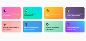
Single-Column vs. Multi-Column Layouts
Image source: UX Magazine
Single-column layouts outperform multi-column layouts in almost every usability test. The reason is simple: users scan forms top to bottom in a straight vertical path. Two columns break that path and create ambiguity about field order.
- Single-column layouts give users a clear, uninterrupted path to the submit button
- Multi-column layouts cause users to scan in Z-patterns, which slows comprehension
- Side-by-side fields (like first name / last name) are the one exception, and even that is debated
Typeform built their entire product around a one-field-at-a-time approach. Extreme, but it eliminates layout ambiguity entirely.
Field Grouping and Visual Chunking
Related fields belong together visually. Grouping address fields, then payment fields, then contact fields reduces the cognitive work of understanding what a section is asking for.
Research from Gestalt psychology backs this up directly. Proximity signals relationship. When fields are scattered or grouped inconsistently, users spend mental energy on organization rather than on answering.
HubSpot data (2024) found each additional form field drops conversion rate by an average of 4.1%. Field grouping does not reduce field count, but it reduces the perception of length, which matters almost as much.
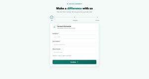
Progress Indicators on Multi-Step Forms
Multi-step forms with a progress bar produce an 86% conversion lift compared to long single-page forms containing the same fields, according to Foundry CRO analysis (2026).
That lift comes from two psychological effects. First, users who complete step one feel invested and are less likely to quit. Second, a visible progress bar removes uncertainty about how much remains.
Empire Flippers saw a 51.6% increase in conversions in 47 days after restructuring their business valuation form into a multi-step layout with a progress bar. For multi-step form design, the sequence of steps matters as much as the number. Lead with easy questions. Save sensitive fields like email and phone for the final step.
| Form Structure | Typical Conversion Rate | Best Suited For |
|---|---|---|
| Single-page, 1–3 fields | ~50–60% | Newsletter signups, simple contact |
| Single-page, 7+ fields | ~12% | Rarely appropriate |
| Multi-step, 2–3 steps | ~28–35% | Lead gen, onboarding, quotes |
| Multi-step with progress bar | Up to 86% lift over single-page | Complex B2B, checkout, applications |
Form Labels, Placeholders, and Instructions
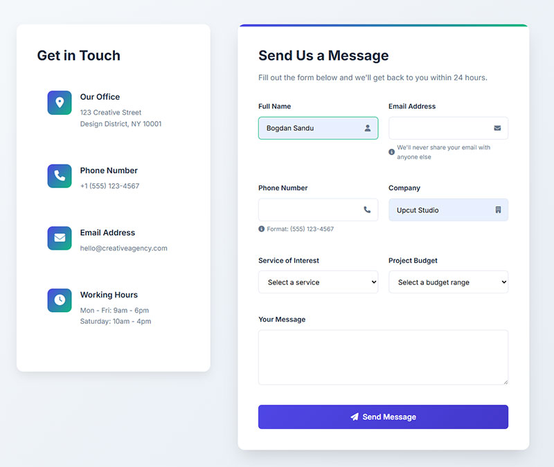
Labels are the questions you are asking users. Their placement, wording, and behavior under different states directly affect form usability and completion rate.
Label Placement: What the Research Shows
Top-aligned labels are the default recommendation for most forms. They offer the fastest scan path, handle long label text without layout breakage, and work cleanly on mobile without horizontal space constraints.
Left-aligned labels have one legitimate use case: complex forms on large screens where slowing the user down is intentional (tax forms, legal documents, medical intake). The horizontal eye movement between label and field acts as a speed reducer, which is sometimes exactly what you want.
| Label Position | Scan Speed | Mobile Friendly | Best For |
|---|---|---|---|
| Top-aligned | Fastest | Yes | Most forms |
| Left-aligned | Slowest | No | Complex desktop forms |
| Floating label | Medium | Conditional | Space-constrained UI |
| Placeholder only | N/A | No | Avoid entirely |
Why Placeholder-as-Label Fails
Placeholder text disappears the moment a user starts typing. That means anyone who pauses mid-entry, gets distracted, or needs to verify their input has lost all context for what the field asks.
This is not a minor annoyance. It is a memory load problem. Users should never have to clear a field just to remember what it is asking for.
Floating labels (labels that animate upward when the field is active) solve the space problem that makes placeholder-as-label tempting. They keep the label visible throughout input while preserving a compact visual footprint. That said, they introduce animation complexity and can create issues with older screen readers if not implemented carefully.
Helper Text and Inline Instructions
Helper text placement matters. Instructions placed below a field are read after the user has already focused on that field. Instructions placed above can be missed entirely on a quick scan.
For format-specific fields (phone numbers, dates, postal codes), show the expected format as helper text below the label, before the input. Do not wait for the user to submit incorrectly and then tell them the format via an error message. For more on writing clear helper copy, looking at real placeholder text examples from live forms is a fast way to see what works in practice.
Input Types and Field Design
Choosing the wrong input type is one of the most common (and most avoidable) form UX mistakes. The right input type reduces both input time and error rate.
Matching Input Type to Data Type
The decision rule is straightforward. Use the input that minimizes the number of user actions required to enter valid data.
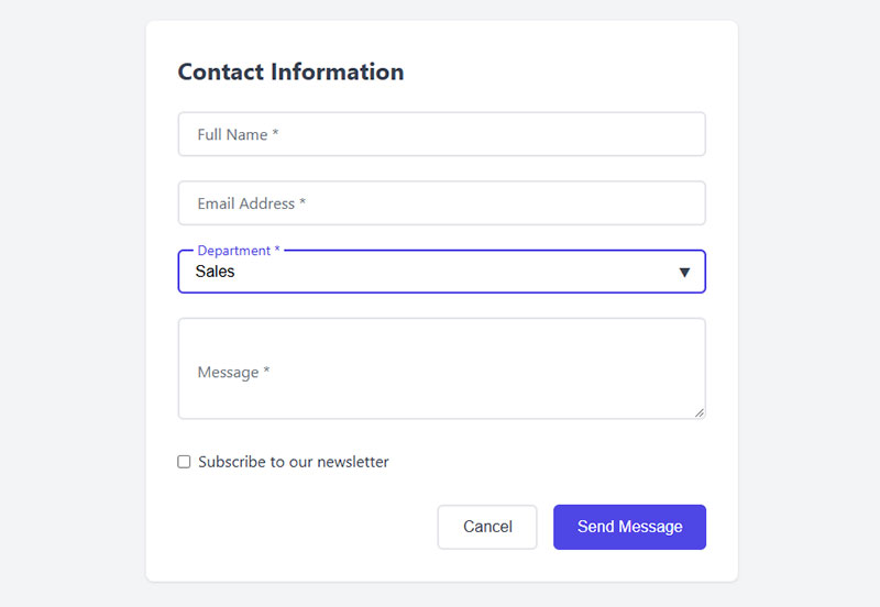
- Radio buttons: Fewer than 5 mutually exclusive options. Always visible, no extra tap required.
- Checkboxes: Multiple selections from a short list. Do not hide options in a multi-select dropdown.
- Dropdowns: 5 or more options, or options that change based on context (country, state). Avoid for fewer than 5 items.
- Toggle switches: Binary on/off settings, not yes/no questions in a form context.
- Date pickers: Use browser-native where possible. Custom date pickers are a common source of mobile input friction.
HubSpot’s form analytics found dropdown menus and radio buttons produce 15.2% fewer abandonments than free-text fields for the same data. Structured inputs remove ambiguity about what format the answer should take.
For a direct look at how the radio button vs checkbox decision plays out in real designs, the pattern differences are clearer than most documentation suggests.
Mobile Input Types
Mobile form design adds a layer of constraints that desktop forms do not face. Touch targets, keyboard types, and one-handed usage patterns all affect which input types work.
Touch target sizing: Apple’s Human Interface Guidelines set the minimum at 44x44px. Smaller targets on mobile forms are a reliable source of input errors and frustration.
Using the correct inputmode attribute triggers the right keyboard type automatically. inputmode="numeric" for PIN fields, inputmode="email" for email fields, inputmode="tel" for phone numbers. These are free performance gains that a surprising number of forms skip.
Zuko data shows mobile form completion sits at 42% vs 47% for desktop. Part of that gap closes just by getting input types right. More on this topic is covered in depth in the mobile form best practices documentation.
Autofill and Autocomplete
Image source: JetFormBuilder
Autofill is one of the highest-leverage optimizations available. Chrome Developers research (2024) found autofill-enabled forms are completed 35% faster with 75% lower abandonment.
Enabling autofill requires correct autocomplete attribute values on each field. autocomplete="given-name", autocomplete="email", autocomplete="postal-code". These are not hints for the browser. They are direct instructions.
Breaking autocomplete by using non-standard field names or disabling it entirely is a real pattern in production forms, often left over from outdated security assumptions. It costs measurable conversion rate with no security benefit in most cases.
Form Validation and Error Handling
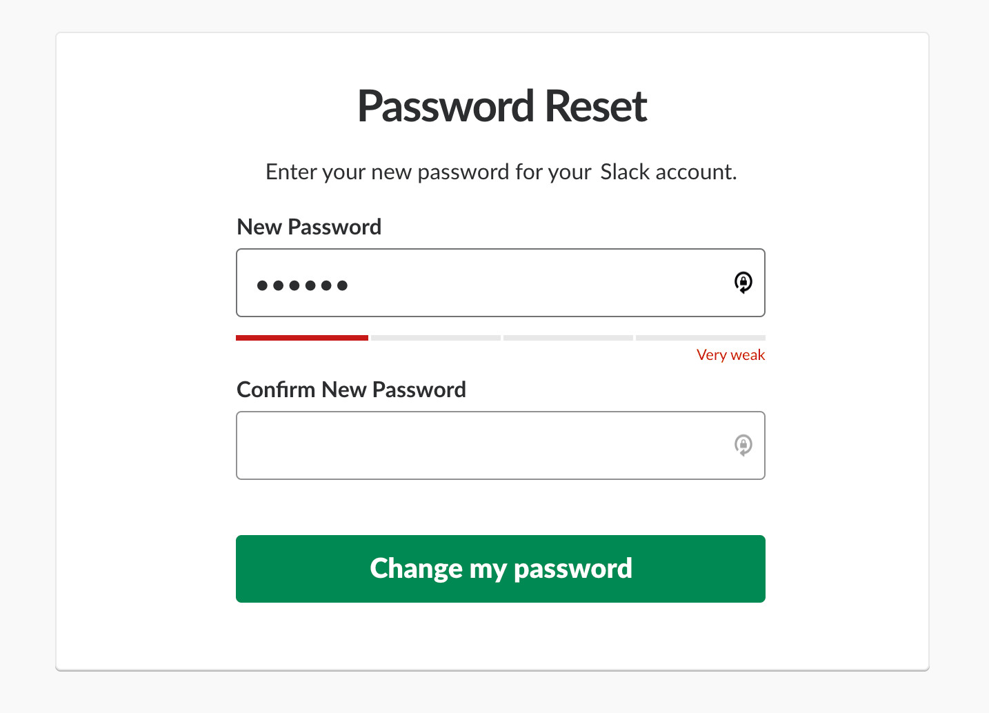
Image source: Smashing Magazine
Validation is where most forms lose users who were otherwise ready to complete. The timing, placement, and language of error messages determine whether a user corrects their input or gives up.
Inline Validation: When it Helps, When it Hurts
Real-time validation (checking input while the user types) works well for format-sensitive fields: email addresses, password strength, postal codes.
It works badly for fields where the user has not finished typing. Flagging a phone number as invalid while the user is mid-entry triggers a false error state and creates anxiety. The fix: validate on blur (when the field loses focus), not on keypress.
One rule that prevents most validation UX problems: never show an error state for a field the user has not yet interacted with. Empty required fields should only be flagged after the user has attempted to submit, or after they have left that specific field blank and moved forward.
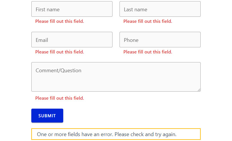
Error Message Language and Placement
Generic error messages are a conversion killer. “Invalid input” tells users nothing. They do not know what is wrong, what format is expected, or how to fix it.
Error messages should do three things: identify the field, say what is wrong, and say how to fix it. “Please enter a valid email address in the format [email protected]” does all three. “Invalid email” does none of them.
Placement matters as much as wording. Errors belong directly below (or adjacent to) the field they refer to, not in a summary block at the top of the form. Users should not have to hunt for which field triggered an error.
Baymard Institute checkout research found 17% of shoppers abandon orders due to difficult checkout processes alone, with error recovery being a primary contributor. Seeing clear form error message examples from real checkout flows makes the difference between good and bad error copy immediately obvious.
And preserve user input on validation failure. There is nothing more frustrating than a form that clears completed fields after a failed submission. It is a basic expectation that forms consistently get wrong.
Client-Side vs. Server-Side Validation
These serve different purposes and should be used together, not as alternatives. The distinction between client-side and server-side validation is important: client-side validation provides fast feedback before submission, while server-side validation protects data integrity and security regardless of what the browser sends.
Client-side: Immediate feedback, no server round-trip, improves perceived speed. Handles format checks, required fields, and length limits.
Server-side: Cannot be bypassed by disabling JavaScript, handles business logic, validates against real data (is this email already registered?).
Relying only on client-side validation is a security problem. Relying only on server-side means users wait for a page reload to find out they made a typo.
Cognitive Load in Form Design
Cognitive load is the mental effort required to process and respond to what a form is asking. Every unnecessary field, ambiguous label, and inconsistent layout adds to it. High cognitive load does not just slow users down. It triggers abandonment.
Required vs. Optional Fields
The best way to reduce cognitive load is to remove fields entirely. Every optional field is a decision the user must make. Is this worth filling in? Should I skip it? What happens if I do?
Formstack research (2025) found forms with more than 7 fields record an average abandonment rate of 67.8% among B2B decision makers. The optimal range for lead generation is 3-5 fields (Forrester Research, 2024).
Mark required fields, not optional ones. The convention of marking required fields with an asterisk (*) is widely understood. Marking optional fields instead forces users to re-evaluate every field they see. Most forms should have few or no optional fields. If a field is optional enough to skip, consider removing it from the form entirely and collecting it later through progressive profiling.
Conditional Logic and Progressive Disclosure
Show fields only when they are relevant. A form that asks everyone for their company name when only 20% of users are businesses is adding friction for 80% of completions.
Conditional logic (showing or hiding fields based on previous answers) reduces perceived form length without reducing the data collected. Users only see what applies to them.
This is one area where conditional logic in forms delivers measurable UX improvement. The technical implementation is straightforward on most platforms. The bigger challenge is mapping out which fields should trigger which conditions, which requires knowing your users well enough to anticipate their paths through the form.
Smart Defaults and Pre-filled Values
Pre-filling known values reduces effort and signals attentiveness. If a returning user’s email is already in the system, pre-fill it. If a user’s country can be inferred from their IP, set it as the default.
Smart defaults work differently. They set the most common answer as the pre-selected option, reducing the number of fields users actively need to engage with. They work well for things like country (pre-select the most common), currency, or unit preferences.
The risk is pre-filling with incorrect data and having users miss it. Important fields that carry real consequences (shipping address, payment method) should be pre-filled but clearly editable, with visual indication that a value has been auto-populated rather than user-entered.
Form Accessibility Standards
WebAIM’s 2025 Million report found 95.8% of the top 1 million homepages have detectable WCAG failures. Forms are one of the most common sources of those failures.
This matters beyond compliance. Accessible form design improves usability for everyone, not just users with disabilities. Clear labels reduce abandonment. Visible focus states help keyboard users. Logical field order helps screen reader users and impatient mobile users alike.
WCAG 2.1 Criteria That Apply Directly to Forms
The four criteria that affect forms most directly:
- 1.3.1 Info and Relationships: Form labels must be programmatically associated with their inputs, not just visually nearby
- 3.3.1 Error Identification: Errors must be described in text, not indicated by color alone
- 3.3.2 Labels or Instructions: Every input must have a visible, descriptive label
- 1.4.3 Contrast: Label and placeholder text must meet minimum contrast ratios
WCAG 2.2, published October 2023, added success criteria that directly affect form interaction, including minimum target size (24x24px for interactive elements) and accessible authentication requirements that affect password and CAPTCHA fields.
Label-Input Association in Code
Visually placing a label next to a field is not enough. A screen reader using VoiceOver or NVDA will only announce the label if it is properly connected in the HTML.
The correct method: use the for attribute on the label element, pointing to the id of the input. That association gives screen readers and assistive technology the context they need to announce the field correctly.
Placeholder text alone as a label fails this test entirely. It is not announced consistently by assistive technology and disappears on input. The form accessibility best practices for label association are well-documented and straightforward to implement once the pattern is understood.
Focus States and ARIA
Removing CSS focus outlines is one of the most common accessibility failures in form design. Keyboard users rely on visible focus indicators to know which field is active.
Three ARIA attributes that belong on almost every form:
aria-required="true"on required fieldsaria-describedbypointing to helper text or error messagesaria-invalid="true"set dynamically when a field has a validation error
Over 5,000 digital accessibility lawsuits were filed in 2025, a 37% increase over 2024 (AudioEye). 67% targeted companies with under $25 million in annual revenue. Accessible form design is not just a usability improvement. It is legal risk management.
Form UX for Checkout and High-Stakes Flows
Checkout forms are where form UX has the most direct impact on revenue. Get them wrong and users leave. Permanently.
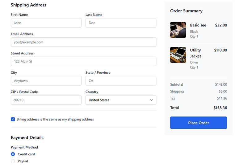
Baymard Institute research (2024) found the average checkout contains 11.3 form fields, while most sites only need 8. That gap represents unnecessary friction in every single checkout session.
Field Count is the Real Problem
Baymard’s 10-plus years of checkout usability testing consistently shows that the number of form fields matters more than the number of checkout steps. A 5-step checkout with 8 total fields outperforms a 2-step checkout with 14 fields.
18% of U.S. shoppers abandoned a checkout in the past quarter due to complexity alone, according to Baymard’s 2024 data. Not price. Not shipping cost. Complexity.
Most sites can cut their field count significantly by:
- Combining first and last name into one field (or splitting only when necessary for fulfillment)
- Auto-detecting city and state from postal code
- Hiding optional fields like “Company name” behind a toggle
- Removing address line 2 from the default view
For a deeper look at how these patterns apply to checkout optimization in practice, the field reduction approach is one of the most accessible wins available.
Guest Checkout vs. Forced Account Creation
Baymard’s research identifies forced account creation as the second-largest cause of checkout abandonment after unexpected costs. 24% of shoppers abandoned checkout because the site required account creation.
Guest checkout is not optional. It is expected.
The right approach: allow guest checkout, then offer account creation after the order is confirmed. The user has already completed their transaction, their data is already in the system, and creating an account requires only a password at that point. Boozt saw their membership registration rate increase after they removed forced sign-up from the checkout flow entirely.
Payment Form Trust and Security Signals
Trust signals in checkout forms:
- Security badge placement near the submit button, not buried in the footer
- Card brand logos displayed at the payment step
- Clear explanation of why each sensitive field is required
Baymard’s usability testing found that a simple one-line explanation of why a phone number is needed reduces abandonment significantly. “For shipping updates only” does real work. Forms with trust badges show a 16% increase in conversions and a 22% lift for new visitors, per Feathery research.
| Checkout Issue | Abandonment Rate | Fix |
|---|---|---|
| Too long / complex | 18–26% | Reduce to 8 fields max |
| Forced account creation | 24% | Guest checkout first |
| Security concerns | 18% | Trust signals near payment fields |
| Unexpected extra costs | 48% | Show totals before final step |
Testing and Measuring Form UX
You cannot improve what you cannot measure. Most form performance problems are invisible until someone looks at the data.
The good news: form-level analytics tools have matured significantly. Field-level drop-off data is accessible without enterprise budgets.
Where to Look First
Zuko Analytics benchmarking data shows the password field has a mean abandonment rate of 10.5%, the highest of any common form field. Email (6.4%) and phone (6.3%) follow closely. These are the fields worth examining first on any form with a completion problem.
Funnel drop-off analysis identifies the step where users leave. Field-level analytics identify which specific input caused them to go. Both are needed. One without the other leaves you guessing.
Tools for Form Analytics
Hotjar form analysis shows which fields take too long, are frequently left blank, or cause users to leave. It works without code changes on most platforms.
FullStory captures every user interaction with form elements and allows retroactive analysis across session recordings. Better suited for teams that need to investigate specific user journeys rather than aggregate patterns.
Mouseflow includes a friction score feature that automatically flags sessions with usability issues, useful for prioritizing which recordings to watch first.
For Google Analytics users, tracking form submissions in Google Analytics via event tracking gives a baseline completion metric without requiring a dedicated form analytics tool.
A/B Testing Form Variables
Most teams test the wrong things first. Button copy and color get tested repeatedly. Field count and label placement rarely do. Those latter two tend to have far larger impacts.
Variables worth testing, in rough order of expected impact:
- Field count (remove one optional field, measure completion rate)
- Step structure (single-page vs. multi-step for forms with 6+ fields)
- Label placement (top-aligned vs. floating)
- Error message copy (specific vs. generic)
- Submit button label (“Submit” vs. action-specific copy like “Get My Quote”)
Run one variable at a time. Form A/B tests need reasonable traffic volume to reach statistical significance, and running multiple simultaneous changes makes it impossible to know what moved the needle. A clear approach to increasing form conversions starts with measuring the current baseline before changing anything.
Form Design Patterns and Common Mistakes

Most form usability problems are not edge cases. They are the same mistakes repeated across thousands of sites.
Knowing them by name does not fix them. But it does make them faster to spot in a review.
The Submit Button Problem
Generic “Submit” copy on a submit button is a missed opportunity at best and a trust signal failure at worst. Users respond better to action-specific labels that describe what happens next.
“Create My Account” outperforms “Submit”. “Get My Free Quote” outperforms “Send”. The button label is the last thing a user reads before committing. Make it specific.
Disabling the submit button before validation passes is a separate issue that consistently backfires in usability testing. When the button is greyed out, users scan the entire form hunting for the error that is blocking submission. When the button is enabled and validation runs on click, the error message directs them exactly where to look.
Multi-Step Forms: When They Help and When They Hurt
Multi-step forms improve completion rates for complex forms. They hurt conversion for simple ones.
| Form Type | Use Single-Page | Use Multi-Step |
|---|---|---|
| Newsletter signup | 1–2 fields: yes | Never |
| Contact form | Under 5 fields: yes | Rarely |
| Lead qualification | Only if 3 fields or fewer | 6+ fields: always |
| Checkout / onboarding | Rarely | Almost always |
For a direct look at multi-step forms vs single-step forms with real conversion data, the evidence for context-dependent use is stronger than any blanket recommendation.
CAPTCHA, Password Fields, and Other Friction Sources
Password fields have the highest abandonment rate of any common form field (Zuko, 10.5% mean drop-off). Two things reduce that: a show/hide toggle and a password strength indicator. Both are standard. Both are still missing from a surprising number of forms.
CAPTCHA is a legitimate friction source. Traditional image-based CAPTCHA in particular creates real barriers for users with visual impairments and frustrates everyone else. There are now better options. CAPTCHA alternatives like honeypot fields and behavioral analysis achieve spam prevention without adding visible friction to the form experience.
Form Microcopy: The Details That Move Metrics
Microcopy covers all the small text surrounding form fields: helper text, field placeholders, error messages, success messages, and button labels. It is easy to underinvest in and measurably impacts completion.
Three microcopy mistakes that consistently hurt form completion:
- Error messages that describe the problem without explaining the fix
- Helper text that restates the label instead of adding context
- Success messages that confirm submission without telling users what happens next
After a form submission, telling users “We received your request and will respond within 2 business days” performs better than “Your form was submitted.” For real-world examples of how this plays out, form submission confirmation messages from live sites show the range between minimal and genuinely useful post-submission UX. And form design examples across different industries make patterns and anti-patterns much easier to recognize in your own work.
FAQ on Form UX Design
What is form UX design?
Form UX design is the practice of structuring, labeling, and styling input fields to reduce friction and increase completion rates. It covers layout, validation timing, error messages, and input behavior across devices. The goal is simple: help users finish what they started.
How many fields should a form have?
As few as possible. Forrester Research recommends 3-5 fields for lead generation. Each additional field drops conversion by roughly 4.1%, according to HubSpot. If a field is optional, consider removing it entirely.
What is the best label placement for form fields?
Top-aligned labels are the default recommendation. They scan fastest, work on mobile without layout issues, and handle longer label text cleanly. Left-aligned labels slow users down, which occasionally works in your favor on complex desktop forms.
Why should I avoid placeholder-as-label?
Placeholder text disappears when a user starts typing. Anyone who pauses mid-entry loses all context for what the field asks. This creates a memory load problem that directly increases form abandonment. Use a visible, persistent label instead.
When should I use a multi-step form?
Use multi-step forms when collecting 6 or more fields. Single-page forms work fine for 1-3 fields. Multi-step forms with progress indicators produce up to an 86% conversion lift over long single-page forms with the same fields, per Foundry CRO.
What causes high form abandonment rates?
The main drivers are form length, security concerns, and poor error handling. Zuko data shows the password field has the highest individual drop-off rate at 10.5%. Email (6.4%) and phone (6.3%) follow closely behind.
What is inline validation and should I use it?
Inline validation checks input as the user types or leaves a field. Use it for format-sensitive fields like email and postal code. Validate on blur, not on keypress. Flagging errors mid-typing creates false error states that frustrate users.
How does form accessibility affect completion rates?
Accessible forms perform better for everyone, not just users with disabilities. Clear label associations, visible focus states, and descriptive error messages reduce confusion across the board. WebAIM found 95.8% of homepages have detectable WCAG failures, many in form elements.
What is the best input type for short option lists?
Radio buttons for fewer than 5 mutually exclusive options. Dropdowns for 5 or more. HubSpot analytics found radio buttons and dropdowns produce 15.2% fewer abandonments than free-text fields for the same data. Visible options reduce input ambiguity.
How do I measure form UX performance?
Track completion rate, field-level drop-off, time-to-complete, and error rate. Tools like Hotjar and FullStory provide field-level analytics without custom code. Pair funnel drop-off data with field analytics to identify both where and why users leave.
Conclusion
Good form UX design is not about aesthetics. It is about removing every reason a user might stop before submitting.
Field count, label placement, inline validation, input type selection, cognitive load, accessibility standards, checkout optimization, and testing methodology all pull in the same direction: fewer barriers between the user and task completion.
The Baymard Institute, Nielsen Norman Group, and Zuko Analytics data covered here point to the same conclusion. Most form abandonment is preventable. The fixes are rarely complex.
Start with your highest-traffic forms. Check field count, error message clarity, and mobile input behavior first. Those three areas account for the majority of avoidable drop-off across most form types.
Measure, test one variable at a time, and iterate.
