


Most WordPress attacks don’t start at the login page. They start at a form, because a form is the one part of a site built to accept whatever a stranger…
Table of contents
A user submits a form on your website. What happens next is important.
The form submission confirmation message is critical, not just a cursory thank you. It’s your first follow-up, a chance to solidify trust, and keep users engaged. Properly created messages can enhance user experience, making the interaction feel appreciated and valued.
Why does this matter? We’ll explore the core elements, strategies to personalize messages, and techniques to maximize engagement. From incorporating user data to seamless technical implementations, you’ll find actionable insights here.
Expect to gain a clear understanding of how to boost brand perception and convert a simple submission into a lasting impression.
Get ready to refine how those little messages impact your digital presence.
What Is A Form Submission Confirmation Message
A form submission confirmation message is the short text a user sees right after they hit submit. It confirms the data landed, tells them what comes next, and sounds like your brand instead of a server log. Skip it, and people refill the form. Or worse, they leave.
Effective messages do three things:
- confirm the submission was received
- tell the user what happens next (email confirmation, expected response time, next step)
- match the site’s brand voice.
This guide covers 23+ real form submission confirmation message examples across 5 form types:
- Contact form confirmation messages
- Job application follow-ups
- Survey participation messages
- E-commerce and payment confirmations
- Subscription and newsletter success messages
Form Success Message vs Form Submission Confirmation Message vs Form Success Confirmation
People search all three. They mean the same thing.
| Term | What people usually mean | Where you see it |
|---|---|---|
| Form success message | The visible text after submit | Design tools, Figma files, UI copy docs |
| Form submission confirmation message | Same text, framed as confirmation of receipt | Form builders, WordPress plugins, client briefs |
| Form success confirmation | Same text, sometimes including the follow-up email | Dev tickets, QA checklists |
| Thank you message | The friendlier version of the same string | Marketing teams |
| Form submission acknowledgement | The formal version, common in HR and gov forms | Enterprise, ATS systems, public sector |
So no, you are not missing a feature. Your form builder calls it one thing, your designer calls it another.
The only real distinction worth keeping: on-page confirmation (what shows in the browser) versus email confirmation (what lands in the inbox). Those are different jobs. Most forms need both.
Types of Form Success Messages
Text-based pop-ups are the most straightforward approach. They are quick, direct and keep users on the same page.
Pop-ups can be minimalist, just a simple message, or they can be richer, with user-specific details. It’s an immediate, no-fuss acknowledgment that maintains the user’s flow.
Redirect pages take users to a new page altogether. It’s like stepping through a door into a new part of the website.
These pages can be customized with more detailed thank-you notes, next steps, or CTAs.
Redirects offer more room to engage and inform users further, without crowding the original form page.
Combined approaches blend pop-ups and redirects. This might involve an immediate pop-up for instant acknowledgment, followed by a redirect that offers more detailed information or further actions.
Using both allows for immediate communication and extended engagement, balancing brevity and depth.
What Makes a Good Form Submission Confirmation Message?
Weak vs Strong Confirmation Messages
Same form. Same user. Different outcome.
| Weak | Strong |
|---|---|
| “Thank you.” | “Thanks! We got your message. We’ll reply within 24 hours.” |
| “Success” | “Success. Your form was submitted. Check your email for the confirmation.” |
| “Your submission was received.” | “We received your submission. Our team reviews new inquiries within 2 business days.” |
| “Form submitted.” | “Form submitted. Your reference number is #4821. Keep it for follow-ups.” |
| “Thanks for signing up.” | “You’re on the list. Confirm your email to start getting the Tuesday newsletter.” |
| “Message sent.” | “Message sent to our support team. Average first reply: 3 hours, Mon to Fri.” |
| “Application received.” | “Application received for Senior Designer. We review in batches every Friday and reply either way.” |
| “Payment complete.” | “Payment complete. Order #10293 ships Thursday. Track it here.” |
| “Thanks for your feedback!” | “Thanks for the feedback. It goes straight to the product team. Here’s 10% off your next order.” |
| “We’ll be in touch.” | “We’ll be in touch by Wednesday. If you don’t hear from us, reply to the confirmation email and we’ll dig in.” |
| “Error-free submission.” | “All set, Sarah. Nothing else needed from you right now.” |
The pattern? Strong messages answer three questions the user has not asked out loud yet. Did it work. What happens now. When.
Weak messages answer one, badly.
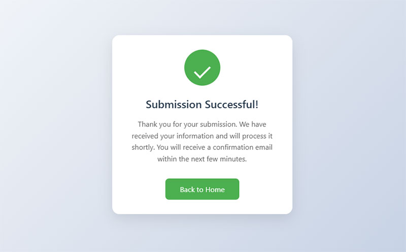
Acknowledgment of form submission is the first step. You need to tell users their info was received. Not just tell – assure. It’s like a handshake, but digital.
The next step is validation of user effort follows. They spent time filling out your form. Show gratitude. A thank-you note embedded in the message does wonders. Authenticity matters here.
What else would they like to know? Well, of course, estimated response time. It’s not just polite, it sets expectations. “We’ll get back to you in 24 hours” is direct and effective. Keeps your users informed and prevents frustration.
Next, clear instructions for next steps. What should the user do now? Sit tight? Check their email? Maybe there’s a form validation step involved? Spell it out.
Links to additional resources or actions can be gold. After submitting, users might need a prompt. Want to read our FAQs? Need support? Or maybe you direct them to a thank-you page loaded with useful links related to their submission.
Confirmation Type by Form Type
Not every form deserves a full redirect page. And not every form survives a tiny inline toast.
| Form type | Best confirmation type | Why | Example message |
|---|---|---|---|
| Contact form | Inline, replacing the form | Keeps context, no page reload | “Thanks, John. We got your message and we’ll reply within 24 hours.” |
| Newsletter signup | Inline toast | Low stakes, fast interaction | “You’re subscribed. Check your inbox to confirm.” |
| Job application | Redirect page + email | High emotional stakes, needs detail | “Application received for [Job Title]. We review within two weeks.” |
| Checkout / payment | Redirect page + email | Legal receipt, order tracking, upsell room | “Order #10293 confirmed. Delivery by March 14.” |
| Survey | Inline, with an incentive | User already gave you time, pay them back | “Thanks for the feedback. Here’s 10% off.” |
| Support ticket | Inline + email with ticket ID | User needs a reference number | “Ticket #7712 opened. First reply within 3 hours.” |
| Event registration | Redirect page + calendar file | They need the date somewhere useful | “You’re registered. Add it to your calendar.” |
| Quote request | Modal + email | Sales follow-up, expectation setting | “Quote request received. Our team replies in 1 business day.” |
| Account signup | Redirect to verification screen | Email confirmation is a required step | “Almost done. Click the link we sent to activate.” |
| File upload | Inline with file name echoed back | Users panic when they can’t see the file went through | “portfolio.pdf uploaded. 4.2 MB. We got it.” |
Quick rule I use: if the user needs to remember something later, send an email too. If they just need to know it worked, inline is enough.
How to Create Personalized Form Submission Confirmation Message?
But how do you achieve this with short form confirmation message?
Use User Data
Embedding user names and specific details in the form submission confirmation message makes it feel personal.
Like a tailored suit, it fits perfectly. If John Doe submits a form, you say: “Thank you, John Doe!” It’s simple but powerful. People love seeing their names.
Addressing user queries or subjects directly is next. If someone’s asking about “web development,” mention it.
“Thanks for your inquiry about web development, John Doe. We’ll get back to you soon.” It’s about showing you’re listening. It’s about precision.
Focus on User Experience
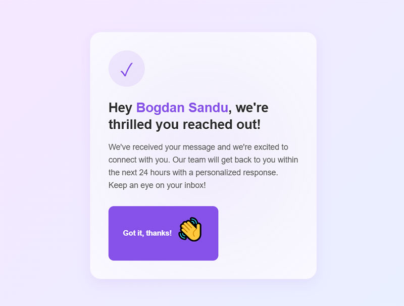
Adding brand logos and consistent design elements ensures a unified look. It’s like walking into any Starbucks – you recognize the vibe immediately.
Your form should echo your website’s feel. Colors, fonts, icons – all should resonate with your brand’s identity.
Using a polite and approachable tone builds rapport. No one likes robotic responses. A simple “Hey Bogdan Sandu, we’re thrilled you reached out!” feels warm.
It’s engaging. No need for stiff corporate jargon. Humanize the interaction.
Create Memorable Touchpoints
Offering incentives like discounts or free resources can leave a lasting impression. “Thanks, John Doe! Here’s a 10% off coupon for your next purchase.”
People appreciate little perks. It feels special. Exclusive.
Inviting users to explore more about the brand is crucial.
After their form submission, direct them to your blog, FAQ, or tutorials. “Check out our latest articles on web development.” It’s not just about saying thank you; it’s about continuing the conversation.
Form Submission Confirmation Message Examples
Contact form confirmation messages
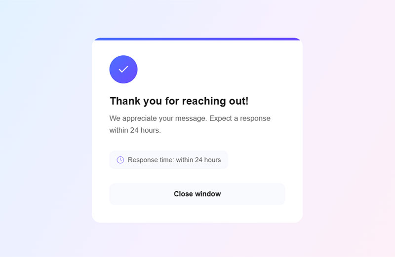
“Thank you for reaching out! We appreciate your message. Expect a response within 24 hours.”
Simple. Direct. Gratitude mixed with a promise. Add some personal flavor – insert the user’s name.
Throw in your brand’s logo to make it feel official. Suddenly, it’s more than just a thank you; it’s a connection.
Job application follow-ups
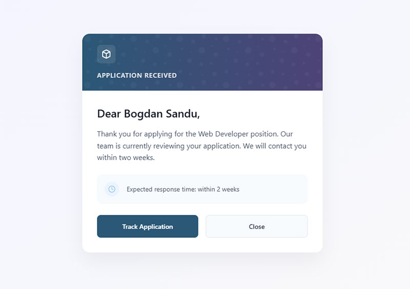
“Dear [Applicant Name], thank you for applying for the [Job Title] position. Our team is currently reviewing your application. We will contact you within two weeks.”
Recognize their effort. These messages are essential in Human Resources workflows. Keeps the applicant’s hopes up while maintaining professionalism.
Survey participation confirmation message
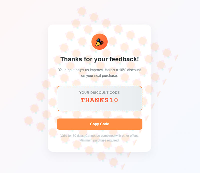
“Thanks for your feedback! Your input helps us improve. Here’s a 10% discount on your next purchase.”
Everyone loves a bonus. It’s a win-win – users feel heard, and you encourage future interaction. Simple form submission acknowledgment morphs into engagement.
E-commerce and payment confirmation examples
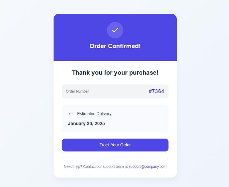
“Thank you for your purchase! Your order number is [Order Number]. Expect delivery by [Estimated Delivery Date].”
Straightforward but loaded with information. Order confirmation. Estimated delivery. Users love knowing exactly what’s happening. Include a link to track their order. Boosts trust immediately.
Subscription and newsletter success messages
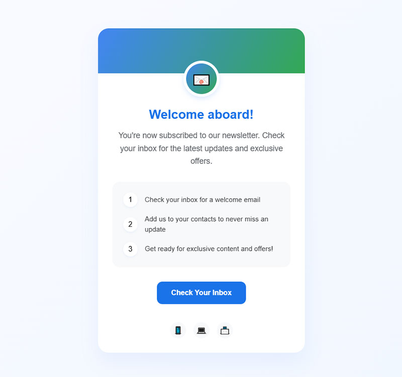
“Welcome aboard! You’re now subscribed to our newsletter. Check your inbox for the latest updates and exclusive offers.”
Warm tones work wonders. You’re not just gaining a subscriber; you’re building a relationship. Make them feel like they’ve joined an exclusive club. Encourages more interaction.
Advanced Strategies for Maximizing Engagement
And if you want to go over and beyond and really make the most out of your form confirmation messages, we’ve got some expert tips in stock.
Encouraging Further Interaction
Including CTAs for blogs, FAQs, or tutorials can keep users engaged. It’s not just about a thank you. Imagine a user submits a form, and you guide them to a blog post or a tutorial that enhances their experience.
“Thank you for contacting us! Check out our latest article on web development.”
Small, strategic links can transform a simple form submission confirmation message into an opportunity for deeper engagement. Every click is an opportunity to offer more value.
Prompting social media engagement or email list signups works like a charm. People love being part of a community.
“Thanks for signing up! Follow us on Instagram for daily updates.”
It’s not just a prompt; it’s an invitation. A chance to build a relationship that extends beyond a single interaction.
Ensuring Accessibility
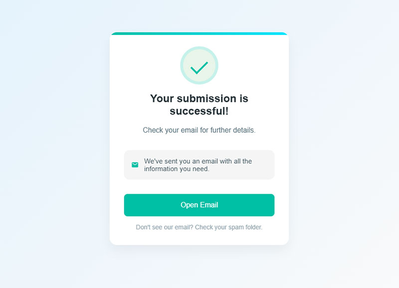
Designing mobile-friendly success messages is essential today. Users want seamless experiences across devices. No one enjoys zooming in and out just to read a tiny text.
“Your submission is successful! Check your email for further details.”
This message should look just as clean and clear on a phone as it does on a desktop. It maintains user satisfaction and improves engagement.
Using responsive layouts for optimal viewing is another necessity. Different screens require adaptable designs.
Whether it’s a compact mobile screen or a broad desktop, the message needs to be consistent and user-friendly. Multi-device compatibility boosts trust and keeps users coming back for more.
How to Add a Confirmation Message to Your Forms
The message is easy. Wiring it up is where people get stuck. Here’s how it works across the setups most of us actually touch.
WordPress: IvyForms
Setting up messages in IvyForms and similar platforms is straightforward. Just drag, drop, configure. Done. A perfect form submission confirmation message is one click away.
“Thank you for getting in touch with us! We’ll reply within 24 hours.”
Personalize it. Use the tools to their full potential. Customize according to user input, sprinkle in some AJAX, and make the form kinetic. It’s these details that make forms user-friendly and, frankly, less of a chore.
Automating responses for efficiency is the next level. Set it up once, and it runs perpetually.
“Email confirmed? Check.”
“Form received? Check. Auto-reply sent.”
No need for manual intervention. Saves time, minimizes errors. Technology doing what it should – making our lives easier.
HTML Form With Vanilla JavaScript
No plugin. No builder. Just the DOM.
<form id="contact-form">
  <input type="email" name="email" required>
  <textarea name="message" required></textarea>
  <button type="submit">Send</button>
</form>

<div id="form-success" role="status" aria-live="polite" hidden>
  <h3>Thanks, we got it.</h3>
  <p>We'll reply within 24 hours. Check your inbox for a copy.</p>
</div>
const form = document.getElementById('contact-form');
const success = document.getElementById('form-success');
form.addEventListener('submit', async (e) => {
e.preventDefault();
const res = await fetch('/api/contact', {
method: 'POST',
body: new FormData(form)
});
if (!res.ok) return; // handle your error state here
form.hidden = true;
success.hidden = false;
success.focus();
});Two things matter more than the copy.
aria-live="polite" means screen readers announce the message. Without it, a blind user hits submit and hears silence. Nothing annoys me more than seeing a beautiful success state that a screen reader ignores completely.
And role="status" tells assistive tech this is a status update, not decoration.
Took me an embarrassingly long time to learn that hiding the form and showing a div is better than a toast that disappears in 4 seconds. People look away. They look back. The message is gone.
Google Forms
Google Forms calls it a confirmation message, and it lives in a place nobody finds on the first try.
- Open your form.
- Click the Settings tab (top of the editor, next to Questions and Responses).
- Expand Presentation.
- Find Confirmation message.
- Edit the text. Save is automatic.
That’s it. The default is “Your response has been recorded,” which is fine and also completely forgettable.
Limits worth knowing: no HTML, no links that render as links (they show as plain text URLs), no personalization tokens. If you need any of that, you need a real form builder or an Apps Script workaround.
Wix Forms
Wix handles it in the form editor.
Click the form > Form Settings > Submission (older editors call it “Message”). You get two options: show a success message, or redirect to a page. If you pick a message, the text field accepts plain text only.
Shopify is similar for contact forms, though most stores end up customizing the Liquid template because the default confirmation is genuinely bad.
Modal vs Inline vs Redirect vs Email
The decision that actually matters.
Inline
Replace the form with the message. Same page, no reload.
Best for contact forms, newsletters, surveys. Fast. Keeps the user where they were. Downside: limited space, and if the user scrolled, they might not see it. Scroll the message into view.
Modal
A dialog on top of the page.
Good when the form itself was in a modal already. Bad when the user has to click an X to escape. Modals make people feel trapped, and about half of the ones I test have no keyboard focus trap, which breaks accessibility.
Redirect
Send them to a dedicated thank-you page.
Best for e-commerce, job applications, event signups. Room for order details, next steps, related links. And it gives you a clean conversion URL for analytics, which is the real reason most marketers pick it.
Not a replacement. A backup.
Send it whenever the user needs a record: order numbers, ticket IDs, application confirmations. The on-page message says “it worked.” The email says “here’s proof.”
My default stack: inline confirmation for speed, plus an email for anything the user might need to find again next Tuesday.
Integration with Analytics
Monitoring click-through rates from success messages is where things get interesting. Hook Google Analytics into your form builder. Data is power. Track which messages generate more engagement.
“Did users click the FAQ after submitting? How many checked out the blog post?”
This data tells you what’s working and what isn’t. User behavior mapped out.
Refining strategies based on user feedback and behavior turns you into a responsive entity. Not set in stone. Adapt, evolve. If a particular call-to-action isn’t generating traction, pivot. Maybe it’s the wording. Maybe the design.
Measuring the Impact of Confirmation Messages
Do they work? How much better are these confirmation messages than generic ones you’ve been using? Measure:
Customer Retention and Loyalty
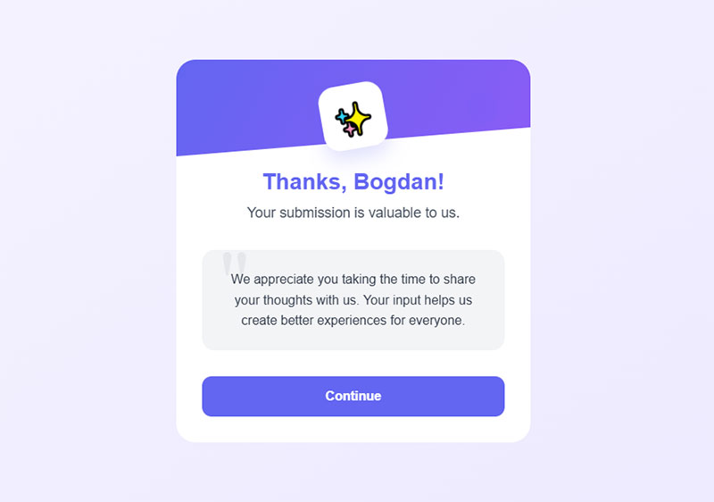
Personalized thank-you messages can transform your brand’s trust level.
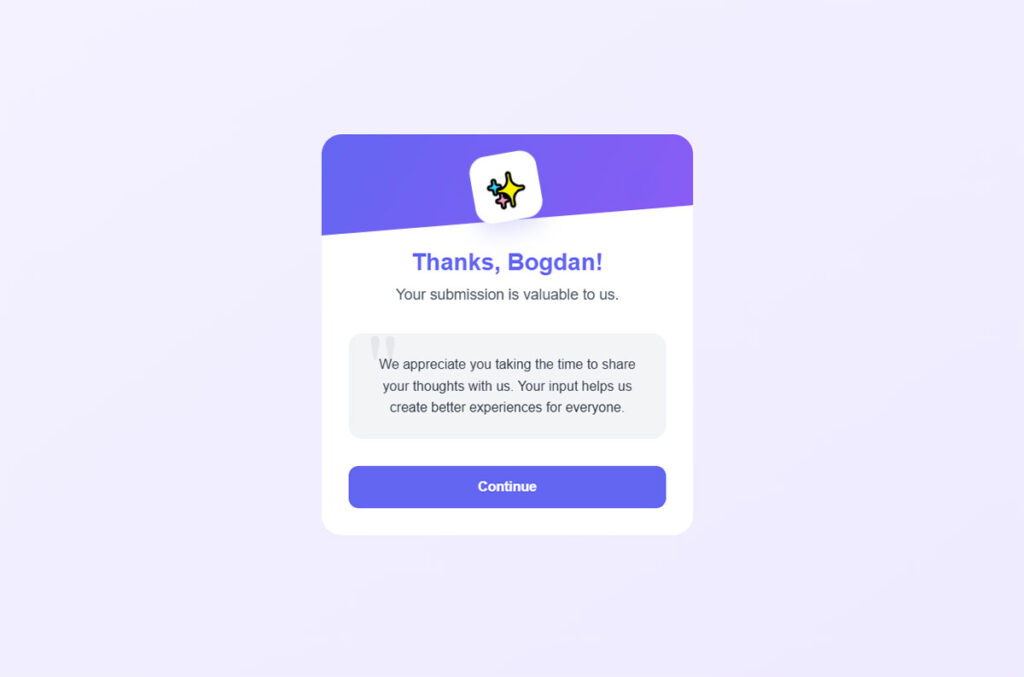
It’s striking how seeing their name can make someone feel appreciated. Imagine receiving a “Thanks, Bogdan! Your submission is valuable to us.” Feels different, right? This little touch can foster a sense of connection, turning a simple form submission confirmation message into an emotion-triggering moment.
Fostering repeat interactions is the next step. If users feel valued, they’re more likely to return. It’s psychological. Form validation is essential, but coupling it with personalized gratitude can encourage them to explore more.
“Hey Sarah, got another question? We’re here for you!”
That familiarity brings them back. It’s like seeing a friendly face.
ROI and Engagement Metrics
Let’s talk numbers. Case studies showcase improved ROI with personalized, engaging success messages. It’s not fluff.
Take a brand that switched from generic “Thank you for your submission” to data-driven, personalized responses. They saw a 20% increase in customer retention. Clients felt heard, seen. The CRM system tracked interactions, and the results were clear – more return visits, more repeat business.
Key performance indicators to track success? Start with click-through rates on success message CTAs. Are users exploring your additional resources or blogs? Track the conversion rates from thank-you messages to actual sales, signups, or interactions.
FAQ on Form Submission Confirmation Message
What to say after submitting a form?
After a form submission, you should thank the user, confirm their action was successful, and let them know what happens next. For example: “Thank you for your submission! We’ll review it and get back to you within 24 hours.”
What is a good confirmation message?
A good form submission confirmation message confirms receipt, sets a time expectation, and tells the user if they need to do anything else. “Thanks, we got your message. We’ll reply within 24 hours. Check your inbox for a copy.” Three sentences. No mystery.
How do you say thank you for your submission?
Say it plainly, then add something useful:
- “Thank you for your submission. We’ll be in touch within one business day.”
- “Thanks for reaching out. Your request is with our team now.”
- “We appreciate your submission. A confirmation email is on its way to your inbox.”
The thank you alone is polite. The thank you plus a timeline is a form submission confirmation message that actually does its job.
How do I add a submission confirmation message in Google Forms?
Open your form, click Settings, expand Presentation, and edit the Confirmation message field. Google saves it automatically. The default text is “Your response has been recorded,” which you should absolutely change. Note that Google Forms does not support HTML, clickable links, or personalization in this field.
How to write a confirmation message?
Keep it clear, short, and in your brand’s voice. A working form submission confirmation message does three things:
- Confirms the action worked.
- Thanks the user.
- States the next step and when it happens.
Anything past that is bonus. Anything short of that leaves the user guessing.
What is form submission acknowledgement?
Form submission acknowledgement is a message (on-screen or via email) that reassures users their form was received. It prevents confusion, builds trust, and often includes details about what they should expect next.
How do you say thank you for your submission?
You can say thank you in a simple, polite way, such as:
- “Thank you for your submission – we’ll be in touch shortly.”
- “Thanks for reaching out! We’ll review your request and respond soon.”
- “We appreciate your submission. A confirmation email has been sent to your inbox.”
What is an example of a confirmation message?
Here’s a basic example you can use or adapt: “Thank you for registering! Your submission has been received successfully. Please check your email for confirmation and next steps.”
Why is a confirmation message important?
It reassures users that their submission was successful and builds trust. Without it, users might wonder if their data was received.
How can I make the message more engaging?
Personalize it with the user’s name and relevant details. Keep the tone warm and include next steps. Add your brand logo for consistency.
Should the confirmation message include an estimated response time?
Yes. Including an estimated response time sets clear expectations for the user. “We’ll reply within 24 hours” informs and reassures them, reducing follow-up inquiries.
Is it essential to have a confirmation message for every form?
Absolutely. Every form, whether for contact, subscriptions, or feedback, should have a confirmation message. It’s a basic courtesy and reinforces reliability.
Can I use pop-ups for confirmation messages?
Sure. Pop-ups are immediate and effective. They quickly display the confirmation without navigating away from the current page, maintaining user engagement.
What about redirect pages for confirmation messages?
Redirect pages provide more room for detailed information. They can guide users to related content or further actions, enhancing the overall user journey.
How do I track the effectiveness of my confirmation messages?
Integrate with analytics tools. Monitor click-through rates on any links within the message, and refine based on user behavior and feedback.
Should confirmation messages be mobile-friendly?
Absolutely. Mobile users make up a significant portion of web traffic. Ensure your messages are readable and engaging on any device, from desktops to phones.
Can I offer incentives in my confirmation messages?
Yes. Offering discounts or free resources can make the confirmation message memorable. It’s a great way to encourage further interaction and build loyalty.
Conclusion
Wrapping this up, a form submission confirmation message is more than a polite nod. It’s a key piece of user interaction. Getting it right means acknowledging the submission, setting expectations, and sometimes guiding users to their next step.
Consider the elements we’ve discussed:
- Personalization: Mention user names, show you care.
- Clarity: Estimated response times and next steps.
- Engagement: Offering additional resources, sometimes incentivizing with discounts.
Each step refines the user experience, reinforces brand trust, and potentially boosts engagement metrics. From using IvyForms for setup to integrating Google Analytics, every detail matters.
Review your current messages. Are they engaging, clear, and personalized? Adjust them, and your users will thank you. And, let’s not forget, always make it mobile-friendly. Users are everywhere, and your message should be too. That’s how you turn a simple interaction into a memorable touchpoint.