



A new client doesn’t sign with an accounting firm because a landing page convinced them. They sign because someone they trust vouched for the firm, or because the firm showed…
Table of contents
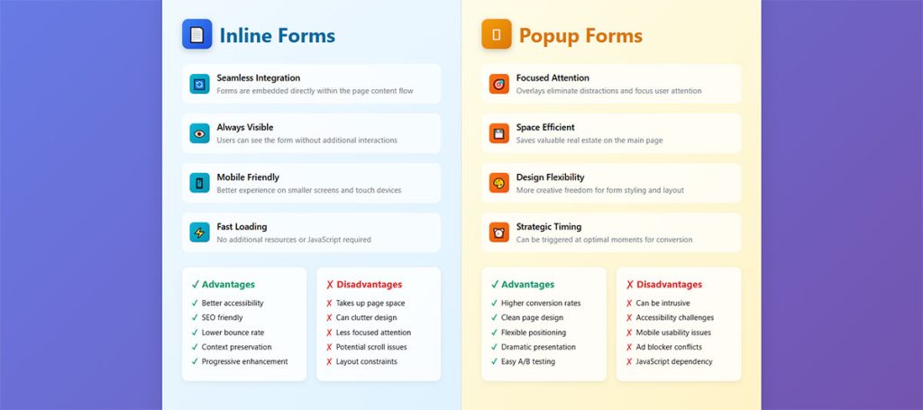
Two thirds of the signup forms live on the web right now are popups, 66 percent according to HubSpot. That number says more about what marketers default to than about which format actually converts better for a given page. The real inline forms vs popup forms question isn’t about picking one overall winner.
An inline form loads with the page and just sits there, waiting for someone to scroll far enough to notice it. A popup doesn’t wait around. It shows up on a timer, a scroll trigger, or the second someone’s cursor drifts toward the back button.
Neither format is automatically the right call. Get the choice wrong on a given page and it rarely blows up loudly. It just quietly costs conversions, or, if the popup fires the moment someone lands from a Google search, it can cost rankings too.
What Is the Difference Between Inline Forms and Popup Forms
Technically, it comes down to where the element lives in the page. An inline form is part of the normal document flow, sitting in the same layout as everything else on the page, nothing special going on.
A popup breaks from that. It renders on a separate layer above the page’s stacking context, which is just a technical way of saying it floats on top of whatever’s currently on screen. Getting there takes some kind of trigger: a click, a timer, a scroll position, or someone’s cursor heading for the exit.
Inline and popup are two of several types of forms used across the web, but the distinction that actually matters here isn’t about design. It comes down to one thing: does the field live inside the document, or does it sit on top of it.
| Feature | Inline Form | Popup Form |
|---|---|---|
| Position | Embedded in page layout | Overlay above content |
| Trigger | None, loads with the page | Click, scroll, timer, or exit intent |
| View rate | Limited to scroll depth | Close to 100 percent of visitors |
| Dismissal | Not applicable | Requires a close action |
Popup Form Formats
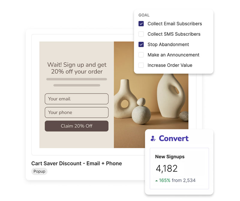
Modal windows, slide-ins, corner boxes and full-screen takeovers cover most of what’s actually out there. Each one behaves differently depending on how much of the screen it’s willing to take over.
- Modal: centered, dims everything behind it
- Slide-in: comes in from a screen edge, feels less like an ambush
- Corner box: small, stays out of the way without blocking content
- Full-screen takeover: takes the whole viewport, no way around it
There’s a full breakdown of these types of popups if you want the positioning and trigger pairing details.
Inline Form Placements
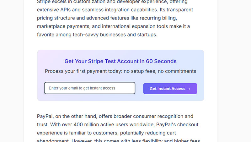
Inline forms tend to land in the same handful of spots on a page, whether or not anyone actually planned it that way.
- Header or navigation bar
- Footer
- Mid-content, between paragraphs
- Sidebar
- Dedicated landing page
Exposure comes down almost entirely to where the thing sits. A footer form only reaches whoever scrolls all the way to the bottom. A mid-content form catches whoever got far enough to actually care what you’re saying.
How Do Inline Forms and Popup Forms Compare in Conversion Rate
Popup benchmarks get repeated constantly, and the most quoted one is still Sumo’s: 3.09 percent average conversion, with the top 10 percent of campaigns hitting 9.28 percent, pulled from an analysis of nearly 2 billion popups. That study is from 2016 (it sometimes gets misdated to 2019 in roundups that clearly never checked the original).
It’s also not the most current number anymore. Wisepops ran a 2026 benchmark off a similarly massive sample, over 1 billion popup displays, and found the average has climbed to 4.82 percent, with the top 10 percent now reaching 57.7 percent. A decade of better targeting and personalization tools will do that.
Inline forms on dedicated landing pages land lower on paper, somewhere between 2.35 percent (WordStream) and 4.02 percent, the higher figure coming from Unbounce’s 2026 Conversion Benchmark Report, which pulled from 44 million actual conversions.
Opt-in pages built with one job, growing an email list, do better than either of those. GetResponse’s 2026 numbers put the average at 10.76 percent, and webinar registration pages specifically climb to 22.84 percent.
| Form Type | Average Conversion | Source |
|---|---|---|
| Popup, all types (original benchmark) | 3.09% | Sumo, 2016 |
| Popup, all types (current benchmark) | 4.82% | Wisepops, 2026 |
| Landing page, cross-industry | 2.35% to 4.02% | WordStream / Unbounce, 2026 |
| Dedicated opt-in page | 10.76% | GetResponse, 2026 |
None of these percentages mean much without accounting for reach, which is the bigger difference between the two formats. A popup shows up for nearly everyone who lands on the page, and even someone closing it immediately still counts as a view. An inline form only reaches the visitors who scroll down far enough to hit it, a smaller group, but one that’s already shown some interest just by getting there.
Social Media Examiner is the case study that gets cited for this specifically. Pagely reported the site grew its email list by 234 percent in a single year, crediting around 70 percent of that growth to one popup form.
The number alone doesn’t tell you much though. Seeing what a 10 percent page actually looks like helps more, and a set of opt-in form examples breaks down the field count and copy choices behind the ones that perform, along with how they’re laid out.
What Triggers and Design Choices Improve Popup Form Performance
Of everything you can tweak on a popup, trigger type moves the needle hardest. Pick the right one and conversion can clear 50 percent. Pick wrong, and you’re lucky to break 4.
| Trigger | Conversion Rate |
|---|---|
| Click-triggered | 54.42% |
| AI-powered / behavioral | 15.98% |
| Hover | 13.05% |
| Scroll-based | 5.37% |
| Exit-intent | 3.94% |
That Wisepops 2026 benchmark, the same one built off more than 1 billion popup displays, found click-triggered popups way out ahead of every other option. Makes sense when you think about it. The visitor already did something to signal interest before the popup ever showed up, so there’s no ambush factor working against the offer.
OptinMonster publishes its own case data here, and two examples come up a lot: exit-intent more than doubled Shockbyte’s sales conversions, and it lifted Reliablesoft’s opt-in rate by 300 percent.
Exit-Intent, Scroll-Based, and Time-Based Triggers Compared
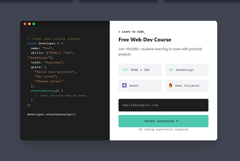
Exit-intent works off cursor movement, specifically the moment someone’s mouse heads toward the browser chrome like they’re about to close the tab or type in a new URL. It’s the core mechanic behind every exit-intent form, and it converts lowest of the three triggers here, but that’s a little unfair to it. By definition it’s only catching traffic that was already on its way out the door anyway.
Scroll-based is simpler. It fires once someone passes a set depth on the page. Drip’s research pegs the sweet spot around 35 percent scroll depth.
Time-based just waits. Campaign Monitor looked at top-performing popups and found 92 percent of them held off at least 4 seconds before showing up.
Field Count and Copy Length Effects on Completion
Field count is the other lever. One or two fields beat longer forms pretty much every time. Sumo’s numbers tie popup success directly to field count, and single-field email capture wins across their whole dataset.
Button copy matters too, more than people expect. “Send Me the Guide” reads like an actual offer. “Submit” reads like paperwork, because that’s exactly what it sounds like.
And don’t skip the close button. A popup with no clear, keyboard-friendly way out is basically the exact pattern that gets flagged under Google’s mobile penalty, more on that below. If you’re building an exit trigger from scratch, that usually means wiring a script up with a plugin, and WordPress exit intent popup plugins handle the cursor-tracking part without custom code.
What Placement and Design Choices Improve Inline Form Performance
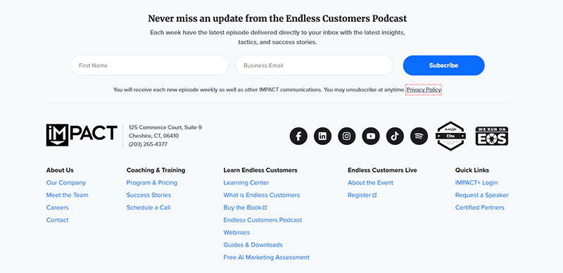
Above-the-fold placement wins over below-content placement in nearly every published test out there. The exact size of the lift depends on traffic source and what’s actually being offered, so don’t expect the same number twice.
Landing pages built around one single call to action convert at 13.5 percent, according to Unbounce. Strip the navigation menu out entirely and, per VWO’s widely-cited Yuppiechief case study, conversion roughly doubled.
Worth being honest about that one: it’s a single documented example, not some database-wide finding pulled from thousands of sites. Still, the same direction (fewer ways to leave the page, higher conversion) shows up again and again across other navigation-removal tests published since.
A sticky sidebar form travels with the visitor as they scroll. A static footer form shows up exactly once, right at the bottom, so naturally fewer people ever see it.
What follows from all that is pretty obvious once you say it out loud: cut the distracting nav links, keep one visible field group, and match the copy to whatever actually brought the visitor to the page. There’s a full set of landing page form best practices if you want the layout details spelled out.
Single-Step Versus Multi-Step Inline Forms
Past around 5 fields, multi-step formats start winning pretty clearly. The most commonly cited number here traces back to Formstack: 13.85 percent average conversion for multi-step forms against 4.53 percent for single-step versions asking the same things, more than double. HubSpot has its own figure too, 86 percent higher conversion for multi-step versus single-step, pulled from its own customer data. Worth flagging that these are two separate datasets. The 86 percent figure and the 13.85/4.53 numbers aren’t measuring the exact same thing, so don’t stack them together as if they agree by coincidence.
Venture Harbour has one of the cleaner before-and-after examples: a consulting inquiry form went from 0.96 percent to 8.1 percent just by splitting the same fields across multiple steps instead of one long page.
BrokerNotes, a B2C financial lead site, saw something similar. Conversion climbed from 11 percent to 46 percent with that same kind of restructuring. There’s a closer look at multi-step forms vs single-step forms that gets into exactly when the split is worth doing and when it isn’t.
How Do Inline Forms and Popup Forms Affect User Experience and Page Flow
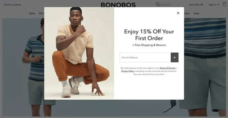
Popups interrupt, plain and simple. Someone has to notice the thing covering their screen, figure out what it wants, and close it before getting back to whatever they actually came for.
Inline forms skip all of that. Nothing covers the page. Scroll position stays put, reading flow stays put, whether someone fills the form out or just scrolls right past it without a second glance.
Google turned this into an actual ranking signal on January 10, 2017. That’s when it started penalizing pages that show a popup covering the main content the moment a visitor arrives from a search result. Product manager Doantam Phan had announced the change was coming back in August 2016.
The penalty targeted a few specific patterns: a popup covering the main content right after the search click, a standalone interstitial someone has to dismiss before reading anything, and layouts where the visible area looks like an interstitial with the real content shoved below the fold.
John Mueller clarified this in an October 2016 webmaster hangout. The rule only kicks in during that narrow window between clicking a search result and the first view of the page. A popup that fires later in the session, an exit-intent one included, doesn’t fall under it at all.
Google names its own exceptions too. Legal notices, age checks, and login walls sitting on non-indexable pages are exempt.
Frequency capping is what stops the interruption from becoming a repeat offense. Someone who already closed a popup, or already filled it out, generally shouldn’t get the same prompt again on their next visit.
Honestly, that single rule probably does more for good form UX design than any visual tweak you could make.
How Do Popup Forms Affect Page Speed and Core Web Vitals
Popup scripts tend to load after the page’s core content is already there, and most implementations don’t reserve any space for the overlay ahead of time. That’s about as textbook a cause of Cumulative Layout Shift as it gets.
| CLS Score | Rating |
|---|---|
| Under 0.1 | Good |
| 0.1 to 0.25 | Needs improvement |
| Above 0.25 | Poor |
Those thresholds come straight from Google’s Core Web Vitals specification. Dynamic content, popups included, along with cookie banners and injected ads, shows up near the top of basically every published list of common CLS culprits.
Third-party popup platforms (OptinMonster, Sumo, Privy, Justuno, take your pick) each load their own separate script, apart from the page’s main bundle. Every single one adds parse time before the popup can even check whether its trigger condition has been met.
Inline forms don’t carry any of that overlay cost. They render inside the normal DOM flow, so there’s no late-arriving element shoving content around after the layout has already settled into place.
Lazy-loading the popup script helps some. Delaying it until scroll or exit-intent actually fires keeps the render-blocking weight off the page’s initial load. It’s a partial fix though, not a complete one. The script still has to load at some point, and Largest Contentful Paint only measures what happens before the main content shows up anyway.
How Do Inline Forms and Popup Forms Perform on Mobile Devices
On raw percentage, mobile popups actually convert better than desktop ones, somewhere between 36 and 74 percent higher depending on which 2026 dataset you’re pulling from (Popupsmart tracks a few).
Completion tells the opposite story though. Desktop forms finish at 54.48 percent, mobile trails at 47.53 percent, per Zuko’s 2026 form analytics numbers across multiple industries.
That gap is friction, not lack of interest. Typing on a phone keyboard just takes more effort than typing on a desktop one, and every extra field you add compounds that cost.
For any tappable element, popup close buttons very much included, 48 by 48 pixels is the working minimum (that’s Google’s Material Design spec, Apple’s Human Interface Guidelines land a little tighter at 44 by 44 points). Sites that stick to this report fewer mis-taps and less abandonment on mobile, though how much of a lift that actually buys varies by study. There’s no one clean number everyone agrees on.
The mobile interstitial rule covered above still carves out exceptions: small banners, login walls sitting on gated pages, and legally required notices. A full-screen popup blocking the view the moment someone arrives from search doesn’t get any of those exemptions, on any device.
Trimming a form down to 6 or 7 fields, and matching keyboard types to what’s being asked (email, numeric, tel), cuts down the friction that drives mobile-specific drop-off. The wider set of tactics for improving form abandonment rate works just as well on a phone as on a desktop, and mobile form best practices covers the input-type and layout side specifically.
Inline forms just adapt to a narrower viewport without any of that ranking risk attached. There’s nothing to reflow into an interstitial pattern, since nothing was ever floating above the content in the first place.
Which Form Type Complies Better With Accessibility and Privacy Standards
By default, popup forms carry more accessibility risk than inline ones. They add a whole second interaction layer that anyone using a screen reader or navigating by keyboard now has to deal with.
WCAG’s Success Criterion 2.1.2, No Keyboard Trap, requires that anyone who tabs into a popup can also tab back out of it using a standard method. Not a mouse click, a keyboard method.
2.4.3, Focus Order, adds a related requirement about sequential navigation. Most solid dialog implementations go further than the bare minimum too, following the WAI-ARIA Authoring Practices for dialogs. Focus jumps into the popup the second it opens, then returns to whatever triggered it once the thing closes.
| Requirement | Inline Form | Popup Form |
|---|---|---|
| Focus management | Follows natural page tab order | Must trap and restore focus manually |
| Screen reader announcement | Not needed, already in the DOM | Needs role=”dialog” and aria-modal |
| Keyboard dismissal | Not applicable | Must support the Escape key |
Screen readers have no way of knowing a popup even appeared unless something tells them. Leave role=”dialog” and aria-modal=”true” off the container, and a screen reader user just stays parked on the underlying page, completely unaware anything opened at all.
Inline forms skip this entire problem. They inherit whatever tab order the page already has. No focus trap to build, no restore-on-close logic to write, no extra ARIA markup bolted on top. There’s a rundown of form accessibility best practices that covers labeling and error announcements for both formats, if you need the specifics.
GDPR complicates things for both formats, and in the same way. A consent checkbox is one more field, and every extra field adds friction. Research that Quicksprout and HubSpot both popularized found that cutting a form from 4 fields to 3 lifted conversion by close to 50 percent, a number that gets cited constantly in guidance on how to create GDPR compliant forms.
H&M ran into this the expensive way. Germany’s Hamburg data protection authority fined the company €35.3 million in 2020 for collecting way more employee data than it needed, including detailed notes on health, family circumstances, and even religious beliefs. None of that had anything to do with the stated purpose for collecting it, which is exactly what GDPR’s data minimization principle exists to prevent.
Timing creates its own separate mess. A popup that fires before a cookie consent banner gets resolved forces two decisions on the visitor at the same moment. In field studies covering more than 80,000 real visitors, consent acceptance climbed to 81 to 83 percent, but only when the checkboxes came pre-selected. That’s exactly the pattern GDPR treats as invalid consent, no matter how good the resulting number looks.
Can Inline Forms and Popup Forms Be Used Together in the Same Funnel
Most sites running both formats aren’t really choosing between them. They’re stacking inline and popup by visitor state, using each one where it actually fits.
An inline form sits quietly in the content for whoever scrolls and reads. A popup, usually an exit-intent one, works as the safety net that catches whoever was about to leave without converting.
SuretyBonds.com is a decent example of doing this without a popup at all, actually. An Unbounce case study has the company raising lead capture 27 percent just by testing inline form placement and call to action prominence on its homepage.
What keeps the pairing from feeling redundant is suppression logic. Once someone submits the inline form, the popup needs to stop firing for them completely. Most platforms handle this through a success-event rule tied to form state, so nobody ends up staring at two competing offers on the same page.
Think of it in terms of where the visitor actually is. Someone who scrolled and read to the end just sees the inline form. Someone new, heading toward the exit, sees the popup instead. Someone who already converted sees neither.
Matching the format to the funnel stage matters more than picking an overall winner between the two. Readers already committed to a topic respond well to gated resources sitting behind an inline form, while gated content promoted through a popup catches the visitor who was never going to scroll that far in the first place.
There’s a broader guide on how to create lead capture forms that walks through the placement and suppression logic in more detail, for anyone setting this up from scratch.
Where Do Popup Forms Reduce Conversion Instead of Increasing It
Checkout is the clearest example of a popup actively working against you. The average checkout flow already runs 5.1 steps and 11.3 form elements by default, and cart abandonment across ecommerce sits at 70.22 percent, per Baymard Institute.
Stack a popup on top of that and you’re handing the visitor one more decision they never asked for, right at the moment they’re closest to actually paying. One recent checkout analysis puts it bluntly: the checkout page is not the place for intrusive popups or long testimonials.
Long-form editorial content is the second obvious case. Immediate, on-load popups get widely blamed for raising bounce rate by something around 35 percent, though that number comes from industry commentary rather than one controlled study anyone can point to. The logic behind it holds regardless. Covering the article before a first-time visitor has even read a sentence gives them nothing to judge the offer against.
Pages already flagged under Google’s mobile interstitial policy lose twice over. The popup hurts conversion and creates ranking risk in the same breath.
Publisher sites stacking a paywall, a popup, and a cookie consent banner on one page load make the problem worse still. Each overlay shifts the layout on its own, and visitors don’t tend to stick around sorting through three separate decisions before they’ve read a single paragraph.
Then there’s the quiet case nobody really talks about: low-traffic pages. A popup script still has to load, parse, and check its trigger condition even if the page only sees 50 visitors a month, and the weight of that script can easily outweigh whatever tiny conversion lift the popup was supposed to bring.
A closer look at checkout optimization gets into form-element reduction specifically, for the highest-stakes version of this problem.
Checkout processes on platforms like Shopify require embedded forms for order completion.
What Tools Are Used to Build and Test Inline and Popup Forms
Popup tools and general form builders solve genuinely different problems. Most CRO stacks end up running one of each instead of trying to force a single platform to do both jobs.
Popup-Specific Platforms Versus General Form Builders
| Tool | Primary Use |
|---|---|
| OptinMonster | Exit-intent and behavioral popups |
| Sumo | Popup and list-building suite |
| Privy | Ecommerce popups and cart recovery |
| Justuno | On-site popup targeting |
| Typeform | Standalone inline and conversational forms |
| Gravity Forms | WordPress inline form builder |
That 66 percent HubSpot number from earlier, popups making up the bulk of all signup forms in circulation, pairs with something else worth knowing: dedicated landing pages hold the highest per-form signup rate at 23 percent. Reach versus intent, basically, showing up again.
On WordPress specifically, most teams just grab a purpose-built plugin instead of building either format from scratch. A set of WordPress lead generation plugins covers the popup and exit-intent side of things, and WordPress contact form plugins handles the inline, embedded side on the same site.
VWO and Unbounce sit on top of either format as the A/B testing layer, splitting traffic between variants so a lift can actually get confirmed before it ships anywhere permanent.
Hotjar and Microsoft Clarity do something different. They record scroll depth and click behavior, so a team can actually see where an inline form gets scrolled past unnoticed, or where a popup’s close button keeps getting missed.
What Do Case Studies Show About Inline Versus Popup Form Performance
Not every dataset agrees on which format actually wins, and that disagreement tells you something useful on its own.
Factors.ai ran a comparative study and found inline forms converting at 45.53 percent against 25.96 percent for modal popups, with both placed in layouts built around the exact same offer.
That runs opposite to the broader averages cited earlier, where the older Sumo dataset had popups ahead of general landing-page inline forms on raw percentage. The gap comes down to what’s actually being measured. Factors.ai tested carefully matched placements head to head. Sumo and WordStream’s numbers pool every implementation out there, the good ones and the sloppy ones, across millions of sites.
| Case | Result | Source |
|---|---|---|
| SuretyBonds.com | 27% more leads from inline placement and CTA testing | Unbounce |
| Factors.ai comparative test | Inline 45.53% vs popup 25.96% | Factors.ai |
| Blog Marketing Academy | Sidebar 0.58% vs callout box up to 6.09% | Blog Marketing Academy |
Blog Marketing Academy’s testing points at something else entirely. The real divergence isn’t inline versus popup, it’s placement within the inline category itself. Sidebar opt-ins on their site converted at just 0.58 percent. The exact same offer, moved into an in-content callout box, reached as high as 6.09 percent.
Industry context shifts the picture again on top of all that. A full conversion rate benchmarks breakdown shows performance swinging by a factor of five or more between sectors alone, before the inline-versus-popup question even enters the conversation.
Every case here seems to point the same direction. Format matters less than fit. A well-placed inline form beats a generic popup about as often as a well-targeted popup beats a badly placed inline form.
FAQ on Inline Forms Vs Popup Forms
What is a good average close rate for a popup form?
The current number, from Wisepops’ 2026 data covering over 1 billion popup displays, sits around 4.8 percent. That’s up from the 3.09 percent figure Sumo’s 2016 study made famous, the one that still gets quoted everywhere even now. Either way, most visitors are going to close or ignore the thing without converting, and that’s completely normal. Something’s only actually wrong if you’re sitting well under 1 percent.
Does Google penalize popup forms on desktop the same way as mobile?
No, it doesn’t. Google’s intrusive interstitial policy, announced back in 2016, targets the mobile search-to-page transition specifically. Desktop popups sit outside that ranking signal entirely, no matter what format or trigger they’re using.
Should a popup form ask for a phone number as well as an email?
Not upfront, usually. Making a phone field mandatory tends to knock completion down by roughly 5 to 8 percent, since it reads as more than a simple signup should require. Asking for it later, in a separate post-signup step, converts better.
Do popup forms still work when JavaScript is disabled?
No. A popup relies on a script checking its trigger condition, so turn off JavaScript and it simply never fires. Inline forms mostly still work in that scenario, since a native HTML form can submit through a normal page request without any script involved at all.
Can ad blockers prevent a popup form from displaying?
Yes, and fairly often too. Most popup platforms load through a third-party script, exactly the kind of request privacy extensions and ad blockers like to flag. Inline forms rendered right in the page’s own HTML rarely get caught by any of that, since there’s no external script for anything to intercept.
Should a popup form appear on every page of a site?
No, that tends to backfire. Targeting specific high-intent pages, a pricing page or cart page, beats a site-wide popup shown on everything. Someone who sees the same offer over and over starts closing it faster each time, which is basically popup fatigue setting in.
Does a countdown timer improve popup form conversion?
Yes, and the difference is fairly noticeable. Exit-intent popups with a countdown convert at 14.41 percent on average, according to Envive AI research (the same figure also floats around attributed to OptiMonk elsewhere), well above standard exit-intent popups without a timer. The urgency seems to push someone on the fence into deciding right then instead of just closing the thing.
Do inline forms need a privacy policy link next to the submit button?
Under GDPR, yes, if the form’s collecting any personal data at all. It doesn’t need to sit right next to the button specifically, but it does need to be visible and reachable before someone submits, not buried in a footer three scrolls down.
Is double opt-in required for popup form email signups?
Not under GDPR itself, no, though several countries treat it as the de facto standard for proving consent actually happened. A single opt-in with a clear, unticked checkbox satisfies the law in most cases on its own. Double opt-in’s real value is protecting list quality and keeping spam complaints down.
Is there a legal limit on how often a popup can show the same visitor?
No fixed number exists, not under GDPR and not under ePrivacy law either. That said, repeated consent or signup prompts can still cross the line into violating freely given consent if they wear someone down enough. Consent fatigue is the term for it, and it can push acceptance rates above 80 percent for reasons that have nothing to do with genuine interest.
Conclusion
None of this needs to be a huge decision sitting at the top of some project plan. Ship the inline version first, on whichever page already carries your most engaged traffic, and treat that as the baseline everything else gets measured against.
A popup only earns a spot once it actually beats that baseline in an A/B test. Not before, no matter how good the trigger idea sounds on paper.
Set a frequency cap and a suppression rule on day one, tied to form completion, so nobody sees the same offer twice on a return visit. That one constraint alone heads off most of the conversion rate optimization headaches this topic tends to create.
And fix field count before messing with trigger timing. A shorter form recovers more lost signups than a perfectly timed exit-intent popup ever will.