

Most WordPress sites reach for a plugin the moment they need a contact form. It works, but it is not the only way. You can create forms in WordPress without…
Table of contents
Zuko Analytics data across 93 million sessions shows that 55% of people who start filling out a form never finish it. That’s more than half your potential leads, customers, or signups gone before they hit submit.
The good news? Most of the reasons people quit are fixable. Bad validation, too many fields, missing trust signals, poor mobile rendering. These are design problems, not traffic problems.
This guide covers practical tips for improving form abandonment rate based on real conversion data from Baymard Institute, Google Chrome research, and CXL usability studies. You’ll learn which fields cause the most drop-offs, how to structure forms for higher completion, and what recovery tactics actually bring people back.
What Is Form Abandonment Rate?
Form abandonment rate is the percentage of users who start filling out a form but leave before hitting submit. That’s it. Simple metric, big consequences.
The formula: (total form starts minus total submissions) divided by total form starts, multiplied by 100.
So if 1,000 people start your form and only 450 finish it, your abandonment rate is 55%. Zuko Analytics benchmarking data across 93 million sessions puts the average form completion rate at roughly 51.7%, meaning nearly half of all form starters bail.
The numbers get worse depending on the industry. Automotive forms sit at an 82% abandonment rate. Travel and ecommerce hover around 49%. Checkout forms specifically can reach abandonment rates as high as 80%, according to FormStory data.
| Industry | Avg. Abandonment Rate | Avg. Completion Time |
|---|---|---|
| Automotive | 82% | Varies |
| Travel | 49% | 3+ minutes |
| eCommerce | 49% | 3 min 21 sec |
| Insurance | 6% | 8+ minutes |
| Local Government | 3% | 8 min 30 sec |
One thing worth calling out: form abandonment and page bounce are not the same thing. A bounce means someone loaded the page and left without interacting. Form abandonment means they started the form. They typed something. They engaged. And then they quit.
That distinction matters because the fix for each problem is completely different. If people aren’t starting your form, you have a messaging or layout problem. If they’re starting and leaving, you have a form UX design problem.
Free Form Abandonment Rate Cost Calculator
Why Users Abandon Forms
People don’t abandon forms because they’re lazy. They abandon forms because something got in their way.
The Manifest survey data breaks down the top reasons pretty clearly: 29% cite security concerns, 27% say the form is too long, 11% blame ads or upselling during the process, and 10% don’t understand why certain information is being collected.
Friction From Length and Complexity
Baymard Institute’s 2025 checkout research found that the average US checkout flow displays 23.48 form elements by default. The ideal? Around 12 to 14 elements (7 to 8 actual fields). That’s roughly twice as many fields as needed.
18% of US online shoppers abandoned an order in the past quarter specifically because the checkout process felt too long or complicated, according to Baymard.
And it’s not just checkout. Comparison forms on financial sites average 36 required inputs, which is absurd for most users. The average form abandonment time sits at just 1 minute and 43 seconds (Feathery data). People decide fast.
Trust, Technical Issues, and Unclear Purpose
Security fears: About 12% of users will leave a checkout that doesn’t display trust badges. Pew Research Center data from 2023 shows 73% of Americans feel they have little or no control over how their personal data gets used online.
Technical friction: If your form has usability problems, 67% of visitors will leave permanently. Only 20% will bother to follow up with the company afterward.
Device mismatch: Zuko data shows desktop users complete forms at a 47% rate compared to 42% on mobile. That gap widens on poorly optimized mobile forms where tiny tap targets and missing input types make the experience frustrating.
The password field alone triggers a 10.5% mean drop-off rate, higher than any other common field. Email fields cause 6.4% drop-off and phone number fields sit at 6.3% (Zuko Analytics).
Asking for a phone number reduces form conversion rates by as much as 5%. But making the phone field optional nearly doubles completions, according to data from Quicksprout.
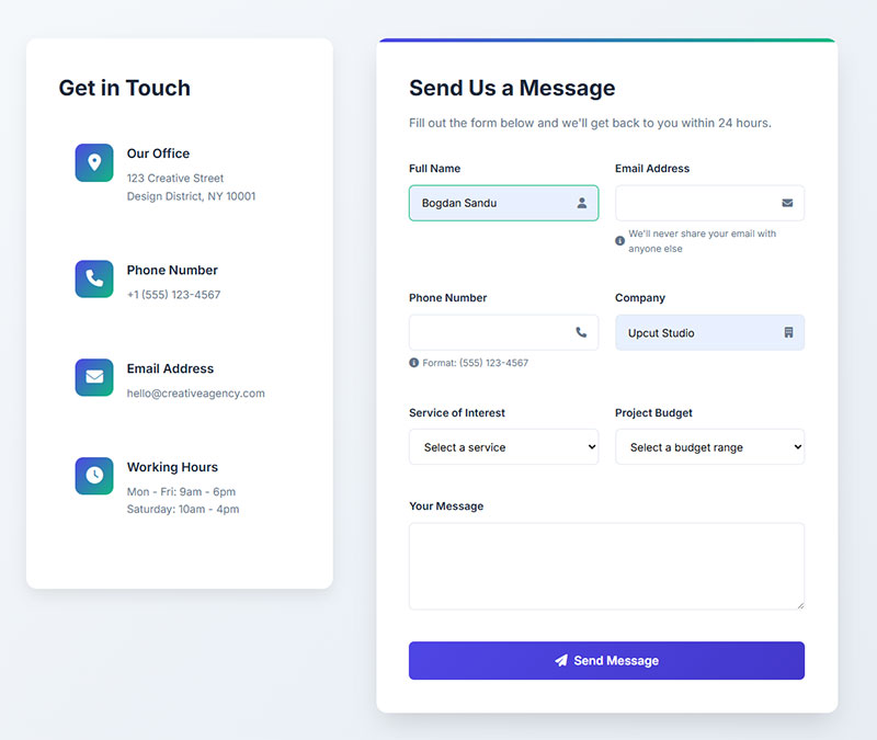
Reduce the Number of Form Fields
Every field you add is a small tax on the person filling out your form. Enough small taxes and they leave.
When Imagescape cut their form fields from 11 to 4, conversion rates jumped by 120%. HubSpot’s internal research found that reducing fields from 11 to 4 produced a similar effect. The pattern holds across industries.
Quicksprout’s research is even more direct: limiting form fields to 3 can dramatically slash abandonment rates.
Which Fields to Cut First
Phone number: Unless you’re running a callback service, this field kills conversions. A 5% conversion rate drop just for including it (Zuko Analytics).
“How did you hear about us”: You can get this from UTM parameters. Don’t make users answer it.
Company name: Rarely needed at the initial contact stage. Ask later.
Separate first and last name fields: Baymard found that 88% of checkout forms don’t include a single “Name” field. Two name fields add friction and slow completion.
Use Conditional Logic Instead of Removing Fields Entirely
Sometimes you genuinely need more information from certain users. That’s where conditional logic comes in.
Show fields only when they’re relevant. Someone selecting “business” on a contact form might need a company name field. Someone selecting “personal” doesn’t.
Tools like Typeform, Gravity Forms, and Jotform all support this natively. You can also find a solid form builder with conditional logic for WordPress that handles these branching paths without code. The goal is to collect what you need without showing everyone every field upfront.
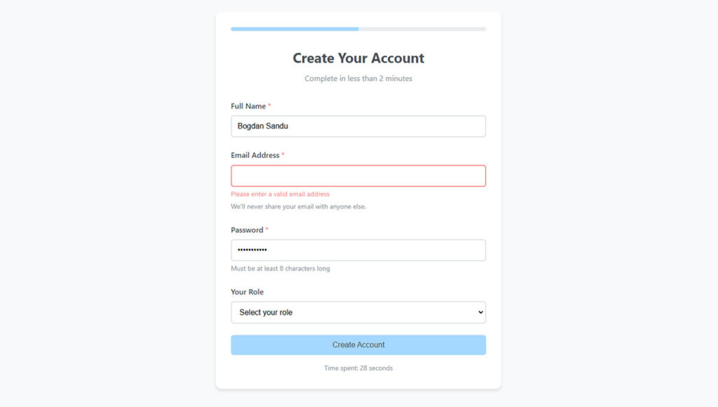
Simplify Validation and Error Handling
Bad error messages are a silent conversion killer. The user types something wrong, sees a vague red banner at the top of the page, and closes the tab. CXL research shows inline form-field validation produces a 22% decrease in form errors and cuts completion time by 42%.
Luke Wroblewski’s usability study (conducted with Etre) found that inline validation also delivered a 31% increase in user satisfaction and a 47% decrease in eye fixations. People processed the form faster because they didn’t have to re-read everything after a failed submission.
Inline Validation vs. Post-Submit Error Dumps
The difference is night and day.
Post-submit validation forces users to submit the form, scroll back up, read a list of errors, then scroll back down to find and fix each one. On mobile, this is especially painful because scrolling means losing context.
Inline form validation checks each field as the user completes it. If the email format is wrong, the user sees the message right there, next to the field, while they still remember what they typed.
And yet, Baymard Institute testing found that 31% of ecommerce sites still don’t provide any inline validation at all. That’s leaving conversions on the table for no good reason.
Write Error Messages Like a Human
A form error message should tell users exactly what went wrong and how to fix it. “Invalid input” tells them nothing.
Good examples:
- “Enter a 10-digit phone number (e.g., 555-123-4567)”
- “This email address doesn’t look right. Check for typos.”
- “Password needs at least 8 characters with one number”
Auto-formatting helps too. Let the form handle dashes in phone numbers, spaces in credit card fields, and date formatting instead of punishing users for guessing wrong. Google’s Material Design guidelines and Apple’s iOS form patterns both push this approach, and for good reason.
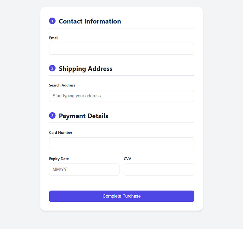
Use Multi-Step Forms Instead of Single Long Forms
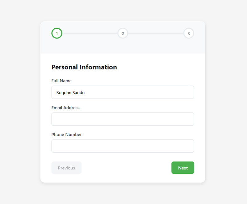
HubSpot reports 86% higher conversion rates for multi-step forms compared to single-step versions. That number alone should make you reconsider any form longer than 5 or 6 fields.
The logic isn’t complicated. A long form on a single page looks intimidating. People see 15 fields and think “this is going to take forever.” Break those same 15 fields into 3 steps of 5, and suddenly it feels manageable.
Why Multi-Step Works (When It Works)
The sunk cost effect: Once someone completes step one, they’ve invested time. They’re less likely to walk away. Venture Harbour tested this extensively. Their consulting form went from a 0.96% conversion rate to 8.1% after switching to a multi-step format.
BrokerNotes, a B2C financial lead generation form site, saw conversion rates jump from 11% to 46% with multi-step forms. Vendio tested a single-page form against a multi-step version and saw a 214% increase in leads.
A form progress bar adds even more momentum. Research on the “endowed progress effect” shows that when people feel they’ve already made progress (even a small amount), they’re far more likely to finish.
When Multi-Step Doesn’t Make Sense
Not every form benefits from splitting. A 3-field newsletter subscription form doesn’t need steps. Neither does a basic contact us page with name, email, and message fields.
If your form has fewer than 5 fields, keep it on one page. The overhead of loading multiple steps and showing progress indicators isn’t worth it for short forms. Your mileage may vary, but I’ve seen multi-step actually hurt conversions on simple sign up forms where users just want to get in and get out.
How to Structure the Step Sequence
Put the easiest, least sensitive fields first. Name and basic preferences. Save email, phone, and payment for later steps when the user has already committed some effort.
Every step should let users go back without losing data. Nothing kills trust faster than clicking “previous” and finding your inputs wiped clean.
And keep it to 1 to 3 questions per step. Cramming 8 fields into “step 2” defeats the whole purpose. For a deeper comparison, look at the differences between multi-step forms or single-step forms and when each approach actually pays off.
Optimize Forms for Mobile Devices
Desktop users complete forms at a 47% rate. Mobile users? 42%. That 5-point gap might sound small, but across thousands of form sessions, it adds up to serious lost conversions.
Zuko Analytics data shows this gap holds across nearly every industry. And on poorly designed mobile forms, the gap gets much wider.
Input Types and Keyboard Matching
This is one of the easiest wins and most developers still skip it.
Using the correct HTML input type (tel, email, number, url) triggers the right keyboard on mobile devices. Someone filling in a phone number gets a numeric keypad instead of a full QWERTY keyboard. Someone entering an email sees the “@” key right there.
Chrome’s 2024 research on autofill found that forms completed with autofill assistance were 35% faster and saw 75% lower abandonment rates. That data came from analyzing thousands of forms across millions of page loads in the US. Making your forms autofill-friendly by using proper autocomplete attributes is one of the highest-leverage fixes you can make.
Shopify’s internal testing backed this up: guest checkouts using autofill had a 45% higher checkout conversion rate than those without it.
Touch Targets and Layout
Tap target sizing matters. Google’s Material Design guidelines recommend at least 48x48px for interactive elements. Anything smaller and users will tap the wrong field, get frustrated, and leave.
Stick to single-column layouts on mobile. CXL research confirmed that single-column forms are completed an average of 15.4 seconds faster than multi-column forms. On a phone screen, multi-column layouts cause confusion about reading order and increase errors.
Avoid dropdown menus where radio buttons, toggles, or segmented controls work better on small screens. Zuko data shows forms relying heavily on dropdowns experience the highest abandonment rates among all field types. Radio buttons let users complete fields an average of 2.5 seconds faster than dropdowns (CXL).
Test on Real Devices
Browser emulators lie. Well, they don’t lie exactly. But they miss real-world problems.
Keyboard overlays that cover form fields. Scroll behavior that breaks when input focus shifts. Auto-zoom on input fields with font sizes below 16px. These things only surface on actual phones.
If you’re running WordPress forms, check that your form plugin’s mobile rendering actually matches what users see on an iPhone SE or a mid-range Android. The difference between the emulator and the real thing can be surprising, and not in a good way.
Add Trust Signals Near the Form
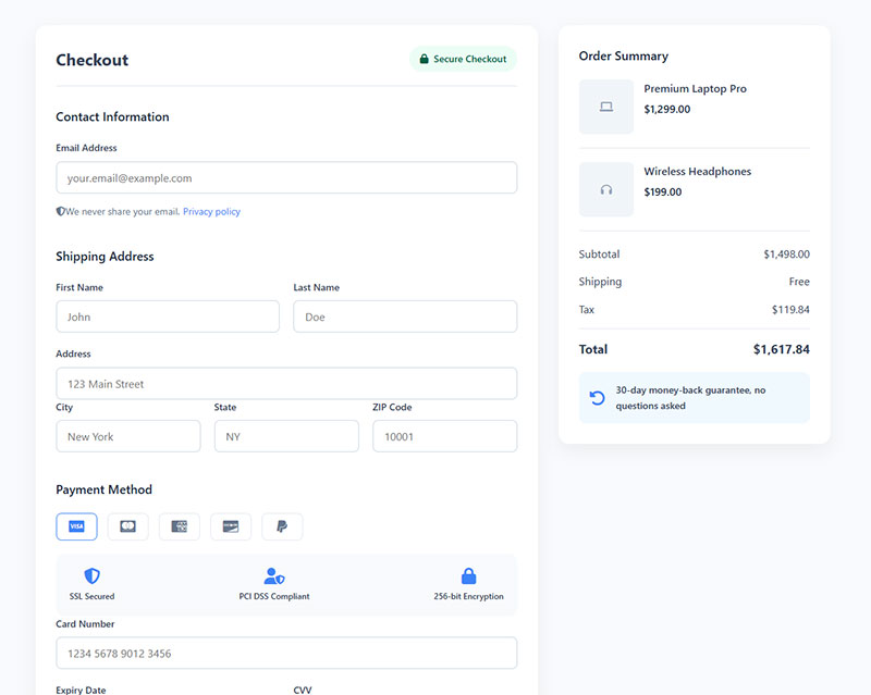
Baymard Institute research found that 19% of shoppers abandon carts specifically because they don’t trust the site with their credit card information. That’s nearly one in five potential customers gone before they even finish typing.
Blue Fountain Media ran a straightforward A/B test: they replaced a text-based privacy note with a VeriSign trust badge on their signup page. The result was a 42% increase in form conversions. Same form, same fields, same everything else.
Which Trust Signals Actually Work
Not all badges carry equal weight. A CXL study with over 1,000 participants found PayPal was perceived as the most trusted badge, while Visa-Mastercard was the most recognized.
| Trust signal type | Best placement | Impact |
|---|---|---|
| SSL / Security badges (Norton, McAfee) | Next to payment fields | Up to 42% conversion lift |
| Payment processor logos (PayPal, Stripe) | Below submit button | Highest perceived trust |
| Money-back guarantee badge | Near CTA button | 32% conversion increase (VWO) |
| Privacy microcopy | Inline, next to email / phone | Reduces field-level drop-off |
An Econsultancy/Toluna survey found that 48% of online shoppers consider trust badges one of the most important things when deciding whether to buy.
Placement Matters More Than Quantity
Stacking five badges in your footer does nothing. Trust signals need to appear where anxiety peaks, which is right next to the fields that ask for sensitive information.
For payment forms, place security badges directly beside the credit card fields. For lead capture forms asking for a phone number, add a short line like “We won’t call you without permission” next to the field. That kind of microcopy directly addresses the reason 37% of users abandon forms that request phone numbers.
Gymshark does this well on their checkout page, displaying Visa, Mastercard, and PayPal badges right at the point of payment. Shoppers see familiar brands and feel safer completing the transaction.
If you’re collecting personal data through any type of form, consider linking your privacy policy inline rather than burying it in the footer. For forms that handle sensitive data in regulated industries, review your approach to form security and make sure your GDPR compliant forms are properly configured.
Implement Save-and-Continue Functionality
Long forms lose people. That’s a given. But some forms genuinely need to be long. Insurance quotes. Job applications. Government paperwork. You can’t shrink a 30-field application down to 5 fields and still collect what you need.
The fix isn’t shorter forms. It’s letting people leave and come back.
Where Save-and-Continue Has the Biggest Impact
Application forms: Zuko Analytics data shows application forms have the highest completion rate of any form type at 75%. But the average abandonment time across all forms is just 1 minute 43 seconds (Feathery). Auto-saving progress keeps those longer sessions from turning into lost submissions.
Insurance and financial forms: Comparison forms in financial services average 36 required inputs. Users who abandon these forms spend about 50 seconds before giving up. Save-and-continue gives them a reason to return when they have the information they need.
Government and healthcare forms: Local government forms take an average of 8.5 minutes to complete (Zuko). Even users who abandon spend around 3 minutes before quitting. That’s 3 minutes of entered data that gets erased without auto-save.
Implementation Options
Formsort data shows that 20% of partial form responders will come back and complete the form if they’re sent a link to their incomplete submission. That’s a meaningful recovery rate for doing almost nothing.
- Email-based save links work best when you capture the email field early in the form
- Session-based auto-save protects against accidental tab closures or browser crashes
- Account-based drafts suit platforms where users already have logins
Formstack and Cognito Forms both offer built-in save-and-resume features. For WordPress, WPForms Pro includes a Save and Resume addon that handles this without custom development. The key is capturing enough identifying info early (usually just an email) so you can reconnect the user to their saved progress.
Use Exit-Intent and Abandonment Recovery
Exit-intent popups convert at an average of 3.94% according to Wisepops 2025 data across billions of popup displays. That sounds modest until you realize these visitors were already leaving. You’re converting people who would have otherwise been zeros.
Cart abandonment popups specifically convert at 17.12% on average, per OptiMonk data. The difference comes down to intent. Someone who loaded items into a cart has already demonstrated purchase interest.
Exit-Intent on Desktop Forms
Desktop exit-intent popups detect when the mouse moves toward the browser’s close button or back arrow. The timing creates a natural psychological interrupt. The visitor has mentally committed to leaving, and your offer breaks that pattern.
Conversion Sciences research shows well-crafted exit messages save 10-15% of abandoning visitors.
What makes the difference between a popup that converts and one that annoys? Relevance and restraint. One clear offer. One action. No guilt-trip copy.
If you’re running WordPress, several WordPress exit intent popup plugins handle the detection and display without custom JavaScript. The technology itself is straightforward. The strategy behind it is what separates the winners.
Email Recovery for Abandoned Forms
Abandonment recovery emails are among the highest-performing automated campaigns in all of email marketing. Klaviyo’s 2024 benchmark data shows abandoned cart emails generate an average of $3.65 revenue per recipient. The top 10% of performers hit $28.89 per recipient.
Timing matters a lot here. SaleCycle research found emails sent one hour after abandonment achieved an average 6.3% conversion rate, the highest of any timing window. Emails sent within the first hour still performed well at 3%, while waiting 24 hours dropped to 2.5%.
| Recovery timing | Avg. conversion rate | Best use case |
|---|---|---|
| Under 1 hour | 3.0% | Quick reminder No discount |
| 1 hour (sweet spot) | 6.3% | Primary recovery email |
| 24 hours | 2.5% | Follow-up With incentive |
| Series of 3 emails | Highest total recovery | Complex forms High-value forms |
What to Say in Recovery Messages
Reference the specific form or product they were looking at. Generic “come back” emails perform worse than personalized ones. Personalized subject lines alone improve open rates by 26%, according to Stripo research.
- Include a direct link that drops them back at the exact point they left
- For complex forms, offer a phone number or chat option for help
One reminder is helpful. Five is spam. Stick to 2 or 3 emails maximum. Open rates drop from 62.94% on the first email to 46.11% by the third (Flowium data). After that, you’re just burning goodwill.
How to Measure Form Abandonment Improvements
You can’t fix what you can’t measure. Took me a while to learn this one, but the biggest mistake people make with form optimization is changing multiple things at once and then having no idea what actually worked.
Setting Up Form Tracking in Google Analytics 4
GA4 includes enhanced measurement for form interactions out of the box. Two events fire automatically: formstart (first interaction) and formsubmit (successful submission).
Enable this in your GA4 property under Admin, then Data Streams, then Enhanced Measurement. Make sure the Form Interactions toggle is on.
The problem? GA4’s built-in tracking only captures starts and submissions. It won’t tell you which specific field caused someone to leave. For that level of detail, you need Google Tag Manager to fire custom events at the field level, or a dedicated tool like Zuko Analytics or Hotjar that tracks per-field behavior automatically.
Key Metrics to Track
Form start rate: What percentage of page visitors actually begin the form? If this number is low, the issue is above the form (page copy, layout, trust signals) rather than inside the form itself.
Per-field drop-off rate: The single most actionable metric. Zuko data shows password fields trigger 10.5% abandonment, email fields 6.4%, and phone fields 6.3%. Find your worst-performing field and fix that one first.
Completion time: Checkout forms average 3 minutes 21 seconds to complete. If yours takes significantly longer, there’s friction hiding somewhere.
Device-level completion rates: Desktop converts at 47%, mobile at 42% (Zuko). If your mobile gap is much wider than 5 points, your form design likely has mobile-specific issues.
A/B Testing Form Changes
Baymard Institute research estimates that better checkout design alone can increase conversion rates by 35.26%. But you only get those gains through systematic testing, not guessing.
Tools like VWO and Convert let you run split tests on form variations. Test one variable at a time. Field count, button copy, layout changes, trust badge placement. Changing everything at once tells you nothing.
Realistic timelines: most form A/B tests need 2 to 4 weeks of traffic to reach statistical significance, depending on your volume. Low-traffic sites might need longer. Don’t call a winner after 3 days just because the numbers look good.
Personalized CTA buttons can improve conversion rates by 42% according to Zuko Analytics. So even small copy changes on the submit button (swapping “Submit” for “Get My Free Quote”) are worth testing. WPForms data confirms that forms using the word “Submit” on the button see 3% more abandonment than those with specific action language.
At the end of the day, increasing form conversions is about building a loop: measure, test, implement, measure again. The benchmarks and stats in this article give you a starting point, but your own data is what matters most. Start tracking, find your worst-performing field, fix it, and repeat.
FAQ on Tips For Improving Form Abandonment Rate
What is a good form abandonment rate?
Zuko Analytics benchmarking data puts the average completion rate at about 51.7% across industries. So roughly 48% abandonment is typical. Anything below 40% abandonment means your forms are performing well above average.
Why do users abandon forms before submitting?
The top reasons are security concerns (29%), form length (27%), unexpected ads or upselling (11%), and unclear data collection purposes (10%). Technical issues like broken validation and poor mobile rendering also push users out.
How many form fields is too many?
There’s no universal number, but research shows that limiting fields to 3 or 4 significantly cuts abandonment. Baymard Institute found the average checkout displays roughly twice as many fields as actually needed.
Do multi-step forms reduce abandonment?
Yes, for longer forms. HubSpot reports 86% higher conversion rates with multi-step formats. But short forms with fewer than 5 fields don’t benefit from splitting. It adds unnecessary complexity for simple interactions.
What is inline validation and does it help?
Inline validation checks each field as the user fills it out, showing errors in real time. CXL research found it reduces form errors by 22% and cuts completion time by 42%. It’s one of the highest-impact fixes available.
How do trust badges affect form completion rates?
Blue Fountain Media’s A/B test showed a 42% conversion increase just from adding a VeriSign badge. Place security badges and payment processor logos near sensitive fields where user anxiety peaks, not buried in footers.
How can I recover users who already abandoned my form?
Send a recovery email within one hour of abandonment. SaleCycle data shows this timing hits a 6.3% conversion rate. Include a direct link back to the partially completed form and keep the message short.
Does mobile optimization really affect form abandonment?
Absolutely. Desktop users complete forms at 47% compared to 42% on mobile (Zuko data). Using correct HTML input types, proper tap target sizes, and single-column layouts closes that gap significantly.
How do I track which form fields cause the most drop-offs?
GA4’s enhanced measurement tracks form starts and submissions automatically. For field-level drop-off data, use Google Tag Manager with custom events or a dedicated tool like Zuko Analytics or Microsoft Clarity.
Should I use exit-intent popups on forms?
They work when done right. Wisepops 2025 data shows exit-intent popups convert at about 3.94% on average. Cart abandonment popups perform even better at 17.12%. Keep the offer relevant and limit frequency to avoid annoying visitors.
Conclusion
These tips for improving form abandonment rate all point to the same principle: remove friction wherever it exists. Every unnecessary field, every confusing error message, every missing trust badge is a small reason for someone to quit.
Start with your worst-performing field. Zuko and Microsoft Clarity will show you exactly where users drop off. Fix that one thing first.
Then work outward. Add inline validation. Test a multi-step form template for anything longer than 5 fields. Set up abandonment recovery emails through Klaviyo or Mailchimp. Make your forms autofill-friendly with proper autocomplete attributes.
None of this requires a full redesign. Small, measured changes tested with A/B tools like VWO or Convert will compound over time. Track everything in Google Analytics 4, measure per-field drop-off rates, and keep iterating.
Your forms are already getting traffic. The opportunity is in converting more of it.

