



A new client doesn’t sign with an accounting firm because a landing page convinced them. They sign because someone they trust vouched for the firm, or because the firm showed…
Table of contents
HubSpot went through more than 40,000 landing pages and found that forms with three fields convert best. Add a fourth field and conversion drops off hard, one of the sharpest single-step declines in the data.
Field count isn’t the only lever. Button color moves the number. So does where the headline sits, and how the button text is worded. None of it is guesswork anymore. There’s enough tested data at this point to separate what actually works from what just feels right.
Most forms fail for boring reasons. A field nobody needed. A button that blends into the background, or a privacy line missing right when a visitor’s already unsure about handing over an email address.
A 2% form and a 15% form usually aren’t separated by luck. They’re separated by a handful of decisions, most of them small, most of them things you can test yourself.
What Is a Lead Capture Form
You give up an email address, sometimes a phone number too, and get something back for it. A guide, a demo slot, a discount code, whatever the offer happens to be. That exchange is the whole point of a lead capture form, and it’s what separates it from a plain contact form.
Contact forms exist to resolve a question someone already has. A checkout form’s job is finishing a transaction that’s already decided. A lead capture form is trying to start something instead, not close it out, which is part of why the split between contact forms and lead generation forms matters more than most site owners give it credit for.
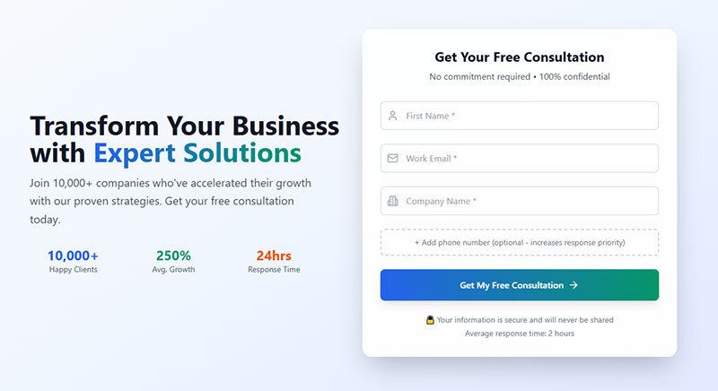
Every one of these forms leans on the same handful of parts: input fields for name, email, or phone number, a headline that states the offer plainly, a line of value proposition copy near the fields, a submit button worded specifically to the action being taken, and a privacy consent line somewhere close by.
Where it sits changes with funnel stage. Landing pages, gated content downloads, and webinar registration pages all use lead capture forms, just tuned differently depending on how much commitment the visitor has already shown.
Unbounce’s 2024 Conversion Benchmark Report looked at more than 57 million conversions across over 41,000 landing pages. The median across industries came out to 6.6%, with SaaS sitting low at 3.8% and events and entertainment pulling ahead at 12.3%.
Most of this doesn’t get hand-coded anymore. On WordPress sites, forms typically run through a dedicated plugin layer, and that layer ends up deciding a lot about how much design control you actually have before you’ve even opened a settings panel.
How Field Count Affects Lead Capture Form Conversion
More fields, lower conversion, but not in a straight line. HubSpot pulled data from over 40,000 landing pages and found three-field forms sitting at the top, a little past 25%. Four fields is where the floor drops out, the steepest single-step decline in the whole dataset. Oddly enough, five fields claws some of that back before the decline picks up again past that point.
Forrester Research puts the workable range for B2B lead generation at 3 to 5 fields. Push past that range and the commonly cited cost is around a 30% drop in conversion, which is a lot to give up for one extra data point.
Digital Applied ran a 2026 benchmark that tracked completion by field count directly: 23.1% at 3 fields, 17.0% at 5, then a real cliff, 11.4% at 7 and 6.9% once you’re asking for 10 or more.
Not every field costs the same amount of trust. Zuko Analytics tracked abandonment by field type across live forms, and password fields bleed the most visitors by a wide margin.
| Field Type | Abandonment Rate |
|---|---|
| Password | 10.5% |
| 6.4% | |
| Phone number | 6.3% |
Making phone number optional tends to help completion in most of the tests referenced above. Cold traffic does best with 3 to 5 visible fields, name, email, company, nothing more. Warmer audiences, people who already know your brand a bit, will sit through 5 to 7 fields if you throw in phone number or role.
Layout changes how those same fields feel. A single column, one field per line, beats horizontal or multi-column arrangements pretty consistently in usability testing. There’s more on the actual numbers in the visual design section further down.
Label position matters in a way that’s easy to miss. Eye-tracking research keeps finding that labels sitting above a field get scanned faster than labels sitting to the left of it, mostly because the eye takes in both at once instead of bouncing sideways. On a long form, that adds up.
Which fields you actually ask for depends on where someone is in the funnel, not on a template copied from another site. The form fields best suited for capturing high-quality leads look completely different at the top of the funnel, just an email, than they do near the bottom, budget, timeline, company size.
Progressive Profiling as an Alternative to Long Forms
Progressive profiling spreads data collection across more than one visit instead of asking for everything up front. Someone hands over an email the first time. Company size or role gets asked for later, once they’re back.
Keeping that first touch light while still building a full profile over time is commonly reported to lift conversion by around 20%. It works through conditional logic that shows or hides fields based on what a visitor already gave you, so a returning contact never sees a question they already answered.
Free Form Conversion Rate Calculator
What Copy Elements Improve Lead Capture Form Conversion
CityCliq had a headline that read “Businesses Grow Faster Online.” Vague, sounds nice, doesn’t actually tell anyone what happens if they fill out the form. They swapped it for “Create a Webpage for Your Business” instead, something a visitor could actually picture doing, and conversions jumped 90%.
Groove ran a similar experiment, rewriting its landing page around a value proposition placed right above the form instead of buried somewhere in a paragraph. Conversion rose to 4.3%, an 87% lift on its own, then climbed again to 4.7% after a round of smaller tweaks. 104% total, more or less doubling the original page.
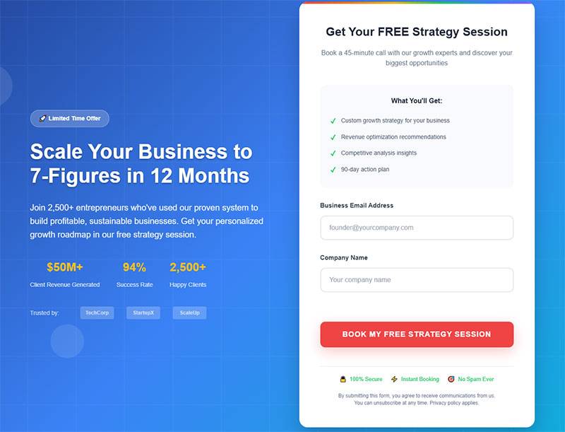
A few copy choices keep showing up in what actually moves conversion: a headline naming the specific outcome instead of the product category, a value proposition sitting above or beside the fields rather than below them, submit button text written like the visitor is saying it themselves (“Start My Trial” beats “Submit” almost every time), and placeholder text inside fields that shows a format example instead of sitting there empty.
Ad copy and the form’s headline need to say the same thing. If a paid ad promises a free guide, the headline a visitor lands on should say “free guide,” not some generic “sign up now.” Mismatch the two and bounce rate spikes before anyone even reaches the form.
Button microcopy does more work than its size suggests. Good call to action wording answers the question a visitor is asking themselves in the exact second they’re deciding whether to click, which is a small window and an easy one to waste on a word like “Submit.”
Sign-up form best practices generally treat copy and field design as one decision rather than two. A strong headline sitting on top of a clunky field layout still loses people, and treating the words and the structure as separate problems is a mistake that shows up more often than it should.
How Call-to-Action Button Design Affects Form Conversion
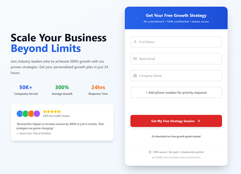
Contrast beats color choice. A button that actually stands out against the page around it will outperform one that blends in, and that holds whether the button is red, green, or some shade of blue nobody would pick first.
One case worth mentioning: a European ecommerce site selling hand-painted porcelain (Unbounce kept the brand anonymized in its own case study) tested button color and shape together on its product pages. Sales rose 35.81%, and that’s sales, not just clicks, which is the number that actually matters at the end of the day.
Ed Leake looked at 90 high-converting CTA buttons across software, ecommerce, and event landing pages. White button text showed up on 78 of the 90. Button height barely correlated with conversion at all, while contrast against the background kept showing up as the more reliable pattern.
A few things worth testing on your own forms:
- The actual tappable area, not just how big the button looks on screen
- Text case: Leake found capitalized text on 39 of the 90 buttons he studied, with no clear winner either way
- Placement right below the last field, skipping the extra whitespace that separates the two
- One primary button per form, with any secondary link kept visually smaller
There’s no solid industry-wide number for button click-through rate the way there is for landing page conversion overall. It swings too much with traffic source, offer, and what the page is even for. Your own page’s history before and after a redesign is a better benchmark than any external average someone hands you.
Where Lead Capture Forms Convert Best on a Page
Above the fold gets seen first, but seen and completed aren’t the same thing. Sometimes a form someone has to scroll to reach converts better simply because whoever scrolled that far already wants what’s being offered.
Factors.ai measured actual completion rather than just impressions, and static inline forms finished at 45.53% against 25.96% for modal popups. That’s a wide gap for something that comes down to where a form physically sits on the page.
| Placement Type | Typical Conversion | Best Fit |
|---|---|---|
| Inline embedded | Higher completion once seen | Blog posts, content pages |
| Popup or modal | Guarantees visibility, lower completion | High-intent trigger moments |
| Sidebar or slide-in | Lower impression rate | Long-form content, secondary offers |
Popups still make up 66% of all signup forms out there, according to HubSpot, even though landing pages pull the highest signup rate at 23%. Volume and performance clearly aren’t the same conversation here. Plenty of sites run popups because they’re easy to install, not because the data says to.
Popup and Exit-Intent Form Behavior
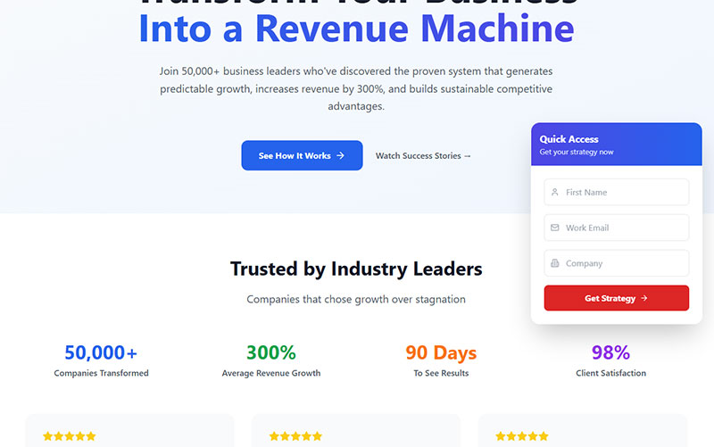
Exit-intent popups trigger off cursor movement, specifically when someone’s mouse heads toward the browser’s close button or back arrow. Wisepops looked at more than 1 billion popup displays and landed on 3.94% as the average exit-intent conversion rate.
Timing swings that number a lot. Popups that show up 11 to 15 seconds after page load convert at 6.45% in Wisepops’ dataset, compared with 4.16% for popups that fire the instant the page loads. Wait too long, past 20 seconds or so, and the rate starts dropping again.
Position matters less than you’d guess, at least compared to timing. Center-positioned popups convert at 6.84%, top-left comes in close behind at 6.80%. The different types of popups, timed, scroll-triggered, exit-intent, each fit a different point in someone’s visit, and picking the right one matters more than nudging it a few pixels left or right.
Most WordPress sites handle exit-intent detection through a dedicated plugin rather than custom code. Cursor tracking at the browser level is fiddly enough to build that almost nobody bothers doing it from scratch.
Single-Step Versus Multi-Step Lead Capture Forms
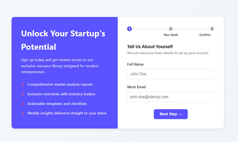
Formstack’s data puts multi-step forms at 13.85% conversion against 4.53% for single-step versions asking the same things. That’s a 206% difference, big enough that it’s worth checking whether your own forms are leaving something on the table.
The gap holds up, and sometimes widens, once you look past one company’s data. Venture Harbour reviewed case studies across several businesses: a 35% lift for BrokerNotes, a B2C financial lead generation site, 59% for Vendio, and 214% for one company that wasn’t named. In every case the fields stayed the same. Only the structure changed, split across steps instead of crammed onto one page.
| Form Type | Typical Conversion | Best For |
|---|---|---|
| Single-step | Higher for short forms | Newsletter signups, low-commitment offers |
| Multi-step | Higher for long forms | Demo requests, qualification-heavy forms |
Blackbaud ran an A/B test on a donation form and saw a 33% lift in total conversions, with total donations jumping 90%, just from breaking the form into steps.
The reason this works isn’t really about how the form looks. Robert Cialdini’s research on commitment and consistency bias explains most of it: once someone finishes step one, they’re meaningfully more likely to finish what’s left, because walking away now means giving up effort already invested.
Single-step still wins in one obvious case. Taking a 3-field form and spreading it across 3 steps just adds clicks without cutting any real friction, since there wasn’t much friction to cut in the first place. Choosing between multi-step and single-step formats comes down to field count, not a stylistic preference.
Progress indicators help regardless of which format gets picked. A form that shows where someone is in the process feels shorter than one that doesn’t, even at the same length, and well-designed progress bar examples make that pretty obvious once you see a few side by side.
What Trust Signals Increase Lead Capture Form Conversion
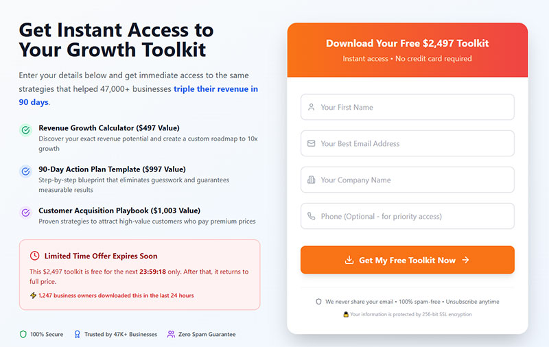
Privacy and security worries are consistently near the top of the list for why someone abandons a form partway through. Some analyses put it as high as 29-30%, right up there with form length as a reason people just leave.
Security badges answer that worry pretty directly. ConversionXL found that adding security badges and certifications near a form raised conversion by around 15%, a decent return for something that takes an afternoon to add.
A handful of trust elements show up again and again in what reduces hesitation: SSL indicators and security badges positioned near the submit button, testimonials or client logos sitting beside the form instead of buried down in a footer, a short no-spam or unsubscribe line right under the fields, and live submission counters or recent-activity widgets, but only where the numbers are actually real.
Placement changes the payoff more than the trust signal itself sometimes does. Hubstaff moved its testimonials and customer logos to sit directly underneath the call-to-action button, and conversion went from 6.89% to 10.95%, a 59% lift, documented as a MarketingSherpa case study. Nothing else about the page changed. Just where the proof sat relative to the decision point.
Reviews carry a lot of weight on their own, separate from badges. Podium’s research found that 93% of consumers say online reviews affect their purchasing decisions, close enough to universal that skipping reviews entirely leaves something on the table.
Third-party trust badges, SSL indicators, security seals, industry certifications, measurably raise visitor trust in independent usability research, and the effect is strongest on sites people don’t already know. If a brand is already well established, the badges matter less. People trust it regardless.
None of this holds up if the back end is weak. WordPress form security matters just as much as the visible signals, since an SSL badge sitting next to a form that leaks data through a vulnerable plugin doesn’t actually protect anyone.
What Visual Design Elements Affect Lead Capture Form Performance
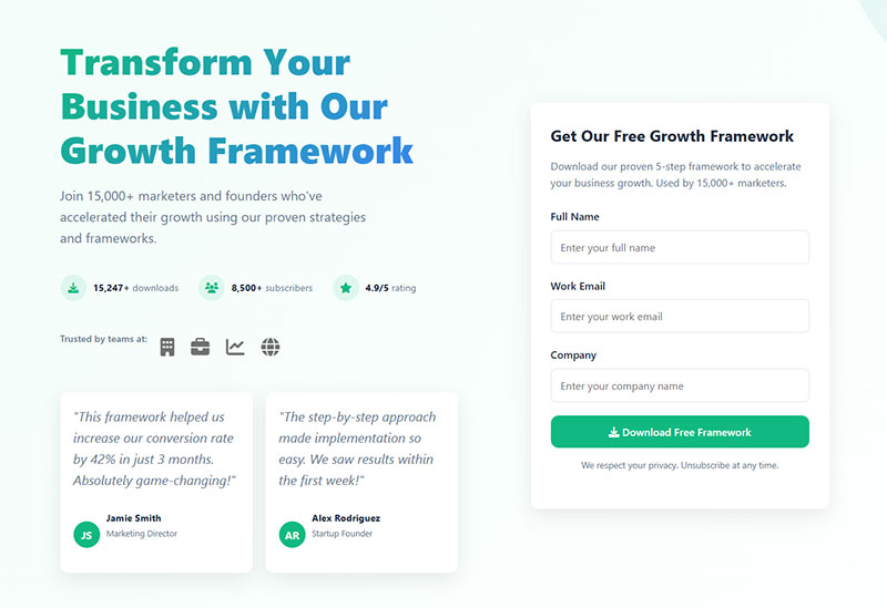
Single-column forms finish faster. CXL Institute found visitors complete a linear, single-column form 15.4 seconds faster than a multi-column version of the same fields, a gap that held up at a 95% confidence level, so it’s not just noise.
Except HubSpot’s own test went the other way. It redesigned a 13-field demo request form, moving it from one column to two, and conversion rose 22% at a 99% confidence level. The form asked for the exact same information. It just looked shorter, and looking shorter apparently mattered more than the extra visual complexity of a second column.
The real variable is perceived length, not column count. A single-column form that scrolls forever can feel heavier to a visitor than a compact two-column version holding the same fields, even though the second one is objectively doing more with the space.
Color contrast isn’t a nice-to-have. Form accessibility best practices follow WCAG 2.1 AA, which sets a 4.5:1 minimum contrast ratio for field labels and body text, and 3:1 for input borders and button outlines. Fail that, and some visitors genuinely can’t read what they’re filling in.
Whitespace does something before anyone reads a single word. A form crammed right up against the edges of the page reads as more work than the same fields with room to breathe around them, and that read happens in about half a second, well before anyone’s processed a single label.
Getting the underlying form design right matters more than any one visual trick on its own. Layout, spacing, and contrast aren’t separate decisions. They lean on each other.
How to Design Lead Capture Forms for Mobile Devices
| Input Type | Keyboard Triggered |
|---|---|
| Email layout with @ symbol | |
| tel | Numeric phone keypad |
| number | Numeric-only keypad |
Setting the right input type does more than keep the markup tidy. Using email or tel instead of a generic text field cuts both completion time and typing errors, because the visitor gets the keyboard that actually matches what they’re typing instead of hunting for the @ symbol on a standard layout.
Touch target size isn’t one number, it’s three, and they don’t quite agree with each other. Apple’s Human Interface Guidelines set a minimum of 44 by 44 points. Google’s Material Design calls for 48 by 48 density-independent pixels. WCAG 2.5.5 sets 44 by 44 CSS pixels as its enhanced target size guideline, the AAA level.
Build to 48 pixels with 8 pixels of spacing between tappable elements and all three get cleared at once, which makes it the number worth designing to instead of chasing each spec separately.
Autofill removes typing altogether for anyone who’s filled out a form like this before. Setting autocomplete=”email” or autocomplete=”tel” lets the browser pull saved data straight into the field instead of asking someone to retype an address they’ve typed a hundred times already.
Vertical stacking on small screens isn’t really a compromise, it’s just the baseline. Mobile form best practices start from single-column layout and build touch targets and input types on top of that, not the other way around.
How Privacy and Compliance Affect Lead Capture Form Design
A pre-ticked consent checkbox doesn’t count as consent under GDPR. The Court of Justice of the EU settled this directly in Planet49 (Case C-673/17, 2019), ruling that a box checked by default doesn’t reflect an actual choice made by the user.
What GDPR actually asks for from a marketing consent checkbox comes down to a few things. It needs to sit unticked by default, requiring someone to actively click it. Marketing consent and data-sharing consent need separate checkboxes, one purpose per box. Consent has to be freely given too, meaning it can’t be a condition of submitting the form in the first place.
A basic support or contact form usually doesn’t need a separate consent checkbox at all. Submitting the form to ask a question is itself the affirmative action GDPR is looking for, since the data collected only gets used to answer that specific question.
| Requirement | GDPR | CCPA |
|---|---|---|
| Consent model | Opt-in before collection | Opt-out after collection |
| Checkbox default | Unticked | Not required |
| Core visitor right | Right to erasure | Right to opt out of sale |
CCPA works from the other direction entirely. Instead of asking permission before collecting anything, it requires a visible way to opt out afterward, usually a “Do Not Sell My Info” link near the form or tucked into the site footer.
Privacy policy links belong close to the submit button, not three scrolls away in a footer nobody reaches. Building GDPR compliant forms starts at the field level, with how consent is actually designed, not with slapping a cookie banner on top of a site that ignores what its own forms are collecting.
What Design Mistakes Reduce Lead Capture Form Conversion Rates
CAPTCHA gets overused, and it costs more than most site owners realize. A figure that keeps coming up across conversion research puts the cost of a visible CAPTCHA challenge at up to 40% of conversions, and even a well-designed one raises bounce rate simply by adding a step nobody was expecting to deal with.
Forrester Research found that 19% of consumers have abandoned a website entirely after running into one. That’s nearly one in five people gone, over a puzzle meant to stop bots.
Popups that fire the instant a page loads do something similar, just quieter. They interrupt someone before they’ve read a single word, and as the timing data above shows, immediate popups convert worse than ones that wait a few seconds for actual engagement.
A few mistakes keep showing up on forms that underperform:
- CAPTCHA on every single submission instead of only when spam signals actually appear
- A popup firing before anyone’s scrolled or engaged with the page at all
- Broken mobile responsiveness that clips fields or pushes the submit button off-screen
- Competing calls to action splitting attention instead of pointing it somewhere specific
- No visible privacy assurance anywhere near the fields, right where hesitation actually happens
Spam protection doesn’t require visible friction at all. A honeypot field, hidden from real visitors but sitting right there for bots, catches spam without asking anyone to prove they’re human.
Pair that with rate limiting and some server-side checks, and form spam prevention tactics like these catch most of what a CAPTCHA would, minus the conversion cost.
Which Tools Are Used to Build Lead Capture Forms
A few tools show up again and again for this, though what sets them apart matters more than the category they get lumped into.
| Tool | Differentiator | Best For |
|---|---|---|
| HubSpot Forms | Native CRM and lead scoring | Teams already on HubSpot |
| Typeform | One-question-at-a-time format | Short qualification forms |
| Unbounce | Landing pages with built-in A/B testing | Dedicated campaign pages |
| OptinMonster | Behavioral targeting for popups | Exit-intent and scroll campaigns |
HubSpot Forms ties every submission straight to a CRM record, which starts to matter once leads need scoring and routing instead of just landing in an inbox for someone to sort through by hand.
Typeform’s one-question-at-a-time format tends to beat a static layout on forms under 10 questions specifically. Push past that and the pacing starts to feel slow rather than conversational.
Unbounce and OptinMonster split a similar job two different ways. Unbounce builds the dedicated landing page a form actually sits on. OptinMonster layers targeting rules on top of a page that already exists, deciding when and where a popup form shows up.
On WordPress, the math changes a bit. WordPress lead generation plugins and WordPress contact form plugins overlap so heavily in feature set that the deciding factor usually isn’t features at all. It’s which one already talks to your CRM and email tool without a middleman integration bolted on.
Free tiers exist across most of these categories, though the ceiling varies quite a bit. Free WordPress form plugins generally cap out at basic fields and a handful of monthly submissions before a paid plan becomes something you actually need.
How to A/B Test Lead Capture Form Design
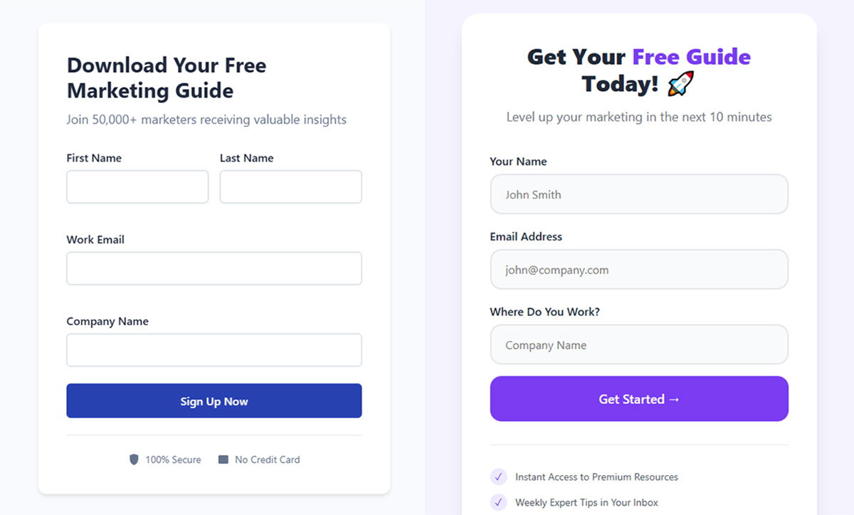
Field count, button copy, button color, and form placement get tested more than anything else, and testing more than one of them at the same time defeats the whole point. There’s no way to know which change actually caused the result.
A test worth trusting needs a sample size calculated before the test starts, not eyeballed afterward once the numbers look good, a fixed significance threshold set in advance (typically 95%), and the discipline to run the test to its planned end instead of calling it early because one variant looks ahead on day three.
That last part has a name. Checking results daily and stopping the moment a variant pulls ahead is called peeking, and it inflates false positive rates well past whatever the significance threshold was supposed to guarantee.
Google Optimize used to be the default free option for this kind of testing. It shut down on September 30, 2023. VWO and Optimizely have mostly filled that gap since, both with built-in sample size calculators that estimate how long a test needs to run before a single visitor gets served a variant.
One variable per experiment, not a redesigned form and a new headline tested in the same run. Increasing form conversions through testing only works when the result traces back to one isolated change, which sounds obvious right up until you’re three weeks into a test and can’t remember what else got changed halfway through.
FAQ on Designing Lead Capture Forms
What is a good conversion rate for a lead capture form?
1.7%, according to Ruler Analytics, is the historical average across all industries. That figure is dated though, and it depends heavily on methodology. More recent data that tracks phone and chat conversions alongside form fills puts overall lead conversion closer to 3-5%. The range itself is the real takeaway here: there isn’t one universal answer.
Conversion rate benchmarks by industry matter more than chasing a single figure, since offer strength and traffic quality swing results further than layout ever does on its own.
Should a lead capture form ask for a business email instead of a personal one?
For B2B, generally yes.
Requiring a business email filters out low-intent signups and improves lead quality overall, but it costs top-of-funnel volume too. Gated content meant for broad awareness usually skips the restriction for that reason. Reach matters more than the filter at that stage.
What happens after someone submits a lead capture form?
Some combination of a confirmation message and a redirect to a thank-you page, depending on how the form’s set up.
What matters more than the format is speed. Delivering the promised offer immediately protects the trust the form just earned. A delayed download link undoes a lot of that goodwill fast.
Can a lead capture form use social login instead of typed fields?
Yes, and it cuts typing down to almost nothing. Social login pulls name and email straight from an account someone’s already logged into, one click and done. The tradeoff is that it hands a third party visibility into who just converted, which isn’t nothing depending on the audience.
How do you connect a lead capture form to a CRM?
Three ways, really. A native integration built into the form plugin, a middleman tool like Zapier, or a direct webhook. A webhook posts submission data straight to the CRM’s API the second someone converts, though native integrations usually need less setup to get running.
What is a conversational lead capture form?

One question shows at a time instead of the whole field list dumped on screen at once, closer to how a real conversation actually moves. Conversational forms shrink how long the process feels and work especially well on qualification flows under 10 questions.
Can chatbots replace lead capture forms entirely?
Rarely, at least not yet. Chatbots vs forms comparisons keep landing on the same result: forms still win on raw conversion with cold traffic. Chatbots do better once someone already trusts the brand enough to ask a direct question, which is why most sites end up running both instead of picking one.
Should a lead capture form explain why it needs sensitive information?
Yes, for anything beyond name and email. A short line next to a sensitive field, something like “we ask for your phone number to schedule your demo,” cuts hesitation without needing a full paragraph of legal language to justify it.
How often should a lead capture form be retested?
Quarterly at minimum if the page gets real traffic, since audience behavior and traffic sources both drift over time. Low-traffic forms need longer windows just to reach statistical significance, so retesting cadence should track available volume rather than a date on a calendar.
What is the difference between a squeeze page and a lead capture form?
One form, no navigation, no distractions, built as its own standalone page. That’s a squeeze page.
The lead capture form is just the component itself, and it can live on a squeeze page just as easily as it lives on a blog post or a full homepage.
Conclusion
None of this is a checklist to complete once and forget about. It’s more of a sequence, and the order matters almost as much as the individual fixes themselves.
Field count and mobile touch targets come first, before button color or headline copy. Both require zero redesign, both work on every device, and both move the number furthest for the least effort, which makes them the obvious place to start.
Give any test real time. Two weeks minimum, and an actual sample size, before trusting what it’s telling you. A variant that looks like a winner on day three flips around more often than people expect once enough visitors have actually seen it.
None of these pieces work in isolation either. A form with a tight field count still bleeds leads if the trust signals aren’t there, and a form covered in trust badges still underperforms if it’s asking for far too much up front. They lean on each other.