



Google Analytics files plenty of visits under direct that were never direct. In a 2023 experiment by SparkToro and Really Good Data, covering 1,113 test visits across 11 networks, 100%…
Table of contents
Two out of three people who open a survey never make it to the last question.
The average completion rate for online surveys sits at 33% (Plinth, 2026), and that number keeps drifting down as more survey requests land in the same inboxes than anyone has time to answer. A product team relying on user feedback and a hospital tracking patient experience have very different survey needs, but they run into the exact same problem: skip past how to avoid survey fatigue, and the data you collect stops meaning much even when the response count still looks fine.
Response quality drops off even among the people who do finish.
Straightlining and rushed answers show up inside completed surveys just as often as abandoned forms show up outside them. Underneath both is the same thing: respondent burden outpacing whatever value people feel they’re getting back.
Trimming a question or two won’t fix that on its own. Fixing it means knowing exactly where attention breaks in the flow, and why, before touching anything else.
What Is Survey Fatigue
Rushed clicking. Skipped rows. A form somebody was filling out in good faith, right up until they weren’t. That’s the visible layer of survey fatigue, the decline in a respondent’s attention, motivation, and answer quality that sets in once survey requests pile up, or a single questionnaire demands more effort than someone planned to give it.
A 2024 study in the Journal of Caring Sciences names survey fatigue as a major limitation in questionnaire-based research, tying it directly to careless responses and shrinking response rates.
Fatigue isn’t the same thing as someone who never opens the invitation email. Non-response happens before engagement even starts. Fatigue happens after someone has already spent time on the task, which is part of why it’s a design failure more than an audience problem.
Within-Survey Fatigue vs Over-Surveying
Two different patterns get lumped under one label, and mixing them up is part of why fixes don’t stick.
One is within-survey fatigue, the tiredness that builds during one long or repetitive questionnaire. It shows up mostly in the back half of the form, once someone’s several questions deep and starting to click through without reading closely. The other is bigger picture: over-surveying, exhaustion that stacks across many separate requests sent to the same person over weeks or months, no matter how short any single one of them is.
SurveySparrow’s 2026 benchmark research puts a number on that second kind. People seem comfortable with somewhere around three to four surveys a year before frequency itself becomes the irritant.
What Causes Survey Fatigue
It’s rarely one bad decision. Fatigue stacks up from small design choices and organizational habits that compound, both within a single survey and across an entire program.
The Federal Reserve Bank of San Francisco traced part of that pattern in real numbers in 2025: employment survey response rates fell from around 60% before the pandemic to below 45% today. Census Bureau data shows something similar elsewhere. The Current Population Survey dropped below a 70% response rate in 2024, a threshold it hadn’t crossed before in the survey’s history.
Question and Format Causes
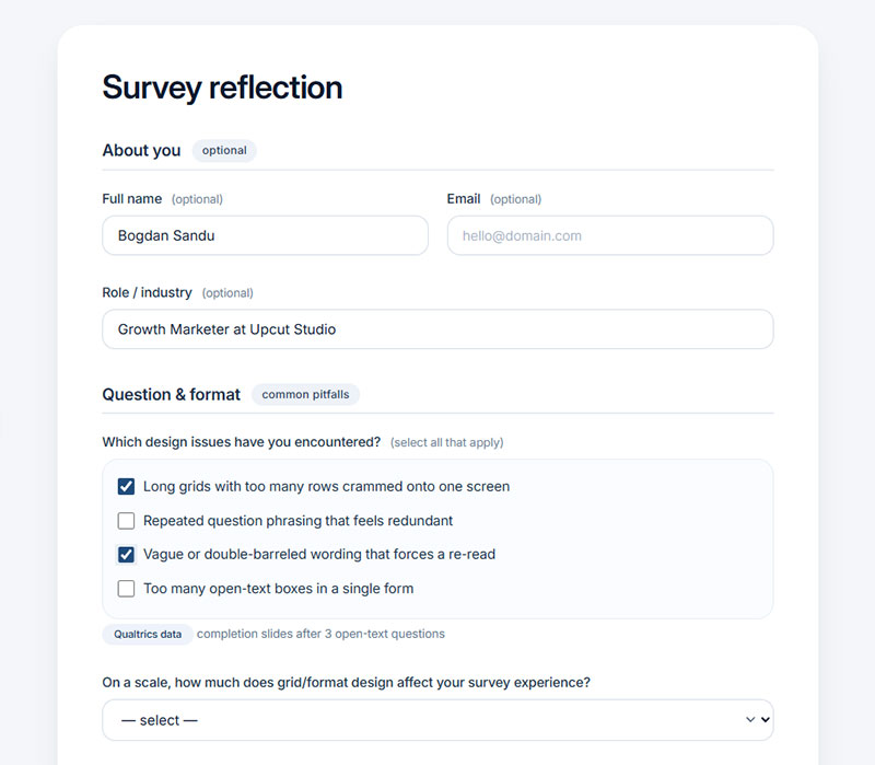
A handful of question and format choices show up again and again in surveys that struggle:
- Long grids with too many rows crammed onto one screen
- Repeated question phrasing that feels redundant
- Vague or double-barreled wording that forces a re-read
- Too many open-text boxes in a single form
Qualtrics’ own platform data shows completion starts sliding once a survey passes three open-text questions, and the answers people do type get noticeably shorter as fatigue sets in.
Program and Frequency Causes
Plinth looked at how charity programs run surveys and found something that explains a lot of the frustration. Charities working with three or more funders on one program can end up asking participants to complete an average of 4.2 separate data collection instruments. Nobody signs up to answer the same question four different ways for four departments, but that’s effectively what ends up happening.
Marketplace ran similar math on Bureau of Labor Statistics data and found the JOLTS employment survey response rate fell from 64% in 2017 to under 31% five years later.
Part of the blame sits with how easy surveys are to build now. Platforms built around WordPress survey plugins let a team launch a new questionnaire in minutes, which is genuinely useful on its own, but that same ease is exactly why so many overlapping requests end up landing in the same inbox.
How to Measure Survey Fatigue in Response Data
Most of the signals that fatigue is happening show up in the response data itself, before anyone reads a single open-text comment. Catching them means knowing how to analyze survey data at the individual question level, not just glancing at one overall completion percentage.
| Signal | What It Looks Like | How It’s Caught |
|---|---|---|
| Drop-off | Exit at question 8 of 12 | Funnel analysis by question |
| Straightlining | Same rating down a whole grid | Row variance check |
| Speeding | Finished in half the expected time | Time-per-question tracking |
Drop-Off and Abandonment Metrics
Abandonment rate is more useful once it’s broken down by question position instead of left as a single overall number, because position is what actually tells you where attention breaks, not just that it broke somewhere.
Dynata has tracked questionnaire fatigue since 2004 and repeated the study in 2009 with the same finding both times: whether a survey runs 10 minutes or 30, most drop-off happens by the halfway point. That pattern holds regardless of total length, which is part of why position matters more than raw duration.
Response Quality Indicators (Straightlining and Speeding)
A few patterns in the raw data point to fatigue fairly reliably:
- Identical answers across every row in a grid question
- Completion time well below the median for that survey
- A sudden shift from varied answers to flat, repeated ones partway through
Studies estimate 5% to 15% of online survey respondents show some degree of straightlining, and that rate climbs in longer surveys and bigger matrix grids, per Pirai AI’s research review.
Peer-reviewed research on grid design, including a 2013 study by Couper, Tourangeau, Conrad, and Zhang in Social Science Computer Review, has repeatedly found that grid format itself predicts straightlining more consistently than respondent demographics like age or education.
How Survey Length Affects Completion Rates
Every added question costs completions, and the relationship isn’t gentle.
| Question Count | Average Completion Rate |
|---|---|
| 1 to 3 questions | 83.34% |
| 4 to 8 questions | 65.15% |
| 9 to 14 questions | 56.28% |
| 15+ questions | 41.94% |
Survicate’s research analyzing live survey data backs that pattern up, and SurveyMonkey’s own study of 100,000 surveys on its platform found drop-off rises with every incremental question added, whether measured by question count or page count.
Optimal Question Count by Survey Type
Research from nonprofit data specialists at Plinth found surveys under 12 questions land roughly 40% higher completion than surveys with 20 or more, without much loss in usefulness of the data collected.
Transactional surveys, the post-purchase or post-support kind, work best kept to 3 to 5 questions and sent close to the moment itself. Relationship surveys get more room. Sent quarterly or twice a year, people expect a bit more depth from them, so they can run longer without the same fatigue penalty.
Academic instruments tend to run longer out of necessity, though even there, the types of survey questions used shapes how long the form actually feels to whoever’s answering it.
Mobile vs Desktop Length Tolerance
Mobile respondents run out of patience faster than desktop ones, and that’s backed by data rather than assumption.
Up to 53% of surveys started on the Qualtrics platform now happen on a phone, per Qualtrics’ own platform data. Item nonresponse on matrix questions runs higher specifically among mobile respondents, according to a study by Liu and Cernat (2018) in Social Science Computer Review comparing matrix and item-by-item formats.
A survey with the same number of questions is simply heavier on a phone than on a desktop. Designing for that up front saves headaches later.
How to Design Questions That Reduce Fatigue
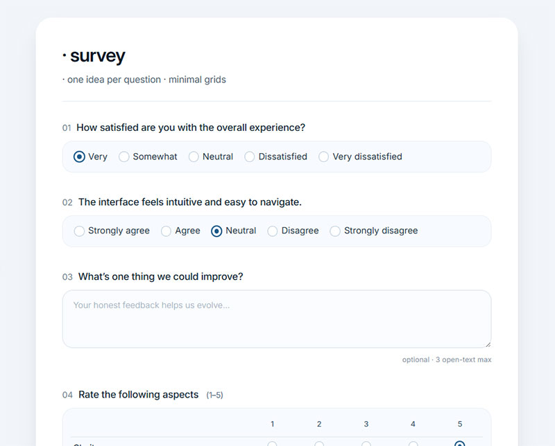
Question design determines how heavy a survey feels, independent of its actual length. A 7-row matrix functions as seven separate questions in terms of cognitive load, even though it occupies one screen and reads like a single item.
Matrix and Grid Question Alternatives
Matrix usage has already been falling across the industry. 43% of online surveys included matrix questions in 2015, down to 19% by 2020, and holding roughly steady since, per OpinionX research.
Breaking large grids into single-item questions, shown one at a time instead of stacked in a table, helps considerably.
- Keep rows and columns to roughly 5 to 7 each
- Cap total cells at around 35
- Avoid placing two matrices back to back on the same screen
Well-built examples of likert scale questions for surveys usually keep to one clear scale per screen instead of stacking multiple rating dimensions into a single grid.
Wording and Cognitive Load
One idea per question, always. A question joined by “and” is really two questions wearing one label, and respondents feel the extra work even without being able to say why.
Open-text questions take 4 to 10 times longer to answer than closed-ended ones, according to PollPe’s 2026 analysis of survey timing data.
Cap open boxes at three per survey. Past that, completion rates start sliding even when every other design choice is solid.
Randomizing item order within any remaining grid removes the predictable pattern that makes straightlining easy in the first place.
How Survey Timing and Frequency Prevent Overload
Length is only half of the fatigue equation. How often someone hears from you at all is the other half.
| Channel | Typical Cadence | Fatigue Risk |
|---|---|---|
| Quarterly for relationship surveys | High without suppression rules | |
| SMS | Single-digit sends per month | Very high, feels intrusive |
| In-app | Tied to an actual usage event | Lower when contextual |
Cooldown Periods and Contact Suppression
AskNicely recommends no more than one customer survey every 90 days, which still touches each customer once a quarter without stacking requests on top of each other.
Qualtrics research goes further, warning that anything more frequent than quarterly puts a program at real risk of fatigue, especially layered on top of transactional surveys already firing after every purchase or support ticket.
A university-based study cited in SurveySparrow’s 2026 benchmark work found each additional survey request sent to the same student pool dropped response rates on the next request even further.
Suppression lists that check contact history across every active survey program, not just the current one, stop that overlap before it starts.
Channel-Specific Timing (Email, SMS, In-App)
Email still works best for scheduled relationship surveys, and it tolerates the longest gap between sends without feeling pushy.
SMS reads as personal and immediate in a way email doesn’t, which means overusing it burns trust faster than any other channel. Treat every text as something that costs you a bit of goodwill.
In-app surveys work best triggered by an actual event, a completed task or a canceled subscription, rather than fired off on a fixed calendar date. A survey that shows up right after someone does something feels earned. One that shows up on a schedule just feels like an interruption.
Short, frequent check-ins, the kind built as examples of pulse survey questions, fit the in-app channel especially well. A two-question pulse survey barely registers as an interruption next to a full relationship survey.
How Skip Logic and Personalization Shorten Surveys
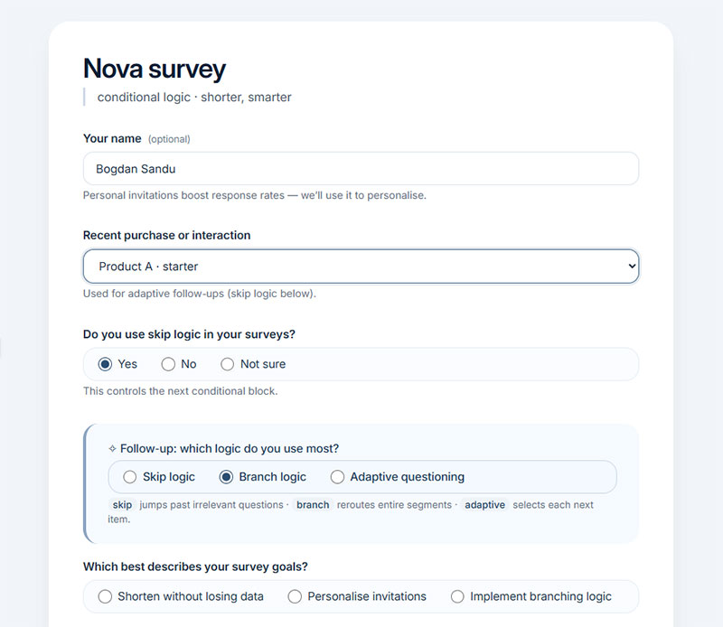
The fastest way to shorten a survey without losing data is to stop asking questions that don’t apply to the person answering them.
Skip logic is one expression of conditional logic, a rule that shows, hides, or reroutes questions based on an earlier answer, so nobody wades through sections meant for a different audience segment.
Personal invitations already outperform generic ones before a single question loads. A 2024 study published in the journal Healthcare found personal invitations reached a 40.2% response rate against 25.3% for generic link groups. Qualtrics research shows personalization, using a name, a past purchase, or a prior answer, lifts response rates by up to 48%.
Branching Logic vs Adaptive Questioning
Skip logic is the simplest version. It jumps a respondent past one or two irrelevant questions based on a single earlier answer. Branch logic goes further, rerouting an entire segment of respondents down a different block of questions entirely. Adaptive questioning is the most involved of the three: it selects each next item based on everything answered so far, rather than following a fixed path.
Skip and branch logic cover most survey design needs on their own. Adaptive engines only earn their added complexity on longer, multi-construct instruments, the kind found in clinical or psychometric research, where a fixed question order wastes real respondent effort.
How Mobile Optimization Affects Survey Completion
Device alone reshapes how a survey performs, separate from question count or wording. A form that completes cleanly on desktop can fall apart on a phone screen for reasons that have nothing to do with the questions themselves.
Load Time and Early Abandonment
Every extra second costs respondents before they answer a single question.
BBC’s own site data found it lost 10% of visitors for every additional second of load time (BBC, 2018). A one-second delay in mobile load speed can cut conversion by up to 20%, per compiled mobile performance research (Site Builder Report, 2026).
Single-column layouts, tap-based inputs, and compressed image assets follow the same mobile form best practices used across web forms generally, and they bring load time down on the very first screen a respondent sees.
Do Incentives Reduce Survey Fatigue
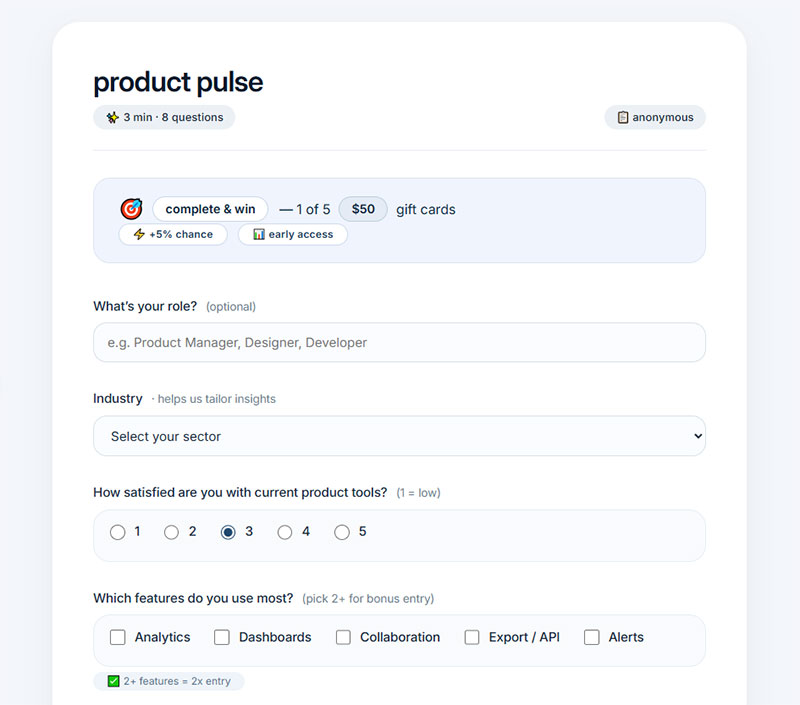
Incentives change whether someone starts a survey. They’re far less reliable at changing whether someone finishes it once fatigue has already set in.
Incentive Types and Effectiveness
A 2024 study in JMIR Formative Research tested incentive amounts directly using identical Instagram ad campaigns. A $15 gift card produced 142 completions against just 24 with no incentive at all.
Gift cards outperform cash at equal dollar amounts, which tracks with how people tend to think about money: cash gets earmarked for bills, while a gift card just reads as a bonus.
For short surveys, the 5 to 10 minute kind, $5 to $15 tends to do the job. Mid-length surveys running 20 to 30 minutes need more, usually $25 to $50 to keep response rates decent. Specialist audiences are their own category: physicians, executives, anyone whose time is worth more than average, and there $100 or more is common.
Effectiveness for most consumer research plateaus around $50, past which additional pay stops moving response rates much at all.
Incentive Overuse and Response Bias
Incentives move recruitment more than they move completion once someone is already engaged.
A cluster-randomized study of primary care patients found no significant difference in completion between incentivized and non-incentivized paper surveys, 100% versus 99.7%, once a research assistant had already secured participation in person.
Underpaying carries its own risk too. Low incentives skew samples toward whoever will answer for minimal pay rather than toward genuinely engaged respondents, according to incentive benchmarking research from Giftogram.
Repeating the same incentive on the same panel wears down its pull over time. It’s the incentive equivalent of over-surveying itself.
Which Survey Platforms and Features Reduce Fatigue
None of the fixes above matter much if the platform itself can’t support them. Shorter forms, skip logic, matrix alternatives all depend on what the tool actually lets you build.
| Platform | Save and Resume | Best Fit |
|---|---|---|
| Qualtrics | Yes, configurable | Large research programs |
| SurveyMonkey | Yes | Mid-size teams, fast setup |
| Typeform | Partial (manual submit points, added 2024) | Short, conversational forms |
| Google Forms | Limited | Simple internal polls |
Qualtrics serves more than 13,000 brands, including roughly 75% of Fortune 100 companies.
Enterprise vs Self-Serve Platform Features
Partial-response capture separates these platforms more than any pricing tier does.
Qualtrics lets a team configure how long an incomplete session stays saved before it drops, even on its free tier, though that tier locks after 3 surveys, 30 questions, or 500 total responses.
Typeform added a Partial Submit feature in 2024 that lets survey builders manually place a checkpoint, capturing data before a respondent reaches the end. It’s useful, but narrower than automatic capture of every abandoned session, and it leaves a gap for anyone building longer forms without deliberately adding those checkpoints themselves.
SurveyMonkey ships 17 field types across more than 15 million users, built for teams that need speed over deep customization.
FAQ on How To Avoid Survey Fatigue
What Counts as a Good Survey Completion Rate
Under 30% and a customer survey is in trouble. Under 50% and a transactional one is too, per PollPe’s 2026 benchmark analysis. Past that range, length usually isn’t what’s limiting you anymore. Relevance is.
How Long Should a Survey Take to Complete
Dynata’s longitudinal research points to the 15 to 20 minute mark as where satisficing and fatigue start accelerating fast. Most transactional and customer surveys should sit well under that, closer to 5 minutes if you can manage it.
Can Conversational Surveys or Chatbots Reduce Fatigue
Early evidence leans yes, at least for engagement. NORC’s 2024 research on AI-moderated interviews found conversational formats improved response specificity, which happens to be the exact dimension fatigue flattens first. It’s one data point in the wider chatbots vs forms comparison playing out across research teams right now.
Does a Progress Bar Always Help Completion
No, and that surprises people. Qualtrics research shows progress bars help mainly when a survey is already about as short as respondents expect. On longer instruments with branching logic, the same bar can backfire, making the remaining length feel discouraging instead of motivating.
Is One Long Survey Better Than Several Short Ones
Splitting works well when the questions don’t all need to happen in one sitting. Matrix sampling, assigning different question subsets to different respondents, has been used in census research specifically to cut individual burden without cutting the total data collected.
Do Shorter Surveys Always Mean Better Data
Not automatically. Complexity matters more than length: a 15-minute survey made up of simple questions consistently outperforms a 10-minute survey of cognitively demanding ones, according to completion-rate research from Lensym. Cognitive load drives most of the fatigue, not the clock.
How Do You Calculate Survey Abandonment Rate
Completion rate is finished responses divided by started responses, per Lensym’s measurement framework. Abandonment rate is just the inverse of that, and it’s more useful tracked by question position than as one flat percentage for the whole form.
Does Survey Length Matter More Than Survey Frequency
Neither wins outright. They compound. A short survey sent too often still triggers over-surveying, and a long survey sent rarely can still trigger within-survey fatigue on its own. Both variables need their own limits, not one shared tradeoff.
Does Mentioning Survey Length in the Invitation Help
Yes, as long as the estimate is honest. Accurate time expectations upfront let respondents self-select into a task they can actually finish, and that alone lowers early abandonment more than most design fixes applied after someone’s already started.
Are Anonymous Surveys Less Prone to Fatigue Than Named Ones
Evidence here is genuinely mixed. Some vendors report anonymity lifts honest responses by up to 58% (TheySaid), while a randomized trial in BMC Medical Research Methodology found greater privacy didn’t reliably increase disclosure at all. Anonymity seems to affect honesty more than it affects fatigue itself.
Conclusion
Most teams trying to fix how to avoid survey fatigue reach for incentives first, or a platform switch. Question count is the better place to start.
Cut anything that doesn’t change a specific decision on the other end, then rebuild what’s left with skip logic. That one pass removes more friction than a bigger reward or a fancier builder ever will.
There’s a point of diminishing returns too, worth knowing about before you overdo it. A tight ten-question survey beats a trimmed twenty-question one on both completion and data quality, but once a form is already lean, shaving it further barely moves either number.
Every added field is a cost charged against respondent experience. It’s not a free way to learn more, even though it feels that way when you’re the one writing the questions. The next survey worth sending has one fewer question than the last one, not one more.