



Google Analytics files plenty of visits under direct that were never direct. In a 2023 experiment by SparkToro and Really Good Data, covering 1,113 test visits across 11 networks, 100%…
Table of contents
Most people who go to an event never tell the organizer what they actually thought about it. They mention it to a coworker on the walk to the parking lot, or they just move on with their week. Post event survey questions exist to catch that opinion before it disappears for good, though most people still won’t bother answering. Zuddl’s 2024 research puts a solid response rate at just 20% to 30%, which tends to surprise organizers expecting something closer to half.
That hallway comment, if you can actually get it down on paper, usually points to something specific. Maybe the venue needs to change next time. Maybe one speaker is worth booking again and another one isn’t.
Content problems and logistics problems don’t look the same, and they don’t get fixed the same way either. A generic form asking “how was everything” tends to miss both.
What Is a Post-Event Survey
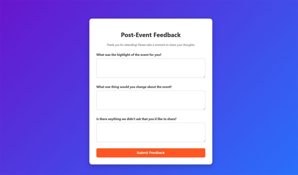
Ask ten event organizers what they send out after wrapping a conference, and most describe some version of the same thing: a short form, sent close to the event’s end, built to capture how attendees felt about the whole experience in one pass.
It’s meant to do more than confirm people had a good time. A well-built one checks satisfaction, sure, but it also grades individual sessions and flags whatever went wrong on the operations side, usually in a single form instead of three separate ones.
The data it produces is basically the only paper trail from a one-time event, and it’s what most planning teams lean on before booking the next one.
Most of the time it goes out as an emailed link. Some event platforms surface it as an in-app prompt instead, and a few organizers still print a QR code on the exit signage for anyone walking out without opening their phone.
Some organizers skip the third-party tool completely and build the form into their own site. If that’s the plan, this guide on how to create a survey form walks through the setup.
Depending on who you ask, a “good” response rate looks different. Zuddl’s 2024 research puts it at 20% to 30%. Explori, which focuses specifically on conferences and corporate events, comes in lower: 10% to 20% depending on the size of the event, dropping to around 12% to 15% for trade shows specifically.
Neither number is wrong. The gap comes down to event size and format more than anything about survey quality.
Post-Event Survey vs Pre-Event Survey
A pre-event survey is the one that goes out during registration, asking what people expect and need. The post-event version comes after, and instead of asking what someone wants, it grades whether the event actually delivered it.
| Element | Pre-Event Survey | Post-Event Survey |
|---|---|---|
| Timing | Sent during registration | Sent within 24 hours of close |
| Purpose | Set session and format expectations | Grade delivery against those expectations |
| Sample question | What topics do you want covered | Did the sessions match what you expected |
The question formats look different too. A pre-event survey usually leans on multiple choice and ranking questions. Post-event surveys shift toward rating scales and open text instead, something covered in more depth under types of survey questions.
When to Send a Post-Event Survey
Twenty four hours. That’s roughly the window before attendee memory starts working against you. Ideally the survey goes out the same day the event wraps, because feedback quality drops fast once specific sessions start blurring together in someone’s head.
There’s data behind that instinct too. Event Marketing Institute’s 2024 study found feedback collected within 2 hours of an event closing scores 40% higher on actionability than feedback collected after a delay.
Zuddl says essentially the same thing in its own guidance. Send while the event is still fresh, then lean on reminders to catch stragglers rather than waiting around for a better moment to ask.
Best Time Window After the Event
- Same-day send for single-day conferences and workshops
- Within 24 hours for events running past a full business day
- Immediately after the final session for webinars, since attention drops fast once the screen closes
This isn’t just a hunch about attention spans. Catalog of Bias, which tracks memory research, confirms recall accuracy drops as more time passes between an experience and being asked to recall it. A same-day send beats a next-week send for anything more detailed than a broad impression.
Follow-Up Reminder Timing
One reminder, sent 48 to 72 hours after the initial email, tends to catch attendees who meant to respond and then got pulled back into work.
Push a second reminder past the one-week mark and it rarely does much good. The event has already faded out of daily thinking, and whatever responses trickle in tend to be shorter and less useful than the earlier batch.
Multi-day events are a different case. Send the survey once, after the final day, rather than repeating it every evening, unless session-by-session data is specifically what’s needed while it’s still fresh in people’s heads.
Overall Satisfaction and Net Promoter Score Questions
Every post-event survey ends up leaning on one of two numbers when it’s time to report results to a boss or client. One tells you how the room felt in the moment. The other tells you whether that feeling turns into somebody recommending the event to a friend.
Those aren’t interchangeable. One is backward looking, grading what just happened. The other is a bet on what happens next.
| Question | What It Measures | Typical Scale |
|---|---|---|
| Overall satisfaction | How the event felt in the moment | 1 to 5 or 1 to 10 |
| Would attend again | Repeat intent | Yes, No, Maybe |
| Net Promoter Score | Willingness to recommend | 0 to 10 |
Overall Satisfaction Rating Questions
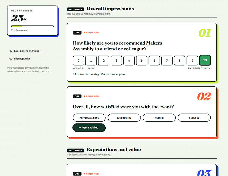
The standard way to ask this is some version of “On a scale of 1 to 10, how would you rate your overall experience at this event?” A 5-point scale works fine too, similar to the pattern covered in these examples of Likert scale survey questions, and whichever choice gets made should stay the same across every event in a series. Otherwise scores aren’t really comparable year to year.
A few more that belong in the opening block:
- Did the event meet, exceed, or fall short of your expectations?
- Was the event worth the time you spent attending?
- Was it worth the cost of the ticket? (for paid events)
- Would you attend this event again next year? (yes / no / maybe)
- What was the single best thing about the event?
- How did this compare to other events you’ve attended this year?
The expectations question is the one I’d fight to keep. A 4 out of 5 from someone who expected a 3 means something completely different from a 4 out of 5 from someone who expected the best day of their quarter.
For reference, a 2023 CyberTraining PI Meeting survey rated overall usefulness at 4.5 out of 5, drawing from 30 respondents out of 84 invited, using a simple 5-point scale across eight questions total.
Short instruments like that one show a real pattern. Attendees will answer a tight, well-scoped satisfaction question even when the full survey stays under ten questions.
Net Promoter Score Questions
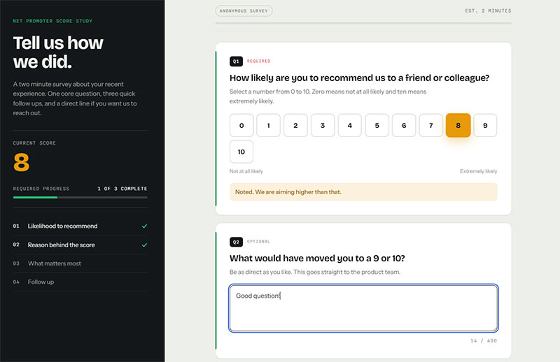
“How likely are you to recommend this event to a friend or colleague?” scored 0 to 10, is the wording almost everyone lands on eventually.
Fred Reichheld is the one who introduced this format, in a December 2003 Harvard Business Review article called “The One Number You Need to Grow.” He’d tested it against other satisfaction and loyalty questions across 14 industries, working with Bain and Company and Satmetrix.
It ranked as the best or second-best predictor of growth in 11 of the 14 industries he looked at. That’s basically why it’s still the default wording most NPS survey question formats use today.
Respondents get sorted into three groups based on score. Promoters answer 9 or 10, passives answer 7 or 8, and detractors answer 6 or below. Subtract the detractor percentage from the promoter percentage and that’s the final score, anywhere from negative 100 to positive 100.
Route the follow-up by score rather than showing everyone the same box:
| Score | Follow-up |
|---|---|
| 9-10 | What would you tell someone thinking about attending next year? |
| 7-8 | What would have made this a 9 or 10 for you? |
| 0-6 | What let you down, and what should we change first? |
Bain and Company says two-thirds of the Fortune 1000 run some version of NPS at this point, so most attendees have already answered this exact question for some other brand before your event ever asks it. That familiarity is actually useful. It keeps their answers roughly comparable across contexts.
Content and Speaker Quality Questions
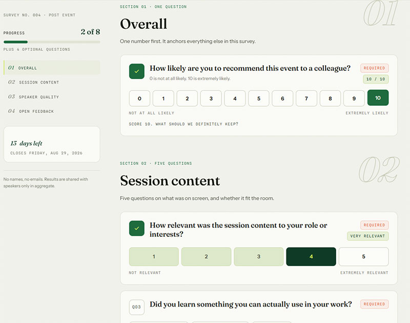
A speaker can know their material cold and still bomb the room if the topic wasn’t what anyone came for. That’s the whole reason content questions and speaker questions get split apart instead of merged into one “how was the session” rating.
A few questions get at that gap directly.
- How relevant was the session content to your role or interests
- How would you rate the speaker’s knowledge of the topic
- How would you rate the speaker’s delivery and ability to hold the room
- Did you learn something you can actually use in your work?
- Was the material pitched at the right level, too basic, or too advanced?
- Did the session length feel right, too short, or too long
- Was there enough time for questions?
- Which session was the most valuable to you, and why?
- Which session would you drop from next year’s agenda?
- What topics would you like covered at a future event
- Is there a speaker you’d like to see invited back?
Splitting relevance from speaker knowledge shows organizers which problem they’re actually looking at, instead of lumping both into a single number that could mean either one. And separating knowledge from delivery matters just as much. Plenty of brilliant people are dull on stage, and that’s a coaching problem, not a booking problem.
The “which session would you drop” question makes organizers uncomfortable. Ask it anyway. Nobody volunteers that information unprompted, and the answers cluster fast.
Session-Level vs Event-Level Questions
Session-level questions rate each talk on its own. The event-level version skips that granularity and just asks for one overall impression of the whole content track.
A workable session block, repeated per talk, stays short:
- Rate the content of this session (1-5)
- Rate the speaker (1-5)
- One thing you’d change about this session (optional text)
The 2023 CyberTraining PI Meeting report is a good example of why this matters. Broken down by session type, poster sessions scored 4.8 out of 5, NSF-related sessions scored 4.7, and lightning round sessions came in lowest at 4.23, all measured on the same 5-point scale used for the event’s overall usefulness number.
That kind of spread is the whole argument for session-level questions. An event-level average of 4.5 would have buried the fact that one format was underperforming the rest.
Multi-track events should default to session-level questions. Single-track events with three or four talks can usually get away with one event-level content question instead.
Logistics, Venue, and Registration Questions
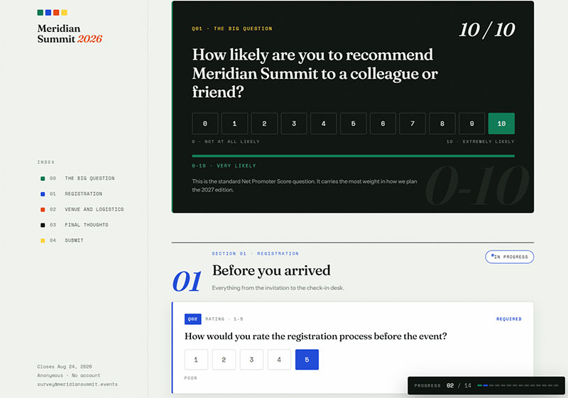
Logistics questions cover the operational side of things, separate from anything about the content. Was the room too cold? Did the wifi actually hold up during the keynote? That kind of question.
Answers here feed straight into planning decisions. A pile of comfort complaints about one venue, or a bottleneck at registration, tells the team exactly what to look at before signing a contract for the same space next year.
| Category | What to Ask | Why It Matters |
|---|---|---|
| Venue comfort | Rate temperature, seating, and noise | Flags a venue to avoid rebooking |
| Registration | Rate check-in speed and clarity | Flags staffing or process gaps |
| Food and beverage | Rate quality and variety | Flags a catering vendor issue |
| Technology | Rate AV, wifi, and app performance | Flags equipment or bandwidth gaps |
Venue and Facilities Questions
Room comfort matters, obviously, but so does accessibility for attendees with mobility needs, the layout and sightlines, and how clear the signage actually is.
- How would you rate the venue overall? (1-5)
- Was the room temperature comfortable?
- Could you see and hear clearly from where you were sitting?
- Was it easy to find your way around? (signage, room numbers, maps)
- Was the venue easy to get to, and was parking or transit workable?
- Did the venue meet your accessibility needs? If not, what was missing?
- Were there enough places to sit, work, or take a call between sessions?
- How would you rate the food and drinks? Were dietary options handled well?
Accessibility deserves its own line, not a footnote buried inside a general comfort question. A venue can score fine on comfort overall and still completely fail an attendee who uses a wheelchair or needs close seating because of a hearing impairment. Those two things aren’t the same complaint.
Wifi and AV performance belong here too when the venue supplies the network rather than the organizer. A dropped connection during a keynote is a venue problem as much as a content problem, and the survey should let attendees flag which one it actually was.
Registration and Check-In Questions
Something like “How would you rate the ease of registering and checking in for this event?” works, paired with an open field for whatever went wrong, if anything.
- How easy was it to register online? (1-5)
- How long did check-in take you? (under 5 min, 5-15 min, over 15 min)
- Did you get the information you needed before arriving?
- Was the event app or schedule easy to use?
- Was anything about the pricing or ticket options unclear?
- Did anything go wrong during registration or check-in?
This isn’t a minor thing to ask about either. RSVPify’s 2025 industry survey found 35.5% of event planners name late attendee registration as their single biggest operational headache, so check-in bottlenecks show up in post-event feedback pretty predictably.
Organizers running registration through their own site rather than a third-party ticketing platform can build that flow directly, following the same setup covered under WordPress event registration form guidance, which keeps registration data and survey data in the same system.
Networking and Engagement Questions
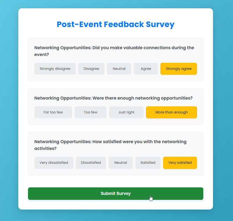
Ask people today why they actually showed up to a conference and “networking” comes up more than the agenda does.
That’s not just a vibe. Freeman’s 2025 trends report found networking has overtaken both education and product discovery as the top reason people give for attending in-person business events, and 51% said effective networking alone is reason enough to come back.
That shift changes what a post-event survey needs to measure. If networking is now what brings people back, a survey that buries it below content and logistics questions is measuring the wrong thing first.
- How would you rate the networking opportunities at this event
- How easy was it to connect with other attendees
- Roughly how many new people did you meet? (none, 1-3, 4-10, more than 10)
- Did you use the event app or matchmaking tool, and how well did it work
- Which format worked best for meeting people? (breaks, meals, structured sessions, evening social, expo floor)
- Would you like more or less structured networking time at future events
- Did you exchange contact information with anyone you plan to follow up with
- Did you meet anyone who could turn into a customer, partner, or hire?
- Did you ever feel stuck without anyone to talk to?
That contact-exchange question matters more than it looks like it should. A high networking satisfaction score sitting next to a low contact-exchange rate usually means people had a nice time in the room, but the format never gave them an actual reason to swap information. That’s a fixable structural problem, not a content one.
The “stuck without anyone to talk to” question is the one solo attendees answer honestly. If a chunk of them say yes, the problem is the schedule, not their personalities.
Sponsor and Exhibitor Questions
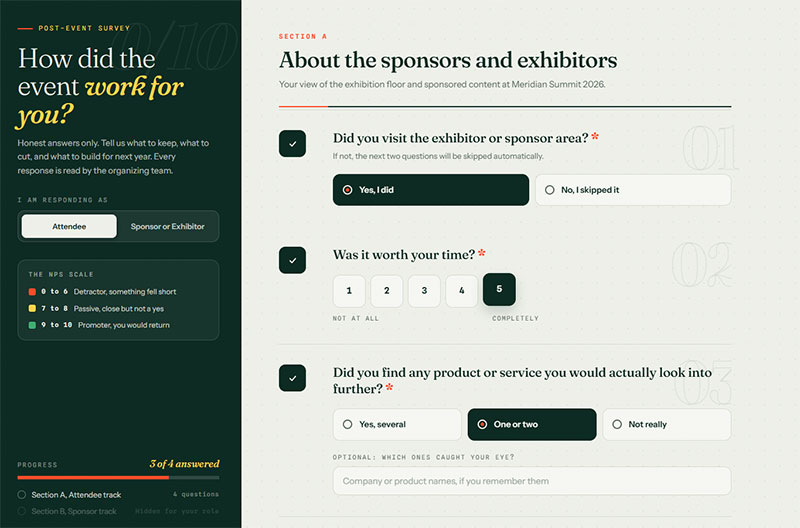
Two audiences here, and they need separate forms. Attendees grade whether the expo floor was worth walking. Sponsors grade whether the money was worth spending, and they’re the ones you need back next year.
Questions for Attendees About Sponsors
- Did you visit the exhibitor or sponsor area?
- Was it worth your time? (1-5)
- Did you find any product or service you’d actually look into further?
- Did sponsored content feel useful or intrusive?
Questions for Sponsors and Exhibitors
- Did you get the volume of leads you expected?
- How would you rate the quality of the people you spoke to? (1-5)
- Was your booth location and foot traffic what you were promised?
- How well did the organizing team communicate before and during the event?
- Was the setup and teardown process smooth?
- How likely are you to sponsor again next year? (0-10)
- What would make the sponsorship more valuable to you?
Send this one within a week, not a month. Sponsor budgets get decided faster than most organizers expect.
Questions for Speakers, Staff, and Volunteers
Nobody sees the operational failures more clearly than the people running the thing, and almost nobody asks them.
- Did you have everything you needed to do your job on the day?
- Was the briefing or run-of-show clear enough?
- What went wrong that attendees probably didn’t notice?
- Was the AV setup and tech check adequate? (speakers)
- How was the audience engagement in your session? (speakers)
- Were shifts and breaks reasonable? (staff and volunteers)
- Would you work this event again?
- What one change would make the biggest difference next year?
The “what went wrong that attendees didn’t notice” question is worth the whole form. Staff catch near-misses that never show up in attendee feedback because they got fixed thirty seconds before anyone walked in.
Open-Ended and Improvement Questions
A scale question can tell you something’s wrong. It can’t tell you what. That gap is why open text fields end up on a survey that already has ten rating questions on it, and it’s why every well-built feedback survey questions set pairs a rating with some kind of follow-up field.
Two questions cover most of the ground here.
- What could we improve for next time
- What did you enjoy most about this event
A few sharper alternatives worth rotating in year to year:
- What’s one thing you’d change if you were running this event?
- What did you expect that didn’t happen?
- What will you actually do differently at work because of this event?
- What’s the one moment you’ll remember from the day?
- Is there anything we should stop doing entirely?
- What almost stopped you from attending?
That last one gets answered by people who nearly skipped it, and their reasons (price, travel, timing, a vague agenda) are the same reasons other people did skip it.
Keep all of these optional. Making an open text field required drags down completion rate without adding much signal, since forced answers tend to be short and low-effort compared to answers volunteered freely.
Required vs Optional Open Text
Survicate’s 2025 benchmark data shows completion rate drops fastest right where open text tends to sit, falling from 86.8% for surveys with 2 to 3 questions to 77.4% for 4 to 6 questions.
Every required open field acts like an extra hurdle in that count, even when the survey’s total question number stays low.
One optional open field near the end, placed after the rating questions are done, keeps the trade-off in the organizer’s favor. Attendees who already answered the scale questions are more likely to add a sentence or two voluntarily, a smaller ask than opening the survey with a blank text box, a pattern covered in more depth under how to avoid survey fatigue.
Questions for Virtual and Hybrid Events
Everything covered so far, the satisfaction question, the content questions, all of it, still applies once you add a screen into the mix. What’s different is one extra block asking specifically about the screen itself instead of the room.
Platform and Technology Questions
The tech side needs its own short block of questions.
- How would you rate the stability of the stream or video connection
- How clear was the audio and video quality
- Did you experience any drops, freezes, or lag? How often?
- Was it easy to join? (link, login, browser issues)
- Did you use chat, polls, or Q&A? How well did they work?
- How satisfied were you with access to on-demand recordings
- How responsive was technical support when you had an issue
- Did you watch the whole thing, or drop off partway? What made you leave?
Kaltura’s Virtually Live survey backs up why this matters. More than two-thirds of attendees say technical glitches alone are enough to make them close the tab and leave a virtual event early.
That single figure is the whole argument for asking this question at all. A content problem loses a few points on a satisfaction scale. A stream that freezes loses the attendee entirely, and the survey needs to be able to tell the two apart.
Hybrid Comparison Questions
Hybrid events also need a direct comparison between the in-person and remote versions of the same event, on top of everything above.
| Question Focus | Asked Of | What It Reveals |
|---|---|---|
| Format preference | All attendees | Whether virtual or in-person felt more valuable |
| Parity of access | Virtual attendees | Whether remote content matched in-person content |
| Networking gap | Virtual attendees | Whether remote networking tools closed the connection gap |
Worded out, that looks like:
- Which format would you choose next time, in person or online?
- Did you feel like you got the same content as people in the room?
- Were you able to ask questions and be heard from where you were?
- What would have made the remote experience closer to being there?
When the parity row disagrees with the format-preference row, the gap points at delivery, not desire. Virtual attendees who still say they preferred being in person aren’t rejecting the format. They are describing what remote access left out.
How to Write Effective Post-Event Survey Questions

Wording can swing results by more than people expect. A single word choice inside an otherwise identical question has been shown to move public opinion by double digits in academic research, and event survey questions aren’t immune to the same effect.
Question Wording Best Practices
Start with asking about a single idea at a time. “How satisfied were you with the speakers and the venue” forces one answer onto two completely different experiences, and whoever answers it has to just pick one to actually respond to.
This isn’t a new problem. Question-wording research has repeatedly shown that swapping “welfare” for “assistance to the poor” in an otherwise identical question changes public support dramatically. Pew Research Center’s own guide to writing survey questions cites this exact example, and analyses of decades of General Social Survey data have found the gap between the two wordings can exceed 30 percentage points.
Event surveys carry the same risk with softer language. “How would you rate our excellent keynote speaker” plants a judgment inside the question before the attendee answers it.
Strip the adjective and the answer options carry the range instead. “How would you rate the keynote speaker” does the same job without planting a verdict first.
Weak Questions and Better Versions
| Weak version | What breaks | Better version |
|---|---|---|
| How was the event? | Too broad to score or act on | How would you rate your overall experience? (1-10) |
| Rate the speakers and the venue | Two things, one answer | Split into two questions |
| Did you love our amazing keynote? | Plants the verdict first | How would you rate the keynote? (1-5) |
| Any comments? | Skipped by nearly everyone | What’s one thing you’d change for next year? |
| Was the food good? | Yes/no hides the useful detail | How would you rate the food, and were dietary needs met? |
| Why didn’t you attend more sessions? | Sounds like a scolding | What kept you from attending sessions you’d planned to? |
Rating Scales and Answer Formats
Match the format to the question. A radio button vs checkbox choice decides whether attendees can pick one reason for attending or several.
Which format fits depends on what’s being asked.
- Radio buttons for single, mutually exclusive answers like overall rating
- Checkboxes for select-all answers like reasons for attending
- Matrix grids for rating several session attributes on the same scale at once
- Star ratings for quick, low-effort satisfaction checks
Matrix grids save space on the page, but they cost attention. Attendees skim down a column and start picking the same answer for every row once fatigue sets in, something researchers actually have a name for, straightlining. Breaking a long matrix into two shorter ones usually fixes it.
Ideal Post-Event Survey Length
Eight to twelve questions. Under five minutes to complete. That’s the range most organizers should be aiming for, and completion rate falls fast as either number climbs, with the steepest drop happening somewhere in the first fifteen questions.
SurveyMonkey’s analysis of roughly 100,000 surveys found the sharpest jump in drop-off happens with each question added up to 15 total. Past that point, each additional question costs less completion than the ones before it did.
A separate SurveyMonkey study of completion times found abandonment rises once a survey passes 7 to 8 minutes, with completion rates falling 5% to 20% beyond that mark.
| Survey Length | Typical Completion Time | Drop-off Risk |
|---|---|---|
| 1 to 5 questions | Under 2 minutes | Low |
| 6 to 15 questions | 2 to 7 minutes | Rising, steepest range |
| 15 or more questions | Over 8 minutes | High, but per-question impact levels off |
The practical move is to put the Net Promoter Score and overall satisfaction questions first, then content and logistics questions, then the optional open text field last. That order protects the two metrics organizers report to stakeholders even if an attendee abandons the survey halfway through.
A Ten-Question Set You Can Copy
If you want something usable without building it from scratch, this order works for most single-day conferences:
- How likely are you to recommend this event to a friend or colleague? (0-10)
- What’s the main reason for your score? (optional text)
- How would you rate your overall experience? (1-5)
- Did the event meet, exceed, or fall short of your expectations?
- Which session was most valuable to you?
- How would you rate the content overall? (1-5)
- How would you rate the venue and facilities? (1-5)
- How easy was check-in? (1-5)
- How would you rate the networking opportunities? (1-5)
- What’s one thing we should change for next year? (optional text)
Multi-day and multi-track events can justify a longer instrument, up to 15 questions, since there’s genuinely more to grade. A single afternoon workshop rarely needs more than 8.
Tools and Platforms for Post-Event Surveys
General-purpose survey builders like Google Forms and Typeform handle most of this fine. Event-specific platforms, Cvent, Whova, Bizzabo, fold the survey directly into the same system as registration data instead, which is the main thing they offer over a standalone tool.
Organizers already running their event site on WordPress can skip a third-party tool and collect responses through WordPress survey plugins instead, which keeps survey data next to registration data in the same dashboard.
Free tiers vary sharply. Typeform’s own help center caps its free plan at 10 responses per month across every form combined, while Google Forms carries no published response cap at all on its free tier.
That gap matters for a 300-person conference. A free Typeform account runs out before a third of attendees have answered, which is when a Google Forms alternative becomes worth exploring, especially once skip logic or deeper reporting outgrows what Google’s tool offers.
Survey Tool Comparison
| Tool | Built For | Best Fit |
|---|---|---|
| Google Forms | Free, unlimited responses | Small events, tight budgets |
| Typeform | Conversational, one question per screen | Short, high-polish surveys |
| Cvent | Registration and survey in one system | Large conferences, trade shows |
| Whova | In-app survey tied to the event platform | Events already running on Whova |
Event-specific platforms win on integration, no argument there. General-purpose tools still win on cost and flexibility though, especially for organizers already building other event pages on their own site instead of a separate platform.
Mistakes That Lower Post-Event Survey Response Rates
Sending the survey too late is probably the single most avoidable mistake on this list, and it’s also the most common one. But it’s far from the only way to tank a response rate.
- Sending too late: waiting more than a day or two lets memory of specific sessions fade before attendees answer
- Overloading the instrument: stacking content, logistics, and networking questions into one long form well past the 15-question range
- Leading language: adjectives like “excellent” or “amazing” baked directly into the question
- No mobile layout: a form that renders fine on desktop but forces pinch-zooming on the phone where most attendees actually open the email
- No incentive or acknowledgment: asking for feedback without offering anything back, not even a thank-you note or a summary of what changed
There’s actual research behind the incentive point too. Church’s 1993 meta-analysis of mail-survey incentive studies found that only incentives included with the initial mailing (prepaid cash or small gifts) produced a real, statistically significant lift in response rates. Promising an incentive only after the survey came back showed no significant effect at all, and later research has continued to back that up.
A pinch-zoom problem is fixable without touching a single question on the form. The same general fixes that work on any form apply here too, shorter fields, a progress bar that’s actually visible, and something that gives people a reason to bother finishing, and they’re covered in more depth under tips for improving form abandonment rate.
That last mistake, no incentive or acknowledgment, quietly compounds every other one on this list. Attendees who never hear what changed after their last survey have little reason to think the next one deserves their time, and that erosion shows up as a lower response rate long before anyone traces it back to the actual cause. It’s a pattern covered in more depth under mobile form best practices.
FAQ on Post Event Survey Questions
How do you analyze post-event survey results?
Start by grouping responses by question type. Average out the rating scales, calculate the Net Promoter Score on its own, then go through the open text answers looking for repeated themes.
After that, cross-reference any low scores against session or venue data so you’re not guessing at the actual cause before presenting anything to stakeholders.
What is a good Net Promoter Score for an event?
Bain and Company’s own scoring framework treats anything above 0 as good, above 20 as favorable, and above 50 as excellent.
Survicate’s 2025 benchmark study puts the cross-industry median close to 40, though what counts as a good number for a specific event still depends on format and audience.
Should a post-event survey be anonymous?
Anonymity gets people more honest on touchy subjects, speaker performance, venue complaints, that kind of thing. The tradeoff is losing the ability to follow up directly with someone who was clearly unhappy.
Plenty of organizers split the difference with an optional name field instead of forcing a choice either way.
Should sponsors and speakers get their own post-event survey?
Yes, and this gets skipped more than it should. Sponsors care about lead quality and booth traffic. Speakers want to know about audience engagement and whether the logistics support actually worked. Attendees are mostly grading content and venue.
Cramming all three into a single shared survey just blends different agendas together and produces noise instead of anything usable.
Can you send a post-event survey to registrants who did not show up?
Yes, though the questions need to change.
Ask no-shows why they skipped the event instead of how they’d rate it, since that answer usually points to a scheduling conflict, a pricing issue, or marketing that oversold what the actual content delivered.
What is the difference between a post-event survey and live event polling?
Live polling, through something like Slido, catches reactions in the moment, during a session, before memory has a chance to fade.
A post-event survey is the reflective version, the big-picture view once the whole thing is over. The strongest feedback programs run both.
How many responses does a post-event survey need to be useful?
There’s no hard minimum, but somewhere around 30 to 50 responses is usually where patterns start meaning something.
For a 500-person conference, that’s a low bar to clear. For a 40-person workshop, every single response counts for a lot more.
What day of the week gets the best post-event survey response rate?
SurveyMonkey’s analysis of 100,000 surveys found Monday sends outperform every other day, pulling in about 10% more responses than average, compared to 13% fewer on Fridays.
In practice, though, a post-event survey’s send date is usually locked in by when the event actually ends, not chosen freely.
Can AI write post-event survey questions?
Sure. Tools like SurveyMonkey’s AI Survey Generator can draft a full question set from a short prompt in seconds.
It still needs a human pass afterward to cut duplicate questions and make sure the wording actually matches the event that happened.
Should a post-event survey stay open indefinitely?
No. Most organizers close it out after one to two weeks, once reminder emails stop pulling in anything new.
Leaving it open longer picks up a handful of stragglers, sure, but it doesn’t add much value and just delays turning the data into an actual plan.
Conclusion
Most teams try to launch a full set of post event survey questions all at once, satisfaction, content, logistics, networking, crammed into one form. That instinct usually backfires.
Start smaller.
Ship just the Net Promoter Score question and one open text field after the very next event. That alone shows whether people would come back, and it sets a baseline response rate to measure every later version against.
Add venue and session questions later, once a full cycle has passed and the data has already shaped at least one real decision.
A form nobody reads and nobody acts on isn’t feedback. It’s an event debrief nobody asked for. Assign one person to turn the next batch of answers into a single concrete change before the next event goes on sale.