

Most form tutorials show you what’s possible. This one shows you what actually works. The State of CSS 2024 survey puts Tailwind CSS at 62% developer usage. More teams are…
Table of contents
Your login form is the first thing a returning user sees. Get it wrong and they leave before they even try.
These examples of CSS login forms cover every major design pattern in use today, from minimalist flat layouts to glassmorphism cards, dark mode UI, animated inputs, and gradient backgrounds.
Each example includes the CSS properties that make it work, browser compatibility notes, and accessibility considerations.
By the end, you’ll know how to build a responsive login form UI that looks sharp, loads fast, and passes WCAG contrast requirements without reaching for a framework.
What Is a CSS Login Form?
A CSS login form is an HTML form element styled with CSS to authenticate existing users on a website or application.
The unstyled HTML version renders as a plain browser default: no spacing, no visual hierarchy, no interactive feedback. CSS is what turns that into something a real user will trust and complete.
Every CSS login form shares 4 core components: an email or username input, a password input, a submit button, and a form container. From there, the styling decisions multiply fast.
CSS handles the visual layer entirely: layout positioning with flexbox or grid, focus states on active inputs, hover transitions on the submit button, placeholder color, error state borders, and responsive breakpoints for mobile viewports.
You’ll find CSS login forms across SaaS dashboards, e-commerce checkouts, membership platforms, admin panels, and any site requiring user authentication. The form design decisions made at this stage directly affect whether users complete the login or abandon it.
Baymard research shows password fields trigger roughly 10.5% form abandonment on their own. That number drops when the surrounding design signals trustworthiness through clear labels, visible focus states, and clean layout.
What Are the Most Common CSS Login Form Layouts?
CSS login form layouts fall into 3 structural patterns. Each serves a different context and relies on distinct CSS properties to work.
| Layout type | Core CSS properties | Best used for |
|---|---|---|
| Centered Card | flexboxbox-shadowborder-radius |
SaaS apps Dashboards Membership sites |
| Split-Screen | grid (2 columns)background-image |
Marketing platforms B2C products |
| Full-Page Background | background-size: coverposition: absolute |
Creative portfolios Lifestyle brands |
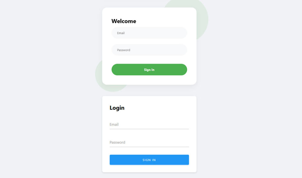
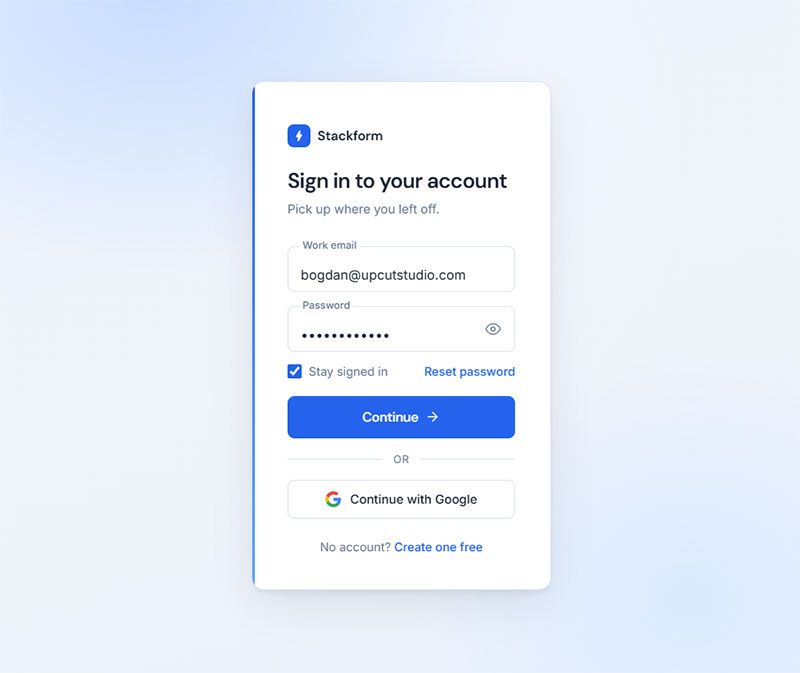
Centered Card Layout
Most common layout pattern across professional web applications. The form card sits centered on the viewport using flexbox on the body element.
The container typically runs 360px to 420px wide with a box-shadow for depth and border-radius between 8px and 16px. Everything inside stacks in a single column.
Centering code that actually works without fighting the browser:
body {

display: flex;

justify-content: center;

align-items: center;

min-height: 100vh;

}
This is the layout Stripe, Notion, and Linear use. Clean, fast to build, and works at every viewport width.
Split-Screen Layout
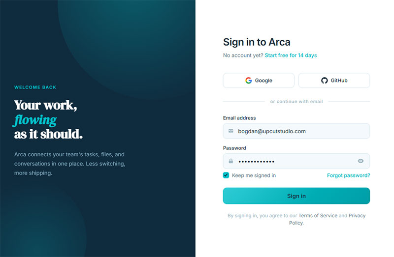
Two equal columns. Left panel carries brand imagery or a marketing message. Right panel holds the form.
CSS grid handles the split: grid-template-columns: 1fr 1fr. Below 768px, a media query collapses both columns to a single stacked view so the form appears first on mobile.
Key trade-off: the split-screen layout adds visual weight that works well for B2C products and creative platforms. For productivity tools or internal dashboards, the centered card is usually cleaner.
Full-Page Background Layout
The form floats over a full-viewport background image or gradient using position: absolute and centering via transform.
Background image setup requires 3 properties to work correctly: background-size: cover, background-position: center, and background-repeat: no-repeat.
Performance note: large background images on login pages add unnecessary load time. Use a compressed WebP file under 200KB or replace the image with a CSS gradient entirely.
What Are the Best Minimalist CSS Login Form Examples?
See the Pen
Card-Centered Login Form with Bootstrap 5 by Bogdan Sandu (@bogdansandu)
on CodePen.
Minimalist CSS login forms remove everything except what authentication requires. No decorative borders, no gradients, no background patterns.
These designs let typography carry the layout. Font-size hierarchy between the heading, label, input, and button creates structure without visual noise.
Typography-First Minimalist Design
Core approach: single-column layout, white or off-white card background, no border on the card itself.
Input fields use a bottom-border-only style instead of a full box border. One line of CSS replaces the default input border:
input {

border: none;

border-bottom: 2px solid #e0e0e0;

outline: none;

background: transparent;

}
On :focus, the border-bottom transitions to the brand accent color with transition: border-color 0.2s ease. That single interaction does more for perceived quality than any decorative element.
Mono-Color Minimalist Design
Single-color palettes work well here: all inputs, labels, and text in one base color with 2 tonal variations. The submit button is the only element with a fill color.
VWO data shows submit buttons with more surrounding white space can increase conversion rates by over 200%. Minimalist login forms naturally deliver that white space without extra effort.
Good examples of this style exist on CodePen from creators like George W. and in the CSSScript.com free snippets library. Both collections include source code you can adapt directly.
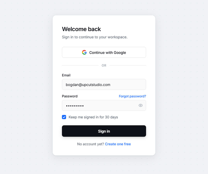
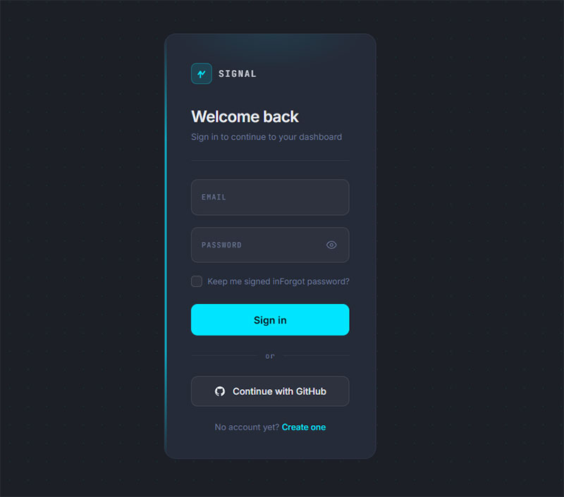
What Are the Best Dark Mode CSS Login Form Examples?
Dark mode login forms are among the most searched CSS form styles on CodePen and Uiverse.io. They look sharp for developer tools, fintech platforms, and creative apps.
Background range that works: #1a1a1a to #2d2d2d for the page, #252525 to #3a3a3a for the card. Go darker than that and contrast ratios start failing WCAG 2.1 AA.
Neon Accent Dark Form
Neon input focus borders are the signature detail of dark mode login forms. The effect uses box-shadow, not border, to create the glow:
input:focus {

box-shadow: 0 0 0 2px #6c63ff, 0 0 12px rgba(108, 99, 255, 0.4);

}
Purple (#6c63ff) and cyan (#00d4ff) are the two most common neon accent colors for dark forms. Both hit WCAG AA contrast ratios on dark backgrounds without adjustments.
Dark Mode with Ghost Button
Ghost buttons (outlined, no fill) in dark mode give the submit action a less aggressive presence. The button uses a transparent background with a colored border:
button {

background: transparent;

border: 2px solid #6c63ff;

color: #6c63ff;

transition: background 0.2s ease, color 0.2s ease;

}

button:hover {

background: #6c63ff;

color: #fff;

}
When to use ghost buttons vs. filled buttons in dark forms: ghost buttons fit secondary actions and creative contexts. Filled buttons convert better for forms where submission is the primary goal. For login forms, use a filled button.
CSS Custom Properties for Dark Theme Tokens
Managing dark mode at scale works best through CSS custom properties. Define all color tokens in :root and swap them with a [data-theme="dark"] selector:
:root {

--bg-card: #ffffff;

--text-primary: #1a1a1a;

--border-input: #e0e0e0;

}

[data-theme="dark"] {

--bg-card: #2d2d2d;

--text-primary: #f5f5f5;

--border-input: #444444;

}
This approach means one CSS file handles both themes. No duplicate rule sets, no specificity conflicts.
What Are the Best Glassmorphism CSS Login Form Examples?
See the Pen
Glassmorphism Login Form by Bogdan Sandu (@bogdansandu)
on CodePen.
Glassmorphism login forms use a frosted glass aesthetic: semi-transparent backgrounds, blurred backdrops, and thin translucent borders. The effect creates depth without adding visual weight.
Josh W. Comeau’s December 2024 analysis confirmed backdrop-filter sits above 97% browser support, making glassmorphism safe for production on any modern project.
Core CSS for the Glass Effect
4 properties produce the glassmorphism look. All 4 are required. Missing any one of them breaks the effect:
- backdrop-filter: blur(16px) – blurs whatever sits behind the card
- background: rgba(255, 255, 255, 0.1) – semi-transparent card fill
- border: 1px solid rgba(255, 255, 255, 0.2) – the glass edge
- box-shadow: 0 8px 32px rgba(0, 0, 0, 0.1) – subtle depth below the card
Always include the -webkit- prefix for Safari: -webkit-backdrop-filter: blur(16px). LambdaTest data puts backdrop-filter browser compatibility at 92 out of 100 as of 2025, but the prefix remains necessary for full Safari coverage.
Input Styling Inside Glass Forms
Standard input styles break inside glassmorphism containers. White backgrounds on inputs kill the frosted effect underneath them.
The fix: transparent or very lightly tinted input backgrounds with white placeholder text:
input {

background: rgba(255, 255, 255, 0.05);

border: 1px solid rgba(255, 255, 255, 0.3);

color: #ffffff;

}

input::placeholder {

color: rgba(255, 255, 255, 0.6);

}
Well-executed glassmorphism login examples include “Glassmorphism Login Form Tutorial” by Foolish Developer on CodePen and several entries in the Uiverse.io component library tagged under glass UI.
Performance Considerations
backdrop-filter triggers GPU compositing. That matters on mobile.
Blur values above 20px cause visible frame drops on mid-range Android devices. Limit blur to 12px to 16px on login forms. Never animate the blur value directly. Animating opacity or transform is far cheaper on the compositor thread.
3 to 4 glass elements per viewport is the practical ceiling before performance degrades noticeably on lower-end phones.
What Are the Best Animated CSS Login Form Examples?
See the Pen
Login form with animated background gradient by Bogdan Sandu (@bogdansandu)
on CodePen.
CSS animations on login forms serve one functional purpose: directing attention and confirming interaction. The best animated login form examples use animation sparingly and purposefully.
Floating Label Animation
The floating label is the most widely used input animation in modern form UX design. The label sits inside the input as placeholder text, then floats above the input border on focus.
CSS that drives it:
label {

position: absolute;

top: 14px;

left: 12px;

transition: transform 0.2s ease, font-size 0.2s ease;

}

input:focus + label,

input:not(:placeholder-shown) + label {

transform: translateY(-22px);

font-size: 12px;

color: #6c63ff;

}
The :not(:placeholder-shown) selector keeps the label in its floated position even after the user stops focusing, which is the behavior most people expect.
Shake Error Animation
A horizontal shake on incorrect password input is a clean, recognizable error signal. No red text block needed. Pure CSS via @keyframes:
@keyframes shake {

0%, 100% { transform: translateX(0); }

20%, 60% { transform: translateX(-8px); }

40%, 80% { transform: translateX(8px); }

}

.input-error {

animation: shake 0.4s ease;

border-color: #d32f2f;

}
Keep the shake duration under 500ms. Longer animations feel laggy rather than responsive.
Button State Animation
3 button states worth animating: default, hover, and loading.
- Hover: background-color shift via
transition: background-color 0.2s ease - Focus: visible outline using
:focus-visible, never suppressed - Loading: spinning border using
@keyframes rotateon a pseudo-element
The loading state matters more than most developers give it credit for. A spinner inside the button after click stops users from submitting twice and signals that something is happening. A button that does nothing visible after a click reads as broken.
What Are the Best Gradient CSS Login Form Examples?
Gradient login forms appear most often on creative portfolios, marketing platforms, and consumer apps. They use color to create energy and brand recognition where neutral designs would fade into the background.
Gradient Background Options
Two approaches work for gradient login forms. They create different visual outcomes:
Full-page gradient: the gradient covers the entire viewport behind the form card. The card itself stays neutral (white or near-white). The color lives in the context, not the form.
Gradient card: the form card carries the gradient directly. This is harder to pull off because text contrast becomes a challenge on most gradient combinations. Test every foreground color against WCAG’s 4.5:1 minimum.
Color Combinations That Work
These 4 gradient pairs show up consistently in high-rated CodePen login form examples and Dribbble UI shots:
- Purple to pink:
linear-gradient(135deg, #6c63ff, #e040fb) - Blue to teal:
linear-gradient(135deg, #1565c0, #00acc1) - Orange to red:
linear-gradient(135deg, #f4511e, #e53935) - Dark navy to slate:
linear-gradient(135deg, #1a237e, #37474f)
Dark gradients (navy to slate) have a practical advantage: they work with both white text and light input styling without contrast issues. That makes them easier to build accessibly than vibrant multi-color gradients.
Gradient Button Technique
See the Pen
Bootstrap 5 Login Form – Full-Bleed Hero with Frosted Glass Card by Bogdan Sandu (@bogdansandu)
on CodePen.
Animating a gradient hover state on a button requires a workaround since CSS cannot directly transition background gradients. The standard fix uses background-position on an oversized gradient:
button {

background: linear-gradient(135deg, #6c63ff 0%, #e040fb 100%);

background-size: 200% 200%;

background-position: left center;

transition: background-position 0.3s ease;

}

button:hover {

background-position: right center;

}
Gradient borders are a separate technique. A true CSS gradient border uses a pseudo-element wrapper rather than border-image, which has limited border-radius support. The pseudo-element carries the gradient background, and the actual card sits on top with a slightly smaller size and opaque background.
For anyone building login forms inside a broader CSS form system, gradient tokens defined as CSS custom properties make it much easier to keep button styles, card borders, and background treatments visually consistent across a whole product.
What Are the Best Responsive CSS Login Form Examples?
See the Pen
Modern Login Form Collection by Bogdan Sandu (@bogdansandu)
on CodePen.
Get started login form example
See the Pen
Form UI Validation Animation by Daniel Gonzalez (@dan10gc)
on CodePen.
Mobile devices account for 64.35% of global website traffic as of July 2025, according to StatCounter. A login form that breaks on a phone is a broken login form, full stop.
Responsive login forms aren’t just scaled-down desktop layouts. Input sizing, spacing, and layout logic all need to change at small viewports.
Mobile-First CSS Structure
Start at 320px and work up. Write base styles for the smallest viewport first, then add breakpoints for larger screens with @media (min-width: 768px).
Most login forms need only 2 breakpoints: mobile (default) and everything else. Split-screen layouts collapse to single-column below 768px, with the form appearing first in document order.
Baymard research shows 61% of mobile sites don’t use the correct keyboard type for form fields. Fix it with 2 attributes: type="email" on the email field and type="password" on the password field. Both trigger the right virtual keyboard automatically.
Touch Target Sizing
Google Material Design specifies a minimum 48x48px tap target for interactive elements. That applies to input fields, the submit button, the “show password” toggle, and any “forgot password” link.
Input fields smaller than 44px height are technically tappable but feel imprecise on mobile. Set a minimum height explicitly:
input, button {

min-height: 48px;

font-size: 16px;

}
The iOS Safari Font-Size Rule
Any input with font-size below 16px triggers automatic viewport zoom on iOS Safari when the user taps the field.
The viewport zooms in and does not zoom back out automatically.
The fix is one line: set font-size: 16px on all inputs. That’s it. This is one of those things that bites teams who design on desktop Chrome and never test on a real iPhone until launch day.
GitLab’s frontend team documented this exact issue in a 2024 merge request after it surfaced across their product page forms, requiring a site-wide CSS patch to resolve it.
How Do CSS Frameworks Handle Login Form Styling?
The State of CSS 2024 survey recorded 81% developer satisfaction for Tailwind CSS against 55% for Bootstrap.
But satisfaction numbers don’t tell the whole story for login forms specifically.
Each framework takes a structurally different approach to form styling. The right choice depends on project context, not popularity rankings.
| Framework | Approach | Setup speed | Design control |
|---|---|---|---|
| Bootstrap 5 | Pre-built components | Fast | Limited without overrides |
| Tailwind CSS | Utility-first composition | Moderate | Full |
| Bulma | CSS-only, Flexbox-based | Fast | Moderate |
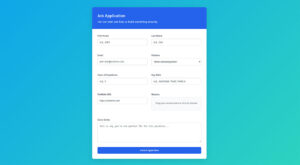
Bootstrap 5 Login Form
Bootstrap 5 still powers roughly 17.5% of all websites globally as of August 2025, according to W3Techs. That install base means the Bootstrap login form pattern is the most widely deployed HTML form structure on the web.
The class structure for a Bootstrap 5 login form:
form-controlon inputs for border, padding, and focus ringmb-3for consistent vertical spacing between fieldsbtn btn-primary w-100on the submit buttonform-labelon labels to match Bootstrap’s typographic scale
The trade-off: Bootstrap’s form-control-sm class sets input font-size below 16px, which triggers iOS Safari zoom on mobile. Avoid it on login forms or override it explicitly.
Tailwind CSS Login Form
Tailwind has no pre-built login form component. Everything is composed from utility classes directly in the HTML.
A Tailwind login form card typically combines classes like this:
<div class="max-w-md mx-auto mt-10 p-8 bg-white rounded-xl shadow-lg">

<input type="email" class="w-full px-4 py-3 border border-gray-300 rounded-lg text-base focus:outline-none focus:ring-2 focus:ring-indigo-500 focus:border-transparent">

</div>
Key advantage: no CSS specificity fights. Every visual decision is explicit in the markup, which makes design reviews faster and overrides unnecessary.
For a deeper look at how Tailwind handles full form systems beyond just login, the Tailwind form examples collection covers multi-field layouts, validation states, and component patterns.
Bulma Login Form
Bulma v1.0.0 released in March 2025 with CSS variables throughout and official dark mode built in. It has 93,369 weekly npm downloads as of 2025, according to Tailkits research.
Bulma form classes:
field wraps each form row. control wraps the input. input applies Bulma’s default input styling. The is-rounded modifier adds pill-shaped inputs for a softer look.
Bulma is CSS-only. No JavaScript ships with the framework, which makes it easier to integrate into projects that already have a JS framework handling interactions.
For teams evaluating Bootstrap form patterns against alternatives, the key question is how much of the default styling you plan to override. Heavy overrides usually mean Tailwind or custom CSS would have been faster from the start.
What CSS Properties Control Login Form Accessibility?
WebAIM’s 2024 Million report found 48.6% of websites had missing form input labels. That’s not a minor oversight. Screen readers read label text to identify each field. Without it, users hear “edit text” instead of “email address.”
ADA web accessibility lawsuits hit 8,800 filings in 2024, a 7% increase year-over-year, according to UsableNet. Login forms appear in nearly every such lawsuit because they block access to the core product.
Labels and Focus Indicators
Two CSS decisions break more login forms than anything else:
- Using placeholder text instead of a visible
<label>element - Writing
outline: nonewithout a replacement focus indicator
Placeholders disappear the moment a user starts typing. If someone tabs to a field and can’t remember what it’s for, they have to delete their input to see the hint again. Labels don’t do that.
For keyboard users, removing the focus ring entirely is the same as removing a cursor from a text document. The CSS :focus-visible pseudo-class fixes this: it shows the focus indicator for keyboard navigation, but not for mouse clicks.
input:focus-visible {

outline: 2px solid #6c63ff;

outline-offset: 2px;

}
Color Contrast Requirements
WCAG 2.1 AA sets 3 specific contrast minimums that directly affect login form CSS:
- Text contrast: 4.5:1 minimum for normal text (inputs, labels, button text).
- Input border contrast: 3:1 minimum against the adjacent background color.
- Placeholder text: the default gray placeholder in most browsers fails WCAG. Use
color: #767676minimum on::placeholderto pass AA. Light gray text on white (#999 on #fff) has a contrast ratio of 2.85:1. That fails.
WebAIM’s 2024 report found low-contrast text on 81% of homepages. Most of it is fixable in one afternoon with a contrast checker like Chrome DevTools’ built-in inspector.
Error State Accessibility
Never communicate errors through color alone. Color blindness affects roughly 8% of males globally, and red-green distinction is the most common deficit.
An accessible error state needs 3 things:
- A changed border color (red works, but only as one of multiple signals)
- An icon or text label alongside the color change
- An
aria-describedbyattribute linking the input to its error message
For teams doing wider accessibility work across form systems, the form accessibility best practices guide covers ARIA labeling patterns, error announcement, and focus management across multi-step flows.
How Does CSS Handle Login Form Error and Success States?
CSS handles basic login form validation states without any JavaScript. The pseudo-classes :valid and :invalid apply based on HTML5 constraint validation attributes like required, type="email", and pattern.
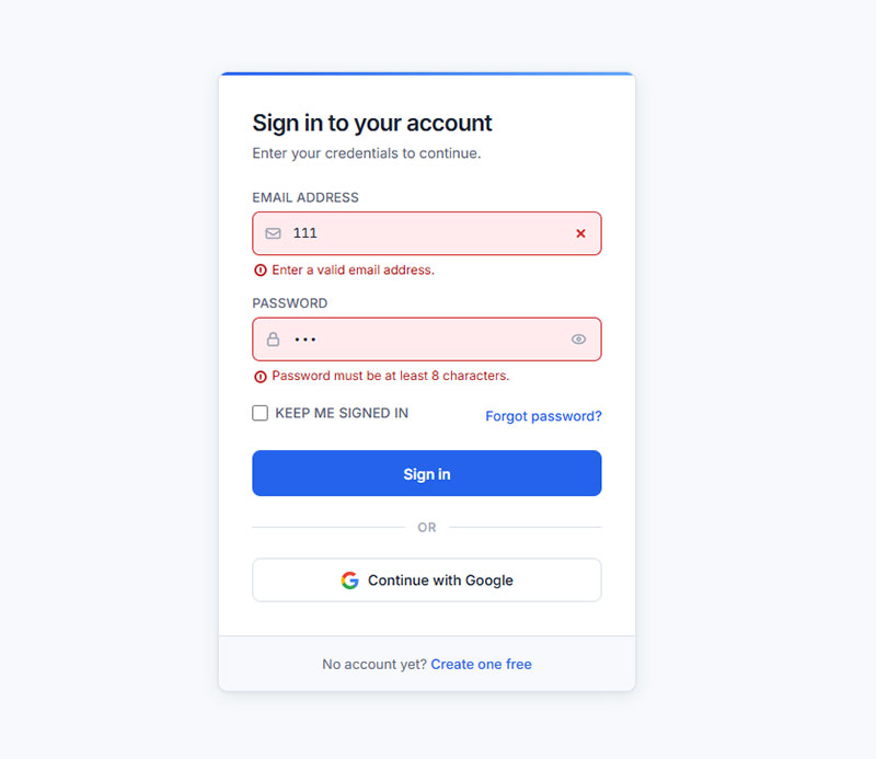
The :invalid Timing Problem
Using :invalid alone shows a red border on page load, before the user has typed anything. An empty required field is technically invalid from the moment it renders.
The fix uses :placeholder-shown to delay the error state:
input:not(:placeholder-shown):not(:focus):invalid {

border-color: #d32f2f;

box-shadow: 0 0 0 1px #d32f2f;

}
This chain means: the error style only applies when the placeholder is hidden (user has typed something), and the field is not currently focused. Users see errors only after they’ve interacted with a field and moved on.
The newer :user-invalid pseudo-class does this automatically. It landed across all major browsers in November 2023, according to MDN’s baseline data. But using it alone without a :invalid fallback leaves older browser users with no validation feedback at all.
Color and State Values
These are the color values that pass WCAG AA contrast on white backgrounds:
- Error: border
#d32f2f, background tint#ffebee. Red (#d32f2f) on white (#fff) has a 5.12:1 contrast ratio. - Success: border
#388e3c, background tint#e8f5e9. Pair with a checkmark icon, not color alone.
Apply transitions so state changes feel intentional, not sudden:
input {

transition: border-color 0.2s ease, box-shadow 0.2s ease;

}
Inline Error Message Positioning
Error messages positioned below the input use the adjacent sibling combinator. No JavaScript required to show or hide them:
input + .error-msg {

display: none;

color: #d32f2f;

font-size: 13px;

margin-top: 4px;

}

input:not(:placeholder-shown):not(:focus):invalid + .error-msg {

display: block;

}
This pattern keeps error messaging in CSS, not in a JavaScript event handler. It reduces the risk of error states breaking when JavaScript fails to load, which matters on slower mobile connections.
For a broader look at how validation messaging fits into overall form validation practices, the patterns for required field indicators, character count feedback, and server-side error display all follow the same accessibility-first logic.
FAQ on CSS Login Forms
What is a CSS login form?
A CSS login form is an HTML form element styled with CSS to handle user authentication. It includes an email input, password field, and submit button. CSS controls the layout, colors, focus states, hover effects, and responsive behavior across devices.
How do I center a login form with CSS?
Use flexbox on the body element. Set display: flex, justify-content: center, and align-items: center with min-height: 100vh. This centers the login card both horizontally and vertically without JavaScript or absolute positioning hacks.
What is the glassmorphism CSS login form style?
Glassmorphism uses backdrop-filter: blur(), a semi-transparent background via rgba(), and a thin translucent border to create a frosted glass effect. Browser support sits above 97% as of December 2024, per Josh W. Comeau’s analysis.
How do I make a responsive login form with CSS?
Write mobile-first base styles, then use @media (min-width: 768px) for larger viewports. Set all inputs to font-size: 16px minimum and use min-height: 48px on inputs and buttons to meet touch target requirements.
How do I add a floating label animation to a CSS login form?
Position the label inside the input using position: absolute. On :focus and :not(:placeholder-shown), use transform: translateY() and transition to float it above the field. No JavaScript needed for the core animation.
What CSS framework is best for a login form?
It depends on your project. Bootstrap 5 is fastest for prototyping with pre-built form-control classes. Tailwind CSS gives full design control through utility classes. The State of CSS 2024 survey shows Tailwind leads in developer satisfaction at 81%.
How do I style login form error states with CSS?
Use :not(:placeholder-shown):not(:focus):invalid to show error borders only after user interaction. Set border-color: #d32f2f for the error state. Always pair color changes with an icon or text label, never rely on color alone for form validation feedback.
How do I make a dark mode CSS login form?
Define color tokens as CSS custom properties in :root, then swap values using a [data-theme="dark"] selector. Use background colors in the #1a1a1a to #2d2d2d range and verify all text meets WCAG 2.1 AA contrast ratios.
Where can I find free CSS login form source code?
CodePen has the largest volume of HTML CSS login form examples, all browsable by tag. Uiverse.io offers MIT-licensed components ready for production use. CSSScript.com and Frontend Mentor both provide downloadable code with structured design files.
How do I fix iOS Safari zooming on my CSS login form inputs?
Set font-size: 16px on all input fields. iOS Safari triggers automatic viewport zoom on any input with a font size below 16px. It does not zoom back out automatically, which breaks the login form layout on mobile devices.
Conclusion
This conclusion is for an article presenting the full range of CSS login form design patterns, from centered card layouts to animated inputs and dark mode UI.
The right approach depends on your project. Glassmorphism works well for creative platforms. Minimalist flat layouts suit productivity tools. Responsive form design is non-negotiable regardless of which style you pick.
Keep WCAG contrast ratios in check, set all inputs to 16px minimum, and never suppress focus indicators without a replacement.
For ready-to-use code, CodePen, Uiverse.io, and Frontend Mentor cover most use cases. Build from a working example, then adjust the CSS custom properties to match your design system.
