
Table of contents
IvyForms organizes its inputs into several field groups so you can quickly find the type of field you need when building a form. The main groups are General fields, Security fields, and Advanced fields. This overview explains what each group is used for and how they fit into your form structure.
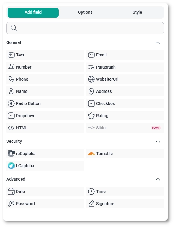
When you create a new form, the General fields group is opened by default so you can start adding the most common field types right away.
General and Advanced fields also include a Description option, which allows you to provide additional instructions or context for users filling out the form. This field supports up to 1000 characters and is useful for clarifying what kind of input is expected or adding helpful notes below the field label.
You can also add simple formatting and clickable links to a description with HTML tags, for example <a href="https://example.com/terms">Terms and conditions</a>. The Description option supports links (<a>) and basic formatting tags such as <strong>, <em>, <u>, <br>, <p> and <span>, while other tags are removed when you save the form. For a full walkthrough of adding a link, refer to the GDPR field documentation.
General fields are standard input types you will use in most forms. They collect everyday information such as names, contact details, addresses, and selections from lists. These fields are usually the first building blocks of any form you create.
Each general field type has its own detailed article that explains how it works, which options it includes, and how to configure it inside the builder. Also, each general field type can be combined with our form templates to quickly assemble complex forms. Use those articles when you want step-by-step guidance for a specific field.
Security fields are focused on protecting your forms from spam and unwanted submissions. They help verify that a real person is filling out the form and can reduce automated or malicious traffic. Depending on your configuration, these fields can also support consent- and compliance-related checks.
Use security fields when you want to add an extra layer of protection to important forms, such as registration flows, contact requests that are exposed publicly, or forms that receive a high number of submissions. Each security field type has its own configuration options, covered in separate documentation pages.
Advanced fields provide specialized input types that go beyond the basic text and selection fields. These fields help you collect structured data such as dates and times, protect sensitive information with passwords, or capture signatures directly inside the form. They are especially useful when you need more dynamic or formal inputs than what the General fields offer.
The Password and Signature fields are available only in the Pro version of IvyForms.
These fields are typically added after you’ve set up the main structure of your form with general inputs. Each advanced field has its own configuration options, which are covered in dedicated documentation pages.
Yes, you can pre-fill a field with dynamic placeholders that IvyForms replaces with real data when the page loads. In the Placeholder or Default value option of a field, click the three dots icon and pick a value from the list, for example {{wp.user_email}}. The placeholder is replaced with the visitor’s details taken from their WordPress profile, so a logged-in visitor sees their own name or email without typing it.
The list holds the following placeholders, which you can also find with the search box at the top of the popup.
{{wp.user_id}}, {{wp.user_name}}, {{wp.user_email}}, {{wp.user_first_name}}, {{wp.user_last_name}}{{wp.site_title}}, {{wp.site_url}}, {{wp.admin_email}}, {{wp.date}}{{wp.post_id}}, {{wp.post_title}}, {{wp.post_permalink}}, {{wp.referer_url}}{{wp.user_ip}}, {{wp.user_agent}}The user details come from the visitor’s WordPress profile, so they are only filled in for logged-in users. If a visitor is not logged in, the field stays empty.
In Default value, the replaced text is actually entered in the field, so it is submitted with the form unless the visitor changes it. In Placeholder, the replaced text is only grey hint text that disappears when the visitor starts typing, and pressing TAB does not fill it in. Use Default value when you want the field pre-filled, and Placeholder when you only want to show an example of the expected input.
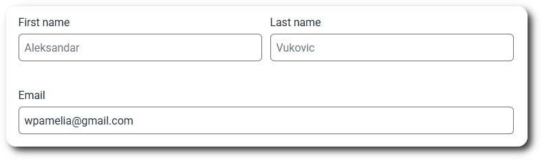
The Placeholder option supports them in Text, Email, Number, Paragraph, Website / URL, Dropdown, and the sub-fields of the Name field. The Default value option, found in the Advanced tab, supports them in Text, Email, Number, Website / URL, and Paragraph. For placeholders in notification emails, refer to the notifications documentation.
This page is an overview of the main field groups in IvyForms. Each field type has its own dedicated article where you can find all configuration details, including its general options, advanced settings, and smart logic behavior.
Smart Logic (conditional logic) is available only in the Pro version of IvyForms.
To continue, open any field category on the left and select the field you want to learn more about. Each article covers how the field works, which settings it includes, and how to adjust its behavior inside the builder.
As you build more forms, you can combine general, security, and advanced fields to create layouts that match your workflow, while keeping everything organized into clear categories in the builder.