Limited time discount
First Birthday, Big Savings
Up to 80%Off
Up to 80%Off
Grab Now
documentation-logo
Menu
  • Guides
  • Form Management
  • Advanced fields

How does the date and time field work in IvyForms

A client booking a consultation needs to choose both a day and a time in one step, not hunt through two separate fields. The Date & Time field handles both together: the visitor sets a date and a time from a single control, in the format and style you choose. This article covers where to find the field, the three ways it can be presented, the settings behind each one, and where the values land after submission.

The Date & Time field is a premium feature, available on the Essential plan and above.

Where can I find the date and time field in IvyForms?

You can add the Date & Time field from the Advanced fields section in the left panel of the IvyForms builder. Expand Add field → Advanced, select Date & Time, and it is added to your form, ready to configure in the options panel.

Advanced fields section in the IvyForms builder showing the Date & Time field

What settings can I configure for the date and time field?

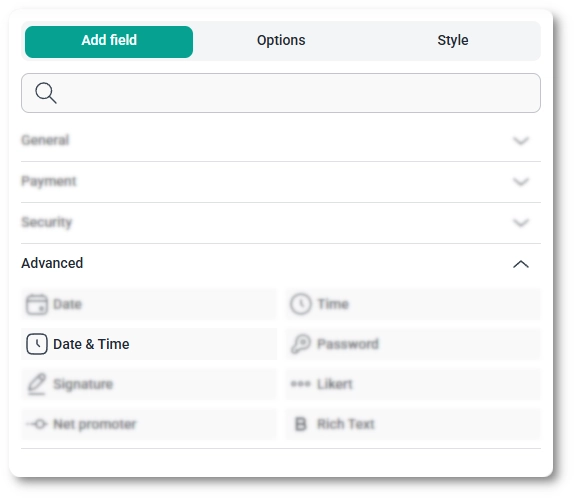
After selecting the Date & Time field in the preview, the side panel switches to the Options view, split across the General, Advanced, and Smart logic tabs. One choice shapes everything else: the Date & Time type you pick on the General tab decides which settings appear on both tabs, so it is worth setting first.

How do general settings work for the date and time field?

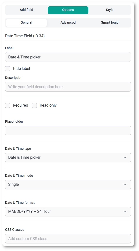
The General tab shows the field type (Date & Time) and its field ID, along with the options that control labeling, presentation, and format.

  • Label – the name shown above the field.
  • Hide label – removes the label on the front end.
  • Description – a short note under the field to guide the visitor.
  • Required – makes a selection mandatory before the form can be submitted.
  • Required message – the text shown when someone submits without a value; it appears once Required is enabled.
  • Read only – shows the field in a non-interactive state, and it is unavailable while Required is on.
  • Placeholder – example text shown before a value is chosen; available for the picker and input types.
  • Date & Time type – sets how the field is presented (picker, dropdown, or input); see the next section.
  • Date & Time mode – choose Single for one value or Range for a start and end; available for the picker and input types.
  • Date & Time format – sets how the value is laid out and clocked; see below.
  • CSS classes – custom class names for styling the field.

The Date & Time format dropdown offers four date layouts, MM/DD/YYYY, DD/MM/YYYY, YYYY-MM-DD, and DD.MM.YYYY, each available in either 24-hour or AM/PM time, for eight combinations in total. Pick the one that matches your audience’s region.

General settings tab for the Date & Time field in IvyForms

What date and time types can I choose?

The Date & Time type selector offers three presentations, and your choice changes which other options appear.

  • Date & Time picker – opens a calendar and clock the visitor clicks through; this type unlocks the full set of advanced options, including the calendar-availability and dynamic-date controls.
  • Date & Time input – a typed field following your chosen format; it shares the picker’s core options and adds a prefix and suffix.
  • Date & Time dropdown – separate selectors for year, month, day, hour, and minute; this is the simplest type, and it hides the Placeholder and Date & Time mode options as well as the advanced calendar controls.

How do advanced settings work for the date and time field?

The Advanced tab keeps every date and time setting in one place, with no separate date and time sections.

The options shown here depend on the Date & Time type. The dropdown type shows a reduced set (range, default, seconds, no duplicates, and label position); the input type adds a prefix and suffix to that set; the picker type shows all the options below.

  • Enable Date & Time range – a toggle that reveals Minimum date & time and Maximum date & time to bound the earliest and latest values someone can choose.
  • Default Date & Time – choose None, Current Date & Time, or Custom to pre-fill the field; the custom option lets you set a specific starting value.
  • Enable seconds – includes seconds in the time alongside hours and minutes.
  • No duplicates – stops the same date and time being submitted across entries.
  • Days of the week available in the calendar – limits which weekdays a visitor can pick.
  • Months of the year available in the calendar – limits which months a visitor can pick.
  • Available dynamic dates – restricts selectable dates to a rolling window relative to today, with options such as Any date, Past dates, Future dates, Past & today, Today & future, Last week, This week, Next week, Last month, This month, and Next month.
  • Exclude weekends / Exclude weekdays – removes Saturdays and Sundays, or Mondays through Fridays, from the calendar.
  • Allow to select datesPast dates and Future dates toggles that decide which side of today is open.
  • Week starts – sets the calendar’s first day to Monday or Sunday.
  • Prefix / Suffix – text shown before and after the field.
  • Label position – places the label in the Default position or to the Top, Left, or Right.

It helps to think of these in two groups. Available dynamic dates, Exclude weekends, and Exclude weekdays decide which dates appear in the calendar at all, while Minimum and Maximum date & time, Allow to select dates, and the day and month availability options control what a visitor can actually pick from those. For an appointment form, for instance, you might allow only future dates and exclude weekends.

Advanced settings tab for the Date & Time picker showing range, default, and calendar availability options

How can I use smart logic with the date and time field?

Smart logic is a Pro feature. It lets you show or hide the Date & Time field based on what visitors enter in other fields: set Conditional Logic to Yes, choose whether Any or All rules must match, then build rules from a source field, an operator (equals, does not equal, contains, or does not contain), and a value.

How does the date and time field look on the front end?

How the field appears depends on the type you chose. The picker opens a calendar and clock the visitor clicks through; the input type is a single box they type into following your format; the dropdown type shows separate selectors for year, month, day, hour, and minute. In Range mode the picker and input collect a start and an end value, and any prefix or suffix text frames the field on the input and picker types.

Date & Time picker on the front end showing the calendar and clock

After a form is submitted, the chosen date and time appear in both the single entry view and the all-entries table, shown in the format you set, and the value is included in email notifications and webhook payloads when those are enabled. Range selections carry both their start and end values through to each of these places.

What should I keep in mind when using the date and time field?

Pick the Date & Time type first, since it decides which other options you have, and choose a Date & Time format that matches your audience’s region so the order of day, month, and year is not ambiguous. Use the availability and dynamic-date options to keep visitors inside valid dates; for bookings, allowing only future dates and excluding weekends is a common setup. To customize colors, spacing, typography, buttons, and the overall form appearance, see the Style tab documentation.