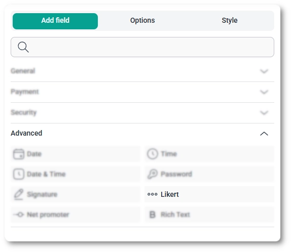
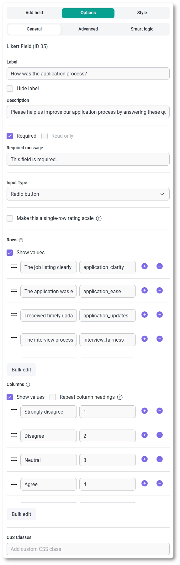
Table of contents
You are gathering feedback on your hiring process and want candidates to rate how strongly they agree with several statements, all on the same scale, without a wall of separate questions. The Likert field does that: it lays out a grid where each row is a statement and each column is a point on your rating scale, so respondents answer everything at a glance. This article covers where to find the field, how to build its rows and columns, the settings behind it, and where responses land after submission.
You can add the Likert field from the Advanced fields section in the left panel of the IvyForms builder. Expand Add field → Advanced, select Likert, and it is added to your form, ready to configure in the options panel.
After selecting the Likert field in the preview, the side panel switches to the Options view, split across the General, Advanced, and Smart logic tabs. Almost all of the work happens on the General tab, where you set the input style and build the rows and columns that make up the grid.
The General tab shows the field type (Likert) and its field ID, along with the options that control labeling, input style, and the overall shape of the scale.
The grid is built from two lists on the General tab: Rows hold the statements or questions respondents answer, and Columns hold the answer options or scale points they choose from. Each list uses the plus and minus buttons to add or remove entries and a handle to drag them into order, and a Bulk edit button lets you fill the list quickly.
The Advanced tab holds a single option, Label position, which places the label in the Default position or to the Top, Left, or Right.
Conditional rules for the Likert field live on the Smart logic tab and are a Pro feature. Turn Conditional Logic to Yes to control when the grid is shown or hidden, decide whether it reacts when Any rule or All rules are satisfied, then add rules that test another field against a value with equals, does not equal, contains, or does not contain. A typical use is to reveal a detailed satisfaction grid only after a respondent says they have used the product.
On the front end the field renders as a grid: the label sits at the top as the question, the columns run across as scale headings, and each row is a statement with a selector at every column. With the Radio button input type respondents pick one option per row; with Checkbox they can pick several. If you enabled Repeat column headings, the headers appear above each row rather than only once at the top, and if you switched on the single-row rating scale, the field shows just one row of options under your question.
After a form is submitted, each row’s selected answer appears in both the single entry view and the all-entries table, and the values are included in email notifications and webhook payloads when those are enabled. Where you set a separate value with Show values, it is that stored value (rather than the visible label) that carries through, which keeps responses easy to score or feed into a spreadsheet.
Keep your scale consistent across columns so every row is judged the same way, and lean on the column presets for well-worn scales like agreement or satisfaction rather than typing them out. Use Show values when you plan to score or analyze the results, turn on Repeat column headings for longer grids, and reach for the single-row rating scale when you only need one question rated. To customize colors, spacing, typography, buttons, and the overall form appearance, see the Style tab documentation.