Limited time discount
First Birthday, Big Savings
Up to 80%Off
Up to 80%Off
Grab Now
documentation-logo
Menu
  • Guides
  • Form Management
  • Payment fields

How does the product field work in IvyForms

You are building an order form for a USB-C charging cable that comes in three lengths at different prices, and you want customers to pick a length, choose how many they want, and watch the total update. The Product field is where that starts: it defines what is for sale and at what price. It is the first of three payment fields in IvyForms, working alongside Quantity and Total, and it is free to use. This article covers where to find the field, how the three payment fields fit together, the settings behind each product type, and where selections show up after submission.

Where can I find the product field in IvyForms?

You can add the Product field from the Payment fields section in the left panel of the IvyForms builder. Expand Add field → Payment, select Product, and it is added to your form, ready to configure in the options panel. The same Payment section also holds the Quantity and Total fields you will pair it with.

Payment fields section in the IvyForms builder showing the Product field

How do the product, quantity, and total fields work together?

The three payment fields split the work between them: the Product field defines the items and their prices, the Quantity field (mapped to a specific product) sets how many of an item someone wants, and the Total field adds everything up. With the cable example, you would offer three lengths in the Product field (1 m at $9.99, 3 m at $19.99, 5 m at $29.99), map a Quantity field to it, then drop in a Total field; if a customer picks the 5 m cable and sets the quantity to 3, the Total shows $89.97. For the full build, see the Quantity field and Total field documentation.

Prices use the currency set for the form in Form settings → Payment settings, so the symbol shown on the front end follows that setting rather than the field itself.

What settings can I configure for the product field?

After selecting the Product field in the preview, the side panel switches to the Options view, split across the General, Advanced, and Smart logic tabs. The General tab is where most of the work happens, and the options it shows change depending on the product type you pick.

How do general settings work for the product field?

The General tab shows the field type (Product) and its field ID, along with a set of options shared by every product type and a Product type selector that controls the rest.

  • Label – the name shown above the field.
  • Hide label – removes the label on the front end.
  • Description – a short note under the label to guide the customer.
  • Required – makes a selection mandatory before the form can be submitted.
  • Product type – sets how products are presented and priced; the options below it change with your choice.
  • CSS classes – custom class names for styling the field.
General settings tab for the Product field in IvyForms set to Radio

What product types can I choose, and what does each one need?

The Product type selector offers four ways to present products, and each one exposes its own settings.

  • Radio (the default) – the customer picks one item from a list you define, each with its own price.
  • Checkbox – the same kind of option list, but the customer can select more than one item.
  • Select – the option list as a dropdown; this is the only type with a Placeholder, which sets the prompt text shown before a choice is made.
  • Single – one fixed-price product rather than a list; here you set the Payment amount, an Amount label, and a Default value.
Single product type in IvyForms showing Payment amount and Amount label

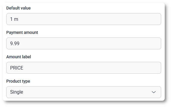
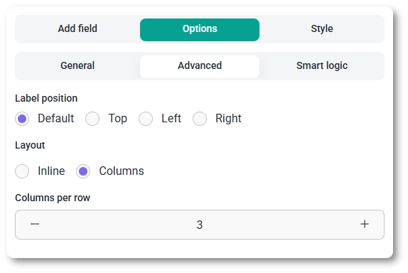
For the Single type these fields sit above the Product type selector, while the list-based types keep their settings below it.

How do I build the product option list?

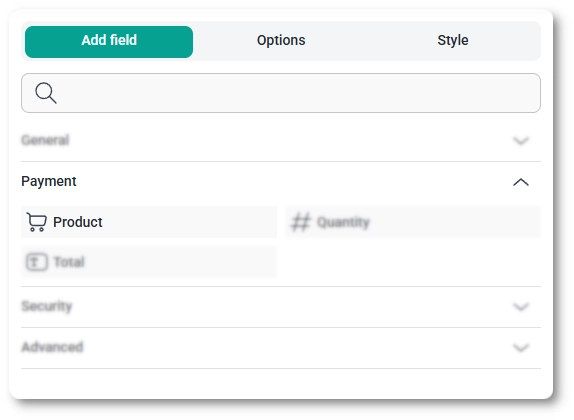
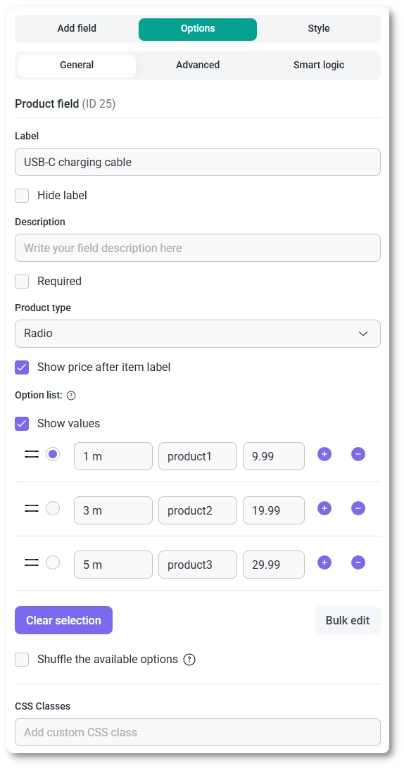
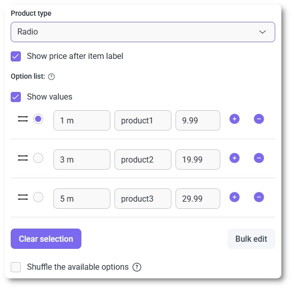
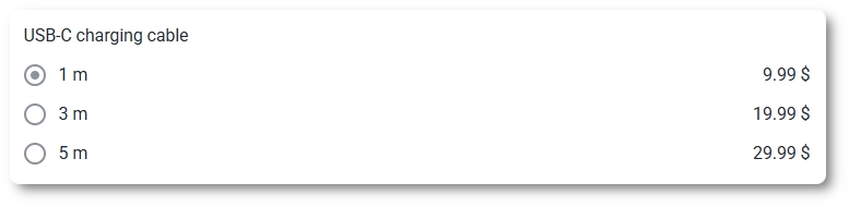
For the Radio, Checkbox, and Select types, you build a list where each row holds an item label, an optional value, and a price, with the plus and minus buttons to add or remove rows and a handle to drag them into order. A control on each row marks which item is selected by default.

  • Show values – reveals the value column so you can store a separate internal value alongside the label customers see.
  • Show price after item label – appends each item’s price next to its label on the front end.
  • Clear selection – removes the default selection so no item is preselected when the form loads.
  • Bulk edit – lets you edit all options at once instead of row by row.
  • Shuffle the available options – randomizes the order of items each time the form is shown.
Product option list in IvyForms with Clear selection, Bulk edit, and Shuffle options

How do advanced settings work for the product field?

The Advanced tab controls layout and label placement.

  • Label position – places the label in the Default position or to the Top, Left, or Right.
  • Layout – choose Inline to stack items in a single column (one item per row) or Columns to spread them across a row.
  • Columns per row – appears when you pick Columns and sets how many items sit side by side in each row.
Advanced settings tab for the Product field showing Layout and columns options

How can I use smart logic with the product field?

Smart logic is a Pro feature. It lets you show or hide the Product field based on what customers enter in other fields: set Conditional Logic to Yes, choose whether Any or All rules must match, then build rules from a source field, an operator (equals, does not equal, contains, or does not contain), and a value.

How do product selections look on the front end?

On the front end the field renders as a radio list, a set of checkboxes, or a dropdown depending on the type, with each item’s price beside its label when Show price after item label is on. The Layout setting decides whether those items stack in a single column or sit side by side across a row.

Product field on the front end shown as an inline list with prices

The inline list is usually the easier of the two to read, especially on narrow screens, since the columns layout can crowd longer labels and prices together in a single row.

Where do product selections appear after submission?

After a form is submitted, the chosen product and its price appear in both the single entry view and the all-entries table, and the value is included in email notifications and webhook payloads when those are enabled. The same selection feeds the Total field, which combines it with the mapped Quantity to produce the amount the customer pays.

What should I keep in mind when using the product field?

Give each option a clear label and set its price directly on the row, and use Clear selection when you do not want any item preselected. Pair the field with a Quantity field when customers can buy more than one, and add a Total field so they can see the amount before submitting. Stick with the Inline layout for readability unless you have a specific reason to spread items across columns. To customize colors, spacing, typography, buttons, and the overall form appearance, see the Style tab documentation.