

A new client doesn’t sign with an accounting firm because a landing page convinced them. They sign because someone they trust vouched for the firm, or because the firm showed…
Table of contents
A stranger lands on your page, looks around for maybe ninety seconds, and leaves without a trace. Nothing about that visit gets remembered unless something on the page catches it first.
Landing pages are still the top priority for lead generation. 43.6 percent of marketers rank new business capture above every other goal, according to Backlinko’s 2026 data.
Form placement matters. Field count matters too, more than most people assume going in. What actually decides whether a visit turns into a contact record worth calling is usually smaller than either of those: it’s whether the handoff after submission actually works.
Get the placement wrong, or ask for too much, or drop the ball on the handoff, and strong traffic still produces nothing worth calling.
What Is a Lead Generation Form
Strip the marketing language away and a lead form does one job. It trades a piece of content, a discount, or a look at a product, for a visitor’s name and email address.
That exchange is the whole mechanism. Take the offer away and the form turns into a wall nobody bothers to climb.
The wider discipline behind all this, turning anonymous visitors into contacts a business can follow up with, covers outbound calls, paid ads, and referrals too. Forms just happen to be the mechanism most websites default to.
A handful of pieces show up on almost every lead form, regardless of industry:
- Input fields for name and email, sometimes phone or company
- A call-to-action button that states the outcome
- A consent checkbox tied to how the data gets used
- The value exchange: a discount, a download, or a demo
Not every form on a website is a lead form, even though people use the terms interchangeably all the time. The difference between contact forms and lead generation forms really comes down to intent.
A contact form invites whatever question happens to be on someone’s mind. A lead form is narrower than that. It’s built around one specific action tied to one specific offer, and it doesn’t work well for much else.
HubSpot’s own site runs almost entirely on this model. A visitor lands on a template or tool page, trades an email for access, and becomes a contact record inside the CRM before ever speaking to a salesperson.
Every submission is the handoff point between anonymous traffic and a sales pipeline. Once that field data lands in a CRM, marketing and sales work from the same record instead of guessing who visited what.
What Types of Lead Generation Forms Exist
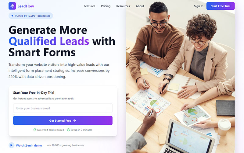
Different offers call for different form structures. The variants below cover most of what shows up on business websites, though the wider spectrum of form types used across the web goes even further than lead generation alone.
| Form Type | What It Captures | Typical Use |
|---|---|---|
| Contact form | General inquiry details | Sales questions, support |
| Newsletter opt-in | Email only | List building |
| Gated content form | Email plus name | Ebook, whitepaper access |
| Multi-step form | Qualification data | Demo requests, quotes |
| Exit-intent popup | Email, sometimes phone | Last-chance capture |
| Conversational form | Chat-style responses | Bot-driven qualification |
Newsletter opt-ins strip everything down to a single field. Grammarly’s homepage does this well, asking only for an email before anything else happens.
Subscription form examples across SaaS and media sites almost all follow this one-field pattern for the same reason. Friction kills sign-ups, fast.
Popups sit at the more aggressive end of the spectrum. A popup form interrupts the browsing session directly, which is why timing and trigger logic matter more here than on any other type. Anyone who’s had a popup fire the second they land on a page knows how quickly that kills goodwill.
Conversational forms (Drift, Intercom) swap the static field grid for a chat window that asks one question at a time. They feel less like paperwork, which is part of why B2B teams lean on them for higher-friction offers like demo bookings.
Once the type is chosen, the next step is usually building it. Creating a lead capture form from scratch takes minutes with most modern form plugins. No custom code required.
Where Should Lead Generation Forms Be Placed on a Website
Placement follows visitor intent. A stranger reading a blog post is not in the same headspace as someone who typed a branded search query and landed straight on a pricing page.
Blog posts work best with inline forms placed mid-article or at the end, tied to a specific content upgrade rather than a generic newsletter ask.
Homepages get the highest-intent traffic, so the form (or at least the CTA leading to one) usually belongs in the hero section, above any supporting copy. Basecamp puts its signup field directly in that top band, before a single feature gets explained.
Footers and sidebars catch the leftovers: visitors who scrolled the whole page without converting. Conversion rates run lower down there, but the volume adds up across a high-traffic site.
Unbounce ran the numbers on this at scale. Its Q4 2024 analysis of more than 41,000 landing pages and 464 million visits puts the median landing page conversion rate at 6.6 percent, with industry medians ranging from 3.8 percent for SaaS up to 12.3 percent for events and entertainment (Unbounce, 2024).
Landing Page Placement
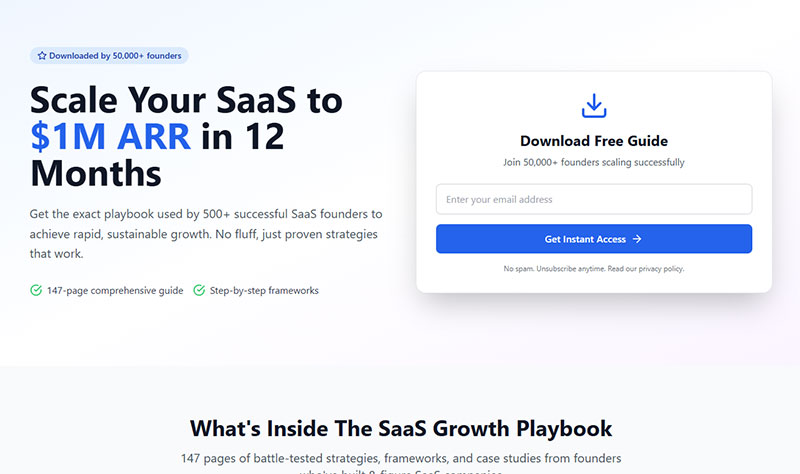
Dedicated, single-purpose pages consistently outperform forms bolted onto a general site page.
- No navigation menu to distract from the one action
- Headline and form message match the ad or link that sent the visitor
- One offer per page, not a menu of options
Following landing page form best practices matters more here than almost any other placement decision, since this is where paid traffic actually lands.
Exit-Intent and Popup Placement
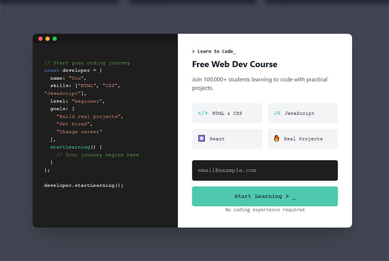
These triggers fire when a visitor’s cursor moves toward the tab bar or the back button, catching people who were already on their way out.
Wisepops pulled data from over one billion popup displays and puts the average exit-intent conversion rate at 3.94 percent, close to the 4.82 percent average across all popup trigger types (Wisepops, 2026).
Timing and offer quality separate the winners from the ignored. Real examples of exit-intent popups that actually convert almost always pair the trigger with a specific, relevant incentive, not a generic “wait, don’t go.”
Most sites run these through a dedicated tool. WordPress exit-intent popup plugins handle the trigger logic and frequency capping without custom development.
How Many Fields Should a Lead Generation Form Have
Fewer fields raise conversion up to a point. Past that point the relationship gets more complicated than “always cut fields.”
Digital Applied’s 2026 benchmark study found conversion drops modestly from 23.1 percent at 3 fields to 17.0 percent at 5 fields, then collapses to 11.4 percent at 7 fields and 6.9 percent at 10-plus fields (Digital Applied, 2026).
| Field Count | Conversion Rate | Drop From Baseline |
|---|---|---|
| 3 fields | 23.1% | Baseline |
| 5 fields | 17.0% | -6.1 points |
| 7 fields | 11.4% | -11.7 points |
| 10+ fields | 6.9% | -16.2 points |
A widely cited 2025 Formstack survey of 1,500 B2B decision-makers found forms asking for more than seven fields see abandonment rates around 67.8 percent, reinforcing the same field-count cliff shown above.
Required fields earn their place only when sales will genuinely use them. Name and email cover most offers.
Phone number belongs on the form only if it changes what happens on the first call. Same goes for company size or job title.
Progressive profiling sidesteps the whole tradeoff. Instead of asking for everything on visit one, the form collects a field or two per interaction and builds the full profile over several visits.
An often-cited Salesforce analysis found SaaS companies using progressive profiling see a 42 percent higher lead-to-customer conversion rate than those using static, one-time forms (Salesforce, 2025).
Airtable applies a version of this by asking for nothing more than an email address to start, then collecting the rest once the account already exists.
Picking the right fields matters as much as counting them. Choosing form fields that actually capture high-quality leads means asking what sales will use, not what would be nice to know.
What Makes a Lead Generation Form Convert
Button copy does some of the work. Field layout does more than most people expect. And trust, whether the page gives someone a real reason to believe the form is safe to fill out, usually decides the rest.
Get those right and optimizing the rest of the form becomes a smaller job. Mostly tweaks instead of a redesign.
Call-to-Action Button Copy

HubSpot’s analysis of over 330,000 CTAs found personalized button copy converts 202 percent better than generic defaults like “Submit” (HubSpot).
Pronoun choice alone moves the needle. A widely cited ContentVerve test found that switching “Start your free trial” to “Start my free trial” produced a 90 percent lift in click-through rate, same offer, same button color (ContentVerve).
- Name the outcome, not the action (“Get My Free Guide” beats “Submit”)
- First-person pronouns (“my”) tend to outperform second-person (“your”)
- Match tone to audience. B2B enterprise copy can stay a notch more formal than B2C
Unbounce’s own landing pages favor benefit-driven copy, phrases like “Get My Demo” instead of a flat “Submit.”
Browse call-to-action examples across industries before writing button copy from scratch. Seeing what’s already been tested saves a few rounds of guessing.
Visual Layout and Field Design
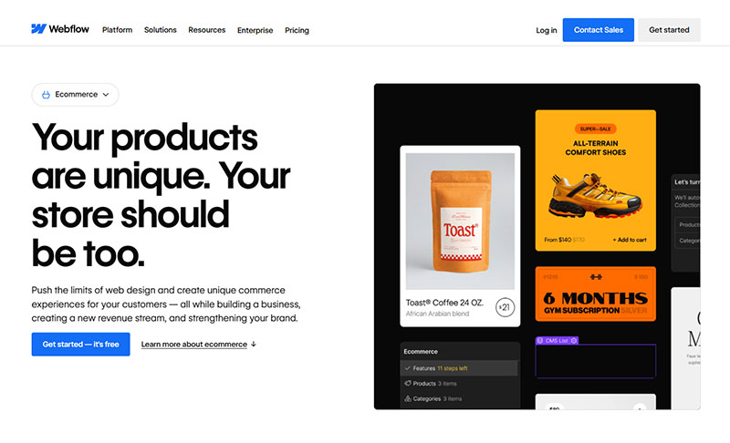
Eye-tracking research popularized by designer Luke Wroblewski, and later confirmed by the Nielsen Norman Group, found that top-aligned labels in a single vertical column let users complete forms noticeably faster than horizontal or left-aligned layouts. The label and field can be read in one eye movement instead of a zigzag pattern.
Label placement matters almost as much. Labels sitting directly above the field read faster than labels beside it, especially on mobile where horizontal space is already tight.
Whitespace between fields reduces the feeling of a wall of inputs, even when the actual field count hasn’t changed.
Working out the details before building anything saves rework later. Designing a lead capture form around these layout principles from the start beats retrofitting them after launch.
Trust Signals and Social Proof
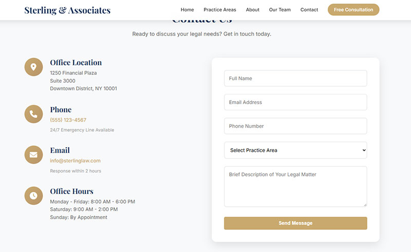
A form with no visible trust signal is asking for something while giving nothing back.
Baymard Institute analyzed 147 ecommerce sites and found trust signals, particularly security badges placed near payment fields for lesser-known brands, lift conversion by 15 to 30 percent on average. Results ranged from a 5 percent drop to a 75 percent gain depending on execution (Baymard Institute).
A short privacy line near the submit button works. So does a real testimonial, or a visible security note tucked somewhere nearby. Vague reassurance like “we care about your privacy” does less than a specific one, something like “we never sell your email.”
Poor execution backfires, too. A security badge that raises a question nobody was asking (why does a newsletter form need bank-level encryption?) can lower trust instead of building it.
How to Use Lead Magnets and Gated Content With Forms
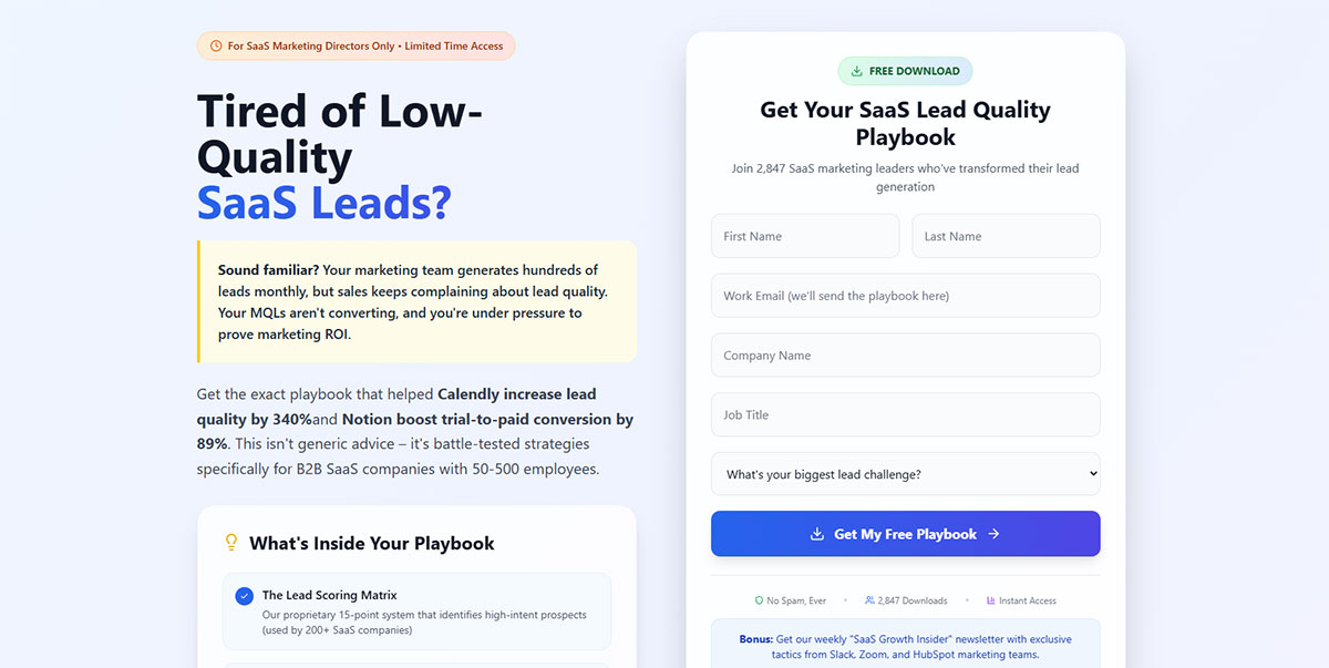
The form is only half of this. A lead magnet is whatever’s sitting behind it, the actual thing someone gets in exchange for handing over an email address.
What counts as a lead magnet spans a wide range, from a simple checklist to a full interactive tool.
- Ebooks and guides
- Checklists and templates
- Calculators and interactive tools
- Webinar registration
The whole model runs on gated content logic: value sits on the other side of the form, and the form is the only door through.
Format performance has shifted hard in the last two years. Static gated PDFs and ebooks typically convert in the low-to-high single digits on a landing page, while interactive formats like quizzes and calculators regularly convert several times higher, according to multiple 2026 lead-magnet benchmarking reports.
Demand for gated material hasn’t disappeared, though. NetLine’s 2024 report, built from 6.2 million first-party content registrations, measured a 14.3 percent year-over-year rise in gated content demand, with ebooks still accounting for 39.5 percent of that demand (NetLine, 2024).
Field depth should track offer value. A low-commitment checklist justifies one field. A detailed industry report can justify two or three, since the visitor already sees more value waiting on the other side.
Content upgrades embedded directly inside a blog post convert differently than a standalone gated page, mostly because the offer is already relevant to whatever the visitor is reading.
To capture leads effectively, you need to embed lead capture forms in high-traffic areas.
Semrush gates several of its deep-dive industry reports behind nothing more than an email field, feeding its list through blog traffic that’s already searching for the topic.
Delivery matters after submission too. Some forms auto-email the resource, others redirect straight to a download or a webinar registration confirmation. Either way, the confirmation step is part of the experience, not an afterthought.
Single-Step Forms vs Multi-Step Forms
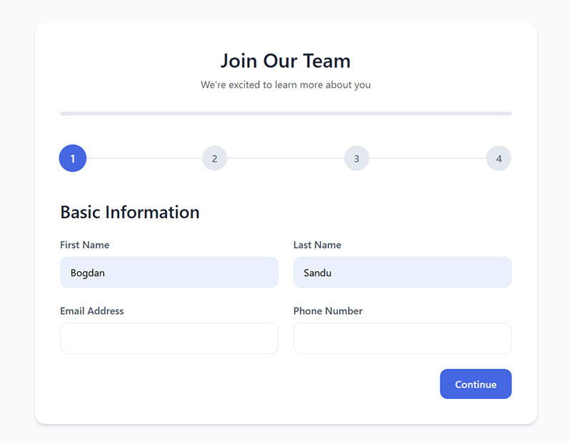
A single-step form is what most people picture: every field, one screen, done. Multi-step forms break that same set of fields across two or more screens instead, usually with some kind of progress indicator so the visitor knows how far they’ve got left.
Formstack’s research found multi-page forms convert at 13.9 percent, versus 4.5 percent for single-page forms, more than triple the completion rate (Formstack).
HubSpot’s data points the same direction. Multi-step forms convert 86 percent higher than single-step alternatives, though only 40 percent of marketers currently use them (HubSpot).
| Factor | Single-Step | Multi-Step |
|---|---|---|
| Best for | Quick, low-friction offers | Longer, qualification-heavy offers |
| Perceived effort | All fields visible at once | Broken into smaller chunks |
| Typical use case | Newsletter signup | B2B demo request, quote form |
The lift comes from perceived effort more than actual effort. Seeing three fields per screen feels lighter than seeing nine at once, even when the total is identical.
A visible progress bar reinforces that feeling. Once someone completes step one, walking away means losing progress already made.
Typeform popularized the one-question-per-screen version of this format, and most modern multi-step lead forms still borrow directly from that pattern.
Neither format wins by default. For a deeper breakdown of when each structure fits, comparing single-step and multi-step forms side by side against your specific offer type settles it faster than guessing.
How to Connect Lead Generation Forms to CRM and Email Marketing Platforms
A form that isn’t connected to a CRM just collects data nobody acts on.
Native integrations handle most of the load. HubSpot forms feed straight into HubSpot CRM, and Salesforce runs its own Web-to-Lead setup for forms built outside its ecosystem.
| Integration Method | How It Works | Best For |
|---|---|---|
| Native connection | Form and CRM share one vendor | Single-platform stacks |
| Zapier or Make | Connector maps fields between tools | Mixed tool stacks |
| Web-to-Lead | Salesforce-hosted form endpoint | Salesforce-first sales teams |
Pipedrive automatically creates a deal record the moment a form-based lead lands in its CRM, skipping manual data entry.
Routing speed matters more than the connection method itself. Chili Piper’s 2025 benchmark study of nearly 4 million form submissions found letting prospects book a meeting immediately after form fill lifts inbound conversion from 30 percent to 66.7 percent (Chili Piper, 2025).
Notification emails need their own check. Misconfigured WordPress email settings are a common reason form submissions silently vanish instead of reaching a rep’s inbox.
Even well-built forms run into this. WPForms not sending email is one of the most searched troubleshooting issues in the plugin’s own support channels, usually tracing back to server mail configuration rather than the form itself.
What happens right after submission is part of the connection, not separate from it. A clear submission confirmation message tells the visitor the handoff actually worked, whether that’s a redirect, an on-page message, or an autoresponder email.
How to Test and Optimize Lead Generation Forms
A form isn’t finished at launch. It’s finished after the first few rounds of testing show what visitors actually do with it.
A/B testing platforms like Optimizely and VWO handle the split traffic and the statistical math behind each test.
Testing rigor has improved over time. An early, widely cited analysis of 28,304 CRO experiments found only 20 percent reached the 95 percent statistical significance level that conversion rate optimization treats as standard. More recent data tells a better story: Convert’s own analysis of experiments run on its platform in 2025 found 70 percent now reach 95 percent-plus confidence, with nearly half reaching 99 percent-plus (Convert, 2025).
A few places are worth testing first.
- Headline and offer, since these carry the largest impact on conversion
- Button copy, tested one variable at a time
- Field count and order, especially around the 5-to-7 field range where earlier drop-off data showed the sharpest cliff
Session recordings and heatmaps show the parts a raw conversion number can’t. Hotjar’s own marketing team relies on session recordings to catch exactly where visitors hesitate before abandoning a signup form.
Watching where a cursor pauses, or where a field gets clicked twice, tells a different story than a completion percentage alone.
Testing isn’t only about design. Form validation best practices reduce a specific kind of drop-off: the visitor who submits, hits an error, and never tries again.
Clear, specific error text keeps that visitor in the form instead of losing them. Well-written error message examples point to the exact field and the exact fix, not a generic “something went wrong.”
Once a test shows a real result, act on it. General form optimization compounds test by test rather than through one big redesign.
For abandonment specifically, small changes usually beat a full rebuild. Ideas for improving form abandonment rate tend to focus on the two or three fields where most people actually leave.
What Mistakes Reduce Lead Generation Form Conversion Rates
Most form problems are self-inflicted. It’s rarely a traffic problem.
Requesting information the offer doesn’t justify tops the list. A phone number field on a newsletter signup signals a mismatch between what’s asked and what’s promised.
An extra optional field on one of Expedia’s checkout forms once cost the company an estimated 12 million dollars in a single year, a case study still cited across conversion research.
| Mistake | Effect | Fix |
|---|---|---|
| Mismatched fields | Signals distrust, raises abandonment | Match fields to offer value |
| Visible CAPTCHA | Adds friction before submit | Switch to invisible verification |
| Slow load time | Visitors leave before the form renders | Compress assets, cut scripts |
CAPTCHA deserves a callout of its own. A Stanford University study found CAPTCHA challenges can reduce form conversion by up to 40 percent, and Forrester Research reported 19 percent of consumers have abandoned a website entirely after encountering one (Stanford University; Forrester Research). Picking crosswalks out of a grid of blurry photos is nobody’s idea of a good time, and apparently plenty of people would rather leave than finish the puzzle.
Spam still needs blocking, just not with a visible puzzle. A honeypot field catches bots without asking a human to prove anything.
Broader spam defense usually combines a few of these methods rather than one. Effective spam prevention tactics layer honeypots, rate limiting, and invisible scoring instead of relying on a single gate.
For sites that still need bot protection with less friction, CAPTCHA alternatives exist that verify in the background instead of interrupting the visitor.
Load time compounds every other mistake on this list. Google’s 2017 research found 53 percent of mobile visitors abandon a page that takes longer than three seconds to load, and a slow-loading lead form never even gets the chance to lose someone on field count or copy (Google, 2017).
Accessibility gaps quietly cut off a segment of visitors too. Form accessibility best practices cover screen reader labels, keyboard navigation, and contrast, issues that never show up in a standard conversion report.
How to Make Lead Generation Forms Privacy Compliant
Privacy compliance isn’t optional once a form collects a name and email address tied to a real person.
Building GDPR compliant forms and building CCPA compliant forms overlap in places, but the two frameworks set different specific rules.
| Requirement | GDPR | CCPA |
|---|---|---|
| Consent default | Opt-in, unchecked by default | Opt-out, sale or share by default |
| Response window | No fixed number for consent itself | 15 business days for opt-out requests |
| Re-consent wait | Withdrawal honored immediately | 12 months before re-asking to opt in |
Mailchimp built double opt-in into its EU-facing signup forms as the default setting, not an option a business has to switch on.
GDPR Consent Requirements
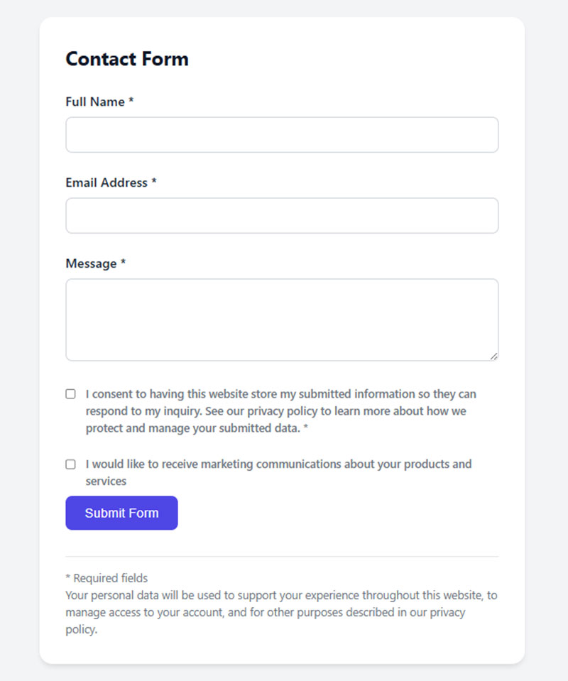
The consent checkbox has to start empty and take an active click to fill. Explicit, unchecked, no exceptions.
The Court of Justice of the European Union’s Planet49 ruling, later reinforced by European Data Protection Board guidance, settled this directly. Pre-ticked boxes, silence, and inactivity do not count as valid consent under GDPR.
Checking a box also can’t be a condition of submitting the rest of the form when consent covers a separate purpose, like marketing emails on top of a requested download.
Browse real GDPR consent form examples before writing checkbox copy. Seeing compliant wording next to non-compliant wording makes the difference obvious fast.
CCPA and US Privacy Requirements
California residents get an opt-out right instead of an opt-in requirement, a structural difference from GDPR worth repeating here.
Once a business receives a valid opt-out request, it has to stop selling or sharing that person’s data within 15 business days, per current CCPA regulation.
A business also cannot ask the same person to opt back in for at least 12 months after an opt-out, and the re-consent request itself has to be a clear, unpressured choice.
At minimum, sites collecting data from California residents need two designated opt-out methods, and at least one has to be an interactive web form rather than an email address alone.
How to Measure Lead Generation Form Performance
Conversion rate is the starting metric: form submissions divided by form views, multiplied by 100.
Completion rate measures something different and shouldn’t get confused with it. Zuko’s 2025 benchmarking data found that of everyone who views a form, about 45 percent go on to complete it, while of those who actually start filling one out, about 66 percent finish (Zuko, 2025).
Conversion rate counts everyone who ever saw the form, whether they clicked into it or not. Completion rate is stricter. It only counts people who’d already started, and that’s exactly why the two numbers almost never line up.
- Conversion rate: submissions divided by total views
- Completion rate: submissions divided by form starts
- Field-level drop-off: where inside the form people quit
Comparing a result against the wrong benchmark leads to bad decisions. Conversion rate benchmarks by industry vary widely enough that a strong SaaS number can look like a weak events-industry number and vice versa.
ConvertKit displays a live conversion rate per form directly in its own dashboard, without requiring a separate analytics tool.
Most sites still route form data through a dedicated analytics setup. Google Analytics remains the dominant web analytics tool by a wide margin, and Google Tag Manager, the tool most teams use to fire the form-submission event, is installed on roughly 65 percent of ecommerce sites, with adoption climbing steadily in recent years.
Setting this up correctly matters more than picking the tool. Tracking form submissions in Google Analytics as a conversion event, not just a raw event, is what makes the number usable in reporting.
Conversion rate and completion rate only tell part of the story. The KPIs worth tracking alongside them include cost per lead, lead-to-customer rate, and time to first contact.
FAQ on Using Website Forms For Lead Generation
Do Lead Generation Forms Need a Phone Number Field
Only when sales genuinely needs to call before the first meeting. A phone field on a newsletter or ebook form raises abandonment for no real benefit. Reserve it for demo requests and B2B forms where a live call happens early.
What Is Progressive Profiling in Lead Generation Forms
Instead of asking for everything on the first visit, progressive profiling spreads the ask out. One or two new fields show up per visit, and a returning visitor sees different questions than a first-timer would, until a fuller profile builds up without ever needing one long form.
Is CAPTCHA Necessary on a Lead Generation Form
Not always. Visible CAPTCHA can cut conversion sharply, and invisible alternatives now block bots just as well. A honeypot field or behavior-based scoring stops most spam without asking a real visitor to prove anything.
Can Chatbots Replace Lead Generation Forms
Not entirely. Conversational tools like Drift and Intercom handle qualification well, but structured forms still capture data faster at scale. Comparing chatbots vs forms usually comes down to offer complexity: simple asks favor forms, nuanced ones favor a chat interface.
What Is Conditional Logic in a Lead Generation Form
Selecting “enterprise” on a signup form can reveal a company-size question that someone who picks “individual” never even sees. That’s conditional logic at work. Fields show or hide based on a previous answer, which keeps the form short for most visitors while still pulling detail out of the qualified ones.
Do Lead Generation Forms Need Double Opt-in
Not under GDPR itself, but it’s considered best practice, especially in Germany and across the EU. A confirmation email after submission verifies the address is real and gives written proof of consent if a regulator ever asks.
How Many Steps Should a Multi-Step Lead Generation Form Have
Two to four steps covers most offers. Simple lead capture works in two, a detailed quote or application can stretch to four. Beyond that, visitors start wondering how much further they have left, and abandonment climbs.
Should a Lead Generation Form Ask for a Work Email Instead of a Personal One
For B2B offers, yes. A work email field, sometimes paired with free-email blocking, filters out low-intent signups and gives sales a domain to research before the first call. B2C forms rarely need this distinction.
What Is a Good Conversion Rate for a Lead Generation Form
It depends on traffic source and offer type. A cold-traffic newsletter signup performing in the mid-single digits is healthy, while a warm-traffic demo request near double digits counts as strong. Compare against your own funnel stage, not a flat number.
Do Lead Generation Forms Need to Be Optimized Separately for Mobile
Yes. Field spacing, button size, and keyboard type behave differently on a phone than a desktop screen. Following mobile form best practices keeps inputs easy to tap and prevents a form that converts well on desktop from losing mobile traffic.
Conclusion
Button copy and field order get most of the attention, but neither matters as much as what happens the second someone hits submit. Fixing response time does more for a form’s real output than any layout change will.
Start with one page. Strip it down to three fields, wire it into a CRM, and get submissions routed to a live rep inside five minutes.
Progressive profiling, multi-step formats, a stack of gated content offers, none of that is the foundation. It’s what gets layered on once the basics already work.
There’s a soft ceiling on cold-traffic conversion, and no amount of clever copy breaks through it completely. An exit-intent popup or a sharper offer can nudge the number. It won’t rewrite it.
Pick one form this week. Fix the handoff before you touch the button color.