



A form is usually the last thing standing between a visitor and whatever you actually want them to do: buy something, sign up, ask a question. Optimizing that form means…
Table of contents
Visitors decide whether a site looks worth their time in roughly 50 milliseconds. Before a single word gets read, the judgment is already made.
Almost all of that happens in the hero section, the full-width block above the fold that holds your headline, primary CTA, and main visual.
These hero section examples pull from real pages built by Stripe, Linear, Notion, Nike, and Allbirds, plus the design tools behind them.
What Is a Hero Section?
That opening band of content at the very top of a page, before anyone scrolls anything. Headline, subheadline, one primary call-to-action, and a supporting visual or background sitting behind it.
Think of the top of Stripe, Linear, or an Apple product page. Everything above the fold is the hero.
The term gets muddled a lot. People call it a banner, a masthead, a slider, and none of those quite fit. A banner is usually a thin promo strip running across the top of an existing layout, while a hero owns the entire top viewport. Sliders rotate through multiple frames. A hero picks one message and commits.
The hero section is almost always the Largest Contentful Paint element on the page, which ties it directly to Google’s Core Web Vitals scoring. Images account for roughly 71% of LCP elements across the web, and on most marketing sites that image is the hero.
One thing worth clearing up early. The hero lives on both homepages and landing pages, but the job shifts depending on which one you’re building, and that difference between a homepage and a dedicated landing page changes how much the hero has to carry.
What Elements Make Up a High-Converting Hero Section?
A value-proposition headline, a subheadline supporting it, one primary CTA, a product visual, and a single trust signal. Strip any of them out and performance usually drops.
Eye-tracking consistently shows attention landing on the headline first, then the visual, then the CTA. Everything else gets a fraction of the dwell time, which is why the headline is where testing pays off first.
The Headline and Subheadline Pairing
The headline names the outcome. Whatever the reader gets, say it there. Then the subheadline picks up the leftovers, usually the how or the who-it’s-for.
Most SaaS headlines land in the 30 to 70 character range. Short enough to read in a glance, long enough to say something real.
Outcome-driven headlines outperform feature-led ones consistently. “We help teams cut costs 30%” beats “Powered by AI” because it names the reader’s result rather than your architecture.
The Primary Call-to-Action
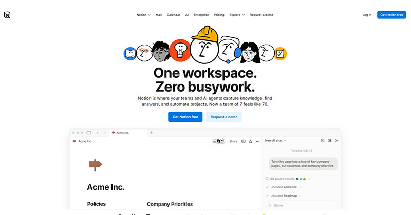
One primary action. That’s the rule.
Unbounce’s analysis of 18,639 landing pages found pages with a single link or CTA convert at 13.5%, pages with two to four links drop to 11.9%, and pages with five or more fall to 10.5%. Every competing action costs you.
Notion pairs a strong primary (“Get Notion free”) with a quieter secondary (“Request a demo”), so the hierarchy stays clear. A secondary link is fine. Two buttons of equal weight is not.
Good CTA copy tells you what you get on click. If you want to see the pattern across industries, studying real call-to-action button examples is a faster teacher than any rulebook.
The Supporting Visual or Background
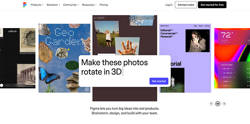
Show the product or set the mood. Real product screenshots beat generic stock every time.
Stock photography in a hero tends to underperform real product shots in A/B tests, because a smiling person at a laptop tells the visitor nothing about what they’re buying. Show the thing. Don’t decorate around it.
What Are the Main Types of Hero Sections?
Centered text, split-screen, image background, video background, illustration-led, minimal text-only, product-shot. Each fits a different job and carries a different load cost.
| Type | Best For | Watch Out For |
|---|---|---|
| Centered text | SaaS, software | Can feel generic if headline is weak |
| Split-screen | Physical products, services | Reflows awkwardly on mobile |
| Video background | Brand mood, campaigns | Hurts LCP and mobile speed |
| Minimal text-only | Portfolios, agencies, editorial | Leans entirely on typography |
Centered Text Heroes
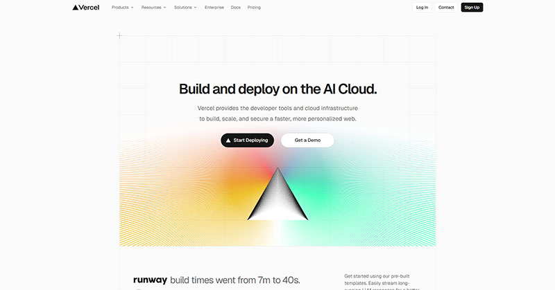
Bold centered headline, short subheadline, one or two CTAs. No lateral distraction.
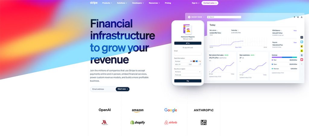
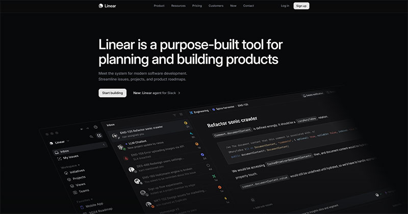
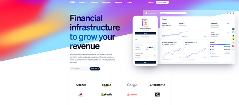
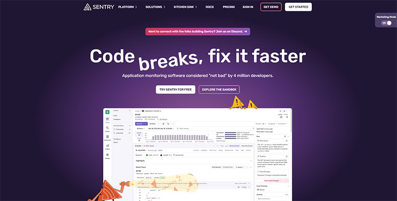
Centered layouts dominate software marketing because they mirror how we read a summary: claim, qualifier, action, straight down the middle. Stripe and Linear both run this pattern with a gradient or product screenshot sitting just under the text.
Split-Screen Heroes
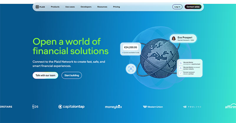
Text on one side, visual on the other. It works when the product is physical, or when the offer needs a human face sitting next to the copy.
The catch shows up at 375px, where those two columns stack and the visual usually drops below the copy. Sometimes that’s fine. Often it means the phone visitor scrolls past a headline with nothing to look at.
Split-screen suits physical products and service businesses, but you have to design the stacked mobile version deliberately, not as an afterthought.
Image and Video Background Heroes
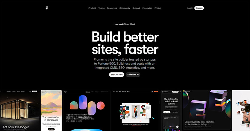
Full-bleed image or looping video behind the text. Great for mood. Rough on performance.
LCP is the metric most sites fail, and hero media is the usual culprit. Only 62% of mobile origins record a good LCP score, against 77% for INP and 81% for CLS. Nike leans on full-bleed motion for campaign pages, but swaps video for a static poster on mobile to protect load time.
Minimal Text-Only Heroes
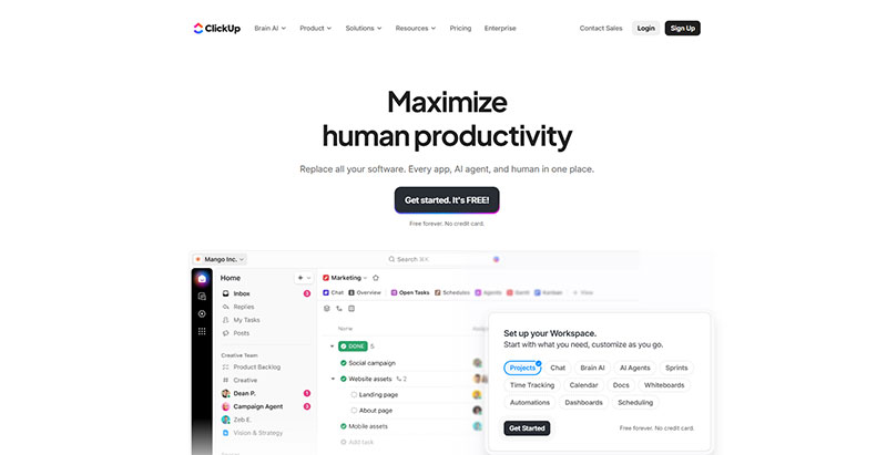
No background image. Strong type carries the whole thing.
This is the easiest hero to make responsive and the easiest to pass Core Web Vitals with. Editorial sites, agencies, and portfolios use it because the writing or the brand voice is the product.
What Are the Best SaaS Hero Section Examples?
SaaS heroes are the most-copied category on the web. The good ones tend to run a benefit-first headline, one sharp CTA, and a product visual that shows the interface rather than describing it.
Linear, Notion, and Stripe all use custom illustration, product UI, or subtle animation rather than photography. That choice signals “this is software” faster than any stock image could.
Stripe runs a gradient background behind an animated code snippet, with a developer-first headline sitting on top. The visual is the pitch. Linear goes dark UI, a real product screenshot, one tight value line, nothing else. Notion runs a dual CTA (free signup plus demo request) over a template preview, and Slack keeps a benefit-led headline above a screenshot of an actual workspace.
Personalized CTA copy converts 202% better than generic buttons, according to HubSpot’s analysis of more than 330,000 CTAs. If the page targets a specific segment, the hero CTA should say so.
What Are Strong Ecommerce Hero Section Examples?
Ecommerce heroes sell a product, not a signup. The pattern shifts toward a single product shot, one purchase-focused CTA, and copy that makes a claim about the item itself.
Mobile matters more here than anywhere. Around 70% of Shopify orders are placed on mobile devices, so the hero has to convert on a phone screen first.
Glossier goes lifestyle imagery with minimal copy and a brand-forward tone, which only works because the brand is doing the persuading. Nike runs full-bleed motion tied to a campaign headline.
Shopify stores rotate hero content for seasonal and promo pushes, swapping the visual and CTA without rebuilding the layout. “Shop now” behaves differently from “Add to cart,” so the verb gets tested against the traffic source.
What Are Effective Portfolio and Agency Hero Sections?
Here the goal is credibility, not conversion. The hero has to prove taste and competence in the first second, because visual appeal gets judged in about 50 milliseconds (Lindgaard et al., 2006).
Design beats copy in that window. Stanford’s Web Credibility Project found 46.1% of users justified their assessment of a site’s credibility by its visual appearance, ahead of any content-based reason.
Designer portfolios often go oversized-type, name-as-headline, with a small scroll cue at the bottom. Agencies lead with a bold claim plus a row of selected-client logos as instant proof.
Studios like Active Theory and Locomotive push into animated and WebGL heroes that win Awwwards.
The tradeoff is real, though. Heavy animation and WebGL fight against accessibility and load time, and that hero is usually the LCP element, so the flashier it gets, the harder the Core Web Vitals pass.
How Do Mobile Hero Sections Differ From Desktop?
Mobile hero sections stack instead of sitting side by side, drop the CTA into thumb reach, and often swap video for a static poster. Mobile now drives around 60% of global web traffic, so the phone layout is the primary version, not a shrink-down.
Stacking and Reordering
On a narrow screen, a split-screen hero collapses to one column. The visual usually drops below the text, sometimes behind it.
Real estate marketing platform Carrot found that trimming hero content on mobile pushed the form higher and won on nearly every test site. At Carrot, mobile accounts for 57% of traffic and 61% of conversions, so that reorder mattered directly to revenue.
CTA Placement and Reach
Put the primary button in the lower third, where the thumb naturally rests.
Load time compounds every other decision here. A fast, reachable CTA beats a beautiful one buried under a heavy image, and mobile visitors abandon slow pages faster than desktop users do.
Media Swaps for Speed
Background video is the first thing to go on mobile. Per the 2025 Web Almanac, 48% of mobile origins pass all three Core Web Vitals against 56% on desktop, and LCP is the metric that fails most.
There’s a detail in that data worth acting on. Home pages score worse than deeper pages, 45% versus 56% on mobile, precisely because home pages carry the heaviest hero media and the largest LCP element. The page you most want to be fast is usually your slowest.
Swapping video for a static poster image protects the score without killing the look.
How Do You Build a Hero Section in Common Tools?
Figma handles the design side, Webflow and Framer cover no-code production, and Tailwind CSS is where hand-coded markup happens. The tool you pick shapes how fast you can test variants, which matters more than most teams admit up front.
| Tool | Best For | Trade-off |
|---|---|---|
| Figma | Design, handoff | Not a live site |
| Framer | Landing pages, animation | Less CMS depth |
| Webflow | Complex production sites | Steeper learning curve |
| Tailwind | Custom-coded heroes | Needs a developer |
Figma and Design Handoff
Figma is where the hero gets designed before anything goes live. Auto-layout frames and constraints let the headline, CTA, and visual reflow cleanly at different widths.
It stays a mockup, though. Figma isn’t a web builder, so responsive behavior gets handed to whoever builds the live version.
Webflow and Framer
Framer works the way Figma works. Frames and stacks, elements that stay independent, so you can copy a hero and try a variant without breaking the original.
Webflow is built on classes instead. Change one class and every element sharing it updates. Powerful, and punishing if you didn’t plan your class structure before you started.
Framer sits closer to the design side and has pulled real adoption among designers who already think in Figma layers. Webflow wins on complex, production-grade sites with deeper CMS features.
Tailwind and Hand-Coded Heroes
For a custom hero, Tailwind CSS handles the layout with flex and grid utilities.
The spacing scale enforces consistency, so the white space around a headline stays even without hand-tuning every margin. You get full control of the markup, but you need someone comfortable in code.
What Common Mistakes Weaken a Hero Section?
Vague headlines, competing CTAs, images that bury the CTA, slow-loading media, low text contrast, carousels. Each one quietly drains conversion.
Slider heroes are the worst offender. When Erik Runyon tracked carousel interaction across Notre Dame’s sites, only about 1% of visitors clicked a feature at all, and roughly 89% of those clicks landed on the first slide. Your best content ends up hidden behind a rotation nobody waits for.
- Headlines that describe the company instead of the visitor’s outcome
- CTA overload, where five or more links on a page drops conversion from 13.5% to 10.5%
- A heavy hero image that pushes the button below the fold
- Oversized hero images, the leading cause of failed LCP
- Text that disappears into a busy background image
Startup pages fail most often by leading with a tagline instead of a value proposition, or by putting visual polish ahead of message clarity. “The AI Platform for Growth Teams” is a tagline, not a promise.
What Makes a Hero Section Convert Better?
One clear primary action, a benefit-first headline, social proof above the fold, and message match between the ad and the page. The headline is usually the biggest lever of those.
Message match is also the cheapest win available. If the ad promises one thing and the hero says another, the visitor has to reconcile the gap before they can act, and most won’t bother. Making the page headline echo the ad costs nothing and requires no redesign.
One Action, Stated Clearly
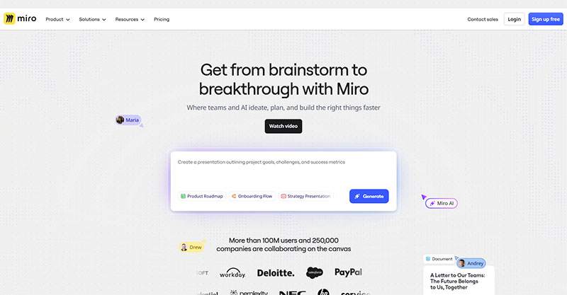
A single primary CTA beats a crowded hero. First-person button copy (“Get My Free Guide”) tends to outperform second-person (“Get Your Free Guide”) because it frames the click as the visitor’s own decision.
Dropbox built its early growth on exactly this. One clean value line, one action, an illustration instead of clutter.
Benefit-First Headlines
Compare “The Only CRM with AI-Powered Lead Scoring” against “Close 30% More Deals Without Working More Hours.”
The second one wins because it names the reader’s outcome rather than the product spec. Since the headline is the first thing eye-tracking picks up and the last thing most teams get around to testing, this is where the first experiment belongs.
Proof and Message Match
Put one trust signal above the fold. A logo row, a star rating, a specific customer count.
Then test the pieces one at a time. Unbounce’s Q4 2024 benchmark data puts the median landing page conversion rate at 6.6%, with top performers clearing 10%, and that gap gets closed by isolated A/B tests on the headline, the CTA verb, and the button, not by redesigning everything at once.
FAQ on Hero Sections
What is a hero section on a website?
A hero section is the full-width block at the top of a page, above the fold. It holds the headline, subheadline, primary CTA, and a supporting visual, and it’s the first thing every visitor sees.
What should a hero section include?
A benefit-driven headline, a supporting subheadline, one primary CTA, a product visual, and a single trust signal. Drop any of them and performance usually falls.
What size should a hero image be?
A common desktop baseline is 1920 x 1080 pixels, compressed well under 500KB and served in a modern format like WebP or AVIF. For mobile, a static image around 800 x 1200 pixels works better than scaled video.
What are the main types of hero sections?
The core types are centered text, split-screen, image background, video background, illustration-led, minimal text-only, and product-shot. Stripe uses gradient-plus-code, Airbnb puts search in the hero, Dropbox leans on illustration.
What makes a good hero section headline?
A good headline names the outcome, not the feature. Most SaaS headlines stay between 30 and 70 characters, and outcome-driven wording consistently outperforms feature lists in A/B tests.
How many CTAs should a hero section have?
One primary CTA. Unbounce found single-link pages convert at 13.5% against 10.5% for pages with five or more links. A quiet secondary link is fine, but only one action should dominate.
Should hero sections use sliders or carousels?
No. In Erik Runyon’s Notre Dame tracking, only about 1% of visitors clicked a slider feature, and roughly 89% of those clicks went to the first slide. Sliders also drag down LCP. One strong static hero wins.
How do mobile hero sections differ from desktop?
On mobile, split-screen layouts stack to one column, the CTA moves into thumb reach, and background video gets swapped for a static poster. Mobile drives around 60% of global web traffic, so it’s the primary layout.
What tools do you build a hero section with?
Figma handles design, Framer and Webflow cover no-code production, and Tailwind CSS suits hand-coded markup. Framer works like Figma with frames and stacks, while Webflow runs on a class-based system.
Why is the hero section important for SEO?
The hero is almost always the Largest Contentful Paint element, so it directly shapes Core Web Vitals scores. Only 62% of mobile origins record a good LCP, and heavy hero media is the leading cause of failure.
Conclusion
The best hero section examples all share one habit: they say one clear thing, fast. A single primary CTA, a benefit-first headline, and a visual that shows the product instead of decorating around it.
Layout follows the job. Centered text for SaaS, split-screen for physical goods, minimal type for portfolios and agencies.
Watch the weight. A slow hero image tanks your Largest Contentful Paint, and mobile is where most of that traffic actually lands now.
Skip the carousel. Pick one message and commit to it above the fold.
Whether you build in Figma, Framer, Webflow, or hand-code it in Tailwind CSS, the pattern holds. Start with clarity, test the headline and button, and let the data settle the rest.