

Most organizations lose volunteers before they ever show up – not because the opportunity wasn’t right, but because the sign-up process was a mess. A well-built volunteer registration form template…
Table of contents
Most people abandon forms. Not because they don’t want what’s on the other side, but because the form itself gets in the way.
And that’s the frustrating part. You’ve done the hard work of getting someone to your page, and then a clunky form kills the conversion.
These form optimization tips will help you fix that. We’re talking about practical, tested changes that actually move the needle on completion rates.
You’ll learn how to cut friction from every field, structure layouts that feel effortless, and handle validation without annoying your users.
No fluff. Just the stuff that works, based on what real data and user behavior keep showing us.
Form Optimization Tips To Try
| Optimization Tip | What It Does | Key Benefit | Impact Level |
|---|---|---|---|
| Reduce Form Fields | Remove non-essential input fields and keep only the data you truly need. Each extra field raises the chance of user drop-off. | Lowers cognitive load and cuts form abandonment rates significantly | Very High |
| Multi-Step Form Layout | Split long forms into smaller, grouped steps with a progress indicator. Users see only a few fields at a time instead of one long page. | Multi-step forms average 13.85% completion vs. 4.53% for single-page forms | Very High |
| Inline Validation | Provide real-time error feedback as users fill in each field, rather than showing all errors after submission. | Reduces user frustration and prevents repeat submission failures | High |
| Mobile-First Responsive Design | Design forms for small screens first with tap-friendly buttons, larger text fields, and optimized input types (tel, email, number). | Over 53% of web traffic comes from mobile devices, so poor mobile forms lose half your audience | Very High |
| Single-Column Layout | Arrange all form fields in a single vertical column instead of placing inputs side by side in multi-column grids. | Creates a natural top-to-bottom reading flow and reduces scanning errors | High |
| Smart Autofill and Defaults | Pre-populate known data, enable browser autofill, and set logical default values for dropdown menus and selection fields. | Minimizes manual typing and speeds up form completion time | High |
| Conditional Logic (Branching) | Show or hide form fields dynamically based on previous user responses. Only display questions that are relevant to each individual. | Personalizes the form experience and collects better-qualified lead data | High |
| Trust Signals and Security Cues | Display SSL badges, privacy policy links, GDPR/CCPA compliance notices, and testimonials near the form to reassure users. | Builds user confidence. One case study showed a 42% increase in conversions after adding a trust badge. | High |
| Action-Oriented CTA Copy | Replace generic submit buttons with value-driven, first-person text. For example, use “Get My Free Quote” instead of “Submit.” | Creates a sense of ownership and clarifies the outcome of completing the form | Medium |
| A/B Testing Form Variations | Test one variable at a time (field count, CTA wording, layout, button color) and let data guide your optimization decisions. | HubSpot reported a 711% increase in conversions by A/B testing different form lengths | Very High |
| Progress Indicators | Show users how far they are in the form completion process using progress bars, step counters, or percentage indicators. | Provides instant feedback and makes the finish line feel achievable, reducing mid-form exits | Medium |
| Save and Resume Functionality | Allow users to save their progress and return later via a unique link, especially useful for lengthy or data-heavy forms. | Recovers otherwise lost submissions from users who need more time or information | Medium |
What Is Form Optimization
Form optimization is the process of improving web form design, structure, field count, and functionality to increase completion rates and reduce user abandonment. It applies to every type of form on a website, from contact forms to checkout flows.
That definition sounds simple enough. But there’s a lot happening underneath it.
Every website form on your site is a conversion point. A gate between browsing and doing something. Filling out a quote request form, signing up for a newsletter, completing a purchase.
When that gate has too much friction, people leave. According to a 2024 Baymard Institute study, the average cart abandonment rate sits at 70.19%. And a big chunk of that comes down to poorly designed forms in the checkout process.
The Formstack 2023 Form Conversion Report found that the average form conversion rate across industries is just 1.7%. Some industries do better (government forms hit around 6%), but most businesses lose the majority of their potential leads right at the form.
Form optimization targets that exact problem. It looks at field labels, input types, validation patterns, button placement, mobile form responsiveness, and trust signals to figure out where users drop off and why.
The goal is not just fewer fields. It’s a better form UX from first click to submission confirmation.
A well-optimized form accounts for cognitive load, visual hierarchy, error handling, and device context. It’s built around the user’s behavior, not the business’s data wishlist.
Took me a while to really understand that last point. Most form problems start with businesses asking for too much, too early. Your mileage may vary, but I’ve seen conversion rates double just by cutting three fields from a lead generation form.
Why Does Form Length Affect Conversion Rates
Shorter forms convert better in most cases. A 2019 HubSpot study across 40,000+ landing pages found that reducing form fields from 4 to 3 increased conversions by nearly 50%.
That’s not a small number.
A 2024 HubSpot study backs this up further, showing that each additional form field drops the conversion rate by an average of 4.1%.
Every additional form field adds decision weight. The user has to read the label, understand what’s being asked, decide if they’re comfortable sharing that information, then type it in. Multiply that by 8 or 10 fields and you’ve created a task, not a quick action.
According to Zuko Analytics, the password field alone has a mean abandonment rate of 10.5%. Email and phone number fields follow close behind at 6.4% and 6.3% respectively. Even a single high-friction field can push users out.
The Baymard Institute tested checkout forms specifically and found that the average US checkout contains 23.48 form elements. The best-performing checkouts? Around 12 to 14 form elements (7 to 8 if you only count the actual fields). That means most checkouts could cut their form elements by 20 to 60%.
Research from The Manifest found the top reasons people abandon forms:
- Security concerns (29%)
- Form is too long (27%)
- Ads or upselling during the process (11%)
- Unclear reason for collecting information (10%)
Over 67% of visitors who hit a complication will abandon the form permanently, according to the same study. Only 20% will follow up with the company.
But here’s where it gets tricky. Shorter doesn’t always mean better.
For high-commitment forms like intake forms in healthcare or legal services, more fields can actually increase perceived value. A 2-field form for a $10,000 consulting engagement feels wrong. Users expect a longer form because the service itself is complex.
Forrester Research’s 2024 data confirms the optimal range for B2B lead generation sits at 3 to 5 fields. Meanwhile, a 2025 Formstack study of 1,500 B2B decision-makers found that the average form abandonment rate jumps to 67.8% when forms request more than 7 fields.
The real principle is this: match form length to the perceived value of what the user gets in return.
A subscription form for a free newsletter? One field (email) is enough. Maybe two if you want a first name for personalization.
A webinar registration form? Name, email, and company is the sweet spot. Three fields. Anything beyond that and your drop-off rate climbs fast. Insiteful data shows that asking for a phone number alone reduces conversion rates by up to 5%.
The Nielsen Norman Group confirmed this pattern in their 2023 research. Users evaluate form length before they start filling it out. If the form looks long, many won’t even begin.
Cobloom research supports this. Landing pages with 5 or fewer fields convert 120% better than those with more.
When to Use Multi-Step Forms Instead

If you need more than 5 fields, don’t cram them on one page. Consider a multi-step form.
HubSpot data shows multi-step forms have an 86% higher conversion rate than single-step forms. Formstack research found they can increase completion rates by up to 300% for longer forms.
Why it works: users experience less cognitive load per step, and the sunk cost effect kicks in. Once someone completes step one, they’re more likely to finish.
Quick Reference: Optimal Field Count by Form Type
| Form Type | Recommended Fields | Benchmark |
|---|---|---|
| Newsletter signup | 1-2 | Email only (+ optional name) |
| Webinar registration | 3 | Name, email, company |
| B2B lead gen | 3-5 | Forrester 2024 optimal range |
| E-commerce checkout | 7-8 fields (12-14 elements) | Baymard best-performing range |
| High-value intake form | 7-12 | Match perceived service value |
Split testing with tools like Optimizely or VWO can reveal the exact tipping point for your specific audience. There’s no universal magic number. But the data gives you a strong starting point.
How Does Form Field Labeling Influence Completion Rates
Label placement directly affects how fast users complete your forms. This isn’t opinion. It’s been measured.
Matteo Penzo’s eye-tracking research (published by UXMatters) tested three label positions: top-aligned, right-aligned, and left-aligned. Top-aligned labels produced the fastest completion times because users only needed a single eye movement from label to field.
Google’s Material Design system adopted top-aligned labels as the default for the same reason. Less visual jumping means less cognitive effort.
Left-aligned labels created the slowest completion times in Penzo’s tests. The gap between the label text and the input field forced users to scan back and forth, adding roughly 500ms per field. On a 10-field form, that’s 5 extra seconds of friction.
Sounds small. But in form completion, every fraction of a second compounds.
CXL Institute research found that users complete single-column forms (which pair naturally with top-aligned labels) 15.4 seconds faster than multi-column layouts. That’s not just about columns. It’s about how the eye tracks from label to input to label to input. Top-aligned labels support a single downward scan path, which Luke Wroblewski confirmed in his 2008 research.
The design choices around labels also tie directly to error rates. Research from CXL shows that inline form-field validation (which depends heavily on clear label placement) reduces form errors by 22% and cuts completion time by 42%. Poor labeling makes validation messages harder to process, which compounds friction.
According to Zuko Analytics, forms that follow usability best practices (including proper labeling) see 78% of users submitting without errors on the first try. Forms that don’t? Only 42%.
Which Label Placement Has the Highest Completion Rate
Top-aligned labels win for speed and completion rate. Floating labels (the ones that start as placeholder text inside the field, then shrink above it on focus) are a close second for compact layouts, especially on landing page forms where vertical space matters.
But floating labels come with trade-offs. Nielsen Norman Group’s research found they’re less problematic than pure placeholder labels, but still not as reliable as static top-aligned labels. The shrunk label text can cause readability issues, and Baymard Institute’s testing revealed that 31% of e-commerce sites still lack any inline validation at all. When floating labels combine with poor validation, errors become harder to spot and fix.
Smashing Magazine actually removed floating labels from their own site forms after testing, resolving multiple accessibility issues and mobile layout problems in the process.
Left-aligned labels still work well for long, complex forms where scannability matters more than speed, like registration forms with 15+ fields. Luke Wroblewski documented this tradeoff extensively in his book “Web Form Design.”
Label Placement Quick Reference
| Placement | Best For | Trade-off |
|---|---|---|
| Top-aligned | Most forms, mobile, speed | Uses more vertical space |
| Floating | Landing pages, space-limited layouts | Accessibility risks, readability issues when shrunk |
| Left-aligned | Complex forms with 15+ fields, desktop | Slowest completion (adds ~500ms per field) |
How to Test Your Own Label Placement
- Pick your highest-traffic form
- Run an A/B test: top-aligned vs. your current layout
- Measure completion rate, time-to-complete, and error rate
- Test for at least 2 to 4 weeks (CXL Institute recommends minimum 100 conversions per variant for reliable results)
- Check mobile and desktop separately. Zuko Analytics data shows desktop has a 47% view-to-starter rate vs. 42% on mobile, so label impact may differ by device
HubSpot data shows that marketers who run A/B tests on their forms report conversion rates 10% higher on average than those who don’t. Yet 36% of marketers never test their forms at all.
What Is the Effect of Multi-Step Forms on User Engagement
Multi-step forms break a long form into smaller, sequenced sections. Instead of showing 12 fields on one page, you show 3 fields across 4 steps.
HubSpot data shows that only 40% of marketers use multi-step forms, yet those who do see conversion rates 86% higher than single-page forms. ConversionXL research puts the potential increase even higher, up to 300% for longer forms.
Real-world results back this up. Venture Harbour reported that switching a consulting inquiry form from single-step to multi-step jumped conversions from 0.96% to 8.1%. BrokerNotes saw a 35% increase. Vendio saw 59%. An Instapage A/B test across 25,500+ visits found the multi-step version won with a 21.4% higher conversion rate.
The psychology behind it is straightforward. When users complete step 1, they’ve invested effort. That creates commitment bias. They’re more likely to continue than to abandon midway because it feels like wasting the work they already did.
Formstack’s research found that multi-page forms have a 13.9% conversion rate compared to 4.5% for single-page forms. The performance gap grows wider as form complexity increases.
This pattern works especially well for complex types of forms like insurance quotes, loan applications, and event registration forms. Anywhere you need more than 5 or 6 fields, breaking the process into steps is worth testing.
Here’s where form length and multi-step structure intersect:
| Form Length | Single-Step Completion | Multi-Step Completion |
|---|---|---|
| Short (1-5 fields) | ~89% | Not needed |
| Medium (6-15 fields) | ~34% | ~71% |
| Long (16+ fields) | ~8% | Varies by design |
Data compiled from IvyForms and industry benchmarking reports
But there’s a catch. If users can’t see how many steps are left, the multi-step approach backfires. People hate uncertainty.
How Do Progress Indicators Change Form Completion Behavior
A progress bar or step counter telling users “Step 2 of 4” reduces abandonment by giving a clear finish line. The University of Toronto’s 2020 research on goal gradient effect confirmed that users accelerate their effort as they see themselves getting closer to completion.
Research published in Interacting with Computers (Conrad et al.) found that progress indicator design matters more than simply having one. When early feedback showed fast progress, users were more motivated to continue. But when the bar moved slowly at the start, abandonment rates were higher and users reported more negative experiences.
SurveyMonkey’s own research across multiple experiments found that progress bars placed at the bottom of the page performed better than those at the top. Top-placed bars actually reduced completion rates compared to having no bar at all. Visual-only progress bars (without page numbers or percentages) performed best overall.
Zuko’s form analytics team recommends starting progress fast and slowing toward the end. This maps to how users perceive effort. If you show 50% completion after just 2 quick fields, users feel invested and push through harder sections later.
Best practices for progress indicators:
- Show step numbers and labels (e.g., “Step 2: Contact Details”)
- Place the indicator at the bottom of the form, not the top
- Start with easy, low-friction questions in step 1 to build momentum
- Keep each step to 2 to 4 fields max
- Use Zuko, Hotjar, or similar tools to track where users drop off per step
When multi-step doesn’t make sense:
Simple contact forms (name, email, message) don’t need to be split. According to Zuko’s benchmarking data, forms with only 4 inputs on average should stay on one page. Splitting a 3-field form across steps adds unnecessary clicks and can actually frustrate users.
The rule is clear: if your form has 6+ fields, test a multi-step version. Start with your highest-traffic form. Run it for at least 2 to 4 weeks. Track completion rate per step, total time-to-complete, and overall conversion.
How Does Mobile Form Design Differ from Desktop Form Design
Over 60% of web traffic comes from mobile devices. Google’s mobile-first indexing means your forms are judged by their mobile experience first, desktop second.
Yet the conversion gap is significant. Desktop converts at roughly 4.8% compared to mobile’s 2.9%, according to SpeedCommerce benchmarks. Zuko Analytics data shows desktop has a 47% form view-to-starter rate versus 42% on mobile. That gap is money left on the table.
The core difference is input method. Desktop users have a keyboard and mouse with precise control. Mobile users have thumbs and a virtual keyboard on a small screen.
That changes everything about form design.
Touch targets need to be at least 48×48 pixels (Google’s recommendation) or 44×44 points (Apple’s Human Interface Guidelines). Anything smaller and users will tap the wrong field, triggering frustration and errors.
Single-column layouts are mandatory on mobile. Multi-column form layouts that look fine on desktop become a mess on smaller screens. CXL Institute research found that single-column forms are completed 15.4 seconds faster than multi-column layouts. The Nielsen Norman Group’s mobile usability research confirmed that single-column forms reduce completion errors by 22% on mobile.
Marketing LTB’s CRO data shows that mobile-friendly sites convert 30 to 45% higher than non-optimized ones. Mobile-first page designs outperform desktop-first by 17%.
Vertical space is premium on mobile, which is exactly why choosing between multi-step and single-step forms matters so much for mobile conversion rates.
What Input Types Reduce Friction on Mobile Devices
HTML5 input types are your best tool here. Setting type="tel" pulls up the numeric keypad for phone numbers. type="email" shows the @ symbol on the keyboard. type="date" triggers the native date picker instead of forcing users to type a date manually.
Using the correct HTML5 input types can reduce input errors by 31% and boost mobile completion rates, according to IvyForms research on landing page form best practices.
Enable autocomplete attributes. Browser autofill can complete an entire form in seconds.
Google Chrome’s 2024 internal research across millions of page loads found that autofill users see a 75% reduction in form abandonment and a 35% reduction in completion time. Zuko’s analysis shows that 23% of users trigger autofill, and those users have a 71% completion rate compared to 59% for non-autofill users.
According to Exatom, 60 to 75% of form starters use autofill when it’s available. But poorly implemented autocomplete attributes can backfire. Zuko found that roughly 10% of forms actually saw lower completion rates from autofill, typically due to incorrect field mapping.
Autofill implementation checklist:
- Use standard
autocompleteattributes (given-name,family-name,email,tel,postal-code) - Don’t split phone or credit card numbers into multiple fields
- Use a single “Name” field with
autocomplete="name"or split into first/last with proper attributes - Test autofill on Chrome, Safari, and Firefox on both iOS and Android
- Avoid
autocomplete="off"(most browsers ignore it anyway)
Use dropdowns sparingly. On mobile, large dropdown menus are painful to scroll through. CXL research shows forms with radio buttons are completed an average of 2.5 seconds faster than forms with dropdown fields. For selections under 5 options, radio buttons or segmented controls are faster. For country selection or state fields, a searchable dropdown is the minimum acceptable pattern.
Mobile vs. Desktop Form Performance
| Metric | Desktop | Mobile |
|---|---|---|
| View-to-starter rate | 47% | 42% |
| Average conversion rate | ~4.8% | ~2.9% |
| Preferred for form completion | 84% of users | 3% of users |
| Cart abandonment rate | ~70% | ~85.65% |
Sources: Zuko Analytics, SpeedCommerce, The Manifest, CRO statistics compilation
The 84% desktop preference for form completion (from The Manifest research) tells you something important. People still choose larger screens when they know they’ll need to fill out forms. Your job is to make the mobile experience good enough that they don’t feel the need to switch.
53% of mobile users leave pages that take longer than 3 seconds to load. Every 1-second speed improvement raises conversions by 4 to 7%. Test your form page speed on mobile separately from desktop. They’re different experiences with different bottlenecks.
What Role Does Form Validation Play in Reducing Abandonment
Inline validation catches errors as users fill out each field, instead of waiting until they hit submit. Luke Wroblewski’s 2009 study tested inline validation against post-submission validation across 22 field types.
The results:
- 22% fewer errors
- 31% higher completion rates
- 42% faster completion time
- 47% fewer eye fixations (less scanning back and forth)
A List Apart’s follow-up research confirmed it. Participants using inline validation were quicker, made fewer mistakes, and reported higher satisfaction.
Yet Baymard Institute’s 2024 checkout research found that 31% of e-commerce sites still don’t offer any inline validation. Another 4% implement it incorrectly. Over a third of sites are losing conversions to a solved problem. Marketing LTB’s CRO data puts it simply: inline validation decreases checkout abandonment by 10%.
Post-submission validation is the worst pattern. Users fill out an entire form, click submit, and get slapped with a list of errors at the top of the page. Often the form clears their inputs too. Nothing kills momentum faster.
WPForms research shows that more than 67% of visitors will abandon a form permanently after hitting any complication. Only 20% will follow up with the company. The average form abandonment time is just 1 minute and 43 seconds, according to Feathery data.
Users decide fast. If your validation makes fixing errors confusing, they’re gone.
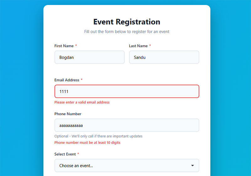
Good form validation does three things: tells users what went wrong, tells them where, and tells them how to fix it. A red border with “Please enter a valid email” is clear. A generic “There were errors in your submission” is useless.
Baymard also found that 98% of sites don’t use adaptive validation messages, ones that change based on the specific error. If someone enters “john@gmail” (missing the .com), the message should address the domain issue, not repeat a generic format error.
Nielsen Norman Group data shows that forms following usability best practices see 78% of users submitting without errors on the first try. Forms that ignore these practices drop to 42%.
Real-time client-side validation handles format checks (email structure, phone number length, required fields) instantly in the browser. Server-side validation handles the heavier stuff like checking if a username already exists. Use both. Always.
Fields that cause the most friction
| Field | Abandonment Rate | Avg. Time to Complete |
|---|---|---|
| Password | 10.5% | 7.2s |
| 6.4% | 6.5s | |
| Phone number | 6.3% | 5.0s |
| Address | varies | 7.4s |
| Name | lowest | 3.5s |
Source: Zuko Analytics
Password fields cause the most drop-off. If your form requires one, show strength indicators and clear requirements upfront, not after the user fails.
When Should Inline Validation Appear to the User
Validate on blur (when the user leaves a field), not while they’re still typing. Showing a “too short” error on a password field after 2 characters is annoying. Wait until the user moves to the next field, then validate.
Baymard’s usability testing specifically warns against premature validation. Triggering errors while users are still typing disrupts flow and causes unnecessary frustration.
For form error messages, green checkmarks on valid fields reinforce progress. A List Apart noted that when success messages faded away too quickly, users worried their valid fields had somehow become invalid. Keep positive confirmation visible.
Validation checklist
- Validate on blur, not on keystroke
- Show errors next to the problem field, not at the top of the page
- Use specific messages (“Email must include @” not “Invalid input”)
- Keep green checkmarks visible on valid fields
- Don’t clear user input on errors
- Mark both required and optional fields explicitly (only 14% of e-commerce sites do this, per Baymard)
- Test validation on mobile separately, error messages need to stay visible with the virtual keyboard open
How Do Call-to-Action Button Labels Affect Submission Rates
“Submit” kills conversions.
Unbounce analyzed over 40,000 landing page forms and found specific, action-oriented button text increased click-through rates by up to 320% compared to “Submit.”
The problem? “Submit” reveals nothing about what happens next. Buttons like “Get My Free Quote,” “Start My Trial,” or “Download the Guide” set clear expectations and give users a reason to click.
First-person language converts 90% better than second-person
Research from ContentVerve shows that changing “Start your 30-day free trial” to “Start my free 30-day trial” boosted click-through rates by 90%. First-person framing (“Get My Report” vs. “Get Your Report”) makes actions feel like gaining something instead of giving something away.
According to Best Version Media, personalized CTAs using first-person pronouns convert 202% better than basic versions. The small shift from “Create your account” to “Create my account” changes how users perceive control over the action.
Keep button text under 5 words
Multiple studies show shorter CTAs perform better. Analysis of 90 high-converting landing pages found the most effective buttons use 2-5 words max. Longer copy creates cognitive load and reduces clicks.
Make every word count:
- Be specific to the form’s purpose
- Focus on the benefit (“Download the Guide” not “Download”)
- Use action verbs (“Start,” “Get,” “Claim”)
Contrast matters more than color

Button color gets attention, but contrast with surrounding elements drives clicks. Heatmap studies from Crazy Egg confirm high-contrast CTA buttons consistently outperform low-contrast ones, regardless of specific color.
Archive Social increased CTR by 101% by moving their CTA above the fold and using contrasting colors. The color itself? Secondary to placement and visibility.
Data from Wiser Notify shows that changing button color can boost conversions by 21%, but this works only when the new color creates stronger contrast with the page design.
Place buttons where eyes naturally land
Position matters. According to Protocol80, placing CTAs above the fold can boost conversions by 317%. HubSpot research shows multiple, strategically placed CTAs throughout content perform better than single buttons buried at the bottom.
Best placement zones:
- After the last form field (user’s natural stopping point)
- Above the fold for immediate visibility
- Mid-content after providing context (Fuel Your Digital saw 32% more downloads)
A dating app company used heatmaps and A/B testing to remove distractions around their conversion button. The result? 25% increase in conversion by hiding the navigation menu and “Download for Free” text above the button.
Add urgency to drive action

Time-sensitive language creates 35% higher CTR according to moldstud.com research. Words like “now,” “today,” or “instant” communicate immediacy without being pushy.
Adding countdown timers next to CTAs increased conversion rates by approximately 9%. Limited-time offers can boost conversions by 332% when used appropriately.
Test everything
PartnerStack increased conversion rate from 6.66% to 14.09% (111.55% improvement) by changing “Book a Demo” to “Get Started.” The less committal language felt more helpful than sales-focused.
What works for one audience fails for another. Run A/B tests on:
- Button copy variations
- Placement positions
- First-person vs. second-person language
- Color contrast levels
According to Invesp research, A/B testing landing pages leads to 30% improvement in conversion rates on average. The average website conversion rate sits at 2.4%, but well-crafted CTAs can push this to 11.5% or higher.
What Is the Impact of Social Proof Near Forms on Conversion
Trust signals placed near forms reduce hesitation. Research from Invesp shows that displaying customer counts or subscriber numbers increases conversions by 12.5%.
The type of social proof matters more than its presence.
Match social proof to your form type:
- Sign-up forms: Customer count works (“Join 50,000+ businesses”)
- Consultation requests: Testimonial quotes perform best
- Payment forms: Security badges (Norton, McAfee, SSL padlock) near credit card fields
According to Baymard Institute research, 18% of users abandon checkouts specifically because they don’t trust the site with payment information. A visible security indicator directly addresses that objection.
The Good found that incorporating social proof throughout ecommerce stores can increase conversion rates by up to 380%. Reviews, testimonials, and user-generated content build credibility fast.
Video testimonials outperform everything
Share One research shows video testimonials increase conversion rates by up to 62%. Video creates authentic, trustworthy endorsements that written reviews can’t match. 79% of people prefer video testimonials over written reviews.
Real-time social proof delivers massive results. According to WiserNotify, dynamic notifications showing live customer activity achieve 98% conversion increases compared to static pages. The combination of urgency (FOMO) and validation makes this one of the highest-impact tactics.
Placement determines effectiveness
Place trust elements within the visual frame of the form itself. A testimonial buried in the footer won’t help. A short quote right above the submit button will.
For GDPR compliant forms, a brief privacy statement (“We’ll never share your email”) positioned near the email field reduces abandonment, especially in European markets where data privacy awareness runs high.
Product reviews make the difference. Bazaarvoice found that products with reviews have a 12.5% higher conversion rate than products without them. Northwestern University’s Spiegel Research Center shows that purchase likelihood peaks at ratings around 4.2-4.5 stars rather than perfect 5.0 ratings. Authenticity beats perfection.
Test different social proof formats:
- Customer photos (user-generated content boosts conversions by 29% according to AMRA & ELMA)
- Live activity feeds (“Sarah from Toronto just signed up”)
- Review snippets near relevant form fields
- Trust badges at payment steps
Research from The Good shows they increased form submissions by 8.63% by highlighting social proof in the registration flow, creating $543,400 in annualized revenue gains.
How Does Removing Optional Fields Change Form Performance
Imagescape ran one of the most cited form optimization tests. They removed all optional fields from their contact form, cutting it from 11 fields to 4. Conversions increased by 120%.
That’s not a typo.
Optional fields create psychological friction. Users see them and feel conflicted. “Is this really optional? Will my submission be taken less seriously if I skip it?” That hesitation alone increases drop-off rates.
The data backs shorter forms
Research from Formstack shows forms with 3 fields have the highest conversion rate (slightly over 25%), followed by forms with 5 fields (above 21%). Going from 3 to 4 fields shows a sharp decline in conversions.
Martech Zone analysis found that forms with 3 fields boost conversions by up to 160% compared to forms with 10+ fields. HubSpot data shows forms with 7 or fewer fields convert at 34%, while forms with 10+ fields convert at just 15%.
According to Chili Piper research, conversion improves by 3-5% for every additional form field removed. Formstack analyzed over 650,000 forms and found the average form has 11 fields. That’s 3-5 percentage points knocked off for every unnecessary field.
Real-world results prove it works
Livestorm reduced fields from 7 to 1 and saw a 50% increase in form conversions. Gong made the same change and got a 70% boost. Both companies used lead enrichment tools to collect additional data automatically.
Multi-step forms can help when you need longer forms. Breaking questions into separate pages reduces perceived effort. One company saw a 214% increase in conversions by splitting their long form into two parts.
Quality vs. quantity matters
If a field is optional, ask whether you actually need the data. If the answer is “it would be nice to have,” cut it. Collect that data later through follow-up emails or progressive profiling.
The fields you choose directly affect lead quality too. Fewer, smarter fields often produce better qualified leads than a 15-field form that scares away everyone except the most desperate prospects.
According to Brixon Group research, each additional form field decreases conversion rate by an average of 4.1%. For B2B lead generation, the optimal number is 3-5 fields for top-of-funnel forms and 6-8 for bottom-of-funnel.
Spot the problem with session recordings
Hotjar’s session recordings reveal hesitation patterns. Watch 20 recordings of users interacting with your form. Count how many pause, hesitate, or hover over optional fields before deciding what to do. That hesitation is costing conversions.
When longer forms work better

Context matters. HubSpot’s Form Analytics shows dropdown menus and radio buttons lead to 15.2% fewer abandonments than free text fields. The field type impacts conversion as much as the field count.
Formisimo Analytics analyzed over 2 million B2B form submissions in 2024. Company name has a -3.2% conversion impact, while annual revenue drops conversions by -12.3%. Know what each field costs you.
Baymard Institute research shows the average checkout flow contains 23.48 form elements displayed by default. An ideal checkout can be reduced to as little as 12 form elements. That 20-60% reduction would recover nearly 1 out of 5 abandoned checkouts from users who cite “too long/complicated” as the reason.
Action steps:
- Remove all optional fields from your forms
- Test 3-field vs. 5-field versions
- Use lead enrichment tools to collect data automatically
- Watch session recordings to spot hesitation points
- Track conversion rate changes for every field you add or remove
Which Form Layout Produces the Highest Completion Rate
Single-column layouts outperform multi-column layouts. CXL Institute’s eye-tracking study found single-column forms were completed 15.4 seconds faster than two-column forms.
The reason is simple.
Single columns create a clear visual path from top to bottom. No ambiguity about which field comes next. Multi-column layouts force users to figure out the reading order. That split second of confusion adds up across every field.
Multi-step forms crush single-page versions
HubSpot research shows multi-step forms convert 86% higher than single-step forms. Only 40% of marketers use them.
Fluent Forms data reveals the gap:
- Multi-step forms: 13.85% average completion rate
- Single-page forms: 4.53% completion rate
Breaking long forms into smaller pages reduces perceived effort. Users don’t see the full mountain they need to climb.
Venture Harbour documented real results:
- BrokerNotes: 35% increase
- Vendio: 59% increase
- Astroturf company: 214% increase
- 30+ question form split into 4 steps: 53% conversion rate
Visual length beats actual field count
Instapage research shows multi-step forms with visually shorter steps convert 37% better than long single forms with the same number of fields.
Users react to what they see, not what they count.
Brixon Group found top-positioned labels are understood 28% faster than left-positioned labels.
When to use side-by-side fields
Related fields like “First Name” and “Last Name” or “City” and “State” can sit side by side. Users expect paired inputs.
Don’t mix paired and full-width fields randomly. Pick one approach and stick to it.
For contact forms, single column wins. For checkout optimization, clean single columns with clear section dividers produce the best results according to Baymard’s 2024 benchmark.
Test your specific audience
HubSpot switched their demo landing page from one-column to two-column. The two-column form improved conversion by 57%.
Rules break. Context matters. Always test.
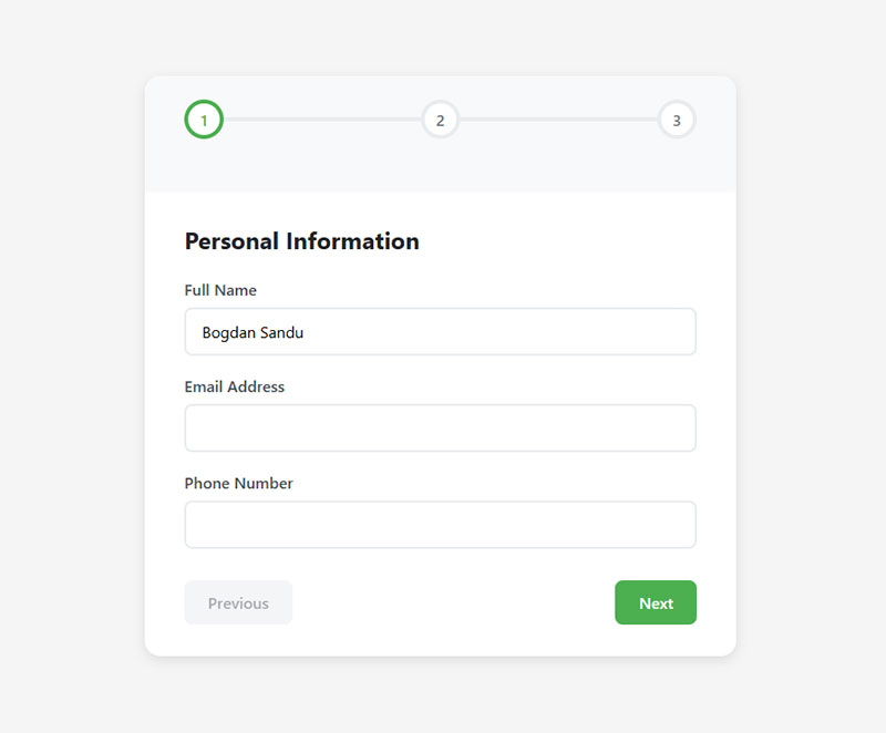
How Do Pre-Filled Form Fields Affect User Behavior
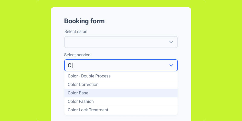
Image source: JetFormBuilder
Pre-populated fields reduce typing effort and completion time.
Google Chrome research shows users complete forms up to 30% faster when using autofill.
The autofill advantage
Chrome analyzed millions of page loads and found:
- 75% less form abandonment with autofill
- 35% faster completion times
Zuko Analytics data:
- Autofill users: 71% completion rate
- Manual entry users: 59% completion rate
EXATOM clients see 10-50% higher completion rates when autofill is used versus manual entry. Even when autofill triggers error notifications, completion rates still beat manual input because users are willing to correct mistakes they didn’t type.
WPForms confirms autofill increases conversion by more than 10%. PayKickstart clients hit 30% conversion increases using auto-address forms.
Most sites mess this up
Baymard Research found 66% of websites don’t have autofill properly configured.
Use standard HTML autocomplete attributes:
autocomplete="given-name"for first nameautocomplete="family-name"for last nameautocomplete="email"for emailautocomplete="tel"for phone number
Don’t let browsers guess. Tell them exactly what each field is.
Pre-fill for returning users
If someone already gave you their email and name through a past lead generation interaction, pre-fill those fields on their next visit.
Salesforce, HubSpot, Mailchimp, and ConvertKit all support this for opt-in forms.
Don’t be creepy
Pre-filling sensitive fields (phone number, address) feels invasive if users don’t expect it.
Stick to name and email. Let users confirm or edit pre-filled data. Never lock it in.
Common autofill mistakes:
- First name field gets full name
- Home address populates billing address
- Multiple boxes for phone/credit card numbers (breaks autofill)
- Client-side validation blocking autofill
- Missing autocomplete attributes
Fix these and unlock 10-50% higher completion rates.
Mobile users need this most
Mobile cart abandonment hits 85%. Typing on small screens is painful.
More than half of all traffic comes from mobile devices. Google found autocomplete forms work 30% faster, which matters even more on touchscreens.
Implementation checklist:
- Add proper autocomplete attributes to all form fields
- Test single-column vs. multi-step layouts
- Pre-fill name/email for known users
- Never lock pre-filled data
- Track autofill usage vs. completion rates
What Are the Most Common Form Optimization Mistakes
These show up on almost every site. Most are easy fixes that produce measurable results.
Using CAPTCHA without testing alternatives
Stanford University research found CAPTCHAs reduce form conversions by up to 40%. A 2024 study from ETH Zurich showed modern AI now solves Google’s reCAPTCHAv2 with 100% accuracy.
The numbers get worse:
- Traditional text CAPTCHA has a 29.45% failure rate
- 1.47% of people abandon forms immediately when they see a CAPTCHA
- Users spend 9.8 seconds solving visual CAPTCHAs, 28.4 seconds for audio versions
- 30% of users leave if a CAPTCHA is too complex
Animoto found forms without CAPTCHA converted at 64% versus 48% with CAPTCHA. That’s a 33% improvement.
Google’s reCAPTCHA v3 or a honeypot technique achieves spam protection without user friction. One online accounting site saw successful submissions drop 73% after adding CAPTCHA.
No form submission confirmation message
Users click submit and nothing visible happens. They wonder if it worked, so they click again. Or they leave confused.
Always show immediate feedback after submission.
Ignoring form accessibility
WCAG 2.1 guidelines require proper label associations, keyboard navigation, and screen reader support.
Around 15% of the global population has some form of disability. Skipping accessibility means excluding potential customers.
Asking for phone numbers on low-commitment forms
Formstack data shows phone number fields reduce conversions by 5% on average. Unless you actually call leads, remove it.
Generic error messages kill conversions
“Invalid input” tells users nothing. Specific messages like “Phone number needs 10 digits” work better.
Experimentation Elite research shows inline validation delivers:
- 22% increase in conversion rate
- 22% drop in error count
- 31% increase in user satisfaction
- 47% decrease in eye fixations
CXL Institute testing found inline validation increased success rates by 22% and reduced completion times by 42%.
No mobile testing
A form that works on desktop might have overlapping fields, tiny tap targets, or broken dropdowns on iOS Safari or Android Chrome.
Mobile cart abandonment averages 85%. Test everything on actual devices.
Resetting the form on errors
If validation fails and the form clears all entered data, most users won’t re-enter it. Keep user input intact after validation errors.
Baymard Institute found 92% of top ecommerce sites have inadequate form field descriptions in their checkout process. This drives up errors unnecessarily.
Common validation mistakes:
- Case-sensitive CAPTCHAs have nearly 30% failure rates
- Users who fail two CAPTCHA challenges are highly likely to abandon
- Requiring exact formatting instead of accepting valid variations (phone numbers with spaces vs. without)
- Not explaining why fields are required
How to Measure Form Optimization Success
You can’t improve what you don’t track. These are the core metrics for form performance.
Form completion rate
The percentage of users who start filling out a form and actually submit it.
Google Analytics 4 tracks this through custom events. Fire one event on first field interaction and another on successful submission.
Form abandonment rate
The form abandonment rate is the inverse. It tells you what percentage of users started but didn’t finish.
Hotjar and Mouseflow both offer form analytics dashboards that show exactly which field causes the most drop-offs.
Zuko Analytics data shows the average form abandonment time is 1 minute and 43 seconds. Know when users give up.
Time-to-complete
How long users spend on your form from first interaction to submission.
FullStory and Hotjar capture this automatically. If your 5-field contact form takes an average of 3 minutes to complete, something is wrong.
Zuko benchmarks show:
- Checkouts: 3 minutes 21 seconds average
- Registration forms: 1 minute 35 seconds average
- Contact forms: vary widely by complexity
Error rate per field
Which fields cause the most validation failures.
High error rates on a single field usually mean the label is confusing, the format isn’t clear, or the validation rules are too strict.
Track which error messages users see most often. Fix those fields first.
Track micro conversions
Each field completion is a micro conversion that moves users toward the final submission.
Tracking these in Google Tag Manager shows you exactly where the funnel leaks.
What Is a Good Form Conversion Rate by Industry
Based on Formstack’s data and conversion rate benchmarks from Unbounce:
- SaaS free trial forms: 2-5%
- Ecommerce checkout: 1.5-3%
- B2B lead gen forms: 2.5-5%
- Healthcare appointment forms: 3-7%
- Nonprofit donation forms: 8-15%
- Government service forms: 5-12%
Ruler Analytics industry data shows:
- Industrial: 2.8% (highest)
- Professional services: 2.5%
- B2B services: 2.2%
- Real estate: 0.6% (lowest)
- B2B eCommerce: 0.7%
- B2C eCommerce: 0.8%
Zuko Analytics form type benchmarks:
- Application forms: 75% completion rate (highest)
- Contact forms: 38% interaction completion, 9% view-to-completion
- Registration forms: 63% start-to-complete, 41% view-to-complete
How to start improving
If you’re below your industry average, start with the highest-traffic form on your site. Fix that one first.
A/B test one variable at a time:
- Field count
- Button text
- Layout (single vs. multi-column)
- Error message clarity
- Inline validation vs. post-submit
Measure changes over at least 2 weeks or 1,000 submissions, whichever comes first.
HubSpot data shows marketers who run A/B tests on forms report conversion rates 10% higher on average than those who don’t test.
FAQ on Form Optimization Tips
What is form optimization?
Form optimization is the process of improving web form design, field structure, validation, and layout to increase completion rates and reduce abandonment. It covers everything from field labels and input types to CTA button text and mobile responsiveness.
How many fields should a form have?
There’s no universal number. HubSpot’s research shows 3-5 fields hit the sweet spot for most lead capture forms. High-commitment forms like insurance quotes or booking forms can use more fields because users expect a longer process.
Do multi-step forms convert better than single-step forms?
In most cases, yes. Formstack data shows multi-step forms increase conversions by up to 86%. They work by reducing perceived effort and triggering commitment bias after users complete the first step.
What is inline form validation?
Inline validation checks user input in real time as each field is completed, showing errors or confirmations immediately. Luke Wroblewski’s testing found it reduces errors by 22% and increases completion rates by 31% compared to post-submission validation.
How does form length affect conversion rates?
Longer forms generally convert worse. Every additional field adds cognitive load and decision weight. A Baymard Institute study found top-performing checkout forms use around 12 elements, while the average US checkout has 23.48.
What is the best form layout for conversions?
Single-column layouts produce the fastest completion times and fewest errors. CXL Institute’s eye-tracking research confirmed users complete single-column web forms 15.4 seconds faster than two-column equivalents because the visual path is unambiguous.
How do I reduce form abandonment on mobile?
Use single-column layouts, 48x48px minimum touch targets, HTML5 input types that trigger the right keyboard, and browser autofill attributes. Test on both iOS Safari and Android Chrome. Consider conversational forms for complex mobile flows.
What button text works best on forms?
Specific, value-driven text like “Get My Free Quote” outperforms generic labels like “Submit.” Unbounce’s data across 40,000+ forms showed action-specific CTA text increased click-through rates by up to 320%. First-person phrasing converts 24% better.
Should I use CAPTCHA on my forms?
Traditional CAPTCHAs reduce conversions by up to 12%. Use Google reCAPTCHA v3 (invisible, score-based) or honeypot fields instead. Both protect against spam bots without adding any visible friction for real users filling out your forms.
How do I track form performance?
Track completion rate, abandonment rate, time-to-complete, and error rate per field. Google Analytics 4 handles event tracking, while tools like Hotjar, FullStory, and Mouseflow provide visual form analytics showing exactly where users drop off.
Conclusion
These form optimization tips come down to one thing: removing friction between the user and the action you want them to take.
Every field, label, button, and validation message either moves someone closer to submitting or pushes them away. There’s no neutral ground.
Start with your highest-traffic form. Run it through Hotjar or FullStory to find the exact drop-off points.
Cut unnecessary fields. Fix your error handling. Test your CTA button text. Check the mobile experience on actual devices.
Small changes compound fast. A better label placement here, smarter form conversion tactics there, and your completion rate shifts in weeks.
Don’t redesign everything at once. Pick one variable, A/B test it with Optimizely or VWO, measure for at least 1,000 submissions, then move to the next.
That’s how real, lasting improvements happen.