
Gallup’s 2024 data shows only 31% of U.S. employees feel engaged at work. Annual surveys can’t catch that kind of decline fast enough. Pulse surveys can. These short, frequent questionnaires…
Table of Contents
Your webinar promotion drives hundreds of clicks. Then 80% of visitors leave without registering.
The problem isn’t your topic or your speakers. It’s your webinar registration form.
Most signup forms create unnecessary friction through too many fields, weak CTAs, and poor mobile design. These mistakes cost you attendees before your presentation even begins.
This guide covers how to maximize signups through strategic form optimization. You’ll learn the ideal number of fields, headline formulas that convert, CTA best practices, and A/B testing methods used by top-performing webinar hosts.
Whether you use GoToWebinar, Zoom, or Demio, these conversion rate optimization principles apply across every platform.
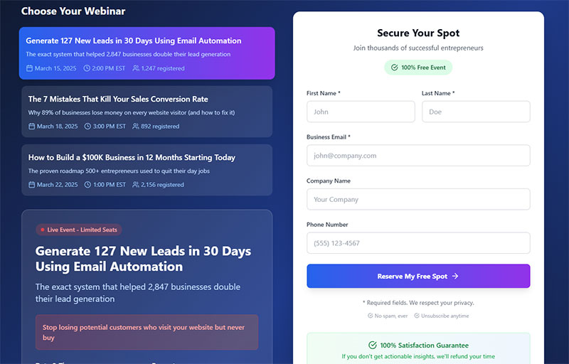
What is a Webinar Registration Form
A webinar registration form is a web form that collects attendee information before granting access to an online event.
It captures names, email addresses, and other relevant data that helps hosts manage their virtual seminars.
Think of it as the gateway between your landing page and your live presentation.
Without a properly designed registration form, potential attendees drop off. They leave. They never come back.
The form sits on your webinar landing page and serves two purposes: collecting lead data and qualifying prospects for follow-up.
Every field you add creates friction. Every unnecessary question reduces your signup conversion rate.
Your registration page optimization starts here.
Why Do Webinar Registration Forms Affect Signup Rates
The registration form is the final barrier between interest and commitment.
A visitor clicks your promotion email. They land on your page. They read your headline.
Then they see your form.
Research from GoToWebinar shows that 57% of webinar registrations come from email marketing. But those clicks mean nothing if your form kills conversions.
HubSpot’s analysis of over 40,000 landing pages found that forms with 3 fields achieve conversion rates above 25%, while forms with 5 fields convert above 21%. The data shows a sharp decline when moving from 3 to 4 fields.
Top webinar landing pages convert between 9% and 50%. Some platforms report registration page conversion rates as high as 59%, nearly double the 30% average reported by competing platforms.
That gap exists because of form design choices.
Too many fields trigger abandonment. Research from CXL shows that phone number fields can decrease conversion by as much as 48%. Confusing layouts create hesitation. Generic CTAs fail to motivate action.
According to Univid’s webinar data, the average webinar CTA conversion rate is 22%. Top performers hit 25%, meaning 1 in 4 attendees take the desired next step after clicking the CTA button.
Your form either accelerates signups or blocks them. No middle ground.
Understanding form UX design principles separates high-converting pages from underperformers.
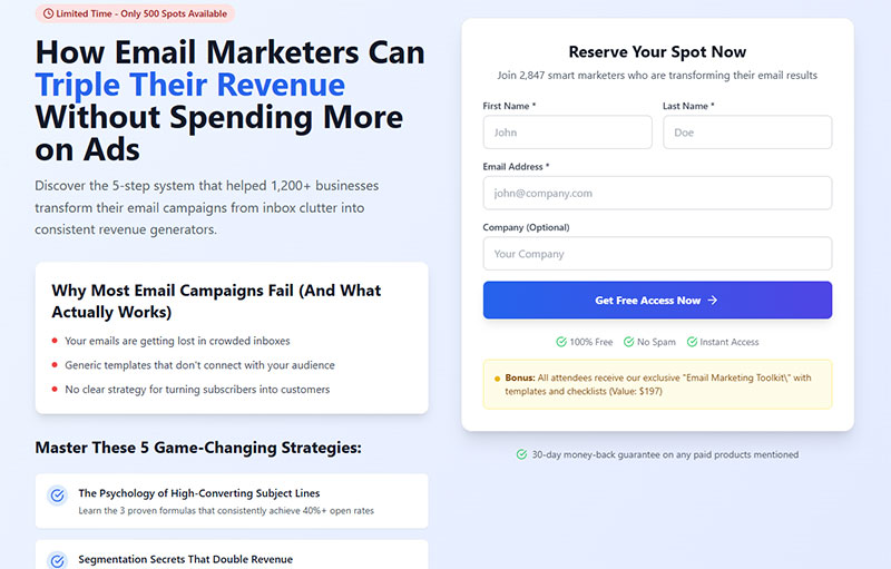
How Many Fields Should a Webinar Registration Form Have
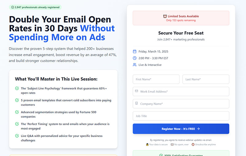
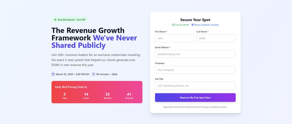
Five to seven fields works best for most webinars. This range balances lead qualification with conversion rate optimization.
Go below five and you lose valuable attendee information. Go above seven and registration abandonment spikes.
According to research from WebinarNinja, every extra field can cost you 5-10% of potential registrants. Industry data shows that reducing form fields from 11 to 4 can boost completion rates by 120%.
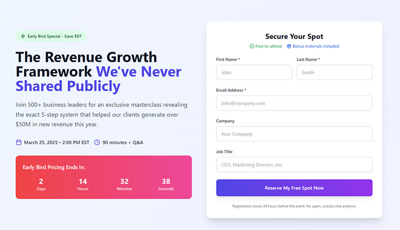
Required Fields for Webinar Signups
Stick to three core fields:
- First name
- Last name
- Email address
These give you everything needed for confirmation emails, reminder sequences, and basic personalization.
Some platforms like Zoom Webinars and GoToWebinar default to these fields. Smart choice.
HubSpot’s analysis of over 40,000 landing pages found that forms with 3 fields convert above 25%. Forms with 5 fields convert above 21%, showing a sharp drop at 4 fields before recovery at 5.
If you run B2B webinars, add company name. Sales teams need it for lead qualification.
Data from Brixon Group shows that 40% of B2B leads suffer from poor data quality. The right form fields depend on your follow-up process.
Optional Fields That Increase Lead Quality
Job title helps segment your audience for targeted content.
Company size qualifies leads for enterprise versus SMB sales tracks.
Phone number enables direct outreach but kills conversions. Research from CXL shows phone fields decrease conversion by 48%. Only add it for high-intent offers where attendees expect a call.
Budget questions reduce conversions by 15.3%, while timeframe inquiries drop rates by 10.8%, according to B2B form performance data.
Use conditional logic to show additional fields based on previous answers. This keeps initial forms short while gathering deeper data from engaged prospects.
Forms with conditional logic see completion rates as high as 53%. One company achieved 300% more conversions by using multi-step forms with branching logic instead of static forms.
Progressive profiling works well here. Collect basics at registration, then gather more through pre-webinar surveys or follow-up sequences.
Companies using progressive profiling achieve 47% higher conversion rates with 32% more comprehensive lead profiles, according to 2025 B2B marketing data. This approach reduced invalid email addresses from 17% to under 3% for one B2B software provider.
Implementation improves lead scoring accuracy. Organizations combining progressive profiling with dynamic lead scoring achieve 79% higher conversion rates from Marketing Qualified Leads to Sales Qualified Leads.
How to Write Headlines That Drive Webinar Registrations
Your headline determines whether visitors read further or bounce.
According to copywriting research, 80% of people read headlines while only 20% continue to body copy. This means headlines account for 80% of your ad’s effectiveness.
Studies show traffic can vary by as much as 500% based on the headline alone. Registration page conversion rates average around 30%.
Benefit-Specific Headlines
Lead with outcomes, not features. “Double Your Sales Pipeline in 90 Days” outperforms “Sales Training Webinar” every time.
Why it works: Quantifiable results create curiosity. Specific numbers build credibility. Headlines like “Boost Your Productivity by 50%” clearly communicate value and drive higher registration rates.
HubSpot and Salesforce use this approach consistently.
Problem-Aware Headlines
Address pain points directly. “Stop Losing Customers to Competitors” hits harder than “Customer Retention Strategies.”
Your audience knows their problems. Show them you understand. Headlines that speak directly to struggles and offer clear solutions increase engagement.
Number-Based Headlines
Lists convert. “5 Mistakes Costing You $50K Annually” promises specific, actionable content.
The data:
- Headlines with odd numbers: 20% higher click-through rate than even numbers
- Numbers in headlines: 30% higher conversion rates (Highrise testing)
- Optimal length: 6-7 words for best results
- 8-word headlines: 21% higher conversion rates
Numbers set expectations. Attendees know exactly what they’ll get.
How-To Formulas
The classic structure still works: “How to [Achieve Result] Without [Common Obstacle]” removes objections upfront.
Analysis by GoToWebinar found that how-to titles consistently rank among the most effective formats. These titles show authority and promise practical takeaways.
Example: “How to Book a Successful Tour Without Losing Your Shirt” (Bandzoogle)
Pair strong headlines with solid landing page forms and conversions follow.
What Makes a High-Converting Registration Form CTA
The call-to-action button is where decisions happen.
Generic CTAs like “Submit” or “Register” underperform consistently. Action-oriented buttons using words like “get,” “reserve,” and “try” drive more clicks than passive alternatives.
CTA Button Text That Converts
“Save My Seat” creates ownership. The spot becomes theirs.
“Reserve My Spot Now” adds urgency without being pushy. “Get Instant Access” works for on-demand webinars and evergreen content.
Avoid “Submit Form” entirely. Nobody wants to submit anything.
HubSpot’s analysis of 330,000 CTAs found that personalized CTAs perform 202% better than basic versions. Test variations like “Yes, I Want the Training” for topic-specific events.
First-person language matters: Studies show using “my” or “I” in CTAs can boost conversions by 90%. “Start My Free Trial” outperforms “Start Your Free Trial.”
Leadpages and Unbounce both recommend first-person language in button text.
CTA Button Placement and Design
Above the fold: Place your primary CTA where visitors see it immediately. Research shows CTAs above the fold boost engagement by 84%.
Color contrast is critical. If your page is blue, make the button orange. The button needs to pop visually. Red CTA buttons outperform green ones by 21%.
Multiple CTAs on longer pages:
- One at the top
- One after speaker bios
- One at the bottom
Placing CTAs at the end of product pages can increase conversions by 70%.
Mobile touch targets: Buttons should be at least 44×44 pixels. WCAG accessibility guidelines and major tech companies (Apple, Google, Microsoft) all recommend this minimum size. Research shows mobile-friendly CTAs increase tap-through rates by 42%.
White space around the button draws attention. Don’t crowd it with competing elements. Buttons surrounded by adequate white space are easier to tap and reduce accidental clicks.
These same principles apply when increasing form conversions across any lead capture scenario.
How to Design Registration Forms for Mobile Devices
Mobile traffic accounts for 62.54% of global website activity. Even though 22% of webinar registrations come through mobile devices, your form either works on phones or loses a significant portion of potential attendees.
Mobile responsive design isn’t optional anymore. It’s baseline.
Touch-Friendly Form Elements
Minimum 44×44 pixel dimensions for buttons. This matches WCAG accessibility guidelines and ensures reliable finger taps. Research shows mobile-friendly CTAs increase tap-through rates by 42%.
Form fields should be tall enough to tap without accidentally hitting adjacent elements. Studies suggest optimal touch targets range from 44-48 pixels for most users, with some experts recommending up to 60 pixels for maximum accessibility.
Dropdown menus and radio buttons reduce typing on small screens. Optimized mobile sites achieve 34% higher form completion rates when input methods match device capabilities.
Simplified Mobile Layouts
Single-column layouts outperform multi-column designs on phones. Research from CXL found that users completed single-column forms 15.4 seconds faster than multi-column versions (95% confidence level).
Stack fields vertically. Never place two inputs side by side on mobile. Single-column layouts:
- Reduce cognitive load
- Improve mobile responsiveness
- Create clear visual progression
- Eliminate horizontal scanning confusion
Keep your CTA visible without scrolling when possible. Mobile pages load 70-80% slower than desktop, making above-the-fold placement critical.
GoToWebinar and Demio both default to mobile-optimized registration forms for this reason.
Reduced Typing Requirements
Auto-fill support lets browsers populate name and email fields automatically. Digital wallet integration can speed up form completion by 28%.
Use dropdown selections instead of text inputs where practical. Inline validation cuts completion times by 42% and increases success rates by 22%.
Enable appropriate keyboard types:
- Email keyboard for email fields
- Numeric keyboards for phone numbers
- Date pickers for dates
Real-time validation is critical on mobile devices where navigating back to fix errors is harder than on desktop.
Following mobile forms guidelines eliminates the friction that kills conversions on smaller screens.
When to Send Webinar Promotion Emails
Email drives 57% of all webinar registrations, making it the most effective promotion channel. Timing matters.
Tuesday, Wednesday, and Thursday perform best for promotional sends. Research shows Tuesday captures 24% of all registrations, with Thursday and Wednesday following at 19% and 18% respectively.
59% of attendees register within seven days of the event. 17% sign up the day of.
Four-Week Promotion Timeline
Start promotion four weeks out. This generates 12% more registrations on average.
The registration breakdown:
- 35% register 8-14 days before (best promotion window)
- 28% register 1-7 days before
- 11% register day-of (making last-minute reminders critical)
Week one establishes awareness. Weeks two and three build momentum. Week four creates urgency.
Data shows 75% of registrations happen between 9 AM and 5 PM local time, with peak windows at 9-11 AM (33% of registrations) and 2-4 PM (21%).
Email Sequence Structure
Send at least four emails. Webinars with three or more reminder emails see 20% higher attendance rates.
Recommended sequence:
- Announcement (4 weeks before)
- Value reminder (2 weeks before)
- Last chance (1 week before)
- Final reminder (day of)
Follow-up emails with direct replay links get 50% open rates.
Mailchimp, ActiveCampaign, and ConvertKit all support automated webinar reminder sequences.
Subject Line Optimization
Mention the specific benefit in your subject line. Include the date to create time sensitivity.
Personalization works: Emails with personalized subject lines are 26% more likely to be opened. Research analyzing 100,000+ emails found that including the recipient’s first name increased open rates from 15.7% to 18.3%.
Emails sent between 9 AM and 12 PM capture audiences when they’re most receptive. Avoid Mondays (catch-up chaos) and Fridays (weekend mindset).
Your email efforts connect directly to using website forms for lead generation strategies.
How Social Proof Increases Webinar Signups

People follow crowds. Social proof exploits this tendency.
Testimonials on sales pages can increase conversions by 34%. Research from Spiegel Research Center shows that displaying 5 or more reviews can boost conversions by up to 270%.
Testimonial Placement
Feature quotes from previous webinar attendees near your registration form.
Include photos and job titles. Anonymous testimonials lack credibility. 88% of consumers trust online reviews as much as personal recommendations.
“Join 12,000+ business owners who attended our last session” works because it quantifies success. Data shows 97% of consumers say online reviews impact their purchasing decisions.
Video testimonials outperform text. Research shows video testimonials increase conversion rates by 80% compared to written reviews. 79% of people prefer video testimonials over written reviews when learning about a company.
For maximum credibility:
- Add full names and job titles (not just first names)
- Include company names for B2B webinars
- Show photos (testimonials with images are more trusted)
- Keep feedback specific to outcomes, not generic praise
Speaker Credentials
Display speaker bios prominently. List company affiliations, certifications, and relevant achievements.
Logos of Fortune 500 clients or recognized brands build instant trust. Research from BrightTALK shows 75% of B2B buyers consider industry awards and credentials a key part of their purchase decision.
ON24 and BrightTALK consistently showcase speaker credentials above the fold.
Attendee Counts and Company Logos
Show registrant numbers in real-time when possible. “847 people already registered” creates FOMO.
Real-time social proof delivers massive results. WiserNotify data shows sales-based social proof notifications boost website conversions by 98%. Recent booking widgets increase conversions by 18%.
Display logos of companies whose employees have attended. Enterprise prospects respond to peer validation.
Balance matters. 68% of consumers trust a brand more when there’s a mix of both positive and negative reviews visible. Don’t filter out every critical comment.
Review recency matters. 83% of buyers consider reviews older than 3 months irrelevant. Keep your testimonials fresh and rotate them regularly.
What Urgency Tactics Work for Webinar Registration
Urgency increases conversions by up to 30% when used correctly. The key is making it real, not manufactured.
Countdown Timers
Place countdown timers prominently on your registration page. Ticking clocks create visual pressure to act immediately.
Timers deliver measurable results. Studies show adding countdown timers to sales pages and popups can increase conversions by 30-50%. One coaching platform saw a 300% conversion increase using countdown timers on their homepage, while LiferLMS boosted revenue by $23,700 in 5 months with dynamic countdown timers.
Set deadlines close enough to motivate action. A timer showing 30 days doesn’t create urgency. Data shows including countdown timers boosts webinar signups by 13%.
Best practices:
- Make the urgency real (authentic deadlines only)
- Place timers near CTAs for maximum impact
- Ensure deals actually expire when timers hit zero (fake urgency damages trust)
ClickMeeting and WebinarJam offer built-in countdown features.
Limited Seats Messaging
“Only 50 spots remaining” works better than “Register now.”
Research shows “limited seats” messaging boosts urgency by 24%. Marketing LTB data indicates registration forms with 2 fields plus scarcity messaging convert 34% better than long forms.
Scarcity must be genuine. Fake limits damage trust permanently. Real seat limits trigger FOMO effectively. The average webinar conversion rate for attendees is 55%, and adding limited seating elements can increase this further.
Webex Events and BigMarker support actual capacity limits you can display.
Implementation tips:
- Display real-time seat availability (“73% full”)
- Update numbers as registrations come in
- Cap registrations at actual capacity limits
Early Bird Incentives
Offer bonuses for early registration: exclusive resources, priority Q&A access, or downloadable materials.
Data shows early-bird registration increases turnout by 17%. Deadline-based incentives push fence-sitters to commit. Limited-time offers or exclusive bonuses increase conversions by 22%.
Structure your incentives with clear deadlines. Research shows webinars with clear CTAs see 25% more conversions than those without specific calls to action.
Effective early bird strategies:
- Exclusive live attendee bonuses
- Downloadable templates or case studies
- Priority access to speaker Q&A
- First 100 registrants get bonus materials
Pair urgency elements with solid web forms fundamentals for maximum impact.
How to A/B Test Webinar Registration Forms
Continuous testing separates good conversion rates from great ones. Small changes compound. A 5% improvement per element adds up quickly.
Run tests for minimum 100 conversions per variation before drawing conclusions. Industry experts recommend this threshold to ensure statistical significance, though larger samples (3,000+ conversions per variant with 30,000+ visitors) are preferred for highly reliable results.
Research shows 77% of companies run A/B testing on their websites. Companies using CRO tools report an average ROI of 223%.
Headline Testing Methods
Create two headline variations with different angles: benefit-focused versus problem-focused.
Test specific numbers against general claims. Headlines that include numbers can drive measurable improvements.
Change one element at a time. Multiple changes obscure what actually worked. Data shows that teams who test more variations within campaigns learn faster and compound gains. Even micro-changes in button color and positioning across many tests accumulate to meaningful uplifts.
Testing best practices:
- Run tests for 2-6 weeks minimum (accounts for day-of-week effects)
- Aim for 95% confidence level (industry standard)
- Use tools that calculate statistical power automatically
Google Analytics and Leadpages both support A/B testing for landing page elements.
Form Layout Testing
Test single-column against two-column layouts.
Compare form placement: right sidebar versus centered.
Forms with 5 or fewer fields often outperform longer forms in completion rate, with some studies showing 10% improvement. Multi-step or progressive forms reduce user overwhelm and can increase completion rates by approximately 10%.
Experiment with field order. Email first sometimes outperforms name first. The average form completion rate across industries is approximately 1.7% of site visitors.
Key layout variables to test:
- Field arrangement (single vs. two-column)
- Form position on page
- Field sequence
- Required vs. optional field indicators
CTA Button Testing
Test button colors systematically. Orange versus green. Blue versus red.
Compare button text variations: “Register Now” versus “Save My Seat.” Research shows using action-oriented text like “click here” instead of “submit” can improve conversion rates by as much as 3%.
Button optimization delivers results. A company using optimized CTAs saw a 10% increase in signup rate, doubling their original 5% goal. Studies show headlines can impact conversion rates by 20-40%.
Evaluate button size and placement combinations.
What to test:
- Button copy (action-oriented vs. generic)
- Button color contrasts
- Button size and prominence
- Placement on page (near benefits vs. at bottom)
Document results in a testing log. Patterns emerge over time that inform future form design decisions.
Testing program maturity: Western Europe runs an average of 7.69 experiments per month. Companies that have been testing for 5+ years make up 44% of mature testing programs. The key is running more tests consistently, as winners compound and pull ahead of competitors.
Common Webinar Registration Form Mistakes
Most registration forms fail for predictable reasons. Avoiding these errors puts you ahead of 80% of competitors.
Too Many Form Fields
Every additional field reduces completions. Research shows Imagescape boosted conversions by 120% by cutting their form from 11 fields down to just 4. Expedia generated an extra $12 million annually by removing one optional “Company” field.
Form field abandonment rates vary by type:
- Password fields: 10.5% mean abandonment rate (highest)
- Email fields: 6.4% abandonment rate
- Phone number fields: 6.3% abandonment rate
Asking for phone number, company size, job title, and budget in one form kills conversions. Data shows reducing form fields from 4 to 3 can boost gated content conversion rates by up to 50%.
Collect only what you’ll actually use for follow-up.
Slow Page Load Times
Pages loading beyond three seconds lose 40% of visitors. Google research shows the probability of bounce increases 32% as page load time goes from 1 second to 3 seconds.
Speed matters:
- 1-2 seconds: 9% bounce rate
- 3 seconds: 32% increase in bounce probability
- 5 seconds: 38% bounce rate
- 53% of mobile visitors leave if a page takes longer than 3 seconds to load
Website conversion rates drop by an average of 4.42% for each additional second of load time between 0 and 5 seconds.
Compress images, minimize scripts, and use fast hosting. Test load speed on both desktop and mobile connections. The average desktop page loads in 2.5 seconds, while mobile takes 8.6 seconds.
Poor Mobile Experience
Forms that require pinching and zooming frustrate mobile users. Tiny buttons, cramped fields, and horizontal scrolling cause abandonment.
Mobile performance data:
- Desktop view-to-starter rate: 47%
- Mobile view-to-starter rate: 42%
- Mobile pages take 70% longer to load than desktop on average
Test your form on actual devices, not just browser simulations. Ensure touch targets meet minimum size requirements (44-48 pixels).
Generic or Missing Value Proposition
“Register for our webinar” tells visitors nothing. State the specific benefit they’ll receive by attending.
Weak copy above the form undermines everything below it. Research shows headlines can impact conversion rates by 20-40%. ClassPass achieved a 10% increase in signup rate through comprehensive redesign that focused on clear value propositions.
Best practices:
- Lead with specific outcomes or transformations
- Use benefit-focused language, not feature lists
- Include social proof near the registration form
- State what attendees will learn or gain
No Confirmation Feedback
Visitors need immediate confirmation that registration succeeded.
A clear registration successful message prevents duplicate submissions and builds confidence. Without proper confirmation, users may resubmit forms, creating data quality issues.
Effective confirmation pages should:
- Confirm the registration immediately
- Provide calendar invite options
- State next steps clearly
- Include webinar details (date, time, access link)
Include calendar invite options and next steps in your confirmation. For deeper optimization, study strategies for improving form abandonment rate across your entire funnel.
The average form completion rate is only 1.7% of site visitors, making every optimization critical to your conversion success.
How to Track Webinar Registration Form Performance
You can’t optimize what you don’t measure. Set up tracking before launching any webinar promotion campaign.
Registration Page Conversion Rate
Calculate: (Total registrations / Unique page visitors) x 100.
Healthy range sits between 20-40% for cold traffic. Research shows webinar registration pages regularly hit 20-40% conversion rates, with top performers reaching 50-60%. The average webinar registration page conversion rate is 30% for cold traffic, and can be as high as 51% for warm audiences.
Below 15% signals serious form or copy problems. For comparison, the median landing page conversion rate across all industries is 2-3%, making webinar pages among the highest-converting landing page types.
Benchmark data:
- Cold traffic: 20-40% (industry standard)
- Warm leads: 51-66% conversion rates possible
- Lead generation pages average: 9-12%
- Newsletter signups average: 10-20%
Google Analytics and your webinar platform’s built-in analytics both track this metric. HubSpot and Marketo provide deeper funnel visibility for enterprise teams.
Form Abandonment Rate
Track how many visitors start filling out your form but don’t complete it.
High abandonment at specific fields indicates friction points. Data shows different field types have varying abandonment rates:
- Password fields: 10.5% mean abandonment
- Email fields: 6.4% abandonment
- Phone number fields: 6.3% abandonment
Heatmaps from tools like Hotjar reveal exactly where users struggle. The average form completion rate is only 1.7% of site visitors, making form abandonment analysis critical.
Proper form validation reduces errors that cause mid-form abandonment. Each form attempt typically includes 7 field returns to change inputs, indicating where users experience confusion or error messages.
Traffic Source Analysis
Identify which channels drive highest-quality registrants.
Email marketing leads webinar promotion. Research shows 91% of respondents name marketing emails as their top-performing channel for qualified webinar attendees. Data reveals 60% of webinar registrants come from email, while 40% come from other sources:
- Social media: 15% of registrations (primarily LinkedIn)
- Website banners: 18% considered high-quality
- Direct traffic and referral: varies by audience
Registration timing patterns:
- 36% of registrations occur between 8-10 AM
- 24% register 15+ days before the event
- 10% register on the day of the webinar
- Thursday drives most registrations (24%), followed by Tuesday (19%) and Wednesday (18%)
Email might generate volume while LinkedIn produces more engaged attendees. The average webinar receives 260 registrations, with 40-57% of registrants actually attending (meaning 100-110 attendees per event).
Allocate promotion budget toward sources with best registration-to-attendance ratios. Compare conversion rate benchmarks against your performance to identify improvement opportunities.
UTM parameters on all promotional links enable accurate source tracking across platforms.
FAQ on Webinar Registration Forms
What is the ideal number of fields for a webinar registration form?
Five to seven fields balances lead qualification with conversion rates. Stick to name, email, and company for most webinars. Every additional field reduces completions by approximately 4%. Keep it minimal.
What is a good conversion rate for webinar registration pages?
Average webinar landing pages convert at 17%. Top performers reach 25-45%. Below 15% signals problems with your form design, headline, or value proposition. Track this metric in Google Analytics or your webinar platform.
When should I start promoting my webinar to maximize registrations?
Begin promotion four weeks before the event for 12% more registrations. Most signups happen in the final week, with 17% registering day-of. Use email sequences through Mailchimp or ActiveCampaign throughout.
Should I include a phone number field on my registration form?
Only for high-intent offers where sales calls are expected. Phone fields significantly reduce conversion rates. Most webinar hosts skip this field entirely and collect phone numbers during post-webinar follow-up instead.
How do countdown timers affect webinar signup rates?
Countdown timers increase conversions by up to 30% when deadlines are genuine. Place them prominently on your registration page. Platforms like ClickMeeting and WebinarJam include built-in countdown features for this purpose.
What CTA button text converts best for webinar forms?
“Save My Seat” and “Reserve My Spot” outperform generic options like “Submit” or “Register.” First-person language creates ownership. Action words like get, reserve, and claim drive more clicks than passive alternatives.
How important is mobile optimization for webinar registration?
Over 50% of registrations come from mobile devices. Forms must be touch-friendly with 44×44 pixel buttons minimum. Single-column layouts, reduced typing, and auto-fill support prevent mobile abandonment.
What social proof elements increase webinar signups?
Testimonials from past attendees, speaker credentials, attendee counts, and company logos all build trust. Adding social proof near your form can boost conversions by 26%. Make credibility indicators visible above the fold.
How do I reduce form abandonment on my webinar registration page?
Remove unnecessary fields, speed up page load time, fix mobile usability issues, and add clear form error message feedback. Test your form on actual devices to identify friction points causing drop-off.
Should I use single-step or multi-step registration forms?
Single-step forms work best for webinars since you’re collecting minimal information. Multi-step forms suit complex registrations requiring extensive data. For most virtual events, keep everything on one screen.
Conclusion
Optimizing your webinar registration forms directly impacts how many signups you generate from every promotion campaign.
The fundamentals stay consistent across platforms like Eventbrite, ON24, and LiveWebinar: keep fields minimal, write benefit-driven headlines, and design for mobile-first experiences.
Test your CTA button text, add genuine urgency elements, and display social proof near your form.
Track your registration page conversion rate and form abandonment metrics religiously. Small improvements compound into significant attendee increases over time.
Your virtual seminar content might be exceptional. Your speakers might be industry leaders. None of that matters if your signup page creates friction.
Fix the form first. The registrations will follow.