


Every form on your site is only as good as the fields inside it. Bad field choices drive users away. The right ones, in the right order, with the right…
Table of Contents
Your website probably has at least three types of forms right now, and you might not even realize how differently they work.
Contact forms collect inquiries. Registration forms create accounts. Checkout forms process payments. Each serves a specific purpose, uses different fields, and requires unique optimization strategies.
Pick the wrong form type and you’ll frustrate users, lose conversions, or collect useless data.
This guide breaks down 22 common form types used across websites and applications. You’ll learn what each form does, which fields to include, and what mistakes kill completion rates. Whether you’re building a subscription form or designing a multi-step application, you’ll know exactly which approach fits your needs.
Types of forms
| Form Type | What the user is trying to do | What it asks for | Where it fits in the funnel |
|---|---|---|---|
| Contact Form | Send a message to a business without having to find (or expose) anyone’s email address | Name, email, subject, message | Early stage. The person is curious or has a question but is not ready to commit to anything yet. |
| Registration / Sign-up Form | Create an account so they can come back later and pick up where they left off | Username, email, password; sometimes location or date of birth depending on the platform | The point where an anonymous visitor becomes a real, trackable user with their own data and history |
| Login Form | Get back into an account they already made | Email or username, password; sometimes a 2FA code | Not really a funnel step. It is a door for people who are already in. The main concern here is security and not making it annoying. |
| Newsletter Subscription Form | Say “yes, keep me posted” without signing up for a full account | Email address, sometimes a first name or a preference (weekly digest vs. product updates) | A low-ask way to stay in someone’s inbox. They are interested but not ready to buy. Good for warming up leads over time. |
| Checkout / Payment Form | Pay for something they already decided they want | Billing address, card details or a payment service like PayPal or Stripe | The last step before money changes hands. Any friction here, a confusing layout, too many fields, a missing trust badge, costs real revenue. |
| Order Form | Specify exactly what they want before any payment happens, which is more common in wholesale or custom orders | Product name or SKU, quantity, delivery address, any special instructions | Sits between “I want this” and “here is my card.” Common in B2B and made-to-order contexts where pricing is confirmed separately. |
| Booking / Appointment Form | Claim a specific date and time before someone else does | Preferred date, time slot, service type, contact details | A real commitment with a calendar attached. Used by clinics, consultants, salons, hotels. The value is mutual: the business plans ahead, the user secures their spot. |
| Feedback Form | Say what they thought about something after the fact, a purchase, a visit, a support interaction | A rating, a comment box, which product or service they are reviewing; contact details are usually optional | After the conversion. The goal is not to sell anything but to learn. Whether the feedback actually gets acted on is a different problem. |
| Survey / Quiz Form | Answer a series of questions to either help a brand collect data or get a result back (a recommendation, a score, a type) | Multiple choice answers, rating scales, open-ended responses; sometimes basic demographic info | Depends on how it is used. A quiz can be a lead magnet. A survey is usually research. Both work best when the user gets something back for their time. |
| Lead Generation Form | Get access to something gated (a PDF, a demo, a consultation) by handing over their contact details | Full name, work email, company, job title; sometimes a phone number or a budget range | The trade: content in exchange for contact info. Once submitted, they go into a CRM and a sales rep will likely follow up. |
| Job Application Form | Apply for a job by submitting their CV and work history through the company’s own system rather than by email | CV or resume, cover letter, employment history, education, references, sometimes a portfolio link | The start of a hiring process. The form feeds into an ATS or HR workflow. Data is kept for longer than most forms because of legal requirements. |
| Event Registration Form | Lock in a spot at a conference, webinar, or workshop before it fills up | Name, email, ticket type; sometimes dietary needs, accessibility requirements, or payment for paid events | Signals genuine intent to attend. Even for free events, registration matters because it lets organizers plan capacity and send reminders. |
| Password Reset Form | Get back into an account after forgetting their password | The email address tied to the account; then a new password after the reset link is clicked | Purely functional. Nobody enjoys it, but a clunky reset flow is one of the most common reasons people abandon a platform for good. |
| Search Form | Find something specific on the site without clicking through menus | A search query; sometimes filters like category, price range, or date | Technically not a conversion form. It is a navigation tool. But a good internal search keeps people on the site longer, which matters. |
| Donation Form | Give money to a cause they believe in, without getting a product back | Donation amount, payment details, name and email for the receipt; sometimes a note or a fund to direct the gift toward | Trust-first. People need to know exactly where their money is going before they will enter card details. Transparency is the main conversion lever here. |
| Quote Request Form | Find out what something will cost before agreeing to anything | Project description, rough budget, timeline, contact info; sometimes files or technical specs | A pre-sales step where fixed pricing does not apply. Common in agencies, construction, and anything bespoke. The form starts a conversation, not a transaction. |
| Support / Help Request Form | Report a problem and get someone to help fix it | Issue type, description of what went wrong, order or account reference, device or browser info; attachments if relevant | After a purchase or during active use. How fast the team responds, and whether the problem actually gets solved, shapes whether the customer sticks around. |
| Profile / Account Settings Form | Update their personal details or adjust how they want the platform to behave for them | Display name, profile photo, email, phone number, password, notification settings | Not a funnel form. It is a housekeeping form used by people who are already committed to the product. Its job is to not get in the way. |
| File Upload Form | Send a file from their device to a server as part of a larger task | One or more files (an image, a PDF, a video); optionally a title, description, or tag | Usually part of another process, a job application, a content submission, a document review. Rarely a standalone form. File size limits and format restrictions are where most friction lives. |
| Multi-step / Wizard Form | Work through a long or complex form without seeing everything at once | Whatever the underlying form collects, split into stages. Personal details first, then preferences, then payment, for example. | A structural choice, not a form type on its own. Breaking a long form into steps tends to improve completion rates because each screen feels manageable. The progress bar matters a lot here. |
| Pop-up / Modal Form | Respond to a prompt that appears based on what they were doing on the page (scrolling, lingering, about to leave) | Usually just an email address, or a yes/no choice. The fewer fields the better, since the user never asked to see this. | Works when the timing and offer are relevant. Gets ignored or dismissed fast when they are not. The close button needs to be obvious, or it damages trust. |
| Conversational Form | Answer questions one at a time in a back-and-forth format that feels more like a chat than a form | The same data as a regular form, just shown one question at a time based on what was answered before | People tend to drop off less because it never feels overwhelming. Works well for lead gen and onboarding. The downside is it can feel slow if someone just wants to fill the thing out and be done. |
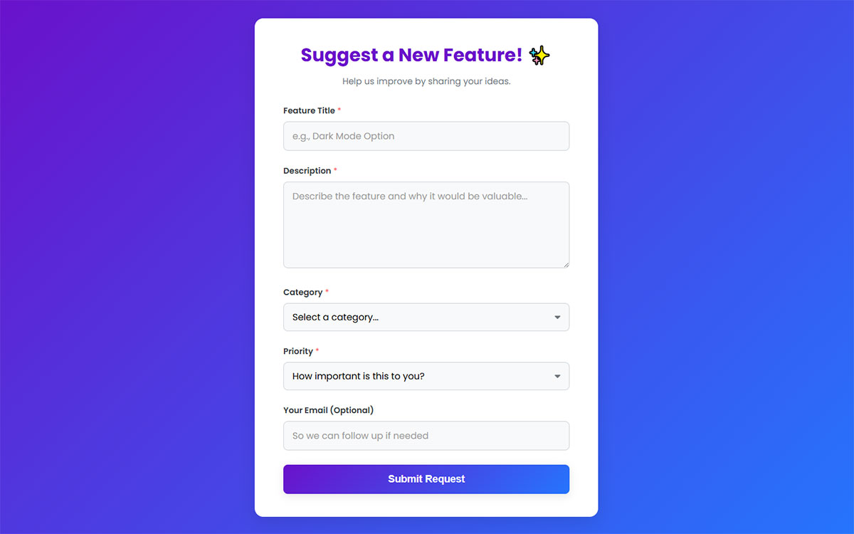
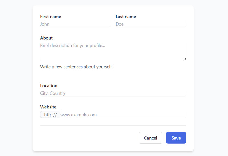
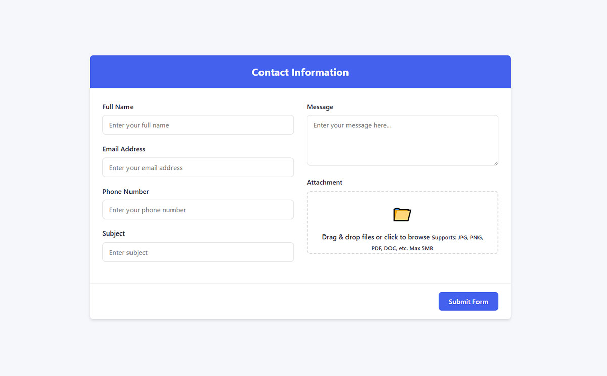
Contact Form
See the Pen
Modern Contact Form by Bogdan Sandu (@bogdansandu)
on CodePen.
A contact form lets visitors send messages without opening their email client.
What is a Contact Form used for?
Service providers, agencies, and corporate sites use these to handle inquiries while keeping spam under control. They work for lead qualification, support requests, partnership inquiries, and general questions. Your email stays hidden from scrapers.
How does a Contact Form work?
Someone fills it out, hits submit, and the message lands in your inbox via SMTP or API. Most send an auto-reply confirming receipt. Smart forms route submissions to the right department or push straight into your CRM.
What fields does a Contact Form typically include?
- Name
- Email address
- Subject line
- Message box
- Phone number (optional unless you need callbacks)
- Dropdown for inquiry type
- File upload for screenshots or documents
- CAPTCHA to block bots
What are the best practices for designing a Contact Form?
Stick to 3-5 fields. Single-column layout works better than side-by-side fields. Labels go above inputs, not inside as placeholders that vanish when typing starts.
Add microcopy where things get confusing. Your CTA should say “Send Message” or “Get in Touch,” not just “Submit.” Make tap targets big enough for thumbs.
Real-time validation catches typos before submission. Security badges help if you’re collecting sensitive details.
What are common mistakes with Contact Forms?
Asking for stuff you don’t actually need (birthday? really?). Multi-column layouts mess with how people scan pages. Making everything required when half could be optional.
Burying the form three clicks deep in your site architecture. No confirmation message leaves people wondering if it worked.
Not testing your own form means you might miss broken submissions for weeks.
Registration / Sign-up Form
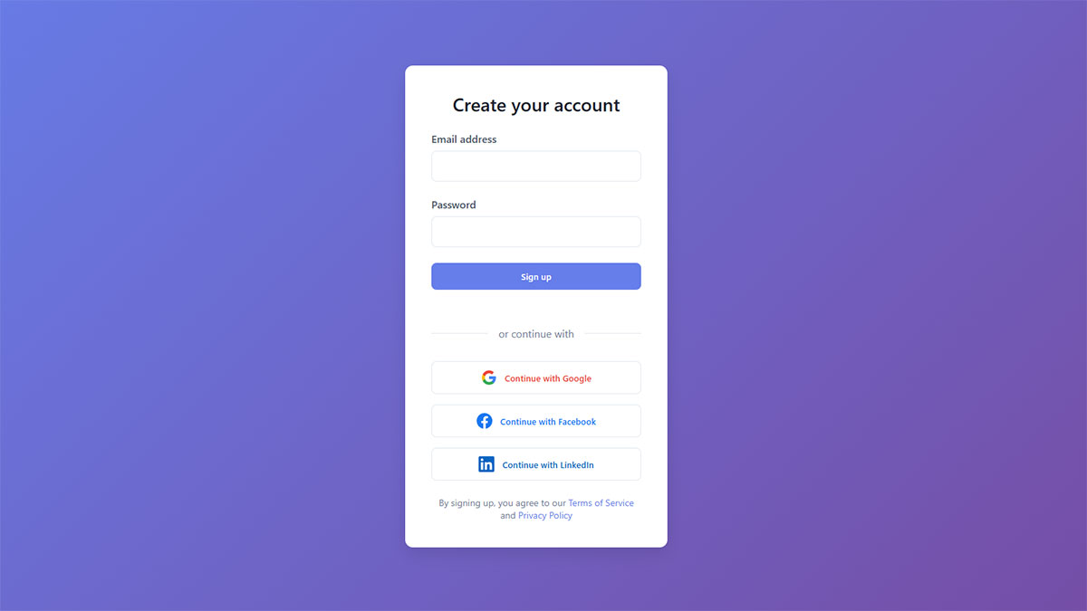
Creates new user accounts by collecting credentials and basic profile info.
What is a Registration / Sign-up Form used for?
E-commerce sites, SaaS platforms, membership communities. Pretty much anywhere you need users to create accounts. B2B platforms grab company details, consumer apps keep it minimal. The goal is onboarding without friction.
How does a Registration / Sign-up Form work?
You type in credentials, system checks if that email already exists, validates your password strength, then creates your account. Most places send a verification email before letting you in. Some skip that step entirely to get you started faster.
What fields does a Registration / Sign-up Form typically include?
Essential:
- Email address
- Password (with strength indicator)
Sometimes added:
- Full name
- Username (though email works fine for most sites)
- Phone number
- Company name
- Date of birth
Social login buttons pull data from Google or Facebook, cutting the whole thing down to one click.

What are the best practices for designing a Registration / Sign-up Form?
Email and password. That’s it. Everything else is optional or can wait until later.
Show password strength while typing. Let people toggle visibility with the eye icon. Support autocomplete so password managers work properly. Use the right HTML5 input types for better mobile keyboards.
Never force account creation at checkout. Offer sign-up forms with social login or guest checkout instead.
What are common mistakes with Registration / Sign-up Forms?
Demanding 10+ fields kills your conversion rate dead. Making people type their email twice wastes time. Password rules that aren’t clear until after you’ve already typed it wrong.
Forcing username creation when literally nobody wants to pick “john_smith_8473.” Blocking paste in password fields (please stop doing this).
Rejecting perfectly valid email formats because your regex is too strict.
Login Form
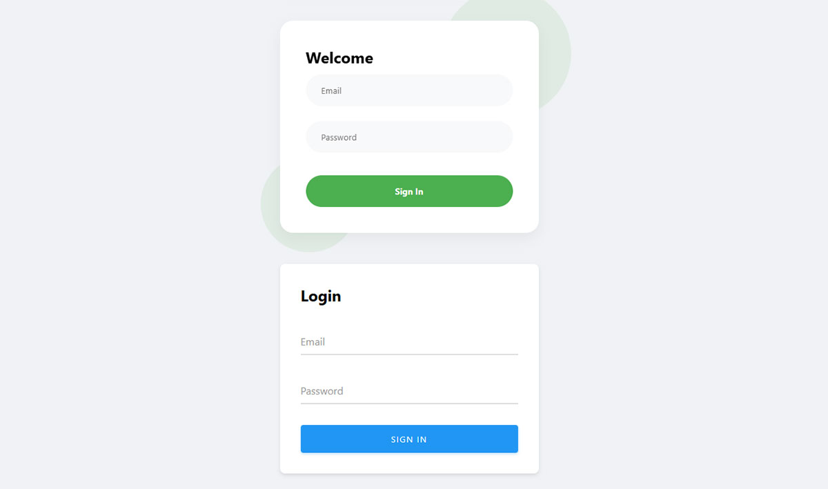
Where returning users prove who they are to access their accounts.
What is a Login Form used for?
Banks, social networks, email services, company intranets. Anywhere user data needs protecting. These verify your identity before opening the doors.
How does a Login Form work?
Enter your credentials, system checks them against what’s stored in the database. Match? You’re in, and it creates a session or token. Wrong password? Try again, but too many failures might lock you out temporarily. “Remember me” checkbox uses secure cookies to keep you logged in.
What fields does a Login Form typically include?
- Email or username
- Password
- “Remember me” checkbox
- CAPTCHA (after failed attempts)
Some split these across two screens. Others show both at once.
What are the best practices for designing a Login Form?
Use type="email" so mobile keyboards show @ and .com shortcuts. Put the “Forgot password?” link where people can actually see it. Set proper autocomplete attributes so password managers work.
Let people toggle password visibility. Don’t clear the fields when someone types wrong credentials (making them retype everything is annoying).
Show specific errors. “Email not found” beats a vague “Login failed.” Add SSO options for login forms that people actually use.
What are common mistakes with Login Forms?
Setting autocomplete="off" breaks password managers, and everyone hates you for it. Error messages that don’t explain what’s wrong.
Locking accounts after 3 tries catches legitimate users more than hackers. Not offering password reset creates support tickets. Using type="text" for passwords shows them in plain text on screen.
Newsletter Subscription Form
Captures email addresses for marketing campaigns and content delivery.
What is a Newsletter Subscription Form used for?
Publishers, bloggers, brands, and SaaS companies build email lists with these. Send regular content, announce updates, share exclusive offers. Works everywhere from fashion blogs to enterprise software.
How does a Newsletter Subscription Form work?
Type in email, click subscribe. System validates the format and checks for duplicates. Most send a confirmation email (double opt-in) to make sure you actually want this and to comply with anti-spam laws. After confirming, you’re added to the list and usually get a welcome email.
What fields does a Newsletter Subscription Form typically include?
Just email, honestly. That’s all you need.
Sometimes added:
- First name
- Content preferences (topics you care about)
- Send frequency choice
GDPR forms need consent language and privacy policy links. But seriously, fewer fields = more signups.
What are the best practices for designing a Newsletter Subscription Form?
One field when possible. Tell people what they’re getting (“Weekly design tips” not “Subscribe to our newsletter”). Mention how often (“Monthly,” not whenever you feel like it).
Put forms where people actually look: homepage, blog sidebar, exit-intent popup forms, article endings. Make your CTA about the benefit, not the action. “Get free templates” beats “Submit.”
Throw in an incentive (discount, free guide, early access). Add social proof like “Join 50,000+ readers” if your list is actually that big.
What are common mistakes with Newsletter Subscription Forms?
Asking for first name, last name, company, job title, shoe size. Pick one (hint: email).
Vague value props that don’t explain why anyone should care. Hiding forms on pages nobody visits. Generic CTAs like “Sign up” without context.
Skipping confirmation emails gets you spam complaints. Not mentioning how to unsubscribe violates actual laws.
Checkout / Payment Form
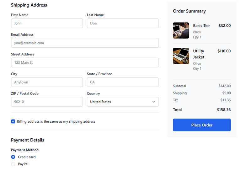
Where customers enter billing info and complete purchases.
What is a Checkout / Payment Form used for?
Online stores, service bookings, SaaS subscriptions, digital products. Any transaction that needs payment processing. Physical products need shipping addresses, digital goods skip that step.
How does a Checkout / Payment Form work?
Review cart, enter addresses, pick payment method, add card details (or use Apple Pay). Payment processor validates everything, checks funds, processes the charge. Approved? Order confirms and inventory updates. Declined? You get a specific error message to fix the problem.
What fields does a Checkout / Payment Form typically include?
Billing address:
- Name
- Street address
- City, postal code, country
Payment:
- Card number (auto-detects Visa/Mastercard/Amex)
- Expiration date
- CVV
- Cardholder name
Also common:
- Shipping address (if different)
- Email for receipts
- Phone number (optional but helpful for delivery)
- Promo code (hide behind a link, don’t show by default)
- Guest checkout vs. account creation
What are the best practices for designing a Checkout / Payment Form?
Eight fields or less if you can manage it. Single column. Order makes sense: shipping, then payment, then review.
Address autocomplete saves typing. Card type detects automatically from the number. Support digital wallets because people love one-click payment.
Progress bars for multi-step checkouts. Security badges where people can see them. Running total stays visible. Guest checkout always offered. Validation catches errors in real-time before submission.
What are common mistakes with Checkout / Payment Forms?
Forcing account creation kills conversions instantly. Surprise fees at the last second destroy trust. Multi-column layouts confuse the flow.
Missing payment methods frustrates customers who wanted to use PayPal. Clearing fields after errors makes people restart from scratch.
Hidden shipping costs until the final step. Unlabeled required fields. Mobile users can’t tap tiny buttons or read microscopic text.
Order Form
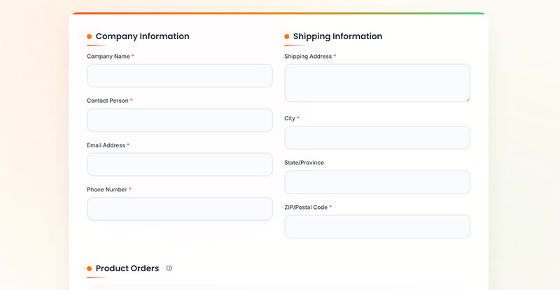
Captures product selections, quantities, and delivery details for purchase requests.
What is an Order Form used for?
Wholesale suppliers, manufacturers, catering services, custom product businesses. These handle bulk orders and complex configurations where regular shopping carts don’t cut it. Good for B2B transactions or taking orders without building a full e-commerce site.
How does an Order Form work?
Pick products, specify quantities, add customizations, choose delivery preferences. Form calculates totals including tax and shipping. Submit and it goes to the vendor for processing and invoicing. Some collect payment immediately, others work on invoice or PO terms.
What fields does an Order Form typically include?
Product selection:
- Dropdown or checkboxes
- Quantity fields
- Customization options (size, color, specs)
Customer info:
- Name, company, email, phone
- Delivery address
- Preferred delivery date
- Payment method
- PO number (B2B deals)
Also useful:
- Special instructions box
- Terms acceptance checkbox
What are the best practices for designing an Order Form?
Group items by category. Show unit prices and auto-calculate totals as quantities change. Use conditional logic to reveal relevant options based on selections.
Product images or descriptions prevent ordering the wrong thing. Dynamic quantity discounts appear automatically. Shipping calculator visible upfront. Calendar picker for delivery dates.
File upload for custom artwork or specs. Clear return policy and contact info. Save-as-draft for large orders that take time to complete.
What are common mistakes with Order Forms?
No automatic total calculation forces mental math. Missing product descriptions leads to wrong orders. Unclear minimum quantities.
Requiring payment when B2B customers expect invoicing. Hiding bulk discounts until after submission. No order confirmation creates uncertainty.
Long forms without draft saving lose data mid-session. No order number makes tracking impossible later.
Booking / Appointment Form
Coordinates availability between service providers and clients for meetings or reservations.
What is a Booking / Appointment Form used for?
Doctors, salons, consultants, repair shops, restaurants, hotels, gyms. Anyone scheduling appointments instead of taking walk-ins. Reduces no-shows through confirmations and replaces phone tag with self-service booking.
How does a Booking / Appointment Form work?
Pick a service, view available slots, choose your preferred time, enter contact details. System checks the calendar in real-time, reserves your slot, sends confirmation via email or SMS, and blocks that time from others. Automated reminders hit before appointments. Calendar sync prevents double-booking disasters.
What fields does a Booking / Appointment Form typically include?
Core fields:
- Service selection
- Date picker
- Time slot chooser
- Name, email, phone
- Number of people (for restaurants/tours)
Industry-specific:
- Insurance info (medical)
- Preferred stylist (salon)
- Vehicle details (auto repair)
- Special requests box
Payment collection for deposits or prepayment.
What are the best practices for designing a Booking / Appointment Form?
Show real-time availability calendar. Let people reschedule or cancel with reasonable notice. Instant confirmation with calendar invite attached.
Reminder system (48hrs, 24hrs, 2hrs before). Conditional logic shows relevant fields (pick “in-person,” see address field; pick “virtual,” choose platform).
Time zones adjust automatically. Buffer time between appointments prevents overruns. Recurring booking option for regulars. Payment integration reduces no-shows.
What are common mistakes with Booking / Appointment Forms?
Not showing available slots creates back-and-forth emails. Manual checking causes double-bookings. No reminders means higher no-show rates.
Asking unnecessary info slows things down. Poor mobile experience frustrates people booking on the go.
No self-service rescheduling creates support tickets. Missing time zone handling confuses remote clients. No waitlist when fully booked.
Feedback Form
Collects opinions, suggestions, complaints, and satisfaction ratings about products or services.
What is a Feedback Form used for?
Every business trying to improve uses these. SaaS platforms gather product feedback, retailers measure shopping experiences, support teams track satisfaction, events assess attendee reactions. They identify pain points, validate improvements, and measure customer sentiment.
How does a Feedback Form work?
User gets the form (post-purchase email, website popup, in-app trigger). Answers questions through ratings, multiple choice, or open text. Submit and responses store in a database for analysis. Negative feedback often triggers automated follow-ups or routes complaints to the right team.
What fields does a Feedback Form typically include?
Rating questions:
- Satisfaction scales (1-5, 1-10, stars, emoji)
- Multiple choice for specific aspects
- NPS score (“How likely to recommend?”)
Open feedback:
- Text box for detailed comments
Optional:
- Contact info (if follow-up wanted)
- Demographics for segmentation
Keep everything optional to reduce abandonment.
What are the best practices for designing a Feedback Form?
Three to five questions max. Consistent rating scales throughout (don’t switch from 1-10 to 1-5 mid-form). Mix closed questions with one open-ended field.
Time requests right. Post-transaction works. After support resolution works. Mid-checkout doesn’t work.
Make fields optional. Progress bars on longer forms. Simple language, zero jargon. Star ratings convert better than number scales. Follow best practices for creating feedback forms to boost response rates.
What are common mistakes with Feedback Forms?
Too many questions exhausts people. Leading questions (“How great was our service?”) bias results. Requiring every field stops quick submissions.
Bad timing like asking during checkout. Collecting feedback but never acting on it. Overly complex questions confuse respondents.
No “prefer not to answer” for sensitive topics. Claiming anonymity while asking for name and email.
Survey / Quiz Form
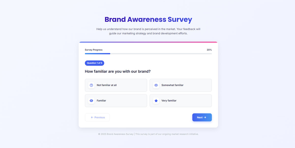
Gathers opinions, preferences, or knowledge through structured questions and answer choices.
What is a Survey / Quiz Form used for?
Market research, customer feedback, employee satisfaction, academic studies. Quizzes work for lead generation (“What’s your marketing style?”), assessments, or entertainment. Surveys measure sentiment, quizzes test knowledge or generate personalized results.
How does a Survey / Quiz Form work?
Present questions in sequence. People choose from options or type responses. Submit and results either get stored for analysis or generate immediate feedback (quiz scores, personality types). Smart surveys use logic branching (answer A shows question 3, answer B shows question 5).
What fields does a Survey / Quiz Form typically include?
Question formats:
- Multiple choice (single or multi-select)
- Rating scales (1-5, 1-10, stars)
- Yes/No questions
- Open text boxes
- Ranking questions
- Matrix grids
Optional:
- Progress bar
- Contact info (name, email)
- Demographics
What are the best practices for designing a Survey / Quiz Form?
Keep it under 10 questions. Five minutes max completion time. Use consistent rating scales (don’t switch from 1-10 to 1-5 mid-survey).
Mix question types but don’t go crazy with it. Start with easy questions, build to harder ones. Make most fields optional to reduce abandonment.
Show progress indicators. Avoid leading questions (“How amazing was our service?”). Skip logic shows relevant questions only. Mobile-friendly layouts with single-column format.
What are common mistakes with Survey / Quiz Forms?
Too many questions exhausts people. Asking for demographics upfront before they’re invested. Matrix questions that don’t work on mobile.
Vague questions get vague answers. Required fields on every question forces dropouts. No “prefer not to answer” option on sensitive topics.
Unclear purpose (people don’t know why they’re answering). Not testing on actual devices before launch.
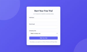
Lead Generation Form
Captures visitor information in exchange for something valuable like guides, trials, or consultations.
What is a Lead Generation Form used for?
B2B and B2C companies building sales pipelines. Downloads (ebooks, whitepapers, templates), free trials, demo requests, webinar signups. Turns anonymous traffic into contacts your sales team can actually follow up with.
How does a Lead Generation Form work?
Visitor wants your offer, fills out minimal info, submits. Data flows into CRM, triggers automation (welcome email, sales notification, lead scoring). Sales team gets context before first contact. Better forms qualify leads immediately through smart questions.
What fields does a Lead Generation Form typically include?
Essential:
- Email address
- First name (sometimes full name)
B2B additions:
- Company name
- Job title
- Company size
- Phone number
Qualification questions:
- Budget range
- Timeline
- Current challenges
More fields = fewer submissions but higher quality leads. Balance depends on offer value.
What are the best practices for designing a Lead Generation Form?
Three to five fields for top-of-funnel offers. More acceptable for high-value items (demos, consultations). State the value clearly upfront.
Use lead generation form examples that show immediate benefits. Progressive profiling collects data over time, not all at once.
Single-column layout. Mobile-optimized. Auto-fill enabled. Privacy policy linked. Clear CTA focused on outcome (“Get Your Free Guide” not “Submit”).
Remove CAPTCHA if possible (kills conversions). Test field count through A/B testing.
What are common mistakes with Lead Generation Forms?
Asking for info you don’t need. Ten fields for a basic PDF download. Generic CTAs that don’t explain the benefit.
No trust signals (testimonials, security badges). Unclear value proposition. Mobile-hostile layouts.
Requiring work email addresses drops conversions by 50%+. Not integrating with CRM means manual data entry.
Job Application Form
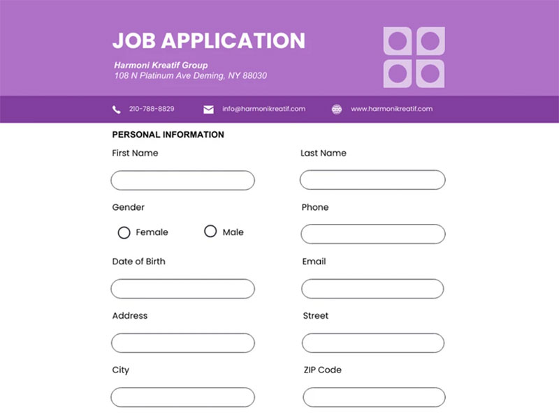
Image source: Venngage
Collects candidate information for employment consideration, standardizing data across all applicants.
What is a Job Application Form used for?
Any company hiring employees. Entry-level positions, management roles, specialized positions. Creates legal record, ensures fair comparison, meets compliance requirements. Works alongside or instead of resumes depending on the role.
How does a Job Application Form work?
Candidate finds job posting, fills out application (contact details, work history, education, skills), uploads resume if required, submits. Application enters applicant tracking system, HR reviews and screens, qualified candidates move forward to interviews.
What fields does a Job Application Form typically include?
Basic info:
- Full name
- Email, phone
- Address
- Position applied for
- Available start date
Work history:
- Previous employers
- Job titles, dates
- Responsibilities
Education:
- Schools attended
- Degrees, certifications
Additional:
- Skills relevant to role
- References (often optional initially)
- Work authorization status
- Resume upload
- Cover letter (optional)
What are the best practices for designing a Job Application Form?
Keep it under 10 minutes to complete. Entry-level roles need fewer fields than senior positions. Mobile-friendly (50%+ of applicants use phones).
Add 1-2 knockout questions to filter unqualified candidates early (“Do you have required certification?”). Don’t ask for duplicate info if resume required.
Allow LinkedIn profile instead of manual entry. Auto-save progress. Clear privacy policy. Confirmation email after submission.
Skip salary history questions (illegal in many places). Make cover letters optional unless truly needed.
What are common mistakes with Job Application Forms?
Twenty screening questions before they even start. Asking for info that’s on the resume anyway. Not mobile-optimized.
Illegal questions (age, marital status, religion). Requiring fields you don’t actually use. No confirmation after submission.
Forcing all fields as required. Complex forms without progress indicators. Poor error messages when something goes wrong.
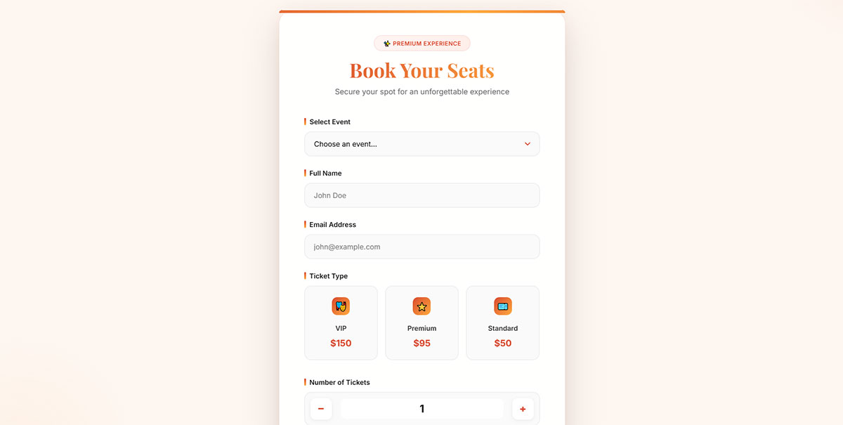
Event Registration Form
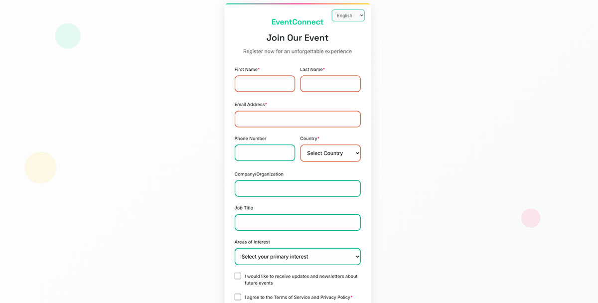
Captures attendee information for conferences, webinars, workshops, or social gatherings.
What is an Event Registration Form used for?
Event planners, conference organizers, workshop hosts, webinar presenters. Manages attendee lists, collects dietary restrictions, assigns tickets, processes payments, sends confirmations and reminders. Works for in-person and virtual events.
How does an Event Registration Form work?
Person finds event, registers through form, selects ticket type or session preferences, provides contact details, submits (sometimes with payment). System confirms registration via email with calendar invite, sends reminders as event approaches.
What fields does an Event Registration Form typically include?
Core fields:
- Name, email, phone
- Ticket type selection
- Number of attendees
- Dietary restrictions
- Accessibility needs
Professional events:
- Company name
- Job title
- LinkedIn profile
Additional:
- Session preferences
- T-shirt size
- Emergency contact
- Payment details
- Promo code
What are the best practices for designing an Event Registration Form?
Show event details clearly (date, time, location, agenda). Real-time ticket availability updates. Multi-attendee registration in one form.
Calendar integration (automatic invite). Immediate confirmation email. Payment options if ticketed. Refund policy visible.
Mobile responsive (people register on phones). Progress indicator for multi-step forms. Allow modifications after registration.
What are common mistakes with Event Registration Forms?
Not stating capacity limits upfront. Confusing ticket types without descriptions. No confirmation email leaves people uncertain.
Asking for too much info for a free event. Payment processing that doesn’t work on mobile. No way to cancel or modify registration.
Missing dietary or accessibility fields. No reminder emails. Complicated group registration process.
Password Reset Form
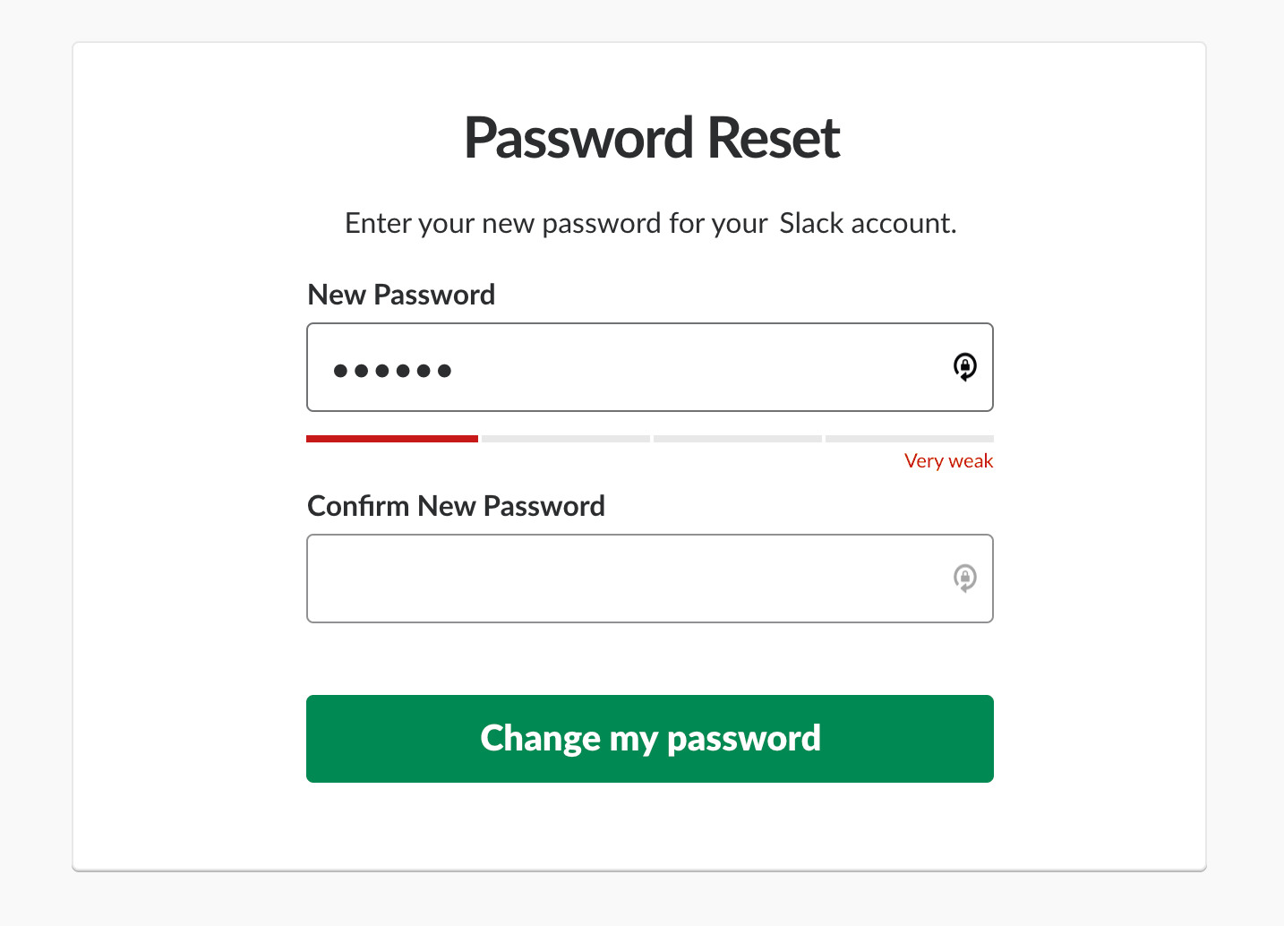
Image source: Smashing Magazine
Allows users to regain account access by verifying identity and creating new credentials.
What is a Password Reset Form used for?
Every platform with user accounts needs one. People forget passwords constantly. This lets them back in without support tickets. Verifies identity through email or SMS before allowing password changes.
How does a Password Reset Form work?
User clicks “Forgot password,” enters email or username, receives verification code or link, clicks through, creates new password, gets confirmed back in. System validates email exists, sends secure token, checks token hasn’t expired, updates password in database.
What fields does a Password Reset Form typically include?
- Email address or username (initial request)
- Verification code (from email/SMS)
- New password
- Password confirmation
- Password requirements display
Some use security questions instead of email verification.
What are the best practices for designing a Password Reset Form?
Clear instructions at each step. Show password requirements while typing. Strength indicator provides feedback.
Expire reset links after reasonable time (1-24 hours). Don’t reveal whether email exists in system (security risk). Allow password visibility toggle.
Mobile-friendly. Confirmation after successful reset. Automatic login after change or redirect to login page.
What are common mistakes with Password Reset Forms?
Telling attackers “email not found” (reveals valid accounts). Reset links that never expire. No rate limiting (allows brute force).
Unclear password requirements frustrate users. SMS codes that arrive 10 minutes late. No way to contact support if locked out.
Overly complex security questions. Forcing immediate password change on every login attempt.
Search Form
Enables users to find specific content, products, or information within websites or databases.
What is a Search Form used for?
E-commerce sites, blogs, documentation, knowledge bases. Anywhere with enough content that browsing becomes inefficient. Helps users find exactly what they need fast.
How does a Search Form work?
Type query, hit enter or click search icon. System scans indexed content, returns relevant results ranked by match quality. Advanced versions offer filters (price, date, category), autocomplete suggestions, typo correction.
What fields does a Search Form typically include?
- Search input box
- Search button/icon
- Category filter (optional)
- Advanced filters (price range, date, location)
- Sort options (relevance, date, price)
- Autocomplete suggestions
What are the best practices for designing a Search Form?
Prominent placement (header, usually top right). Large enough click target. Autocomplete saves typing.
Show recent searches or popular queries. Voice search option on mobile. Clear button to wipe query.
Display results count (“127 results for ‘blue shoes'”). Suggest alternatives for zero results. Fast response time (under 1 second).
What are common mistakes with Search Forms?
Tiny search box that hides what you’re typing. No autocomplete or suggestions. Poor results ranking.
No handling of typos or synonyms. Too many filters overwhelming the experience. Search button not obvious.
Slow results that take 5+ seconds. No way to refine bad results.
Donation Form
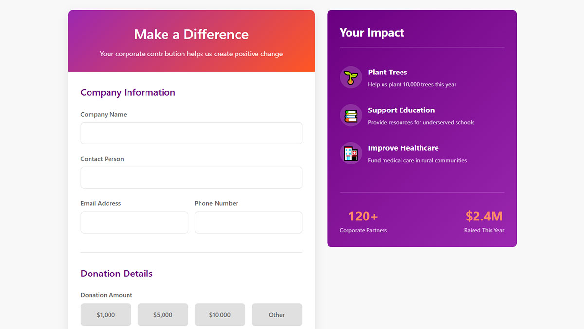
Facilitates charitable giving by collecting donor information and processing financial contributions.
What is a Donation Form used for?
Nonprofits, charities, political campaigns, crowdfunding. Processes one-time or recurring donations, collects donor data for tax receipts and future outreach. Some offer tribute gifts or fund designation options.
How does a Donation Form work?
Donor chooses amount (preset or custom), selects payment method, enters billing info and contact details, optionally adds dedication or tribute, submits. Payment processor handles transaction, system sends receipt, adds donor to database.
What fields does a Donation Form typically include?
Donation details:
- Amount (preset buttons or custom)
- Frequency (one-time, monthly, annual)
- Fund designation
- Tribute/memorial option
Payment:
- Card details or PayPal
- Billing address
Donor info:
- Name, email, phone
- Anonymous option
- Employer (matching gifts)
What are the best practices for designing a Donation Form?
Suggested amounts guide giving. Show impact (“$50 feeds 10 families”). One-click recurring option.
Multiple payment methods. Mobile wallets supported. Guest donation without account creation.
Tax receipt sent immediately. Thank you message with impact statement. Employer matching reminder.
Security badges visible. Progress toward campaign goal. Social sharing buttons.
What are common mistakes with Donation Forms?
Too many required fields. No suggested amounts forces decisions. Hidden fees appearing at checkout.
Complicated recurring cancellation. No mobile optimization. Unclear where money goes.
No immediate confirmation. Asking for excessive personal info. Payment failures without clear error messages.
Quote Request Form

Gathers project details from potential clients requesting price estimates for services or products.
What is a Quote Request Form used for?
Service businesses (contractors, agencies, consultants), B2B sales, custom product manufacturers. Collects enough detail to provide accurate pricing without lengthy discovery calls. Qualifies leads before sales investment.
How does a Quote Request Form work?
Prospect describes project needs, provides contact info, submits request. Sales team receives details, evaluates scope, follows up with formal quote. Form data helps prepare proposal and estimate effort.
What fields does a Quote Request Form typically include?
Project details:
- Service/product type
- Project scope description
- Timeline/deadline
- Budget range
Contact info:
- Name, company
- Email, phone
- Location (if relevant)
Qualification:
- Decision-maker status
- Current solution
- Urgency level
What are the best practices for designing a Quote Request Form?
Balance detail with simplicity. Too short = can’t quote accurately, too long = abandonment.
Use dropdowns for service type. Budget ranges instead of exact numbers. Timeline options (ASAP, 1-3 months, just exploring).
Set response time expectations. File upload for specs or examples. Auto-response confirms receipt.
Conditional logic shows relevant questions based on service selection.
What are common mistakes with Quote Request Forms?
Asking for detailed specifications upfront (save for sales call). No budget indication makes quoting impossible.
No response time stated. Vague service descriptions confuse prospects. Required fields that don’t apply to all quote types.
No follow-up system means requests get forgotten.
Support / Help Request Form
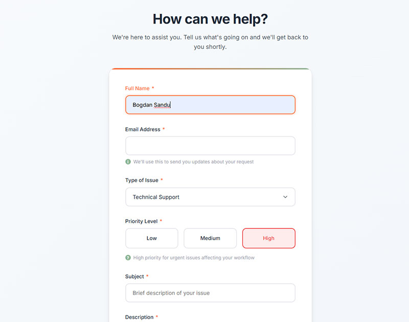
Channels customer support inquiries into ticketing systems for organized resolution.
What is a Support / Help Request Form used for?
Customer service teams across all industries. Triages issues, creates support tickets, routes to right department. Collects enough context for efficient troubleshooting. Alternatives to phone or live chat support.
How does a Support / Help Request Form work?
Customer describes issue, categorizes problem type, provides account details, attaches screenshots if helpful, submits. System creates ticket, assigns to appropriate team, sends confirmation with ticket number. Support team responds via email or portal.
What fields does a Support / Help Request Form typically include?
Issue details:
- Subject/summary
- Category (billing, technical, general)
- Priority level
- Detailed description
Account info:
- Name, email
- Account/order number
- Product/service affected
Helpful additions:
- File upload (screenshots, logs)
- Device/browser info
- Steps to reproduce
What are the best practices for designing a Support / Help Request Form?
Auto-suggest knowledge base articles as they type (reduces tickets). Clear categories speed routing.
Show response time estimates per priority. Ticket number provided immediately. Status tracking link.
Pre-fill account info for logged-in users. Device detection captures tech specs automatically.
Search existing tickets to prevent duplicates.
What are common mistakes with Support / Help Request Forms?
Too many categories confuse users. No acknowledgment after submission. Asking for info already in their account.
No file upload when screenshots would help. Priority options without explaining what each means.
Forms that create tickets but nobody monitors them.
Profile / Account Settings Form
Manages user account preferences, personal information, and configuration options.
What is a Profile / Account Settings Form used for?
User accounts on any platform. Updates contact details, notification preferences, privacy settings, payment methods, password changes. Self-service reduces support load.
How does a Profile / Account Settings Form work?
User logs in, navigates to settings, modifies fields as needed, saves changes. System validates new data, updates database, confirms changes. Some changes (email, password) require verification before taking effect.
What fields does a Profile / Account Settings Form typically include?
Personal info:
- Name, email, phone
- Address
- Profile photo
- Bio/description
Preferences:
- Notification settings
- Language/timezone
- Privacy controls
Security:
- Password change
- Two-factor authentication
- Active sessions
Billing:
- Payment methods
- Subscription plan
- Billing history
What are the best practices for designing a Profile / Account Settings Form?
Group related settings logically. Save buttons per section (not one master save).
Show what changed recently. Undo option for accidental changes. Confirmation before destructive actions (delete account).
Email verification for address changes. Clear password requirements. Export data option (GDPR compliance).
Show connected apps/integrations. Activity log for security.
What are common mistakes with Profile / Account Settings Form?
Everything on one overwhelming page. No confirmation messages. Changes that take effect without warning.
Can’t undo destructive actions. Password change that logs out all devices without warning.
No way to download your data. Settings scattered across multiple confusing pages.
File Upload Form
Allows users to submit documents, images, or other files to websites or applications.
What is a File Upload Form used for?
Job applications (resumes), support tickets (screenshots), creative submissions (portfolios), document verification (contracts, IDs), content submissions (photos, videos). Any scenario requiring file transfer from user to server.
How does a File Upload Form work?
User clicks upload button, selects file from device, sees upload progress, file validates (size, type), stores on server, confirmation appears. Some show preview before final submission.
What fields does a File Upload Form typically include?
- File picker button
- Drag-and-drop zone
- File type restrictions notice
- Size limit notice
- Upload progress bar
- Preview (for images)
- Description/caption (optional)
- Contact info fields
What are the best practices for designing a File Upload Form?
State file requirements clearly (types, size limits). Drag-and-drop plus click-to-upload options.
Progress indicator for large files. Error messages that actually help (“File too large, max 10MB” not “Error 413”).
Multiple file upload at once. Preview before submission. Allow removal/replacement.
Mobile camera access for photos. Compress images automatically if needed.
What are common mistakes with File Upload Forms?
No size limit stated until upload fails. Accepted formats unclear. Progress bar that freezes.
Uploads that timeout without warning. No mobile optimization. Can’t preview what you uploaded.
Form submits before upload completes. No retry option for failed uploads.
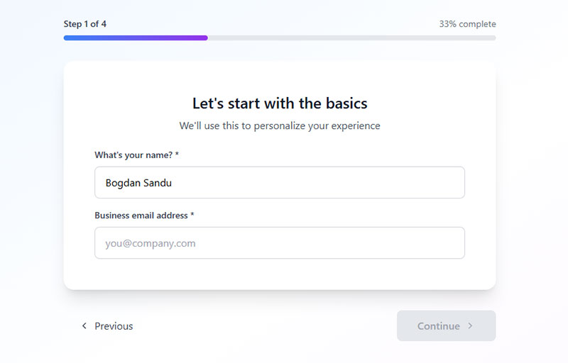
Multi-step / Wizard Form
Breaks complex forms into sequential steps with progressive disclosure of questions.
What is a Multi-step / Wizard Form used for?
Long processes where showing everything at once overwhelms people. Checkout flows, complex applications, detailed surveys, onboarding, product configurators. Reduces perceived effort by chunking information.
How does a Multi-step / Wizard Form work?
First screen shows initial questions, user completes those, clicks next, second screen appears with new questions. Progress saves as you go. Back button available. Final step reviews everything before submission.
What fields does a Multi-step / Wizard Form typically include?
Depends on purpose, but structure includes:
- Progress indicator (step 2 of 5)
- Current step’s questions
- Back/Next navigation
- Step labels
- Optional review page
Each step typically has 2-5 related questions grouped logically.
What are the best practices for designing a Multi-step / Wizard Form?
Keep it to 3-5 steps max. Progress bar shows position. Allow back navigation without losing data.
Auto-save between steps. Clear step titles explain each section. Review page before final submit.
Logical grouping (contact info → preferences → payment). Skip irrelevant steps with conditional logic.
Mobile-friendly. Exit option that saves draft.
What are common mistakes with Multi-step / Wizard Forms?
Too many steps (10+). No progress indicator. Back button clears data.
Can’t jump to specific steps to fix errors. No save-as-draft option. Each step too long (defeats the purpose).
Progress bar lies about remaining steps. No review before submission.
Pop-up / Modal Form
Overlay form that appears above page content, triggered by user actions or behaviors.
What is a Pop-up / Modal Form used for?
Newsletter signups, lead capture, exit-intent offers, age verification, cookie consent, special promotions. Grabs attention without navigating away. Timed or behavior-triggered (scroll depth, exit intent, time on page).
How does a Pop-up / Modal Form work?
Trigger condition met (page load, scroll 50%, mouse moves to exit), popup appears over content, background dims, user completes form or closes it. Submission or close action dismisses popup. Good ones remember you closed it (don’t show again same session).
What fields does a Pop-up / Modal Form typically include?
Keep minimal:
- Email address (most common)
- Name (optional)
- Single preference question
Always include:
- Clear close button (X)
- Submit button
- Value proposition
What are the best practices for designing a Pop-up / Modal Form?
Delay appearance (wait 30+ seconds or scroll trigger). Easy to close (visible X button).
Mobile-friendly sizing. Single field when possible. Clear value exchange.
Don’t show immediately on every page load. Respect dismissal (use cookies). GDPR compliant.
Exit-intent forms work for cart abandonment. Consider popup forms vs inline alternatives.
What are common mistakes with Pop-up / Modal Forms?
Appears instantly (before reading anything). No close button or tiny/hidden X. Impossible to dismiss on mobile.
Shows repeatedly after closing. Blocks content without adding value. Tiny text on mobile.
No explanation of what you’re signing up for. Multiple popups on same page.
Conversational Form

Presents questions one at a time in chat-like interface, creating interactive dialogue.
What is a Conversational Form used for?
Lead qualification, customer support intake, quizzes, surveys, booking appointments. Makes long forms feel engaging. Works well for mobile. Personality-driven brands use these for on-brand experiences.
How does a Conversational Form work?
First question appears, user answers, next question appears based on response. Feels like chat conversation. Uses conditional logic heavily. Answers build up progressively. Review and submit at end.
What fields does a Conversational Form typically include?
Same questions as regular forms, just presented differently:
- Single question at a time
- Answer options (buttons, text input)
- Progress indicator
- Back option
- Conversational copy (“Great! Now…”)
What are the best practices for designing a Conversational Form?
Natural language in questions. Short questions work better. Mix button choices with open text.
Acknowledge answers (“Got it!”). Show progress. Use conversational forms for longer processes.
Personality in copy matches brand voice. Allow back to change answers. Fast transitions between questions.
Mobile-first design. Keyboard shortcuts (Enter to submit).
What are common mistakes with Conversational Forms?
Too slow between questions frustrates users. No way to review all answers before submitting. Forced to answer everything (can’t skip).
Progress indicator missing. Transitions too animated/distracting. Not actually conversational (just regular form rearranged).
No personality in copy defeats the purpose. Answers get lost (no review step).
FAQ on Types Of Forms
What are the most common types of forms on websites?
Contact forms, registration forms, login forms, newsletter subscriptions, and checkout forms appear on most sites. Lead generation forms, feedback forms, and search forms are also widespread. The specific mix depends on your site’s purpose and business model.
How many fields should a form have?
Depends on the form type and offer value. Newsletter forms work with one field (email). Contact forms need 3-5 fields. Lead generation forms balance quality versus quantity—fewer fields increase submissions, more fields qualify leads better.
What’s the difference between a contact form and a lead generation form?
Contact forms handle general inquiries with basic fields. Lead generation forms qualify prospects by collecting business details like company size, budget, or timeline. Lead forms feed sales pipelines, contact forms route to support.
Should I use multi-step forms or single-page forms?
Single-page forms convert better for simple requests (3-5 fields). Multi-step forms work for complex data collection by reducing cognitive load. Use progress bars and keep each step to 2-3 questions maximum for best results.
What makes a good registration form?
Email and password only. Optional fields go last. Show password strength indicators and allow visibility toggles. Support autocomplete for password managers. Never force account creation before checkout. Social login options reduce friction significantly.
How do I reduce form abandonment?
Remove unnecessary fields. Add inline validation showing errors immediately. Use single-column layouts. Display progress bars on multi-step forms. Enable auto-save. Make mobile-friendly with large tap targets. Show clear value proposition upfront.
What fields are required for GDPR compliance?
Clear consent checkboxes (pre-checked boxes don’t count). Privacy policy links. Purpose statement explaining data use. Opt-in for marketing communications. Right to access, delete, or export data. GDPR compliant forms need explicit permission.
When should I use a popup form versus an inline form?
Popup forms grab attention for high-priority conversions like email capture or special offers. Inline forms feel less intrusive and work better for content-focused pages. Exit-intent popups catch abandoning visitors without disrupting reading.
What’s the best way to validate form fields?
Real-time validation as users type catches errors immediately. Show success states (green checkmarks) for correct entries. Error messages appear next to problematic fields with clear fix instructions. Validate email format, required fields, and password strength before submission.
How do conversational forms differ from regular forms?
Conversational forms present one question at a time in chat-like interfaces. They feel more engaging than traditional forms and work great on mobile. Best for lengthy surveys or qualification processes where standard forms feel overwhelming.
Conclusion
Understanding different types of forms helps you match the right tool to each job. Contact forms handle inquiries, registration forms build user bases, payment forms process transactions.
Each form type needs specific fields and design approaches. What works for a simple newsletter signup fails spectacularly on a complex job application.
Form validation, mobile responsiveness, and user experience matter across every category. But implementation details vary wildly between a feedback survey and a multi-step checkout flow.
Start with your goal, pick the matching form structure, then optimize field count and layout for your audience. Skip unnecessary fields. Test on actual devices. Make error messages helpful.
The right form improves conversions. The wrong one creates friction your competitors will happily exploit.
