

Most lead generation programs produce data. Few produce the right decisions from it. Knowing which lead generation KPIs to track is what separates teams that grow their pipeline with intention…
Table of contents
Most lead magnets collect dust. Someone downloads your PDF, skims two paragraphs, and never opens another email from you again.
The problem isn’t the concept. Gated content still works. The problem is execution. A weak offer, a clunky opt-in form, or zero follow-up will tank your conversion rate no matter how much traffic you’re driving.
This guide covers lead magnet best practices that actually move the needle, from choosing the right format and writing copy that converts, to placing your opt-in forms where they’ll get seen and building the email sequence that turns subscribers into customers.
No filler. Just the specific tactics, benchmarks, and lead magnet checklist items that separate high-performing offers from the ones nobody remembers downloading.
Lead Magnet Best Practices
Free Form Conversion Rate Calculator
What Makes a Lead Magnet Convert?
Not all lead magnets are created equal. Some collect emails like clockwork. Others sit on a landing page doing absolutely nothing. The difference comes down to a handful of specific traits.
Specificity Beats Broadness Every Time
“The Ultimate Guide to Marketing” sounds impressive. Nobody downloads it.
“5-Minute Morning Routine for Remote Workers” gets clicks because the promise is narrow, clear, and instantly understood. Unbounce’s Q4 2024 analysis of 41,000 landing pages found that the median conversion rate across all industries is 6.6%, but pages with specific, focused offers consistently outperform that baseline.
The tighter your promise, the higher your opt-in rate. Your mileage may vary, but I’ve seen this play out over and over again.
Instant Perceived Value
Perceived value has to register within seconds. If someone reads your headline and can’t immediately picture the benefit, they’re gone.
A GetResponse study found that 58.6% of marketers report short-form written content (checklists, toolkits, newsletter snippets) converts better than long-form text. Short content works because the value proposition is immediately obvious. Three pages, five action items, done.
The 30-page ebook? It creates friction. People download it, skim two pages, and forget it exists.
Low Time-to-Value
The best lead magnets deliver a result fast. A checklist takes two minutes to scan. A template is ready to use immediately. A quiz gives you a personalized answer in 60 seconds.
Compare that to a 45-minute webinar recording or a dense white paper. Both can work, but they require more from the visitor before they get anything back.
Interact’s data across 80 million leads shows that quizzes maintain an average 40.1% conversion rate specifically because they deliver personalized results almost instantly.
The Landing Page Does the Selling
Look, the lead magnet itself is only half the equation. The landing page form is where the actual convincing happens.
Unbounce’s research found that landing pages written at a 5th-to-7th grade reading level convert at 11.1%, while college-level copy converts at just 5.3%. That’s more than double the performance just from simplifying your language.
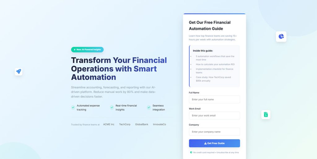
The formula that keeps working: a clear headline, three to four bullet points, a mockup image of the resource, and a single call to action. Nothing else on the page. No navigation menu, no sidebar, no distractions.
And keep the form fields minimal. Research shows each additional field you add to your opt-in form reduces conversion by roughly 13%. Name and email is usually enough to start the relationship.
Lead Magnet Formats That Perform Best by Industry
Not every format works the same way in every market. What converts for a SaaS company will flop for an ecommerce brand. Took me a while to accept that, but the data backs it up.
SaaS and Software
Free trials remain the gold standard for lead generation for SaaS. They let prospects experience the product firsthand, which is something no PDF can replicate.
ROI calculators and comparison spreadsheets work well as mid-funnel assets. HubSpot, for example, built its entire inbound marketing engine partly around free tools (Website Grader, Email Signature Generator) that function as lead magnets while also demonstrating platform capability.
Ecommerce
Discount codes are the obvious winner for lead generation for ecommerce. But style quizzes built with tools like Typeform or Interact are catching up fast.
A 2024 HubSpot report noted that gated eBooks now convert below 0.9% in many sectors, while interactive tools like quizzes convert upward of 5.2%. That’s a nearly 6x difference. Ecommerce brands especially benefit from using quizzes because product recommendation quizzes double as both a lead capture mechanism and a shopping assistant.
Coaching and Consulting
Free assessments and short video workshops dominate for lead magnets for coaches. The reason is straightforward: coaching is a trust-heavy purchase, and prospects need a taste of the experience before committing.
ConvertKit and ActiveCampaign email sequences tied to mini-courses perform particularly well here because they let the coach demonstrate expertise over multiple touchpoints rather than a single download.
When Multi-Step Lead Magnets Make Sense
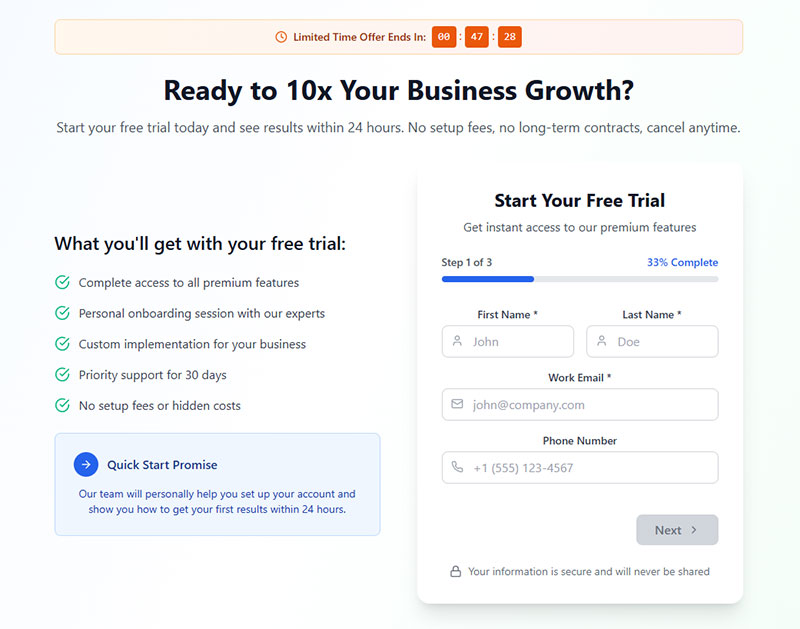
Tripwire funnels and multi-step forms introduce micro-commitments before the main opt-in. The idea is that small “yes” answers build momentum.
HubSpot data shows that only 40% of marketers use multi-step forms, but those who do report conversion rates that are 86% higher than single-step alternatives. The catch? If the steps feel pointless or the form drags on, people bail. There’s a fine line between smart progressive disclosure and multi-step forms that kill conversions.
Email courses vs. single PDF downloads involve a tradeoff. An email course spreads value across five to seven days, which keeps your brand in someone’s inbox longer. But completion rates drop with each email. A PDF gives instant gratification but ends the interaction faster.
How to Match a Lead Magnet to Buyer Intent
Throwing the same lead magnet at every visitor is like handing everyone the same shoe size. Some people will fit. Most won’t.
Matching your offer to where someone sits in their decision process changes everything about your conversion rate, your lead quality, and your eventual cost per acquisition.
Top of Funnel: Low-Commitment, Educational
Checklists, short guides, and infographics work here. The visitor barely knows they have a problem, or they’re just starting to research solutions. They’re not ready to commit time or attention to anything heavy.
This is where you’ll get the most volume but the lowest immediate purchase intent. That’s fine. The goal at this stage is to start the relationship, not close a deal.
Blog-specific content upgrades are particularly effective here because they match the exact topic the reader is already consuming.
Middle of Funnel: Comparative and Evaluative
Webinar recordings, templates, detailed case studies. These visitors are comparing options and actively weighing solutions.
ConvertFlow data shows that 43% of marketers using quizzes as lead magnets reported improved list quality within 60 days. That’s because assessment-style quizzes naturally filter out tire-kickers and attract people who are genuinely trying to solve a problem.
Webinar registration forms also tend to pull higher-quality leads at this stage. Someone willing to block out 45 minutes on their calendar has real interest.
Bottom of Funnel: Decision-Stage Triggers
Free trials, demos, consultations, and audit offers. These visitors are ready to buy. They just need a final nudge.
The lead magnet here often isn’t a downloadable asset at all. It’s access. A free trial of the software. A 15-minute strategy call. A personalized audit of their current setup.
Google’s research on the “messy middle” of buyer behavior shows that people loop between exploration and evaluation repeatedly. Your lead generation funnel needs assets at every stage because you can’t predict which touchpoint will be the one that tips someone toward action.
Lead Magnet Design and Presentation
A lead magnet that looks like it was thrown together in ten minutes gets treated like it was thrown together in ten minutes. Perception of quality directly affects both download rates and how seriously people engage with the content after they get it.
Professional Design Increases Perceived Value
Canva templates are the baseline now. They’re free, they look decent, and they take about 20 minutes to customize. But they also look like every other lead magnet on the internet.
Tools like Beacon and Designrr offer lead-magnet-specific design features (automatic table of contents, branded headers, embedded links) that push the quality up a notch without requiring a graphic designer.
For form design, the same principle applies. A well-designed opt-in form signals that whatever’s on the other side is worth the exchange.
Cover Mockups and Visual Previews
3D book renders and device frames on your landing page make the lead magnet feel like a tangible product. This is a small psychological trick, but it works.
According to HubSpot survey data, approximately 39% of marketers confirm that videos on landing pages positively affect conversions. Visual elements like mockup images and preview screenshots serve a similar function: they let the visitor “see” what they’re getting before opting in.
Keep It Short
A three-page checklist often outperforms a 30-page ebook. The GetResponse study backs this up: 58.6% of marketers found short-form written content delivered higher conversion rates than long-form alternatives.
This doesn’t mean long content never works. Guidebooks still pulled a 67.2% conversion rate among long-form written formats in that same study. But if you’re choosing between making something short and excellent versus long and padded, go short every time.
File Format Matters
PDF for guides and checklists. Google Sheets for templates and calculators. Video for tutorials and workshops. Match the format to the content type.
Webinars achieved the highest conversion rate (70.2%) among long-form video formats in the GetResponse study. Video clips led short-form formats at 55.7%. If you’re going to invest time in a lead magnet, video content consistently pulls strong numbers across most verticals.
Opt-In Placement and Delivery Methods
Where and how you present the lead magnet matters just as much as what it contains. The best offer in the world won’t convert if nobody sees it, or if it shows up at the wrong moment.
Inline Content Upgrades vs. Site-Wide Pop-Ups
Content upgrades (placed within blog posts as contextual offers) consistently outperform generic site-wide pop-ups. The reason is simple: the offer matches what the reader is already interested in.
Sumo’s data across 3.2 billion popup impressions shows the average email opt-in rate is 1.95%. The top 10% of performers hit around 4.77%. But inline forms or popup forms placed contextually within high-traffic blog posts can push well beyond those averages because relevance is built in.
The tradeoff: content upgrades require more work. You need a unique or semi-unique offer for each high-performing post. Site-wide pop-ups are “set and forget” but less targeted.
Exit-Intent Pop-Ups Still Work
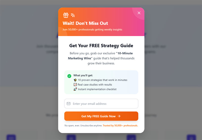
Exit intent popups catch visitors who are about to leave. They’re a last-chance play, and they still pull results.
Timing and frequency capping matter, though. Showing the same popup to a returning visitor who already dismissed it three times? That’s how you annoy people into never coming back. WordPress exit intent popup plugins like OptinMonster and ConvertBox give you control over display rules, device targeting, and cookie-based frequency limits.
Lower-Friction Alternatives
Not every visitor responds to pop-ups. Some people hate them. Period.
Sticky bars across the top of the page, slide-in boxes in the bottom corner, and embedded sign up forms within the content all provide gentler touchpoints. They’re less aggressive, which means lower conversion rates per impression but also lower annoyance.
Gamification adds another angle. Spin-to-win style popups achieve roughly 10% conversion rates compared to 4-5% for standard popup forms, according to Opensend’s ecommerce research. But they’re not appropriate for every brand or audience.
Delivery: Instant Download vs. Email
Sending the lead magnet via email forces the subscriber to provide a real, working address. That’s good for list quality. But it also means your WordPress email settings and deliverability need to be dialed in, or the subscriber never gets what they signed up for.
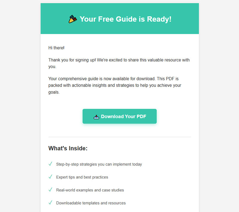
A hybrid approach works well: show a brief thank-you page with a preview or summary of the resource, then deliver the full version by email. You get the confirmation benefit and the instant gratification at the same time.
After delivery, the form submission confirmation message should clearly state what happens next. “Check your inbox” is better than a generic “Thanks for subscribing.” Set the expectation. Make sure your registration successful message actually tells people where to find their download.
How to Write Lead Magnet Copy That Drives Opt-Ins
The copy on your opt-in page does most of the heavy lifting. You can have the best lead magnet in the world, but if the words around it don’t sell the exchange, nobody’s filling out that form.
The Headline Does 80% of the Work
Your headline should name the outcome, not describe the format. “Get the Checklist” is weak. “Launch Your Podcast in 7 Days” tells the visitor exactly what they’ll achieve.
HubSpot’s analysis of over 330,000 CTAs found that personalized calls to action convert 202% better than generic ones. The same principle applies to headlines. The more specific the promise feels to the reader’s situation, the higher the opt-in rate.
PartnerStack saw a 111.55% conversion increase just by changing their CTA copy from “Book A Demo” to “Get Started,” according to WiserNotify research. Words matter more than most people think.
Bullet Points That Describe Transformation
Features tell. Outcomes sell.
- “10-page PDF guide” is a feature. Nobody cares about page counts
- “Stop wasting 3 hours a week on manual reporting” is an outcome. That’s what gets clicks
- “Includes bonus spreadsheet template” sits somewhere in the middle. Useful but not compelling on its own
Three to four bullet points on your lead magnet landing page should each describe a specific result the reader will get. Not what’s inside the resource, but what changes after they use it.
CTA Button Text That Actually Converts
WordStream data shows emails with a single CTA increased clicks by 371% and sales by 1,617% compared to emails with multiple CTAs. Focus matters.
For the button itself, first-person phrasing outperforms generic labels. “Send Me the Guide” beats “Submit.” “Get My Free Template” beats “Download Now.”
The word “Submit” can actually cause a 3% higher abandonment rate on forms, according to Feathery’s research. Such a small change, but it adds up fast at scale.
Copywriting Frameworks That Pull Weight
Joanna Wiebe at Copyhackers built her entire reputation on conversion copywriting for opt-ins. Her approach boils down to one thing: write what the reader is already thinking, then offer the solution.
Problem-agitate-solve works well for lead magnet pages. State the pain. Make it feel urgent. Present the lead magnet as the answer. Three sentences. Done.
The landing page for Dollar Shave Club’s original launch followed this exact pattern, and their viral success started with copy that spoke directly to a specific frustration (overpriced razors) before offering the fix.
Measuring Lead Magnet Performance
A lead magnet that “feels good” doesn’t mean it’s working. Numbers tell the real story. And the numbers that matter go way beyond download count.
Opt-In Rate Benchmarks
Unbounce’s Q4 2024 analysis of 41,000 landing pages puts the median conversion rate at 6.6% across all industries. But that number hides a lot of variation.
Email traffic converts at the highest rate by channel. Unbounce found visitors from email have a 19.3% average conversion rate on landing pages, far above paid search or social.
Cost Per Lead
Knowing your CPL is non-negotiable when running paid traffic to a lead magnet funnel. HubSpot data shows the average cost per lead across all industries is $198.44.
That number fluctuates wildly by industry and channel. But if you’re spending $15 per click on Google Ads and your landing page converts at 5%, your CPL is $300. Whether that’s good or terrible depends entirely on what happens next in your lead generation strategies pipeline.
Lead-to-Customer Conversion Rate
A high opt-in rate means nothing if those leads never buy.
Focus Digital research shows lead-to-sale conversion rate benchmarks vary dramatically. Biotech leads convert to sales at around 1.60%, while Industrial IoT sits at just 0.60%. Companies with systematic follow-up sequences report 25-35% above-benchmark conversions.
Invesp data backs this up: nurtured leads make 47% larger purchases than non-nurtured leads. The lead magnet starts the relationship. The lead nurturing templates and email sequences that follow are what turn downloads into revenue.
When to Retire or Replace a Lead Magnet
Performance decay is normal. The checklist that crushed it 18 months ago might be pulling half the opt-ins now.
Warning signs:
- Opt-in rate dropping steadily over 3+ months
- High unsubscribe rates within the first week after download
- Low open rates on follow-up emails (below 20%)
GetResponse benchmarks show welcome emails achieve an average 83.63% open rate and a 16.60% click-through rate. If your post-download emails are nowhere near those numbers, the problem might be the lead magnet itself attracting the wrong audience.
A/B test a new offer against the existing one before pulling the plug entirely. Track it through Google Analytics event tracking and UTM parameters to get a clear picture, or use dedicated attribution tools like Hyros or SegMetrics for more granular data.
Common Lead Magnet Mistakes
Most lead magnets fail for predictable reasons. The same mistakes keep showing up across industries, company sizes, and niches. Here’s what to watch out for.
Going Too Broad With the Topic
“The Ultimate Guide to Digital Marketing” attracts everyone and converts no one. Broad topics attract low-intent visitors who aren’t looking for a specific solution.
Compare that to something narrow: “Instagram Reels Script Templates for Fitness Coaches.” Fewer people will search for it, but the ones who find it are way more likely to opt in and eventually buy. That’s how smart generating leads for your business works in practice.
Asking for Too Much Information
Convertica research found the top reasons people abandon forms: security concerns (29%), form length (27%), ads or upselling (11%), and unnecessary questions (10%).
For a lead magnet opt-in, you almost never need more than name and email. Phone number? Company size? Annual revenue? Save those for later. Every extra field you add reduces completions by roughly 13%, and 67% of visitors who hit complications on a form will abandon it permanently, according to WPForms data.
If you absolutely need extra data points, consider conditional logic to show fields only when relevant. Or collect additional info after the initial opt-in through a survey in your welcome sequence. The point is to get them in the door first.
Delivering Low-Quality Content
30% of people will return to complete a form if there’s something worthwhile in it for them, according to Insiteful research. But flip that around: if the download feels thrown together, you’ve burned any trust the opt-in page built.
HubSpot’s 2024 report showed that the conversion rate for gated eBooks has dropped below 0.9% in some sectors. Part of the reason? Too many businesses ship mediocre PDFs with recycled blog content. People have been burned before and they’re skeptical.
Your lead magnet doesn’t need to be long. A three-page checklist that actually solves a problem beats a 30-page ebook that says nothing new. Quality is density of usefulness per page, not volume.
No Follow-Up After Delivery
This is the biggest one. The lead magnet is the start of a conversation, not the end.
Zendesk’s research shows that 80% of new leads never convert into sales due to lack of nurturing. And Digital Thrive data shows welcome emails have 86% higher open rates than regular promotional emails. That first email after download is the single highest-engagement touchpoint you’ll ever get with that person.
A basic welcome sequence looks like this:
- Email 1 (immediate): deliver the resource, set expectations
- Email 2 (day 2-3): share a related tip or case study
- Email 3 (day 5-7): introduce your product or service with a soft CTA
Tools like ConvertKit, ActiveCampaign, and Mailchimp make setting up automated drip sequences straightforward. The investment in building a proper welcome email flow after creating a lead magnet pays back immediately in engagement and downstream revenue.
Promising One Thing and Delivering Another
The landing page says “Free SEO Audit Template.” The download is a two-page overview of what SEO is. That disconnect destroys trust instantly.
Whatever you promise on the opt-in form, deliver exactly that. Better yet, over-deliver. Throw in a bonus template or a quick video walkthrough that wasn’t advertised. That small surprise turns a skeptical subscriber into someone who actually opens your next email.
At least in my experience, the brands that over-deliver on the initial lead magnet see dramatically better engagement through the rest of their funnel. And the ones that under-deliver? Those subscribers hit the unsubscribe link before the second email even lands.
FAQ on Lead Magnet Best Practices
What is a lead magnet?
A lead magnet is a free resource offered in exchange for contact information, typically an email address. Common formats include checklists, templates, quizzes, ebooks, and free tools. The goal is turning anonymous visitors into identifiable leads.
What makes a high converting lead magnet?
Specificity, instant perceived value, and low time-to-value. The best lead magnets solve one narrow problem fast. A focused three-page checklist will almost always outperform a vague 30-page guide.
How many form fields should a lead magnet opt-in have?
Stick to two fields maximum, typically name and email. Each additional field reduces conversions by roughly 13%. Collect extra data later through your welcome sequence or a follow-up feedback survey.
What is a good opt-in conversion rate?
Unbounce’s Q4 2024 data shows the median landing page conversion rate is 6.6% across industries. Dedicated landing pages typically convert between 6-25%, while blog pop-ups average 2-5%.
Which lead magnet format converts best?
It depends on your audience. GetResponse research found 47% of marketers say video and text formats perform best. Quizzes built with tools like Typeform or Interact average a 40.1% conversion rate, well above static PDFs.
Where should I place my lead magnet opt-in?
Use a mix of placements. Inline content upgrades within blog posts boost conversions through relevance, while dedicated landing page forms work best for paid traffic campaigns.
Should I use a pop-up or an embedded form?
Both have a place. Pop-ups get more visibility and higher conversion per impression. Embedded forms are less intrusive and catch visitors who dismiss pop-ups. Test both and measure results.
How do I write copy that drives opt-ins?
Name the outcome in your headline, not the format. Use three to four bullet points describing transformation, not features. First-person CTA text like “Send Me the Guide” consistently outperforms generic labels like “Submit.”
What should happen after someone downloads my lead magnet?
Send a welcome email immediately. Follow with two to three emails over the next week mixing value and a soft call to action. Nurtured leads make 47% larger purchases than non-nurtured ones, according to Zendesk research.
When should I replace my lead magnet?
Watch for declining opt-in rates over three or more months, rising unsubscribe rates after download, and low engagement with follow-up emails. A/B test a new offer against the old one before fully retiring it.
Conclusion
Getting lead magnet best practices right isn’t about one perfect PDF or a clever pop-up. It’s about the full system: a specific offer matched to buyer intent, a clean opt-in experience, and an email nurture sequence that keeps the conversation going.
The data is clear. Short-form content outperforms bloated ebooks. Quizzes built on platforms like Interact crush static downloads. And personalized CTAs convert at more than double the rate of generic ones.
But none of that matters without follow-up. Your lead magnet tools and lead magnet ideas only work when paired with proper audience segmentation, form validation, and a welcome sequence that delivers real value.
Start with one focused offer. Test it. Measure the opt-in rate, email engagement, and lead-to-customer conversion. Then improve from there.
