Gallup’s 2024 data shows only 31% of U.S. employees feel engaged at work. Annual surveys can’t catch that kind of decline fast enough. Pulse surveys can. These short, frequent questionnaires…
Table of Contents
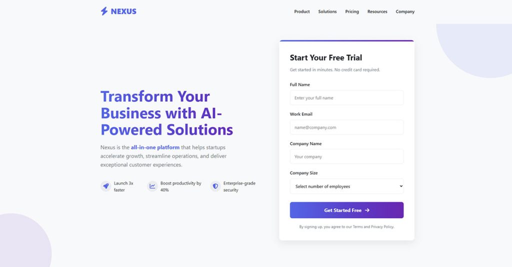
Users decide within seconds whether your form looks worth completing. Form layout best practices determine that split-second judgment.
Poor layout choices cost conversions. Confusing field arrangements, buried submit buttons, inconsistent spacing. These mistakes push users away before they type a single character.
This guide covers the structural decisions that separate high-converting forms from abandoned ones.
You will learn how to position labels, group fields logically, build responsive layouts, and avoid the most common design errors. Every recommendation draws from eye-tracking research, usability studies, and real-world testing by organizations like Nielsen Norman Group and the Baymard Institute.
What is Form Layout
Form layout is the structural arrangement of input fields, labels, buttons, and visual elements within a web or application form.
The layout controls how users scan, interpret, and complete each field. Poor structure kills conversions. Good structure feels invisible.
Every website form relies on spatial relationships between elements to guide user attention and reduce friction during data entry.
Why Does Form Layout Affect Conversion Rates
The Baymard Institute found that 18% of users abandon forms due to overly complex or confusing layouts.
Eye-tracking research from Nielsen Norman Group shows users scan forms in an F-pattern. When layouts fight this natural behavior, completion rates drop.
A 2019 study by Luke Wroblewski demonstrated that optimized form design can boost conversions by 25-40%.
Layout directly impacts cognitive load. More mental effort means more abandonment. Users make split-second judgments about whether a form looks “easy” before typing a single character.
Smart layout choices address form abandonment at its source.
What are the Different Types of Form Layouts
Three primary layout patterns dominate form UX design: single-column, multi-column, and inline.
Each serves different contexts and user needs.
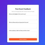
What is a Single-Column Form Layout
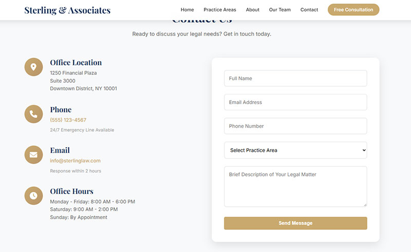
Single-column layout stacks all form fields vertically, one after another. This creates a clear top-to-bottom reading path that matches natural eye movement.
Works best for sign up forms, checkout flows, and mobile forms where screen width is limited.
What is a Multi-Column Form Layout
Multi-column layouts place related fields side by side. Common examples: first name and last name, city and state, start date and end date.
Reduces vertical scroll on desktop but creates problems on mobile. Only group fields that have a logical relationship.
What is an Inline Form Layout
Inline forms arrange all elements horizontally on a single line. You see these in search bars, newsletter signups, and quick filters.
Limited to 1-3 fields maximum. Anything more becomes unusable. Best for simple actions where speed matters more than thoroughness.
How Should Form Labels be Positioned
Label placement directly impacts form performance. Research from UXmatters shows that users complete forms with top-aligned labels 50% faster than those with left-aligned labels due to reduced eye movement.
What is Top-Aligned Label Placement
Labels sit directly above input fields.
Performance benefits:
- Research from Matteo Penzo found users complete top-aligned forms fastest
- Single vertical eye movement pattern
- CXL research shows inline validation with top alignment reduces errors by 22% and completion time by 42%
Best for most types of forms. Eye-tracking studies confirm users scan straight down the page without horizontal scanning.
What is Left-Aligned Label Placement
Labels align to the left margin, creating a ragged right edge next to input fields.
UXmatters research found this placement requires more eye fixations and longer saccade times (500ms compared to 50ms for top-aligned). Users scan in a Z-pattern (down and right), slowing completion.
Works for data-heavy forms where users reference labels repeatedly during input, like medical intake forms.
What is Right-Aligned Label Placement
Labels sit left of fields but align right, positioning close to inputs.
Trade-offs:
- UXmatters eye-tracking showed saccade times of 170-240ms (faster than left-aligned)
- Reduced fixations compared to left alignment
- Hard to scan label list quickly due to no consistent left edge
Use for forms with familiar fields where users know what to expect. The proximity between label and input creates strong visual connection based on Gestalt psychology’s Law of Proximity.
What is Floating Label Placement
Labels start as placeholder text inside fields, then animate above when users interact.
Space-efficient design popular in Material Design and Bootstrap.
Accessibility concerns:
- Default placeholder text typically fails WCAG 4.5:1 contrast requirements (appears as light grey)
- Animation can trigger vestibular disorder reactions in motion-sensitive users
- Deque’s accessibility research warns labels disappearing during input creates memory burden
- Users with cognitive disabilities may mistake placeholder text for pre-filled content
- Nielsen Norman Group found fields with floating labels less noticeable, increasing missed fields
- When labels shrink during float transition, text becomes harder to read for users with low vision
According to W3C guidelines and multiple accessibility experts, floating labels require careful CSS implementation to meet minimum contrast ratios and should maintain visibility during all input states.
For best accessibility practices, keep labels visible at all times and ensure 4.5:1 minimum contrast ratio.
How Should Form Fields be Grouped
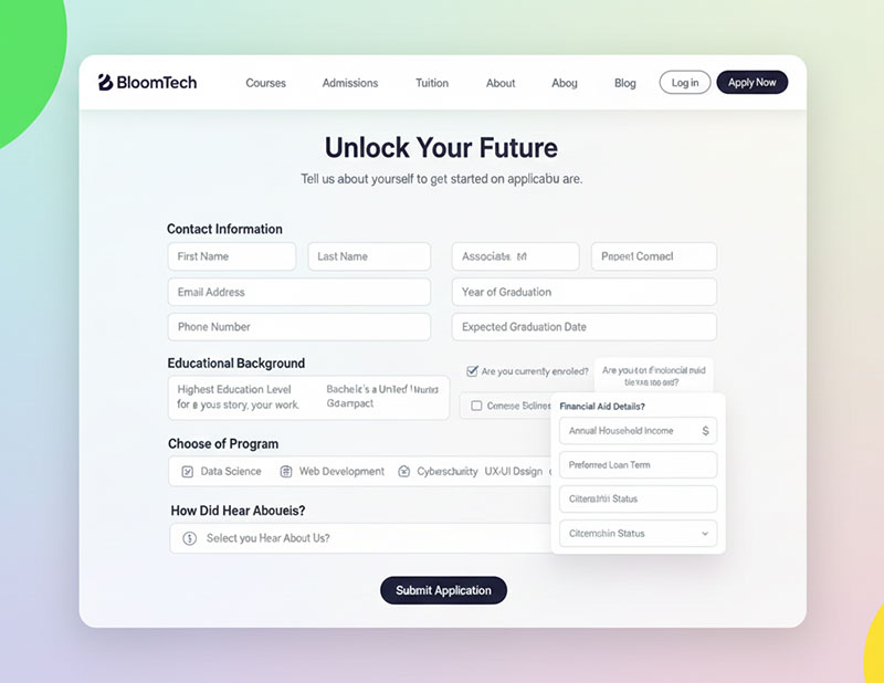
Grouping related fields reduces cognitive load. Research from Nielsen Norman Group shows that organizing content logically helps users focus on one information category at a time, minimizing context switching between unrelated topics.
Users process chunks faster than scattered elements.
What is Logical Field Grouping
Place fields together based on the information they collect.
Group by category:
- Personal details in one section
- Payment info in another
- Shipping address separate from billing
HTML implementation:
Use <fieldset> and <legend> elements. According to TPGi and W3C guidelines, the <fieldset> element is exposed as role=group and labeled by the <legend> content. Screen readers announce these groupings when users navigate to controls.
When users enter a group with a screen reader, the legend provides context for all controls within. Research from the Accessibility Developer Guide shows JAWS attaches the legend text when focusing the first element, while NVDA announces it when entering the fieldset.
Improves form accessibility for users with assistive technology. TetraLogical research found that without proper grouping, people relying on screen readers and braille displays cannot perceive connections between related controls, forcing them to exit forms mode and use arrow keys to find context.
When to use fieldset/legend:
- Multiple choice questions (radio buttons or checkboxes)
- Several questions on the same topic
- Any thematically related controls (address details, date of birth)
Don’t use for single fields collecting one piece of information.
What is Visual Field Grouping
Create separation through whitespace, borders, background colors, or subtle dividers. The eye naturally perceives distinct sections.
Spacing requirements:
W3C cognitive accessibility guidelines recommend adequate whitespace around objects and text so each section is clearly separated. Research shows whitespace reduces clutter and eases reading difficulties for people with cognitive and learning disabilities.
According to WCAG 1.4.12 text spacing guidelines, paragraph spacing should be at least twice the font size. For a 16px font, that equals 32 pixels between sections. AEL Data accessibility research confirms this maintains readability while providing clear visual hierarchy.
Typical range: 24-32 pixels works well for clear visual separation without wasting screen space.
Performance impact:
CXL research on mobile forms found that multi-step forms chunk segments to reduce cognitive load, making long forms less intimidating. When information is saved after each step, users can complete forms more easily.
Reform’s analysis shows grouping related fields makes forms feel more organized and easier to navigate, helping users know what to expect and complete forms more efficiently.
What is Visual Hierarchy in Form Layout
Visual hierarchy guides users through a form by establishing clear importance levels between elements.
Primary actions like submit buttons need more visual weight than secondary options like “Cancel” or “Save Draft.” Size, color, contrast, and position all signal priority.
Place the main call-to-action button at the bottom left for left-to-right reading cultures. Research from Fitts Law confirms larger, closer targets get clicked faster and more accurately.
Button hierarchy matters for increasing form conversions. Make the desired action obvious.
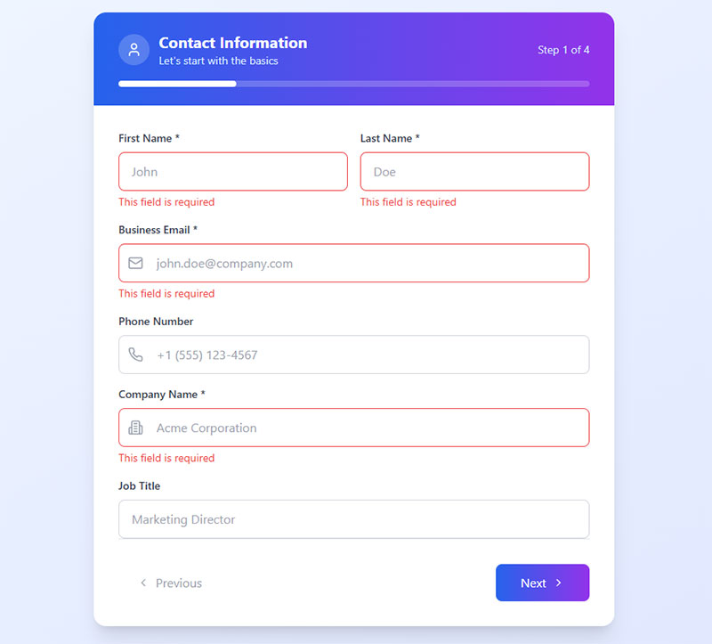
What is the Correct Field Order in Forms
Field sequence should match mental models. Nielsen Norman Group research confirms users expect name before email, street before city, card number before expiration date. Use logical sequencing for both fields and value choices.
Start with easy fields.
Name and email create momentum. Research from involve.me shows arranging fields from easiest to hardest leverages psychological commitment principles. Users become more invested in completion as they progress.
Save sensitive or complex fields like payment details for the end when users are already committed. According to Formsort data, security concerns account for 29% of form abandonment, making early placement of sensitive information particularly risky.
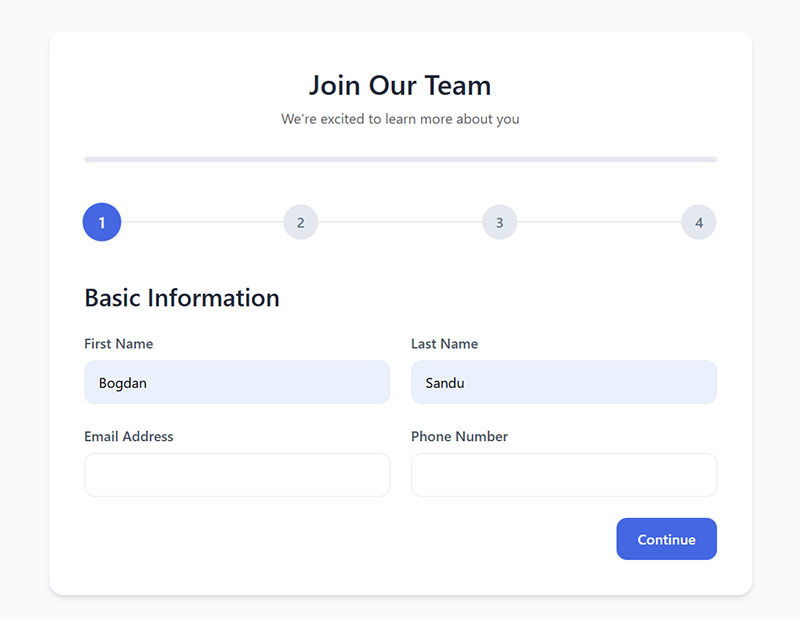
Multi-step approach:
Multi-step forms work well for long sequences. Research shows multi-step forms convert 86% higher than single-step forms. Breaking 15+ fields into digestible chunks of 3-5 fields per step reduces cognitive load.
Reform analysis found that chunking segments helps users focus on one information category at a time, minimizing context switching between unrelated topics.
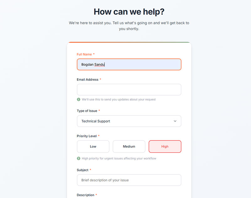
How Should Required Fields be Indicated
Mark required fields with a red asterisk (*) next to the label. This convention is nearly universal and immediately understood according to Jakob’s Law.
Alternative approach:
Mark optional fields instead when most fields are required. Nielsen Norman Group research shows this reduces visual noise. According to UX Tigers data, when the vast majority of fields are required, marking the one or two optional fields with “(optional)” dramatically reduces visual clutter and cognitive load.
Baymard Institute testing found a critical problem: 32% of users failed to complete required fields when only optional fields were marked, because they were forced to guess the status of unmarked fields.
Best practice:
Mark both required (with asterisk) and optional (with “optional” text) fields to eliminate ambiguity and reduce validation errors.
Accessibility requirements:
Always include a legend explaining your notation. Screen readers need programmatic required attributes in the HTML (required or aria-required), not just visual indicators.
According to Deque and TPGi accessibility research, asterisks provide a very visual solution but can be less meaningful to screen reader users. The asterisk is often not announced unless screen readers are configured to announce punctuation marks. A more robust solution combines both visual indicators and programmatic attributes.
W3C guidelines recommend including text like “Fields marked with * are required” prominently in the header or content area.
What is Input Field Sizing in Form Layout
Field width should hint at expected input length. A zip code field sized for 5-6 characters. An address field spanning the full container width.
Oversized fields for short inputs look broken. Undersized fields for long inputs frustrate users who cannot see what they typed.
Touch target standards:
WCAG 2.5.8 Target Size (Minimum) requires interactive elements be at least 24 by 24 CSS pixels at Level AA. However, research from MIT Touch Lab found the average index finger width is 1.6 to 2cm, translating to 45-57 pixels.
Platform-specific recommendations exceed minimum requirements:
- Material Design: 48 by 48 pixels for touch devices
- Apple iOS: 44 by 44 points minimum
- Microsoft Fluent: 40 by 40 effective pixels
Common range:
Standard heights of 40-48 pixels work for most touch and mouse interactions. According to AllAccessible research, while 24 pixels meets WCAG AA compliance, 44-48 pixels aligns with platform best practices and improves usability for users with motor impairments, hand tremors, or those operating devices in environments with shaking (like public transportation).
HTML form structures benefit from consistent sizing across all input types. Use CSS min-width and min-height properties to ensure targets meet accessibility requirements while using padding to create larger interactive areas around smaller visual elements.
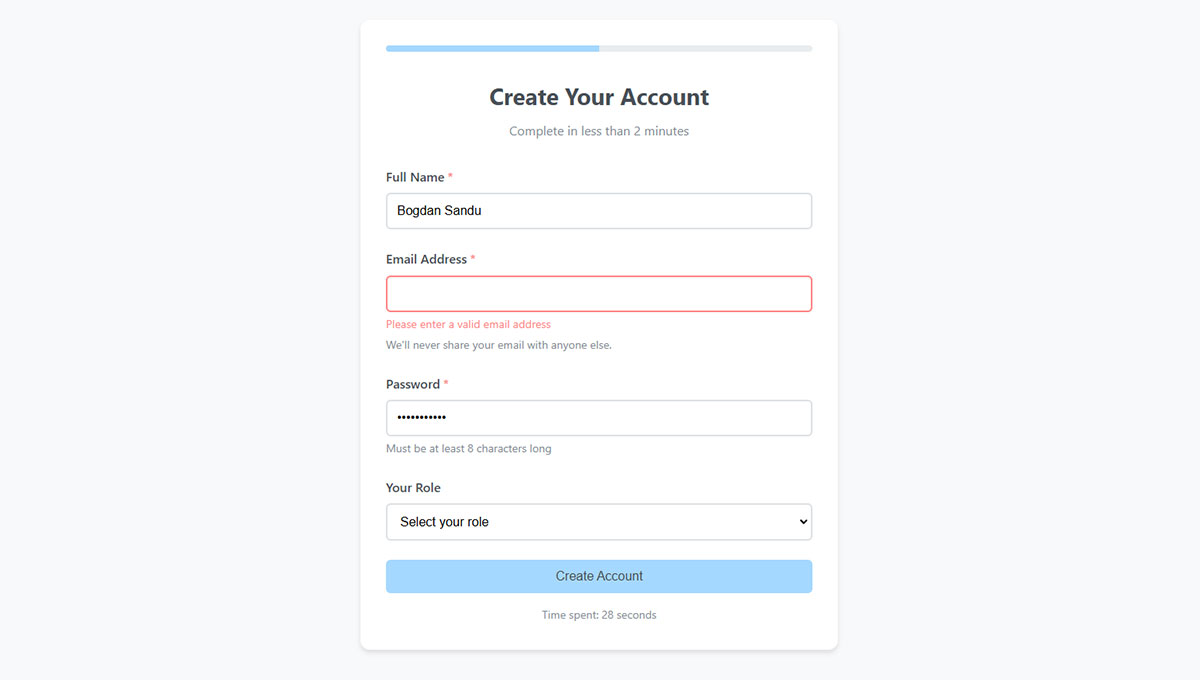
How Should Error Messages be Positioned in Form Layout
Error positioning determines whether users fix mistakes or abandon the form entirely. Research shows nearly 70% of users will abandon a form if they encounter complications. Poor error message placement causes confusion and frustration.
What is Inline Error Positioning
Display errors directly below the problematic field, immediately after validation fails. Use red text with an error icon for quick recognition.
Performance data:
UXmovement research found that inline validation resulted in the shortest time to initiate error correction. According to their study, top and bottom of form validation resulted in the highest error rates, longest completion times, and least user satisfaction.
Baymard Institute research shows 31% of e-commerce sites fail to provide inline validation. Their testing found participants who encountered errors upon form submission were forced to come to a complete stop, leading to significant delays and occasional abandonment.
Implementation:
Inline errors work best with real-time validation that checks input as users move to the next field. Avoid premature validation. UXPin data confirms that over 60% of browsing happens on mobile, where 75% of users abandon purchases when errors arise.
Best practices:
Remove error messages as soon as input is corrected. Provide positive indicators (green checkmarks) for valid fields. Use keystroke-level rechecking for complex fields like passwords.
Accessibility requirements:
Use aria-invalid="true" on fields with errors. According to TetraLogical and W3C guidelines, when a field has aria-invalid set to true, screen readers announce “invalid data” or “invalid entry” when the field receives focus.
Associate error messages with fields using aria-describedby attribute. Research from Smashing Magazine shows this ensures screen readers can link messages to correct fields.
Use role="alert" or aria-live regions to announce errors dynamically. W3C standards require aria-live attributes so assistive technologies can be notified when error messages are injected into the page.
What is Summary Error Positioning
A summary block at the top lists all errors after form submission. Link each error to its corresponding field for quick navigation.
When to use:
Required for screen reader users who need errors announced in a logical order. Nielsen Norman Group research recommends combining summary and inline errors for comprehensive feedback.
Implementation standards:
According to TetraLogical accessibility research, move focus to the error summary container once generated so screen reader users can find it immediately. This prevents users from missing critical error information.
Harvard Digital Accessibility guidelines require programmatically associating each error in the summary with its corresponding form control using links that jump to the fields.
Accessibility approach:
Use both role="alert" and aria-live="assertive" on the error container for wider screen reader support. W3C testing shows this works across JAWS, NVDA, and VoiceOver combinations.
Ensure error summary includes specific, actionable guidance per WCAG 3.3.3 Error Suggestion. Simply notifying users of problems isn’t enough. Clear instructions on how to fix errors are essential.
Best practice:
Combine with inline errors for the best experience across all users. Sara Soueidan accessibility research confirms that using both methods ensures status messages meet WCAG 4.1.3 requirements without requiring focus changes.
What is Responsive Form Layout
Responsive layouts adapt form structure based on screen size and device capabilities. According to BrowserStack research, websites must accommodate devices ranging from mobile phones to desktops, with most internet traffic coming from mobile devices.
How Does Form Layout Change on Mobile Devices
Stack all fields vertically on screens below 768 pixels. Multi-column layouts collapse to single-column automatically.
Breakpoint standards:
Bootstrap and industry frameworks use 768px as the standard tablet breakpoint. According to BrowserStack and Webflow research, common responsive breakpoints are:
- Mobile: 320-480px
- Tablets: 768-1024px
- Desktop: 1200px and above
Research from W3Schools and CSS-Tricks shows that 768px is widely adopted for medium devices (landscape tablets). At this breakpoint, layouts typically switch from single-column to multi-column formats.
Mobile-first approach:
BrowserStack data confirms mobile-first design is the industry standard. Design for smallest screens first using percentages or relative units, then scale up with min-width media queries for larger devices.
Touch target requirements:
Touch targets need minimum 44×44 pixel dimensions per WCAG 2.5.5 and Apple Human Interface Guidelines. Material Design recommends 48×48 pixels for touch devices.
According to LogRocket accessibility research, the average index finger width is 1.6-2cm (45-57 pixels). Spacing between tappable elements prevents accidental selections.
Implementation:
@media (max-width: 768px) {
  .form-row {
    flex-direction: column;
  }

  input, button {
    min-height: 44px;
    min-width: 44px;
  }
}
What is Adaptive Field Sizing
Fields expand to fill available container width on mobile using CSS Flexbox or Grid. Fixed pixel widths break on smaller screens.
Fluid grid systems:
Use percentage-based layouts or CSS Grid/Flexbox that scale proportionally. According to W3C accessibility techniques, width and max-width properties with flexbox adapt to available space and prevent horizontal scrolling.
Research from OneNine shows fluid grids use relative units like percentages instead of fixed pixels, allowing content to resize based on screen size. BrowserStack confirms this ensures layouts remain functional across devices.
Best practices:
Use viewport-relative units (vw) or percentage widths with max-width constraints. W3C standards recommend:
.form-field {
  width: 100%;
  max-width: 100%;
}

.form-container {
  width: 90%;
  max-width: 1200px;
  margin: 0 auto;
}
According to developerlife.com research, CSS Grid’s minmax() function provides flexible sizing:
.form-grid {
  display: grid;
  grid-template-columns: repeat(auto-fit, minmax(min(100%, 300px), 1fr));
  gap: 1rem;
}
Flexbox for responsive forms:
Research from Quackit and W3Schools shows Flexbox excels at one-dimensional layouts. Items automatically wrap and adjust:
.form-row {
  display: flex;
  flex-wrap: wrap;
  gap: 1rem;
}

.form-field {
  flex: 1 1 calc(50% - 1rem);
  min-width: 250px;
}

@media (max-width: 768px) {
  .form-field {
    flex: 1 1 100%;
  }
}
Testing requirements:
Test on actual devices, not just browser resize. According to BrowserStack testing standards, Chrome DevTools and real device clouds reveal layout shifts, rendering quirks, and touch-specific bugs that simulators miss.
OneNine research recommends testing on devices with screen widths between 768-1024 pixels if analytics show large audience segments in this range.
How Does Form Layout Affect Accessibility
Layout decisions directly impact users with disabilities. Structure that works visually must also work programmatically for assistive technology.
According to WebAIM Million 2024 report, missing form labels are the third most common accessibility issue on homepages, appearing on 45% of sites.
What are WCAG Requirements for Form Layout
WCAG 2.1 guidelines 1.3.1 (Info and Relationships) and 3.3.2 (Labels or Instructions) set baseline requirements.
WCAG 1.3.1 Info and Relationships:
Labels must be programmatically associated with inputs using for/id attributes. According to W3C and DigitalA11Y standards, this ensures assistive technologies can convey field information to users.
<label for="email">Email Address:</label>
<input type="text" id="email" name="email">
Research from WCAG.com shows clear labels improve form completion for users with cognitive disabilities and screen reader users. Without proper association, screen readers may announce fields as “edit text blank,” leaving users confused.
WCAG 3.3.2 Labels or Instructions:
W3C guidelines require labels or instructions for all user input fields. This criterion is separate from 1.3.1—you can have properly coded labels that still fail 3.3.2 if instructions aren’t clear.
According to AccessiCart research, clear labels and instructions help users understand requirements, reduce errors, and improve completion rates for everyone.
Visual grouping requirements:
Visual groupings need corresponding fieldset and legend markup. TetraLogical and W3C standards require <fieldset> and <legend> elements to group related form controls like radio buttons and checkboxes.
GDPR compliant forms add consent checkbox requirements with proper labeling.
What is Focus Order in Form Layout
Tab sequence must follow visual layout order. Keyboard users navigate forms without a mouse, relying on logical focus progression.
WCAG 2.4.3 Focus Order:
According to W3C Understanding Success Criterion 2.4.3, when users navigate sequentially through content, they must encounter information in an order consistent with meaning and can be operated from keyboard. This reduces confusion and allows users to form a consistent mental model.
Testing requirements:
Test by pressing Tab through every field. Yale Accessibility research shows focus order should match visual layout—left to right, top to bottom. Header first, then main navigation, then page content, finally footer.
WebAIM standards confirm navigation order is determined by HTML source code. Structure underlying code correctly, then use CSS for visual presentation.
tabindex implementation:
If focus jumps unexpectedly, fix the HTML source order first. Use tabindex attributes carefully:
tabindex="0": Places element in natural tab ordertabindex="-1": Removes from tab order but allows programmatic focustabindex="1+": Avoid always (creates maintainability problems)
According to TPGi and Harvard accessibility research, tabindex values greater than 0 disrupt intuitive focus order and cause confusion. WebAIM confirms this creates navigation order different from visual and screen reader order.
Impact on users:
W3C research shows logical focus order benefits people with mobility impairments, visual impairments using screen magnifiers, and users with reading difficulties who become disoriented when focus jumps unexpectedly.
What is Error Prevention in Form Layout
Design layouts that prevent errors before they happen. Clear labels, appropriate field types, input masks, and helpful conditional logic reduce mistakes.
WCAG 3.3.1 and 3.3.3 requirements:
TestParty accessibility research confirms WCAG requires errors to be identified (3.3.1) and suggestions to be offered (3.3.3). Error messages must identify the problem and suggest how to fix it.
Implementation:
Use appropriate input types and autocomplete attributes. Silktide and AudioEye research shows semantic HTML improves error prevention—type="email" triggers appropriate keyboards on mobile and validates format.
Associate error messages with fields using aria-describedby. Don’t rely on color alone for status indication—use text, icons, and other indicators.
Confirmation steps:
Confirmation steps for irreversible actions. Review screens before final submission. These patterns appear in checkout optimization and registration forms where errors cost conversions.
According to dock.codes WCAG research, provide instructions for complex input formats (phone numbers, dates, passwords) near the input field using visible text or aria-describedby associations.
What Tools Measure Form Layout Performance
Data drives layout decisions. These tools reveal how users actually interact with your forms:
- Hotjar – heatmaps, recordings, form analytics showing field drop-off points
- Google Analytics – conversion tracking, goal funnels, form abandonment rates
- Crazy Egg – click tracking, scroll maps, A/B testing for layout variations
- Formisimo – dedicated form analytics with field-level completion metrics
- Microsoft Clarity – free session recordings and heatmaps
Track conversion rate benchmarks against industry standards. Most contact forms convert between 1-3%.
What are Common Form Layout Mistakes
Avoid these frequent errors that kill form completion rates:
- Too many fields – every field reduces completion by 3-5%
- Poor mobile adaptation – tiny touch targets, horizontal scrolling
- Missing labels – placeholder-only fields fail accessibility and usability
- Unclear required indicators – users guess which fields matter
- Submit button confusion – multiple buttons with unclear hierarchy
- No error feedback – silent failures leave users stuck
- Inconsistent spacing – uneven rhythm creates visual chaos
Run usability tests with real users. Watch where they pause, backtrack, or abandon.
Tools like Figma and Adobe XD let you prototype layouts before building. Test early, iterate often.
FAQ on Form Layout Best Practices
What is the best form layout for mobile devices?
Single-column layout works best on mobile. Stack all fields vertically with touch targets of at least 44×44 pixels. Avoid multi-column arrangements that force horizontal scrolling or cramped spacing on smaller screens.
Should form labels be above or beside input fields?
Top-aligned labels above fields perform best in most situations. Eye-tracking research shows this placement reduces completion time by 50% compared to left-aligned labels. Use it for web forms and mobile interfaces.
How many fields should a form have?
Fewer fields increase completions. Each additional field reduces conversion rates by 3-5%. Keep lead generation forms under 5 fields. Longer forms like feedback forms benefit from multi-step layouts.
What is the ideal spacing between form fields?
Use 16-24 pixels between fields and 24-32 pixels between grouped sections. Consistent spacing creates visual rhythm and reduces cognitive load. Too little spacing makes forms feel cramped; too much wastes screen space.
Where should the submit button be placed?
Place the primary submit button at the bottom left of the form, aligned with input fields. Make it visually prominent using size and color contrast. Secondary actions like “Cancel” should appear less prominent beside it.
How do I make forms accessible for screen readers?
Associate labels with inputs using for/id attributes. Group related fields with fieldset and legend elements. Ensure logical tab order matches visual layout. Follow WCAG 2.1 guidelines for landing page forms and all form types.
Should I use placeholder text instead of labels?
No. Placeholders disappear when users type, removing context. They also fail accessibility standards and cause usability problems. Use visible labels above fields. Reserve placeholders for supplementary hints like format examples only.
When should I use a multi-step form layout?
Multi-step forms work better than single-step when you have 7+ fields. Break complex processes into logical chunks of 3-5 fields per step. Add progress indicators so users know their position in the sequence.
How do I indicate required fields in form layout?
Mark required fields with a red asterisk () next to the label. Include a legend explaining the notation. If most fields are required, label optional fields instead to reduce visual clutter throughout the form.
What is the best way to display form errors?
Show inline errors directly below problematic fields using red text and an icon. Combine with a summary at the top for accessibility. Display errors immediately after validation, not just on submission.
Conclusion
Form layout best practices come down to reducing friction at every step. Clear visual hierarchy, logical field order, proper spacing, and accessible markup work together to guide users toward completion.
Small changes produce measurable results. Top-aligned labels speed up completion. Inline validation catches errors early. Consistent field sizing sets expectations.
Test your layouts with real users. Tools like Hotjar and Google Analytics reveal where people struggle or abandon. Data beats assumptions.
Whether you build subscription forms, contact form templates, or complex event registration forms, the principles stay the same.
Prioritize usability. Follow WCAG guidelines. Keep iterating based on performance data. Your form completion rates will reflect the effort.
