



Google Analytics files plenty of visits under direct that were never direct. In a 2023 experiment by SparkToro and Really Good Data, covering 1,113 test visits across 11 networks, 100%…
Table of contents
Loyalty tracking at most large companies comes down to one question. Two out of three Fortune 1000 companies build it around a single line: how likely someone is to recommend the business to a friend or colleague.
Fred Reichheld put that question in front of Harvard Business Review readers back in 2003, and unlike a lot of management ideas from that decade, it never really went away.
The question itself is short enough to fit in a text message. Teams still manage to mess it up.
Swap a scale label between quarters, or let a leading word slip into the wording, and the number sitting on a dashboard six months later won’t mean what anyone thinks it means. Promoters, passives, and detractors sort into fixed bands no matter the industry, but the wording around the question shifts depending on whether the survey is relational or transactional. Most of the useful information isn’t even in the score, honestly. It’s in whatever the customer types into the box right after.
Getting these details right is what separates a number worth trusting from one that only looks precise.
What Is an NPS Survey Question
The term describes one thing: a single-item question asking how likely someone is to recommend a company, product, or service to somebody else. Nothing more elaborate than that. It lives inside what Reichheld called the Net Promoter System, which really just means the rating question paired with a follow-up.
Reichheld published the idea in Harvard Business Review in December 2003, under the title “The One Number You Need to Grow,” while working as a consultant and fellow at Bain and Company. Bain has stayed the framework’s caretaker ever since, and Bain’s own tracking, along with independent industry surveys, keeps landing on the same figure: two-thirds of the Fortune 1000 use this as a primary loyalty indicator.
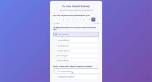
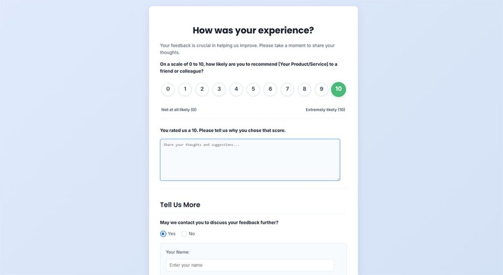
A full system has three moving parts, though calling it a “structure” makes it sound more complicated than it actually is: a 0 to 10 rating question, an open box asking why, and an automatic sort into promoter, passive, or detractor once the number comes in.
NPS is one entry in a bigger family of question formats. Knowing where it sits among the different types of survey questions makes it easier to reach for when it’s actually the right tool, instead of defaulting to a satisfaction scale or a plain multiple-choice rating out of habit.
What Is the Standard NPS Survey Question Format
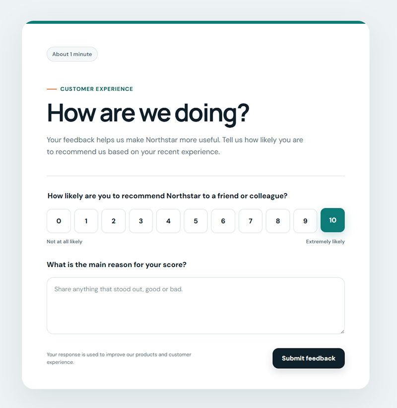
Every version boils down to the same line: “How likely are you to recommend [Company] to a friend or colleague?” Nothing fancier gets added to it.
The scale runs 0 to 10, eleven points total, and that’s not negotiable. Not a 5-point range, not 7. The extra room lets you tell the difference between someone who’s mildly fine with a business and someone who’s genuinely enthusiastic about it, a distinction a 5-point Likert scale question tends to flatten out.
Endpoint labels don’t move. Zero is always “Not at all likely.” Ten is always “Extremely likely.” That consistency across every send is what makes wave-to-wave comparison possible at all.
There’s a smaller wording decision buried in here too. Zonka Feedback’s research on question design points to matching the noun to who’s answering, “friend” for a consumer brand, “colleague” for B2B software, and the choice actually primes how someone answers before they even look at the scale.
| Audience | Wording variant | Best for |
|---|---|---|
| Consumer | “…to a friend” | Ecommerce, apps, personal services |
| Business | “…to a colleague” | SaaS, enterprise software |
| Mixed | “…to a friend or colleague” | Brands serving both |
A handful of accepted variants on the core line, depending on what you’re actually measuring:
- How likely are you to recommend [Company] to a friend or colleague?
- How likely are you to recommend [Product] to someone with a similar need?
- Based on your recent experience, how likely are you to recommend us?
- How likely are you to recommend [Company] as a place to work? (the eNPS version)
- How likely are you to recommend working with [Account Manager’s team]?
The single-question rule sounds obvious until you see it broken. Ask about price and service in the same line and the resulting score averages two unrelated feelings into a single number nobody can act on. The data isn’t wrong exactly. It just stopped meaning anything specific.
How Is the NPS Score Calculated From Survey Responses
Bain and Company set the thresholds when it built the framework, and nobody’s really touched them since. Score a 9 or 10 and you’re a promoter. A 7 or 8 puts you in the passive bucket, satisfied but not exactly excited. Anything 6 or under counts as a detractor, no partial credit or in-between category.
Getting the score itself just means subtracting the percentage of detractors from the percentage of promoters. Passives still count toward the total number of responses, they just don’t factor into the subtraction.
Promoters keep buying and tend to actually tell other people about a business, which is the entire point of tracking any of this. Detractors sit at the opposite end, unhappy customers at real risk of leaving and saying something negative about it in public. Passives fall in between, satisfied enough not to complain but with nothing holding them in place either, an easy target for whichever competitor reaches out next.
Run the math on a company with 60% promoters, 20% passives, and 20% detractors, and the score comes out to 40, not 60. That gap catches almost everyone the first time they calculate it.
The final number lands somewhere between negative 100 and positive 100. No percentage sign gets attached, which trips people up too. And zero isn’t automatically a bad score. It just means promoters and detractors are splitting the room evenly.
Passives are easy to write off since they don’t move the formula directly, but that’s a mistake. They’re the segment sitting closest to flipping either direction, and the next interaction usually decides which way they go.
What Are the Types of NPS Survey Questions
Relational and transactional are the two structural approaches here, and the choice between them changes more than just how often the survey goes out. It changes the wording too.
Relational NPS Questions
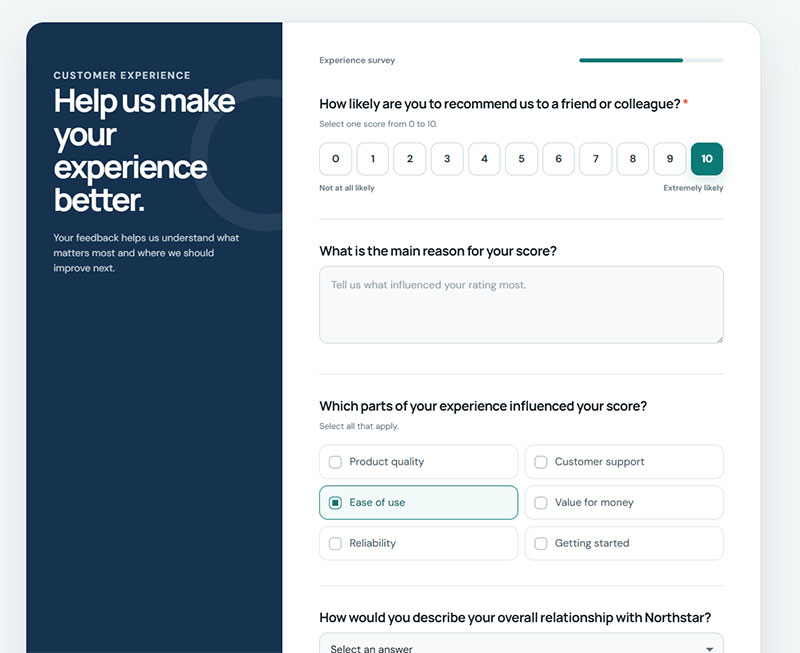
These go out quarterly, twice a year, or once annually, sent to the entire customer base regardless of what any individual person did that particular week. The wording stays broad on purpose, “recommend our company” instead of “recommend this experience”, and most teams try to time the send outside any peak sales period so the results reflect the actual relationship rather than a temporary rush of goodwill or a temporary dip. That gives leadership a number they can track quarter over quarter.
Relational wording that holds up:
- How likely are you to recommend [Company] to a friend or colleague?
- Thinking about the past six months overall, how likely are you to recommend us?
- How likely are you to continue working with us over the next year?
- What’s the main reason you’ve stayed with us so far?
CustomerGauge’s research on this found a 5.2% retention lift among companies running quarterly relationship surveys, and the mechanism makes sense once you think about it. Catching a recurring friction point before it turns into churn beats finding out about it after the customer’s already gone.
Transactional NPS Questions
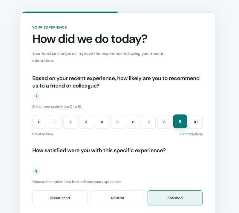
Transactional NPS fires immediately, tied to one moment like a purchase, a support call, or an onboarding session wrapping up. The wording narrows to match it.
| Trigger | Question wording |
|---|---|
| Purchase | Based on your recent purchase, how likely are you to recommend us? |
| Delivery | Based on your order and delivery, how likely are you to recommend us to a friend? |
| Support ticket | Based on the help you just received, how likely are you to recommend us? |
| Onboarding complete | After your first few weeks, how likely are you to recommend [Product] to a colleague? |
| Renewal | Having just renewed, how likely are you to recommend us to a peer? |
| Feature launch | Based on the new [feature], how likely are you to recommend [Product]? |
Slack runs both types side by side. Quarterly relational surveys handle the long-term sentiment tracking, and transactional surveys fire right after onboarding and after major feature releases, catching reactions while they’re still fresh.
The same logic carries into post-purchase survey questions, where the prompt ties directly to the order itself instead of floating on some generic time window that would really produce relational-style answers dressed up under a transactional label.
What Follow-Up Questions Should Accompany the NPS Score
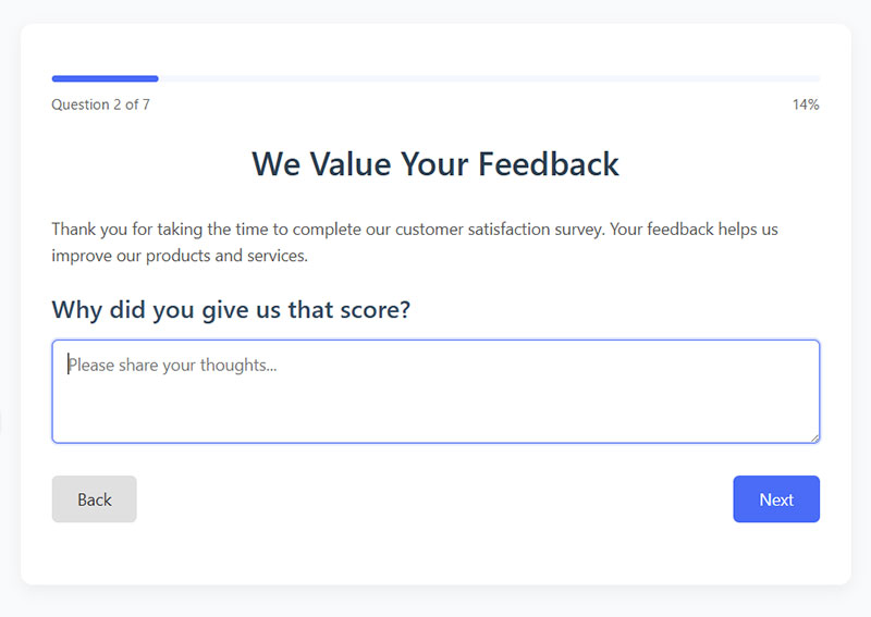
A score by itself doesn’t explain anything. It just sits there. The follow-up question, usually some version of “What’s the primary reason for your score,” is what turns a number into something a team can actually act on.
Nielsen Norman Group’s research on survey design has a warning worth taking seriously here: every additional question tacked onto a rating drags down both the response rate and the quality of what people write. Most well-run programs stop at one core follow-up because of it.
| Format | Completion Rate | Best For |
|---|---|---|
| Open-ended text | ~44% | Surfacing unexpected themes |
| Closed-ended reasons | ~82% | Fast, structured reporting |
| Hybrid (closed plus optional comment) | ~82% plus partial text | Balancing speed and depth |
These completion figures are directional, not universal. CustomerGauge and other vendors report ranges that shift by industry, channel, and survey length, so it’s more useful to treat this as a pattern, closed-ended beats open-ended, than a fixed benchmark for any one program.
Open-Ended Reason Questions
Give someone an open box and they’ll explain the score in whatever words make sense to them, which tends to surface things a pre-written multiple-choice list would never have predicted. CustomerGauge’s data suggests something like two out of five respondents will actually use that box when it’s offered as optional rather than mandatory.
Wording matters more than you’d expect here. “Why did you give that score” comes across as redundant, like asking the same question twice. Better options:
- What’s the one thing we could do better?
- What’s the main reason behind your score?
- What would need to change for that number to go up?
- If you were describing us to someone, what would you say first?
- What almost made you score us lower?
- What’s the one thing you’d want us to keep exactly as it is?
That “almost made you score us lower” question is my favorite of the set. Promoters answer it honestly, and you get to see the friction hiding underneath a 9 before it becomes a 6.
Running this kind of data at any real scale usually means leaning on structured methods to analyze survey data, since a few hundred loose comments don’t turn themselves into a short list of repeat themes on their own.
Closed-Ended Follow-Up Options
Completion goes up noticeably with closed-ended options, and CustomerGauge’s research backs that up fairly clearly. The setup is simple. Present four to six reason categories, let people select more than one since dissatisfaction rarely traces back to a single cause, and leave an optional comment box open for anyone who wants to add more.
Category sets that work, depending on the business:
- SaaS: product features, ease of use, reliability, support, pricing, onboarding
- Ecommerce: product quality, price, shipping speed, packaging, returns, customer service
- B2B services: results delivered, communication, responsiveness, expertise, value for money
- Subscription apps: content quality, app performance, price, notifications, account management
Depth is what gets traded away, though. Closed options move fast, but what a team learns stays capped to whatever categories someone decided on ahead of time. If the real problem isn’t one of the listed options, it just doesn’t show up in the data.
NPS Survey Question Examples by Score Segment
Send the exact same follow-up to everyone and it gets wasted on two of the three score bands. A promoter, a passive, and a detractor are each dealing with a completely different situation, so the question that comes after the score has to change with them. Skip logic handles this automatically in most survey tools, routing each person to whichever version matches their score.
Promoter Follow-Up Questions
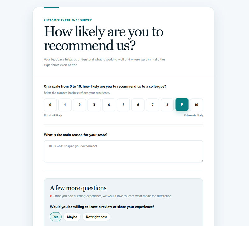
Someone just said they’d recommend a business to a friend. The obvious next move is asking them to actually do it while that goodwill is still there. A few options that tend to work:
- Would you be willing to leave a review or share your experience?
- What’s the one thing you’d tell a colleague considering us?
- Can we feature your feedback in a case study?
- Which part of what we do matters most to you?
- Is there anyone on our team you’d like us to thank by name?
- Who else do you know who’d get value from this?
- Would you be open to a 15-minute call about how you use us?
Naming the specific thing that worked is what turns a 9 or 10 into an actual referral or testimonial, instead of just another number sitting in a dashboard nobody looks at again.
Passive Follow-Up Questions
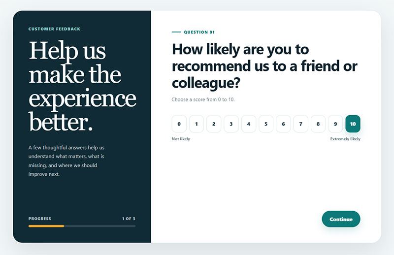
This is the group everyone underrates. A 7 or 8 means satisfied, not excited, and passives are exactly the customers who’ll quietly switch to a competitor without ever filing a complaint. Moving one passive up to a 9 helps the score by the same amount as stopping one detractor from leaving. Same math, same impact. Most programs still spend most of their effort on detractor recovery and barely touch this middle group.
The single most useful question to ask them is some version of “What would it take for us to earn a 9 or 10 from you next time?” A few more that pull specifics:
- What’s the one thing holding your score back?
- Is there anything you’ve considered switching to?
- What do other tools or providers do that we don’t?
- What would make you actively recommend us rather than just answer honestly if asked?
Passives tend to answer with something specific, one concrete gap, rather than a vague complaint, mostly because they’re already close to the promoter line and know exactly what’s keeping them from crossing it.
Detractor Follow-Up Questions
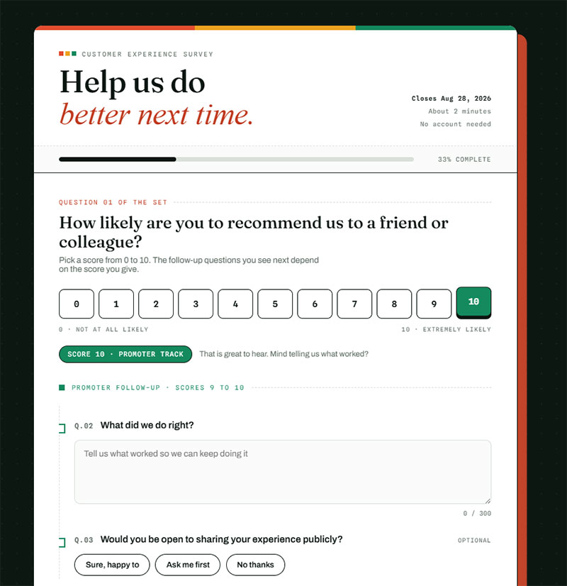
Detractors score 0 through 6, and here’s something that surprises people: they’re often the most engaged respondents in the whole dataset. CustomerGauge’s data shows detractors spending longer on surveys and writing more in the open text field than promoters or passives do, not less.
- What specifically went wrong?
- What did you expect that didn’t happen?
- Can we follow up directly to make this right?
- When did things start going wrong for you?
- Did you raise this with anyone here before now?
- Is this a one-off problem or something that keeps happening?
- Are you currently considering leaving?
Ask the “did you raise this before” question and you’ll find out whether you have a product problem or a listening problem. Those get fixed by different teams.
Speed is what actually determines whether any of that feedback turns into a saved account. Closed-loop research keeps finding the same pattern: the odds of winning a detractor back drop off fast the longer a company waits, which is why most CX teams treat 24 to 48 hours as the real outer limit for a personal follow-up. Reach out inside that window and a meaningful share of detractors can be recovered. CustomerGauge’s account-level data ties a consistent closed-loop process to a noticeably higher rate of promoters showing up down the line.
NPS Survey Question Examples by Industry
The core question barely changes from one industry to the next. What shifts is the wording around it, tuned to how customers in each sector actually think about recommending something to someone else. Retently’s benchmark data shows scores swinging by more than 40 points between the highest and lowest-scoring sectors, so a raw score compared across industries, on its own, tells you almost nothing.
| Industry | Median NPS | Primary Trigger |
|---|---|---|
| SaaS | 58 (Google) | 30 days post-signup |
| Ecommerce | 61 (Retently 2026) | 24-48 hrs post-delivery |
| B2B Services | 38 (average) | Quarterly, per account |
| Hospitality | 44 (QuestionPro) | Post-checkout |
SaaS NPS Questions
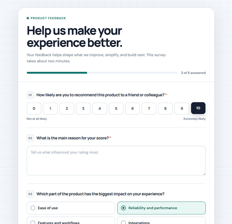
SaaS wording ties the recommendation to actual product use rather than some vague brand feeling: “Based on your experience with [Product], how likely are you to recommend it to a colleague?” Google sits at 58 on this metric, per CustomerGauge’s SaaS benchmark tracking, well clear of the industry average, which most current trackers place somewhere in the low-to-mid 30s.
Follow-ups tuned to software:
- Which feature do you use most often?
- What would you miss most if we shut down tomorrow?
- Is there anything about the product that regularly slows you down?
- How does this compare to what you used before?
The “what would you miss most” question comes from Sean Ellis territory rather than NPS orthodoxy, but it fits neatly under the score and pulls sharper answers than a generic reason box.
Timing matters here too. Most programs wait roughly 30 days after signup before sending the first transactional wave, not right at signup, since a score collected on day one reflects the sales pitch more than the actual product. This pairs naturally with the thinking behind onboarding survey questions, which helps separate a genuinely rough first week from an actual product problem underneath it.
Ecommerce NPS Questions
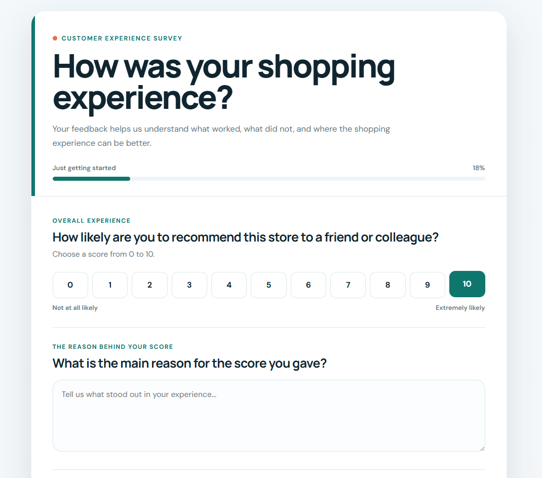
The order itself anchors ecommerce wording: “Based on your recent order and delivery experience, how likely are you to recommend [Company] to a friend?” It goes out 24 to 48 hours after delivery, timed so the unboxing feeling is still fresh but the package has actually shown up.
- Did the product match how it was described online?
- How would you rate the delivery experience specifically?
- Was anything about the checkout confusing?
- Would you buy from us again?
- What almost stopped you from ordering?
Retently’s 2026 benchmark places the ecommerce median at 61, and CustomerGauge specifically lists Amazon at 73. Checkout friction, shipping delays, and how accurate the product description turned out to be are the drivers that move scores most in current datasets, often ahead of price.
B2B NPS Questions
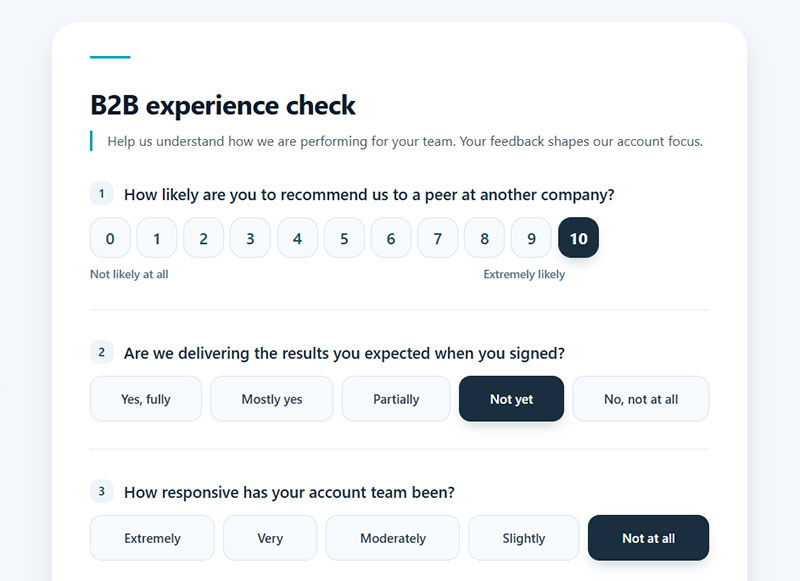
B2B wording changes in a few small ways. “Colleague” replaces “friend,” since the audience is professional. Surveys go out to every stakeholder on an account instead of just the primary contact, and scores route to a named account manager or customer success lead rather than a general inbox nobody’s watching.
- How likely are you to recommend us to a peer at another company?
- Are we delivering the results you expected when you signed?
- How responsive has your account team been?
- Is there anyone else on your side we should be talking to?
- How likely are you to renew when your contract comes up?
That renewal question sits awkwardly next to NPS, and some teams refuse to ask it. I’d ask it anyway. A high recommend score paired with a low renewal likelihood is a signal you want months in advance, not at the renewal call.
Zonka Feedback’s 2026 compilation puts consulting firms at 64 to 69, well above the average B2B score of 38 mentioned earlier. Insurance and financial services tend to lead most B2B benchmarks, and the reason isn’t complicated: long contracts and high switching costs keep even a mildly unhappy account from actually walking away.
Healthcare NPS Questions
Healthcare runs NPS alongside HCAHPS, the federally standardized patient experience survey. The Centers for Medicare & Medicaid Services started developing it in 2002, rolled it out nationally in October 2006, and began publicly reporting results in March 2008. NPS itself stays separate from that process, asking its simpler recommendation question on its own schedule.
Patients who feel treated as individuals are 12 times more likely to become promoters, according to NRC Health’s research on individualized care. Gundersen Health System picked up 3 points on its NPS after leaning into a more individualized approach, and M Health Fairview gained 4 points the same way, both per NRC Health’s reporting.
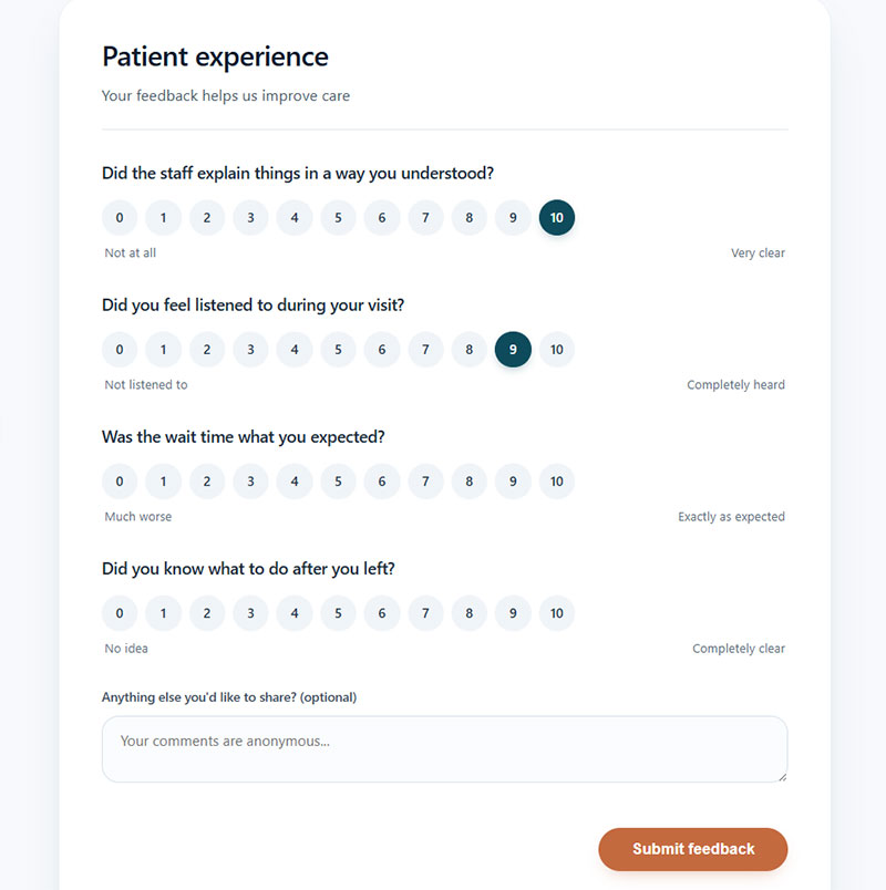
Wording stays tied to the specific care episode: “How likely are you to recommend this hospital to family or friends needing similar care?” Reasonable follow-ups:
- Did the staff explain things in a way you understood?
- Did you feel listened to during your visit?
- Was the wait time what you expected?
- Did you know what to do after you left?
Hospitality NPS Questions
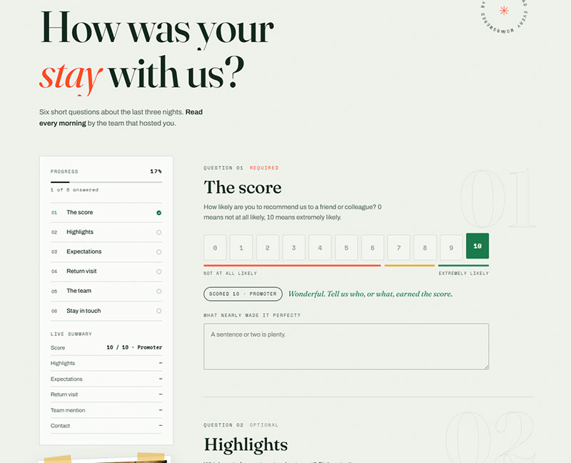
Checkout is when hospitality and travel brands send this, not partway through the stay, so the whole visit counts toward the score, not just the last few minutes of it. Hotels post a median NPS in the mid-40s, one of the higher-scoring sectors QuestionPro tracks, sitting alongside banking and automotive.
A typical wording example: “How likely are you to recommend [Hotel/Airline] to a friend planning a similar trip?” Then:
- Which part of your stay stood out most?
- Was anything not as advertised?
- Would you stay with us again on your next trip here?
- Did anyone on staff make a difference to your stay?
Airlines drag the sector average down, though, and most researchers point to the same reason. So much of a flight experience sits entirely outside the airline’s control, weather delays and air traffic being the obvious examples.
What Are eNPS Survey Questions
Same mechanic, different audience. Employee Net Promoter Score asks staff how likely they are to recommend the company as a place to work, scored 0 to 10 and bucketed the same way.
- How likely are you to recommend [Company] as a place to work? (0-10)
- What’s the main reason for your score?
- What’s one thing that would make this a better place to work?
- Would you recommend your own team specifically to someone joining?
One caveat that gets ignored constantly: anonymity has to be real, and people have to believe it’s real. An eNPS collected through a system where managers can see individual responses measures fear, not loyalty.
When Should You Send an NPS Survey
Timing affects more than just convenience for the customer. Bain’s own research on the framework found that when a survey lands changes both how many people respond and how accurate the resulting score ends up being.
Relational sends stick to the cadence already covered: quarterly works for most B2B and SaaS businesses, and twice a year is roughly the floor before the data gets too thin to compare one wave against the next. Transactional sends fire close to the trigger itself, usually within 0 to 10 days, depending on how long it takes the experience to actually settle in the customer’s mind.
Most programs cap a single customer at one NPS survey per 30 days, and hold off on a transactional send entirely if a relational survey already went out in the two weeks before. CustomerGauge’s client ICON Communication reportedly sees a 100% response rate on its program, though that’s an outlier worth treating as one. It’s usually credited to close client relationships and visible follow-through, not to any particular send-time trick.
Day of the week matters too, apparently. Survey-industry research, SurveyMonkey’s included, generally points to Tuesday through Thursday outperforming the rest of the week, though how big that lift actually is varies by study and by audience.
Getting the moment right matters more than picking the perfect channel. Pairing solid timing with guidance on how to avoid survey fatigue keeps those suppression rules from feeling arbitrary to whoever’s on the receiving end of yet another survey request.
Common Mistakes in Writing NPS Survey Questions
Bad wording doesn’t just irritate the person answering it. It quietly bends the resulting score, and that’s worse than a low response rate in a way, since a bent number still looks perfectly trustworthy sitting on a dashboard next to last quarter’s.
| Mistake | Why It Skews Data | Fix |
|---|---|---|
| Leading language | Nudges respondents toward a higher rating | Use neutral verbs, drop emotional qualifiers |
| Compound follow-up | Mixes two reasons into one open text answer | Ask one “why” at a time |
| Inconsistent labeling | Breaks comparability between survey waves | Lock endpoint wording permanently |
| Disconnected surveys | Loses the link between score and reason | Keep rating and follow-up in one flow |
Bad Wording and What to Use Instead
| Don’t write this | Write this instead |
|---|---|
| Would you strongly recommend our amazing product? | How likely are you to recommend [Product] to a colleague? |
| How satisfied are you, and would you recommend us? | Two separate questions, rating first |
| Rate us from 1 to 10 | Rate us from 0 to 10, labels locked at both ends |
| Why did you give that score? | What’s the one thing we could do better? |
| You wouldn’t recommend us to a friend, would you? | How likely are you to recommend us to a friend? |
| How likely are you to recommend our new pricing and support? | Pick one. Ask about the other separately. |
Leading language is the easiest mistake to spot once you know what to look for. Research on question formatting from platforms like KnoCommerce keeps finding the same thing, that brands skew their own NPS results the moment they start treating the question like a marketing line instead of an actual measurement.
The compound-question problem from earlier doesn’t stay contained to the main rating line. It shows up just as often in the follow-up, where something like “How satisfied are you with the product, and would you recommend it?” forces one answer to somehow cover two separate questions.
Inconsistent labeling seems minor, right up until a team swaps “Extremely likely” for “Very likely” halfway through a year. Once the anchor words shift, scores from before and after stop being comparable, even if actual customer sentiment never moved at all.
The quiet killer, though, is running the rating question and the reason question as two disconnected surveys. Survey-design research flags this constantly. Split them apart and most respondents simply never make it to the second one.
What Makes an NPS Survey Question Effective
Good wording tends to have a few things going for it. Neutral tone, for one, nothing pushing the respondent toward a particular answer. It tests one variable, not two ideas mashed into a single line. It’s short enough to survive being read on a phone without a second thought. And somewhere along the way, someone actually tested it against real respondents instead of assuming it would work because it sounded reasonable on paper.
Neutral, single-variable phrasing means the question isolates one thing and one thing only. “How likely are you to recommend us?” measures loyalty and nothing else. Add “and how satisfied are you with pricing?” onto the end and the question measures nothing, really, since the answer now blends two separate signals into a number that can’t tell you which one moved.
Scale labels need to stay consistent for another reason beyond the wave-to-wave comparability issue covered earlier. Unfamiliar labels slow people down, and on mobile specifically, every extra second spent reading raises the odds someone abandons the survey halfway through. A question that fits on one screen without scrolling, uses the exact same 0 to 10 wording every time, and skips jargon the average person wouldn’t use themselves tends to hold onto more respondents.
Hotjar is worth mentioning here. The company reportedly moved away from the standard “reason for your score” prompt and started asking what it would take to “wow” the customer next time instead, a small wording change said to pull more specific, usable answers than the generic version did.
Testing the wording itself, not just subject lines or send times, is really what separates teams guessing at what works from teams who actually know. Worth tracking completion rate and response rate side by side too, since a question can lift one number while quietly dragging the other down without anyone noticing right away.
Building this kind of discipline into a program looks a lot like the process covered in best practices for creating feedback forms, where wording, length, and testing all get treated as one connected system instead of three separate decisions made in isolation.
Tools and Platforms for Creating NPS Surveys
Team size, technical resources, and whether NPS needs to live inside a CRM or run as its own separate system pretty much decides which platform makes sense.
Worth flagging up front. Delighted, which used to be the default recommendation for lightweight NPS, is being sunset by its parent company Qualtrics. Annual contracts stopped renewing as of July 1, 2025. Monthly subscriptions stop renewing May 31, 2026. The platform goes fully dark on June 30, 2026, with existing customers pushed to migrate into the Qualtrics XM Suite instead.
| Platform | Best For | Standout Feature |
|---|---|---|
| Qualtrics XM | Enterprise CX programs | Text iQ analytics on open-text responses |
| SurveyMonkey | Fast, template-based setup | 200-plus integrations, no IT needed |
| Medallia | Omnichannel enterprise feedback | IVR, SMS, and point-of-sale collection |
| HubSpot Service Hub | CRM-native NPS tracking | Responses sync directly to contact records |
Qualtrics XM serves more than 18,000 organizations at this point, and the company’s recent public disclosures put its Fortune 100 penetration somewhere in the 75-90%+ range. Its Text iQ engine automatically sorts open-ended responses by theme and sentiment, work that used to require manual tagging before tools like this existed.
SurveyMonkey leans on a library of customer satisfaction survey templates, which is really how non-technical teams end up running a full NPS program without needing a dedicated CX department to manage it.
Medallia collects responses across email, SMS, IVR systems, and point-of-sale terminals, which fits brands running both a physical presence and a digital one side by side.
HubSpot Service Hub connects every response straight back to the contact record it came from. Since HubSpot switched to seat-based pricing in 2024, this feature lives behind the Professional tier, priced around $90-100 per seat a month if billed annually, plus a one-time $1,500 onboarding fee. Branching logic and the more advanced reporting stay locked to the Enterprise tier, roughly $150 per seat a month plus a $3,500 onboarding fee. Pricing shifts with seat count and whatever promotion happens to be running, so it’s worth confirming current numbers directly with HubSpot before building a budget around them.
Wootric used to show up on basically every list like this one. It got acquired by InMoment back in January 2021, and InMoment itself was then acquired by Press Ganey Forsta in May 2025. Worth remembering that this category consolidates fast, and vendor names keep shifting even when the underlying technology barely changes.
NPS Survey Benchmarks by Industry
Retently tracks the average net promoter score at 32 across every industry it covers, though that single number hides a lot of variation underneath it.
| Segment | NPS Benchmark | Source |
|---|---|---|
| Insurance (B2B) | 80, the highest of any B2B category | Zonka Feedback, 2026 |
| Insurance (overall) | Ranges from 23 to 80 by segment | Retently, 2025 |
| Consumer Electronics (B2C) | 54, the highest B2C category tracked | Zonka Feedback, 2026 |
B2C companies average 49, about 11 points above the B2B figure mentioned earlier. Lorikeet’s 2026 analysis ties that gap to shorter B2C purchase cycles, where loyalty is both easier to earn quickly and easier to lose just as fast.
Momentum matters almost as much as the raw number does. Retently’s benchmark reporting found that 10 of the 14 industries it tracks either improved or held steady on NPS through 2025, continuing a trend that started the year before.
Response rate benchmarks by channel don’t actually agree across sources, which is worth saying plainly instead of picking whichever figure sounds most authoritative. Zonka Feedback’s 2026 compilation puts email at 15-25%, SMS at 40-50%, and in-app somewhere between 20-35%. Delighted’s 2024 analysis lands quite a bit lower on email, closer to 6%, with web around 8% and mobile SDK near 16%.
The two sets of numbers agree on direction even where the specific figures diverge. In-app and SMS collection beat email consistently, no matter which benchmark report gets used.
Comparing a raw score against a competitor in a totally different industry doesn’t tell you much of anything. A 45 in ecommerce and a 45 in airlines represent completely different levels of actual customer sentiment. The airline number sits well above what’s normal for that sector, while the ecommerce number sits below its own norm. The comparison that actually matters is a company’s score against its own industry and its own history, nothing else.
FAQ on NPS Survey Questions
Is NPS the Same as Customer Satisfaction (CSAT)
No, and mixing the two up causes real confusion. NPS measures long-term loyalty on a 0 to 10 scale. CSAT measures satisfaction with one specific interaction, usually on a 1 to 5 scale instead. CSAT diagnoses a single touchpoint. NPS tracks the relationship over time.
What Is the Difference Between NPS and Customer Effort Score (CES)
CES asks how easy one specific task was, typically right after a support interaction. NPS asks about overall willingness to recommend, and gets tracked far less often. CES flags friction in a single moment. NPS signals whether the whole relationship is getting stronger or weaker.
Can NPS Survey Questions Measure Employee Loyalty
Yes, under the name eNPS. The wording shifts to “How likely are you to recommend this company as a place to work?” Same 0-10 scale, same promoter, passive, detractor bands apply underneath it. A good eNPS score generally sits between plus 10 and plus 30, with anything above 30 considered strong and above 50 considered excellent.
Should You Offer an Incentive for Completing an NPS Survey
Generally, no. Tying an incentive directly to the NPS question itself tends to bias scores upward, since anyone anticipating a reward rates things a little higher than they otherwise would. Incentivizing participation broadly, a sweepstakes entry, say, works better than rewarding the specific answer someone gives.
What Sample Size Do You Need for a Reliable NPS Score
It depends entirely on the confidence target and how much precision actually matters. MeasuringU’s research on NPS confidence intervals shows the required sample size moving quite a bit based on margin of error: something like 90 to 120 respondents supports 90% confidence at a wider margin, while a tighter margin at 95% confidence can push that up to 300 or 400, sometimes more. Smaller customer bases end up leaning more on open-ended feedback than the raw score.
Does NPS Still Work as a Loyalty Metric
Mostly, yes, though its grip is loosening. Only 23% of enterprise CX leaders treat NPS as their primary metric anymore, according to a TELUS Digital and Statista survey. Marketing Science Institute research found it explains roughly 1% of the variance in customer spending, a lot less than the metric’s reputation would suggest.
Can NPS Survey Questions Be Translated for International Customers
Yes, the numeric scale itself translates cleanly since 0 to 10 means the same thing in any language. Endpoint labels are trickier. “Extremely likely” doesn’t carry identical intensity across languages, and that mismatch can shift regional score distributions without any actual change in how customers feel.
How Many Questions Should an NPS Survey Include
CustomerGauge recommends keeping the total between 2 and 6 questions, the core rating line plus a small handful of follow-ups. Every question past that point measurably drags completion down, and most of the actual value still comes from just the first two.
Can an NPS Survey Be Anonymous
Technically, sure, but most programs don’t go that route. Knowing who answered is what lets a company route a detractor’s response to the right person for follow-up. Anonymous NPS protects candor, but it gives up the ability to close the loop with any one individual.
What Is Feature-Level NPS
Swap the company name for a specific feature and that’s feature-level NPS: “How likely are you to recommend our new [feature] to a friend or colleague?” It shows which parts of a product are actually driving loyalty, instead of one blended score covering everything at once.
Conclusion
If there’s only one part of this worth fixing first, fix the follow-up, not the rating scale. The 0-10 number sorts customers into buckets. The open text explains why they landed there, and that’s genuinely where the useful information lives, not in the score itself.
Start there before touching wording, send timing, or which platform to use. Pick one channel to begin with, not three at once.
A closed-loop follow-up process matters more than getting the question wording perfectly optimized. A detractor contacted within 24 hours converts back at a noticeably higher rate than one left waiting.
Expect the first full quarter of data to come in noisy. Sample size and survey fatigue both distort early scores, so treat that initial number as a baseline to build on rather than a final verdict on how customers feel.
Read the actual comments before getting too attached to tracking the score. The rest of the program tends to fall into place from there.