

Google Analytics files plenty of visits under direct that were never direct. In a 2023 experiment by SparkToro and Really Good Data, covering 1,113 test visits across 11 networks, 100%…
Table of contents
Plenty of teams run a usability survey on their site and end up with a number they can’t interpret. A System Usability Scale (SUS) score of 70 is the classic case. It looks like a decent grade, but the average SUS score is 68, the 50th percentile (MeasuringU, 2018), so a 70 sits just above average and is not “70 percent good.”
Website usability survey questions are how you collect visitors’ ratings and comments on how easy the live site was to use. You can write custom items that locate problems in navigation, content and checkout. Or you can use a standardized instrument like the SUS or the Single Ease Question (SEQ) and get a score you can benchmark.
Both instruments measure perceived usability. That makes them reliable for tracking change over time and pretty weak at explaining why something changed.
What questions belong in a website usability survey?
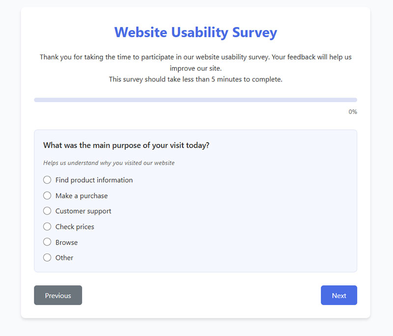
Start with what a visitor can realistically report on. That’s findability, navigation, learnability, efficiency, content clarity, visual design and error recovery, and one to three questions per area is plenty.
Choose the response format before you write the question. Bending a question to fit a scale afterward is much harder.
Opinions about brand impression or intent to return fit better in a separate website feedback survey. Keep this one on use, not opinion.
Navigation and findability questions
Open with “What were you trying to do on this site today?” as multiple choice, with an “other” field. It goes first because it lets you split every later answer by intent. A visitor who came to compare prices and one who came to reach support will rate the same menu very differently.
- “How easy was it to find what you were looking for?” works on a 7-point scale, very difficult to very easy.
- “The menu labels made sense to me.” is an agreement item.
- For site search, ask “Did the search results match what you typed?” and offer yes, partly or no.
Content and visual design questions
“Do you like the design?” returns noise. “Did this page answer your question?” returns something you can fix, so test comprehension and skip taste.
- “Did this page answer your question?” with yes, partly or no
- “Was anything on the page unclear or hard to read?” as open text
- “The layout made it easy to see what to do next.” on an agreement scale
Mobile, performance and accessibility questions
Visitors can tell you how a page felt. They can’t tell you how fast it loaded, so ask about the experience and leave real load time, device split and bounce rate to analytics.
- “Did the page load fast enough for you?” (yes/no)
- “Was anything hard to tap or read on your phone?” (open text)
- “Did anything stop you from using the page, such as text size, contrast or small buttons?” (open text)
One limit worth knowing. A survey cannot confirm that a page is accessible. It only surfaces the visitors who hit a barrier and chose to say so.
Checkout and error recovery questions
Most question lists skip error recovery, which is odd, because it’s where visitors get most annoyed. It covers what happens after a mistake: a mistyped card number, a rejected form field, a search that returned nothing.
Ask only the visitors who hit a problem. Otherwise the answers mix people who never saw an error with people who did.
- “Did anything go wrong while you were completing this step?” (yes/no, with the next question shown only on yes)
- “Did the message tell you how to fix it?” (yes, partly, no)
Conditional logic handles the “only on yes” rule. The follow-up question stays hidden until the visitor answers yes, and the rule is set on that field’s Smart Logic tab.
Checkout questions follow the same rule, one rating of ease and one open-text field for friction.
Learnability and efficiency fit anywhere as agreement items, such as “I figured out the site without help” and “I finished without extra steps.”
Which question formats and response scales work best?
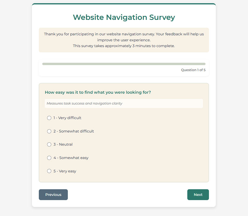
Rating scales are what you use for anything you plan to benchmark, and multiple choice is how you segment visitors. One open-ended question explains the scores. Yes/no and matrix items fill the gaps, each with a cost.
Ranking, demographic and other types of survey questions rarely earn a place in a usability survey of ten questions or fewer.
Open-ended versus closed-ended questions
Rating scales are good for benchmarks and tracking over time. They tell you how much, never why.
Multiple choice suits visitor goal, device and visit frequency, but it breaks when the options miss a real answer. Add “other.”
The open-ended question is where the reason behind a score lives, and it costs analysis time, so I’d keep it to one per survey. A Paragraph field is the usual home for it.
Yes/no handles task success and error checks, though you lose all detail about degree. Matrix items put several questions on one scale, which sounds efficient until visitors straight-line through them on a phone.
Closed questions give you numbers to compare across runs. The fix usually shows up in the open text.
Likert scale length and the neutral midpoint
Sources disagree on 5 versus 7 points.
Jeff Sauro of MeasuringU found a seven-point scale gives a small benefit over five, mostly for single items, because too few options force respondents to round to the nearest one.
Jim Lewis’s 2019 study in Human Factors points the other way. It compared 3-, 5-, 7- and 11-point versions of the UMUX-Lite on auto insurance websites, and MeasuringU’s summary reads the results as support for five points. A 2022 item response theory study in the International Journal of Assessment Tools in Education reached the same recommendation on a student sample, with five points more reliable than three and not meaningfully worse than seven.
Both can be right. Use seven points for a single standalone rating and five for a battery of items. Keep every standardized instrument on its native scale, because its benchmarks assume it.
Sauro adds a caveat worth remembering. The effect of a usable or unusable site outweighs the effect of scale points, labels and direction.
Keep a neutral midpoint on ease and agreement items so visitors who never noticed a feature do not have to invent an opinion. Drop it only when you need a forced lean, such as a go or no-go call on a redesign.
The midpoint is also not the average. The benchmarks in the next section sit well away from the middle of their scales.
For ready-made wording, these worked examples of Likert scale questions cover the standard agreement labels.
The Likert field builds a grid with statements as rows and scale points as columns, and its column presets include Satisfaction, Importance, Agreement and Likelihood. Turn on Show values to store a number for each label, so scores from separate runs compare cleanly.
Label wording and scale direction
Label every point with words, not only numbers, and keep one direction across the survey. Low is bad, high is good.
Direction matters more than it looks. MeasuringU documents SEQ variants with reversed direction and agreement endpoints that differ from the standard item, so their scores should not be read against the standard SEQ benchmarks.
Which standardized questionnaire fits a website: SUS, SEQ, SUPR-Q or UMUX-Lite?
The SEQ handles task-level ease. For a general usability score the SUS is the usual choice, and the SUPR-Q suits tracking a site over time. When the survey can only hold two items, that’s the UMUX-Lite’s job.
| Instrument | Items and scale | Measures | Best use |
|---|---|---|---|
| SUS | 10 items, 5-point agreement, scored 0 to 100 | Perceived usability and learnability | General score after a session |
| SEQ | 1 item, 7-point | Task difficulty | Right after a task |
| SUPR-Q | 8 items | Usability, trust, appearance, loyalty | Site-level tracking |
| UMUX-Lite | 2 items, 7-point | Ease and usefulness | Short pop-up surveys |
A few figures are worth keeping nearby when you read results.
- The SUS averages 68 across about 500 studies, which is the 50th percentile (MeasuringU).
- SEQ averages run 5.3 to 5.6 on a 7-point scale across more than 400 tasks and 10,000 users (MeasuringU).
- The SUPR-Q has 8 items and is normed against a database of 150 websites (MeasuringU).
- Across 16 published comparisons, the UMUX-Lite and the SUS differed by under half a point on average (Lah et al., 2020, summarized by MeasuringU).
System Usability Scale
John Brooke created the SUS in 1986 as a fast, low-effort rating to run after usability tests. It is still the most used usability questionnaire.
Scoring is a little fiddly. Odd-numbered items score the answer minus 1, even-numbered items score 5 minus the answer, and the sum is multiplied by 2.5 to land on a 0 to 100 score.
In IvyForms, the Calculated field can apply that arithmetic for you. Build the ten items as Radio button fields with the values 1 to 5 stored on each option, then write the odd and even item rules into the formula. The result is saved with each entry.
The number reads like a percentage but is not one. A 70 sits just above the 68 average, so report SUS results as a percentile or grade when stakeholders read them.
The SUS gives you one number and no reasons, and MeasuringU states it was not built to diagnose problems. Post-test scores track task performance only loosely, so a low result says the site has a problem, not which page.
Single Ease Question
The SEQ is a single item, “Overall, how difficult or easy was the task to complete?”, answered on seven points from very difficult to very easy. You ask it straight after a task, not at the end of the visit.
A Rating field with seven levels and labels from very difficult to very easy reproduces the item, and Show values keeps the numbers 1 to 7 in the entry.
A 4 is the scale midpoint, not the average. The average in the figures above is well higher, and an average SEQ score goes with an average task completion rate of 71% (MeasuringU), so a task rated 4 is already underperforming.
MeasuringU updated its historical SEQ average in May 2019 after years of new data.
Pair the item with a free-text “why” field. The SEQ flags which task is hard and says nothing about the cause.
SUPR-Q and UMUX-Lite
The SUPR-Q has 8 items across four factors, usability, trust, appearance and loyalty, so it covers ground the SUS leaves out. An older version used 13 items (MeasuringU).
The UMUX-Lite is just two items, ease of use and usefulness, on a seven-point agreement scale converted to 0 to 100 like the SUS. A five-point variant, the UX-Lite, fits the same grid as the SUS and SUPR-Q.
The SUPR-Q is distributed through MeasuringU, so check its current licensing terms before putting it into a commercial survey.
For a one-screen pop-up I’d go with the UMUX-Lite. Its means track the SUS closely enough to read against SUS grading.
Where NPS, CSAT and CES fit
NPS, CSAT and CES measure loyalty, satisfaction and effort. None of them measures usability, though each shows up in usability surveys anyway.
CSAT asks how satisfied the visitor was with an interaction, and CES asks how much effort it took. NPS asks how likely the visitor is to recommend the site, on a 0 to 10 scale.
MeasuringU found the SUS explains around 40% of the variation in likelihood to recommend. A low NPS can therefore come from usability, but also from price, product or support.
Keep the two apart. The wording of NPS survey questions and their follow-ups is covered in a separate guide to NPS survey questions.
The NPS field gives you the 0 to 10 buttons with a label at each end, and the stored scores read directly as detractors, passives and promoters.
When and where should the survey appear?
Match the trigger to the question. Task questions belong right after the task, site-level questions can wait for a meaningful visit, and checkout questions go after the order.
Post-task prompts
The SEQ and other sets of one to three questions fit here.
Asking right after the task catches the experience while the visitor still remembers it. MeasuringU’s guidance is that one to three questions are enough at this point.
Nielsen Norman Group draws the same line. Post-test questionnaires rate the whole system, while post-task scales point at the problem parts of a design.
Fire the prompt from the confirmation or result page, not from a timer.
On-site and exit-intent surveys
Exit intent only reaches people who are already leaving.
An on-page intercept shows after time on page, scroll depth or a page event, so it reaches active visitors and suits site-level questions. Exit intent fires when the cursor leaves the window. It reaches leavers only and cannot speak for the visitors who stayed and finished.
Detection varies by tool. Survicate’s documentation says exit intent works only on desktop and laptop browsers, while Asklayer’s documentation says it fires on mobile when a visitor tries to switch tabs.
Exit-intent forms use the same cursor-leave trigger, but a good exit question asks why the visitor is leaving, not how usable the site was.
Email and in-app delivery
Post-purchase email suits checkout and delivery questions, sent once the order is done. Logged-in products can use an in-app prompt tied to a feature the visitor just used, and a short site-level set works as a post-session prompt after a visit with several page views.
Checkout questions sent by email reach visitors who bought, not the ones who abandoned. Abandoners need an on-site prompt instead.
Question ideas for the buyer side are collected in a guide to post-purchase survey questions.
For the email link, a conversational form has its own permalink and shows one question at a time, which keeps a post-order survey light on a phone. The Post-purchase feedback form template covers checkout, delivery and fulfillment as a starting point.
Which tools deliver a website usability survey?
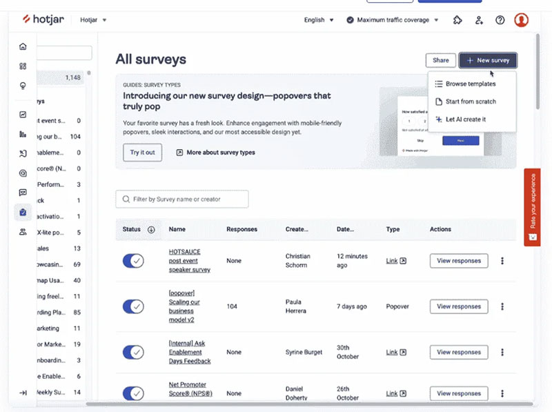
Hotjar, SurveyMonkey and Qualtrics can display a survey on a live page with display rules. Typeform and Google Forms embed one but leave the timing to your own page code.
Details below reflect vendor documentation as of October 2026.
| Tool | How it reaches visitors | Display control | Best fit |
|---|---|---|---|
| Hotjar | On-page survey as link, full screen or popover | URL rules plus Events API triggers | Ongoing feedback beside heatmaps and recordings |
| SurveyMonkey | Embed, popup invitation, popup survey, embedded button (beta) | Sample rate; one embedded survey per page | Quick on-page surveys with mixed question types |
| Typeform | Standard, full page, popup, slider, popover, side tab | Opened by a button click or your own script | Short surveys opened from a button |
| Google Forms | Iframe code from the Send menu | None, shows where you place it | One-off surveys of an existing audience |
| Qualtrics | Website / App Insights intercept linked to a separate survey | Intercept rules built outside the survey | Large sites and research teams |
Each tool has documented quirks that can bite you.
In Hotjar, event-based targeting overrides URL targeting, including excluded URLs. If one page fires two events tied to different surveys, the most recent event wins (Hotjar help center).
SurveyMonkey popups reappear after cleared cookies or a new browser session, which allows duplicate responses from the same person (SurveyMonkey help center).
Qualtrics treats the survey and the intercept as separate projects. Support documentation says to leave “Prevent multiple submissions” deselected so visitors can answer each time they see the intercept.
The obvious pick is the biggest platform. For a one-off survey of an existing audience, though, a free embedded form is enough, and display rules only pay off once you run the survey repeatedly.
WordPress sites can skip embed code entirely with survey plugins built for WordPress. A plugin such as IvyForms places the survey with a shortcode, the Gutenberg block or Elementor, and keeps every response as an entry in your own dashboard.
Anyone who outgrows a bare form has plenty of alternatives to Google Forms.
How long should the survey be, and how should the questions be worded?
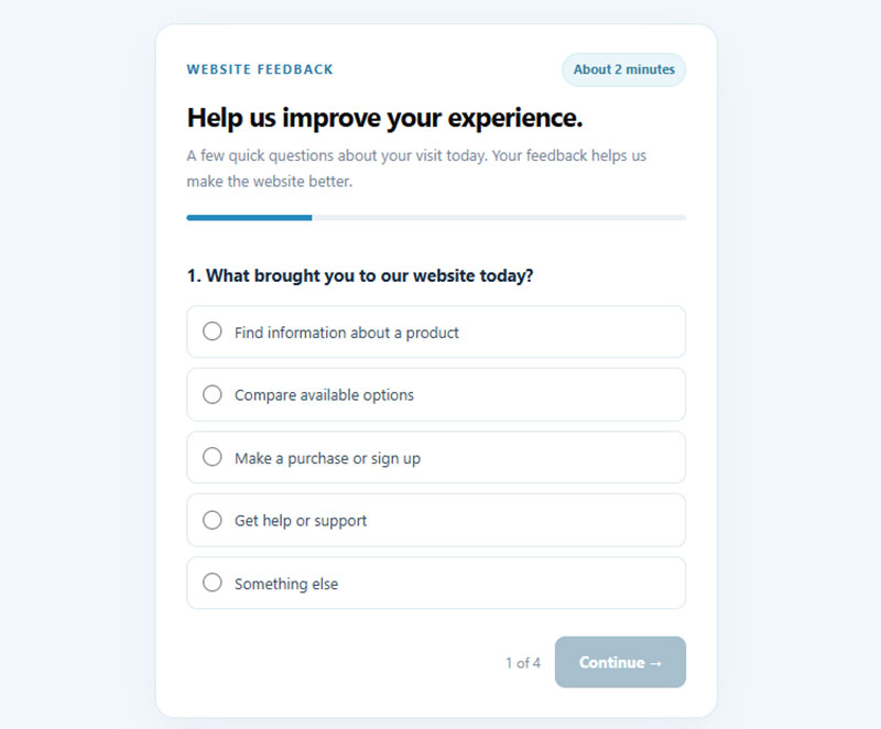
A live-site survey tops out at one standardized instrument, a few custom questions and a single open-text field. Past that you trade completion for detail you will not have time to analyze.
Length and completion
Sources disagree on how much length costs.
Galesic and Bosnjak (Public Opinion Quarterly, 2009) told web respondents a survey would take 10, 20 or 30 minutes. The longer the announced length, the fewer people started and finished it.
A 2022 questionnaire-length study from the University of Gothenburg went the other way. It concluded that length does not necessarily lower data quality, and it called the effect on web surveys less certain.
The gap comes from what respondents are told up front. A pop-up gives a visitor one decision, and the stated length is most of it, so say how long the survey takes and keep that claim honest.
Visitors who feel a survey dragging quit halfway, which is why it pays to prevent survey fatigue even on a two-minute survey.
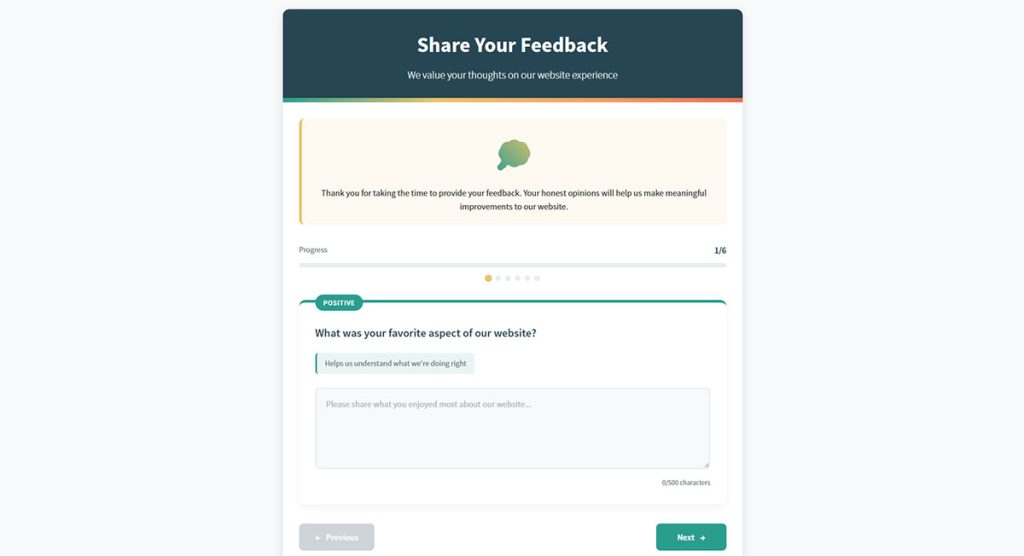
When the question count cannot shrink, multi-page forms split it into short pages with a progress bar, so the visitor always sees how far along they are.
Question order
Position changes the answer you get. In the same Galesic and Bosnjak experiment, answers to later questions came faster, shorter and more uniform than answers to earlier ones.
- After the goal question, ask the rating you care about most
- Put the open-text field right after that rating, before any grid
- Leave matrix items and optional segment questions for the end
A visitor who quits at question four should still have given you the rating and the reason.
Wording errors that corrupt answers
Respondents answer what is written, not what you meant. A 2021 Stanford Biodesign guide, citing Pew Research Center’s questionnaire design guidance, lists the usual culprits.
| Error | Weak version | Better version |
|---|---|---|
| Leading | “How easy was our simple checkout?” | “How easy or difficult was checkout?” |
| Double-barreled | “Was the site fast and easy to use?” | Two questions, one on speed and one on ease |
| Assumptive | “Which search filter helped most?” | “Did you use the search filters?” then a follow-up |
| Double negative | “I did not find the menu confusing.” | “The menu was easy to understand.” |
Ambiguity is the fifth. “Was the site good?” leaves room for interpretation, and ambiguous questions usually return ambiguous answers.
Pilot the wording with a small group before it reaches every visitor. The Stanford guide recommends exactly that.
How do you read and analyze the results?
Compare each score to a published benchmark first, then code the open-text answers into themes, and only after that join everything to behavior data. The score tells you how bad things are, the comments tell you what, and behavior data narrows down where.
Scoring and benchmarking
Read every score against its own reference, whether that’s the SUS grading curve, the SEQ database or the SUPR-Q percentile. The raw midpoint of the scale is the wrong yardstick.
Segment the results by the goal question before averaging anything. A blended score hides the visitor type that is struggling.
For the mechanics of cleaning responses and cross-tabbing, see this walkthrough on analyzing survey data. The entries table in a form plugin supports search and date-range filters for cutting each run, and every entry keeps its submission date.
Coding open-text answers
Braun and Clarke (2006) set out thematic analysis in six phases, and the last one is the report. Applied to a stack of survey comments, the first five go like this.
- Read every comment once before labeling anything.
- Attach a short code to each comment, such as “menu labels” or “slow checkout.”
- Collect the codes into candidate themes.
- Test each theme against the raw comments and drop the ones that do not hold.
- Give each remaining theme a plain name and count the mentions.
The report is then a ranked list of themes with a count and one representative comment each.
Keep a “no problems” bucket so praise does not disappear into the other themes.
Pairing survey data with behavior data
Behavior data locates the problem, and the survey explains how visitors felt about it.
In Google Analytics, send each submission as an event with the rating as a parameter, then compare completion and bounce rate for visitors who rated high and low.
Hotjar events can filter recordings and heatmap data (Hotjar help center, as of October 2026). If your page code fires an event on a low rating, the recordings narrow to the sessions worth watching.
Task completion adds one more read. Low ease with low completion points to the failing step, while low ease with normal completion points to friction.
Tools that push answers into GA4 send them as event parameters. Survicate’s help center states, as of October 2026, that a parameter must be registered as a custom dimension to show in reports, and that custom dimensions do not work retroactively.
Register it before launch. Survey submissions are form submissions, so the usual setup for tracking form submissions in Google Analytics applies.
Each entry in a form plugin also stores the page it was submitted from (a Source URL), so ratings can be grouped by page without an extra question. The wpDataTables integration turns entries into tables and charts, and a redirect to a dedicated thank-you page gives GA4 a clean URL to count.
How to launch a website usability survey, step by step
The path from one goal to a first report is short, with a small pilot sitting ahead of the public rollout.
- Set the goal by naming one decision the results will inform, such as whether to redesign the pricing page.
- Pick two or three usability areas and one standardized questionnaire that fits them.
- Write the custom items. A few questions and one open-text field is plenty, with leading and double-barreled wording removed.
- Pilot it with a cognitive walkthrough, a mechanical test of skip logic and a usability test of the survey itself.
- Choose the page event that triggers it and the share of visitors who see it, then launch to that slice.
- Read scores against benchmarks, code the comments and write up themes with counts.
The pilot tests come from Nielsen Norman Group’s guidance on testing a survey. Each catches a different failure: unclear questions, broken logic, and a survey that visitors cannot operate.
Once the questions are fixed, building the survey form takes minutes. This guide to creating a survey form covers the build.
Ready-made survey form templates save the layout work, though the questions should still be yours. The Website experience feedback form template is built around usability, design and navigation, and the live preview in the builder helps with the mechanical pilot test.
How many responses to collect
Small samples give stable but wide estimates. MeasuringU simulated SUS scores from five users, and half the time the result landed within 6 points of the true score, so a true 74 showed up anywhere from 68 to 80.
Five answers are enough to catch a confusing question. They are not enough to benchmark.
QuestionPro’s guide suggests 30 to 40 recent visitors for a short survey. Treat that as a vendor rule of thumb, not a tested threshold, and keep collecting until the theme counts stop shifting.
When does a website usability survey fall short?
The moment your goal is to find where and why visitors fail, a survey stops being enough. It records what people say happened, not what happened.
| Dimension | Survey | Usability test |
|---|---|---|
| Data | Self-reported attitudes | Observed behavior |
| Reach | Many visitors, little depth | Few participants, deep detail |
| Output | Scores and comments | Located problems |
| Best for | Benchmarking and tracking | Diagnosing and fixing |
Where vendor guides and researchers disagree
VWO’s guide says a website usability survey measures how easily visitors navigate, find information and complete tasks.
Nielsen Norman Group takes a harder line and calls surveys the wrong method for studying usability on their own. Respondents are not using the system while they answer, and their recollections come out incomplete, vague or wrong.
Both sides agree on what the instruments capture, which is perceived usability. They split on how far that perception can stand in for behavior.
Nielsen’s Alertbox of December 1999 put numbers on the gap. He cited a Zona Research survey in which 28% of respondents called finding products somewhat or extremely difficult, then set it against observations showing people find the product they want less than half the time.
The data is old (Zona surveyed 239 regular internet users, per IDG in 1998), but NN/g’s current survey guidance makes the same argument.
Cases where a survey is the wrong tool
- Finding where visitors get stuck. Perceived findability and actual findability are different measurements, and NN/g says research on findability and discoverability needs observational methods.
- Diagnosing a low score. A rating carries no location, so it cannot say which page failed.
- Low-traffic sites, where small response counts give wide intervals and scores move more from sampling noise than from the site.
- Choosing between two designs, since Nielsen (2001) warned that users who have not tried the designs base their comments on surface features.
- Representing everyone, because respondents choose to answer and they filter what they share (NN/g).
What to run alongside it
Think of the survey as the tracking layer and observation as the diagnostic layer.
Use the survey to find the task or page that scores lowest. Then watch recordings or run a short moderated test on that page.
Website Usability Survey Questions FAQ
Where can I find free website usability survey templates?
Survey tools such as Jotform and Zonka Feedback publish free templates grouped by navigation, content, design and performance. Most use custom rating items, so add a standardized instrument like the SUS when you need a score you can benchmark.
On WordPress, the feedback form templates include website and customer experience versions that you can edit freely.
Do redesign surveys need different questions?
Yes. Before a redesign, ask what frustrates visitors today.
After launch, repeat the same standardized instrument with identical wording, so the two scores compare directly.
Is a B2B website usability survey different from a consumer one?
Yes, in focus. Contentsquare separates the two. A website survey measures how easily prospects and customers use the site, while a B2B usability survey measures how well a product fits users’ needs and how easy it is to use.
The UMUX-Lite suits the second case, because its usefulness item asks whether the system’s capabilities meet the visitor’s requirements.
Is a usability survey the same as a customer satisfaction survey?
No. A usability survey asks how easy the site was to use, while a customer satisfaction survey asks how satisfied a visitor was with an interaction.
Satisfaction scores also fall for reasons the site does not control, such as price or support, so keep the two question sets apart.
When a Change in Usability Scores Counts as Real
Website usability survey questions show real change only when the new score’s 95% confidence interval does not overlap the old one (MeasuringU). A release that touches the measured pages is the trigger for a second run, not the calendar.
Detecting a 5-point difference in System Usability Scale scores between two groups, at 95% confidence and 80% power, takes 396 responses, about 198 per group (MeasuringU, 2022).
That is ten to thirteen times the 30 to 40 visitors one vendor guide suggests, or five to seven times that figure for each group, so a first run reads the level while a second run needs far more to read the change.
The figure assumes a standard deviation near 17.7, and a more variable audience needs more. Low-traffic sites accept the trade-off that only large swings will register. I checked this against MeasuringU’s published tables as of October 2026.
- Re-run after a release that changes the measured pages
- Collect until each run reaches its required sample, then compare confidence intervals, not point scores
To count responses per run, filter the entries table by date range, or keep one form per run so each has its own entry total.