




A screen reader user tabs into a checkout form and one of the fields just announces “edit text.” No name, no hint about what it wants, nothing. That’s the actual…
Table of contents
Roughly half of the people who start filling in a web form never finish it.
The fix is rarely design. It is picking the wrong form type for the job, then wondering why nobody submits.
There are 25 types of forms used on websites, and each one has a specific field set, a specific placement, and a specific conversion rate. A contact form and a lead generation form look identical. They do completely different jobs.
This guide sorts every form type into 5 categories:
- Data collection (contact, feedback, survey, quiz)
- User accounts (registration, login, password reset)
- Transactions (checkout, payment, booking, donation)
- Marketing and lead capture (lead gen, newsletter, popup)
- Utility (search, file upload, multi-step, conversational)
By the end, you will know which form type matches your goal, what fields it needs, and where it belongs on the page.
What Is a Web Form?
A web form is a set of input fields on a webpage that collects data from a visitor and sends it to a server, database, email inbox, or CRM. Every web form has 4 parts: input fields, labels, a submit button, and a backend destination.
The word “form” gets used for tax paperwork and printed documents. This guide covers only the online kind: the form on a website that someone fills in and submits.
Zuko Analytics data from 93 million sessions puts the overall form completion rate across industries at 51.7%, with desktop beating mobile by 8 to 9 points.
How a Web Form Works
Submission runs through a predictable sequence.
- The browser packages field values into an HTTP POST or GET request
- Validation checks the data (client-side, server-side, or both)
- The server stores the record or forwards it by email
- The user lands on a thank you page or sees a confirmation message
Client-side validation is a convenience layer, not a security layer. Anyone can bypass it with the browser console open, which is why the split between client-side and server-side checks decides whether garbage data ever reaches your database.
Common Form Fields
Every form type below is built from the same small set of inputs.
Text-based: text, email, tel, password, number, textarea
Selection-based: dropdown, radio button, checkbox, date picker
Other: file upload, hidden field, consent checkbox
HubSpot pegs the average form at 4.92 fields. Zuko’s field-level data shows the password field carries a 10.5% abandonment rate, the worst of any single input, followed by email at 6.4% and phone at 6.3%.
Picking between a radio button and a checkbox trips people up constantly, and the choice is not cosmetic. CXL found radio buttons get completed 2.5 seconds faster than dropdowns, so the rules for when each control belongs on a form are worth knowing before you build anything. If you want the full input-by-input breakdown, including the edge cases nobody documents, start with the field reference.

What Are the Most Common Types of Forms Used on Websites?
The most common types of forms on websites are contact, registration, login, checkout, feedback, survey, lead generation, newsletter, application, and popup forms. This guide covers 25 form types across 5 categories: data collection, user accounts, transactions, marketing, and utility.
Every form type below serves one job. The category tells you what the form is for. The field list tells you what it costs the visitor.
| Category | What It Does | Types Inside |
|---|---|---|
| Data collection | Gathers information, no account, no payment | 4 |
| User account | Creates or verifies an identity | 4 |
| Transaction | Moves money or reserves a slot | 6 |
| Marketing and lead | Captures a contact record | 4 |
| Utility and specialized | Serves one narrow function | 7 |
Different types of forms convert at wildly different rates, and the spread is not subtle. Zuko’s benchmarking shows application forms at a 75% start-to-completion rate while contact forms sit at 37.85%.
Ruler Analytics puts the cross-industry average form conversion rate at 1.7%. Treat that as a floor, not a target.
Theory only gets you so far here. Seeing how these different kinds of forms are actually built on live sites tells you more in five minutes than any category list, and this collection of real website form examples is the fastest way to do that.
What Are Data Collection Forms?
Data collection forms gather information from a visitor without creating an account or processing payment. They carry the lowest field counts of any category, use no authentication, and touch no payment gateway. The 4 types are contact, feedback, survey, and quiz forms.
| Form Type | Primary Use | Key Fields |
|---|---|---|
| Contact | Open a conversation | NameEmailMessage |
| Feedback | Rate an experience | Rating scaleComment |
| Survey | Collect structured opinions | Multiple choiceLikert scale |
| Quiz | Score answers, segment people | Scored questionsEmail capture |
Contact Form
See the Pen
Modern Contact Form by Bogdan Sandu (@bogdansandu)
on CodePen.
The contact form is the most requested form on the web and the worst-performing one in the data.
Only 9.09% of people who see a contact form submit it (Zuko). Of those who start typing, 37.85% finish.
Three fields is the working standard: name, email, message. Adding a phone number field to a contact form is the fastest way to lose a submission you already had.
The gap between a contact form that converts and one that sits empty comes down to a handful of small decisions, and these contact form examples show what the good ones do differently.
Feedback Form
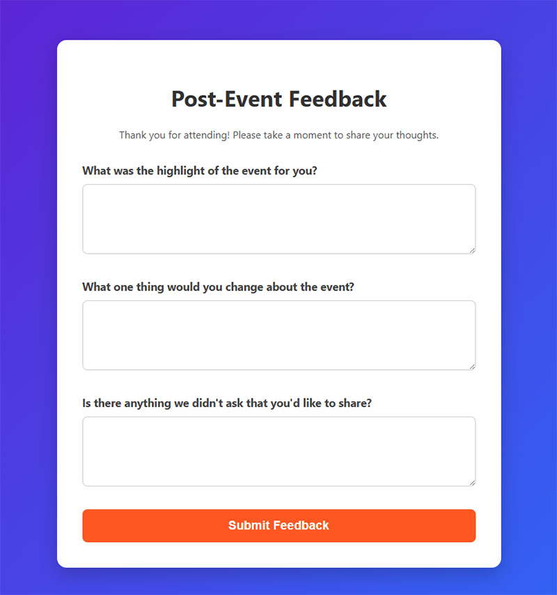
Placement is the whole game here. A feedback form shown after a purchase, a support ticket, or a completed onboarding step gets responses. The same form parked on a /feedback page gets crickets.
Keep it to a rating scale plus one open comment box. Two fields.
Contentsquare recommends firing an exit-intent survey at cart abandoners with a single question, which is roughly the shortest useful feedback form that exists.
Question wording does more damage than form design in this category, and the best practices for building feedback forms cover how to ask without leading the answer.
Survey Form
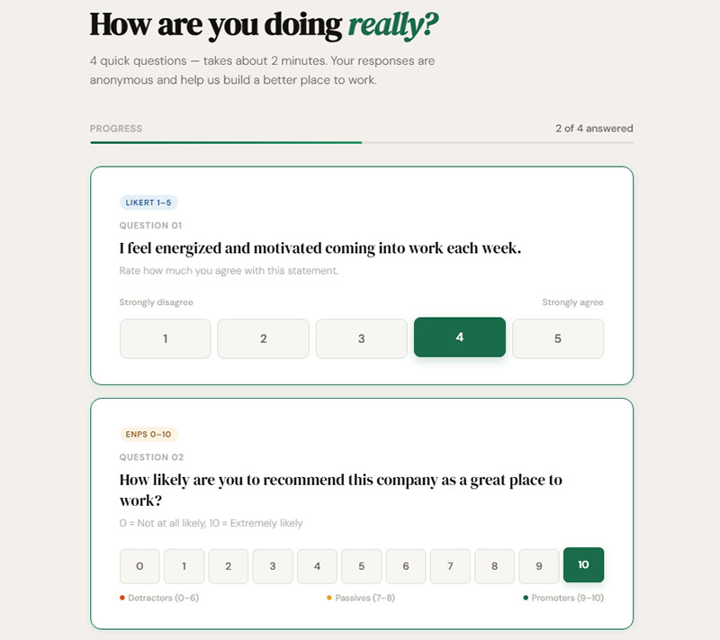
Surveys are the one form type where more fields is sometimes correct.
Question types that belong here:
- Multiple choice (fast, clean data)
- Likert scale (attitude measurement)
- Ranking (priority ordering)
- Open text (use sparingly, kills completion)
Zuko’s data shows form length is not the primary abandonment driver people assume it is. Survey fatigue is. Ask 40 questions and watch the drop-off curve.
Picking the right question format for what you actually want to measure is half the job, which is why the different types of survey questions are worth reading before you open a form builder. Once the questions are settled, building the survey form itself takes about twenty minutes.
Quiz Form
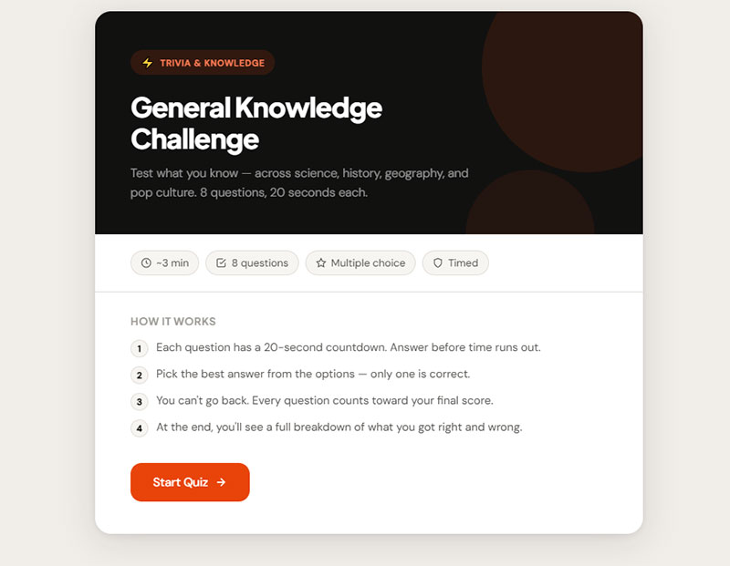
A quiz form scores answers and returns a result. That result is the incentive.
Product finders, skin-type quizzes, and “which plan is right for you” tools all run on this structure. The email capture sits at the end, after the person has already invested effort.
OptiMonk’s data on conversational popups (which use quiz logic) shows a 15.2% average conversion rate, roughly 5x a plain newsletter box.
Nobody builds a quiz from scratch twice. Steal the structure from a working quiz template and swap the questions.
What Are User Account Forms?
User account forms create or verify a user identity. They handle credentials, hash passwords, open sessions, and enforce security rules that no other form category deals with. The 4 types are registration, login, password reset, and profile forms.
Zuko’s field-level analysis shows the password input drives 10.5% abandonment, the highest of any form field measured. Every form in this category contains one.
Registration / Signup Form

Registration forms are the fastest form type to complete: one minute and thirty-five seconds on average (Zuko).
They also post a 63% start-to-complete rate and a 41% view-to-complete rate, which is respectable.
Three fields beats eight. Email, password, done. Everything else (company size, job title, phone) belongs in a profile form after the account exists.
Most signup forms fail on field count rather than design, and the signup form best practices explain which fields survive that cut. If you want to see the pattern applied, these registration form examples run the range from two fields to twelve, and the registration form templates give you a starting point that already works.
Login Form
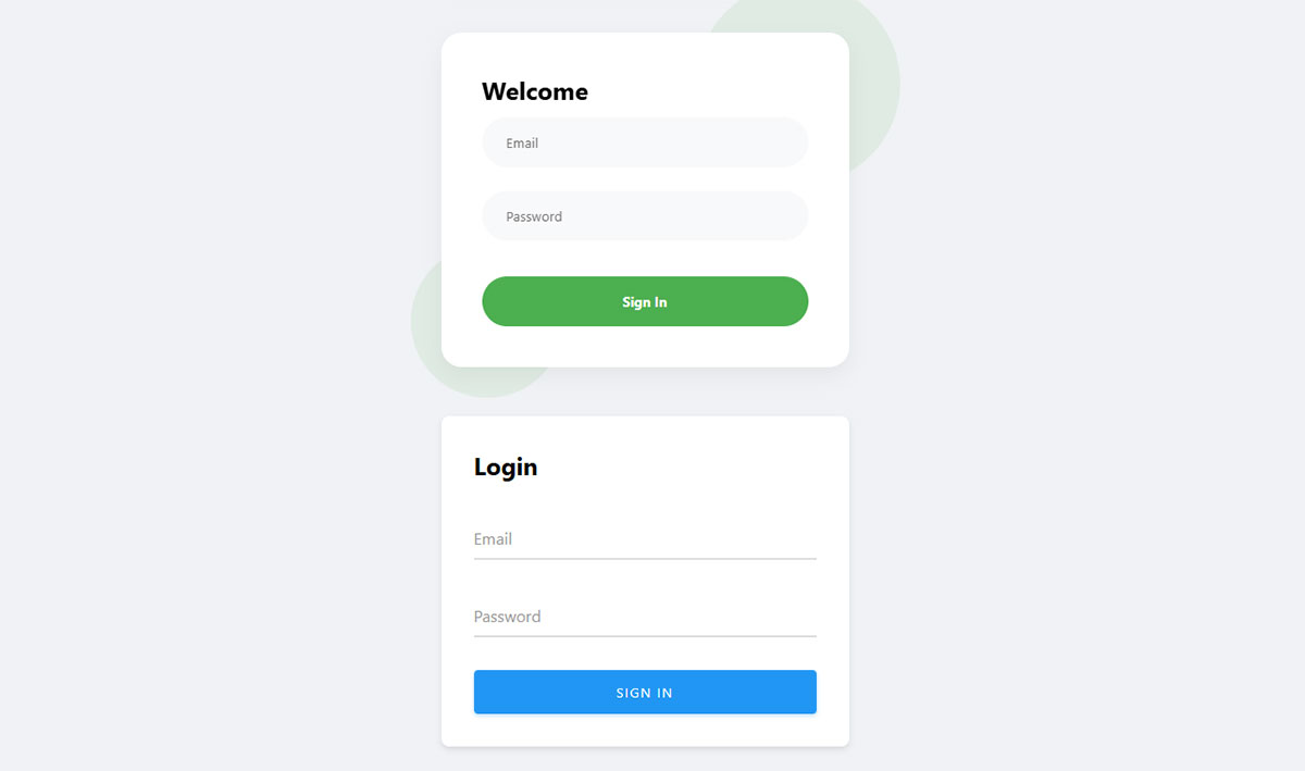
Two fields, one button, and more design opinions than any other form on the internet.
What actually moves the needle:
- Autofill support (Chrome data: 35% faster completion, 75% lower abandonment)
- A visible “show password” toggle
- Magic links or SSO as an escape hatch from the password field entirely
OAuth and single sign-on exist because the password field is the leakiest input in web forms. Skipping it is the strongest optimization available.
For the front-end side of it, these CSS login form builds cover the layouts people actually ship.
Password Reset Form
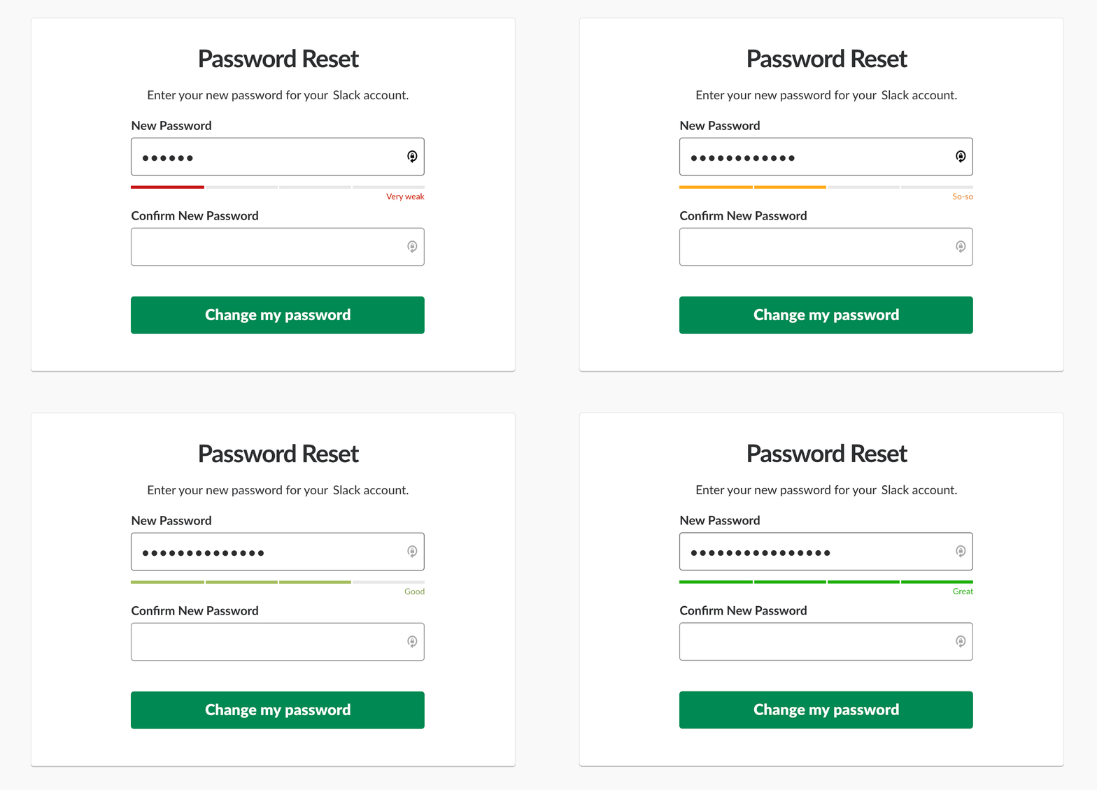
Image source: Smashing Magazine
One field: email address.
The form itself is trivial. The failure point is downstream, in the email that never arrives because SMTP was never configured properly.
Nothing generates more support tickets than a reset link that lands in spam. Before you blame the form, check that your outgoing mail is configured correctly, because the default setup on most hosts sends straight to junk.
Profile / Account Settings Form
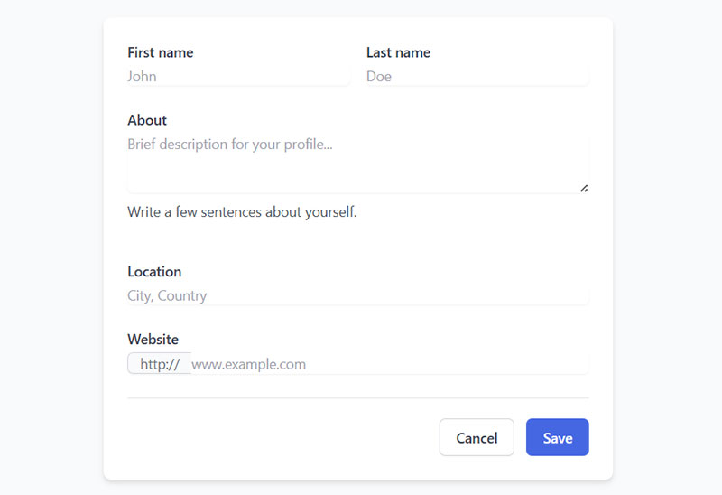
This is where the fields you cut from the signup form go to live.
Profile forms tolerate length because the user is already logged in, already committed, and already motivated. Job title, company, timezone, notification preferences, avatar upload.
Key difference from registration: no acquisition pressure. Nobody bounces off a settings page.
What Are Transaction Forms?
Transaction forms complete a purchase, reservation, payment, or formal request. They integrate a payment gateway, validate addresses, meet PCI DSS requirements, and trigger a confirmation email. The 6 types are checkout, payment, order, booking, donation, and quote request forms.
Baymard Institute puts the average cart abandonment rate at 70.22% across 50 studies. Transaction forms are where the most money leaks out of a website.
| Form Type | Primary Use | Example |
|---|---|---|
| Checkout | Complete a purchase | Shopify Checkout |
| Payment | Take a one-off payment | Stripe, PayPal |
| Order | Place an itemized order | Restaurant order form |
| Booking | Reserve a time slot | Calendly, OpenTable |
| Donation | Accept a contribution | Nonprofit giving page |
| Quote request | Get pricing | B2B “request a quote” |
Checkout Form
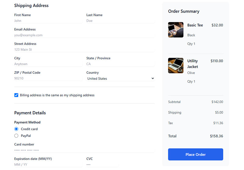
The average US checkout displays 23.48 form elements by default (Baymard). The ideal is closer to 12.
Checkout forms take three minutes and twenty-one seconds to complete on average, the longest of any form type in Zuko’s dataset.
Baymard’s testing across Walmart, Amazon, Wayfair, and ASOS found the average large ecommerce site can gain a 35.26% conversion increase through better checkout design alone. That maps to $260 billion in recoverable orders across the US and EU.
That 35% is not theoretical. It comes from a short list of fixable problems, and the checkout optimization playbook works through them in order of impact.
Payment Form

Difference from checkout: a payment form takes money without a cart. Invoices, deposits, tuition, membership dues.
Fields: amount, card details, billing address, email for the receipt.
Stripe and PayPal handle the sensitive part. Never build the card input yourself unless PCI compliance is your idea of a fun quarter.
Plenty of sites do not need a full ecommerce stack for this, and a payment form built without a plugin handles a single price point fine.
Order Form
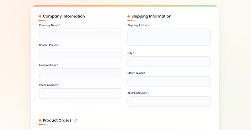
Order forms sit between a catalog and a checkout. Quantity selectors, product variants, delivery notes.
Restaurants, wholesalers, and B2B suppliers lean on them hard because their customers order the same 12 items every week.
Conditional logic matters here more than anywhere: hide the “delivery address” block when someone picks pickup.
Since the field structure barely changes between businesses, most people start from a ready-made order form template and adjust. Restaurants have their own quirks (modifiers, allergens, pickup windows), which is why food order forms get built differently.
Booking / Appointment Form
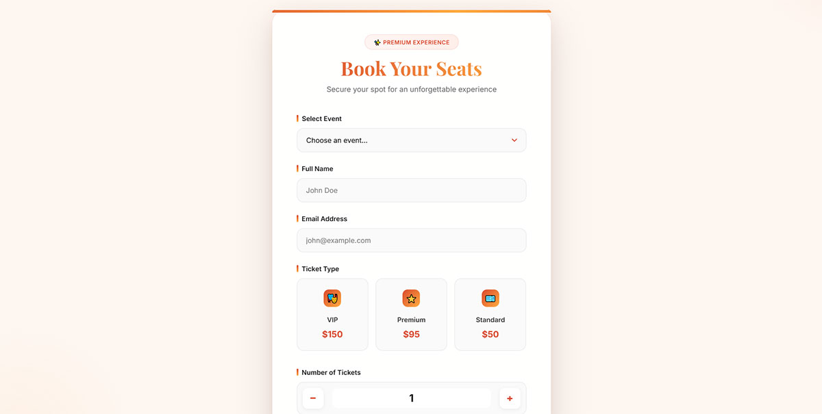
A booking form reserves a slot in a calendar. Date picker, time slot, service type, contact details.
Calendly built an entire company on this one form type, which tells you something about how badly the old back-and-forth email version worked.
Watch the timezone field. It is the single most common bug in booking forms, and the person who shows up an hour late will blame you, not their browser.
The structure varies by industry more than you would expect. A salon needs service duration, a consultant needs a buffer between calls, and these booking form templates and appointment form templates cover both patterns.
Donation Form
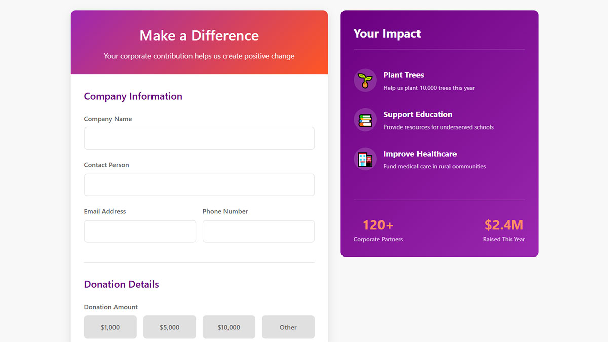
Preset amount buttons ($25, $50, $100) beat an open amount field. Every time.
Add a recurring-donation toggle and a “cover the processing fee” checkbox. Both lift average gift size without adding a required field.
Nonprofit forms skew heavily mobile, so single-column layout is not optional.
Small nonprofits rarely have a designer on staff, and a donation form template with the preset amounts already in place solves most of the problem.
Quote Request Form

The quote form is a transaction form wearing a lead form costume.
It collects project scope, budget range, and timeline. The fields are qualifying questions, and the length is deliberate: friction is the feature here, because a 12-field quote form filters out people who were never going to buy.
Sales teams complain about volume. Ignore them. Quote forms optimize for lead quality, not lead count.
What Are Marketing and Lead Forms?
Marketing and lead forms capture contact details in exchange for something valuable, then push that record into a CRM or email list. Every form in this category involves a trade. The 4 types are lead generation, newsletter signup, popup, and gated content forms.
Nearly 50% of marketers name web forms their highest-converting lead capture tool (HubSpot), which is worth sitting with if you have never looked at what lead generation actually involves beyond the form itself.
Lead Generation Form

Field count is the entire strategy conversation.
Fewer fields: more leads, lower quality, more sales team noise.
More fields: fewer leads, better qualification, happier sales team.
HubSpot found only 40% of marketers use multi-step forms, despite a conversion rate 86% higher than single-step equivalents. That gap is the easiest win in the category.
The argument gets settled by looking at which fields separate a real buyer from a tire kicker, and the field research on high-quality leads puts numbers on the cost of each one. For the finished article, these lead generation form examples show what the trade looks like when it works.
Newsletter Signup Form

One field. Email address. That is the whole form, and people still find ways to break it.
Omnisend analyzed 1.24 billion popup displays and landed on a 2.1% average email opt-in rate. Wisepops reports 4.65% on a different dataset.
The number that matters more: HubSpot found landing pages produce the best signup rates at 23%, far above any inline or popup placement.
Double opt-in cuts your list size and saves your deliverability. Take the trade.
If you are starting from zero, a newsletter signup template gets the consent checkbox and confirmation flow right by default. Paid lists work differently, and subscription form examples handle the billing side.
Popup / Modal Form
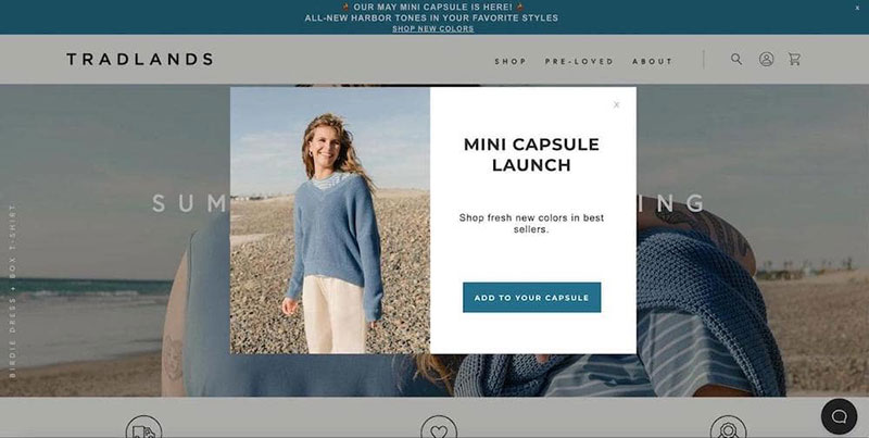
Popups make up 66% of all signup forms (HubSpot), which explains why everyone hates them and everyone uses them.
Sumo studied 1.5 million popups and found a 3.09% average conversion rate. The top 10% cleared 9%.
Static inline forms convert at 45.53% versus 25.96% for modal popups when measured on form success rate, so placement changes the math completely.
That number gap is the whole argument, and the inline versus popup breakdown explains when the popup still wins despite it. If you are new to the format, what a popup form is covers the mechanics, and exit intent popup examples show the least annoying version of it.
Gated Content / Download Form

A gated content form trades a file for an email address. Ebook, template, checklist, report.
The asset has to be worth more than the email. Most are not, which is why so many of these forms convert at 1%.
OptiMonk’s data shows ebook-incentive popups hit 7.49%, versus 5.10% for incentive-free email capture. The lead magnet is doing the work, not the form.
Which means the real question is not the form at all. It is whether gating the content makes sense in the first place, and whether you have a lead magnet worth trading for.
What Are Utility and Specialized Forms?
Utility forms serve one narrow function rather than a category-wide goal. Some collect no marketing data at all. The 7 types are search, file upload, job application, event registration, support ticket, multi-step, and conversational forms.
Search Form
One input, one button, zero marketing intent.
The site search form is the only form on this list where the visitor is actively trying to give you their intent for free. Most sites still bury it behind a magnifying glass icon.
Log your internal search queries. They are the cheapest keyword research available.
File Upload Form
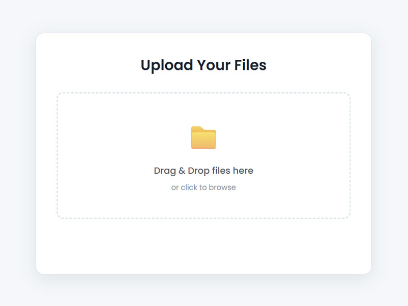
Where it shows up: job applications, insurance claims, print orders, design briefs, support tickets with screenshots.
The failure mode is almost never the form. It is the server upload limit, silently rejecting a 12 MB PDF with no error message.
Which is why the first thing to fix is not the form but the upload size limit on the server. After that, wiring up the upload field itself is straightforward, and a drag-and-drop zone beats a “Choose File” button for anything over one attachment.
Job Application Form
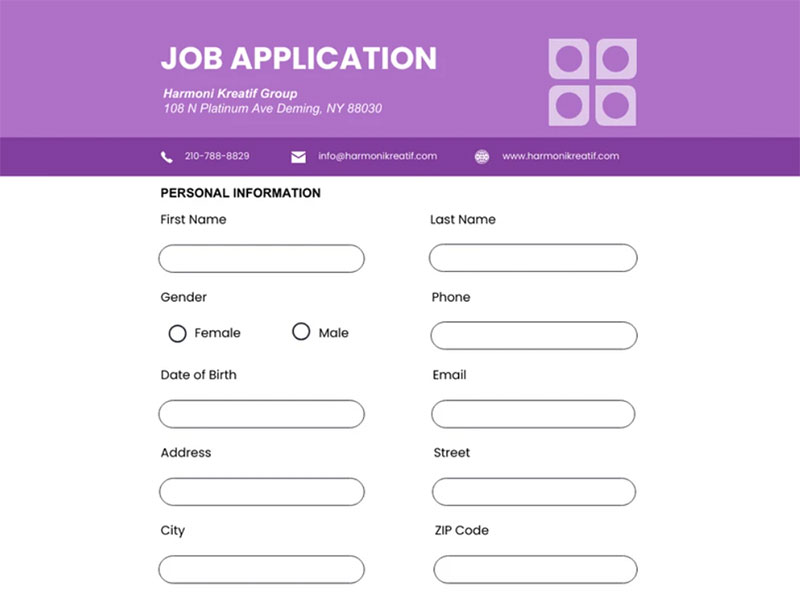
Image source: Venngage
Application forms post the highest completion rate of any form type: 75% of people who start one finish it (Zuko).
That number is misleading. Completion rates collapse by nearly 50% once an application asks 50 or more questions instead of 25 or fewer.
Recruitment forms also show a strange pattern: people who abandon spend one minute forty seconds on the form, while people who convert spend one minute twenty-five. The abandoners are getting lost, not bored.
Greenhouse, Workday, and Lever all live or die on this form.
Event Registration Form
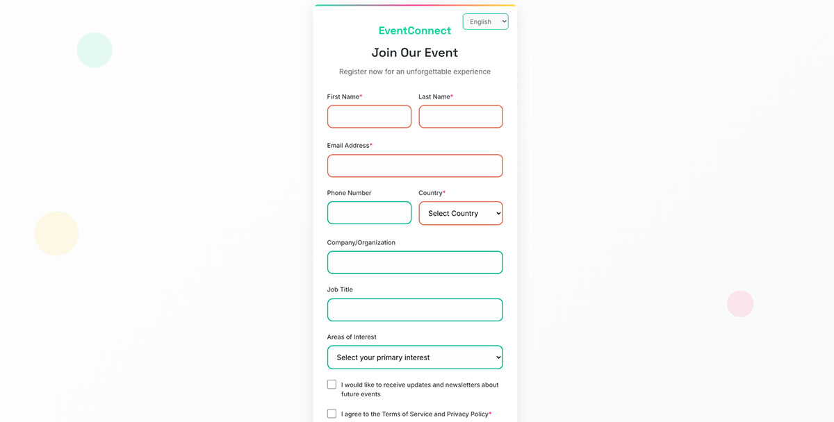
Name, email, ticket type, dietary requirements, done.
Registration forms are the fastest form type to fill in, which makes the event category a rare one where you can afford one extra qualifying question.
Webinar registration pages convert at 30% from cold traffic (ConvertKit), the highest rate of any form type in this article. That number explains why webinar registration forms get treated as their own discipline.
For in-person events, the field set is different (dietary, accessibility, plus-ones), and these event registration templates already account for it. Building one from scratch is covered in the event registration walkthrough.
Support / Ticket Form
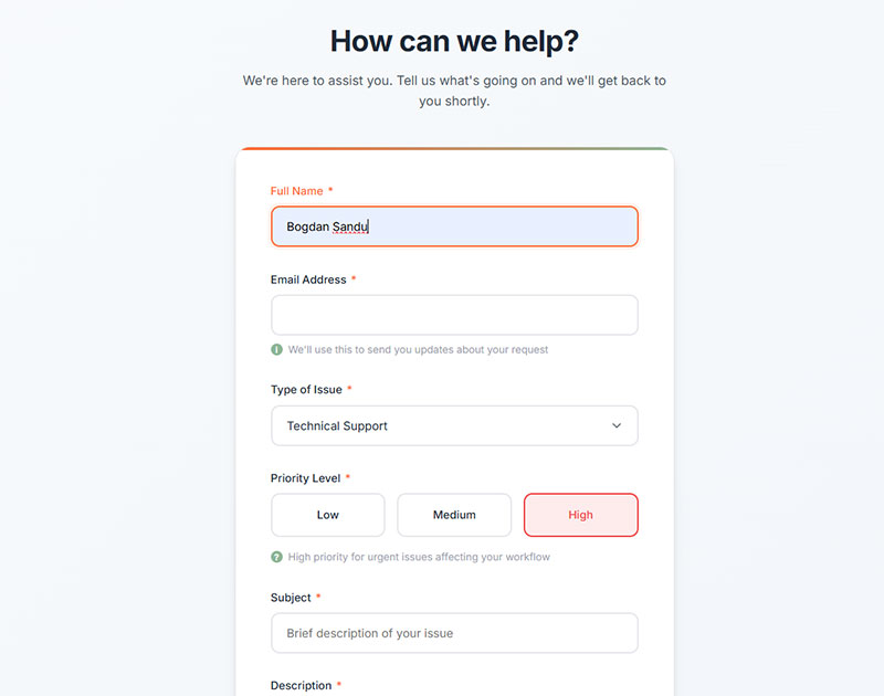
A support form routes a problem to a queue. Zendesk and Intercom both run on this structure.
Fields: category dropdown, priority, description, file upload, order number if commerce.
The category dropdown is doing invisible work. It routes the ticket, sets the SLA, and populates the auto-response, all from one selection.
Do not confuse this with a contact form. A contact form starts a conversation. A ticket form starts a clock.
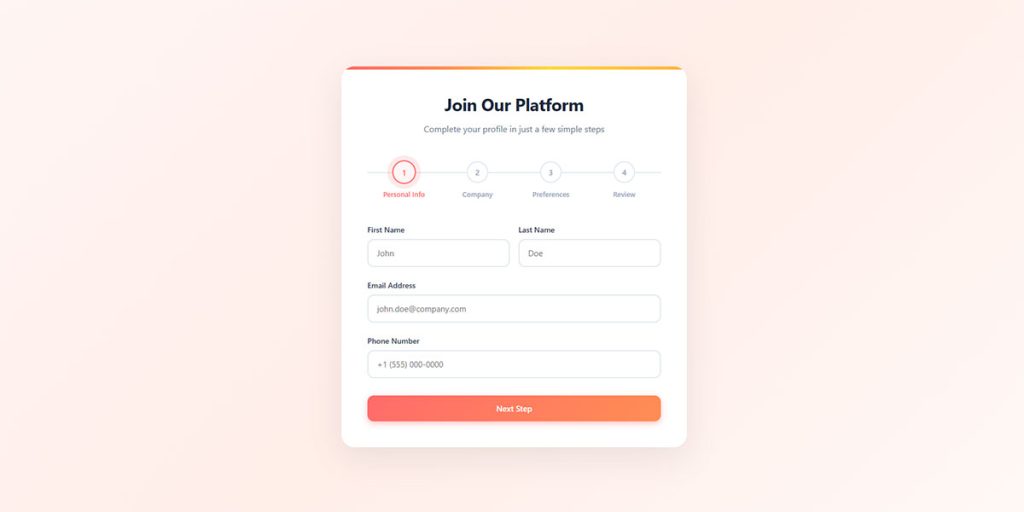
Multi-Step Form
See the Pen
Modern Multi-Step Job Application Form by Bogdan Sandu (@bogdansandu)
on CodePen.
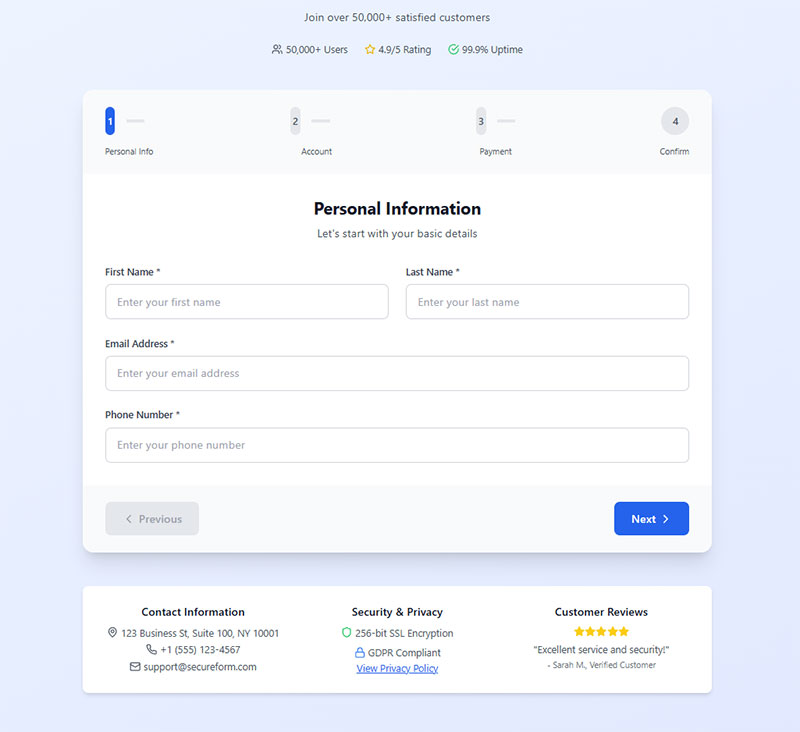
Multi-step forms split one field set across 2 to 4 screens with a progress bar.
Conversion lift is real but overstated. HubSpot reports 86% higher conversion. Independent 2026 benchmarking from Digital Applied puts the honest number at 14% on average, rising to 21% on lead-gen forms specifically.
Shopify redesigned its default checkout to a single page precisely because their data showed one-page beat multi-step for most merchants. Context decides, and the direct comparison of multi-step against single-step forms lays out which side of that line your form falls on.
Worth reading the counterargument too: multi-step forms can quietly kill conversions when the steps hide progress instead of showing it. For the format done right, these multi-step form examples are the reference.
Conversational Form

One question at a time, chat-style, with the next question depending on the last answer.
Typeform popularized the format. OptiMonk measured conversational popups at a 15.2% average conversion rate.
What makes the format work is not the chat bubble. It is the branching underneath it, so understanding conditional logic matters more than the visual style. Skip the irrelevant branches and a 20-question form feels like 6, which is the entire point of building forms conversationally.
The tradeoff nobody mentions: they are slower for people who already know what they want. Terrible for a login. Excellent for a product finder.
What Fields Does Each Type of Form Use?
Field sets are dictated by form type, not preference. A newsletter form runs on 1 field. A contact form needs 3. A checkout form carries 11 to 14. Every field beyond the minimum costs conversions.
A 2024 HubSpot study measured the damage: each additional field cuts conversion rate by roughly 4.1%.
| Form Type | Minimum Fields | What They Are |
|---|---|---|
| Newsletter | 1 | |
| Contact | 3 | NameEmailMessage |
| Registration | 2 to 3 | EmailPassword |
| Checkout | 11 to 14 | AddressPaymentContact |
Input Types Matched to Data Types
HTML5 input types trigger the correct mobile keyboard. Use type="email" and the @ symbol appears. Use type="tel" and a number pad appears.
Most developers still ship type="text" for everything and wonder why mobile completion lags.
The mapping that matters: email, tel, number, date, password, file, url.
Required vs Optional Fields
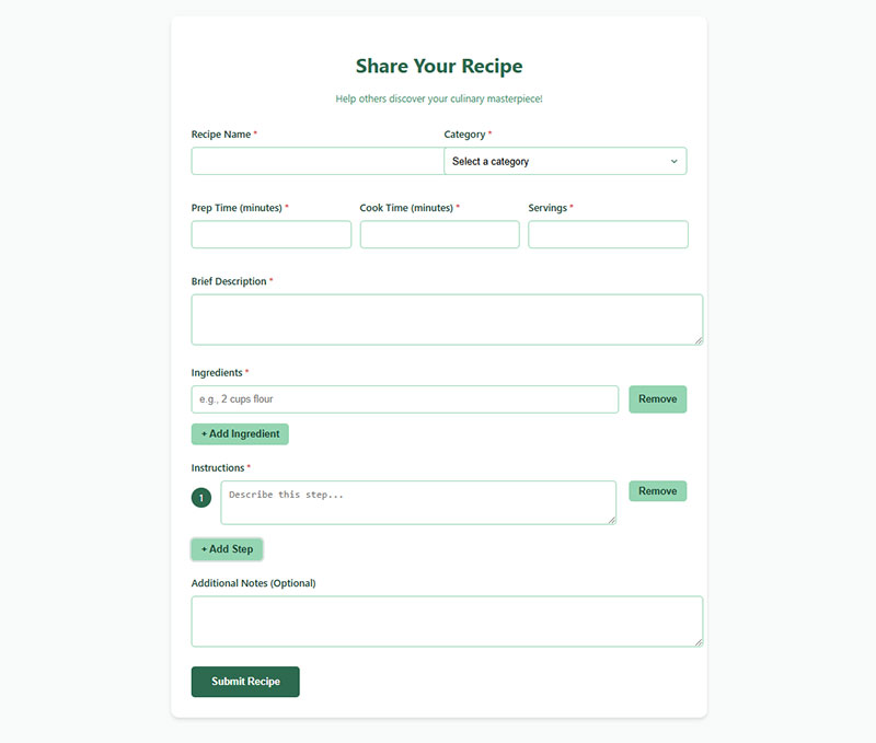
The asterisk convention is nearly universal, and Baymard’s testing shows why it matters: 32% of users failed to complete required fields when only the optional ones were marked.
Nielsen Norman Group argues for marking optional fields instead when most fields are required, which cuts visual noise.
Both approaches work. Mixing them silently on the same form does not.
Clicktale found that simply including a phone number field can drop conversions by as much as 39%, even when the field is optional. Think hard before you add it.
Labels and Placeholder Text
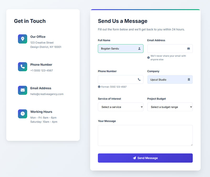
Top-aligned labels win. Eye-tracking research puts them up to 50% faster to complete than left-aligned labels, because the eye processes label and input in one fixation.
Placeholder text is not a label. It disappears the moment someone starts typing, which forces people to rely on short-term memory, and the difference between good and lazy placeholder text is usually the difference between a filled field and a skipped one.
Smashing Magazine removed floating labels from their own forms after testing and fixed several accessibility and mobile bugs in the process.
Label alignment sits inside a wider set of layout decisions (column count, field order, error position) that get made once and never revisited, which is why the layout rules are worth auditing even on forms that already work.
Validation Timing
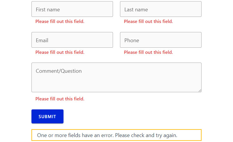
Inline validation: checks each field on blur. Reduces errors by 22% and cuts completion time by 42% (CXL).
On-submit validation: dumps a list of errors at the top of the page after the user has already finished. Momentum dies.
Baymard’s 2024 checkout research found 31% of ecommerce sites still ship no inline validation at all. Another 4% implement it wrong.
Zuko’s data: forms following usability standards see 78% of users submit error-free on the first try, versus 42% for forms that do not.
Timing is only half of it. What the message actually says decides whether people fix the error or leave, so pair the validation rules with error messages written in plain language rather than “invalid input.”
Where Do Different Types of Forms Appear on a Website?
Form placement is decided by form type. Search sits in the header. Newsletter sits in the footer. Contact gets a dedicated page. Lead generation lives inline or on a landing page. Placement changes performance more than design does.
Nielsen Norman Group found content above the fold captures 57% of page-viewing time.
| Form Type | Standard Placement |
|---|---|
| Search, login | Header |
| Newsletter | FooterSidebar |
| Contact, application | Dedicated page |
| Lead generation | Landing pageInline |
| Popup | OverlayExit intent |
Dedicated Pages
The contact page is the highest-intent page on most websites and usually the ugliest.
Someone landing on /contact has already decided to reach out. The form’s only job is to not get in the way.
Three fields. One button. No hero image of a call center.
The page around the form does more work than most teams think, and these contact page examples show how the good ones handle response times, alternative channels, and trust. If you would rather not design it from scratch, a contact page template covers the structure.
Landing Page Placement
HubSpot’s data gives landing pages the best signup rates at 23%, ahead of every inline or overlay placement.
The reason is boring: no navigation, no competing links, one action available.
That constraint is exactly why landing page forms follow their own rules, and why the homepage-versus-landing-page distinction matters before you decide where the form goes at all.
A form above the fold beats one below it, but only when the offer is already understood. Complex offers need the copy first, which is a hero section problem more than a form problem, and the hero section patterns that work are worth borrowing.
Overlay and Exit Intent
Popups make up 66% of all signup forms (HubSpot), and static inline forms still beat them: 45.53% success rate versus 25.96% for modal popups.
Exit-intent triggers are the compromise. The form fires only when someone is already leaving, so it costs nothing, which is the entire case for exit-intent forms over timed ones.
Google penalizes intrusive interstitials on mobile. Full-screen welcome mats on a phone are a ranking problem, not just a UX one. Slide-ins, sticky bars, and scroll boxes all avoid that penalty, and the differences between popup formats decide which one you can safely use.
Mobile Placement
Mobile devices account for 64% of global internet traffic (Digital Web Solutions, late 2024), yet Zuko shows mobile forms convert 8 to 9 points below desktop.
Single column. Full-width buttons. 44px minimum touch targets.
Sticky bottom bars work better than sidebar forms on a phone, because the sidebar does not exist on a phone.
That 8-point gap is not a device limitation. It is a design one, and the mobile-specific form rules close most of it.
How Do Different Types of Forms Affect Conversion Rates?
Form type is the single largest driver of conversion variance. Application forms complete at 75%. Contact forms complete at 37.85%. The spread between form types is wider than the spread between good and bad design within a type.
Ruler Analytics puts the cross-industry average form conversion rate at 1.7%.
| Form Type | Start-to-Complete |
|---|---|
| Application | 75% |
| Onboarding | 68% |
| Registration | 63% |
| Purchase | 58% |
| Contact | 38% |
Data source: Zuko
Averages hide industry. Industrial and B2B services clear 2.8%, while real estate sits at 0.6%, so checking the benchmark for your sector beats comparing yourself to the global mean.
Field Count and the Drop-Off Curve
Conversion does not decline in a straight line. It falls off a cliff.
Digital Applied’s 2026 benchmarking tracks the collapse: 23.1% at 3 fields, 17.0% at 5 fields, 11.4% at 7 fields, and 6.9% at 10+ fields.
The break point sits between 5 and 7. Every field past 5 costs roughly 2.8 points each, versus 1.5 points before it.
Formisimo analyzed 2 million B2B submissions and found “annual revenue” alone drops conversions by 12.3%.
Why People Abandon
Security concerns: 29% of abandonments
Form length: 27%
Unnecessary questions: 10%
WPForms research shows more than 67% of visitors abandon a form permanently once they hit any complication. Only 20% follow up through another channel.
The average form abandonment time is 1 minute 43 seconds (Feathery). People give up faster than most teams assume, and clawing those sessions back is a specific discipline covered in the work on form abandonment rates.
Measuring the Right Thing
View-to-completion and start-to-completion are different numbers and get confused constantly.
Contact forms post a 9% view-to-completion rate but 38% start-to-completion. The form is not the problem. Getting people to start it is.
Field-level drop-off tells you which input killed the session, which a submit-event goal never will. Setting that up properly starts with tracking form submissions in Google Analytics, then layering on the smaller signals (field focus, step completion, scroll depth) that count as micro conversions.
What Actually Moves the Number
Autofill is the highest-leverage fix available. Chrome’s 2024 analysis found autofill users complete forms 35% faster and abandon 75% less often.
Button copy matters more than it should. Insiteful measured 3% more abandonment on forms whose button reads “Submit.”
Marketers who A/B test their forms report conversion rates 10% higher than those who never test (HubSpot). And 36% of marketers have never run a single user test on a form.
None of those wins are exotic. They are a short, boring checklist, and working through it in order usually beats a redesign.
Which Type of Form Do You Need?
Match the form type to the outcome, not to what your competitor has on their site. One goal, one form. Stacking three objectives into a single form is the most common mistake in this category.
Start with what you want to happen after submission.
- Capture leads for sales to a lead generation form
- Grow an email list to a newsletter signup form
- Collect opinions at scale to a survey form
- Take payment to a checkout or payment form
- Reserve a time slot to a booking form
- Let people reach you to a contact form
- Onboard a new client to an intake form
- Fill a role to a job application form
When Two Form Types Compete
Contact form vs lead generation form: the contact form waits. The lead gen form offers something and asks for a trade. If you want volume, offer value. If you want inbound intent, keep the contact form.
Most sites need both, running on different pages for different intents, and the side-by-side comparison sorts out which page gets which.
Popup vs inline: inline wins on success rate. Popups win on visibility. Run both, on different pages.
When to Combine Form Types
Multi-step is a wrapper, not a type. Wrap a lead generation form in it and you split 8 fields across 3 screens.
Formstack and Venture Harbour data puts multi-step forms at 13.85% conversion versus 4.53% for single-page equivalents.
The rule of thumb: more than 6 or 7 fields, or any conditional logic, and the form goes multi-step.
That second condition is the one people skip. Branching logic is what lets a 20-field form show any given person only 6 of them, and not every builder handles it well, so checking which tools support conditional logic is worth doing before you commit.
When a Form Is the Wrong Tool
Sometimes the answer is no form at all.
A booking link beats a “request a call” form. Live chat beats a support form for anything urgent. A plain mailto link beats a broken contact form.
Chatbots handle simple, repetitive intake better than forms do, and worse than forms at anything requiring structured, complete data. The honest breakdown of where chatbots beat forms and where they fail is less flattering to chatbots than most vendors admit.
Client onboarding is the opposite case. It needs structure, completeness, and a record, which is exactly what an intake form delivers and a chat thread never will.
What Makes a Form Type Work Well?
The rules that lift completion are the same across all 25 form types: single column layout, labels above fields, inline validation, plain-language errors, and a submit button that says what it does. None of this is new. Most sites still get it wrong.
WebAIM’s 2025 Million report found 48.2% of homepages have unlabeled form inputs. Half the web is shipping forms that screen readers cannot read.
Layout and Labels
CXL’s eye-tracking study: single-column forms are completed 15.4 seconds faster than multi-column ones.
Multi-column layouts break the reading path, confuse field order, and multiply validation errors. Especially in checkout.
Put the easy fields first. Name and email before billing address. Once someone has invested two fields of effort, they are far less likely to walk.
Layout, spacing, and visual weight all sit under form design best practices, while the behavioral side (what happens when someone hesitates, mistypes, or backtracks) belongs to form UX design. Both matter. If you want the finished result rather than the theory, these form design examples are the shortcut.
Accessibility
WCAG requires labeled inputs (1.3.1), provided instructions (3.3.2), identified errors (3.3.1), and correction suggestions (3.3.3).
94.8% of homepages had at least one detectable WCAG failure in 2025 (WebAIM). The average page carried 51 distinct errors.
Use <label for>. Not an ARIA patch on top of a broken structure. WebAIM found pages using ARIA average 57 errors versus 27 on pages without it.
Keyboard navigation, visible focus states, and contrast on the submit button are the baseline, and the full accessibility checklist for forms covers the rest before a lawyer does.
Button Copy and Confirmation
“Submit” is the worst word on your form. It describes what the server does, not what the user gets.
Better: “Get the guide,” “Create my account,” “Book a demo,” “Send my quote.” The pattern is verb plus outcome, and these call to action examples show how far you can push it before it gets cute.
Something has to change on screen within 100 milliseconds of a click. A spinner, a label change, anything. Without it, people click twice and you get duplicate records.
What comes after the click is where most forms go quiet. A blank page tells the user nothing, so write the confirmation message deliberately, and if the form created an account, say so clearly instead of dumping them on a login screen.
Spam and Security
Inc. reported CAPTCHAs can cut form conversion by as much as 40%. That is a brutal tax for stopping bots.
A honeypot field costs zero conversions. It is an invisible input that humans never fill and bots always do, and the way honeypots actually work explains why they beat a challenge nobody wants to solve.
Order of preference: honeypot first, then time-based checks, then rate limiting, then reCAPTCHA as the last resort. That ordering comes straight out of the spam prevention tactics that do not cost conversions, and if you are stuck on a form that already uses reCAPTCHA, the CAPTCHA alternatives are worth testing against it.
None of that protects your database. Sanitization does, and sanitizing user input is the one step that stays non-negotiable regardless of which spam filter you pick.
Consent and Compliance
Any form collecting personal data from EU visitors needs a GDPR consent checkbox. Unticked by default. Separate from the terms link.
Pre-ticked boxes are not consent. That has been settled law since Planet49 in 2019 and people still ship them.
Data retention, purpose limitation, and a working delete request path all sit behind the form, not on it, which is the part a GDPR compliance walkthrough covers and a checkbox does not. For the wording itself, these consent examples are specific enough to copy.
Compliance and security are not the same thing. A consent checkbox does nothing against injection, brute force, or a leaked submission log, so harden the form itself too.
Pick the form type that matches the outcome you want, cut it to the fields you will actually use, and validate inline. The rest is testing.
FAQ on Form Types
What are the different types of forms on a website?
Websites use 25 form types across 5 categories: data collection (contact, feedback, survey, quiz), user accounts (registration, login, password reset), transactions (checkout, payment, booking, donation), marketing (lead generation, newsletter, popup), and utility (search, file upload, multi-step, conversational).
Name two types of forms and what they do.
A contact form collects a name, email, and message so a visitor can start a conversation. A checkout form collects address and payment details so a visitor can complete a purchase. One gathers information. One moves money.
What is a web form?
A web form is a set of input fields on a webpage that collects data from a visitor and sends it to a server, database, or CRM. Every form has fields, labels, a submit button, and a destination.
How many fields should a form have?
Three to five for most form types. HubSpot’s data shows each extra field cuts conversion by roughly 4.1%, and completion collapses between 5 and 7 fields. Checkout forms are the exception, needing 11 to 14.
Which type of form converts best?
Application forms lead, with 75% of starters finishing (Zuko). Onboarding forms hit 68%, registration forms 63%. Contact forms sit at the bottom around 38%. Form type predicts conversion more reliably than design quality does.
What is the difference between a contact form and a lead generation form?
A contact form waits for someone to reach out. A lead generation form offers something (a guide, a demo, a discount) and asks for contact details in exchange. One is passive. One is a trade.
Are popup forms better than inline forms?
Inline forms win on completion. Static forms convert at 45.53% versus 25.96% for modal popups. Popups win on visibility and make up 66% of all signup forms. Use exit-intent triggers to get both.
What is a multi-step form?
A multi-step form splits one field set across 2 to 4 screens with a progress bar. Formstack data puts multi-step conversion at 13.85% against 4.53% for single-page. Use it past 6 or 7 fields.
What fields does a registration form need?
Two: email and password. Everything else (job title, company size, phone number) belongs in a profile form after the account exists. Registration forms are the fastest form type to complete, averaging one minute thirty-five seconds.
Which form type should I use for my goal?
Capture leads with a lead generation form. Grow a list with a newsletter form. Collect opinions with a survey form. Take payment with a checkout form. Book time with an appointment form. One goal, one form.
Conclusion
The types of forms on a website are not interchangeable, and treating them that way is what quietly kills submissions. A survey form built like a checkout form fails. So does a lead capture form wearing a support ticket’s field set.
Start from the outcome. Then work backward to the field set, the placement, and the validation.
Cut every input you will not actually use. Put labels above fields. Validate inline, on blur, with error messages a human wrote.
Autofill support is the cheapest win available: 35% faster completion, 75% lower abandonment, according to Chrome’s data.
Everything else is testing. Pick one form, change one thing, measure the completion rate, repeat.