
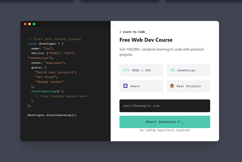
Most lead magnets don’t work. They get downloaded, skimmed for 30 seconds, and forgotten. Meanwhile, your email list fills up with people who will never buy anything. The problem isn’t…
Table of Contents
Your website probably loses more subscribers than it gains. That’s the reality when your email signup sits ignored in the footer or buried on a contact page somewhere.
Opt-in form examples show you what actually works when you need people to hand over their email addresses. You’ll see real forms that convert visitors into subscribers without feeling pushy or desperate.
This guide breaks down different form types, placement strategies, and design choices that make people want to sign up. We’ll cover popup timing, inline positioning, exit-intent triggers, and mobile optimization. Plus, you’ll learn which form fields to include (spoiler: fewer is usually better).
By the end, you’ll know exactly how to build signup forms that people actually use. No guessing, no theory. Just proven examples you can adapt for your own site.
Opt-In Form Examples
| Form Type | Activation Method | Primary Function | Optimal Context |
|---|---|---|---|
| Overlay Forms (Interruption-Based) | |||
| Pop-up Forms | Immediate display upon page load or scroll depth trigger | Capture immediate attention with high-visibility modal overlay | Blog posts, content pages with engaged readers |
| Exit-Intent Forms | Mouse movement toward browser close button detection | Recover abandoning visitors with last-chance conversion opportunity | E-commerce checkout, pricing pages, high-value content |
| Full-Screen/Takeover Forms | Complete viewport occupation blocking underlying content | Force decision point for maximum conversion or exit | Product launches, exclusive offers, gated premium content |
| Welcome Gate Forms | First-visit detection triggering pre-content overlay | Gate content access requiring opt-in before viewing | Premium publications, membership sites, research portals |
| Position-Based Forms (Non-Intrusive) | |||
| Floating Bar/Sticky Bar | Fixed position at viewport top or bottom during scroll | Maintain persistent visibility without blocking content consumption | Site-wide announcements, ongoing promotions, webinar signups |
| Slide-In Forms | Corner animation triggered by scroll percentage or time delay | Balance visibility with reduced disruption to reading flow | Long-form articles, case studies, educational content |
| Sidebar Forms | Static placement within page sidebar column layout | Provide consistent opt-in access across multiple page views | Blogs with sidebar navigation, resource hubs, news sites |
| Inline/Embedded Forms | Natural integration within content body flow structure | Convert engaged readers at contextually relevant content moments | Mid-article placements, resource download sections, tutorials |
| Progressive Forms (Multi-Stage Conversion) | |||
| Two-Step Forms | Initial button click expands to reveal full input fields | Reduce initial commitment friction with staged input reveal | Email list growth, lead magnets, newsletter subscriptions |
| Multi-Step Forms | Sequential page progression collecting incremental data points | Gather comprehensive information while maintaining completion rates | Lead qualification, consultations, detailed assessments |
| Timed Pop-ups | Delay-based display after specified session duration threshold | Target engaged users demonstrating meaningful content interest | Time-sensitive offers, engagement-based incentives, content upgrades |
| Specialized Forms (Enhanced Engagement) | |||
| Gamified Forms | Interactive elements with rewards, spin-to-win, or quiz mechanics | Increase participation through entertainment value and incentive discovery | E-commerce promotions, contest entries, customer acquisition |
| Video Opt-In Forms | Video player integration requiring email for continued viewing | Gate valuable video content while qualifying viewer interest level | Webinar replays, tutorial series, product demonstrations |
| Landing Page Forms | Dedicated standalone page with focused conversion objective | Eliminate navigation distractions for single-purpose conversion goal | Paid advertising campaigns, specific offers, event registration |
| Channel-Specific Forms (Communication Preferences) | |||
| Email Opt-In Forms | Email address collection for marketing communication permission | Build owned audience for direct marketing channel control | All website types requiring permission-based email marketing |
| SMS Opt-In Forms | Phone number collection with explicit text message consent | Enable real-time mobile notifications with immediate delivery rates | Retail alerts, appointment reminders, urgent updates |
| Newsletter Forms | Regular content delivery subscription with frequency expectation | Establish recurring communication pattern for audience retention | Content publishers, thought leaders, recurring content creators |
Pop-Up Forms
Modal windows that overlay website content and request visitor information. They interrupt the browsing session to capture attention.
Primary Use Case
Email list building and lead magnet delivery. Works best when you need immediate engagement from active visitors.
Key Design Elements
- Center-screen positioning with background overlay
- Single email field or name/email combination
- High-contrast CTA button
- Close button (X) clearly visible
- Images boost conversion by 63% compared to text-only versions
Mobile popups convert at 6.57% on average. Desktop sits around 3.77%.
Conversion Attributes
Average conversion rate hits 11.09% across all industries. Top performers reach 42.35%.
The “opt-out” button paradox actually helps. Forms with two buttons (yes/no) convert 14.34% higher than single-button versions.
Timing matters more than design. Popups shown after 6 seconds outperform immediate displays by 67.42%.
Implementation Context
Trigger based on scroll depth (40-50% down page), time on site, or specific page visits. Avoid firing on first-page load unless offering something genuinely valuable.
E-commerce sites use these for discount codes. Content sites push lead magnets and newsletter signups.
Value Proposition Approach
Lead with the benefit, not the ask. “Get 15% off your first order” beats “Join our mailing list” every time.
Include social proof when possible. “Join 10,000+ subscribers” adds credibility without extra fields.
Best For
- High-traffic blogs and content sites
- E-commerce stores offering first-purchase discounts
- SaaS companies with free trials or demos
- Any business with a compelling lead magnet
Not ideal for B2B sites where the visitor needs to research first.
Common Variations
- Exit-intent specific: Fires when cursor moves toward browser close button
- Scroll-triggered: Appears after visitor scrolls certain percentage
- Timed delay: Shows after X seconds on page
- Click-triggered: Opens when visitor clicks specific element (highest conversion at 28.79%)
Modal popups outperform slide-ins by 75.95% on mobile and 27.22% on desktop.
Exit-Intent Forms
Popup forms that detect abandonment behavior and trigger milliseconds before a visitor leaves. Uses mouse movement tracking on desktop and scroll/tap patterns on mobile.
Primary Use Case
Last-chance conversion attempts. Reduces bounce rates and recovers abandoning visitors who haven’t engaged with other CTAs.
Cart abandonment scenarios see the highest returns here.
Key Design Elements
- Urgent, benefit-focused headline
- One or two form fields maximum
- Contrasting button color
- Optional countdown timer for limited offers
- Relevant imagery tied to what visitor viewed
Keep copy concise. Two sentences max.
Conversion Attributes
Cart abandonment popups using exit-intent average 17.12% conversion. Email signup versions range from 5.10% to 7.65%.
These qualify leads better than standard popups. Lower volume, higher quality.
The key? They only show to people who’ve already demonstrated interest by browsing your content.
Implementation Context
Deploy on product pages, pricing pages, and blog posts. Set exit detection sensitivity to avoid false triggers from normal scrolling.
E-commerce: Offer shipping discounts or cart recovery incentives B2B sites: Push gated content downloads Blogs: Newsletter signups with content upgrades
Mobile requires different triggers. Watch for rapid upward scrolling or address bar taps.
Value Proposition Approach
Frame the offer as preventing loss. “Don’t miss out on 20% off” performs better than “Get 20% off.”
Reference what they viewed. “Still thinking about [product name]?” creates personalization without complex targeting.
Best For
- Online stores with cart abandonment issues
- Content sites losing traffic without engagement
- Service businesses where visitors research before contacting
- Any site with bounce rates above 60%
Common Variations
- Desktop-only: Uses precise cursor tracking
- Mobile-adapted: Triggers on scroll velocity or session duration
- Delayed exit: Waits for 30+ seconds on page before arming
- Multi-page exit: Only fires if visitor viewed 2+ pages
Some businesses layer these with standard popups but show exit-intent only to visitors who closed the first popup.
Inline/Embedded Forms
Forms embedded directly within page content as natural elements. They flow with the layout instead of interrupting it.
Primary Use Case
Long-form content sites and educational pages. Best for audiences allergic to popups who value non-intrusive experiences.
Blog posts, resource libraries, and help documentation all benefit from inline placement.
Key Design Elements
- Single-column layout for mobile optimization
- Minimal fields (email only or email + name)
- Clear visual separation from surrounding content
- Above-the-fold placement on landing pages
- Branded design matching site aesthetic
The form should look like it belongs, not like an afterthought.
Conversion Attributes
Forms embedded within articles convert 40% better than sidebar placements. Average rates sit between 1.95% and 5% depending on offer quality and placement.
They don’t convert as high as popups (which hit 11%+ on average), but they also don’t annoy visitors. Trade-off worth considering.
Content-heavy sites see better performance with inline implementations than interrupt-based forms.
Implementation Context
Place mid-content on long blog posts (after 3-4 paragraphs). Use at the end of valuable articles as a natural next step.
WordPress sites can use various form plugins to add these without coding.
Landing pages benefit from above-fold inline forms. No scrolling required means more conversions.
Value Proposition Approach
Context is everything. The form should relate to the content around it.
Reading about email marketing? Offer an email template guide. Article about conversion optimization? Push a CRO checklist.
Generic newsletter signups underperform targeted content upgrades by massive margins.
Best For
- Publishers and content-focused blogs
- Educational sites and online course platforms
- B2B companies with long sales cycles
- Sites targeting professional audiences who dislike popups
Mobile-first businesses also benefit since inline forms avoid the friction of popup dismissal on small screens.
Common Variations
- Header forms: Sit at top of page for immediate visibility
- Mid-content: Appear between paragraphs as content upgrades
- Footer forms: End-of-article placement for engaged readers
- Sidebar embedded: Fixed position but not floating (different from true sidebars)
Some sites use conditional logic to show different inline forms based on content category.
Floating Bar/Sticky Bar
Horizontal notification bars that stick to the top or bottom of the viewport while visitors scroll. Sometimes called hello bars or announcement bars.
Primary Use Case
Persistent announcements and low-friction lead capture. Works for time-sensitive offers that need constant visibility without blocking content.
Key Design Elements
- Single-line message with minimal fields
- Typically one text input (email) plus submit button
- Fixed position (top or bottom)
- Contrasting background color from main site
- Close button optional (many omit it)
Height should be 50-80px to avoid eating too much screen real estate.
Conversion Attributes
Conversion rates range from 2.3% to 8.45% depending on offer and targeting. They underperform modal popups but maintain better UX.
The benefit? Zero interruption. Visitors can read content while the bar remains accessible.
Best performers use specific targeting. Different bars for different pages beat blanket site-wide messages.
Implementation Context
Top placement works for announcements and promotions. Bottom placement converts better for newsletter signups since it doesn’t interfere with navigation.
E-commerce sites showcase shipping thresholds or discount codes. Content sites push newsletter signups or content downloads. Event sites promote registration deadlines.
Mobile requires careful height management. 80px bars eat significant screen space on phones.
Value Proposition Approach
Lead with urgency or scarcity. “Sale ends tonight” or “Limited spots remaining” outperform evergreen messages.
Keep copy under 10 words. Nobody reads paragraphs in a sticky bar.
Best For
- E-commerce sites with ongoing promotions
- Event organizers with registration deadlines
- Content creators building email lists gradually
- Sites wanting conversion tools without popup aggression
Not ideal for complex offers requiring explanation.
Common Variations
- Static bars: Never close, always visible
- Dismissible: Include X button for one-session removal
- Countdown timers: Add urgency with ticking clock
- Multi-message: Rotate through different announcements
- Geo-targeted: Show different messages based on visitor location
Some advanced implementations use different bars per URL or traffic source.
Slide-In Forms
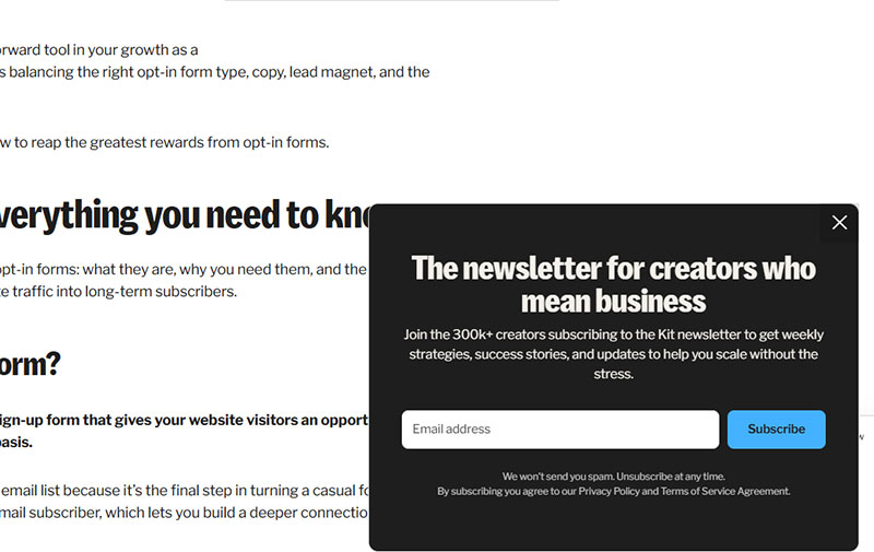
Image source: kit.com
Forms that smoothly slide into view from the bottom corner of the screen. Less intrusive than center-screen modals but more noticeable than static elements.
Primary Use Case
Gentle engagement during content consumption. Captures attention without full interruption.
Works well for blogs and content sites where hard popups hurt user experience.
Key Design Elements
- Bottom-right or bottom-left corner positioning
- Compact size (typically 300-400px wide)
- Smooth animation on entry
- Easy dismiss option
- Minimal form fields to fit small space
The slide should be smooth, not jarring. 300-500ms animation works best.
Conversion Attributes
Average conversion sits around 2.17% to 2.64%. They underperform modals significantly (which hit 4.44% on desktop) but maintain better engagement scores.
The conversion gap exists because slide-ins are easier to ignore. Trade lower conversion for higher satisfaction.
Scroll-triggered slide-ins outperform time-based by 35% in most scenarios.
Implementation Context
Trigger at 50-70% scroll depth on blog posts. This timing indicates real engagement before asking for commitment.
Bottom-right corner avoids navigation conflicts on most sites.
Mobile slide-ins need careful sizing. 100% width slide-ups work better than corner slides on small screens.
Value Proposition Approach
Keep the ask simple and relevant to content being consumed. Content upgrades perform better than generic newsletter pitches.
Use first-person CTAs. “Send me the guide” converts 25% better than “Get the guide.”
Best For
- Content publishers who reject aggressive popups
- Sites with high mobile traffic percentages
- Blogs with engaged readers spending 2+ minutes on articles
- Brands prioritizing user experience over maximum conversion
B2B sites with professional audiences often prefer slide-ins over full popups.
Common Variations
- Bottom corner: Slides in from lower right or left
- Side tab: Permanent tab on screen edge that expands on click
- Delayed slide: Waits for exit intent instead of scroll
- Multi-step: First slide shows teaser, second shows form
Modal popups convert 75.95% better than slide-ins on mobile, but slide-ins maintain better bounce rates.
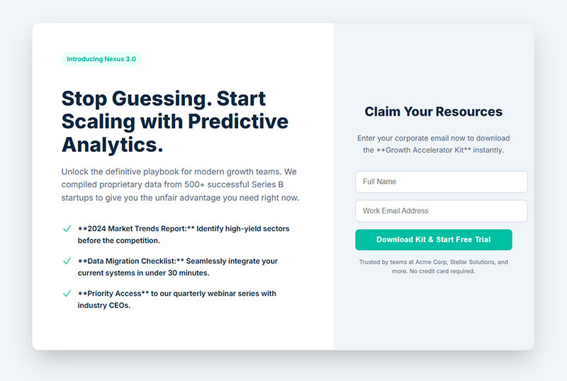
Full-Screen/Takeover Forms
Popups that cover 100% of the viewport, blocking all content until dismissed or submitted. Maximum attention, maximum risk.
Primary Use Case
High-value offers that justify full interruption. Flash sales, exclusive launches, and major announcements.
Use sparingly. Overuse kills trust and increases bounce rates.
Key Design Elements
- Full viewport coverage with dark overlay
- Large, bold headline with clear benefit
- High-quality visuals or product images
- Single-focus CTA (no competing elements)
- Prominent close button for easy escape
White space matters. Don’t cram the screen with elements just because you have room.
Conversion Attributes
Average conversion rate hits 14.40% when properly implemented. That’s significantly higher than standard modals (11.09%) or slide-ins (2.17%).
The catch? They also increase bounce rates if shown too early or too often.
Fullscreen forms qualify leads better. Visitors who convert here show higher purchase intent than those who submit to smaller forms.
Implementation Context
Deploy for major site events only. Black Friday sales, product launches, or exclusive early access scenarios.
Never fire on first page load. Wait for engagement signals (30+ seconds on site, multiple pages viewed, or exit intent).
Mobile requires extra caution. Fullscreen takeovers feel more aggressive on small screens.
Value Proposition Approach
The offer needs to be genuinely valuable. “Join our newsletter” doesn’t justify blocking content.
“Get 50% off your entire order” does. “Early access to our new product line” might.
Include a secondary message explaining why this offer is special.
Best For
- E-commerce during major sale events
- SaaS companies offering limited-time trials
- Course creators with enrollment deadlines
- Brands with truly exclusive offers
Not for everyday lead generation or standard content upgrades.
Common Variations
- Exit-intent fullscreen: Only shows when visitor attempts to leave
- Welcome mat: Fires immediately on landing but offers high value
- Quiz/gamified: Interactive experience justifies takeover
- Video fullscreen: Plays promo video in takeover format
Some sites use fullscreens as “gates” for premium content, though this hurts SEO and user experience.
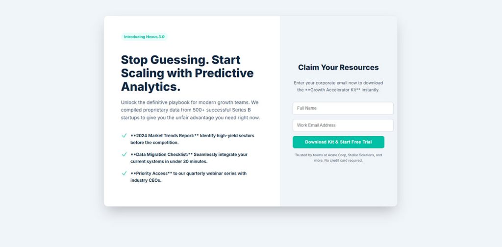
Landing Page Forms
Standalone forms designed as the primary conversion element on dedicated landing pages. The entire page exists to drive form submissions.
Primary Use Case
Paid traffic campaigns and specific conversion goals. Every element on the page supports form completion.
Key Design Elements
- Above-the-fold placement (visible without scrolling)
- Clear headline stating the benefit
- Supporting copy explaining the offer
- Trust signals (testimonials, security badges, client logos)
- Single-column layout for easy scanning
Remove navigation menus. Fewer exit options mean higher conversions.
Conversion Attributes
Landing page form conversion averages 2% across industries. Good performers hit 11%+.
The page design matters as much as the form itself. Landing page optimization can double conversion rates.
Multi-step forms on landing pages convert up to 300% better than single long forms when asking for 5+ fields.
Implementation Context
Paid advertising campaigns (Google Ads, Facebook, LinkedIn) Email campaign destinations Webinar registration pages Gated content downloads
Match message from ad to landing page. Continuity increases conversion by massive margins.
Value Proposition Approach
Lead with the outcome, not the process. “Start growing your email list” beats “Sign up for our software.”
Use bullet points to list benefits. Scannable content converts better than paragraphs.
Best For
- PPC campaigns with specific offers
- Webinar and event registrations
- Lead magnet downloads
- Free trial signups for SaaS products
Any scenario where you’re paying for traffic justifies a dedicated landing page.
Common Variations
- Short forms (1-3 fields): Email-only or email + name for top-funnel offers
- Long forms (5+ fields): Qualification-focused for sales-ready leads
- Multi-step forms: Break long forms into digestible chunks
- Two-column: Form on right, benefits on left (desktop only)
B2B landing pages often use longer forms to qualify leads. B2C keeps them short to maximize volume.
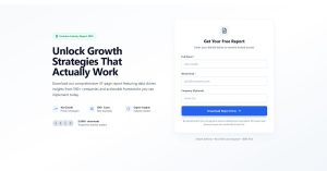
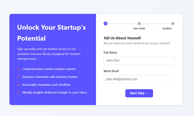
Sidebar Forms
Image source: designyourway.net
Forms positioned in the sidebar column of blog posts and website pages. Persistent throughout the page but not floating or sticky.
Primary Use Case
Passive lead capture on content-heavy sites. Works for visitors who want to subscribe after consuming content.
Key Design Elements
- Compact width (typically 250-350px)
- Simple headline
- Minimal fields (email only preferred)
- Clear submit button
- Optional thumbnail image or icon
The form should be above sidebar fold if possible, but below primary navigation.
Conversion Attributes
Conversion rates sit around 2.61% on average. They underperform center-screen modals but outperform sticky bars and slide-ins in specific contexts.
Sidebar forms convert 40% worse than in-content embedded forms on the same page.
The benefit? They don’t interrupt reading flow and remain available throughout the article.
Implementation Context
Blog layouts with right sidebar (left sidebars perform worse) Resource libraries and documentation pages Category and archive pages
WordPress sites commonly use subscription form plugins for sidebar placement.
Value Proposition Approach
Simple, direct messaging works best. “Get weekly insights” or “Subscribe for updates” outperforms complex value propositions.
The sidebar isn’t the place for lengthy explanations. Save that for dedicated landing pages.
Best For
- Blogs with consistent sidebar layout
- Sites where popups would hurt user experience
- Professional/business audiences who dislike interruptions
- Content sites with long articles (3+ minute read time)
Not ideal for mobile-first sites since sidebars often move below content on small screens.
Common Variations
Static sidebar: Same form across all pages Dynamic sidebar: Different forms based on content category Sticky sidebar: Follows scroll (becomes floating form) Multi-form sidebar: Multiple CTAs stacked vertically
Some blogs use form design best practices to test sidebar versus in-content placement.
Two-Step Forms
Forms requiring two interactions to complete. First click triggers the form, second completes submission. Sometimes called click-triggered or MonsterLink forms.
Primary Use Case
Breaking psychological barriers to email capture. The initial click creates commitment that increases follow-through rates.
Uses the “foot-in-the-door” psychological principle. People who say yes to a small action are more likely to complete a larger one.
Key Design Elements
- First step: Button or text link with compelling copy
- Second step: Simple form (typically email only or email + name)
- Clear benefit statement on both steps
- No form fields visible until after first click
- Option to display in lightbox or dedicated page
The initial button should feel low-commitment. “Yes, I want 10% off” beats “Submit your email now.”
Conversion Attributes
Two-step CTAs can increase conversions by up to 785% compared to standard forms. Average conversion sits around 44-45% when properly implemented.
The magic? Visitors commit mentally before seeing the form. That tiny click creates momentum toward completion.
One case study showed conversions jumping from 6.35% to 13.76% simply by adding a pre-click step.
Implementation Context
Works everywhere but shines in email capture scenarios.
E-commerce product pages (pre-purchase incentives) Blog content (content upgrade downloads) Pricing pages (demo requests) Exit-intent scenarios (last-chance offers)
Place the trigger link naturally within content flow. Mid-article CTAs often outperform above-fold placement because engaged readers convert better.
Value Proposition Approach
Frame the first step as a choice, not a form. “Want 20% off?” feels different than “Enter your email for 20% off.”
The question creates curiosity. The form satisfies it.
Best For
- E-commerce sites with discount strategies
- Content creators offering downloadable resources
- SaaS companies with free trial offers
- Any business struggling with form abandonment
Not ideal if you need to collect lots of information. The simplicity is the selling point.
Common Variations
- Click-triggered popup: Button opens modal with form
- Link-activated page: Text link redirects to dedicated opt-in page
- Image-triggered: Clickable image launches form
- Exit-intent two-step: Combines abandonment detection with two-step psychology
Some marketers test one-step vs two-step versions and find the two-step often wins despite the extra click.
Multi-Step Forms
Long forms broken into multiple screens or sections. Each step shows a subset of fields, creating the illusion of simplicity.
Primary Use Case
Qualifying leads while maintaining high completion rates. When you need 5+ pieces of information but don’t want to scare visitors away.
B2B lead gen and complex service industries rely heavily on these.
Key Design Elements
- Progress bar showing completion percentage
- 2-4 steps maximum for lead gen (more for checkout)
- Logical field grouping (personal info first, details second)
- “Next” and “Back” navigation
- Each step asks 1-3 related questions
The progress indicator matters. Studies show it can boost completion by 20-30%.
Conversion Attributes
Multi-page forms convert at 13.9% on average compared to single-page long forms at 4.5%. That’s a 209% improvement.
Converting from single to multi-step improved conversions by 52.9% in one documented test.
The key? Breaking cognitive load. People see one simple step instead of an intimidating wall of fields.
Implementation Context
Lead qualification scenarios where form length is non-negotiable.
B2B demo requests Service consultations
Complex product configurations Detailed customer profiles Insurance quotes
Bad fit for quick newsletter signups. The multi-step process works best when the value justifies the effort.
Value Proposition Approach
Start with the easiest questions. Name and email first, then qualification questions.
This uses the “commitment and consistency” bias. Once someone starts, they want to finish.
Never ask for phone numbers early. They drop conversion by 5%. Save sensitive fields for the final step after investment is made.
Best For
- B2B companies qualifying enterprise leads
- Service businesses needing detailed intake
- E-commerce with complex product options
- Any scenario requiring 6+ form fields
Consumer-facing businesses with simple offers should skip these.
Common Variations
- Breadcrumb navigation: Shows all steps at top with current position highlighted
- Accordion style: All steps visible but only one expanded at a time
- Wizard format: Linear progression with no back button
- Branching logic: Different paths based on previous answers using conditional form logic
Multi-step form templates make implementation faster without custom development.
Gamified Forms
Interactive forms incorporating game mechanics. Spin-to-win wheels, scratch cards, pick-a-gift boxes, and daily deal reveals.
Primary Use Case
Engagement through entertainment. Converts skeptical visitors who ignore traditional forms by making email capture fun.
E-commerce brands love these for first-purchase discounts.
Key Design Elements
- Interactive element (wheel, scratch card, gift box)
- Multiple prize tiers creating perceived value
- Email capture before or after game interaction
- Visual excitement (animations, colors, movement)
- Clear instructions on how to play
The game should take 3-5 seconds max. Too complex kills conversion.
Conversion Attributes
Spin-to-win forms average 13.23% conversion. Traditional popups sit around 3.5-5%.
That’s a 125% higher conversion rate according to recent data. Some case studies report 10-30% conversion rates for gamified approaches.
One cosmetics brand hit 12.43% conversion and collected 3,000 subscribers using a wheel popup.
Implementation Context
Works best on product pages and homepages of consumer-facing businesses.
E-commerce stores (discount distribution) Retail brands (seasonal promotions) Entertainment sites (giveaway entries) Consumer services (first-time offers)
Timing matters. Show on exit intent or after 20-50 seconds. Immediate display feels pushy.
Value Proposition Approach
The game IS the value proposition. People play for the chance to win, not because they want your newsletter.
Make prizes varied. 5% off, 10% off, 15% off, free shipping. The uncertainty drives engagement.
One study found wheels with a single prize underperform multi-tier wheels by significant margins.
Best For
- E-commerce sites with discount-driven customers
- Brands targeting younger demographics
- Seasonal campaign promotions
- Sites struggling with popup blindness
Professional B2B audiences often find these too casual. Know your market.
Common Variations
- Spin-to-win wheel: Classic wheel with multiple prize segments
- Scratch card: Virtual scratch-off revealing discount code
- Pick-a-gift: Multiple boxes, visitor picks one
- Daily deals: Different offer revealed each day
- Falling gifts: Click falling objects to reveal prizes
Warning: List hygiene becomes critical. People will submit fake emails to re-spin, hurting deliverability. GDPR compliance and verification help combat this.
Welcome Gate Forms
Full-screen overlays that appear immediately when visitors land on the site. Sometimes called welcome mats or entry popups.
Different from other fullscreen forms because they fire on arrival, not on exit or time delay.
Primary Use Case
Immediate engagement before content distraction occurs. Captures attention when interest is highest (the moment of arrival).
Key Design Elements
- Full viewport coverage
- Appears within first 0-2 seconds of page load
- Single clear CTA (one ask only)
- Minimal form fields (email preferred)
- Obvious close button for escape
Simple design wins. The page IS the pitch. No room for clutter.
Conversion Attributes
Welcome gates can increase conversions by 61.5% to 80% when properly implemented. One university collected 2,000 signups in 9 days with a 77% conversion rate.
Average welcome mat conversion sits around 2.6% to 4.76% depending on offer and implementation.
The aggressive timing trades volume for quality. Fewer people see the content, but those who engage are highly interested.
Implementation Context
Best for sites where the offer is more valuable than immediate content access.
Lead magnet libraries (gated content repositories) Course and webinar registrations
Flash sale announcements Exclusive community invitations
Terrible for SEO-dependent blogs where Google needs to crawl content. Search engines can’t see past the gate.
Value Proposition Approach
The offer must justify blocking content access. “Get our free marketing toolkit” works. “Join our newsletter” doesn’t.
Be specific about what visitors get. Vague promises tank conversion.
Test welcome gates against delayed popups. Sometimes the aggressive approach backfires with higher bounce rates.
Best For
- Course creators with high-value free content
- Membership sites with exclusive offers
- Product launches with early access
- Brands with extremely compelling lead magnets
Content publishers relying on ad revenue should avoid these. You can’t monetize visitors who never see your content.
Common Variations
- Instant display: Shows immediately on page load
- Delayed gate: Waits 3-5 seconds before appearing
- Scroll-activated: Appears after minimal scrolling
- New visitor only: Returns visitors skip the gate
- A/B tested: Different messages for different traffic sources
Exit intent popups offer a less aggressive alternative with similar psychology.
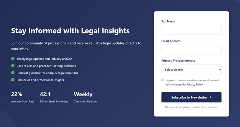
Email Opt-In Forms
Any form specifically designed to collect email addresses for marketing purposes. This is an umbrella category covering multiple form types.
Primary Use Case
Building an owned marketing channel. Email lists remain the highest-ROI marketing asset for most businesses.
Every business needs email capture regardless of industry or size.
Key Design Elements
- Email field (obviously)
- Optional name field (reduces friction when omitted)
- Clear value proposition
- Privacy assurance
- Submit button with action-oriented copy
The fewer fields, the higher the conversion. Email-only forms outperform email + name variations.
Conversion Attributes
Average email opt-in conversion rates range from 1.95% to 5% depending on implementation and industry.
Top performers hit 10%+ through optimized form design and compelling offers.
The presence of incentives matters. Forms without lead magnets convert at 5.10%. Adding a discount or download bumps this to 7.5-7.65%.
Implementation Context
Literally everywhere on your website.
Blog post footers and midpoints Sidebar widgets Header bars Checkout pages (post-purchase) Landing pages dedicated to email capture
Placement affects performance dramatically. Above-fold inline forms capture 57% of attention. Below-fold requires scrolling commitment.
Value Proposition Approach
Lead with the benefit, not the ask. “Get weekly marketing tips” beats “Subscribe to our newsletter.”
Specificity wins. “Get our 52-page SEO guide” converts better than “Get our free guide.”
Social proof adds credibility. “Join 10,000+ marketers” validates the decision.
Best For
Literally every business with an online presence. Email isn’t optional anymore.
- E-commerce for abandoned cart recovery
- B2B for lead nurturing
- Publishers for reader engagement
- Service providers for consultation booking
Common Variations
- Single opt-in: Immediate list addition (higher volume, lower quality)
- Double opt-in: Email confirmation required (lower volume, higher quality)
- Progressive profiling: Collects more data over time
- Preference center: Lets subscribers choose content types
Many businesses now offer both sign up forms and registration forms for different conversion goals.
Newsletter Forms
Specific email opt-in forms focused on recurring content delivery. Promises regular updates, articles, or curated content.
Primary Use Case
Building engaged readership for content-driven businesses. Works for publishers, bloggers, and thought leaders.
The promise is ongoing value through scheduled communication.
Key Design Elements
- Clear sending frequency (“weekly digest” vs “occasional updates”)
- Content preview or example
- Email field (name often optional)
- Unsubscribe mention for transparency
- Sample content or past issues linked
Setting expectations about frequency builds trust. “Weekly newsletter” performs better than “newsletter” alone.
Conversion Attributes
Newsletter signups convert at 1.95% on average. Email capture rate (ECR) above 2% is considered healthy.
But context matters. Newsletter forms on blog posts see higher conversion than those on product pages. One test showed 11% on content pages vs 0.18% on blogs for the same form.
The key? Relevance to what the visitor is currently reading.
Implementation Context
Content-heavy websites and publications.
Blog post endings (natural continuation point) Resource library access gates Sidebar placement on article pages Footer sections site-wide
Timing affects performance. Scroll-triggered forms (shown at 40-50% scroll depth) convert better than immediate displays.
Value Proposition Approach
Be specific about what subscribers get. “Weekly SEO tactics” outperforms “Get our newsletter” by massive margins.
Include sample topics or past issue titles. Concrete examples beat vague promises.
Address the “why subscribe” question directly. “Learn copywriting tactics used by 7-figure businesses” gives clear reason.
Best For
- Content publishers and bloggers
- Industry experts and thought leaders
- Media companies and online magazines
- Educational platforms and course creators
E-commerce sites should lead with discounts, not newsletters. Product-focused visitors care less about content.
Common Variations
- Content-focused: Promises articles, tips, tutorials
- Curated: Handpicked resources and links
- Exclusive access: Behind-the-scenes or early content
- Digest format: Weekly or monthly roundups
- Update-based: Product news and company announcements
Newsletter signup form templates provide starting points for quick implementation.
Smart publishers create content-specific lead magnets instead of generic newsletter signups. A lead generation form offering a downloadable guide converts 3-5x better than a plain newsletter ask.
FAQ on Opt-In Forms
What makes an opt-in form effective?
Clear value proposition, minimal form fields, and strong visual hierarchy. Your email signup needs a compelling reason for people to subscribe, usually a lead magnet or exclusive content. Keep it to name and email at most.
Where should I place opt-in forms on my website?
Multiple locations work best. Try inline forms within blog content, popup forms triggered by scroll depth, sidebar boxes, and footer sections. Test different placements to see what your audience responds to.
How many form fields should an opt-in form have?
Two fields maximum for best conversion rates. Email address is required, first name is optional. Every additional field you add drops your conversion rate by roughly 10-15%. Progressive profiling can collect more data later.
What’s the difference between single and double opt-in?
Single opt-in adds subscribers immediately after form submission. Double opt-in requires email confirmation before adding them to your list. Double opt-in creates cleaner lists but reduces signup completion by 20-30%.
Should I use popup or inline opt-in forms?
Both. Inline forms or popup forms serve different purposes and audiences. Popups grab attention and convert better for cold traffic. Inline forms feel less intrusive and work well for engaged readers.
How do I make opt-in forms mobile-friendly?
Large tap targets, minimal typing, and single-column layouts. Follow mobile form best practices like using appropriate input types and avoiding tiny checkboxes. Test on actual devices, not just browser simulators.
What should I offer as a lead magnet?
Something specific, immediately useful, and relevant to your audience. PDF guides, checklists, templates, discount codes, or exclusive content all work. The lead magnet should solve one specific problem your target subscriber faces.
How do exit-intent popups improve conversions?
They catch visitors before they leave your site. Exit-intent forms detect cursor movement toward the browser’s close button and trigger a final conversion attempt. They can recover 10-15% of abandoning visitors.
What makes good opt-in form copy?
Benefit-focused headlines and action-oriented button text. Skip “Submit” and use specific phrases like “Get My Free Guide” or “Send Me Tips”. Your copy should answer “what’s in it for me?” within three seconds.
How can I make my forms GDPR compliant?
Clear consent checkboxes, explicit data usage statements, and easy opt-out options. GDPR compliant forms require active consent, not pre-checked boxes. Include links to your privacy policy and explain exactly what subscribers will receive.
Conclusion
The opt-in form examples you’ve seen here prove that email signup doesn’t need to be complicated. Start with one or two high-performing placements and test from there.
Your subscriber list grows when you make signing up easy, valuable, and obvious. Pick a lead magnet that solves a real problem, keep your form fields minimal, and write copy that focuses on benefits instead of features.
Tools like Mailchimp, ConvertKit, and OptinMonster handle the technical stuff. You just need to decide on placement, timing, and incentive.
Test different approaches. What works for one audience might flop for another.
Track your conversion rates, watch your form analytics, and adjust based on actual data. The best email signup strategy is the one that actually gets people to subscribe on your site with your audience.
Start simple, measure everything, and improve from there.
