



An HTML checkbox is a form input element that lets a user select any number of independent options from a group at the same time, with each box holding its…
Table of contents
A contact page is one of the few pages on a site with a single job: get someone to reach out, then get someone to answer them. That second part breaks more often than people think. Leadferno looked at contact form leads in 2024 and found that 42.6 percent of submissions never get a reply at all, and when a business does respond, the average first response takes more than 17 hours.
The page itself is a small piece of a much longer chain. A lead form, paired with business details and usually a map, built on WordPress, Webflow, or a page someone coded by hand. Small businesses, agencies, and SaaS teams all build some version of it, and the only number that actually matters for judging one is the share of visitors who fill it out. Traffic alone doesn’t tell you anything.
What Is a Contact Us Page Template?
It doesn’t try to do everything a homepage does. It’s built for exactly one outcome, a filled-out form, and everything else on it (the map, the phone number, the office hours) exists just to make that one action feel safe enough to take.
It sits inside the broader category of website page layouts, but it does a narrower job than a homepage or a service page. Its function is conversion, not brand storytelling.
That puts it alongside other form types built around a single outcome, rather than the general content pages that make up the rest of a site.
It isn’t a landing page template built to sell one product. It isn’t a homepage template built for navigation and brand storytelling either, though the two get mixed up constantly.
You’ll usually find it linked from the main navigation bar, referenced again in the footer near the social links, and sometimes tacked onto the bottom of a pricing or service page.
Small businesses, agencies, SaaS products, and ecommerce stores all use some version of it, though the fields and tone shift by industry.
What Elements Make Up a Contact Us Page Template?
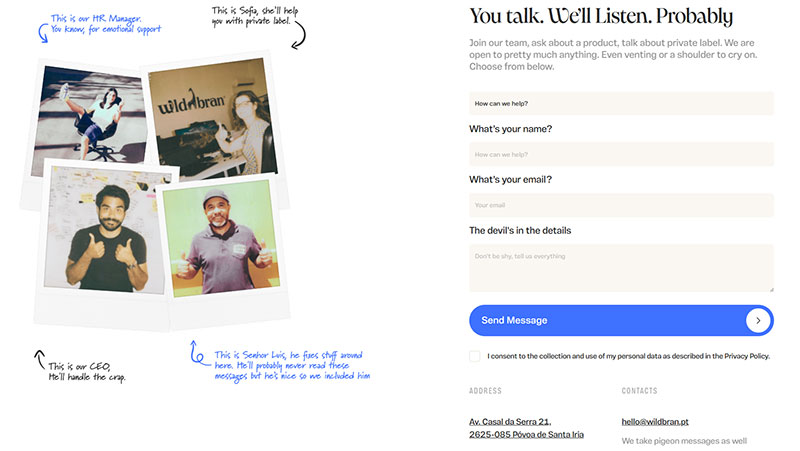
Image source: wildbran.pt
Strip a contact page down to its studs and you’re left with a form, a button that submits it, and the business’s contact details sitting somewhere visible. Most templates add a map too, though that one’s genuinely optional.
Pull any single piece out and the page still technically works, it just works worse. The average contact form converts at just 3 to 5 percent (WebFX), so every element on the page is either adding friction or taking it away.
Form Fields
The field set barely changes from one form to the next.
- Name
- Email address
- Phone number, usually optional
- Subject or reason for contact, often a drop-down
- Message field
Field count isn’t just a design decision. Imaginary Landscape, a web development firm based in Chicago, dropped its own contact form from 11 fields down to 4, and submissions rose 120 percent, according to the firm’s own case study.
Anyone putting together contact form templates for a client site hits this tradeoff fast. More fields mean more qualified leads, but fewer total submissions.
Call to Action Buttons
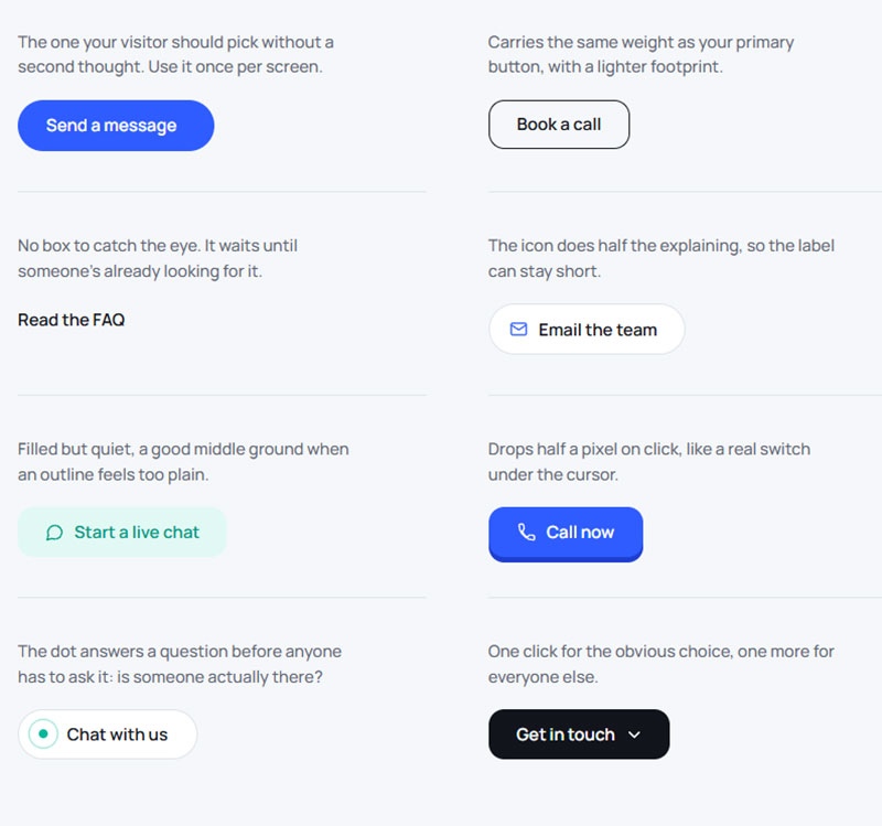
The button is the one thing every visitor on the page actually has to touch. Its wording matters more than its color ever will.
“Submit” is the safe default, and it also reads a little cold, a little transactional. “Send Message” or “Get in Touch” pushes in a warmer direction. “Schedule a Call” is doing something different entirely, setting an expectation the rest of the page needs to back up.
Whatever the button says has to match what actually happens after someone clicks it. A form that just drops into an inbox shouldn’t promise a callback within the hour.
Contact Information Display
Visitors scan this section instead of reading it, so how it’s laid out does more work than what it actually says.
Business address, phone number, email address, and business hours all need to be visible without scrolling. Nothing here should require a click to find.
Most templates repeat a shorter version of this in the footer, useful for anyone who lands on a different page of the site entirely.
Embedded Maps
A map matters for one simple reason, it tells someone whether they can actually get there. Plenty of contact pages skip it entirely, and that’s fine.
The common options are a live Google Maps iframe, a static image (loads faster, a bit less finicky), or nothing at all when there’s no physical location to point to.
Service businesses and SaaS companies without a storefront usually skip the map and use that space for a live chat prompt or a link to an FAQ instead.
What Layout Structures Do Contact Us Page Templates Use?
Most contact pages land on one of a few layout patterns: single column, split-screen, or a sidebar form running next to other content. Which one fits comes down to how much supporting material needs to sit next to the form itself.
Getting this wrong is well documented in research on what makes a form layout work. Cramped fields and inconsistent spacing cost completions before a visitor even reads the labels.
| Layout | Pros | Cons |
|---|---|---|
| Single column | Fast to scan, works well on narrow screens | No room for a map or extra trust signals |
| Split-screen | Form and map or image sit side by side | Needs more horizontal space, cramped on tablets |
| Sidebar-form | Keeps the form visible while browsing other content | Form can feel like an afterthought next to a full page |
Single Column Layout
One form, stacked top to bottom, nothing else competing for attention.
It’s the default for small business sites and portfolios where the form basically is the page. This also lines up with guidance on building forms for small screens, since most people are going to hit that page on a phone first anyway.
Split-Screen Layout
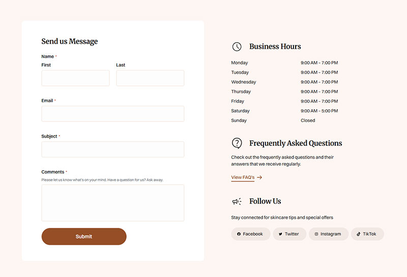
Form on one side, map or brand image on the other. Real estate sites and agencies with a physical office lean on this pattern hard, and it’s easy to see why.
The map gets actual visual weight instead of getting shrunk into a footer afterthought. A photo of the office or the team can sit right next to the form, which does more for trust than people give it credit for. The tradeoff is that it wants desktop-level space. On mobile it just collapses into a stacked single column anyway.
Sidebar-Form Layout
Service and agency sites use this one when they want a way to get in touch that’s always there, without giving it a whole page to itself.
The form sits in a narrow column next to blog content, case studies, or service descriptions. Fewer fields work better here, mostly because the column itself doesn’t leave much room.
How Does Spam Protection Work on a Contact Us Page Template?
Spam protection on a contact form comes down to filtering submissions before they land in an inbox, either through a trap a bot walks into without knowing it, or a background score that flags suspicious behavior.
Almost every template in use today leans on some combination of a honeypot field, Google reCAPTCHA, and Cloudflare Turnstile.
The honeypot trick works by hiding a form field from real visitors using CSS, while leaving it fully visible to a bot scanning the page’s raw HTML. A bot doesn’t know any better and fills it in anyway.
Whatever gets typed into that field gets the submission tossed on the backend before it ever reaches an inbox. No puzzle, no checkbox, nothing the bot even notices.
A closer look at how a honeypot trap actually works covers this mechanism in more depth. It needs zero interaction from a real visitor to function.
Google reCAPTCHA works differently. Version 3 runs quietly in the background and hands back a score between 0.0 and 1.0 for every submission, built from behavior signals instead of a puzzle anyone has to solve.
- 0.5 is Google’s suggested default threshold for blocking
- Scores closer to 0.0 point to automated traffic
- Scores closer to 1.0 point to a genuine visitor
Google rolled this frictionless scoring model out in 2018 as version 3, replacing the older click-a-checkbox challenge most people still picture the second someone says the word captcha.
Setting this up on a WordPress build follows a fairly standard process. The steps for wiring reCAPTCHA into a WordPress contact form apply to most page builders with only minor variation.
Cloudflare Turnstile does something similar in the background, minus sending visitor data over to Google, which actually matters for sites with strict privacy requirements to meet.
None of these methods catch everything, and that’s worth saying plainly. A honeypot only stops bots that blindly fill in every visible field. A sophisticated script that actually reads the CSS can skip right past it.
Which Contact Us Page Template Should You Use?
The right template depends on whatever platform is already running the site, not on which one looks best in a screenshot.
WordPress remains the most common starting point by a wide margin. It powers roughly 41.2 percent of all websites and about 59.1 percent of sites running a known content management system (W3Techs, 2026).
| Platform | Cost | Customization | Best fit |
|---|---|---|---|
| WordPress | Free to low cost with plugins | High, with a plugin or custom code | Small business, blogs, agencies |
| Webflow | Subscription based | High, visual editor with clean code output | Design-led brands, agencies |
| Shopify | Included in store subscription | Moderate, theme dependent | Ecommerce stores |
| Website builders (Wix, Squarespace) | Included in plan | Low to moderate | Solo founders, simple sites |
| HTML and CSS | Developer time only | Unlimited | Custom builds, developers |
By Platform
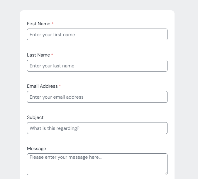
Simple contact form template created with IvyForms
On WordPress, the template usually comes from a theme, a page builder like Elementor, or a dedicated form plugin. Picking one from the available WordPress form plugins is the fastest route for most people who aren’t developers.
Developers who want full control over markup and styling, without the overhead a plugin adds, often just build the page directly instead. The guide on building a WordPress form without installing a plugin walks through the native approach using PHP and HTML5 form elements.
Webflow and Wix bundle their own form handling, so the decision there comes down to design flexibility more than functionality.
By Business Type
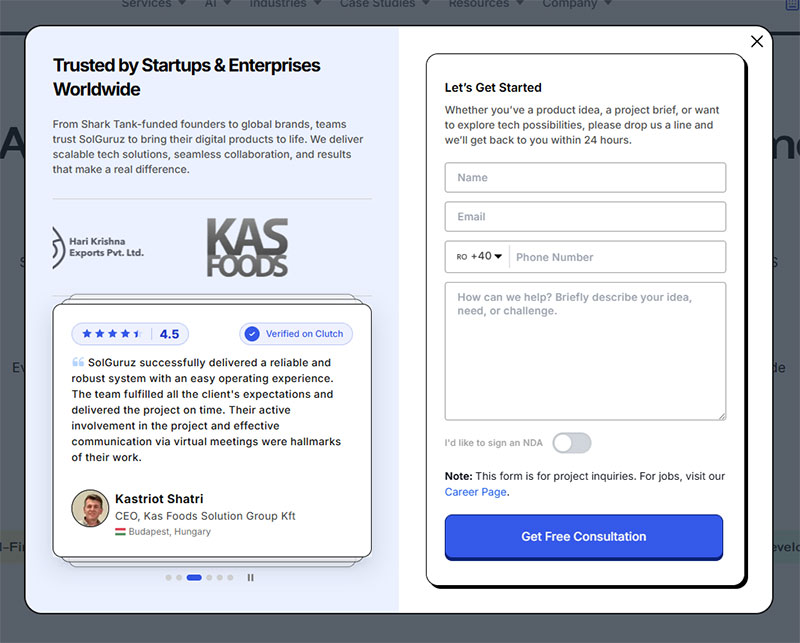
Image source: solguruz.com
The fields shift by industry more than most people expect. A small business or local service mostly needs a name field, phone, message box, and a map.
An ecommerce contact page usually swaps the map out for an order number field and a subject drop-down instead. SaaS contact pages often skip a physical address altogether and just route the message by department.
A custom-coded template earns its cost when a business needs something a theme genuinely can’t do, like a multi-step form that routes leads out to different sales reps.
Does a Contact Us Page Template Need to Meet Accessibility Standards?
Yes. A contact form is one of the few places on a site where a visitor has to interact directly with inputs, which makes labeling and keyboard access non-negotiable rather than optional polish.
WebAIM’s Million report scans the home pages of the top one million sites every year.
It found that roughly a third of all form inputs still carry no proper label, whether through the label element, an aria-label attribute, or aria-labelledby.
WCAG 2.1 AA is the standard courts and auditors reference most often for form fields specifically, with WCAG 2.2 AA increasingly treated as the current best practice on top of that floor. Either way, that means visible labels, sufficient color contrast, and a visible keyboard focus state on every input.
ARIA labeling fills the gap when a visual label doesn’t exist, like an icon-only submit button, but it doesn’t replace a visible label for the fields themselves.
Legal exposure here is not theoretical. Federal web accessibility lawsuits filed under the ADA jumped 27 percent in 2025 to 3,117 filings (Seyfarth Shaw), and courts typically point to WCAG as the practical benchmark.
Domino’s Pizza is the case most people bring up. The company fought a screen reader accessibility claim in court for five years before a federal judge ordered it to bring the site up to WCAG 2.0 standards and pay damages, back in 2021. The case didn’t fully settle until 2022, six years after it was first filed, and it’s the saga that reset how seriously a lot of businesses started treating inaccessible forms and checkout flows.
- Section 508 applies specifically to US federal agencies and contractors
- ADA Title III applies to most private businesses with a public-facing website
- WCAG itself is not a law, but it is what regulators and plaintiffs cite
None of this is a checkbox exercise. A contact page with unlabeled fields fails a screen reader user in the exact moment they’re trying to reach a human, which is the whole point of the page.
Reviewing solid form accessibility habits before launch catches most of these issues while the form is still easy to change.
How Much Does a Contact Us Page Template Cost?
Cost ranges from free to several thousand dollars, and where it lands depends entirely on whether the template comes bundled with something else, gets bought on its own, or is built custom from scratch.
- Free: bundled with a WordPress theme, or included in a Wix, Squarespace, or Shopify plan
- Paid template: bought from a marketplace, typically a few dozen to a few hundred dollars
- Custom built: designed and coded from scratch, priced by project scope instead of a flat rate
A freelancer customizing an existing template for a small business site usually lands somewhere in the low hundreds to low thousands. A fully custom page built around specific routing logic or CRM integration costs more than that, and the price climbs with every extra dependency added on.
Hidden costs tend to show up after launch, not before it. Form plugin premium tiers, CRM integration fees, ongoing maintenance for spam rules and field changes, all of it adds to the real total.
A free template running on a paid form plugin backend often ends up costing more over two years than a slightly pricier all-in-one solution would have upfront. Worth doing that math before picking the free option just because it’s free.
How Do You Build a Contact Us Page Template?
Building one isn’t complicated in theory: pick the platform, place the fields, connect the form handler, add spam protection, then test the whole thing end to end. That last step is where most launches quietly break, usually because nobody actually submitted the form as a stranger would before pushing it live.
- Choose the platform. WordPress (with IvyForms), Webflow, Shopify, or a hand-coded HTML page, decided by whatever already runs the rest of the site.
- Place the fields. Name, email, subject, and message cover most cases, in that order.
- Connect the form handler. Route submissions to an inbox, a CRM like HubSpot, or an automation tool like Zapier that fans the data out to other systems.
- Add spam protection. A honeypot field first, reCAPTCHA or Turnstile layered on top once volume justifies it.
- Test the full path. Submit the form as a stranger would, then confirm the email, the CRM entry, and any autoresponder all actually fired.
Some templates also push new submissions into an email list tool like Mailchimp, useful when a contact form doubles as a soft opt-in.
Common Mistakes
Most of what goes wrong here is boring and preventable.
- Error states with no styling, so a failed field looks identical to a working one
- No confirmation message after submit, leaving the visitor unsure it went through
- A form that fails silently on the backend while looking completely fine on the frontend
A quick look through real form error message examples shows how much a red border and one short line of text actually do for trust.
The silent failure is the expensive one. Across major email service providers, an average of 10.5 percent of emails land in spam and 6.4 percent never arrive at all (EmailToolTester, 2024). WordPress deliverability guides, including Jetpack’s, apply that same benchmark to contact form email, largely because the default PHP mail function doesn’t send anything that looks authenticated to Gmail or Outlook.
Pairing a proper form submission confirmation message with delivery monitoring is the only way to know a submission failed before a lead does.
How Do You Improve Conversion on a Contact Us Page Template?
Conversion on a contact page comes down to a short list of levers: how fast the page loads, how clear the button is, and where in the form people actually quit. Fixing any one of them moves the needle, but pulling the data first stops you from spending effort on the wrong lever.
The numbers back this up pretty clearly.
- A B2B page that loads in 1 second converts 3 times higher than one loading in 5 seconds (Portent, 2022)
- Only 45 percent of people who visit a contact form actually go on to complete it (Zuko Analytics)
- Desktop visitors complete forms at 47 percent versus 42 percent on mobile (Zuko Analytics)
- OfficeRnD saw a 10 percent increase in overall website conversion rate, and a 12.5 percent boost on its key product page, after fixing failing Core Web Vitals scores on its site (NitroPack, 2024)
None of this shows up without measurement. Setting up form submission tracking in Google Analytics comes first, it’s the only real way to see which exact field visitors abandon on.
Button wording matters too, though less than speed and field count combined. A broader walkthrough on how to increase form conversions covers testing button copy against a control before rolling any change out site wide.
Contact Us Page Templates
See the Pen
tailwind contact form by fabform (@fabform)
on CodePen.
See the Pen
Tailwind CSS – Contact Form 1 by Rhythm Ruparelia (@rhythm19)
on CodePen.
See the Pen
Responsive Contact Us Page by Nguyễn Tấn Thắng (@nguyn-tn-thng)
on CodePen.
See the Pen
Yellow Dots Contact Form – Pen #15 – 2020 by Ricky Eckhardt (@rickyeckhardt)
on CodePen.
See the Pen
Colorful Contact Form – Day 1 – 100 DAYS – 2020 by Ricky Eckhardt (@rickyeckhardt)
on CodePen.
See the Pen
Contact Form by Carlos Rincon (@mezerotm)
on CodePen.
See the Pen
Contact Form by Couch John (@tmoran18)
on CodePen.
See the Pen
Wordpress/wp7 contact form with animated placeholder text by Jason Heyburgh (@MrShibumi)
on CodePen.
See the Pen
Stylish Contact Form with HTML, CSS, and JS by Envato Tuts+ (@tutsplus)
on CodePen.
See the Pen
healthy lifestyle contact form by Oscar Beamish (@OscarTBeamish)
on CodePen.
See the Pen
jQuery Pop-up Contact Form by Beka (@bekqs)
on CodePen.
See the Pen
Contact Form by Aina Requena (she/her) (@ainarela)
on CodePen.
See the Pen
Elegant Contact Form by Grandvincent Marion (@GrandvincentMarion)
on CodePen.
See the Pen
Contact Us Page Design – Contact Form Design by Ikbal Hossain (@indikbal)
on CodePen.
When Does a Contact Us Page Template Not Work?
A contact us page template stops being the right tool in a few specific situations, mostly involving speed of response, sales complexity, or brand fit.
None of these mean the form is broken. They mean something else answers the visitor’s actual need better.
Immediate Response Expectations
A static form loses to live chat the moment a visitor wants an answer right now instead of a reply that shows up hours later. Live chat teams now average a first response of 1 minute and 35 seconds, against the hours a contact form email typically takes to get a reply (Tidio, 2025).
Drift built its entire go-to-market position around swapping the contact form for a chat widget on B2B sites that need to catch a buyer while they’re still on the page.
A closer look at how chatbots compare to standard forms covers that tradeoff in more depth.
High Touch B2B Sales
A generic message field doesn’t fit a sales process that needs to route a lead by deal size, region, or product line before anyone even replies.
A scheduling link, or an intake form built for lead generation rather than general contact, fits that process better than a template built for simple inquiries.
Too Many Required Fields
Once a template asks for more than a name, email, and message, submissions tend to drop off faster than a phone number or a booking link would.
Brand Fit
A template built around someone else’s layout conventions sometimes fights against a brand that needs something fully custom. At that point the template stops saving time and starts costing it.
FAQ on Contact Us Page Templates
What Is the Difference Between a Contact Us Page Template and a Landing Page Template?
A landing page is built around one offer and one campaign. It exists to get a single action out of traffic that arrived from an ad. A contact us page doesn’t have that expiration date built in, it’s meant to sit there for every visitor, pairing a lead form with the business’s actual details, whether someone came from an ad, a Google search, or just typed the URL in directly.
Is a Contact Us Page Template Better Than a General-Purpose Form Plugin?
Not really a fair comparison, honestly, they’re not doing the same job. A form plugin just builds the input fields and handles submission. A template takes those fields and arranges them alongside a map, business hours, and a call to action into one finished layout, usually with a plugin running underneath it to actually power the form.
What Tools Measure Contact Page Performance After Launch?
Analytics platforms track submission rate and where exactly people drop off, field by field. Heatmap tools and session recorders (Hotjar, Microsoft Clarity, that kind of thing) show where someone hesitates or just gives up and leaves.
CRM dashboards are the last piece. They close the loop by showing how many of those submitted leads actually turn into real business.
Can a Contact Us Page Template Be Used on Mobile Without Changes?
Rarely, no. A desktop layout built around a split-screen map and form pretty much has to collapse into a single column on a small screen, with bigger tap targets and a shorter field order, or the mobile version just doesn’t hold up.
What Should You Check First After Publishing a Contact Us Page Template?
A contact us page template needs a live submission test within 24 hours of launch, confirming the email notification, the spam filter, and the confirmation message all fire before real leads start showing up.
The order matters here, more than the checklist itself does.
- Submission delivery: email, spam filter, and confirmation message
- Mobile rendering: field spacing and tap targets on a small screen
- Accessible labels: visible text on every input, not a placeholder
EmailToolTester’s 2024 deliverability data puts total email failure under 17 percent, while Leadferno’s 2024 research found 42.6 percent of leads never receive a reply at all. Most of that gap comes from a follow-up failure inside the business, not a delivery failure inside the template.
Prioritizing delivery over design means accepting a plainer form while the pipeline gets proven. Once the mechanics hold up, reviewing real contact form examples turns that proven skeleton into a page worth publishing.