

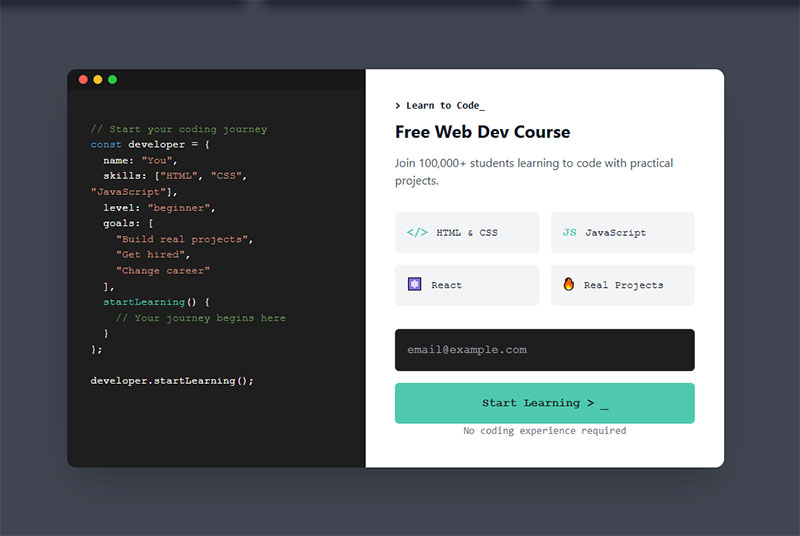
Most form tutorials show you what’s possible. This one shows you what actually works. The State of CSS 2024 survey puts Tailwind CSS at 62% developer usage. More teams are…
Table of contents
Most subscription forms get ignored. Not because the offer is bad, but because the form itself gives visitors no real reason to act.
The right email subscription form does more than collect addresses. It communicates value, removes friction, and converts passive visitors into an owned audience.
This guide covers real subscription form examples across newsletters, SaaS products, and e-commerce stores. You will see what high-converting forms actually look like, why they work, and how to apply the same principles to your own opt-in form design, copy, and placement.
What is a Subscription Form
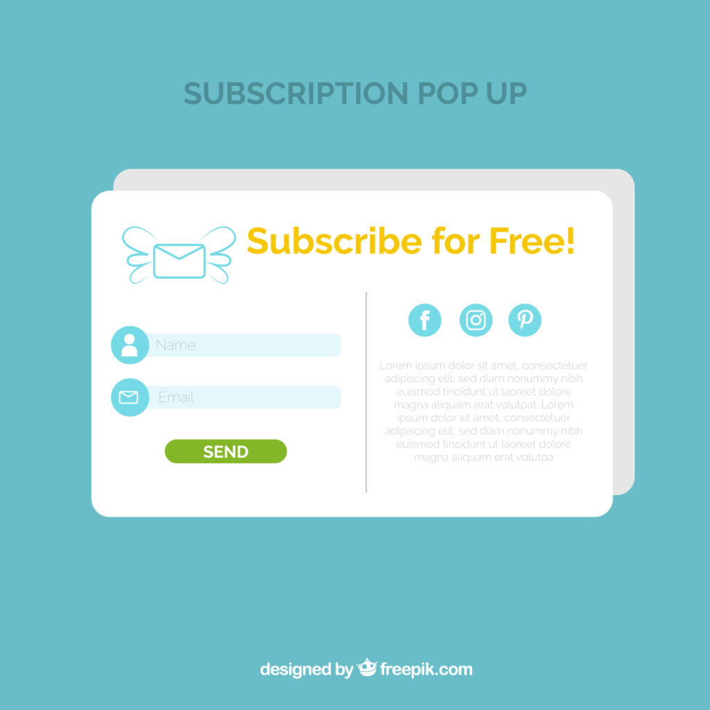
A subscription form is a structured input element on a website that collects user data – typically an email address – in exchange for access to content, updates, discounts, or other offers.
It is not the same as a contact form or a checkout form. Those serve different goals. A subscription form exists specifically to grow an email list and build an owned audience.
Core Components
Every functional subscription form has these parts:
- An input field for the email address (sometimes name too)
- A CTA button with action-oriented copy
- An optional incentive line (discount, content, access)
- A privacy note or consent checkbox where required
Kit (ConvertKit) data from 2024 shows newsletter landing pages average around a 4% conversion rate – but individual forms vary wildly depending on placement and copy.
How It Differs from Other Lead Capture Forms

Subscription forms: single-purpose, low friction, usually one or two fields. The goal is an email address.
Lead generation forms: often more fields, qualify the lead, used for sales pipelines. If you want to compare approaches more closely, contact forms vs lead generation forms is worth reading.
Subscription forms sit at the top of the funnel. They are not the place to ask for a phone number, company size, or budget range.
Where Subscription Forms Appear
| Placement | Typical Format | Best For |
|---|---|---|
| Homepage hero | Inline / embedded | Brand-first audiences |
| Blog post (mid or end) | Embedded, contextual | Content-driven sites |
| Footer | Inline, minimal | Low-pressure capture |
| Exit intent overlay | Popup / modal | Recovering bouncing traffic |
| Dedicated landing page | Full-page form | Paid traffic, lead magnets |
Each placement has a different job. A footer form is passive. An exit intent popup is aggressive. Knowing the difference matters before you pick a format.
Types of Subscription Forms
Not all subscription forms work the same way. The format you choose changes how visible the form is, how much it interrupts the user, and ultimately how many people sign up.
There are five main types worth knowing – and each suits a different context.
Inline and Embedded Forms
See the Pen
Modern Header Subscription Bar by Bogdan Sandu (@bogdansandu)
on CodePen.
These live inside the page content itself, either within a blog post, below a hero section, or in the footer. No interruption. No overlay.
After-content placement converts up to 40% better than top-of-page positioning (Getsitecontrol), because readers who finish an article have already demonstrated interest. The form shows up at exactly the right moment.
- Good for content-heavy sites and blogs
- Lower friction than popups
- Subscribers from inline forms tend to have higher long-term engagement
Popup and Modal Forms
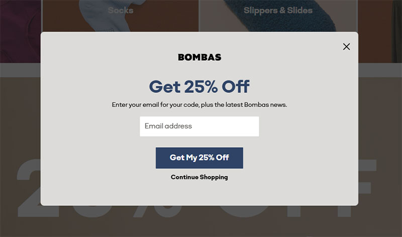
Image source: bombas.com
Popups are the most debated format in email list building. They work. That is the uncomfortable truth.
Getsitecontrol data shows email popup forms convert an average of 3.77% on desktop and 6.57% on mobile. Exit-intent triggers outperform simple timed popups by about 35%.
Well-designed popups with a clear offer and a strong close button are a completely different thing from the intrusive, full-screen nightmares that give the format a bad reputation. To understand what a popup form actually is and when to use one, the format deserves a proper look before you dismiss it.
Slide-in and Sticky Bar Forms
See the Pen
Modern Slide-In Subscription Form by Bogdan Sandu (@bogdansandu)
on CodePen.
Slide-ins: appear from a corner after the user scrolls a set percentage of the page. Less aggressive than a full modal, more visible than a footer form.
Sticky bars: sit fixed at the top or bottom of the browser window. Always visible, never blocking content. Sumo data shows the average sticky bar converts around 0.5% of visitors – lower than popups, but the trade-off is zero content interference.
Multi-Step Subscription Forms
Instead of showing all fields at once, multi-step forms ask one question at a time. HubSpot research shows only 40% of marketers use multi-step forms, yet their conversion rate is 86% higher than single-step alternatives.
The catch: badly designed multi-step flows can hurt conversions badly. There is a real risk of drop-off between steps if the form does not feel like it is progressing. For a detailed look at multi-step form examples that actually work, it is worth seeing both good and bad implementations side by side.
If you are thinking about the broader choice between these formats, inline forms vs popup forms is a useful comparison.
Key Elements of an Effective Subscription Form
Most subscription forms fail because of decisions made before the design phase even starts. The copy, the field count, the button text – these things decide whether the form converts.
Headline Copy
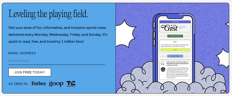
Image source: thegistsports.com
Generic headlines kill conversions. “Subscribe to our newsletter” tells the visitor nothing about what they are getting.
Specific headlines work. “Get 3 actionable marketing tactics every Tuesday” gives the reader a format, a frequency, and a concrete promise. That is three reasons to sign up in one sentence.
- State what the subscriber receives, not what they are doing
- Include frequency when it is a selling point (“weekly,” “every Monday”)
- Match the headline to the audience – a B2B SaaS form reads differently than a DTC discount form
CTA Button Text
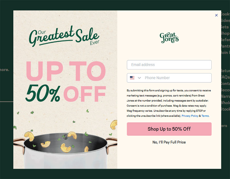
Image source: greatjonesgoods.com
Wordstream research confirms the best-performing CTA buttons use action words like “get,” “reserve,” and “try.” The worst? “Submit.”
“Send me the guide” outperforms “Submit” consistently. First-person framing (“Start my free trial”) outperforms second-person (“Start your free trial”) in most A/B tests. Small word changes, real conversion differences.
Form Fields and Friction
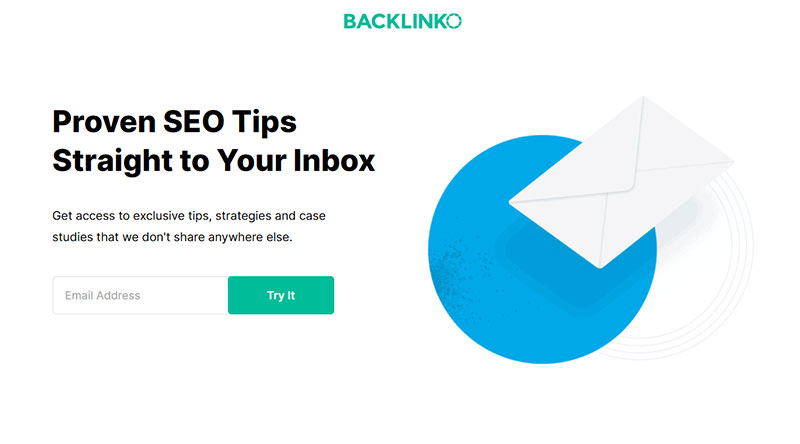
Image source: backlinko.com
HubSpot data shows over 30% of marketers get the highest conversion rates from forms with just 4 fields. For pure email list building, even 4 fields is often too many.
Reducing an 11-field form to 4 fields produced a 120% increase in form submissions in one documented case study, without any reported drop in submission quality. More fields mean more friction. Every extra field is a reason for someone to leave.
For a full breakdown of form fields and how each one affects completion rates, the data is worth looking at before you decide what to include.
Trust Signals and Microcopy
What works:
- A short privacy note directly below the button (“No spam. Unsubscribe anytime.”)
- A subscriber count when it is large enough to be impressive
- Social proof, which can increase conversion rates by up to 26% (GetLeadForms)
Adding social proof to a subscription form, even a simple line like “Join 12,000 readers,” shifts the visitor’s thinking from “should I sign up?” to “why haven’t I yet?”
Subscription Form Types
The best way to understand what makes a subscription form work is to look at real ones – not hypothetical wireframes, but forms that are live and converting right now.
Newsletter Subscription Forms
Morning Brew grew to over 4 million subscribers largely by keeping its signup form dead simple: one email field, a strong value prop (“business news worth reading”), and a CTA that does not say “submit.”
The Hustle used a similar approach but leaned harder on personality in the headline copy – a deliberate choice that attracted a specific audience. Referrals drove 300,000 new subscribers in a matter of months, which says something about what happens when your form and your brand voice align.
Substack creators have access to built-in opt-in form designs, and the ones that perform best share a pattern: specific topic promise, short field count, and no distractions around the form itself.
SaaS and Product Update Forms
Waitlist forms: Notion, Linear, and Figma have all used early-access subscription forms during product launches. The format is different from a newsletter signup – the incentive is access, not content.
Product update forms: “Get notified when we launch” with a single email field. No copy needed beyond the button. The context of the page does all the work.
These SaaS subscription forms tend to convert well because the visitor is already motivated. The form just needs to stay out of the way. For comparison, look at how similar approaches work in the context of lead generation form examples – the intent and design logic overlaps more than most people expect.
E-commerce Subscription Forms
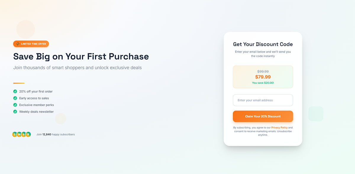
Discount-driven forms dominate e-commerce. “Get 10% off your first order” with an email field is the baseline. It is everywhere because it works.
Organic Aromas ran a single Omnisend popup with a 6.8% conversion rate and captured 661 leads with zero ad spend, according to Omnisend’s published case study. That is a real number from a real campaign.
Klaviyo popup forms built for Shopify stores follow a clear pattern:
- Discount or free shipping as the incentive
- Email field only (phone is a second step, if at all)
- A clear “no thanks” option that does not shame the user
- Mobile-first layout with a large tap target on the CTA
Blog and Content Site Forms
Content sites face a harder sell. The incentive is not a discount – it is the promise of more good content. That requires a stronger value statement.
Well-performing blog subscription forms on platforms like WordPress or Webflow typically sit mid-content or just after a strong article section. The form appears when the reader is already engaged, not before they have read a single word.
For writers and media sites using ConvertKit (now Kit), the landing page form is often the highest-converting placement. Kit’s 2024 data confirms landing pages maintain consistently strong conversion rates across devices, ahead of popups and embedded forms when you factor in both desktop and mobile traffic.
Subscription Form Examples by Placement
The same form goal – collect an email address – behaves completely differently depending on where it sits on the page. Placement changes the user’s mindset, their intent level, and how the form needs to be written.
Header and Hero Area Forms
High visibility. The user sees it before they read anything.
This placement works best when the brand or publication is already known – when the visitor arrives with a reason to subscribe already in mind. For cold traffic, it rarely converts well on its own without a strong incentive above the fold.
- Minimal fields (email only)
- Strong hook in the headline – no room for vague copy
- CTA must do heavy lifting since there is no supporting content yet
Footer Forms
See the Pen
Modern Footer Subscription Form with Social Proof by Bogdan Sandu (@bogdansandu)
on CodePen.
Footer forms are the lowest-pressure placement on any page. They catch readers who made it to the bottom – which is actually a self-selected group of engaged visitors.
Typical footer form design: two columns, a short headline on the left, an email field and button on the right. Simple. No popup, no overlay, no disruption. The visitor found it because they were looking around.
Conversion rates are lower than popups by definition, but the quality of subscribers tends to be higher. Someone who reads all the way to the footer and then signs up is genuinely interested.
Within-Content Subscription Forms
Context is the whole game here. A form that appears mid-article on a topic about email marketing is far more relevant – and far more likely to convert – than the same form dropped into an unrelated piece.
Getsitecontrol research confirms after-content placement outperforms top-of-page by up to 40%. The reasoning is straightforward: a reader who reaches the end of a 1,500-word article has already demonstrated real interest. The form shows up at exactly the moment that interest peaks.
Exit Intent Popup Examples
Exit intent triggers fire when the user moves their cursor toward the browser close button or address bar. The form appears at the last possible moment before the visitor leaves.
Sleeknote’s 2024 analysis found exit intent forms perform 35% better than simple timed triggers. Popups with countdown timers convert 25.48% better than those without. Both of these are real behavioral levers, not design preferences.
For real exit intent popup examples worth studying, the pattern that shows up most often in high converters is a single, specific offer with no competing elements on the overlay.
Sidebar Forms
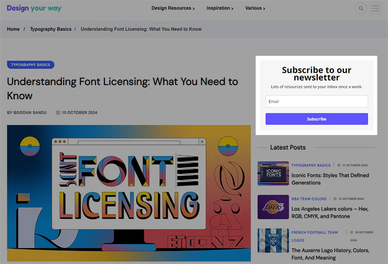
Image source: designyourway.net
Sidebar subscription forms are declining. Most readers have developed a habit of ignoring the sidebar entirely, especially on mobile where sidebars often collapse or disappear.
They still have a place on long-form blog layouts where the sidebar stays visible for the full scroll. But for most modern sites – especially those with mobile-first designs – the sidebar form is not worth the real estate it takes up. There are better placements available.
Subscription Form Copy Examples
Copy is where most subscription forms either win or lose. The design can be clean, the placement can be perfect, and the form still fails because the words give the visitor no real reason to act.
Headline Formulas That Work
The most reliable headline structure is also the most direct:
“Get [specific thing] every [frequency]”
This works because it answers the two questions every potential subscriber has: what do I get, and how often will it show up in my inbox? “Get 5 design resources every Friday” is clearer and more compelling than “Subscribe for design inspiration.”
- “Join 18,000 developers getting weekly Webflow tips”
- “Get the newsletter that 40,000 marketers read every Tuesday”
- “Weekly roundup of SaaS growth tactics – no fluff”
CTA Button Copy Examples
First-person CTA copy consistently tests better. Here is the pattern:
| Weak Copy | Stronger Copy |
|---|---|
| Subscribe | Send me the newsletter |
| Submit | Get my free guide |
| Sign up | Join the list |
| Enter email | Start reading for free |
The shift is small but consistent: the subscriber is not doing something for you – they are getting something for themselves.
Microcopy and Privacy Lines

The line directly below the submit button is one of the most underused conversion levers on a subscription form. Most forms either leave it blank or drop a legal-sounding privacy statement that no one reads.
What actually works:
- “No spam. Unsubscribe with one click.” – addresses the real hesitation
- “We send one email per week. That’s it.” – sets expectations clearly
- “Join 9,400 readers. Unsubscribe anytime.” – social proof plus escape hatch
ConvertKit and Mailchimp both publish copy frameworks for subscription forms in their documentation. The pattern across all of them is the same: remove doubt, state the benefit, make the exit easy. That combination handles most of the friction that stops people from submitting.
For a full look at how sign up form best practices translate into copy decisions, the overlap with the examples above is significant – the principles are consistent across form types.
A/B tested variations from published HubSpot case studies show that changing the CTA text alone – nothing else on the form – can shift conversion rates by 10 to 15%. The words matter more than most form owners assume.
Subscription Form Design Examples
Design decisions on a subscription form are not just aesthetic. They directly affect whether a visitor submits their email or closes the tab.
Mobile traffic changes the math considerably. Approximately 50% of internet traffic now comes from phones and tablets (Formsort), and mobile form abandonment runs 27% higher than desktop (Tinyform). The design has to work on a 375px screen first.
Minimalist Single-Field Designs
One email field. One button. Nothing else.
This is the default for high-traffic newsletters and SaaS product updates. It removes every possible reason to hesitate. Kit’s landing page forms follow this pattern closely, and their 2024 data shows landing pages consistently outperform embedded and popup forms across both desktop and mobile traffic.
What makes minimalist forms work:
- Single-column layout reduces cognitive load vs. multi-column alternatives
- Large, high-contrast CTA button with adequate tap target on mobile
- No competing visual elements near the form
Mobile Form Design Examples
Simplified mobile forms see up to 63% higher completion rates than their desktop-sized counterparts forced onto smaller screens (Tinyform).
Best-practice mobile subscription form design:
- Single-column layout, always
- Input fields at least 48px tall for easy tapping
- Autofill-compatible email field (reduces completion time by ~35%, per Chrome Developers 2024 data)
- No image-heavy backgrounds that slow load times
For a deeper look at form UX design decisions that affect both mobile and desktop performance, the principles overlap more than most people expect.
Branded and Styled Form Examples
Generic form widgets from Mailchimp or ConvertKit work, but they look borrowed. Custom-styled forms that match brand colors, typography, and tone convert better because they feel like part of the site rather than a widget dropped in from somewhere else.
Dark mode forms: used heavily by tech and developer-focused newsletters. They match the site aesthetic and signal that the brand pays attention to detail.
Illustrated forms: popular on lifestyle and DTC brand sites. A small illustration next to the form copy adds personality without adding friction.
Looking at form design examples across industries shows a clear pattern: the forms that feel native to the page convert better than the ones that feel pasted in.
What Makes Subscription Form Examples Worth Studying
Looking at subscription forms from other sites is only useful if you know what to look for. Otherwise you are just collecting screenshots.
The median landing page conversion rate is around 6.6%, based on Unbounce’s Q4 2024 benchmark across 41,000 landing pages. Most subscription forms sit well below that. Understanding why the gap exists is the whole point of studying real examples.
What to Look for When Analyzing a Subscription Form
Four things decide whether a form is worth learning from:
- Copy clarity: Is it immediately obvious what the subscriber gets?
- Field count: How many fields, and are all of them necessary?
- CTA specificity: Does the button tell you what happens next, or does it just say “Submit”?
- Incentive presence: Is there a concrete reason to sign up beyond vague “stay updated” language?
If a form passes all four checks, it is probably worth studying further. If it fails even one, that is the actual lesson.
How to Reverse-Engineer a Competitor’s Subscription Form
Manual inspection gets you most of the way. Right-click, view page source, and look at what form platform is being used. Most form tools leave identifiable code signatures.
BuiltWith and Wappalyzer both identify form tools automatically. Run any URL through either and you will see the email platform, any popup tools, and the CMS in use. Takes about 30 seconds.
From there, the analysis is straightforward: what is the headline doing, how many fields exist, where does the form sit on the page, and what incentive (if any) is being offered. Document the pattern. Then compare it against your own form’s answers to the same questions.
Tracking Your Own Subscription Form Performance
Conversion rate is the primary metric. The formula: (new subscribers / unique visitors to the form) x 100.
Beyond that, the metrics that matter are field-level drop-off rate and form abandonment rate. These show you exactly where people stop. A high abandonment rate on the email field specifically suggests a trust issue with how the form presents itself, not a problem with traffic quality.
Conversion rate benchmarks by form type:
- Popup forms: 3.77% desktop, 6.57% mobile average (Getsitecontrol)
- Landing page forms: ~4% average across industries (Kit 2024)
- Inline/embedded forms: lower impression-to-conversion ratio but higher subscriber quality
For how to optimize forms once you have baseline data, the process is straightforward: identify the drop-off point, form a hypothesis, run an A/B test, wait for statistical significance. Changing the CTA text alone can shift conversion rates by 10 to 15%, based on published HubSpot case studies. Start with the simplest variables before rebuilding the whole form.
DocuSign reported a 35% increase in mobile conversion rates simply by removing non-essential fields from their mobile signup flow (Optimizely). That is the kind of result that comes from reading the data, not from redesigning from scratch.
FAQ on Subscription Forms
What is a subscription form?
A subscription form is an opt-in form that collects user data, typically an email address, in exchange for content, updates, or offers. It sits at the top of the email list building funnel and feeds directly into your email marketing strategy.
What makes a subscription form high-converting?
A clear value proposition, minimal fields, and a specific CTA button are the biggest factors. Forms with one field and action-oriented copy consistently outperform generic multi-field designs in A/B tests across industries.
Where should I place a subscription form on my website?
After-content placement converts up to 40% better than top-of-page. Exit-intent popups, mid-article inline forms, and dedicated landing page forms each serve different traffic types. Placement should match where your visitor’s intent peaks.
What is the average subscription form conversion rate?
Newsletter landing pages average around 4% (Kit, 2024). Popup forms convert 3.77% on desktop and 6.57% on mobile on average (Getsitecontrol). Inline embedded forms convert lower but tend to attract higher-quality subscribers over time.
How many fields should a subscription form have?
For pure email capture, one field is ideal. HubSpot data shows over 30% of marketers get their highest conversion rates from four-field forms. Every extra field adds friction. Unless you need the data immediately, keep it to email only.
What tools are used to build subscription forms?
Mailchimp, Kit (ConvertKit), and Klaviyo are the most widely used. Klaviyo suits e-commerce and Shopify stores. Kit works best for creators and newsletters. Typeform handles multi-step subscription flows. Tool choice depends on your platform and audience type.
What should a subscription form CTA say?
Avoid “Submit.” First-person, benefit-driven copy performs better. Phrases like “Send me the guide” or “Join the list” consistently outperform generic labels in split tests. The button text should tell the subscriber exactly what happens next.
Do popup subscription forms hurt SEO?
Poorly timed, full-screen popups on mobile can trigger Google’s intrusive interstitials penalty. Well-designed exit-intent popups and scroll-triggered forms that do not block content are generally fine. Timing, size, and placement all matter for compliance.
What is double opt-in and should I use it?
Double opt-in requires subscribers to confirm their email after submitting the form. It reduces list size but improves deliverability and engagement rates. For newsletters and content sites, it is worth the drop-off. For discount-driven e-commerce forms, single opt-in is common.
How do I track subscription form performance?
Measure conversion rate, field-level drop-off, and form abandonment rate. Tools like Google Analytics, Hotjar, and built-in platform dashboards all provide this data. Start by identifying where visitors stop, then run A/B tests on the highest-impact variables first.
Conclusion
This conclusion is for an article presenting subscription form examples across real tools, placements, and copy patterns that actually drive signups.
The recurring pattern is hard to miss: fewer fields, specific copy, and context-matched placement consistently outperform generic newsletter signup forms.
Whether you are using Klaviyo popups for an e-commerce store, Kit inline forms for a content site, or a custom-built email capture form on a landing page, the same principles apply.
Study forms that convert. Identify what the headline promises, how many fields are present, and what the CTA actually says.
Then test one variable at a time. Subscriber growth compounds when small improvements stack. Start with the form you have, not the one you plan to build someday.

