

Every form on your site is only as good as the fields inside it. Bad field choices drive users away. The right ones, in the right order, with the right…
Table of contents
Your website form is losing half its visitors before they hit submit.
Traditional layouts overwhelm users with endless fields, triggering abandonment the moment they see the full scope of effort required. Conversational forms flip this dynamic by asking one question at a time, mimicking natural dialogue instead of interrogation.
The format transforms data collection from chore into conversation. Users engage longer, complete more fields, and provide higher-quality responses.
This guide covers how conversational design works, when it outperforms standard forms, and how to implement it for better conversion rates across lead generation, surveys, and customer onboarding.
What is a Conversational Form?
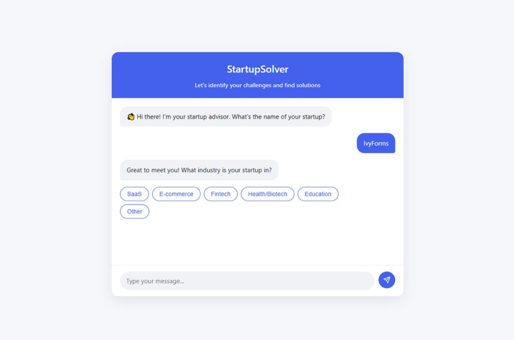
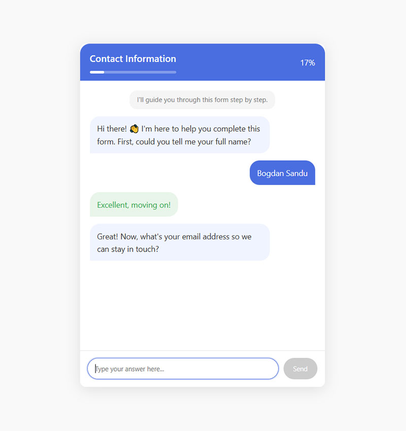
A conversational form is an interactive user interface that mimics human conversation to collect information, typically used in chatbots or forms.
Instead of filling out traditional fields, users answer questions one at a time, creating a more natural, engaging, and user-friendly experience for gathering data or completing tasks.
Why Traditional Forms Fail Users
Standard web forms assault visitors with 10, 20, sometimes 30 fields at once.
The cognitive load is massive. Research from WPForms shows 81% of people abandon forms after starting to fill them out. Users see the full scope of effort required before they’ve committed to anything, triggering immediate form abandonment.
Top abandonment reasons:
- Security concerns: 29%
- Form length: 27%
- Ads or upselling: 11%
- Unnecessary questions: 10%
Mobile forms amplify the problem. Scrolling through endless fields on a 6-inch screen while trying to tap tiny radio buttons? Frustrating doesn’t begin to cover it.
Zuko Analytics data shows desktop forms convert at 47% while mobile drops to 42%. Only 3% of users prefer filling forms on mobile devices. The gap exists because mobile creates friction.
Traditional layouts also ignore context. Every user sees identical fields regardless of their situation, forcing irrelevant questions on people who don’t need them.
Industry abandonment rates by sector:
- Automotive: 82%
- Travel: 81%
- Nonprofits: 77.9%
- Finance: 75.7%
- Retail: 75.8%
The completion rate suffers predictably. Over 67% of visitors abandon forms forever if they encounter any complications.
Core Components of Conversational Forms
Question Flow Architecture
One screen, one question. The interface advances only after the user responds, maintaining focus and reducing distractions.
Conditional logic powers the branching. Answer “yes” to owning a business, get asked about revenue. Answer “no,” skip straight to employment questions.
This sequential approach reduces cognitive load. Research shows forms asking one question at a time see dramatically higher engagement.
Response Types and Input Methods
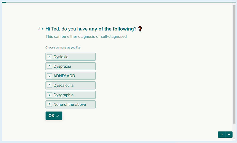
Multiple choice buttons for quick selections. Text fields for open-ended answers. Date pickers that don’t require manual typing.
File upload capabilities when documents matter. Each input method mirrors how humans naturally share information in conversation.
Input optimization stats:
- Radio buttons: 2.5 seconds faster than dropdowns (CXL)
- Single-column layouts: 15.4 seconds faster completion (FormStory)
- Autofill features: 10%+ conversion increase (Zuko Analytics)
Progress Indicators
Visual bars or percentages show completion status, answering the unspoken question: “How much longer?”
Reduces anxiety. Users tolerate longer forms when they know they’re 60% done versus wondering if 15 more screens await.
Progress indicators boost completion by 43% according to conversion research.
How Conversational Forms Work
The mechanism is straightforward but powerful.
Display question one. Capture response. Validate input immediately, not after submission. Show next relevant question based on previous answer.
Backend logic maps the decision tree. If user selects “residential customer,” the system triggers homeowner-specific questions while hiding commercial inquiries entirely.
Real-time form validation catches errors instantly. Invalid email format? User knows before moving forward, not after clicking submit and losing their place.
CXL research proves inline validation reduces form errors by 22% and decreases completion time by 42%.
Data gets collected progressively, stored as users advance. Even abandoned sessions preserve partial information for follow-up. 19% of users return to complete forms when companies email a resume link.
Conversational Forms vs Standard Forms
| Attribute | Conversational Forms | Standard Forms |
|---|---|---|
| User Interaction Pattern | Displays one question at a time in a dialogue-style sequence that mimics natural human conversation flow | Presents all form fields simultaneously on a single page or multi-step layout with visible field groups |
| Completion Rate Impact | Achieves higher completion rates by reducing cognitive load through progressive disclosure of form elements | Shows lower completion rates when forms contain numerous fields due to perceived complexity and visual overwhelm |
| User Experience Quality | Creates engaging, personalized experience with conditional logic that adapts questions based on previous responses | Provides efficient, predictable experience optimal for users familiar with traditional web form conventions |
| Implementation Complexity | Requires advanced development effort with sophisticated logic engines, animation libraries, and state management systems | Enables straightforward implementation using basic HTML form elements with minimal JavaScript requirements |
| Optimal Use Cases | Best suited for lead generation campaigns, customer surveys, onboarding workflows, and complex qualification processes | Ideal for checkout processes, account registration, contact forms, and scenarios requiring quick data entry |
| Mobile Device Performance | Delivers superior mobile experience with single-field focus that eliminates scrolling and reduces input errors | Presents usability challenges on mobile devices requiring excessive scrolling and viewport adjustments |
Side-by-side, the differences are stark.
Traditional forms show everything upfront. Conversational forms reveal questions sequentially, controlling information flow and attention.
Standard layouts rely on visual scanning. Users jump between fields, miss required markers, submit incomplete data. The conversational approach eliminates confusion by presenting one clear action at each step.
Completion rates tell the story:
Traditional single-step forms: 68% completion for simple forms, drops to 23% with 10+ fields
Conversational/multi-step formats: 86% completion for equivalent information requests
HubSpot data confirms multi-step forms achieve 86% higher conversion rates compared to single-step alternatives.
Breaking forms into 3-4 steps increases conversions by up to 300% compared to single-page versions.
Form UX design principles suggest lower cognitive load equals higher conversion. The one-question-at-a-time model proves it.
Performance by field count:
- 3 fields: 25% conversion
- 6+ fields: 15% conversion
- Forms with 10+ fields: Performance crashes
Average form abandonment time is just 1 minute 43 seconds. Conversational formats keep users engaged longer by reducing perceived complexity.
The data is clear: conversational forms work because they align with human psychology. Small commitments create momentum. Sequential questioning feels natural. Real-time feedback prevents frustration.
Benefits for Different Use Cases
Lead Generation Forms
Lead capture forms built conversationally qualify prospects through progressive questions. Each answer refines targeting, routing hot leads immediately while nurturing cold ones differently.
The average landing page conversion rate across industries is 9.7%, but conversational formats push this higher. Professional services achieve 9.3% conversion rates, while B2B technology averages 1.7%.
Engagement metrics spike because the format feels less transactional, more consultative. Interactive lead magnets like calculators and quizzes show 70% conversion increases over static content.
Speed matters: Responding within 5 minutes increases conversion rates by 9X. Conversational forms feed leads instantly to CRM systems.
Customer Onboarding
New user setup demands multiple data points. Conversational flow makes the process feel guided rather than bureaucratic, improving data accuracy through focused attention per field.
Users complete profiles they’d normally abandon halfway. SurveySparrow data shows conversational forms achieve 40% higher completion rates compared to traditional formats.
Progressive profiling builds user trust by requesting information gradually rather than overwhelming new customers upfront.
Surveys and Feedback Collection
Feedback forms gain response quality when presented conversationally. Single-question screens encourage thoughtful answers instead of rushed checkbox clicking.
Survey completion benchmarks:
- 1-3 questions: 83% completion
- 4-8 questions: 65% completion
- 9-14 questions: 56% completion
- 15+ questions: 42% completion
Conversational formats maintain engagement even with longer surveys. Completion rates climb 30-50% compared to traditional survey layouts.
Average survey response rates sit at 33%, but conversational approaches exceed 50% regularly.
Application Forms
Complex applications (job postings, loan requests, registrations) become manageable through conversational design. Breaking 40 fields across 40 screens transforms overwhelming into achievable.
Job application statistics:
- Average completion rate: 10.6% for under 25 questions
- Drops to 5.7% for 50+ questions
- 365% decrease in completion when applications take over 15 minutes
- Mobile completion: just 1.5% (desktop: 8%)
Error rates drop because validation happens per question, not after submission. Application forms using multi-step conversational design see 40-60% completion rates, significantly higher than industry averages.
Design Principles That Matter
Conversation Tone and Copy
Write questions like a human would ask them. “What’s your email?” beats “Please enter your email address in the field below.”
Skip formality when it creates distance. Conversational copywriting builds rapport through personality, not corporate speak.
Personalized survey invites increase response rates by 7.8% and reduce drop-off by 2.6%.
Visual Hierarchy
Everything except the current question fades to background. Focus stays singular, removing competing elements that fracture attention.
Buttons need thumb-friendly sizing. Input fields demand prominence. Distractions get eliminated entirely.
Clear visual hierarchy with proper labels above fields increases completion rates.
Mobile-First Considerations
Conversational formats shine on small screens because they’re already optimized for limited viewport space.
Single-column layouts work perfectly. Research shows single-column forms complete 15.4 seconds faster than multi-column formats.
Thumb zones align naturally with action buttons. Keyboard optimization happens automatically when one field appears at a time.
Mobile accounts for 60.66% of traffic, but desktop still converts better. Optimize for both.
Technical Implementation Approaches
JavaScript Libraries and Frameworks
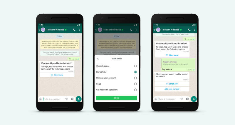
Typeform pioneered the space but multiple alternatives exist. Open-source libraries like Conversational Form (GitHub) provide React and Vue.js components for custom builds.
WordPress form plugins now include conversational templates, eliminating need for custom development on simpler projects.
Multi-step forms using WordPress can increase conversions by up to 300% according to Growth List data.
Backend Integration
APIs connect conversational forms to existing systems. CRM platforms like HubSpot and Salesforce accept webhook data from form submissions.
Real-time sync ensures leads hit sales teams immediately, not hours later after manual export.
Marketing automation impact: Companies using automation see 77% higher lead conversion than those without it.
Analytics and Tracking
Track drop-off by question, not just overall abandonment. Identify exactly where users bail, then optimize that specific screen.
Completion funnels reveal problem areas. Question 7 losing 40% of users? Rewrite it, make it optional, or eliminate it entirely.
Monitor these metrics:
- Field-level abandonment rates
- Average completion time
- Device-specific performance
- Question-by-question engagement
Common Mistakes to Avoid
Asking 50 questions just because the format allows it. Conversational design improves tolerance but doesn’t eliminate friction entirely.
Research shows 17% drop in response rate when surveys exceed 12 questions or take longer than 5 minutes.
Poor branching logic that asks married users if they’re single three questions later destroys trust instantly.
Mobile forms without progress indicators leave users guessing duration. Zero context about remaining questions kills completion.
Progress indicators boost completion by 43%. Always show users where they stand.
Missing accessibility features alienates users who need screen readers or keyboard navigation. 40% of e-commerce checkouts don’t use inline validation properly (Baymard Institute).
Other critical errors:
- Requiring phone numbers (reduces conversions by 5%)
- Using dropdown menus excessively
- No autofill or autocomplete options
- Ignoring real-time validation
- Making all fields mandatory
- Poor mobile optimization
- Slow loading times
Test your forms regularly. A 14% response rate improvement comes from sending one reminder 3-7 days after initial invite.
When Conversational Forms Don’t Work
B2B procurement forms requiring reference documents don’t suit single-question flows. Users need to see all fields to gather materials before starting.
Power users who fill identical forms repeatedly prefer speed over guidance. Accountants submitting weekly expense reports want everything visible for rapid completion.
Situations demanding field comparison (pricing tiers, product specifications) need simultaneous visibility. Sequential revelation hinders rather than helps decision-making.
Form accessibility becomes complex with heavy JavaScript. Some assistive technologies struggle with dynamic content updates.
When to avoid conversational formats:
- Forms under 5 fields (overhead not worth it)
- Repeat submissions by same users
- Price comparison scenarios
- Document reference requirements
- Complex calculations needing field visibility
- Screen reader compatibility issues
Traditional forms still win for speed-focused power users and comparison-heavy tasks.
Optimizing Form Performance
A/B Testing Strategies
Test question order ruthlessly. Moving email request from position 2 to position 8 can double completion rates by building commitment first.
Button copy matters. “Continue” versus “Next” versus “Let’s go” produces measurably different click-through rates.
What to test:
- Question sequence
- Button text and color
- Field labels and help text
- Progress indicator style
- Error message wording
- Number of steps
Testing best practices:
Research from Econsultancy shows 74% of CRO programs boost sales. Companies with structured testing approaches see conversion improvements twice as likely as those without.
84% of organizations combining A/B testing with personalization increased conversion rates (Econsultancy/RedEye).
Top performers run 60% more A/B tests than average companies. They’re 111% more likely to segment audiences effectively.
Test sample sizes need 1,000+ visitors per variation for statistical significance. Run tests during representative business periods, not just holidays or slow seasons.
Software companies saw conversions jump from 4% to 8% when writing at elementary school reading level across forms.
Reducing Abandonment
Lead with easy questions. Name and basic info build momentum before requesting sensitive data like income or phone numbers.
Question positioning impact:
Asking for phone numbers early reduces conversions by 5%. Address fields drop conversions by 4%. Age questions decrease conversions by 3%.
Start forms with low-friction questions like “What’s your goal?” to engage users psychologically before requesting personal data.
Save progress automatically. Users who abandon mid-form can resume later without restarting, improving form abandonment rate significantly.
Save & resume statistics:
19% of users return to complete forms when companies email resume links (Insiteful).
Form abandonment tracking tools show +12% average conversion lift by capturing partial entries and sending follow-up emails.
Over 74% of potential leads drop off forms before converting. Save progress features recover otherwise lost submissions.
Auto-save after 3-second delays from last input prevents data loss without waiting for page completion.
35% reduction in abandonment possible by improving checkout form design alone (WPForms). This equals $260 billion in recovered orders globally.
Additional abandonment reduction tactics:
- Send reminder emails 3-7 days after initial visit (14% boost)
- Display SSL certificates and trust badges
- Show estimated completion time upfront
- Use autofill and autocomplete
- Implement real-time validation
- Remove unnecessary fields
- Avoid dropdown menus when possible
Accessibility Considerations
Screen reader announcements must trigger on question changes. ARIA labels need implementation on every interactive element.
Keyboard navigation should allow tabbing through options without mouse dependency. High contrast modes help visually impaired users distinguish active fields.
Accessibility requirements:
- ARIA labels on all form elements
- Keyboard-only navigation support
- Focus indicators clearly visible
- Error messages programmatically associated with fields
- Logical tab order maintained
- Alt text for visual elements
- Sufficient color contrast ratios
- Screen reader testing on major platforms
40% of e-commerce checkouts fail to implement inline validation correctly (Baymard Institute), creating accessibility barriers.
Form validation errors should appear adjacent to problem fields, not only at the top of forms. Users with screen readers need contextual error placement.
Accessibility testing checklist:
- Test with NVDA, JAWS, VoiceOver
- Verify keyboard-only completion possible
- Check color contrast meets WCAG AA standards
- Ensure dynamic content updates announced
- Validate focus management on navigation
- Test with browser zoom at 200%
- Verify touch targets minimum 44×44 pixels
Forms requiring heavy JavaScript for conversational features may exclude users with older assistive technologies. Provide graceful degradation or alternative completion methods.
Progressive enhancement ensures basic functionality works without JavaScript, then adds conversational features for capable browsers.
Mobile accessibility:
- Single-column layouts for screen reader flow
- Touch targets sized for fingers, not mouse pointers
- Avoid fixed positioning that blocks content
- Test on actual devices, not just simulators
- Support landscape and portrait orientations
Companies running 5+ tests monthly see better results than those testing sporadically. 70% of top performers use testing in various capacities versus 46% of average companies.
The conversion rate optimization industry continues growing. Organizations investing in CRO tools see 223% average ROI.
Regular testing, abandonment recovery, and accessibility compliance create compound improvements. Forms optimized across all three areas achieve completion rates significantly above industry averages.
Real-World Examples and Results
Insurance and Progressive Disclosure
Insurance quote forms using conversational design see 40% higher completion versus traditional layouts. Progressive disclosure reduces intimidation while qualifying leads.
SaaS Signup Flows
SaaS companies report 25-35% conversion increases switching to one-question-at-a-time format.
HubSpot research shows multi-step forms achieve 86% higher conversion rates compared to single-step alternatives. User engagement improves across session duration and interaction depth.
The Sunk Cost Effect in Action
Venture Harbour switched their consulting form from basic contact to multi-step. Results: conversion jumped from 0.96% to 8.1% (743% increase).
After users invest time in early steps, abandonment drops. They’re committed.
Event Registration Wins
Webinar registration forms built conversationally convert 50% better than standard designs. They feel less transactional, more engaging.
Stacked Marketer research: Typeform’s conversational approach produces 72% higher completion rates. One field at a time keeps users focused.
Healthcare Forms Done Right
Medical history questions presented sequentially with contextual help produce more accurate patient data.
Zuko Analytics: average checkout takes 3 minutes 21 seconds. Breaking complex forms into steps dramatically improves completion.
Financial Services Results
BrokerNotes: Conversion climbed from 11% to 46% with multi-step forms.
Vendio: A/B test showed 214% increase in leads using multi-step versus on-page design.
Real Estate Calculations
Labrosse Real Estate implemented a multi-step investment calculator:
- 25% increase in conversion rates
- Lower form abandonment
- Better data accuracy
- Stronger prospect trust
Performance Benchmarks
Form completion rates:
- Standard forms: 66.7%
- Multi-step forms: 86%
Completion time:
- Average registration: 1 minute 35 seconds
Device performance:
- Desktop: 3% conversion
- Mobile: 1.6% conversion
Field count impact:
- 3 fields: 25% conversion
- 6+ fields: 15% conversion
Industry baseline: Ruler Analytics reports average form rate across industries is just 1.7%. Multi-step and conversational formats consistently beat this.
Progressive profiling bonus: Additional 20% conversion boost when properly implemented.
Breaking complex processes into digestible chunks reduces cognitive load, increases completion rates, and captures better quality data.
FAQ on Conversational Forms
How do conversational forms improve completion rates?
Single-question screens reduce cognitive load and decision paralysis. Users focus on one field at a time instead of scanning dozens simultaneously, building momentum through progressive disclosure that keeps them engaged until submission.
What’s the difference between conversational forms and multi-step forms?
Multi-step forms group related fields into sections. Conversational forms ask one question per screen, creating dialogue-like interaction. Both break content into chunks, but conversational design emphasizes natural flow over logical grouping.
Do conversational forms work on mobile devices?
They’re ideal for mobile. Single-question layouts eliminate scrolling, fit perfectly within small viewports, and align with thumb-friendly touch targets. The format was practically designed for smartphone screens.
Can I add conditional logic to conversational forms?
Absolutely. Question branching adapts the form path based on previous answers, showing relevant questions while hiding irrelevant ones. This personalization improves user experience and data quality simultaneously.
Are conversational forms accessible for all users?
When built properly, yes. Screen reader compatibility requires ARIA labels and keyboard navigation support. Dynamic content updates need proper announcements. Implementation matters more than format.
How long should a conversational form be?
No strict limit exists, but user tolerance drops after 15-20 questions. Test your specific audience. Complex applications tolerate more questions than simple lead generation forms because expectations differ.
What tools can I use to build conversational forms?
Typeform leads the market. Alternatives include JotForm, Paperform, and Tally. WordPress contact form plugins like WPForms and Formidable offer conversational templates. Open-source libraries exist for custom development.
Do conversational forms increase conversion rates?
Studies show 25-40% improvement over traditional layouts for complex forms. Simple contact forms see smaller gains. Results vary by industry, form length, and implementation quality.
When should I avoid conversational forms?
Skip them when users need to reference multiple fields simultaneously, fill forms repeatedly (power users prefer speed), or require document uploads before starting. Traditional layouts work better for comparison-heavy decisions.
How do I track conversational form performance?
Monitor drop-off by question, not just overall abandonment. Track completion time, question-level engagement, and response quality. A/B test question order, copy variations, and button text to optimize forms continuously.
Conclusion
Conversational forms replace overwhelming field walls with guided, one-question-at-a-time interactions that feel natural rather than transactional.
The format excels at complex data collection where traditional layouts trigger abandonment. Sequential question flow reduces cognitive load while conditional logic personalizes the experience based on user responses.
Implementation requires strategic planning. Question order, copy tone, and progress indicators directly impact completion rates and response quality.
Test ruthlessly. Track drop-off points, optimize failing questions, and refine branching logic based on actual user behavior rather than assumptions.
The conversational approach won’t suit every scenario, but for lead capture forms, customer onboarding, and detailed surveys, the conversion improvements justify the effort. Start with your highest-abandonment form and measure the difference.