

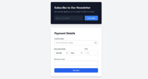
Most form tutorials show you what’s possible. This one shows you what actually works. The State of CSS 2024 survey puts Tailwind CSS at 62% developer usage. More teams are…
Table of contents
Every contact page roundup exists for the same reason: someone is about to rebuild their own page and doesn’t want to start from a blank screen. Design teams and marketers dig through real websites, weighing something like a split screen layout against a plain single column stack, before touching their own site.
Not every example is worth copying. The pages that hold up are the ones built around what actually gets a visitor to reach out, not just what looks good in a screenshot.
A 2019 Nielsen Norman Group usability study watched 20 business professionals try to complete contact tasks across 40 corporate websites. One finding stood out: replacing a visible phone number with a form, and only a form, damaged how much visitors trusted the business.
What Is a Contact Us Page
Strip away the form, the map, the hours, and one job is left: getting a visitor in front of a real person at the business. That’s the entire purpose of a contact us page. Everything on it exists to support that single job, nothing more.
People mix it up with a couple of other page types often enough that it’s worth drawing the line.
- A footer contact block shows a partial address or email with no page of its own
- A service inquiry form asks about one product or offer and feeds straight into a sales sequence
The service inquiry form is really just one entry in a much longer list of types of forms a site might run. It’s built for a narrower job than a full contact page.
Most sites link to the page from the header nav, the footer, or both. Some pin that link in a sticky header too, so it stays visible no matter how far someone scrolls. That placement alone tells a visitor the business actually wants to be found.
What Elements Do the Best Contact Us Pages Include
The strongest pages combine a short form, a direct phone or email option, a map or address, stated hours, and a clear button telling the visitor what happens next. Miss one of those pieces and visitors bounce off looking for it somewhere else.
Core Elements Every Page Needs
A handful of elements aren’t optional, no matter which layout wins out.
- A form, kept short enough that it does not feel like a job application
- A direct phone number or email address for anyone who skips forms on principle
- An address or embedded map, if there is a physical location involved
- Business hours, especially for anything with a phone line or live chat attached
- Social media icons, usually in the footer rather than competing with the form for attention
If the site runs on WordPress, that form block is almost always generated by a dedicated plugin rather than typed by hand. It’s worth knowing what WordPress forms actually are before picking one.
Most forms also run basic spam protection quietly in the background, usually a captcha or Google’s reCAPTCHA, so the inbox doesn’t fill up with junk submissions.
Nielsen Norman Group’s research on this exact page type doesn’t hedge much. Visitors still expect to see a real address, phone number, and email, and swapping all of that out for a chat widget or a bare form tends to backfire.
CTA Wording and Placement
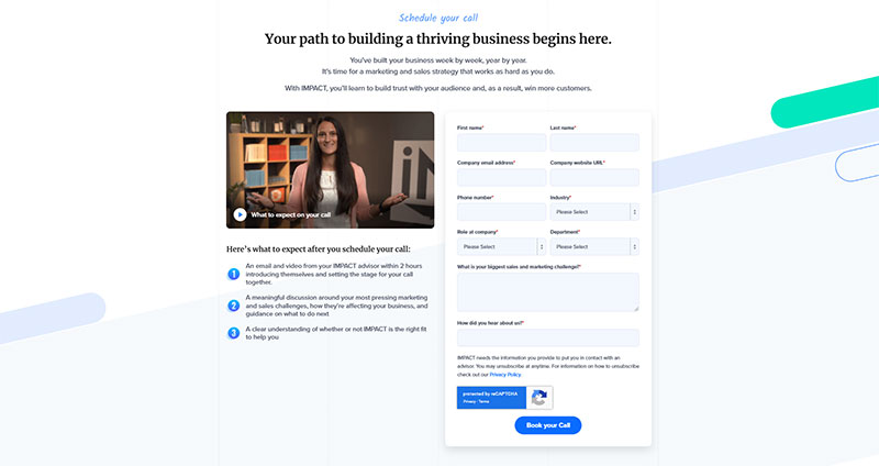
Image source: impactplus.com
Button copy matters more than most teams think.
Take “Submit.” It’s weak copy. It tells a visitor nothing about what happens after they click it. “Send My Message” or “Get a Reply Within 24 Hours” work better, since both set an actual expectation.
Placement isn’t complicated. The button sits directly under the last field, never off to the side where someone has to hunt for it. On longer pages, a second button repeated near the top, next to the phone number, catches visitors who never planned to scroll down and fill anything out.
Basic form UX design practice treats the button as part of the form’s visual flow, not a decoration bolted on afterward.
Contact Us Page Examples by Layout
Split screen, single column, grid, and sidebar cover almost every contact page layout you’ll run into. Each one trades off differently between how much information it can show and how simple it feels to a first time visitor.
| Layout | Structure | Best For |
|---|---|---|
| Split screen | Form on one side, map or info on the other | Businesses with a physical location |
| Single column | Everything stacked top to bottom | Mobile heavy traffic, simple sites |
| Grid | Contact methods shown as separate cards | Sites offering several distinct ways to reach them |
| Sidebar | Form paired with a sticky map or info panel | Local businesses, clinics, studios |
Split Screen Layout
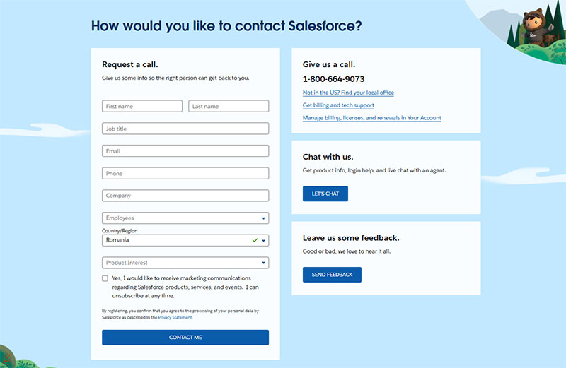
Image source: salesforce.com
The form usually takes up half the screen. Whatever sits opposite it, a map, an address, maybe a photo of the team, fills the rest.
The form side usually keeps fields stacked in a single vertical column rather than side by side pairs, which lines up with standard form layout best practices. A two column field grid slows scanning on the way down.
This setup earns its keep when the business has a real address worth showing, or when there’s a photo or map that adds actual context instead of just decoration.
It falls apart without a real visual to fill that second half. All that’s left is empty white space. And squeezed onto mobile, the split has to collapse into a stack anyway, so nothing was really gained.
Single Column Layout
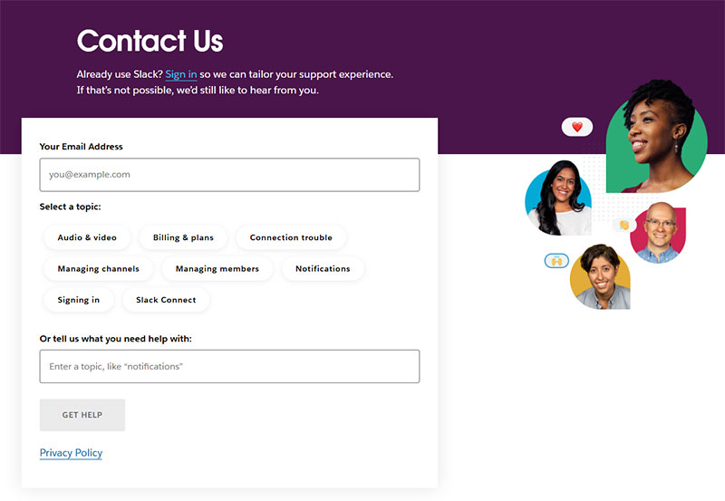
Image source: slack.com
Everything runs top to bottom in one stack: intro line, form, then contact details at the bottom. It’s the layout that survives a phone screen without any redesign, since there’s nothing to rearrange in the first place.
Agencies and small service businesses lean on this one when they don’t have a location worth showing off.
Mobile is where it wins outright. There’s nothing to break, because it was never anything but a stack. The tradeoff shows up when the form runs long: contact details end up pushed far down the page, and anyone hunting for a quick phone number has to scroll past the entire form first.
Grid Layout
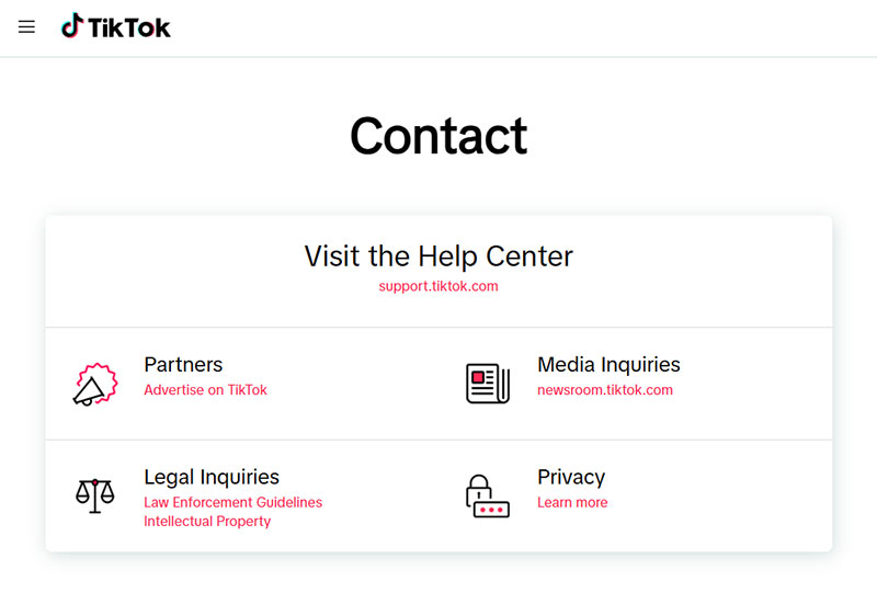
Image source: tiktok.com
Contact methods appear as separate cards: one for email, one for phone, one for chat, sometimes one for social. Zendesk leans on this style for its own support entry point, splitting chat, email, and community help into separate cards instead of one long page.
It works well for businesses running several channels that each serve a different kind of question, especially support heavy sites where routing matters more than a single form. It falls flat with only one real contact method though. Empty cards just look unfinished.
The card format also gives room to add a short line under each option, like average reply in 2 hours, without cluttering a single shared form.
Sidebar Layout
The form sits in the main column while a sidebar panel holds the map, address, and hours, usually pinned so it stays visible while the form scrolls.
A handful of sidebar builds trim the form itself down to one horizontal row of fields, close to the compact horizontal form patterns you’d see on a newsletter bar.
| Strength | Weakness |
|---|---|
| Map stays visible during the whole interaction | Sticky elements can misbehave on smaller laptop screens |
| Feels natural for single location businesses | Does not scale well to five or six locations |
Contact Us Page Examples by Industry
The right layout and channel mix depends heavily on what kind of business is running the page. A SaaS company and a nonprofit are solving completely different problems with the same page type.
| Industry | Typical Emphasis | Common Layout |
|---|---|---|
| SaaS | Live chat, short form, demo request | Grid or split screen |
| Ecommerce | Order lookup, multiple channels | Grid |
| Agency | Personality, portfolio links, short form | Single column |
| Local business | Map, hours, phone number | Sidebar or split screen |
| Nonprofit | Mission framing, mission adjacent contact | Single column |
Saas Contact Pages
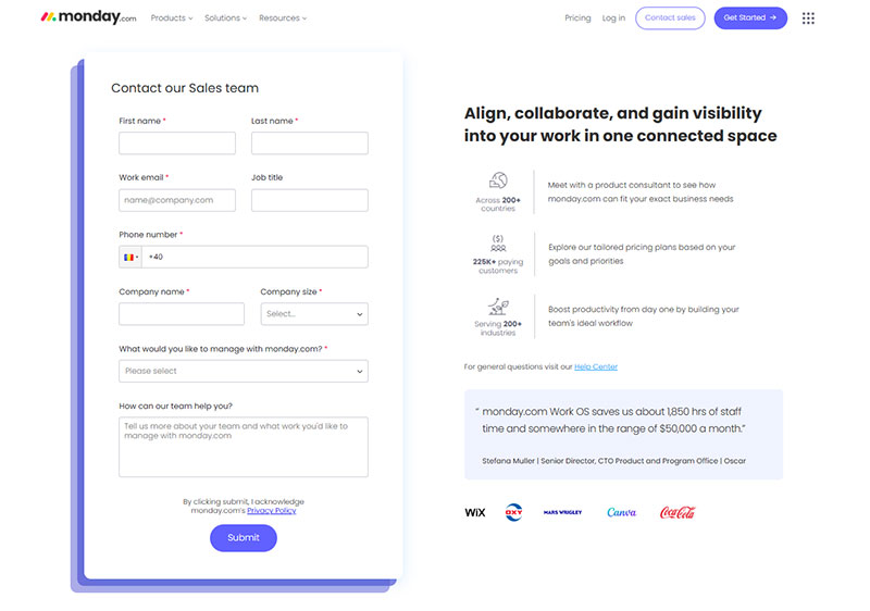
Image source: monday.com
SaaS pages lean toward chat first, form second, because most visitors have a quick question, not a long story to tell.
The pattern repeats everywhere: a chat bubble parked in the corner, a short form underneath it, and a phone number that almost never shows up at all. Intercom and Drift both built entire businesses around selling that exact pattern back to other SaaS companies.
The page usually feeds straight into a demo request or trial signup, tying it into lead generation for SaaS rather than pure support.
Ecommerce Contact Pages
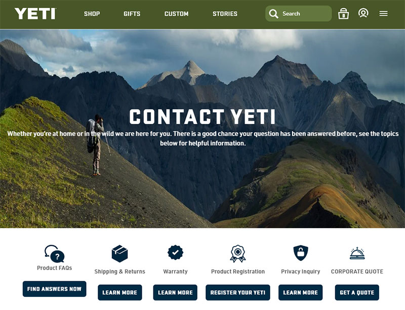
Image source: yeti.com
Order status is basically the whole game for ecommerce contact pages.
Order lookup, or at least a link to order status, usually sits front and center. Returns and shipping policy links sit right next to the form. Multiple channels matter more here than in most industries, since a shipping delay and a sizing question call for pretty different urgency.
Many direct to consumer brands route return and sizing questions through a channel picker instead of one generic form, which cuts down on misrouted tickets. Post purchase contact points also double as a quiet source of upsell and review requests, not just complaint handling.
Agency Contact Pages
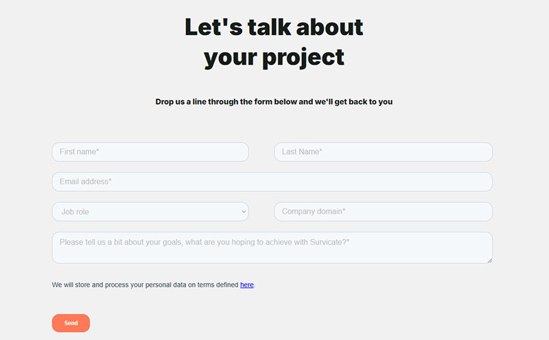
Image source: survicate.com
Agencies use the contact page to show personality as much as prove availability.
Portfolio links show up. So do team photos. The tone leans toward a loose “let’s talk” instead of anything that feels transactional like a SaaS or ecommerce form.
Field counts stay low too, usually three to four, just enough to route the inquiry to the right team lead without turning it into an application.
A single column layout dominates here, since most agency sites are narrative first and want visitors reading copy before they reach the fields.
Local Business Contact Pages
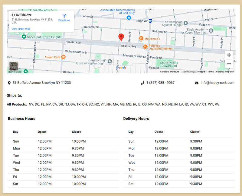
Image source: happy-cork.com
Phone and map come before anything else, because most visitors are checking whether the business is open right now, not composing a message.
A few things show up almost every time: a click to call phone number, especially on mobile, an embedded Google Maps pin with directions, and business hours, including holiday exceptions where relevant.
BrightLocal’s research on local business websites found that the preferred contact method stays telephone across every age group surveyed, which is why the phone number usually sits above the form, not below it.
Many of these pages also mark up their address and hours with local business schema, so the details show up correctly when someone searches for the business by name. This ties directly into lead generation for local businesses, where a missed call often means a lost customer who just calls the next listing instead.
Nonprofit Contact Pages
Nonprofits use the page to build trust before asking for anything, so the tone reads more like an introduction than a support form.
A mission framing line, something about who the organization serves, usually sits above the form, before asking a visitor to type anything.
| Inquiry Type | Usually Routed To |
|---|---|
| Volunteer sign up | Separate short form |
| Press inquiries | Direct email, rarely a form |
| Donation adjacent questions | Kept apart from the payment flow itself |
Splitting inquiry types like this usually beats one long form trying to serve every visitor at once. A single column layout keeps the page feeling personal rather than transactional, which matters more here than almost anywhere else on this list.
Contact Form Design: How Many Fields Should You Include
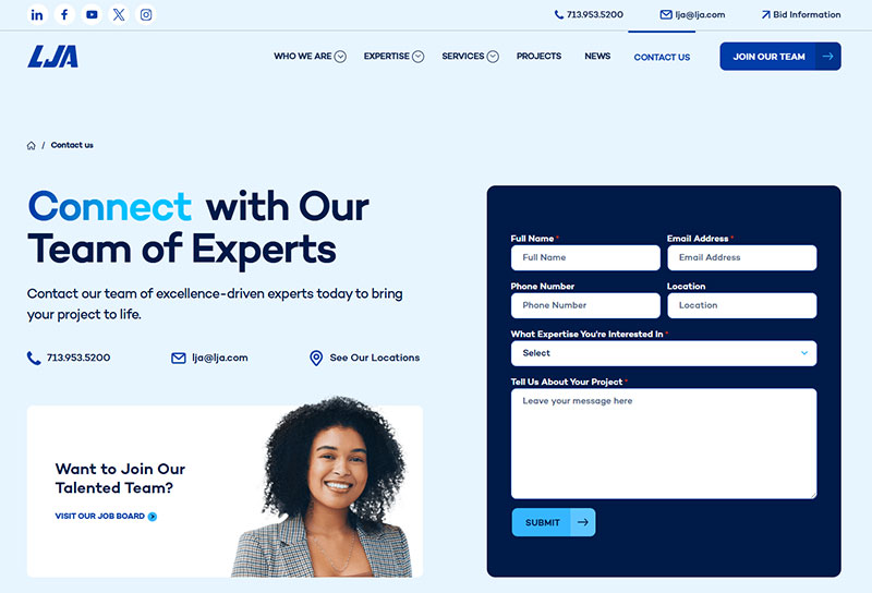
Image source: lja.com
Three to five fields convert best for a general contact form, and every field added past that point costs submissions. The exact number still depends on what happens after someone hits submit.
The numbers back this up pretty clearly.
- Forms with 3 fields converted highest, just over 25%, in a HubSpot analysis of more than 40,000 customer landing pages
- 5 field forms followed at just above 21% in the same dataset
- Conversion dropped sharply moving from 3 fields to 4, before partially recovering at 5
- Multi line text fields and dropdown menus hurt conversion more than adding another single line text field does
Short forms, three to four fields, work for low commitment inquiries where the goal is just opening a conversation. Detailed forms, seven to ten fields, fit qualification heavy b2b intake, where the sales team needs enough detail before the first call to avoid wasting it.
Field type matters as much as field count. A phone number field with strict validation can reject a real number formatted differently than expected, and that kills a submission that plain text would have let straight through.
Auditing which fields are actually required versus just requested is usually the fastest way to start improving form abandonment rate on an existing page.
For the detailed end of that range, picking the best form fields for capturing high quality leads matters more than hitting a specific number. Two well chosen fields beat four generic ones for actually qualifying someone.
Which Contact Channels Should Your Page Include
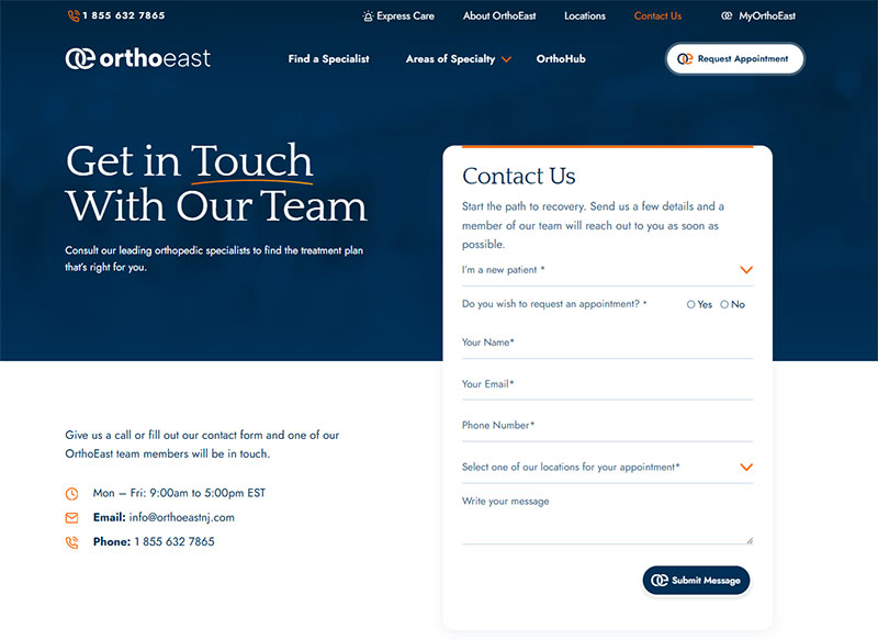
Image source: orthoeastnj.com
Phone, live chat, email, and social all serve different visitors, so most pages need at least two channels, not just one. Picking channels comes down to urgency and what your customers already expect from you.
Urgency drives most of the decision.
- Phone, for anything urgent or b2c support related
- Live chat, for saas onboarding and pre sale questions
- Email, for anything formal, detailed, or b2b
- Social, for consumer brands whose audience already lives on that platform
Live chat carries the highest speed expectation of any channel on this list, and it’s unforgiving if you can’t staff it. Tidio’s benchmark data puts the average live chat first response at 1 minute 35 seconds across industries, with most teams targeting under a minute for anything customer facing.
That’s part of why the chatbots vs forms debate keeps coming back around. A bot can hit that speed target around the clock, a static form can’t respond at all.
Some pages split the difference with a conversational form, one question at a time instead of a full field list, which feels closer to chatting than filling out paperwork.
Whatever the mix, keep at least one channel that reaches an actual person without waiting on a bot or a queue. A chat widget with nobody behind it is worse than no chat widget at all.
How Trust Signals Change Contact Page Performance
Trust signals decide whether a hesitant visitor actually submits the form instead of closing the tab to compare you against a competitor. Testimonials, a stated response time, real staff photos, and clear consent language do most of the work.
Get contact details wrong and none of the rest matters.
BrightLocal’s research on business listings found that 66% of consumers lose trust in a business over a wrong or inconsistent phone number, and 60% say the same about an incorrect address. A contact page with a broken map pin or an outdated number does more damage than a page with no testimonials at all.
Response time promises work the same way testimonials do. They lower the perceived risk of reaching out. HubSpot Research found that nearly 60% of customers define an immediate reply as ten minutes or less, whichever channel they used to reach out.
Stating a number, even a modest one like “we reply within one business day,” beats saying nothing and letting visitors assume the worst.
Consent language matters for a different reason. It’s a legal requirement in plenty of jurisdictions, not just a trust nicety. Any form collecting personal data for marketing follow up needs a checkbox that’s actually opt in, and GDPR compliant forms spell out exactly what that checkbox needs to say. That checkbox usually sits right next to a privacy policy link, not buried in a separate settings page.
Pairing that with a clear confirmation message right after submission, not just a promised email, matters more for trust than most teams assume. A visitor who gets no confirmation often assumes the message never went through at all.
Staff photos and short testimonials near the form add a final layer, mostly because a name and a face read as more accountable than a generic “our team” line. Trust badges and security seals show up less often on a contact page specifically, since they matter more at checkout, but a testimonial or two does similar work here.
Contact Page Layout on Mobile
Every layout from the last section collapses into a single stack on a phone screen, no matter how it looks on desktop. What changes is the order things stack in, not just the width.
The stacking order on mobile follows a pretty predictable pattern.
- Phone number or click to call button, moved to the very top
- Short form, trimmed further if it was already long on desktop
- Map, often collapsed into a single tap to open rather than shown inline
- Hours and address, pushed to the bottom of the stack
Tap targets need real room to work with a thumb instead of a mouse pointer. WCAG 2.2’s target size rule sets the floor at 24 by 24 CSS pixels for any button or link someone taps, with extra spacing required if a control comes in smaller than that.
| Desktop Element | Mobile Behavior |
|---|---|
| Typed phone number field | Replaced by a click to call button |
| Inline embedded map | Collapses to a single tap to open |
| Multi column field layout | Forced into one column regardless of the desktop grid |
Following general mobile form best practices covers most of this without needing a separate mobile design.
Google’s Core Web Vitals scores take a real hit from heavy map embeds and chat scripts loading on the same page. That’s part of why a lot of mobile builds delay loading either one until someone scrolls near them.
Which Tools Power the Best Contact Us Pages
Most contact pages run on one of a handful of tools, and the right pick depends on the platform underneath the site. WordPress sites lean on a WordPress contact form plugin, while everything else usually leans on whatever the site builder already includes.
| Tool | Best For | Key Feature | Pricing |
|---|---|---|---|
| Contact Form 7 | Simple WordPress sites needing a basic form | Lightweight, developer flexible, no bundled upsells | Free |
| WPForms | WordPress sites wanting a drag and drop builder | Templates and conditional logic on paid tiers | Free lite version, paid tiers for more fields |
| Webflow | Fully custom coded builds outside WordPress | Native form element tied to visual design | Bundled with hosting plan |
| Typeform | A conversational, one question at a time format | Question by question flow instead of a full field list | Free tier, paid tiers for more responses |
On WordPress specifically, Contact Form 7 lists more than 10 million active installations on the official WordPress.org plugin directory, ahead of WPForms Lite’s more than 5 million. That gap mostly comes down to age and simplicity rather than capability, since Contact Form 7 shipped years earlier and asks for almost no setup beyond dropping a shortcode onto a page.
Contact Form 7’s native spam layer covers Akismet filtering and CAPTCHA out of the box. Pairing that with reCAPTCHA on a WordPress contact form closes most of the remaining gaps a determined spammer would try next.
Squarespace and Shopify skip the plugin question entirely, since both platforms build a contact block straight into their native page editor. The tradeoff is flexibility. A native block styles faster but customizes less than a dedicated plugin.
When a Contact Us Page Does Not Need a Form
A form isn’t mandatory, and forcing one onto every page ignores how some businesses actually get contacted. A few situations come up often enough to call out directly.
Solo consultants and freelancers often do better with a direct email address or a booking link, something like what Calendly offers, instead of a form. Visitors reaching out here are usually ready to talk, not fill out a qualification questionnaire.
Urgent support is another case. A form adds delay that a phone line or live chat doesn’t have, so anything time sensitive should skip the form entirely and go straight to a channel someone’s actually staffing right now.
Local search results barely need a form at all. A map pin and a phone number answer the question faster than a form ever could, since most visitors just want to know if the business is open, not to leave a written message.
Enterprise b2b flows sometimes go the opposite direction, gating the general contact form behind a separate qualification page entirely and routing serious buyers to a sales form while everyone else gets a support address.
None of this means skip contact information altogether. It means the form specifically, as one channel among several, doesn’t automatically belong on every version of this page.
How to Design a Contact Us Page Step by Step
Building the page in order avoids the most common rework: picking a layout before deciding what the page actually needs to do. The process breaks down into a straightforward sequence.
- Define the goal. Decide whether the page exists mainly for sales inquiries, support requests, or general questions, since that answer drives everything after it.
- Choose the channel mix. Pick phone, chat, email, or a combination based on urgency and what the audience already expects.
- Pick a layout. Match split screen, single column, grid, or sidebar to however many channels made the cut in step two.
- Build and test the form. Keep the field count tight, then add trust elements like a stated response time or a short testimonial.
- Check mobile and publish. Confirm the stacking order and tap targets work on a real phone, then publish and start tracking submissions.
Basic spam protection belongs in step four too, whether that means a quiet honeypot field running in the background or a full captcha.
Skipping step one is the most common shortcut, and it’s the one that causes the most rebuilding later. A page built around chat, then handed to a team that only staffs email, gets rebuilt within a month almost every time.
Most of the ongoing work after launch comes down to form optimization rather than a full rebuild.
Contact Page Accessibility Requirements
Accessibility compliance for a contact page comes down to a consistent set of requirements.
Label pairing matters first.
- Every field needs a real label tied to it in code, not just placeholder text that disappears once someone starts typing
- Placeholder text alone fails for screen reader users, since some assistive tools never announce it at all
WebAIM’s 2026 Million report found that 33.1% of form inputs across the top one million home pages still lack a proper label, whether through a label tag, an aria-label, or a title attribute. Following general form accessibility best practices from the start avoids most of this rework later.
Color contrast is a separate requirement, covered under its own rule entirely. WCAG 1.4.3 sets the minimum contrast ratio at 4.5 to 1 for normal text and 3 to 1 for large text, and that covers field labels, button copy, and error text alike.
Keyboard navigation matters just as much as visual design. Every field, checkbox, and the submit button itself need to be reachable by tab key alone, in a logical order, with no mouse required.
Screen readers need error and success messages announced automatically, not just displayed as a color change or a small icon that a sighted user would notice but a screen reader user would miss entirely. Looking at real form error message examples that pair a visual cue with a programmatic one helps avoid that exact miss.
The European Accessibility Act, in force across the EU since June 2025, made several of these requirements a legal baseline rather than just a best practice.
Common Contact Us Page Mistakes That Hurt Conversions
Most contact page problems trace back to the same handful of mistakes, not exotic design failures.
- Too many required fields on the first form a visitor sees, before any trust has been built
- No confirmation message after submission, leaving a visitor to wonder if it actually sent
- A broken map embed or a widget script that stalls the page load
- The page buried three or four clicks deep in site navigation instead of one click from the header
- A layout that was never actually tested on a real phone before launch
No confirmation message costs more than it seems. A visitor who assumes the form failed often just submits it again, or switches channels and emails the same message separately. That creates duplicate entries for a single inquiry, which is a support workload problem as much as a visitor experience one.
Navigation depth causes a quieter version of the same issue. If reaching the page takes real hunting, some visitors give up and search for the business on a review site or a directory instead, where the contact information may already be outdated.
None of these mistakes require a full redesign to fix. Most come down to auditing one existing page against this list, and a pass through general guidance on how to increase form conversions covers the rest.
FAQ on Contact Us Pages
Should a Business Use a Contact Form, a Direct Email Link, or Both
Most pages need both. A short form captures inquiries around the clock, while a direct email or phone number reassures visitors who distrust forms. Solo consultants and simple service sites often skip the form and keep only an email link.
Does a Contact Page Affect SEO or Local Search Visibility
Yes, indirectly. A page with a matching address, phone number, and local business schema helps search engines confirm where a business operates, supporting local pack rankings. An inconsistent address does more damage to those rankings than a plain page design ever would.
How Long Should a Contact Page Be
Short. A contact us page needs about one screen of real content: a headline, contact methods, and a short form, without long paragraphs of marketing copy. That kind of copy belongs on the homepage or an about page, not here.
What Should You Fix First in Contact Us Page Examples?
Contact us page examples reveal the fix order fastest when a business starts with accurate contact details, then trust signals, then layout. A correct phone number and address matter more to a hesitant visitor than any visual redesign.
BrightLocal’s consumer survey and Nielsen Norman Group’s lab study reached the same conclusion through different methods: a wrong phone number costs more trust than a plain layout ever will. That convergence, not either figure alone, is why accuracy outranks design here.
Fixing accuracy first means layout work waits, so the page looks unfinished a little longer while the fundamentals get sorted.
The next logical step from a set of examples is a working starting point, and a set of contact us page templates covers that structure without starting from a blank page.