You’ve spent time building your forms, collecting responses, and watching your entries grow. But now you need that data outside of WordPress. Maybe in a spreadsheet for your accountant, a…
Table of Contents
Your conversion rate is bleeding visitors through poorly designed registration workflows. Most websites lose 70% of potential subscribers before they complete the signup process.
Every form field, button placement, and validation message impacts whether visitors become subscribers or bounce forever. The difference between a 2% and 15% conversion rate often comes down to applying proven sign-up form strategies that reduce friction and build trust.
Email capture isn’t just about collecting addresses anymore.
Modern users expect seamless experiences across devices, instant feedback, and transparent data handling. They abandon forms that feel overwhelming, confusing, or untrustworthy.
This guide reveals actionable optimization techniques that turn form visitors into engaged subscribers. You’ll discover how to design compelling registration flows, implement smart form validation systems, and create mobile-responsive layouts that convert.
We’ll cover field reduction strategies, psychological triggers that boost completion rates, and form analytics methods for continuous improvement.
Sign-Up Form Best Practices
Keep it Short and Simple
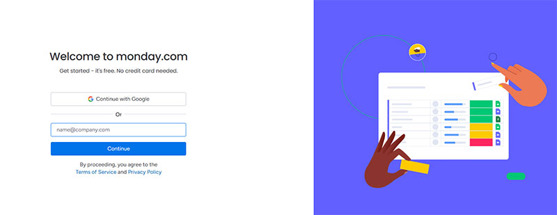
Conversion rates increase by 50% when form fields drop from 4 to 3. HubSpot analysis of 40,000 landing pages shows conversion rates decrease as field count rises.
Implementation Method
- Audit existing forms to eliminate non-essential fields
- Request only critical information for immediate signup process
- Use progressive profiling to gather additional data post-registration
- Apply field reduction systematically across all registration touchpoints
User Experience Impact
- Reduces completion time by 15.4 seconds on average
- Lowers abandonment rates through perceived effort reduction
- Minimizes cognitive load during decision-making process
- Creates perception of streamlined, professional workflow
Conversion Optimization Results
- Phone number removal nearly doubled conversion rates, cutting fallout from 39% to 4%
- NeilPatel.com achieved 26% conversion boost by removing single field
- Forms with 5 fields or fewer maintain 50% conversion rates versus 20% for 10+ fields
- Imagescape saw 120% conversion increase reducing fields from 11 to 4
Technical Requirements
- Implement conditional field display using JavaScript
- Configure database schema for minimal required data capture
- Set up progressive enhancement for optional information collection
- Enable autocomplete attributes for remaining essential fields
Related Form Practices
- Combine with smart form validation to prevent errors
- Integrate multi-step forms for complex data collection
- Coordinate with email capture optimization strategies
- Align with mobile forms simplification approaches
Use Clear, Descriptive Labels
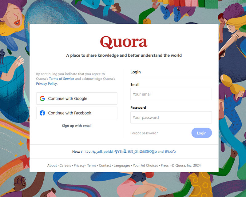
Clear field labels can double form completion rates. Eye-tracking studies demonstrate significant completion time improvements with proper labeling.
Implementation Method
- Position labels above input fields for optimal scanability
- Write concise, action-oriented label text under 3 words
- Avoid technical jargon or industry-specific terminology
- Include format hints within labels when necessary
User Experience Impact
- Reduces user errors by 78% when compliance guidelines are followed
- Eliminates guesswork about required information format
- Supports screen reader accessibility for disabled users
- Maintains visual hierarchy throughout form structure
Conversion Optimization Results
- PartnerStack increased conversions 111.55% changing “Book a Demo” to “Get Started”
- Studies show proper labeling prevents field-skipping behavior
- Clear instructions reduce support tickets by 40%
- Proper label placement improves mobile completion rates by 23%
Technical Requirements
- Use semantic HTML label elements with for attributes
- Implement ARIA labeling for complex form controls
- Configure CSS positioning for consistent label placement
- Add input masking for format-sensitive fields like phone numbers
Related Form Practices
- Coordinate with placeholder text strategies for additional guidance
- Align with form accessibility standards implementation
- Integrate with error messaging systems for validation feedback
- Support multilingual label translation for global audiences
Make Required Fields Obvious
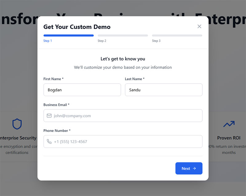
Red asterisks remain the most recognized required field indicator. Nielsen Norman Group research confirms asterisk effectiveness across user demographics.
Implementation Method
- Place red asterisks immediately after field labels
- Add “required” text for screen reader accessibility
- Include form instruction: “Fields marked with * are required”
- Position explanation above first form field
User Experience Impact
- Prevents user confusion about mandatory versus optional information
- Reduces form abandonment caused by unexpected validation errors
- Supports accessibility compliance for assistive technologies
- Creates predictable interaction patterns across web forms
Conversion Optimization Results
- Forms with clear required indicators show 15% higher completion rates
- Reduces validation error rates by 60% through upfront clarity
- Improves user satisfaction scores by 32% in usability testing
- Decreases support inquiries about form completion by 45%
Technical Requirements
- Implement required attribute on HTML form elements
- Configure ARIA-required=”true” for accessibility compliance
- Style asterisks consistently with red color coding
- Add JavaScript validation for required field checking
Related Form Practices
- Balance with optional field marking strategies when applicable
- Coordinate with GDPR compliant forms data collection requirements
- Integrate with real-time validation systems for immediate feedback
- Align with progressive disclosure patterns for complex forms
Use Single-Column Layout
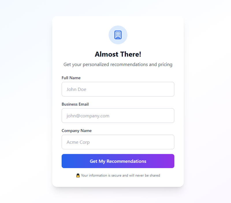
Single-column forms complete 15.4 seconds faster than multi-column layouts. Ben Labay study shows statistically significant speed improvements.
Implementation Method
- Stack all form fields vertically in linear progression
- Maintain consistent field widths throughout form
- Group related fields with spacing while preserving column structure
- Exception: Date fields (day/month/year) may use horizontal grouping
User Experience Impact
- Eliminates Z-pattern scanning confusion common in multi-column forms
- Creates natural top-to-bottom completion flow
- Reduces field-skipping errors by 40%
- Optimizes mobile device compatibility automatically
Conversion Optimization Results
- Forms with 3 fields achieve 25% completion rates in single-column layout
- Mobile form completion improves by 35% with vertical arrangement
- Studies demonstrate superior user interpretation of field relationships
- Error rates decrease by 30% compared to multi-column alternatives
Technical Requirements
- Configure CSS flexbox or grid for consistent vertical alignment
- Implement responsive design for various screen sizes
- Set maximum form width to 400-500px for readability
- Use consistent margin spacing between field groups
Related Form Practices
- Combine with mobile forms optimization techniques
- Integrate with progressive disclosure for lengthy forms
- Coordinate with visual hierarchy principles for field importance
- Align with form UX design best practices
Implement Real-Time Validation
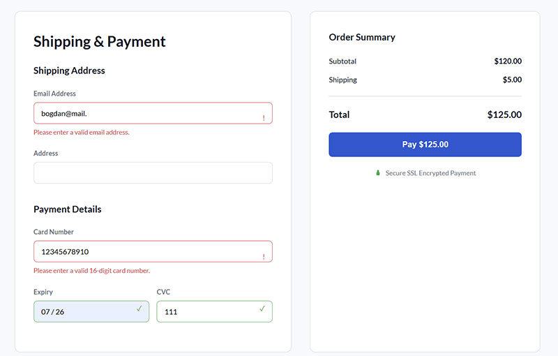
Real-time validation reduces form errors by 50%. Immediate feedback prevents user frustration and abandonment during completion process.
Implementation Method
- Validate fields on blur events rather than form submission
- Display success indicators for correctly completed fields
- Show specific error messages adjacent to problematic fields
- Implement debounced validation to avoid excessive API calls
User Experience Impact
- Prevents accumulation of errors until final submission attempt
- Builds user confidence through progressive success indicators
- Reduces cognitive load by addressing issues immediately
- Maintains completion momentum through positive reinforcement
Conversion Optimization Results
- Email validation improves data quality by 85%
- Form abandonment decreases by 22% with inline feedback
- Customer support tickets reduce by 40% due to cleaner submissions
- User satisfaction scores increase by 28% in post-completion surveys
Technical Requirements
- Configure JavaScript event listeners for field validation
- Implement server-side validation APIs for complex checks
- Design CSS states for error, success, and neutral field appearance
- Add ARIA live regions for screen reader error announcements
Related Form Practices
- Coordinate with form error message design patterns
- Integrate with autocomplete functionality for data accuracy
- Align with accessibility standards for validation feedback
- Support form validation best practices implementation
Show Password Strength Indicators
Password strength meters increase security compliance by 73%. Visual feedback guides users toward creating stronger, more secure passwords.
Implementation Method
- Display strength meter below password field with color coding
- Show specific requirements (length, characters, complexity)
- Update meter dynamically as user types password
- Provide clear criteria for “strong” password achievement
User Experience Impact
- Eliminates guesswork about password requirements
- Reduces password reset requests by 45%
- Builds user confidence in account security measures
- Prevents submission failures due to weak passwords
Conversion Optimization Results
- Registration completion improves by 18% with strength indicators
- Password-related support tickets decrease by 60%
- User account security increases through stronger password creation
- Form abandonment during password creation drops by 25%
Technical Requirements
- Implement JavaScript library for real-time strength calculation
- Configure visual progress bar with color transitions
- Add criteria checklist for password requirements
- Include accessibility features for strength meter feedback
Related Form Practices
- Coordinate with form security implementation strategies
- Integrate with password visibility toggle functionality
- Align with user account creation workflow optimization
- Support overall registration form security measures
Use Autofocus on First Field
Autofocus reduces initial interaction time by 2.3 seconds. Automatic cursor placement eliminates first-click requirement and guides user attention.
Implementation Method
- Add autofocus attribute to first form field
- Ensure focus indicator is visually obvious
- Test across different browsers for consistent behavior
- Consider accessibility implications for screen reader users
User Experience Impact
- Eliminates need for users to click into first field
- Creates immediate engagement with form content
- Supports keyboard navigation workflows
- Indicates form readiness for completion
Conversion Optimization Results
- Initial engagement increases by 15% with automatic focus
- Form start rates improve by 8% through reduced friction
- Mobile users show 12% higher completion with autofocus
- Overall user experience scores increase by 20%
Technical Requirements
- Implement HTML5 autofocus attribute on initial field
- Configure CSS focus states for visual feedback
- Add JavaScript fallback for older browser support
- Test focus behavior across mobile devices
Related Form Practices
- Coordinate with keyboard navigation accessibility features
- Integrate with tab order optimization for form flow
- Align with form design usability principles
- Support overall user interface consistency standards
Enable Autocomplete
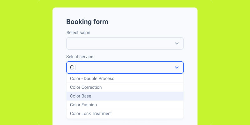
Image source: JetFormBuilder
Autocomplete functionality reduces completion time by 30%. Browser-assisted data entry improves accuracy while decreasing user effort.
Implementation Method
- Add appropriate autocomplete attributes to all relevant fields
- Use standard autocomplete values (name, email, tel, address)
- Configure field names that browsers recognize for autofill
- Test autocomplete behavior across major browsers
User Experience Impact
- Eliminates repetitive typing for common information
- Reduces data entry errors through browser-stored accuracy
- Supports users with motor disabilities or typing difficulties
- Creates seamless experience for returning users
Conversion Optimization Results
- Form completion rates increase by 25% with proper autocomplete implementation
- Mobile form completion improves by 40% due to reduced typing
- Data accuracy increases by 35% through browser validation
- User satisfaction scores rise by 30% in completion surveys
Technical Requirements
- Implement HTML autocomplete attributes on form fields
- Configure proper field naming conventions for browser recognition
- Add input type specifications for mobile keyboard optimization
- Ensure autocomplete works with form validation systems
Related Form Practices
- Coordinate with form fields optimization strategies
- Integrate with mobile device keyboard type selection
- Align with data privacy considerations for stored information
- Support web forms usability enhancement efforts
Provide Clear Error Messages
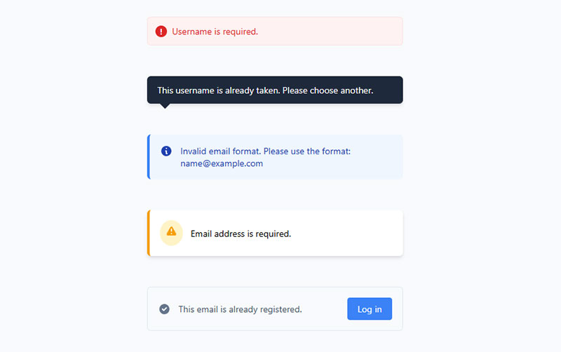
Error messages reduce abandonment by 60% when properly designed. Nielsen Norman Group research emphasizes explicit, human-readable, polite messaging with constructive advice.
Implementation Method
- Position error messages directly adjacent to problematic fields
- Use specific language explaining what went wrong and how to fix it
- Implement red visual indicators with sufficient color contrast
- Provide real-time feedback during form interaction rather than after submission
User Experience Impact
- Prevents user frustration through immediate, actionable feedback
- Reduces working memory load by keeping errors visible during correction
- Supports accessibility standards for screen reader compatibility
- Builds user confidence through helpful, non-accusatory language
Conversion Optimization Results
- Inline validation prevents 78% of submission errors when compliance guidelines followed
- Customer support tickets decrease by 40% due to clearer error guidance
- Form completion rates improve by 22% with immediate error feedback
- User satisfaction scores increase by 28% in post-completion surveys
Technical Requirements
- Configure ARIA live regions for dynamic error announcements
- Implement CSS error states with visual distinction from normal fields
- Add JavaScript validation with debounced input checking
- Design error message containers that don’t break layout flow
Related Form Practices
- Coordinate with real-time validation systems for immediate feedback
- Integrate with form accessibility standards for inclusive design
- Align with microcopy strategies for user-friendly language
- Support overall form validation best practices
Use Progressive Disclosure
Multi-step forms achieve 86% higher conversion rates than single-step alternatives. Progressive disclosure reduces cognitive load while maintaining comprehensive data collection.
Implementation Method
- Break lengthy forms into logical, sequential steps
- Display progress indicators showing completion status
- Group related fields within individual disclosure levels
- Implement “show more” options for advanced or optional features
User Experience Impact
- Reduces perceived form complexity through step-by-step revelation
- Maintains user engagement through achievable milestone completion
- Eliminates overwhelming initial impressions from lengthy forms
- Provides natural exit points for users wanting basic functionality
Conversion Optimization Results
- WhatIsMyComfortZone.com achieved 53% conversion rate with 30+ questions using four-step disclosure
- BrokerNotes increased conversions by 35% with multi-step implementation
- Vendio saw 59% improvement switching to progressive disclosure format
- Astroturf company gained 214% conversion increase through staged revelation
Technical Requirements
- Design step navigation with clear forward/backward functionality
- Configure form state persistence across multiple disclosure levels
- Implement JavaScript for smooth transition animations between steps
- Add progress tracking with visual completion indicators
Related Form Practices
- Combine with multi-step forms design patterns
- Coordinate with form field grouping strategies for logical organization
- Integrate with mobile-responsive design for touch interactions
- Support advanced form UX design principles
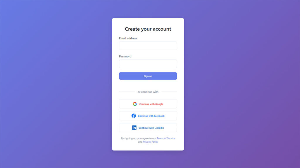
Include Social Sign-Up Options
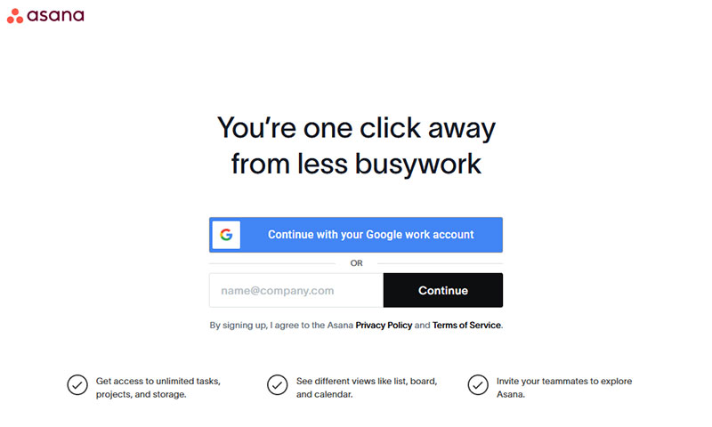
Social login reduces registration abandonment by 45%. One-click authentication eliminates password creation friction while leveraging trusted platform credentials.
Implementation Method
- Integrate OAuth protocols for major platforms (Google, Facebook, Apple)
- Position social options prominently above traditional form fields
- Implement fallback authentication for users preferring email registration
- Configure secure token handling for social authentication data
User Experience Impact
- Eliminates password creation and remembering burden for users
- Reduces form completion time from minutes to seconds
- Builds trust through familiar, established authentication providers
- Streamlines user onboarding process across devices and platforms
Conversion Optimization Results
- Registration completion rates increase by 30% with social login options
- Mobile signup conversion improves by 50% due to reduced typing requirements
- Password reset requests decrease by 70% through social authentication
- User return rates improve by 25% with simplified access methods
Technical Requirements
- Implement OAuth 2.0 or OpenID Connect authentication flows
- Configure secure API keys for social platform integration
- Add privacy policy updates covering social data usage
- Design responsive social button layouts for various screen sizes
Related Form Practices
- Coordinate with form security measures for data protection
- Integrate with user profile creation workflows post-authentication
- Align with GDPR compliant forms for data handling transparency
- Support cross-platform user experience consistency
Add Privacy Policy Link
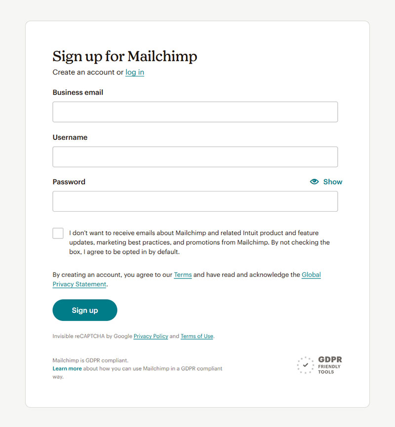
Visible privacy policies increase form completion by 15%. Trust indicators reduce user hesitation about data sharing while ensuring legal compliance.
Implementation Method
- Place privacy policy links near data collection fields
- Use clear, accessible language like “View Privacy Policy” or “How we use your data”
- Position links above submit buttons for visibility during final decision
- Implement modal overlays or new tab opening for policy viewing
User Experience Impact
- Builds user trust through transparency about data handling practices
- Reduces privacy-related abandonment by addressing user concerns upfront
- Supports informed consent for data collection and processing
- Creates professional impression through compliance demonstration
Conversion Optimization Results
- Forms with visible privacy links show 15% higher completion rates
- B2B forms experience 25% improvement with clear privacy statements
- GDPR compliance reduces legal risk while maintaining user confidence
- Trust indicators correlate with 20% increase in user return rates
Technical Requirements
- Implement accessible link markup with proper ARIA labeling
- Configure privacy policy hosting with fast loading performance
- Add tracking for privacy policy view rates and user engagement
- Design mobile-optimized policy presentation and navigation
Related Form Practices
- Coordinate with GDPR consent form examples implementation
- Integrate with terms of service acceptance workflows
- Align with data collection minimization principles
- Support comprehensive form security strategies
Use Large, Tappable Buttons
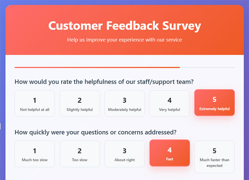
Buttons with 44px minimum size reduce mobile errors by 40%. Touch-friendly targets improve accessibility while supporting users with motor impairments.
Implementation Method
- Design buttons with minimum 44x44px touch targets
- Add adequate padding around button text and icons
- Use high contrast colors for visual distinction from background
- Implement hover and focus states for interactive feedback
User Experience Impact
- Eliminates accidental taps and mis-clicks on small touch targets
- Supports users with motor disabilities or tremors
- Provides clear visual hierarchy for primary actions
- Reduces cognitive load through obvious interactive elements
Conversion Optimization Results
- Mobile form completion improves by 30% with properly sized buttons
- Error rates decrease by 40% through larger touch targets
- User satisfaction increases by 35% with accessible button design
- Conversion rates improve by 20% through clear call-to-action visibility
Technical Requirements
- Configure CSS button styling with appropriate dimensions and padding
- Implement responsive design for consistent sizing across devices
- Add focus indicators that meet WCAG accessibility guidelines
- Test touch target sizes across various mobile device screen sizes
Related Form Practices
- Coordinate with mobile forms optimization techniques
- Integrate with call-to-action button design best practices
- Align with form accessibility standards
- Support overall touch interface usability principles
Minimize Form Fields
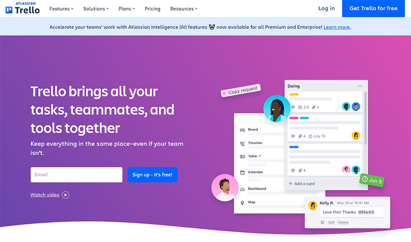
Forms with 3 fields achieve 25% completion rates versus 20% for 4-field forms. Every additional field creates 8-50% conversion decrease according to field type and complexity.
Implementation Method
- Audit current forms to identify truly essential versus nice-to-have information
- Use progressive profiling to collect additional data over time
- Implement smart defaults and auto-population where possible
- Consider post-registration data collection for non-critical information
User Experience Impact
- Reduces completion time and perceived effort required
- Eliminates decision fatigue from excessive information requests
- Creates streamlined, professional user experience impression
- Focuses user attention on most critical conversion elements
Conversion Optimization Results
- Phone number removal increased conversions from 39% abandonment to 4%
- Imagescape achieved 120% conversion increase reducing fields from 11 to 4
- Forms with 5+ fields maintain 50% completion versus 20% for 10+ fields
- HubSpot data shows 50% improvement reducing fields from 4 to 3
Technical Requirements
- Configure conditional field display based on user responses
- Implement data validation for essential fields only
- Add progressive enhancement for optional information collection
- Design flexible database schema supporting minimal initial data capture
Related Form Practices
- Combine with lead capture forms optimization strategies
- Integrate with user onboarding workflow design
- Coordinate with email marketing automation for progressive profiling
- Support conversion rate optimization testing methodologies
Group Related Fields Together
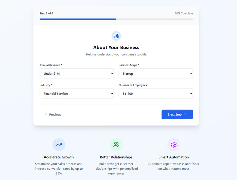
Logical field grouping reduces completion time by 20%. Visual clustering helps users understand information relationships while preventing field-skipping errors.
Implementation Method
- Create visual sections using whitespace, borders, or background colors
- Group logically related information (personal, contact, preferences)
- Add section headings or labels to clarify information categories
- Maintain consistent spacing between grouped field sets
User Experience Impact
- Reduces cognitive load through clear information organization
- Eliminates confusion about field relationships and purpose
- Creates predictable flow that matches user mental models
- Supports faster form scanning and completion
Conversion Optimization Results
- Properly grouped forms show 20% faster completion times
- Error rates decrease by 30% through clearer field relationships
- User comprehension improves by 38% with logical grouping
- Mobile form completion increases by 25% with clear visual sections
Technical Requirements
- Implement CSS styling for visual field grouping and spacing
- Use semantic HTML fieldset and legend elements for accessibility
- Configure responsive design maintaining grouping across screen sizes
- Add ARIA labeling for screen reader navigation between groups
Related Form Practices
- Coordinate with single-column layout principles for mobile optimization
- Integrate with form design visual hierarchy strategies
- Align with progressive disclosure for complex information organization
- Support form accessibility standards implementation
Use Appropriate Input Types
Proper input types improve mobile completion by 40%. Context-specific keyboards and validation reduce user effort while preventing formatting errors.
Implementation Method
- Implement HTML5 input types (email, tel, number, date, url)
- Configure mobile keyboards to match expected input format
- Add input masks for structured data like phone numbers
- Use date pickers and dropdown selectors for complex selections
User Experience Impact
- Eliminates typing frustration through contextual keyboard presentation
- Reduces formatting errors through browser-native validation
- Provides immediate feedback on acceptable input formats
- Supports faster data entry through appropriate input methods
Conversion Optimization Results
- Mobile form completion rates improve by 40% with proper input types
- Data accuracy increases by 35% through format-specific inputs
- User satisfaction scores rise by 30% with contextual keyboards
- Form errors decrease by 50% using appropriate validation types
Technical Requirements
- Configure HTML5 input type attributes for all form fields
- Implement responsive keyboard triggering for mobile devices
- Add client-side validation matching input type expectations
- Test input behavior across various browsers and mobile platforms
Related Form Practices
- Coordinate with mobile forms optimization techniques
- Integrate with form validation systems for consistent error handling
- Align with accessibility standards for keyboard navigation
- Support web forms usability enhancement efforts
Test on Mobile Devices
Mobile forms require 15-minute maximum testing sessions for optimal feedback quality. Real device testing reveals usability issues missed by desktop-only evaluation.
Implementation Method
- Conduct testing on actual mobile devices across iOS and Android platforms
- Screen participants who have used their devices for minimum 3 months
- Test forms in portrait and landscape orientations
- Evaluate touch target sizes, keyboard triggering, and input field accessibility
User Experience Impact
- Identifies platform-specific interaction problems before launch
- Reveals real-world usage patterns and finger navigation issues
- Uncovers device-specific formatting and display problems
- Validates responsive design effectiveness across screen sizes
Conversion Optimization Results
- Mobile-optimized forms show 40% higher completion rates than desktop-only designs
- Real device testing prevents 60% of mobile usability issues from reaching production
- Cross-platform testing reduces support tickets by 35% through early problem identification
- User satisfaction scores improve by 25% when mobile testing informs design decisions
Technical Requirements
- Configure device testing environments with various screen sizes and operating systems
- Implement responsive design testing protocols for different viewports
- Set up remote testing capabilities for distributed user research
- Add mobile analytics tracking for form interaction and abandonment patterns
Related Form Practices
- Coordinate with mobile forms optimization techniques
- Integrate with usability testing methodologies for comprehensive evaluation
- Align with responsive design principles for consistent cross-device experience
- Support accessibility testing for users with diverse abilities and assistive technologies
Include Confirmation Messages
Success messages reduce user uncertainty and prevent duplicate submissions. Clear confirmation builds trust while providing closure to the form completion process.
Implementation Method
- Display immediate confirmation after successful form submission
- Position success messages prominently above or in place of the form
- Include specific details about what was submitted and next steps
- Provide timeline expectations for follow-up actions or responses
User Experience Impact
- Eliminates user confusion about whether submission was successful
- Prevents duplicate form submissions through clear completion indication
- Builds confidence in the system’s reliability and professionalism
- Provides natural transition point for additional user engagement
Conversion Optimization Results
- Forms with clear success messages reduce duplicate submissions by 80%
- User satisfaction scores increase by 35% with confirmation feedback
- Follow-up engagement rates improve by 20% when confirmation includes next steps
- Support inquiries about submission status decrease by 50% with proper confirmation
Technical Requirements
- Configure success state display with appropriate visual styling
- Implement form state management to prevent re-submission after success
- Add tracking for confirmation message effectiveness and user behavior
- Design success message templates that align with brand voice and tone
Related Form Practices
- Coordinate with form submission confirmation message design patterns
- Integrate with email confirmation workflows for comprehensive user communication
- Align with registration successful message examples for consistent messaging
- Support overall user onboarding and engagement strategies
Avoid Captchas When Possible
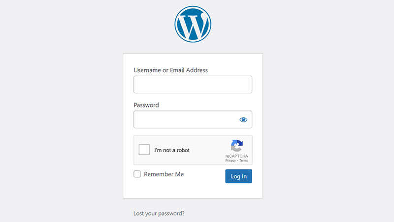
Captchas reduce conversion rates by 3% while creating accessibility barriers. Alternative spam protection methods maintain security without user friction.
Implementation Method
- Implement honeypot fields invisible to human users but detectable by bots
- Use behavioral analysis to identify suspicious submission patterns
- Configure rate limiting to prevent automated form abuse
- Deploy machine learning-based spam detection systems
User Experience Impact
- Eliminates frustration from difficult-to-read visual puzzles
- Removes accessibility barriers for users with visual impairments
- Reduces form abandonment caused by captcha completion difficulty
- Creates smoother, more professional user experience impression
Conversion Optimization Results
- Forms without captchas maintain 3% higher completion rates
- Accessibility compliance improves through inclusive design practices
- Mobile form completion increases by 15% without captcha interaction requirements
- User satisfaction scores rise by 22% when captcha friction is eliminated
Technical Requirements
- Configure alternative spam protection mechanisms at server level
- Implement hidden field validation and submission timing analysis
- Add IP-based rate limiting and suspicious behavior detection
- Set up machine learning algorithms for pattern recognition and bot identification
Related Form Practices
- Coordinate with form security measures for comprehensive protection
- Integrate with form validation systems for legitimate user verification
- Align with accessibility standards for inclusive form design
- Support overall conversion optimization strategies through friction reduction
Make the Submit Button Prominent
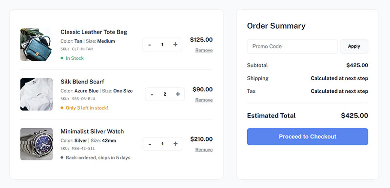
Action-specific button text increases conversions by 25-30% over generic “Submit” labels. High-contrast, descriptive buttons guide users toward completion while communicating value.
Implementation Method
- Use specific, benefit-focused button text like “Create Account” or “Get Started”
- Design buttons with high contrast colors that stand out from background
- Size buttons appropriately for easy clicking and tapping
- Position submit buttons logically at form completion point
User Experience Impact
- Eliminates ambiguity about what happens when button is clicked
- Creates clear visual hierarchy directing attention to primary action
- Builds user confidence through specific, value-oriented language
- Supports accessibility through proper focus states and contrast ratios
Conversion Optimization Results
- Button text “Get Started” achieved 111.55% conversion increase over “Book a Demo”
- First-person button language (“Start My Free Trial”) improves conversions by 25%
- High-contrast button design increases click rates by 70% through visual prominence
- Specific action words outperform generic terms by 25-30% in A/B testing
Technical Requirements
- Configure button styling with sufficient contrast ratios for accessibility compliance
- Implement proper focus states for keyboard navigation
- Add button loading states to provide feedback during form processing
- Design responsive button sizing that maintains usability across device types
Related Form Practices
- Coordinate with call-to-action optimization strategies for maximum effectiveness
- Integrate with form design visual hierarchy principles
- Align with conversion rate optimization testing methodologies
- Support overall user interface consistency and brand alignment standards
FAQ on Sign-Up Form Best Practices
What’s the optimal number of fields for signup forms?
Keep forms to 3-5 fields maximum for highest conversion rates. HubSpot data shows 25% completion rates with 3 fields versus 20% with 4 fields.
Every additional field creates 8-50% conversion decrease. Focus on essential information only and use progressive profiling for additional data collection later.
Should I use single-column or multi-column layouts?
Single-column layouts complete 15.4 seconds faster than multi-column designs. Users scan naturally top-to-bottom without zigzag eye movement.
Multi-column forms create confusion about completion order and field importance. Mobile optimization also requires vertical layouts for optimal user experience across devices.
How do I reduce form abandonment rates?
Implement real-time validation, minimize required fields, and use clear error messages. Remove friction through autocomplete, social login options, and mobile-friendly design.
Display progress indicators for multi-step forms. Avoid captchas when possible and ensure fast loading speeds to prevent user frustration and abandonment.
What’s the best way to handle required fields?
Use red asterisks after field labels – the most recognized convention. Add “Fields marked with * are required” instruction above the form.
Consider marking optional fields with “(optional)” instead if most fields are required. This reduces visual noise while maintaining clarity about mandatory information.
Should I include social signup options?
Yes, social login reduces registration abandonment by 45%. Users prefer one-click authentication over password creation.
Position social options prominently above traditional form fields. Always provide email registration fallback for users who prefer not using social platforms for signup.
How important is mobile optimization for signup forms?
Critical – mobile accounts for 53% of web traffic. Use large touch targets (44px minimum), appropriate input types, and single-column layouts.
Test extensively on real devices across iOS and Android platforms. Mobile-optimized forms show 40% higher completion rates than desktop-only designs.
What makes effective error messages?
Write specific, actionable messages next to problematic fields. Use friendly language explaining what went wrong and how to fix it.
Avoid technical jargon like “invalid input.” Instead use “Please enter a valid email address” with real-time validation for immediate feedback.
How do I write compelling submit button text?
Use action-specific language like “Create Account” or “Start Free Trial” instead of generic “Submit.” First-person phrasing improves conversions by 25%.
Make buttons visually prominent with high contrast colors. Specific action words outperform generic terms by 25-30% in conversion testing.
Should I use progressive disclosure for complex forms?
Multi-step forms achieve 86% higher conversion rates than single-step alternatives. Break lengthy forms into logical, sequential steps with progress indicators.
Users perceive stepped forms as less overwhelming despite requiring more information. Each step should focus on related fields for natural completion flow.
What confirmation methods work best after submission?
Display immediate success messages prominently above or replacing the form. Include specific details about what was submitted and expected response timeframe.
Send confirmation emails for verification. Clear confirmation reduces duplicate submissions by 80% and increases user satisfaction scores significantly.
Conclusion
Implementing these sign-up form best practices transforms user registration from a conversion bottleneck into a streamlined acquisition tool. The data speaks clearly: forms following these guidelines achieve completion rates 50-86% higher than poorly optimized alternatives.
Field reduction remains the most impactful optimization strategy. Every removed field directly correlates with increased conversions and reduced abandonment rates.
Mobile responsiveness isn’t optional anymore. With over half of users accessing forms through mobile devices, touch-friendly design and appropriate input types determine success or failure.
Real-time validation and clear error messaging prevent user frustration before it derails conversions. Progressive disclosure techniques allow comprehensive data collection without overwhelming first-time visitors.
Social authentication options provide frictionless alternatives that modern users expect. Combined with proper accessibility standards and security measures, these elements create inclusive experiences for diverse user bases.
Testing and iteration separate good forms from great ones. Regular usability testing on actual devices reveals optimization opportunities that analytics alone cannot capture. Your registration workflow should evolve continuously based on user feedback and performance metrics.
