

Gallup’s 2024 data shows only 31% of U.S. employees feel engaged at work. Annual surveys can’t catch that kind of decline fast enough. Pulse surveys can. These short, frequent questionnaires…
Table of Contents
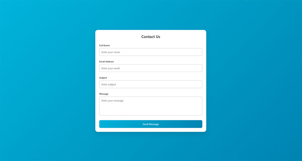
Most users abandon forms before hitting submit. Not because they changed their minds about what you’re offering, but because your form UX design made completion feel impossible.
Poor input field design, confusing validation errors, and unnecessary friction cost you conversions every day. Good user experience in forms isn’t about aesthetics; it’s about removing obstacles between users and their goals.
This guide covers the psychology behind form abandonment, field-level optimization techniques, mobile considerations, accessibility requirements, and testing strategies that reveal hidden friction points. You’ll learn how structure, validation timing, and button placement directly impact completion rates.
What is Form UX Design?
Form UX design is the practice of creating input interfaces that collect user information with minimal friction while maintaining accuracy and completion rates.
Good user experience design makes data collection feel effortless. Bad design turns simple tasks into obstacles.
The difference shows up in your metrics. Abandoned carts. Incomplete registrations. Lost leads.
Understanding Form Psychology
Forms trigger psychological responses that directly affect completion rates.
Users approach data entry with inherent resistance. Each field represents effort, time, and sometimes anxiety about sharing information.
Cognitive load increases with every decision point. Radio buttons versus checkboxes. Required versus optional. What information is safe to share.
User Expectations in Digital Forms
Users expect forms to behave predictably.
Labels should sit above fields, not inside them. Placeholder text disappears when typing starts, making it terrible for labels.
Buttons need clear hierarchy. Primary actions get visual weight. Secondary options fade back.
Tab order must follow reading patterns. Left to right, top to bottom. Breaking this flow creates confusion.
Form Abandonment Triggers
Form abandonment happens when friction exceeds motivation.
Too many fields kill completion. Users calculate effort before starting. Long forms get closed before the first click.
Unexpected required fields frustrate users mid-flow. Asking for phone numbers on email signups. Demanding middle names. Each surprise increases bail-out risk.
Poor error handling destroys trust. Generic messages like “Invalid input” provide zero help. Users need specific guidance.
Form Structure Fundamentals
Structure determines whether users can parse your form at a glance.
Visual hierarchy guides attention. Logical grouping reduces cognitive effort. Smart layouts prevent mistakes before they happen.
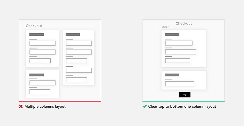
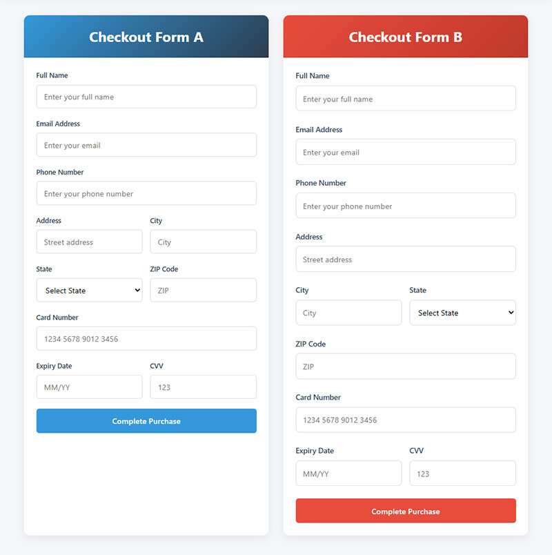
Single Column vs Multi Column Layouts
Single columns win for most forms.
Multi-column layouts force horizontal eye movement. Users scan vertically by default. Fighting natural reading patterns slows completion.
Multi-column works in specific cases. Side-by-side city and state fields make sense. First and last name can share a row. But these are exceptions.
Mobile screens make the decision automatic. Columns collapse anyway.
Logical Field Grouping
Group related information together.
Contact details cluster in one section. Billing separate from shipping. Personal information away from account credentials.
Visual separators help. White space between groups. Subtle background colors. Section headers that explain what’s coming.
Grouping reduces the perception of form length. Five sections with three fields each feels shorter than fifteen fields in a list.
Progressive Disclosure Patterns
Show fields only when relevant.
Checking “shipping address differs from billing” reveals new fields. Selecting “other” in a dropdown displays a text input. This is conditional logic in action.
Progressive disclosure keeps forms lean. Users see only what applies to them. Irrelevant fields stay hidden.
Reduces overwhelm. Decreases completion time. Minimizes errors from confused users filling wrong fields.
Input Field Design
Field design impacts both usability and error rates.
Width signals expected input length. Styling indicates interactivity. Smart defaults reduce typing.
Text Input Best Practices
Input width should match content length.
ZIP codes need short fields. Email addresses need longer ones. Phone numbers somewhere between. Mismatched widths confuse users about what you’re asking.
Single-line inputs for brief responses. Text areas for longer content. Don’t make users type paragraphs into a cramped box.
Character limits prevent frustration. Show the limit upfront. Display remaining characters as users type.
Dropdown Menu Optimization
Dropdowns hide options behind clicks.
Use them for known lists with 4-15 options. Fewer than four? Radio buttons work better. More than fifteen? Consider autocomplete search.
Alphabetical sorting helps with long lists (countries, states). Logical sorting beats alphabetical for short lists (t-shirt sizes: XS, S, M, L, XL).
Default selection matters. “Select one” prevents accidental submissions. But pre-selecting obvious choices (user’s country based on IP) reduces work.
Radio Buttons vs Checkboxes
Radio buttons select one option. Checkboxes allow multiple.
Don’t mix the metaphors. Users know these patterns. Breaking conventions creates hesitation.
Radio buttons need a default selection or a “none” option. Otherwise users can’t deselect after clicking.
Checkbox groups need clear instructions. “Select all that apply” removes ambiguity.
Toggle Switch Implementation
Toggles work for binary choices with immediate effect.
“Enable notifications” makes sense as a toggle. “Gender” does not. Toggles imply on/off states, not multiple options.
Visual state must be obvious. Color alone fails accessibility. Add text labels showing current state.
Mobile users need larger touch targets. Desktop hovers don’t exist on touchscreens.
Label and Instruction Design
Labels tell users what to enter. Instructions tell them how.
Poor microcopy causes errors. Good microcopy prevents them.
Label Positioning Methods
Top-aligned labels beat left-aligned for forms.
Left-aligned labels create ragged edges. Eyes jump between label and field. Slows scanning. Breaks flow.
Top-aligned labels stack cleanly. Reading path stays vertical. Works on mobile without collapsing.
Inline labels (inside the field) disappear when users click. Memory aid vanishes right when users need it most.
Microcopy for Error Prevention
Instructions should appear before users make mistakes.
“Password must include 8 characters, one number, one symbol” goes above the field. Not in an error message after submission.
Format examples help. “XXX-XX-XXXX” shows Social Security format. Users match patterns faster than reading instructions.
Explain why you’re asking for sensitive data. “Phone number for delivery updates only” builds trust. Mystery requests get skipped.
Contextual Help Systems
Help text handles edge cases without cluttering the interface.
Tooltip icons next to complex fields. Click or hover reveals explanation. Keeps the form clean while providing depth.
Character counts for limited fields. “0/500 characters” updates in real-time. Users monitor their own progress.
Field-level help stays with the field. Don’t bury critical instructions in a footer.
Validation and Error Handling
Form validation prevents bad data from entering your system.
Done poorly, it frustrates users into abandoning. Done well, it guides users toward success.
Real Time Validation
Validate fields as users complete them, not after submission.
Email format checked immediately. Password strength displayed while typing. Username availability confirmed before moving forward.
Catches errors early when context is fresh. Users fix mistakes in the moment instead of hunting through a submitted form.
Inline Error Messages
Show errors next to the problematic field.
Red borders signal something’s wrong. Specific text explains what. “Email must include @” beats “Invalid input.”
Error messages need action-oriented language. “Enter a valid ZIP code” tells users what to do. “ZIP code error” just announces failure.
Keep messages visible while users correct mistakes. Don’t hide them on focus.
Success State Indicators
Confirm when users get it right.
Green checkmarks after valid entries. Removes doubt. Users know they can move forward.
Particularly valuable for complex requirements. Password meets all criteria? Show it. Phone number formatted correctly? Confirm it.
Reduces submission anxiety. Users trust the form will accept their data.
Mobile Form Optimization
Mobile users face smaller screens, imprecise touch input, and unpredictable keyboards.
Designs that work on desktop fail on phones. Mobile forms need different thinking.
Touch Target Sizing
Minimum 44×44 pixels for any tappable element.
Fingers cover more area than mouse cursors. Small targets cause mis-taps. Users hit the wrong field, get frustrated, quit.
Space between fields matters too. Cramped layouts lead to accidental selections.
Larger targets improve accuracy and speed. Users tap confidently instead of carefully aiming.
Keyboard Type Selection
Match input type to expected data.
Email fields trigger email keyboards (includes @ symbol). Phone fields show numeric keypads. URL fields add .com shortcuts.
Reduces typing effort. Users don’t hunt for special characters on wrong keyboard layouts.
HTML input types handle this automatically. type="tel", type="email", type="url" do the work.
Auto Fill and Auto Complete
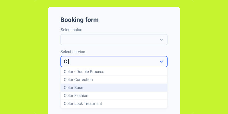
Image source: JetFormBuilder
Leverage browser and system capabilities.
Properly labeled fields enable autofill. autocomplete="given-name" lets browsers inject saved names. autocomplete="email" pre-fills email addresses.
Saves massive time on mobile. Typing on touchscreens is tedious. Autofill reduces 20 taps to one.
Test autofill behavior. Some custom styling breaks it. Native form controls work best.
Accessibility in Forms
Accessibility isn’t optional. It’s a requirement for usable forms.
About 15% of users have some form of disability. Ignore them at your own risk.
Screen Reader Compatibility
Screen readers need semantic HTML and proper labels.
Every input needs an associated <label> element. Not just placeholder text. Actual labels with for attributes matching input IDs.
Fieldsets group related inputs. Legends describe the group. Radio button sets need both to make sense audibly.
Error messages must be programmatically associated with fields. aria-describedby links error text to inputs. Screen readers announce errors when users focus the field.
Keyboard Navigation
Mouse-free navigation must work flawlessly.
Tab key moves between fields in logical order. Enter submits the form. Escape cancels or closes modals.
Custom controls need keyboard handling. Styled dropdowns lose native keyboard support. You have to rebuild it.
Focus indicators show current position. Default browser outlines are ugly but functional. Custom focus styles need sufficient contrast.
Color Contrast Requirements
WCAG requires 4.5:1 contrast ratio for normal text.
Low contrast makes labels invisible to users with vision impairments. Also impacts everyone in bright sunlight or on cheap screens.
Red/green error states fail for colorblind users. Add icons or text, not just color changes.
Test tools like WebAIM’s contrast checker remove guesswork.
ARIA Labels Implementation
ARIA attributes provide context screen readers miss.
aria-label adds labels when visual text doesn’t exist. Icon-only buttons need them. “Submit” button with just a checkmark icon gets aria-label="Submit form".
aria-required="true" announces required fields. Better than asterisks alone.
aria-invalid="true" marks fields with errors. Combined with error messages creates complete feedback loop.
Reducing Form Friction
Friction is anything that slows completion or creates hesitation.
Every extra field increases abandonment risk. Every confusing instruction creates drop-off.
Required vs Optional Fields
Only mark fields as required if you actually need the data.
Asking “just in case” tanks completion rates. Each required field raises the bar for form submission.
Mark optional fields instead of required ones when most fields are mandatory. “(optional)” next to three fields beats asterisks on twenty.
Explain why required fields are necessary. “Email required for account recovery” makes sense. Mystery requirements don’t.
Default Values Strategy
Smart defaults reduce work.
Pre-select the most common choice. Country based on IP address. Current date for “today’s appointment.”
Don’t pre-fill credit card data or passwords. Security risk. User confusion when autofill conflicts with defaults.
Default selections must be undo-able. Users need control even when you’re trying to help.
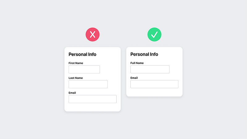
Smart Field Ordering
Sequence fields by user mental model.
Name before email. Email before password. Billing address before payment method. Match user expectations about what comes next.
Put optional fields at the end. Users who hit required fields early feel progress. Optional stuff at the end feels like bonus points, not obstacles.
Group similar data types. All contact info together. All payment info together. Jumping between contexts kills flow.
Multi Step Forms
Multi-step forms break long data collection into digestible chunks.
Trade-off between commitment (starting) and completion (finishing). Done wrong, you add friction. Done right, you boost completions.
Progress Indicators
Show users where they are and how much remains.
Step counters (“Step 2 of 4”) set expectations. Progress bars visualize completion percentage. Either works better than nothing.
Labeled steps beat numbered ones. “Contact Info → Delivery → Payment” shows value. “Step 1 → Step 2 → Step 3” shows nothing.
Never hide total step count. Surprise extra screens destroy trust.
Step Naming Conventions
Each step needs a clear, specific name.
“Personal Details” works. “Information” doesn’t. Vague labels create anxiety about what’s coming.
Names preview step content. Users decide if they’re ready. Reduces surprises that cause abandonment.
Keep names short. Mobile screens can’t fit “Professional Background and Employment History.”
Save and Resume Functionality
Let users pause and return later.
Long forms take time. Interruptions happen. Lost progress means lost submissions.
Save drafts automatically. Manual save buttons get forgotten. Background saving removes friction.
Email magic links for return access. Users don’t remember passwords for half-finished forms.
Form Button Design

Buttons trigger action. Design must make available actions obvious.
Poor button hierarchy confuses users. They click the wrong thing. Or nothing.
Primary Action Clarity
One button should dominate visually.
Submit buttons get high contrast and solid fills. Cancel or back buttons fade into backgrounds with outlines or ghost styles.
Button placement reinforces hierarchy. Primary actions align right in Western layouts. Users scan left to right, end on the main action.
Single-column mobile forms center buttons. No left/right ambiguity on narrow screens.
Button Label Wording
“Submit” tells users nothing about what happens next.
Specific labels reduce uncertainty. “Create Account” describes the outcome. “Subscribe to Newsletter” states the commitment. “Complete Purchase” clarifies the action.
Action-oriented language performs better than generic verbs. Users click when they understand the result.
Avoid negative language on primary actions. “Don’t miss out” focuses on loss. “Get Updates” focuses on gain.
Secondary Action Placement
Secondary buttons need sufficient visual separation from primary actions.
Too close? Users mis-click. Too far? Users miss them entirely.
Ghost buttons (outline only) work for secondary actions. Create clear visual hierarchy without competing for attention.
Destructive actions (Delete, Cancel) need distance and different styling. Prevent accidental clicks on permanent actions.
Testing Form Performance
Data reveals friction points design reviews miss.
Users behave differently than designers predict. Testing catches the gaps.
Completion Rate Metrics
Track percentage of users who start versus finish.
Below 50%? Major friction exists. Above 80%? Form works well. Middle ground needs investigation.
Segment by traffic source. Different audiences have different tolerance for form length. Paid ads might see 60% completion while organic gets 75%.
Compare against conversion rate benchmarks for your industry.
Field Level Analytics
Identify exactly where users abandon.
Time spent per field shows confusion. Users stalling at “Company Name” might not understand if personal or employer. Clarify the label.
Error rates per field highlight validation issues. 40% of users failing at phone number? Format requirements need better explanation.
Drop-off after specific fields pinpoints friction. Users who reach payment but don’t complete have pricing or trust issues.
A/B Testing Variables
Test one element at a time for clean insights.
Button color changes are easy to measure but rarely impact completion. Field count and requirement changes drive significant differences.
Test variations like:
- Single-step versus multi-step approaches
- Different field ordering
- Various label positions
- Form validation timing (real-time versus on-submit)
Run tests long enough for statistical significance. A week of data beats a day. Seasonal variations matter.
FAQ on Form UX Design
What makes a form user-friendly?
Clear labels, logical field ordering, minimal required fields, and real-time validation create user-friendly forms. Single-column layouts work best. Error messages should be specific and actionable. Each input field needs sufficient spacing for touch targets on mobile devices.
How many form fields is too many?
No universal limit exists. Completion rates drop significantly after 7-10 fields for casual interactions. Motivated users (job applications, loan requests) tolerate longer forms. Test your specific audience. Remove any field you don’t absolutely need for your business process.
Should forms validate in real-time or after submission?
Real-time validation catches errors immediately while context is fresh. Validate format (email structure, phone numbers) as users complete fields. Save submission validation for server-side checks like username availability. Hybrid approach works best for most use cases.
What’s the difference between single-step and multi-step forms?
Single-step forms display all fields at once. Multi-step forms break data collection across multiple screens with progress indicators. Multi-step reduces overwhelm for long forms but adds navigation friction. Test both approaches against your completion metrics.
Where should form labels be positioned?
Top-aligned labels beat left-aligned for readability and mobile compatibility. Labels create a clean vertical scan path. Never use placeholder text as labels since it disappears on focus. Icon labels fail accessibility standards without proper ARIA attributes.
How do you reduce form abandonment rates?
Remove unnecessary fields, add progress indicators, provide clear error messages, enable autofill, and explain why you need sensitive data. Test one variable at a time. Improving form abandonment requires field-level analytics to identify exact drop-off points.
What input types should mobile forms use?
Match keyboard type to expected input. Email fields trigger keyboards with @ symbols. Tel fields show numeric keypads. URL fields add .com shortcuts. Proper HTML input types (type="email", type="tel") activate appropriate keyboards automatically.
How do you make forms accessible?
Every input needs a proper <label> element with matching for attribute. Maintain 4.5:1 color contrast. Support keyboard navigation with logical tab order. Add ARIA labels where visual labels don’t exist. Test with actual screen readers regularly.
Should required fields be marked differently?
Mark required fields with asterisks plus text explanation (“* indicates required field”). Color alone fails colorblind users. When most fields are required, mark optional ones instead with “(optional)” next to labels. Explain why required fields are necessary.
What’s the ideal form button design?
Primary buttons need high contrast and solid fills. Use specific action labels (“Create Account”) instead of generic “Submit.” Place primary actions right-aligned on desktop, centered on mobile. Secondary actions get ghost styling. Maintain minimum 44×44px touch targets.
Conclusion
Effective form UX design starts with understanding user psychology and ends with continuous testing. Every field, label, and button placement affects completion rates.
Focus on reducing cognitive load through logical structure and progressive disclosure. Mobile optimization isn’t optional when most traffic comes from smartphones.
Accessibility creates better experiences for everyone, not just users with disabilities. Real-time validation catches errors before frustration builds.
Track field-level analytics to identify friction points your design reviews miss. Small changes like button label wording or default values can shift conversion rates significantly.
Start with the basics: clear labels, minimal required fields, and obvious primary actions. Test variations. Measure results. Iterate based on data, not assumptions about what users want.

