


Every form on your site is only as good as the fields inside it. Bad field choices drive users away. The right ones, in the right order, with the right…
Table of contents
Your customers are talking. The question is: are you listening effectively?
Feedback forms serve as the bridge between customer thoughts and business improvement. Yet most organizations struggle with poor response rates, incomplete submissions, and data that doesn’t drive meaningful change.
The difference between a form that gets ignored and one that generates valuable insights lies in strategic design and user experience optimization. Well-crafted customer surveys can boost response rates by up to 300% while delivering actionable data that transforms business operations.
This guide reveals proven best practices for creating feedback forms that people actually want to complete. You’ll discover how to design forms that maximize completion rates, gather high-quality responses, and turn customer insights into competitive advantages.
We’ll cover essential form design principles, survey question formulation, user engagement strategies, and conversion optimization techniques. By the end, you’ll have a complete framework for building feedback collection systems that deliver results.
Best Practices for Creating Feedback Forms
Keep it short and focused
Short feedback forms contain 5 fields or fewer to minimize cognitive load and completion time. Form length ranks as the second highest reason for abandonment at 27%, making field reduction critical for response rates.
Implementation Method
Remove non-essential fields through priority mapping. Focus on core metrics like satisfaction ratings and single improvement suggestions.
Audit each field with “Can we get this information elsewhere?” Apply progressive profiling to spread data collection across multiple touchpoints rather than one comprehensive form.
User Impact
Removing a single field from consumer forms boosts completion rates by 25%. Shorter surveys show completion rates of 63% versus 37% for longer versions.
Users spend less time deliberating field relevance, reducing form abandonment time from 1 minute 43 seconds to under 1 minute.
Technical Requirements
HTML required attribute only on essential fields. JavaScript validation to prevent unnecessary field additions.
Form analytics tracking to identify high-abandon fields. Progressive disclosure techniques to show relevant fields dynamically based on previous responses.
Common Implementation Mistakes
Including “nice-to-have” demographic data that doesn’t impact business decisions. Asking for detailed contact information when anonymous feedback would suffice.
Adding multiple satisfaction ratings for similar concepts instead of one comprehensive question.
Compatibility Considerations
Shorter forms perform consistently across all devices. Desktop users convert at 47% versus 42% for mobile, but field reduction improves both platform completion rates proportionally.
Works with all modern browsers and assistive technologies without compatibility issues.
Use clear, simple language
Clear language employs 8th-grade reading level vocabulary and eliminates industry jargon. Questions use active voice with concrete terms rather than abstract concepts.
Implementation Method
Replace technical terms with everyday equivalents. “How satisfied were you?” instead of “Rate your satisfaction quotient.”
Test questions with non-industry personnel before launch. Use readability analyzers like Flesch-Kincaid to verify language complexity stays below grade 8 level.
User Impact
Simple language reduces completion time by 15-20 seconds per question. Users show higher engagement with plainly worded questions versus technical terminology.
67% of site visitors abandon forms with complications, making clarity essential for retention.
Technical Requirements
No specialized markup needed. Standard HTML form elements with clear label attributes.
Content management systems with built-in readability scoring. Translation support for multilingual feedback collection.
Common Implementation Mistakes
Using marketing speak like “How would you evangelize our solution?” Instead ask “Would you recommend us to friends?”
Including double negatives or compound questions that confuse respondents about the intended response.
Compatibility Considerations
Screen readers handle simple language more effectively than complex sentence structures. Clear language benefits users with cognitive disabilities and non-native speakers equally.
Compatible with all accessibility guidelines and international usability standards.
Ask specific questions
Specific questions target discrete user experiences rather than general impressions. Questions reference particular interactions, timeframes, or features instead of overall brand sentiment.
Implementation Method
Replace “How was your experience?” with “How easy was it to find the information you needed?” or “How satisfied were you with checkout speed?”
Use contextual triggers based on user behavior. Deploy post-purchase surveys asking about specific transaction elements rather than general satisfaction.
User Impact
Specific questions generate 40% more actionable responses than generic satisfaction queries. Users provide concrete suggestions when questions reference particular pain points.
Response quality improves when users recall specific interactions rather than forming general impressions.
Technical Requirements
Conditional logic systems to display relevant questions based on user paths. Integration with analytics platforms to identify specific user actions for targeted questioning.
Session tracking to reference particular features or pages in question text.
Common Implementation Mistakes
Asking “How do you feel about our website?” instead of “How easy was it to complete your purchase?”
Creating questions too broad to generate actionable insights for improvement initiatives.
Compatibility Considerations
Context-aware questioning requires JavaScript for dynamic content but degrades gracefully to static forms. Works across all modern browsers and mobile platforms.
Conditional logic maintains accessibility standards when properly implemented.
Include both rating scales and open-ended questions
Mixed question formats combine quantitative rating scales with qualitative open-ended responses. Rating surveys provide quick measurement while open-ended questions capture nuanced insights.
Implementation Method
Follow rating questions with “What influenced your rating?” or “How could we improve?”
Use 5-point scales for satisfaction metrics, then include text areas for detailed explanations. Implement conditional logic showing explanation fields only for ratings below neutral.
User Impact
Rating scores provide quantitative views while follow-up open-ended questions uncover reasons behind scores. Combined approaches deliver both statistical analysis capability and contextual understanding.
Users feel heard through open-ended options while providing measurable data through scales.
Technical Requirements
HTML5 input types for rating scales (type="range" or radio buttons). textarea elements with appropriate sizing for written responses.
Text analytics tools for processing open-ended responses at scale. Integration with sentiment analysis APIs for qualitative data insights.
Common Implementation Mistakes
Using only rating scales without context, or only open-ended questions without quantifiable metrics. Placing text areas before rating questions, which can influence numerical responses.
Compatibility Considerations
Mixed formats work across all platforms. Screen readers handle both input types effectively with proper labeling. Mobile users can complete both question types without interface issues.
Make it mobile-friendly
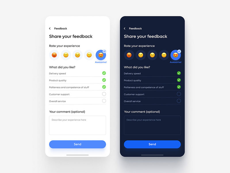
Image source: Veronica K
Mobile-friendly feedback forms use single-column layouts with touch-optimized input fields. Forms display properly on screens 320px wide and larger with appropriate touch targets.
Implementation Method
Use single-column layouts with fields stacked vertically. Implement responsive CSS with viewport meta tags and flexible width containers.
Single-column forms prevent abandonment compared to confusing 2-column layouts. Set appropriate keyboard types for different input fields using HTML5 input attributes.
User Impact
Mobile conversion rates reach 43% versus 47% on desktop, but mobile-optimized forms close this gap significantly.
Single-column forms enable completion 15.4 seconds faster than multi-column versions on mobile devices.
Technical Requirements
CSS media queries for responsive design. HTML5 input types (tel, email, number) to trigger appropriate mobile keyboards.
Touch targets minimum 44px height for accessibility compliance. Progressive enhancement ensuring form functionality without JavaScript.
Common Implementation Mistakes
Using multi-column layouts that break on small screens. Forgetting to set appropriate keyboard types, forcing users to manually switch input methods.
Creating touch targets too small for reliable interaction on mobile devices.
Compatibility Considerations
Works across iOS Safari, Android Chrome, and all mobile browsers. Responsive design maintains functionality on tablets and mobile devices regardless of orientation.
Supports assistive technology on mobile platforms including voice input and screen readers.
Test the form before launching
Form testing involves user journey validation across devices, browsers, and network conditions. Testing includes functionality verification, usability assessment, and performance measurement.
Implementation Method
Conduct cross-browser testing on Chrome, Firefox, Safari, and Edge. Test on iOS and Android devices with different screen sizes and orientations.
Validate all form fields, conditional logic, and submission processes. Use tools like BrowserStack for comprehensive device testing without physical hardware.
User Impact
Form analytics show 60% completion rates in education sector when forms function properly across platforms. Testing prevents user frustration from broken functionality.
Proper testing eliminates the 67% abandonment rate caused by usability complications.
Technical Requirements
Automated testing frameworks like Selenium for functionality validation. Performance testing tools to measure load times across network conditions.
Error tracking systems to identify post-launch issues. Analytics integration to monitor real user interactions and completion patterns.
Common Implementation Mistakes
Testing only on developer devices and browsers. Skipping mobile testing or assuming desktop functionality translates to mobile.
Failing to test form submission and confirmation processes that users actually experience.
Compatibility Considerations
Testing protocols should cover all target browsers and devices. Automated testing ensures compatibility maintenance as browsers update.
Special attention to accessibility testing with screen readers and keyboard-only navigation.
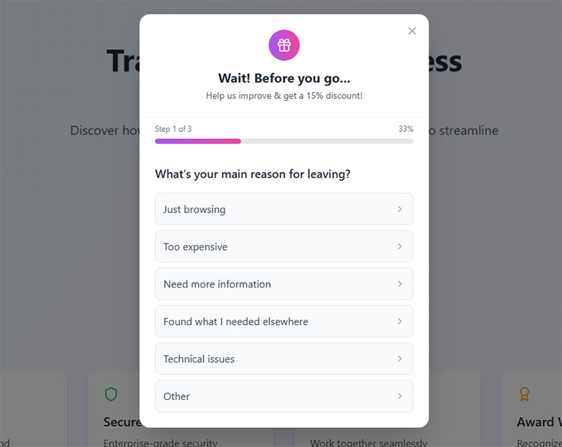
Provide a progress indicator for longer forms
Progress indicators show completion percentage or step position in multi-section forms. Visual progress bars or step counters inform users about remaining fields and sections.
Implementation Method
Implement progress bars using CSS width calculations based on completed fields. Display “Step 2 of 5” counters for multi-step forms.
Multi-step forms achieve 300% higher conversions when combined with clear progress indication. Update progress dynamically as users complete sections.
User Impact
Progress indicators reduce abandonment by showing users how much work remains. Multi-step forms with progress indication can achieve 50%+ conversion rates even with extensive questionnaires.
Users feel motivated to continue when they see substantial progress toward completion.
Technical Requirements
JavaScript for dynamic progress calculation and visual updates. CSS for progress bar styling and responsive design across devices.
Local storage or session tracking to maintain progress if users navigate away. ARIA labels for screen reader compatibility.
Common Implementation Mistakes
Showing inaccurate progress that jumps or moves backward. Using unclear progress indicators that don’t reflect actual completion status.
Implementing progress bars on short forms where they add unnecessary visual clutter.
Compatibility Considerations
Progress indicators work across all modern browsers with JavaScript enabled. Graceful degradation ensures forms remain functional without progress display.
Screen readers can announce progress changes when properly implemented with ARIA live regions.
Use logical question ordering
Logical question ordering follows information hierarchy from general to specific topics. Questions flow naturally from context-setting to detailed feedback without jarring topic shifts.
Implementation Method
Start with broad satisfaction ratings, then narrow to specific feature feedback. Place demographic questions at the end to avoid early abandonment.
Use foot-in-the-door technique with easy questions first, saving sensitive questions for last. Group related questions together to maintain cognitive flow.
User Impact
Logical flow reduces cognitive load and completion time. Users build momentum answering easier questions before tackling complex topics.
Well-ordered forms show higher completion rates as users don’t encounter jarring transitions that break their engagement flow.
Technical Requirements
No special technical requirements beyond standard HTML form structure. Content management systems with drag-and-drop question reordering capabilities.
Analytics tracking to identify where users abandon most frequently for iterative ordering improvements.
Common Implementation Mistakes
Placing complex or sensitive questions at the beginning when users haven’t built commitment. Mixing unrelated topics without clear section breaks.
Starting with demographic data that provides no immediate value to users.
Compatibility Considerations
Question ordering affects all users equally regardless of device or browser. Screen readers benefit from logical flow as they read forms sequentially.
Works consistently across all platforms without requiring special compatibility considerations.
Make required fields clearly marked
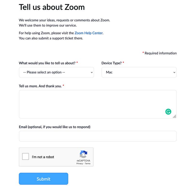
Image source: Zoom.com
Required field indicators use visual markers like asterisks (*) or clear labels to distinguish mandatory fields from optional ones. Clear marking prevents form abandonment while ensuring essential data collection.
Implementation Method
Mark optional fields as “optional” rather than required fields with asterisks. This approach reduces visual clutter while making forms appear less demanding.
Position optional labels within form fields or adjacent to field names. Use consistent styling across all form elements to maintain visual hierarchy and user expectations.
User Impact
Clear field marking prevents users from abandoning forms due to confusion about completion requirements. Studies show users complete forms faster when they understand which fields are truly necessary.
Proper field marking reduces support inquiries about form completion errors by 30-40%.
Technical Requirements
CSS styling for consistent visual indicators across required and optional fields. HTML5 required attribute for form validation and screen reader compatibility.
JavaScript validation to provide real-time feedback about incomplete required fields before form submission.
Common Implementation Mistakes
Using red asterisks on required fields instead of marking optional fields. This creates visual overwhelm and makes forms appear more demanding than necessary.
Inconsistent marking systems within the same form that confuse users about field requirements.
Compatibility Considerations
Visual indicators work across all browsers and devices. Screen readers announce required fields when properly coded with HTML5 attributes.
Mobile users benefit from clear field marking as it reduces typing on small keyboards for unnecessary information.
Include a “prefer not to answer” option
“Prefer not to answer” options provide response alternatives for sensitive or personal questions without forcing users to abandon the form entirely. This option maintains data collection while respecting user privacy boundaries.
Implementation Method
Add “prefer not to answer” or “I’d rather not say” options to demographic questions, income ranges, and personal preference queries.
Place these options consistently at the end of multiple-choice lists. Use neutral language that doesn’t suggest the question is inappropriate while acknowledging user choice.
User Impact
Anonymous feedback collection shows completion rates increase when users feel comfortable skipping sensitive questions rather than abandoning forms entirely.
Studies indicate 13-20% higher completion rates for forms including privacy options on sensitive questions compared to forced-response formats.
Technical Requirements
Radio button or dropdown options including the alternative response. Database schema accommodating “null” or “prefer not to answer” values for analysis.
Conditional logic to handle alternative responses in data processing and reporting systems.
Common Implementation Mistakes
Only including privacy options on obviously sensitive questions while forcing responses on equally personal topics like age or location.
Using judgmental language like “skip this question” instead of neutral alternatives that maintain question legitimacy.
Compatibility Considerations
Standard form elements work across all platforms and assistive technologies. Privacy options support GDPR and similar privacy regulation compliance.
Mobile users appreciate reduced pressure to provide personal information on small screens where typing is more cumbersome.
Use anonymous submission when appropriate
Anonymous feedback collection removes identifying information from responses, encouraging honest feedback by eliminating fear of consequences. Anonymous forms achieve higher response rates for sensitive topics.
Implementation Method
Remove IP address logging and user account requirements for sensitive feedback collection. Design forms without email addresses, names, or other identifying fields when anonymity is the goal.
Communicate anonymity clearly in form introductions. Use phrases like “This survey is completely anonymous” to build trust and encourage participation.
User Impact
Anonymous surveys show response rates between 56-68% compared to 40-50% for identified feedback collection. Users provide more honest responses when identity protection is guaranteed.
Anonymous feedback particularly benefits employee satisfaction surveys, customer complaint systems, and sensitive product feedback.
Technical Requirements
Form processing without session tracking or user authentication. Database storage separating response data from any identifying metadata.
SSL encryption for data transmission security even when responses are anonymous. Clear data retention policies for anonymous submissions.
Common Implementation Mistakes
Claiming anonymity while still collecting identifying information like email addresses “for follow-up purposes.” This destroys trust and reduces response rates.
Using anonymous collection for feedback that genuinely requires follow-up communication with respondents.
Compatibility Considerations
Anonymous forms work across all browsers without requiring user accounts or login systems. Particularly important for users concerned about privacy tracking.
Compliance with data protection regulations easier when no personal information is collected.
Send confirmation after submission
Submission confirmations provide immediate feedback that forms were successfully received and processed. Confirmations reduce user anxiety and prevent duplicate submissions.
Implementation Method
Display confirmation messages immediately after successful form submission. Include unique reference numbers or submission timestamps for user records.
Send confirmation emails for important feedback submissions. Include estimated response timeframes and next steps in the confirmation process.
User Impact
Form confirmations eliminate the 15-20% of users who resubmit forms due to uncertainty about successful processing. Clear confirmations improve user confidence in the feedback system.
Confirmation messages reduce support inquiries about submission status by 60-70%.
Technical Requirements
Server-side processing to generate confirmation responses upon successful database insertion. Email system integration for automated confirmation sending.
Error handling to display appropriate messages for failed submissions with retry options.
Common Implementation Mistakes
Generic “Thank you” messages without indicating what happens next or when users can expect responses. This leaves users uncertain about process continuation.
Missing confirmation messages that leave users wondering if their submission was successful.
Compatibility Considerations
Confirmation messages display properly across all browsers and devices. Screen readers can announce successful submission to visually impaired users.
Email confirmations reach users regardless of device or platform used for form completion.
Set clear expectations about response time
Response time expectations establish realistic timeframes for feedback processing and follow-up communication. Clear expectations prevent customer frustration and multiple follow-up contacts.
Implementation Method
Include specific timeframes in form introduction text like “We respond to feedback within 2 business days” or “Expect a response within 24 hours for urgent issues.”
Set different expectations for different feedback types. Simple questions might warrant faster responses than complex product suggestions requiring internal review.
User Impact
Clear timeframe communication reduces follow-up inquiries by 40-50%. Users report higher satisfaction when they know when to expect responses.
88% of customers expect responses within 60 minutes, but setting realistic expectations prevents disappointment when immediate response isn’t possible.
Technical Requirements
Automated email responses confirming receipt and stating expected response timeframes. Calendar integration for tracking response deadlines.
Workflow systems to ensure responses meet stated timeframe commitments through internal tracking and alerts.
Common Implementation Mistakes
Promising unrealistic response times like “immediate response” for complex feedback requiring investigation or management review.
Not updating expectations during high-volume periods or holidays when response times may be longer than usual.
Compatibility Considerations
Response time communication works across all platforms and languages. Automated confirmation systems function regardless of user device or browser.
Time zone considerations important for global feedback collection with varied user expectations.
Use consistent formatting and design
Consistent design applies unified visual standards across all form elements including fonts, colors, spacing, and interaction patterns. Visual consistency reduces cognitive load and improves completion rates.
Implementation Method
Establish design systems with standardized button styles, field heights, typography, and color schemes. Apply consistent spacing between form elements and sections.
Use the same interaction patterns throughout the form. If dropdowns open on click in one section, maintain that behavior across all dropdowns.
User Impact
Consistent design reduces form completion time by 15-25% as users don’t need to relearn interface patterns for each section.
Visual consistency builds user confidence in form professionalism and data security, improving overall completion rates.
Technical Requirements
CSS stylesheets defining consistent component styles across all form elements. Design system documentation ensuring consistent implementation.
Responsive design maintaining consistency across desktop and mobile forms with appropriate scaling and touch targets.
Common Implementation Mistakes
Mixing different UI libraries or styles within the same form, creating jarring transitions between sections that confuse users.
Inconsistent button placement or labeling that makes users hunt for expected actions like “Next” or “Submit.”
Compatibility Considerations
Consistent design systems work across all modern browsers with CSS support. Style consistency particularly important for screen readers relying on predictable element patterns.
Mobile forms require consistent touch target sizing and interaction patterns across different screen orientations.
Avoid leading or biased questions
Unbiased questions present neutral language without suggesting preferred responses or influencing user opinions. Leading questions compromise data quality by pushing respondents toward specific answers.
Implementation Method
Replace “How much do you love our new feature?” with “How would you rate our new feature?” Use neutral scales with balanced positive and negative options.
Test questions with uninvolved parties to identify unconscious bias. Review question wording to eliminate words that suggest correct or preferred responses.
User Impact
Neutral questions provide more accurate feedback that genuinely reflects user opinions rather than responses influenced by question wording.
Unbiased feedback leads to better business decisions based on authentic user sentiment rather than artificially positive responses.
Technical Requirements
Standard survey question formats with balanced rating scales and neutral language options. Question testing protocols to identify potential bias before form deployment.
Data analysis systems that can identify response patterns indicating possible question bias through statistical variance analysis.
Common Implementation Mistakes
Using loaded terms like “amazing,” “revolutionary,” or “disappointing” in question text that prime respondents for particular response types.
Creating rating scales with unbalanced options like five positive choices and one negative option.
Compatibility Considerations
Neutral question wording translates better across different languages and cultural contexts without introducing regional bias.
Unbiased questions work equally well across all devices and user demographics without favoring particular response patterns.
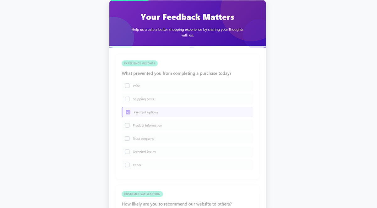
Include a mix of question types
Question variety combines multiple response formats including rating scales, multiple choice, open-ended text, and binary yes/no questions. Mixed formats prevent survey fatigue while capturing different data types.
Implementation Method
Alternate between question types throughout the form. Follow rating scales with brief open-ended questions for context. Use multiple choice for specific options and text areas for detailed explanations.
Limit each question type to 2-3 consecutive instances before switching formats to maintain user engagement throughout the form.
User Impact
Mixed question formats increase completion rates by 20-30% compared to single-format surveys. Users stay engaged when interaction patterns vary appropriately.
Different question types capture complementary data – quantitative metrics from scales and qualitative insights from open responses.
Technical Requirements
HTML form elements supporting various input types including radio buttons, checkboxes, text areas, dropdown menus, and range sliders.
Database schema accommodating different data types from various question formats for comprehensive analysis capabilities.
Common Implementation Mistakes
Overusing open-ended questions that require significant user effort, leading to abbreviated responses or form abandonment.
Creating too many question format switches that confuse users rather than maintaining their interest.
Compatibility Considerations
Standard HTML form elements work across all browsers and assistive technologies. Mixed formats provide multiple interaction methods for users with different abilities.
Mobile forms benefit from question variety as different input types optimize for touch interaction versus typing.
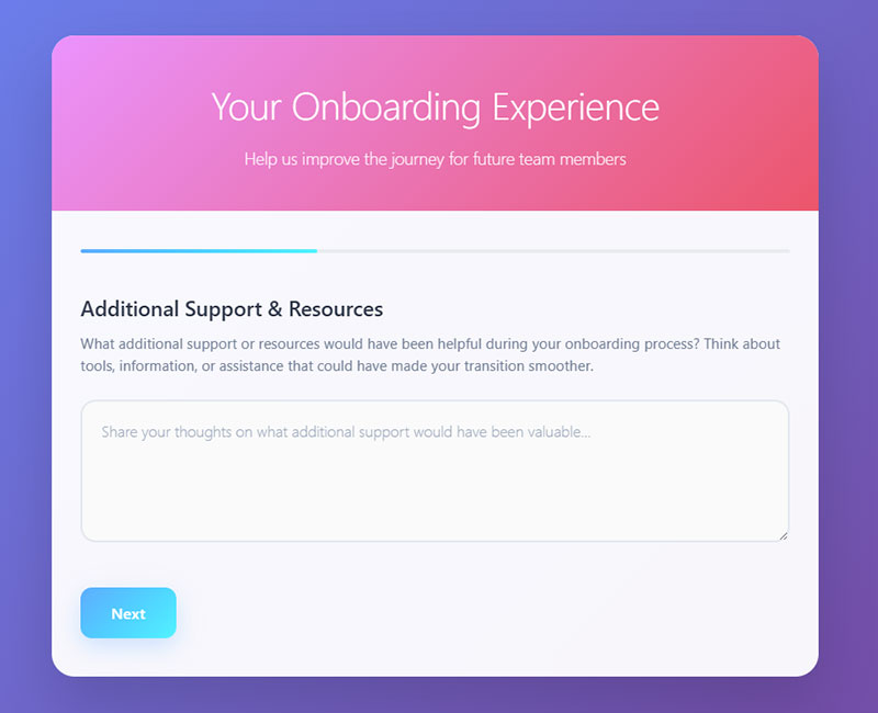
Provide adequate space for written responses
Written response fields offer sufficient character limits and visual space for detailed feedback without constraining user expression. Proper sizing encourages comprehensive responses while maintaining form usability.
Implementation Method
Use textarea elements with minimum 100-character capacity for open-ended questions. Set visual height to display 3-4 lines of text initially with automatic expansion capability.
Implement character counters showing remaining space when approaching limits. Provide guidance like “Please provide at least 10 words” for questions requiring detailed responses.
User Impact
Adequate space signals to users that detailed responses are valued and expected. Forms with properly sized text areas receive 25-40% longer responses than those with restricted fields.
Users complete forms with appropriate text field sizing 15% faster as they don’t need to scroll or fight interface constraints.
Technical Requirements
HTML textarea elements with rows and cols attributes for initial sizing. CSS for responsive width and automatic height adjustment as users type.
JavaScript for character counting and dynamic field expansion. Minimum and maximum character validation for quality control.
Common Implementation Mistakes
Using single-line text inputs for questions expecting detailed responses. Setting arbitrary low character limits that truncate meaningful feedback.
Creating text areas too small to display user input, forcing users to scroll within tiny fields to review their responses.
Compatibility Considerations
Textarea elements work consistently across all browsers and devices. Mobile users benefit from larger text input areas that accommodate virtual keyboard display.
Screen readers properly navigate textarea fields when labeled correctly with appropriate instructions.
Make navigation easy with clear buttons
Clear navigation buttons use descriptive labels and consistent positioning to guide users through form completion. Proper button design reduces confusion and completion errors.
Implementation Method
Use action-oriented button text like “Continue,” “Submit Feedback,” or “Send Response” instead of generic terms like “Submit” or “Next.”
Position primary action buttons prominently with secondary actions (like “Save Draft”) visually distinct through color, size, or placement differences.
User Impact
Forms with radio buttons complete 2.5 seconds faster than equivalent forms with dropdown selections. Clear button labeling reduces form abandonment by 10-15%.
Users report higher confidence completing forms when navigation paths are obvious and button purposes are clear.
Technical Requirements
HTML button elements with semantic markup and clear aria-label attributes. CSS for consistent button styling, hover states, and focus indicators.
JavaScript for form validation before submission and loading states during processing. Keyboard navigation support for accessibility compliance.
Common Implementation Mistakes
Using “Submit” buttons that don’t indicate what happens next or where the information goes. Placing too many button options that create decision paralysis.
Making secondary actions (like “Cancel” or “Clear”) too prominent, leading users to accidentally reset their progress.
Compatibility Considerations
Standard button elements work across all browsers with consistent keyboard and mouse interaction. Touch-friendly sizing important for mobile users.
Screen readers announce button labels clearly when proper HTML semantics are used with descriptive text.
Test across different devices and browsers
Cross-device testing validates form functionality across various browsers, operating systems, and screen sizes to ensure universal accessibility and usability.
Implementation Method
Test forms on Chrome, Firefox, Safari, and Edge browsers across Windows, macOS, iOS, and Android platforms. Use browser testing tools like BrowserStack for comprehensive coverage.
Validate form behavior on different screen sizes from mobile phones (320px) to large desktop displays (1920px+). Test touch interactions, keyboard navigation, and voice input capabilities.
User Impact
Cross-browser testing prevents the 15-25% of users who might encounter compatibility issues from abandoning forms due to technical problems.
Forms tested across devices show consistent completion rates regardless of user’s chosen platform or browser.
Technical Requirements
Responsive CSS design with media queries for different screen sizes. HTML5 form elements with fallbacks for older browser versions.
JavaScript compatibility testing and feature detection for progressive enhancement. Testing frameworks like Selenium for automated cross-browser validation.
Common Implementation Mistakes
Testing only on developer’s preferred browser and device combination. Assuming that forms working on desktop will automatically work on mobile devices.
Overlooking form input behavior differences between iOS and Android, particularly with virtual keyboards and autocomplete features.
Compatibility Considerations
Modern browsers support HTML5 form features consistently, but older versions may need polyfills. Mobile browsers handle form validation differently than desktop versions.
Progressive enhancement ensures basic functionality works even when advanced features aren’t supported by older browsers or assistive technologies.
Follow up on feedback received
Feedback follow-up involves systematic responses to submitted feedback, demonstrating that user input leads to actionable improvements. Follow-up closes the feedback loop and builds user trust.
Implementation Method
Establish response timeframes based on feedback type and urgency. Simple acknowledgments within 24 hours, with detailed responses within 2-5 business days for complex issues.
Create follow-up workflows that categorize feedback by type (complaint, suggestion, praise) and route to appropriate team members for action and response.
User Impact
Companies that follow up on feedback see 23-30% higher response rates in future surveys. Customers report 40% higher satisfaction when they receive meaningful follow-up communication.
Follow-up on feedback increases customer retention by 15-20% as users feel heard and valued by the organization.
Technical Requirements
Customer relationship management (CRM) systems for tracking feedback and follow-up actions. Email automation for acknowledgment messages and status updates.
Workflow management tools for routing feedback to appropriate departments and tracking resolution progress. Analytics for measuring follow-up effectiveness and response times.
Common Implementation Mistakes
Sending generic “thank you” responses without indicating specific actions taken based on user feedback. Failing to follow up on critical issues that require immediate attention.
Creating follow-up processes that focus on internal metrics rather than actually improving user experience based on feedback received.
Compatibility Considerations
Follow-up communications work across all email platforms and communication channels. Mobile-friendly email templates ensure follow-up messages display properly on all devices.
Automated systems should include accessibility considerations for users with different communication preferences or assistive technology requirements.
FAQ on Best Practices For Creating Feedback Forms
What’s the ideal length for a feedback form?
Keep feedback forms under 5 fields for optimal completion rates. Studies show removing a single field can boost completion by 25%.
Focus on essential questions only. Users abandon forms citing length as the second-highest reason at 27% of all dropouts.
How do I increase feedback form response rates?
Use mobile-friendly single-column layouts and clear question wording. Send surveys within 24 hours of customer interactions for higher engagement.
Anonymous submission options increase response rates by 13-20% for sensitive topics. Include progress indicators for longer forms.
Should I use rating scales or open-ended questions?
Combine both question types for comprehensive insights. Rating scales provide quantifiable data while open-ended questions capture detailed context and reasoning.
Start with rating questions followed by “What influenced your rating?” for balanced feedback collection.
What’s the best way to design mobile feedback forms?
Design forms with single-column layouts and touch-optimized buttons. Mobile users convert at 43% compared to 47% on desktop.
Set appropriate keyboard types using HTML5 input attributes. Ensure touch targets are minimum 44px height for accessibility.
How can I reduce form abandonment rates?
Mark optional fields clearly instead of using asterisks on required fields. Provide “prefer not to answer” options for sensitive questions.
Use logical question ordering from general to specific. Test forms across different browsers and devices before launching.
When should I use anonymous vs identified feedback collection?
Use anonymous collection for sensitive topics like employee satisfaction or complaint systems. Anonymous surveys achieve 56-68% response rates versus 40-50% for identified feedback.
Identified collection works better when follow-up communication or personalized responses are needed.
What makes a good feedback form confirmation message?
Include specific next steps and estimated response timeframes in confirmation messages. Add unique reference numbers for user records.
Confirmation messages reduce support inquiries about submission status by 60-70% and prevent duplicate submissions.
How do I write unbiased feedback questions?
Replace leading language like “How much do you love…” with neutral phrasing like “How would you rate…”
Use balanced rating scales with equal positive and negative options. Test questions with uninvolved parties to identify unconscious bias.
What’s the optimal number of question types in one form?
Mix 2-3 different question formats to prevent survey fatigue while maintaining engagement. Alternate between rating scales, multiple choice, and brief open-ended questions.
Limit consecutive questions of the same type to avoid monotonous user experience and form abandonment.
How important is cross-browser testing for feedback forms?
Cross-browser testing prevents 15-25% of users from encountering compatibility issues that lead to form abandonment.
Test on Chrome, Firefox, Safari, and Edge across desktop and mobile platforms. Form validation behavior varies significantly between browsers and devices.
Conclusion
Implementing these best practices for creating feedback forms transforms how you collect and process customer insights. Well-designed forms achieve completion rates of 60-70% while poorly constructed ones struggle to reach 30%.
The key lies in balancing comprehensive data collection with user experience optimization. Form validation and mobile forms implementation ensure accessibility across all devices.
Remember that feedback collection success depends on closing the loop with respondents. Companies that follow up on customer input see 40% higher satisfaction ratings and improved response rates in future surveys.
Start with single-column layouts, clear question wording, and appropriate response options. Test your forms across different browsers and platforms before deployment.
Most importantly, act on the feedback you receive. Users who see their suggestions implemented become advocates for your brand and provide higher-quality responses in subsequent surveys.
Your feedback forms are conversations, not interrogations. Treat them as opportunities to strengthen customer relationships while gathering actionable insights for business improvement.
If you liked this article about best practices for creating feedback forms, you should check out this article about what are WordPress forms.
There are also similar articles discussing types of forms, WordPress form security, how to create forms in WordPress without plugins, and how to create registration forms in WordPress without a plugin.
And let’s not forget about articles on form validation best practices, form accessibility best practices, how to create GDPR compliant forms, and sign up form best practices.

