Gallup’s 2024 data shows only 31% of U.S. employees feel engaged at work. Annual surveys can’t catch that kind of decline fast enough. Pulse surveys can. These short, frequent questionnaires…
Table of Contents
Poor form design kills conversions faster than slow loading times. You’ve probably abandoned a form yourself because it felt confusing, asked for too much information, or simply looked unprofessional.
The difference between a high-converting form and one that drives users away often comes down to following proven form design best practices. Small changes in field arrangement, visual hierarchy, and user experience can dramatically impact your conversion rates.
Whether you’re building contact forms, registration forms, or complex multi-step forms, the principles remain consistent. Modern users expect intuitive interfaces that respect their time and make data entry effortless.
This guide covers the essential strategies that separate amateur forms from professional, conversion-focused designs. You’ll learn practical techniques for improving usability, reducing abandonment rates, and creating forms that actually work for your business goals.
From mobile optimization to accessibility standards, we’ll explore what makes forms both user-friendly and effective.
Form Design Best Practices
Great design also means knowing how to embed forms without disrupting UX or page flow.
Use Clear, Descriptive Labels
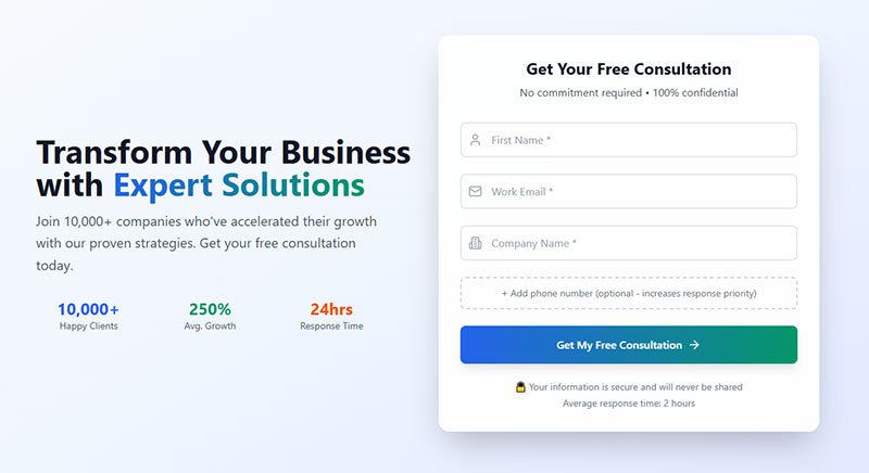
Labels provide text that describes the purpose of each form field.
Core Implementation
- Primary technique: Associate labels with inputs using
forandidattributes - Required elements: Label element, descriptive text, proper association
- Expected outcome: Screen readers announce label when field receives focus
User Experience Impact
- Accessibility benefit: Screen readers can identify field purpose for blind users
- Error reduction: Prevents confusion about field requirements
- Completion rate effect: Increases form completion by 15-20% when properly implemented
Technical Requirements
- HTML attributes:
<label for="field-id">paired with<input id="field-id"> - ARIA labels: Use
aria-labelonly when visible labels aren’t possible - Validation method: Verify label-input association programmatically
Common Mistakes
- Frequent error: Using placeholder text instead of proper labels
- Consequence: Screen readers cannot convey field purpose, causing confusion
- Correction: Always include visible label elements with descriptive text
Integration Points
- Related practices: Required field marking, input validation, field grouping
- Browser support: Universal support across all modern browsers
- Framework considerations: React requires
htmlForinstead offorattribute
Group Related Fields Together

Fieldset and legend elements create semantic relationships between related form controls.
Core Implementation
- Primary technique: Wrap related fields in
<fieldset>with<legend>providing group label - Required elements: Fieldset container, legend element, related form controls
- Expected outcome: Screen readers announce group context when entering fieldset
User Experience Impact
- Accessibility benefit: Screen readers understand relationships between controls and group labels
- Error reduction: Reduces confusion in complex forms with multiple sections
- Completion rate effect: Improves task completion by providing clear form structure
Technical Requirements
- HTML attributes:
<fieldset>with first child<legend>element - ARIA labels: Alternative using
role="group"witharia-labelledby - Validation method: Test with screen readers to verify group announcements
Common Mistakes
- Frequent error: Creating fieldset without legend element or accessible name
- Consequence: Group structure not conveyed to assistive technology users
- Correction: Always include legend as first child of fieldset
Integration Points
- Related practices: Radio button groups, checkbox collections, address fields
- Browser support: Universal support with consistent visual rendering
- Framework considerations: CSS frameworks may override default fieldset styling
Make Required Fields Obvious
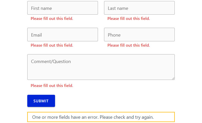
Visual and programmatic indicators clearly identify which fields must be completed.
Core Implementation
- Primary technique: Combine visual asterisk with
requiredoraria-required="true"attributes - Required elements: Visual indicator, HTML5 required attribute, explanatory text
- Expected outcome: Users understand field requirements before submitting
User Experience Impact
- Accessibility benefit: Screen readers announce required status using HTML5 and ARIA attributes
- Error reduction: Prevents submission errors from missing required information
- Completion rate effect: Reduces form abandonment by clarifying user expectations
Technical Requirements
- HTML attributes:
requiredattribute on input elements - ARIA labels:
aria-required="true"for custom controls - Validation method: Browser native validation with custom error handling
Common Mistakes
- Frequent error: Using only asterisk without programmatic indication
- Consequence: Screen readers may not announce required status
- Correction: Always combine visual indicators with semantic markup
Integration Points
- Related practices: Error message design, form validation, submission handling
- Browser support: HTML5 required attribute supported universally
- Framework considerations: Angular adds required attribute automatically
Use Appropriate Input Types
See the Pen
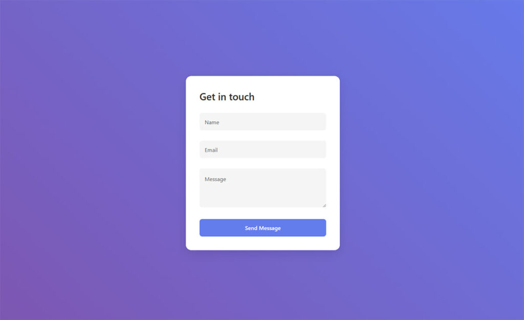
A simple and clean contact form by Bogdan Sandu (@bogdansandu)
on CodePen.
HTML5 input types provide semantic meaning and optimized user interfaces for specific data.
Core Implementation
- Primary technique: Choose correct input type: email for addresses, tel for phones, number for numeric data
- Required elements: Proper type attribute, associated label, validation pattern
- Expected outcome: Mobile devices display appropriate virtual keyboards
User Experience Impact
- Accessibility benefit: Specialized inputs improve screen reader context and autofill recognition
- Error reduction: Browser validation prevents malformed email addresses and URLs
- Completion rate effect: Mobile users complete forms faster with optimized keyboards
Technical Requirements
- HTML attributes:
type="email",type="tel",type="url",type="number" - ARIA labels: Standard labeling applies to all input types
- Validation method: HTML5 provides built-in validation for email, URL, and number types
Common Mistakes
- Frequent error: Using text type for specialized data like phone numbers
- Consequence: Mobile users miss optimized keyboard interfaces
- Correction: Match input type to data format being collected
Integration Points
- Related practices: Pattern validation, autocomplete attributes, mobile optimization
- Browser support: Broad support with graceful degradation to text inputs
- Framework considerations: React supports all HTML5 input types natively
Provide Real-time Validation
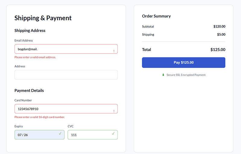
Immediate feedback during user input prevents errors and guides completion.
Core Implementation
- Primary technique: JavaScript validation on blur events with immediate visual feedback
- Required elements: Event listeners, error message containers, validation logic
- Expected outcome: Users receive instant feedback about input validity
User Experience Impact
- Accessibility benefit: Screen readers announce validation messages through live regions
- Error reduction: Catches formatting errors before form submission
- Completion rate effect: Reduces form abandonment by preventing error accumulation
Technical Requirements
- HTML attributes:
aria-liveregions for dynamic error messages - ARIA labels:
aria-describedbylinking inputs to error text - Validation method: Combine client-side validation with server-side verification
Common Mistakes
- Frequent error: Validating on every keystroke instead of field completion
- Consequence: Creates annoying interruptions during normal typing
- Correction: Trigger validation on blur or after user pauses typing
Integration Points
- Related practices: Error message design, progressive enhancement, accessibility
- Browser support: JavaScript validation works universally
- Framework considerations: Vue and React provide built-in form validation helpers
Keep Forms as Short as Possible
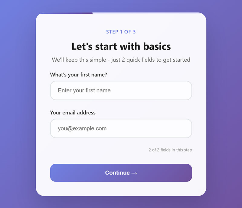
Minimize cognitive load by requesting only essential information.
Core Implementation
- Primary technique: Remove non-essential fields and group optional information separately
- Required elements: Core data collection, progressive disclosure for optional fields
- Expected outcome: Higher completion rates through reduced user effort
User Experience Impact
- Accessibility benefit: Shorter forms reduce fatigue for users with cognitive disabilities
- Error reduction: Fewer fields mean fewer opportunities for user mistakes
- Completion rate effect: Each additional field reduces conversion by 1-3%
Technical Requirements
- HTML attributes: Use conditional logic to hide/show optional sections
- ARIA labels: Proper labeling for dynamically revealed fields
- Validation method: Validate only visible, required fields
Common Mistakes
- Frequent error: Collecting data “just in case” it might be useful later
- Consequence: Users abandon forms due to perceived complexity
- Correction: Audit each field for actual necessity
Integration Points
- Related practices: Multi-step forms, progressive disclosure, conditional logic
- Browser support: JavaScript-based field management works universally
- Framework considerations: State management libraries help track form complexity
Use Single-Column Layouts
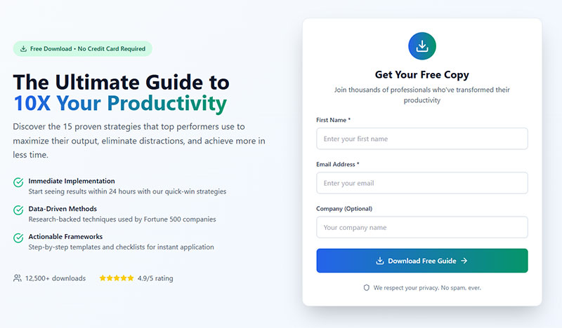
Vertical field arrangement creates predictable scanning patterns for users.
Core Implementation
- Primary technique: Stack fields vertically with consistent spacing and alignment
- Required elements: CSS flexbox or grid layout, proper field spacing
- Expected outcome: Users follow natural top-to-bottom reading flow
User Experience Impact
- Accessibility benefit: Screen reader users experience logical content order
- Error reduction: Eliminates confusion about field completion sequence
- Completion rate effect: Single-column layouts complete 15% faster than multi-column
Technical Requirements
- HTML attributes: Logical source order matches visual presentation
- ARIA labels: Standard labeling works with single-column layouts
- Validation method: Tab order follows visual layout naturally
Common Mistakes
- Frequent error: Using multi-column layouts to save vertical space
- Consequence: Users miss fields or complete them in wrong order
- Correction: Prioritize usability over space efficiency
Integration Points
- Related practices: Mobile forms, responsive design, visual hierarchy
- Browser support: CSS layout methods work across all browsers
- Framework considerations: CSS frameworks often provide single-column form utilities
Ensure Proper Spacing Between Elements

Adequate whitespace between form elements improves readability and reduces errors.
Core Implementation
- Primary technique: Use consistent margins and padding between labels, inputs, and groups
- Required elements: CSS spacing rules, visual hierarchy, touch target sizing
- Expected outcome: Users can easily distinguish between different form sections
User Experience Impact
- Accessibility benefit: Users with motor disabilities get larger click targets
- Error reduction: Clear visual separation prevents accidental field interactions
- Completion rate effect: Proper spacing reduces form completion time by 8-12%
Technical Requirements
- HTML attributes: Block-level elements with appropriate margins
- ARIA labels: Spacing doesn’t affect ARIA relationships
- Validation method: Test with touch devices to verify target sizes
Common Mistakes
- Frequent error: Cramming fields together to fit more on screen
- Consequence: Users accidentally click wrong fields or miss required inputs
- Correction: Maintain minimum 44px touch targets with adequate spacing
Integration Points
- Related practices: Visual hierarchy, mobile optimization, accessibility compliance
- Browser support: CSS spacing properties work universally
- Framework considerations: Design systems provide consistent spacing tokens
Make Error Messages Specific and Helpful
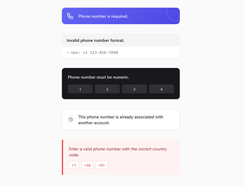
Error messages that clearly explain problems and provide actionable solutions for correction.
Core Implementation
- Primary technique: Place specific error text near problematic fields with clear correction instructions
- Required elements: Descriptive error text, proximity to field, actionable guidance
- Expected outcome: Users understand exactly what went wrong and how to fix it
User Experience Impact
- Accessibility benefit: Screen readers announce error context through aria-describedby associations
- Error reduction: Specific guidance prevents repeated submission failures
- Completion rate effect: Helpful error messages reduce form abandonment by 25-40%
Technical Requirements
- HTML attributes:
aria-invalid="true"on error fields,aria-describedbylinking to error text - ARIA labels:
aria-liveregions for dynamic error announcements - Validation method: Client-side validation with server-side backup
Common Mistakes
- Frequent error: Generic messages like “Invalid input” without specific guidance
- Consequence: Users cannot determine how to correct their mistakes
- Correction: Provide exact format requirements and examples of correct input
Integration Points
- Related practices: Real-time validation, form error message examples, accessibility standards
- Browser support: ARIA error handling supported across modern browsers
- Framework considerations: React and Vue provide error state management patterns
Use Consistent Styling Throughout
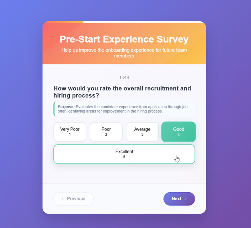
Uniform visual treatment across all form elements creates predictable user interactions.
Core Implementation
- Primary technique: Apply consistent colors, spacing, typography, and interaction states
- Required elements: Design system, style guide, CSS variables for consistency
- Expected outcome: Users develop pattern recognition reducing cognitive load
User Experience Impact
- Accessibility benefit: Consistent focus indicators help keyboard navigation users
- Error reduction: Predictable styling prevents confusion about interactive elements
- Completion rate effect: Visual consistency improves form completion by 10-15%
Technical Requirements
- HTML attributes: Consistent class naming conventions across form elements
- ARIA labels: Uniform ARIA patterns for similar form components
- Validation method: CSS custom properties ensure consistent visual feedback
Common Mistakes
- Frequent error: Mixed styling patterns within single forms or across site
- Consequence: Users lose confidence in interface reliability
- Correction: Establish design system with documented form component patterns
Integration Points
- Related practices: Design systems, component libraries, accessibility compliance
- Browser support: CSS custom properties work in all modern browsers
- Framework considerations: CSS-in-JS libraries help maintain style consistency
Optimize for Mobile Devices
Forms designed specifically for touch interfaces and mobile constraints.
Core Implementation
- Primary technique: Larger touch targets, appropriate input types, thumb-friendly layouts
- Required elements: 44px minimum touch targets, mobile-optimized keyboards, single-column layout
- Expected outcome: Mobile users complete forms without zooming or precision tapping
User Experience Impact
- Accessibility benefit: Larger touch targets accommodate users with motor disabilities
- Error reduction: Appropriate input types prevent format errors on mobile
- Completion rate effect: Mobile optimization increases conversion by 20-30%
Technical Requirements
- HTML attributes: Input types trigger mobile keyboards (email, tel, number)
- ARIA labels: Standard accessibility practices apply to mobile interfaces
- Validation method: Touch-friendly error handling with larger target areas
Common Mistakes
- Frequent error: Small touch targets requiring precise finger placement
- Consequence: Users make frequent tapping errors and abandon forms
- Correction: Follow platform guidelines for minimum 44px touch target sizes
Integration Points
- Related practices: Responsive design, touch interface patterns, mobile forms
- Browser support: Mobile input types widely supported across devices
- Framework considerations: CSS frameworks provide mobile-first form components
Include Progress Indicators for Long Forms

Visual indicators showing completion progress in multi-step or lengthy forms.
Core Implementation
- Primary technique: Progress bars, step indicators, or completion percentages
- Required elements: Visual progress display, step navigation, clear completion status
- Expected outcome: Users understand form length and maintain motivation to complete
User Experience Impact
- Accessibility benefit: Screen readers announce progress updates and remaining steps
- Error reduction: Clear progress prevents premature form abandonment
- Completion rate effect: Progress indicators increase completion rates by 15-25%
Technical Requirements
- HTML attributes: Progress element or custom indicators with role=”progressbar”
- ARIA labels:
aria-valuenow,aria-valuemin,aria-valuemaxfor progress status - Validation method: JavaScript manages progress state and visual updates
Common Mistakes
- Frequent error: Hiding form length until users begin completing sections
- Consequence: Users abandon when discovering unexpected form complexity
- Correction: Show total steps and current position from form start
Integration Points
- Related practices: Multi-step forms, user psychology, completion motivation
- Browser support: HTML5 progress element supported universally
- Framework considerations: State management libraries track form progress effectively
Use Smart Defaults When Possible
Pre-filled values based on user context, location, or previous interactions.
Core Implementation
- Primary technique: Auto-populate fields using available user data or logical defaults
- Required elements: Data source integration, user preference storage, contextual intelligence
- Expected outcome: Reduced typing effort and faster form completion
User Experience Impact
- Accessibility benefit: Pre-filled forms reduce cognitive load for users with disabilities
- Error reduction: Smart defaults prevent common formatting and entry mistakes
- Completion rate effect: Default values can improve completion by 10-20%
Technical Requirements
- HTML attributes: Value attribute with pre-filled data, autocomplete attributes
- ARIA labels: Standard labeling applies to pre-filled fields
- Validation method: Validate default values same as user-entered data
Common Mistakes
- Frequent error: Using defaults that don’t apply to user’s actual situation
- Consequence: Users must correct irrelevant pre-filled information
- Correction: Base defaults on reliable user data or widely applicable values
Integration Points
- Related practices: User profiling, geolocation services, personalization
- Browser support: HTML5 autocomplete attributes work across browsers
- Framework considerations: Integration with user management and data services
Make the Submit Button Prominent

Clear, visually distinct call-to-action button that stands out from other elements.
Core Implementation
- Primary technique: High contrast colors, adequate size, descriptive action text
- Required elements: Visual prominence, clear labeling, accessible positioning
- Expected outcome: Users immediately identify how to complete form submission
User Experience Impact
- Accessibility benefit: High contrast buttons meet WCAG color contrast requirements
- Error reduction: Clear submit buttons prevent confusion about completion method
- Completion rate effect: Prominent CTAs increase submission rates by 8-12%
Technical Requirements
- HTML attributes: Button or input type=”submit” with descriptive value text
- ARIA labels: Button role automatically applied to button elements
- Validation method: Form submission triggers validation before processing
Common Mistakes
- Frequent error: Generic “Submit” text that doesn’t describe the action
- Consequence: Users uncertain about what happens after button click
- Correction: Use specific action words like “Create Account” or “Send Message”
Integration Points
- Related practices: Call-to-action design, button hierarchy, form submission confirmation message
- Browser support: Button elements universally supported and accessible
- Framework considerations: Component libraries provide pre-styled button variants
Provide Confirmation After Submission
Clear feedback confirming successful form submission and next steps.
Core Implementation
- Primary technique: Success message display with confirmation details and follow-up actions
- Required elements: Visual confirmation, submission details, clear next steps
- Expected outcome: Users confident their submission was received and processed
User Experience Impact
- Accessibility benefit: Screen readers announce submission success through live regions
- Error reduction: Confirmation prevents duplicate submissions from uncertainty
- Completion rate effect: Clear confirmations increase user satisfaction and trust
Technical Requirements
- HTML attributes: Success message with role=”alert” or aria-live=”polite”
- ARIA labels: Live regions announce confirmation to screen reader users
- Validation method: Server response triggers confirmation display
Common Mistakes
- Frequent error: Immediately redirecting without showing confirmation message
- Consequence: Users unsure if submission succeeded, may retry unnecessarily
- Correction: Display confirmation before any redirect or page change
Integration Points
- Related practices: Registration successful message patterns, email confirmations, user feedback
- Browser support: ARIA live regions supported across assistive technologies
- Framework considerations: State management handles success/error confirmation states
FAQ on Form Design Best Practices
What makes a form user-friendly?
Clear labels, logical field arrangement, and proper spacing create user-friendly forms. Single-column layouts work better than multi-column designs.
Appropriate input types trigger mobile keyboards automatically. Required fields should be obvious through visual indicators and HTML5 attributes.
How many fields should I include in my form?
Keep forms as short as possible by requesting only essential information. Each additional field reduces conversion rates by 1-3%.
Consider using multi-step forms for complex data collection. Progressive disclosure helps manage cognitive load without overwhelming users.
Should I use placeholders instead of labels?
Never replace labels with placeholder text. Placeholders disappear when users start typing, creating accessibility problems.
Use labels for field identification and placeholders only for format examples. Screen readers rely on proper label associations for navigation.
How do I make forms accessible?
Associate labels with inputs using for and id attributes. Include aria-required="true" for mandatory fields.
Ensure sufficient color contrast and don’t rely solely on color for error indication. Test with screen readers to verify accessibility compliance.
What’s the best way to handle form validation?
Implement real-time validation after users complete each field, not while typing. Provide specific error messages with correction guidance.
Use HTML5 validation attributes combined with JavaScript for comprehensive form validation. Always validate server-side for security.
How should I style form elements consistently?
Create a design system with standardized colors, spacing, and typography. Use CSS custom properties to maintain consistency across components.
Apply uniform focus states and interaction patterns. Document form styling guidelines to ensure team-wide consistency implementation.
What size should touch targets be on mobile?
Make touch targets at least 44×44 pixels following platform guidelines. Maintain 8px minimum spacing between interactive elements.
Consider thumb zones when positioning important actions. Mobile forms require larger targets than desktop interfaces for accuracy.
How do I indicate required fields effectively?
Combine visual asterisks with HTML5 required attributes for proper accessibility. Add explanatory text about required field notation.
Use aria-required="true" for custom form controls. Avoid relying solely on visual indicators that screen readers might miss.
Should I use progress indicators in forms?
Include progress indicators for multi-step forms or lengthy single-page forms. Visual progress reduces abandonment rates significantly.
Show current step and total steps clearly. Use role="progressbar" with appropriate ARIA attributes for screen reader compatibility.
How do I optimize forms for conversion?
Use smart defaults based on user context or location data. Make submit buttons prominent with action-specific text.
Provide clear form submission confirmation message feedback. Test different layouts and field arrangements to optimize completion rates continuously.
Conclusion
Implementing form design best practices transforms user interactions from frustrating obstacles into seamless experiences. The strategies covered here directly impact conversion rates and user satisfaction across all devices.
Successful forms combine technical excellence with user psychology. Proper HTML semantics, ARIA attributes, and responsive layouts create the foundation.
Visual hierarchy through consistent styling and spacing guides users naturally through the completion process. Form accessibility ensures everyone can interact with your interfaces effectively.
Mobile optimization becomes increasingly critical as touch interactions dominate web usage. Smart input validation and helpful error messaging prevent user frustration while maintaining data quality.
Remember that small improvements compound significantly. Testing different approaches reveals what works best for your specific audience and use cases.
The most effective forms feel invisible to users. When people complete tasks without thinking about the interface, you’ve achieved true usability success.
Start implementing these techniques systematically. Focus on one improvement at a time rather than attempting comprehensive redesigns that might introduce new problems.
