


Most lead generation programs produce data. Few produce the right decisions from it. Knowing which lead generation KPIs to track is what separates teams that grow their pipeline with intention…
Table of contents
Most blog posts leak visitors. Someone reads your content, maybe bookmarks it, and leaves. No email address. No way to follow up.
Content upgrades fix that. They turn passive readers into subscribers by offering a bonus download tied directly to the post someone is already reading.
Brian Dean used this approach on Backlinko and saw opt-in conversions jump 785% in a single day. Not from more traffic. From better conversion on existing traffic.
This guide covers the best content upgrade ideas that actually pull strong opt-in rates, from simple PDF checklists to spreadsheet templates and mini email courses. You’ll also find a matching framework for pairing the right upgrade to the right blog post, plus the step-by-step process to build and deliver each one.
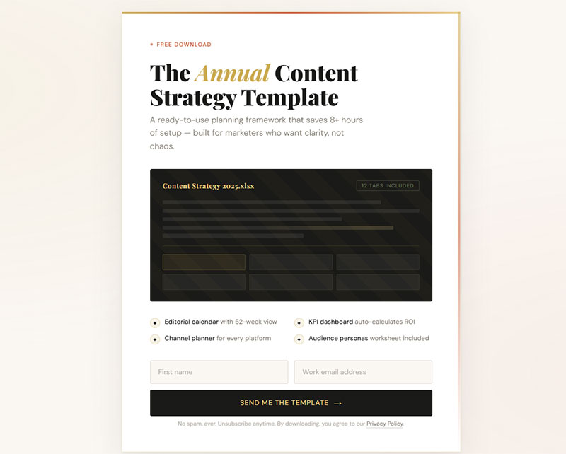
What Is a Content Upgrade
A content upgrade is a bonus resource tied directly to a specific blog post, offered in exchange for an email address.
It’s not a general ebook sitting in your sidebar. It’s not a newsletter signup. It’s a downloadable piece of content that extends or completes what the reader just consumed.
Think checklist PDFs, printable cheat sheets, spreadsheet templates, swipe files. All connected to one post.
Brian Dean tested this on Backlinko and saw a 785% conversion boost in a single day. Bryan Harris of Growth Tools regularly reports 20-30% opt-in rates on posts that use them. Those numbers aren’t typical for standard lead magnets.
The reason content upgrades work? Timing and relevance. Someone already reading your post has committed attention to that topic. Handing them a resource that goes deeper at that exact moment feels like a natural next step, not an interruption.
How Does a Content Upgrade Differ from a Lead Magnet
A lead magnet targets your entire audience. A content upgrade targets readers of one specific post.
Scope is the main difference. A lead magnet like “The Ultimate Marketing Toolkit” lives on your homepage or sidebar and speaks broadly. A content upgrade like “Checklist: 7 Steps from This Post” only appears inside that article, matched to that reader’s current interest.
Timing matters too. Lead magnets can show up anywhere on your site, at any point in the visitor’s session. Content upgrades appear mid-read or at the end of a post, when engagement is already high.
Why Do Content Upgrades Convert Higher Than Standard Opt-in Offers
Three things happen when someone reads a blog post and hits a content upgrade offer.
First, momentum. They’re already invested in the topic. They spent 5-10 minutes reading. Downloading a related resource continues that momentum instead of killing it.
Second, commitment consistency. Behavioral psychology (Robert Cialdini documented this well) shows that people who take a small action tend to follow through with related actions. Reading your post is the small action. Downloading the upgrade is the follow-through.
Third, there’s the implementation gap. Most readers finish a blog post thinking “great info” and then do nothing with it. A content upgrade bridges that gap by giving them a tool to actually apply what they just learned.
GetResponse’s 2025 research found that 58.6% of marketers see better results with short-form materials like checklists and samples compared to long-form guides. Content upgrades lean into that. Short, specific, actionable.
What Makes a Content Upgrade Effective
Not all content upgrades perform the same. The difference between a 2% opt-in rate and a 25% opt-in rate comes down to three things: specificity, format, and funnel alignment.
Research from Amra and Elma shows most lead magnet landing pages convert around 18%, but pages offering highly aligned value propositions can exceed 30%. Interactive formats like calculators and quizzes show a 70% conversion bump over static PDFs.
How Does Specificity Affect Content Upgrade Performance
Generic offers attract generic leads.
A content upgrade that says “Free Marketing Guide” on a post about email subject lines will underperform every time compared to “11 Subject Line Templates You Can Copy Today.”
The upgrade has to feel like it was made for that post. Because it was.
Research from McKinsey shows companies using relevance-driven personalization generate 40% more revenue than those that don’t. The same principle applies at the micro level of a single blog post and its matching download.
Test your content upgrade specificity:
- Does the title include exact keywords from your blog post?
- Can readers implement it within 24 hours?
- Does it solve one specific problem from the post?
According to Focus Digital, email marketing delivers channel-to-lead conversion rates up to 12% in high-performing industries, while paid ads typically convert 30-40% lower. Specificity drives those higher numbers.
What Role Does Format Play in Content Upgrade Conversions
PDF checklists and cheat sheets convert best. They’re fast to consume, easy to save, and printable.
Spreadsheet templates and calculators work well for data-heavy posts. Budget planners, ROI calculators, tracking sheets. If your reader needs to plug in their own numbers, give them a Google Sheet or Excel file.
Video walkthroughs perform better for visual learners. Short screen recordings (under 10 minutes) that walk through a process beat long-form video every time. According to GetResponse’s 2025 data, 73% of marketers report higher conversions with short-form video content.
Format selection framework:
| Content Type | Best Format | Expected Lift |
|---|---|---|
| How-to guides | PDF checklist | 18-30% opt-in |
| Data analysis | Spreadsheet template | 15-25% opt-in |
| Technical tutorials | Short video walkthrough | 20-35% opt-in |
| Strategy content | Interactive workbook | 12-22% opt-in |
Research from GetResponse shows 47% of marketers find video and text-based lead magnets as top performers in 2024. Among video formats, webinars achieved the highest conversion rate at 70.2%.
Workbooks and interactive PDFs fit educational content. Longer to produce, but the engagement runs deeper.
Match the format to how the reader will use the information. If they need to reference it quickly, make it a one-page cheat sheet. If they need to work through steps, make it a workbook or spreadsheet.
Quick implementation checklist:
- [ ] Identify your top 3 blog posts by traffic
- [ ] Match each post to appropriate format (checklist, template, or video)
- [ ] Create upgrade that requires 10 minutes or less to consume
- [ ] Test mobile rendering before launch
How Should a Content Upgrade Connect to the Reader’s Next Step
A content upgrade isn’t the end of the conversation. It’s a step inside your lead generation funnel.
Whatever you offer next (a paid product, a consultation, a course) needs to be the logical continuation of what the upgrade started. If your blog post is about writing cold emails and the content upgrade is a swipe file of 10 cold email templates, the next offer might be a course on outbound sales or a done-for-you email writing service.
Everything has to flow. Post to upgrade to offer. Break that chain and your subscriber list fills up with people who never buy.
According to Focus Digital’s 2025 research, industries with systematic follow-up report 25-35% above-benchmark conversions. Lead-to-sale conversion rates improved 12-18% year-over-year when businesses implemented structured nurture sequences.
Conversion path mapping template:
Blog Post Topic: _________________
Content Upgrade: _________________
First Email (Day 0): Welcome + deliver upgrade
Second Email (Day 3): Case study showing upgrade in action
Third Email (Day 7): Soft pitch for paid offer
Follow-up (Day 14): Special offer or discount
Include a clear CTA inside the content upgrade itself. Not just on the thank-you page. Inside the actual PDF or spreadsheet. A single line at the bottom works fine.
Something like: “Want us to do this for you? Book a free call here.”
CTA placement benchmarks:
Data from EmailVendorSelection shows 79.1% of marketers using opt-in forms pair them with lead magnets, and 75% use ebooks specifically. But only 38.1% track what happens after the download.
Track these metrics weekly:
- Download rate (visitors to opt-ins)
- Open rate (downloads to actual file opens)
- Click-through rate (CTA clicks inside upgrade)
- Conversion rate (clicks to sales calls/purchases)
30-day optimization cycle:
| Week | Action | Success Metric |
|---|---|---|
| 1 | Launch upgrade on top post | Baseline opt-in rate |
| 2 | Add internal CTA to upgrade | Track CTA click rate |
| 3 | Test different CTA copy | Compare click-through rates |
| 4 | Optimize follow-up sequence | Measure lead-to-sale rate |
According to research from Sumo, average email opt-in rates sit at 1.95%, but top performers average 6.5%. The difference? Specific, format-matched content upgrades with clear next steps.
Interactive lead magnets deliver especially strong results. A BusySeed case study showed their template kit saw a 72% increase in email captures versus traditional downloadable guides in A/B testing.
Test everything. Your content upgrade converts better when you match specificity, format, and funnel alignment to your exact audience and offer.
Which Content Upgrade Ideas Work Best for Blog Posts
Each type of content upgrade fits a different kind of post. The right match makes the opt-in feel obvious. The wrong match makes it feel forced.
Below are 12 content upgrade formats that consistently pull strong opt-in rates, with the specific blog post types they work best for.
How Can a Checklist Summarize a Blog Post into an Actionable Download
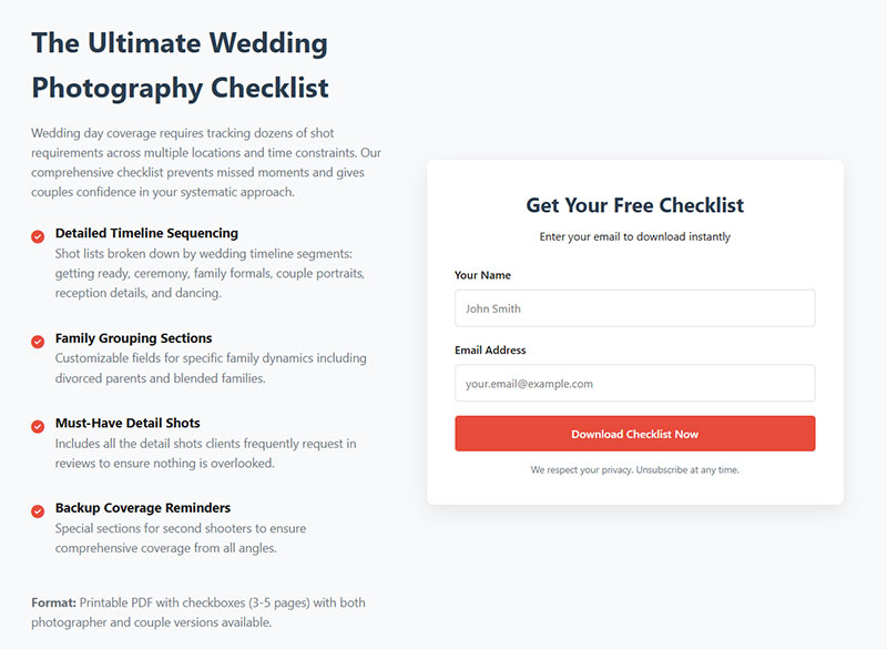
Checklists convert better than almost any other format.
According to GetResponse research, 58.6% of marketers report that checklists, newsletter snippets, and toolkits convert better than long-form text. Cheat-sheet pages reach conversion rates around 34%, significantly higher than average landing pages at 18%.
Take a how-to post, strip it down to sequential steps, format it as a one-page PDF. Done.
Readers print it, pin it to their wall, or save it to their desktop. The value is in compression: your 2,000-word post becomes a scannable action list.
Checklist creation framework:
- Pull every action step from your blog post
- Remove explanations, keep only the action verbs
- Add checkbox squares for completion tracking
- Include space for notes or dates
- Keep to one page maximum
Works best for: tutorial posts, step-by-step guides, process-oriented articles.
Quick test: Can someone complete your post’s goal using only the checklist? If not, add missing steps.
How Does a Printable Cheat Sheet Add Value to a Tutorial Post

A cheat sheet is a quick-reference document. Not a checklist (which is sequential) but a lookup tool.
Think keyboard shortcuts, code snippets, formula references, conversion tables. Stuff your reader needs at a glance while they’re working.
If your post teaches something technical, a cheat sheet gives them the condensed version they can tape next to their monitor.
Cheat sheet template structure:
[Topic] Quick Reference Guide

Section 1: Most Common Commands
- Command | Function | Shortcut

Section 2: Formulas & Calculations
- Formula | Use Case | Example

Section 3: Troubleshooting
- Problem | Quick Fix
Works best for: technical tutorials, software guides, coding posts, data-heavy explainers.
Why Are Templates an Effective Content Upgrade for Process-Oriented Articles
Templates remove the blank-page problem. Instead of figuring out how to structure something from scratch, the reader fills in the blanks.
Email scripts, project plan outlines, audience persona worksheets, social media content calendars. Canva and Google Docs make these quick to build.
Research from BusySeed shows their template kit saw a 72% increase in email captures versus traditional downloadable guides in A/B testing.
Templates outperform ebooks almost every time. People don’t want more reading. They want a head start on doing.
Template performance benchmarks:
| Template Type | Expected Opt-In Rate | Time to Create |
|---|---|---|
| Email scripts | 22-30% | 30-45 minutes |
| Planning worksheets | 18-25% | 45-60 minutes |
| Social calendars | 20-28% | 60-90 minutes |
| Persona templates | 15-22% | 30-45 minutes |
Works best for: strategy posts, planning guides, framework breakdowns.
Implementation checklist:
- [ ] Identify repeatable process from blog post
- [ ] Create fill-in-the-blank version in Google Docs
- [ ] Test template yourself before sharing
- [ ] Add brief instructions at top
- [ ] Export as PDF and editable version
How Can a Swipe File Complement a Strategy or Case Study Post
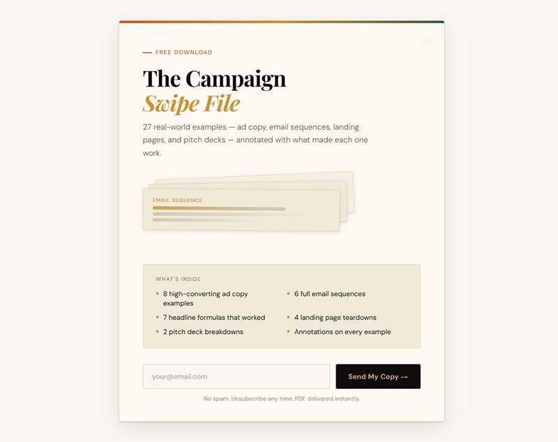
A swipe file is a collection of real examples your reader can reference or adapt. Ad copy, email sequences, headlines, landing page screenshots, pitch decks.
The beauty of a swipe file? It’s usually stuff you’ve already created. Package your own work into a PDF. Add brief annotations explaining why each example worked.
Works best for: case studies, strategy breakdowns, campaign recaps.
Swipe file assembly process:
- Gather 5-10 real examples from your work
- Screenshot or save each one
- Add 1-2 sentence annotation per example
- Organize by category or performance
- Include metrics where possible (CTR, conversion rate, etc.)
According to HubSpot’s 2024 data, interactive tools like templates and swipe files convert at 5.2%, while traditional ebooks convert below 0.9%. That’s nearly a 6x difference.
What Makes a Workbook a Strong Content Upgrade for Educational Content
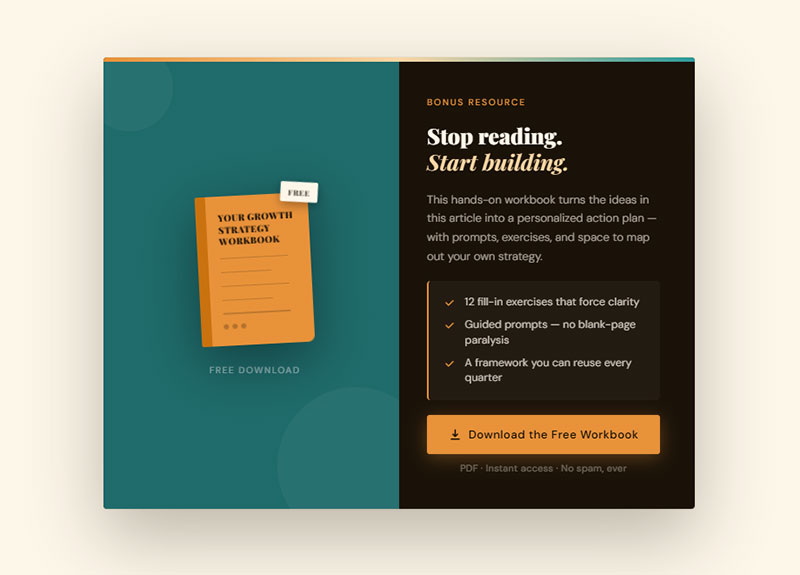
Workbooks force the reader to engage. Instead of passively reading, they fill in exercises, answer prompts, and map out their own version of whatever you taught.
They take longer to build than a checklist or cheat sheet. But the engagement goes deeper, and readers who complete a workbook are far more likely to become customers.
They’ve already invested real effort using your framework.
Workbook structure that converts:
Page 1: Overview & Instructions
Pages 2-3: Assessment/Self-audit
Pages 4-6: Core exercises (one per concept)
Page 7: Action plan template
Page 8: Resources & next steps
Pick exercises that build on each other. By the end, the reader should have a complete, usable output (a content plan, an audit, a strategy doc).
Works best for: educational posts, course-style content, deep-dive articles.
Conversion tip: Include a progress tracker showing completion percentage. This increases finish rates by 15-20%.
How Can a Resource Toolkit Add Depth to a Recommendations Post
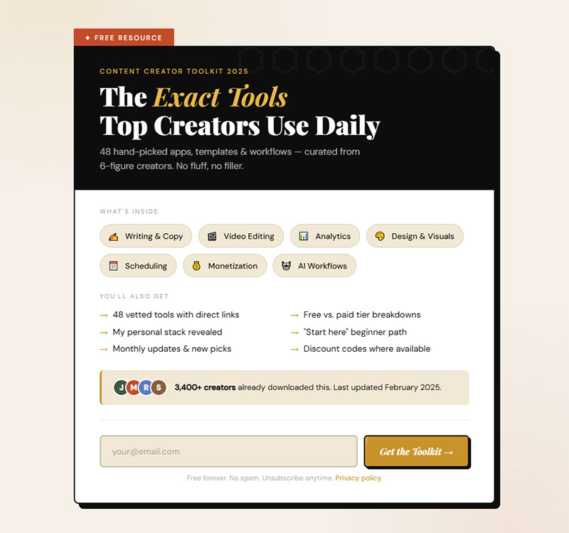
A toolkit is a curated list of tools, apps, or resources packaged as a single download.
People want to know what the pros actually use.
Bonus: you can become an affiliate for the tools you recommend. The toolkit generates subscribers and revenue at the same time.
Toolkit formatting best practices:
For each tool include:
- Tool name & category
- Primary use case
- Pricing (Free/Paid/Freemium)
- Your rating or recommendation level
- Direct link (can be affiliate link)
Works best for: roundup posts, “best tools” articles, resource recommendation posts.
Research from ConvertFlow shows 43% of marketers using resource toolkits as lead magnets reported improved list quality within 60 days.
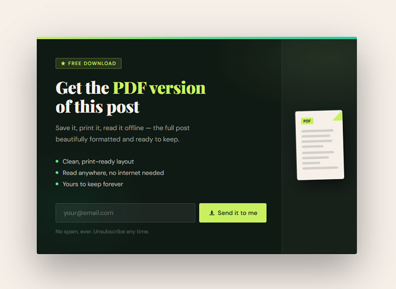
Why Does a PDF Version of a Blog Post Still Convert Well
This sounds too simple. It works anyway.
Save your most popular blog post as a formatted PDF and offer it as a free download.
Readers opt in because they want to own it, save it for later, or read it offline.
Takes five minutes to produce. Worth testing on your top-traffic posts before building anything more complex.
PDF conversion quick steps:
- Copy blog post content to Google Docs
- Add cover page with title and your logo
- Format headings consistently (H1, H2, H3)
- Export as PDF
- Test file size (keep under 5MB)
Data from Ian Brodie shows targeted lead magnets can achieve conversion rates of 20-25%, with PDF versions of popular posts consistently performing well.
How Can a Spreadsheet or Calculator Upgrade a Data-Heavy Post
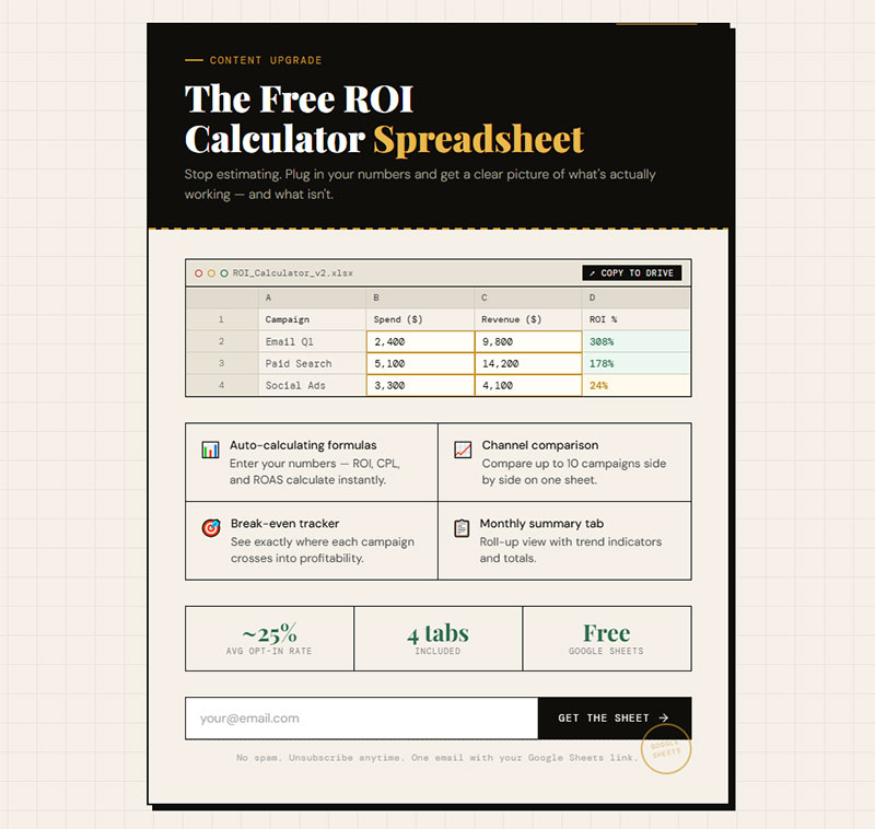
If your blog post involves numbers, give readers a spreadsheet they can plug their own data into.
Budget planners, ROI calculators, tracking templates, pricing comparison sheets.
Google Sheets works fine for this. Share a view-only link and let readers make their own copy. No design skills needed, no PDF formatting. Just a functional tool that makes the post actionable.
Calculator types by conversion rate:
- ROI calculators: 25-35% opt-in rate
- Budget planners: 20-28% opt-in rate
- Pricing comparison tools: 18-25% opt-in rate
- Tracking templates: 15-22% opt-in rate
Works best for: finance posts, analytics tutorials, pricing guides, performance tracking content.
One BusySeed case study showed an ROI calculator was directly tied to 45% of a client’s total revenue in 2024, with a 2.7x conversion rate increase.
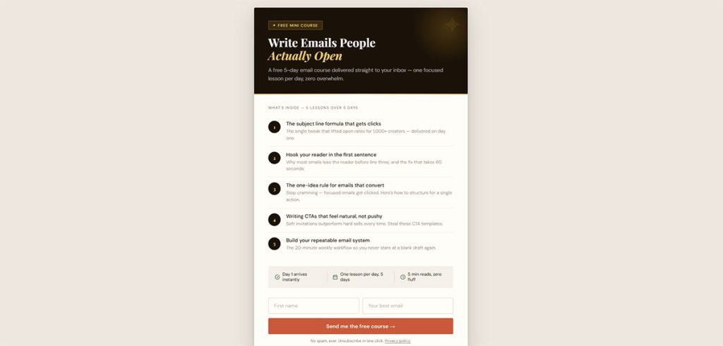
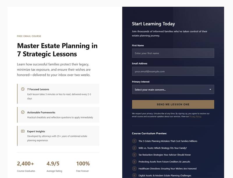
What Makes a Mini Email Course a High-Value Content Upgrade
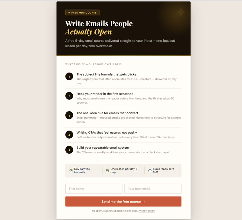
Instead of delivering everything at once, drip it over 3-5 emails. Each email covers one lesson or action step.
ConvertKit (now Kit) and ActiveCampaign make these easy to set up with automated sequences.
The reader opts in, gets day-one content immediately, and receives follow-ups over the next few days.
Mini course structure that performs:
Day 0: Welcome + Lesson 1 (immediate delivery)
Day 2: Lesson 2 + quick win
Day 4: Lesson 3 + case study
Day 6: Lesson 4 + implementation tips
Day 8: Final lesson + pitch for paid offer
The real advantage? Multiple touchpoints.
A PDF gets downloaded and forgotten. An email course keeps you in the reader’s inbox for a week. That builds familiarity faster than any single download.
According to Omnisend research, automated drip campaigns perform two times better than promotional campaigns. One brand saw a 32% conversion rate from their drip sequence, generating 17% of annual revenue from automated emails.
Works best for: complex topics that benefit from spaced learning, onboarding-style content, skill-building posts.
Success metrics to track:
- Email 1 open rate (target: 40-60%)
- Email 5 open rate (target: 25-35%)
- Link click rate per email (target: 8-15%)
- Course completion rate (target: 30-45%)
How Can a Video Walkthrough Expand a Written Tutorial
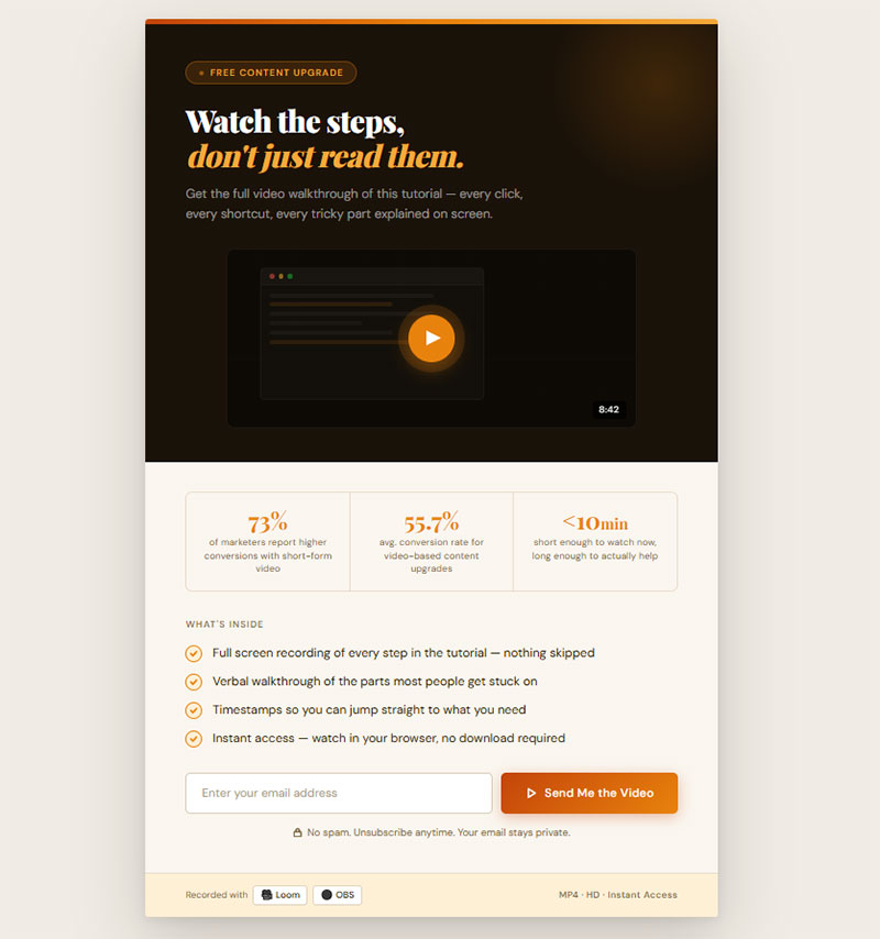
Some readers want to watch, not read.
A short screen recording (under 10 minutes) showing exactly how to do what the blog post describes can be a strong content upgrade.
GetResponse’s 2025 data shows 73% of marketers report higher conversions with short-form video content. Video clips deliver approximately 55.7% conversion rates, while short tutorials hit 54.1%.
Record it with Loom or OBS. No fancy editing needed. Just walk through the steps, show your screen, and talk through the tricky parts.
Video walkthrough production timeline:
- Outline script: 15 minutes
- Record first take: 15-20 minutes
- Review and re-record if needed: 10 minutes
- Add simple intro/outro: 10 minutes
- Upload and create landing page: 15 minutes
- Total time: 60-75 minutes
Works best for: software tutorials, technical how-tos, design walkthroughs, WordPress setup guides.
Quality checklist:
- [ ] Audio is clear (use microphone, not laptop)
- [ ] Screen resolution set to 1080p
- [ ] Mouse movements are slow and deliberate
- [ ] Each step announced before performing
- [ ] File size under 100MB for easy download
Why Are Bonus Expert Interviews an Effective Content Upgrade for Roundup Posts
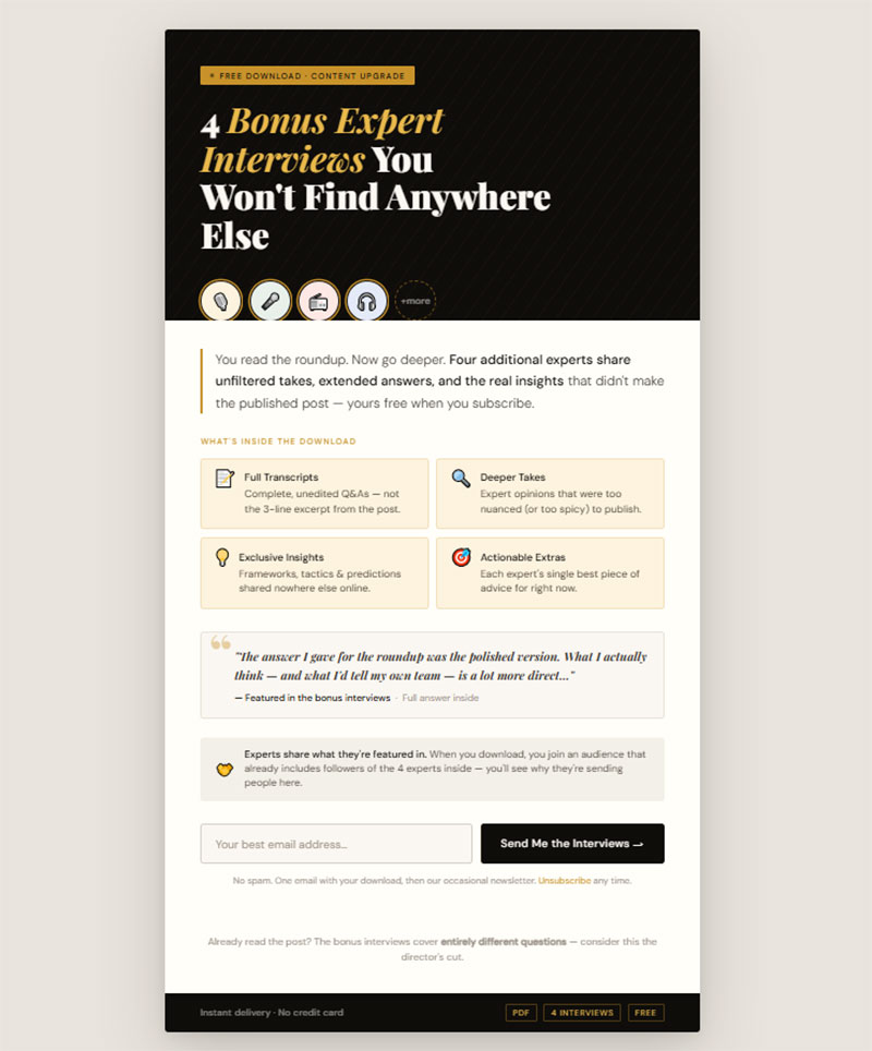
If you wrote a roundup post with quotes from 8 experts, interview 4 more and package those as the content upgrade.
Extended answers, deeper takes, exclusive insights that didn’t make the published post.
The experts will likely share it too, since they’re featured. Double benefit: subscriber growth plus social distribution from the experts’ own audiences.
Expert interview upgrade process:
- Email 3-4 experts not in original post
- Ask 2-3 focused questions (same for all)
- Record responses (written or audio)
- Compile into PDF or audio file
- Get expert permission to use in lead magnet
- Ask experts to share with their audience
Works best for: expert roundup posts, industry trend articles, opinion-based listicles.
Amplification strategy:
- Tag experts in social posts about the upgrade
- Send direct message when upgrade goes live
- Offer co-marketing opportunity
- Track referral traffic from expert shares
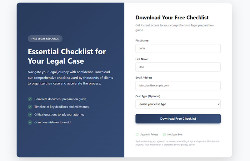
How Does a Case Study Download Work as a Content Upgrade
Package a detailed case study as a PDF with screenshots, data tables, and step-by-step breakdowns.
Include results, timelines, and the specific process that led to those results.
Case studies build trust faster than almost any other content type. A reader who downloads one is already evaluating whether to work with you. That makes them a high-quality lead.
Case study template structure:
Page 1: Challenge/Problem Overview
Page 2: Strategy & Approach
Pages 3-4: Implementation Process
Page 5: Results & Metrics
Page 6: Key Takeaways
Page 7: How to Apply This
Works best for: strategy posts, results-focused articles, service-based business blogs.
Performance data to include:
- Before/after metrics
- Timeline from start to results
- Budget or resource investment
- Specific tactics used
- Unexpected challenges overcome
According to Marketing Sherpa, white papers and case studies still have strong performance in B2B transactions, with downloads averaging 7% conversion rates. B2B customers who download case studies spend 40% more on subsequent purchases.
Testing protocol:
Test each format on your top 3 blog posts before scaling:
| Week | Action | Success Metric |
|---|---|---|
| 1 | Create checklist version | Track baseline opt-in rate |
| 2 | Create template version | Compare to checklist |
| 3 | Create video version | Identify highest converter |
| 4 | Deploy winner to 10 posts | Scale what works |
Match format to reader behavior. If they need to reference information quickly, use checklists or cheat sheets. If they need to build something, use templates or workbooks. If they want proof, use case studies or swipe files.
The format matters less than the match.
How to Choose the Right Content Upgrade for a Specific Blog Post
The format has to match the post type. Mismatched upgrades feel random and convert poorly.
What Type of Content Upgrade Fits an Informational Blog Post
Informational posts explain concepts, define terms, or break down topics. Readers come for understanding, not immediate action.
Best fits: PDF summary, cheat sheet, or a mini email course that goes deeper.
Give them something they can reference later when they’re ready to apply what they learned.
Match framework:
| Post Goal | Reader Intent | Best Format | Expected Opt-In |
|---|---|---|---|
| Explain concept | Understanding | PDF summary | 15-20% |
| Define terms | Quick reference | Cheat sheet | 20-25% |
| Deep dive | Mastery | Email course | 18-24% |
According to Omnisend’s 2025 research analyzing automated drip campaigns, email courses perform two times better than promotional campaigns, making them ideal for educational content.
What Type of Content Upgrade Fits a How-To or Tutorial Post
Tutorial readers want to do something. They’re mid-task or about to start.
Best fits: checklist, template, spreadsheet, or video walkthrough.
Anything that shortens the gap between reading and doing. A printable checklist they can follow step-by-step while working is ideal.
Action-oriented format selection:
Research from GetResponse shows 58.6% of marketers report checklists, toolkits, and short-form content convert better than long-form text. Cheat-sheet pages reach conversion rates around 34%, significantly higher than average landing pages at 18%.
For video tutorials, GetResponse’s 2025 data shows 73% of marketers report higher conversions with short-form video content, with video clips delivering approximately 55.7% conversion rates.
Quick implementation:
- [ ] Convert tutorial steps into checklist format
- [ ] Add checkbox squares for completion tracking
- [ ] Include space for notes or custom additions
- [ ] Test both PDF and spreadsheet versions
- [ ] Track which format drives higher completion rates
What Type of Content Upgrade Fits a Listicle or Roundup Post
Listicle readers are browsing and comparing. They want options.
Best fits: expanded list as PDF, resource toolkit, bonus expert interviews, or a comparison spreadsheet.
Give them more of what they came for, in a portable format.
According to ConvertFlow data, 43% of marketers using resource toolkits as lead magnets reported improved list quality within 60 days.
Expansion strategies:
Original Post: "10 Marketing Tools"
Upgrade Options:
1. Expanded list (25 tools) with ratings
2. Comparison spreadsheet with pricing
3. Bonus interviews with tool creators
4. Implementation templates for each tool
How to Create a Content Upgrade Step by Step
The process is straightforward. Identify the right post, pick the right format, build it, deliver it.
How Do You Identify Which Blog Posts Need a Content Upgrade
Open Google Analytics or Google Search Console. Sort your posts by traffic.
Your top 5-10 posts are where content upgrades will have the most impact.
Look for posts that already rank well and pull steady organic traffic. Adding a content upgrade to a post that gets 50 visits a month won’t move the needle. Adding one to a post that gets 2,000 visits a month? That’s potentially hundreds of new subscribers.
Post selection criteria:
| Metric | Minimum Threshold | Why It Matters |
|---|---|---|
| Monthly traffic | 500+ visits | Conversion volume |
| Time on page | 2+ minutes | Engagement signal |
| Bounce rate | <60% | Content quality |
| Ranking position | Top 10 | Organic stability |
Also check engagement. Posts with high time-on-page and low bounce rates signal that readers are actually consuming the content. Those readers are primed to opt in.
Priority scoring system:
Post Score = (Monthly Traffic × 0.4) + (Time on Page × 100 × 0.3) + (Engagement Rate × 100 × 0.3)

Example:
Post A: 2,000 visits, 3 min time, 45% engagement
Score: (2000 × 0.4) + (3 × 100 × 0.3) + (45 × 0.3) = 800 + 90 + 13.5 = 903.5

Post B: 500 visits, 5 min time, 65% engagement
Score: (500 × 0.4) + (5 × 100 × 0.3) + (65 × 0.3) = 200 + 150 + 19.5 = 369.5
Start with your highest-scoring posts.
What Tools Can You Use to Build a Content Upgrade
You don’t need expensive software.
- Canva for designed PDFs, checklists, cheat sheets, and workbooks
- Google Docs or Google Sheets for templates, calculators, and spreadsheets
- Designrr for turning blog posts into formatted ebooks and PDFs
- Loom for quick video walkthroughs
- ConvertKit, ActiveCampaign, or Mailchimp for email course automation
- IvyForms for creating that lead gen form
Most content upgrades take 30-60 minutes to build if you already have the blog post written. The content exists. You’re just repackaging it into a more usable format.
Production timeline by format:
| Format | Build Time | Tools Needed | Skill Level |
|---|---|---|---|
| Checklist | 30 min | Canva | Beginner |
| Template | 45 min | Google Docs | Beginner |
| Video | 60 min | Loom | Intermediate |
| Email course | 90 min | ConvertKit | Intermediate |
| Spreadsheet | 75 min | Google Sheets | Advanced |
How Should a Content Upgrade Be Delivered to the Reader
The delivery method matters as much as the content itself. Clunky opt-in flows kill conversions.
Place your opt-in offer in at least two spots: once in the top third of the post and once near the bottom.
Some marketers add a third in the middle. Bryan Harris links to his content upgrades three times per post and sees 20-30% opt-in rates.
Placement performance data:
According to Wisepops analysis of 1 billion popup displays, center-left positions convert at 5.51%, while bottom-center drops to 3.41%. Corner positions like bottom-left (2.65%) and bottom-right (2.88%) show the lowest performance.
Timing matters too. Wisepops data shows popups displayed between 11-15 seconds achieve the highest conversion rate at 6.45%. Immediate popups (0 seconds) convert lower at 4.16%, while waiting too long (21-30 seconds) drops conversion to just 1.53%.
Use inline forms or popup forms depending on what fits your layout.
Inline forms blend into the content and feel less intrusive. Popup forms triggered by scroll depth or exit intent catch readers who might otherwise leave without subscribing.
Format comparison benchmarks:
According to Omnisend’s 2025 analysis:
- Multi-step popups: 2.3% conversion rate
- Single-step popups: 2.0% conversion rate
- Inline forms: 1.95% average opt-in rate
Research from GetSiteControl shows modals convert 75.95% better than slide-ins on mobile devices. On desktop, modals (4.44%) outperform slide-ins (3.49%) by 27.22%.
Two-step opt-ins (click a button, then see the email field) tend to outperform single-step forms.
The initial click creates a micro-commitment. Once someone clicks, they’re more likely to complete the signup.
Two-step opt-in performance:
OptinMonster data shows The Eczema Company nearly doubled conversions from 6.35% to 13.76% of mobile users by switching to a two-step opt-in. This leverages the Zeigarnik effect, where once a visitor clicks “Yes, I want 10% off!” they’re far more likely to finish the process.
Another OptinMonster case study showed Lead Guru increased their lead magnet conversion from 55% to 81.8% (a 26% lift) by turning their campaign into a two-step opt-in using MonsterLink.
Optimal form field count:
According to HubSpot’s 2024 research, conversion rates drop an average of 4.1% per additional form field. Reducing from 4 to 3 fields increased conversions by nearly 50% in Dan Zarrella’s analysis of 40,000 forms.
Omnisend research shows:
- Forms with only email field: highest conversion
- Forms with email + phone: 10.15% conversion rate
- Forms including birth date or gender: 5-6% conversion rate
Best practice: stick to 3 form fields maximum for approximately 10% conversion.
For WordPress sites, tools like Thrive Leads, OptinMonster, or free WordPress form plugins handle the technical side.
Most let you set up content-specific triggers so the right upgrade shows on the right post.
Trigger optimization strategy:
| Trigger Type | Use Case | Expected Conversion | Setup Time |
|---|---|---|---|
| Time delay (11-15 sec) | Engaged readers | 6.45% | 5 min |
| Scroll depth (50-75%) | Content consumption | 4-5% | 10 min |
| Exit intent | Abandoning visitors | 2.81% | 15 min |
| Click trigger | Two-step opt-in | 8-12% | 20 min |
After the opt-in, deliver the download instantly via email. Don’t make people wait.
Automated delivery through your email marketing platform (Mailchimp, ConvertKit, Drip, AWeber) keeps the experience smooth.
Make sure your WordPress email settings are configured properly so delivery emails don’t land in spam.
Delivery sequence template:
Email 1 (Immediate): Welcome + download link
Subject: "Here's your [Content Upgrade Name]"
- Thank them for subscribing
- Provide immediate download link
- Set expectations for future emails

Email 2 (Day 3): Implementation tips
Subject: "How to get the most from [Content Upgrade]"
- Share success story or case study
- Offer additional resources
- Soft introduction to paid offer

Email 3 (Day 7): Next step offer
Subject: "Ready to take it further?"
- Present paid product or service
- Show how it builds on free upgrade
- Include time-limited incentive
Performance tracking dashboard:
Monitor these metrics weekly:
| Metric | Calculation | Target Benchmark |
|---|---|---|
| Opt-in rate | Subscribers ÷ Visitors | 3-5% |
| Delivery rate | Delivered ÷ Sent | >98% |
| Open rate | Opens ÷ Delivered | 40-60% |
| Click rate | Clicks ÷ Opens | 15-25% |
| Conversion rate | Purchases ÷ Subscribers | 1-3% |
According to BDOW research based on 3.2 billion popup views, the average email opt-in rate is 1.95%. Top performers (top 10%) achieve 6.5% or higher.
A/B testing priorities:
Test these elements in order of impact:
- Format (popup vs inline) – potential 75% lift
- Timing (11-15 sec vs immediate) – potential 55% lift
- Steps (two-step vs single) – potential 15-115% lift
- Field count (1 vs 3 fields) – potential 50% lift
- Copy (benefit vs feature) – potential 20-40% lift
Start with format testing, then move down the list. Each improvement compounds.
The goal is not perfection on day one. The goal is a working system that you can test and improve over time.
Install the upgrade. Track the data. Make one change per week. Watch your subscriber numbers climb.
What Are Common Mistakes When Creating Content Upgrades
Most content upgrade failures come down to two problems. Both are fixable.
Why Does a Generic Content Upgrade Underperform a Specific One
A site-wide “Subscribe to get our free guide” banner is not a content upgrade. It’s a lead magnet. And it converts like one, typically 1-3%.
According to BDOW research based on 3.2 billion popup views, the average email opt-in rate for generic offers is 1.95%. That’s baseline performance.
The whole point of a content upgrade is specificity. It has to match the post.
A reader on your article about increasing form conversions wants a checklist about form conversions, not a general marketing ebook.
Performance comparison:
| Offer Type | Average Opt-In Rate | Quality of Leads |
|---|---|---|
| Generic site-wide lead magnet | 1.95% | Mixed quality |
| Post-specific content upgrade | 15-30% | High intent |
| Interactive content upgrade | 25-45% | Very high intent |
Research from Sleeknote shows a blog added a content-specific upgrade and saw opt-in rates jump from 0.37% to 4.14%. That’s an 11x improvement from adding specificity.
Build unique upgrades for your highest-traffic posts. Use a general lead magnet everywhere else as a fallback.
Upgrade mapping template:
Top Post #1: [Post Title]
Traffic: [Monthly Visitors]
Topic: [Core Subject]
Reader Intent: [What they want to do]
Perfect Upgrade: [Specific format + outcome]

Example:
Top Post #1: "How to Write Cold Emails"
Traffic: 5,000/month
Topic: Email copywriting
Reader Intent: Write effective cold outreach
Perfect Upgrade: 10 Cold Email Templates with Subject Lines
Testing framework:
Week 1: Install generic site-wide popup (baseline)
- Track: opt-in rate, email quality, sales conversion
Week 2: Create post-specific upgrade for top post
- Track: same metrics, compare to baseline
Week 3: Roll out to top 3 posts
- Track: cumulative improvement
According to MarketingSherpa’s 2025 research, context-optimized forms have a 25-40% higher conversion rate than generic standard forms.
How Does Poor Placement Reduce Content Upgrade Opt-in Rates
Burying your opt-in offer at the very bottom of a 3,000-word post means most readers never see it.
Average scroll depth on blog posts hovers around 50-60%.
Scroll depth benchmarks by content type:
According to 2025 research from AgencyAnalytics and Personizely:
- Long-form content (2,000+ words): 60-80% scroll depth is strong
- Standard blog posts (800-1,800 words): 50-70% healthy range
- Landing pages: 40-60% acceptable when CTA appears early
- Mobile users: 20-30% lower scroll depth than desktop
Plausible Analytics data shows most users aim to reach at least 75% of blog posts, where the conclusion or CTA often resides. If most users drop off before 25%, it signals issues with the header or introduction.
Place your first CTA above the fold or right after the introduction. Use a second one mid-post. And a third at the end for completers.
Strategic placement zones:
| Placement | Scroll Depth | Visibility Rate | Best For |
|---|---|---|---|
| Above fold (0-10%) | 100% see it | 100% | Email-only capture |
| After intro (10-25%) | 90% reach | 90% | Primary upgrade offer |
| Mid-content (40-60%) | 55% reach | 55% | Engaged readers |
| Bottom (90-100%) | 15-25% reach | 15-25% | Completers only |
Based on this data, your upgrade offer should appear:
- First placement: 10-25% scroll depth (after intro, before main content)
- Second placement: 50% scroll depth (middle of post)
- Third placement: 90% scroll depth (conclusion)
Placement optimization checklist:
- [ ] First CTA appears within first 2-3 paragraphs
- [ ] Mid-content CTA at approximate 50% scroll point
- [ ] Final CTA in conclusion paragraph
- [ ] Each CTA uses different copy to avoid repetition
- [ ] Track which placement drives most conversions
Pay attention to form design too.
A visually distinct opt-in box that breaks up the text catches the eye. Plain text links buried in paragraphs get ignored.
Use contrasting colors, clear headlines, and a single form field (email only) to keep friction low.
Form field impact on conversions:
According to multiple 2024-2025 studies:
HubSpot’s research: Conversion rates drop an average of 4.1% per additional form field. Reducing from 4 to 3 fields increased conversions by nearly 50%.
Brixon Group analysis: B2B form conversion rates decrease by an average of 7% with each additional required field. With more than 7 fields, bounce rates spike by 50% compared to forms with just 3 fields.
Amra and Elma data: Reducing form fields from 4 to 3 boosts gated content conversion rates by up to 50%.
Optimal field counts:
| Field Count | Conversion Impact | Use Case |
|---|---|---|
| 1 field (email only) | Highest conversion | Content upgrades, newsletters |
| 3 fields | 50% higher than 4 fields | Lead magnets with qualification |
| 5 fields | 120% better than 6+ fields | High-value offers |
| 7+ fields | 30% conversion decrease | Serious buyers only |
Zuko’s 2025 research analyzing millions of form submissions shows:
- Password fields: 10.5% abandonment rate (highest of all fields)
- Email fields: 6.4% abandonment rate
- Phone number fields: 6.3% abandonment rate
- Name fields: Lowest abandonment, 3.5 seconds average completion
Only 38% of users who interact with a contact form successfully submit their details. The view-to-completion rate drops to just 9% when factoring in users who never start the form.
Form design best practices:
Winning Form Elements:
- Single column layout (15.4 seconds faster on mobile)
- Clear headline stating benefit
- Contrasting button color
- One field (email only) for content upgrades
- Button text with action verb (“Get My Checklist”)
- Privacy assurance below button
- Auto-fill enabled for email field
Avoid These:
- Multiple columns on mobile
- Generic “Submit” button text
- Asking for phone number on content upgrades
- Password requirements
- Dropdown select boxes (break typing flow)
- Large text areas (imply time commitment)
According to Omnisend’s research, forms with only an email field convert highest. Adding phone fields drops conversion to 10.15%, while adding birth date or gender drops it to 5-6%.
If you’re seeing high traffic but low opt-in rates, test your placement before rebuilding the upgrade itself.
Often the offer is fine. The problem is nobody’s seeing it.
Diagnostic framework:
| Problem Signal | Likely Cause | Fix |
|---|---|---|
| High traffic, low opt-ins | Poor placement | Move CTA higher, test 3 placements |
| Good placement, low opt-ins | Wrong format or generic offer | Create post-specific upgrade |
| Good opt-ins, poor conversions | Unqualified leads | Add one qualification field |
| High mobile traffic, low mobile opt-ins | Form not mobile-optimized | Test single-column, larger buttons |
Quick wins to implement today:
- Move your first CTA above 25% scroll depth
- Expected impact: 2-3x more visibility
- Time to implement: 10 minutes
- Tool needed: Your CMS editor
- Reduce form fields to email only
- Expected impact: 50% conversion increase
- Time to implement: 5 minutes
- Tool needed: Form builder settings
- Change button text from “Submit” to benefit-driven copy
- Expected impact: 15-25% lift
- Time to implement: 2 minutes
- Example: “Get My Free Template”
- Add contrasting color to form box
- Expected impact: 10-20% better visibility
- Time to implement: 5 minutes
- Tool needed: CSS or page builder
- Test two-step opt-in (click button, then show email field)
- Expected impact: 15-115% conversion increase
- Time to implement: 15-20 minutes
- Based on OptinMonster case studies
30-day fix-it plan:
Week 1: Audit & Baseline
- [ ] Check scroll depth for top 10 posts
- [ ] Document current form field counts
- [ ] Record baseline opt-in rates
- [ ] Screenshot current placements

Week 2: Quick Wins
- [ ] Reduce all forms to email-only
- [ ] Move primary CTA to 20% scroll depth
- [ ] Update button copy on 3 top posts
- [ ] Add contrasting colors

Week 3: Test & Optimize
- [ ] A/B test placement positions
- [ ] Test two-step vs single-step
- [ ] Try different button colors
- [ ] Test different headlines

Week 4: Scale What Works
- [ ] Roll winning variation to all posts
- [ ] Create post-specific upgrades for top 5 posts
- [ ] Document new opt-in rates
- [ ] Calculate ROI of changes
The combination of specific upgrades + optimal placement + minimal friction typically results in 10-20x improvement over generic, poorly placed, multi-field forms.
Start with placement. It’s the fastest fix and often delivers the biggest impact.
FAQ on Content Upgrades Ideas
What is a content upgrade?
A content upgrade is a bonus downloadable resource tied to a specific blog post, offered in exchange for an email address. Unlike site-wide lead magnets, it matches the exact topic the reader is already consuming, which is why opt-in rates run significantly higher.
How is a content upgrade different from a lead magnet?
A lead magnet targets your whole audience with a broad offer. A content upgrade targets readers of one specific post with a resource directly related to that post’s topic. Scope and specificity are the core differences.
What are the best content upgrade formats?
PDF checklists, printable cheat sheets, spreadsheet templates, swipe files, and workbooks consistently convert well. Short-form formats outperform long-form. GetResponse’s 2025 data shows 58.6% of marketers see better results with checklists and samples over lengthy guides.
How do I choose the right content upgrade for my blog post?
Match the format to the post type. Tutorial posts work best with checklists or templates. Informational posts pair well with cheat sheets or PDF summaries. Roundup posts convert with toolkits or bonus expert interviews. Format follows intent.
What tools can I use to create content upgrades?
Canva handles designed PDFs and checklists. Google Sheets works for calculators and templates. Designrr converts blog posts into formatted ebooks. Loom records video walkthroughs. Most content upgrades take under an hour to build with these tools.
Where should I place the opt-in form for a content upgrade?
Place it in at least two spots: the top third and near the bottom of the post. Adding a mid-post CTA helps too. Use landing page forms or inline opt-in boxes with contrasting colors to catch attention without disrupting the reading flow.
What opt-in rate can I expect from content upgrades?
Well-matched content upgrades typically convert between 5-30% of readers. Bryan Harris reports 20-30% on posts with multiple CTA placements. Generic sidebar lead magnets average 1-3%. The gap comes down to relevance and placement timing.
Can I use the same content upgrade for multiple blog posts?
You can, but performance drops. The closer the upgrade matches a single post’s topic, the higher the conversion rate. Use a general lead magnet as a fallback for lower-traffic posts and build custom upgrades for your top performers.
How do I deliver a content upgrade after someone opts in?
Use automated email delivery through platforms like ConvertKit, ActiveCampaign, or Mailchimp. The download link should arrive instantly after signup. Delayed delivery kills conversions. A clean form submission confirmation message reassures the reader their download is on the way.
Do content upgrades work for small blogs with low traffic?
Yes, but focus on your top 2-3 posts first. Even at 500 monthly visitors, a 15% opt-in rate means 75 new subscribers per month from a single post. Start with your highest-traffic article, build one upgrade, and measure results before scaling.
Conclusion
The best content upgrade ideas share one thing: they give the reader something they can use right after finishing your post.
Not more theory. Not another ebook they’ll never open. A checklist they print out, a spreadsheet they plug numbers into, a swipe file they reference during their next campaign.
Start with your top-traffic blog posts in Google Search Console. Pick one. Build a single upgrade that matches the post’s topic and format. Use Canva for a quick PDF or Google Sheets for a template.
Place your opt-in form in at least two spots within the post. Test inline placement against exit intent popups. Measure your subscriber conversion rate after 30 days.
Then build the next one. Every high-traffic post without a content upgrade is leaving email subscribers on the table.